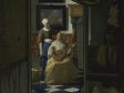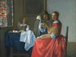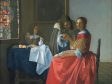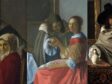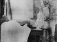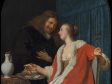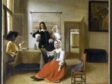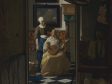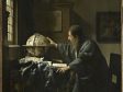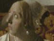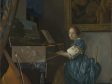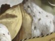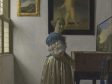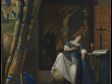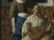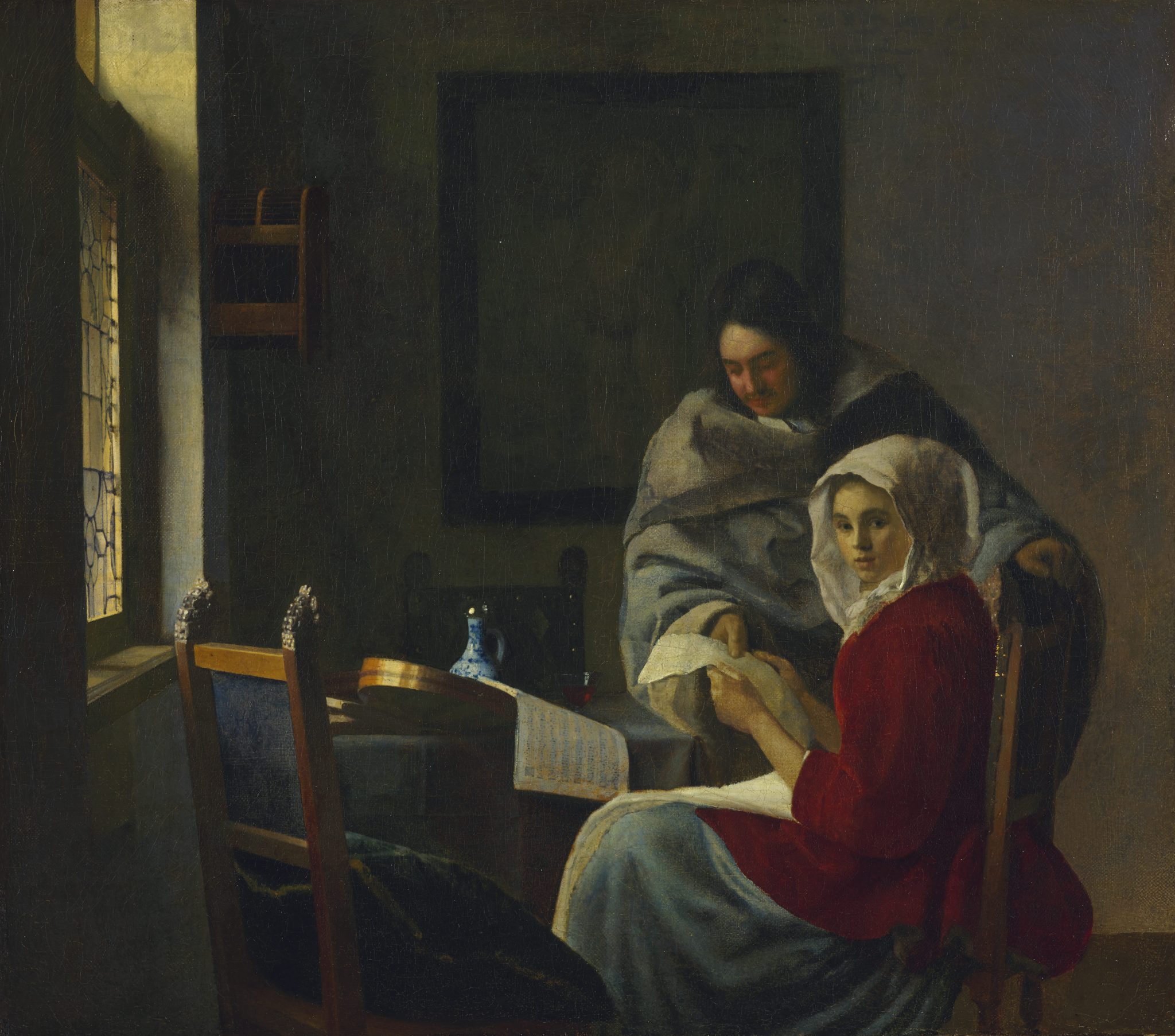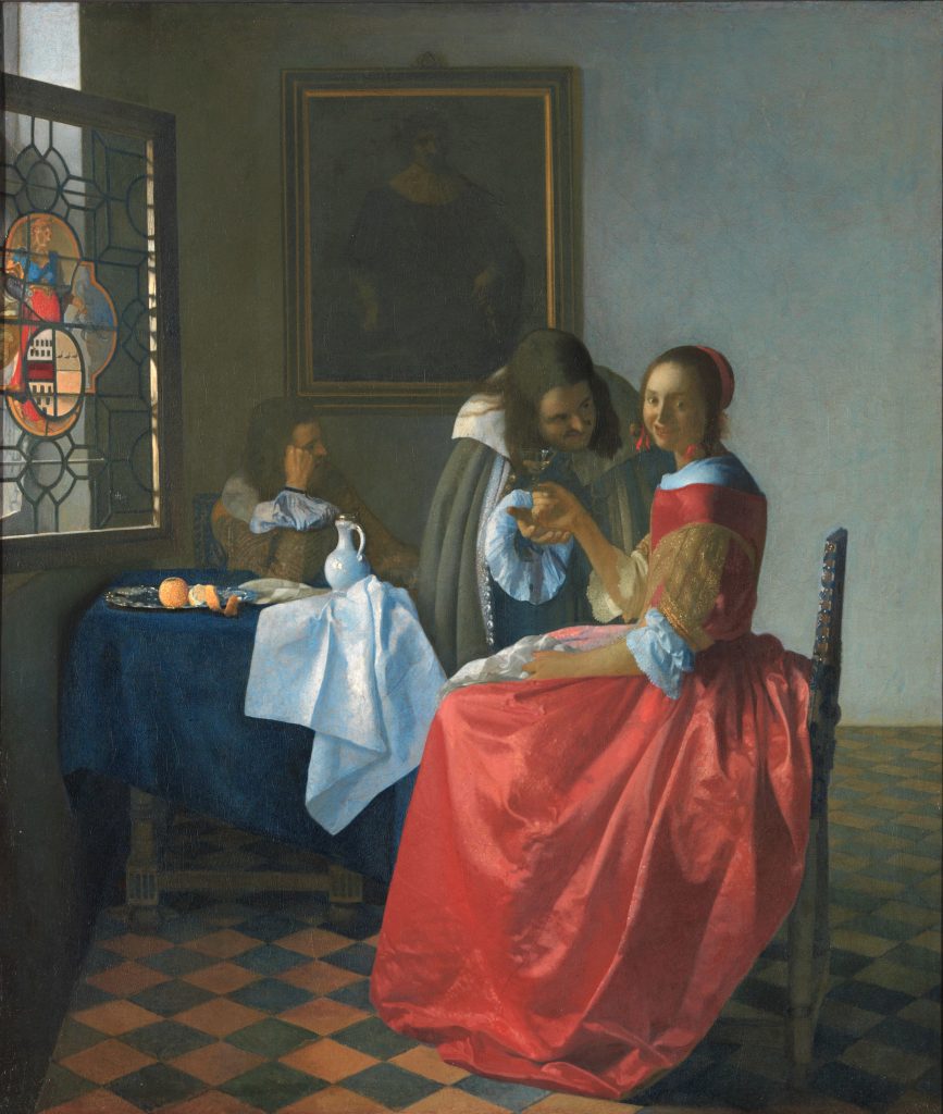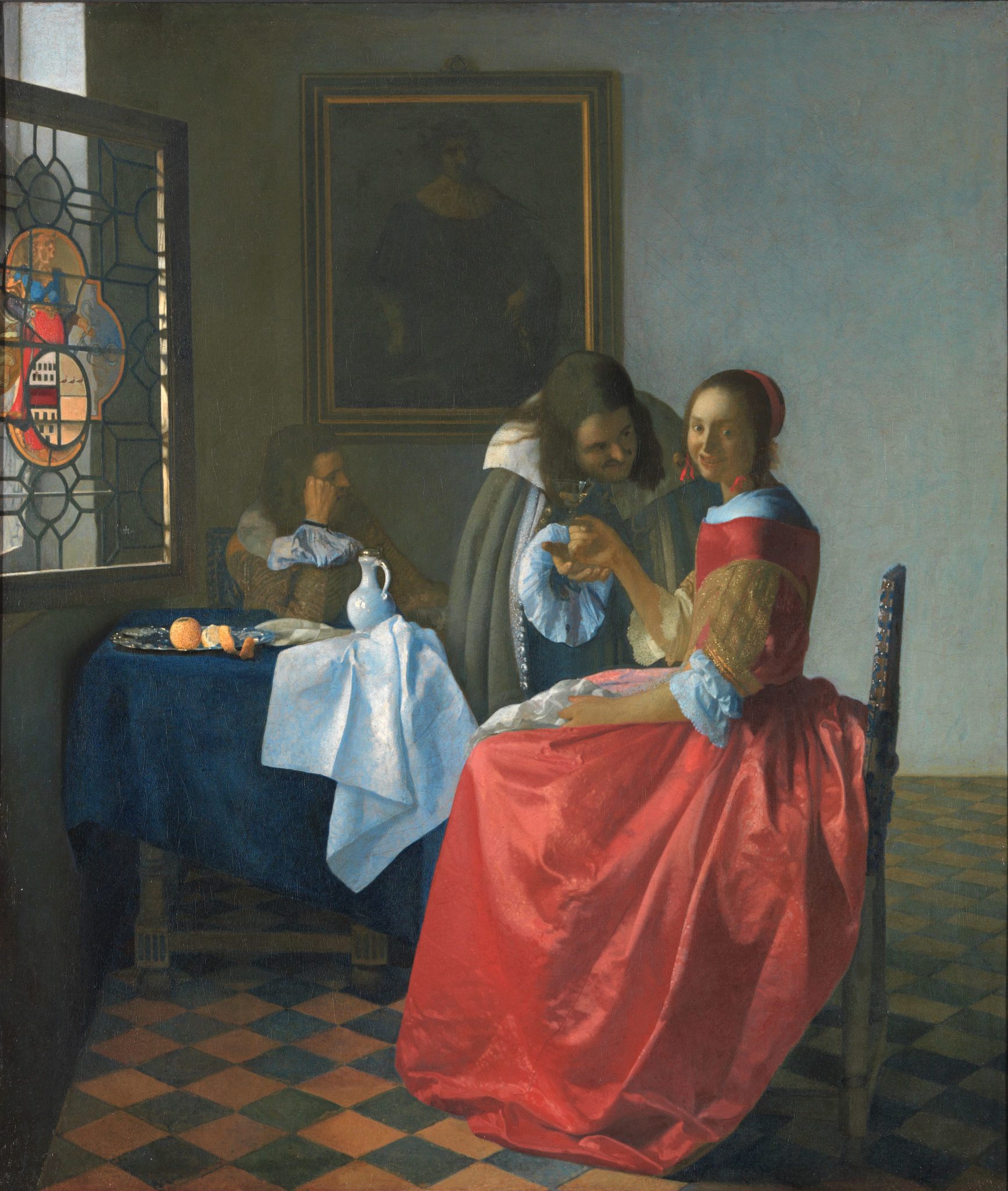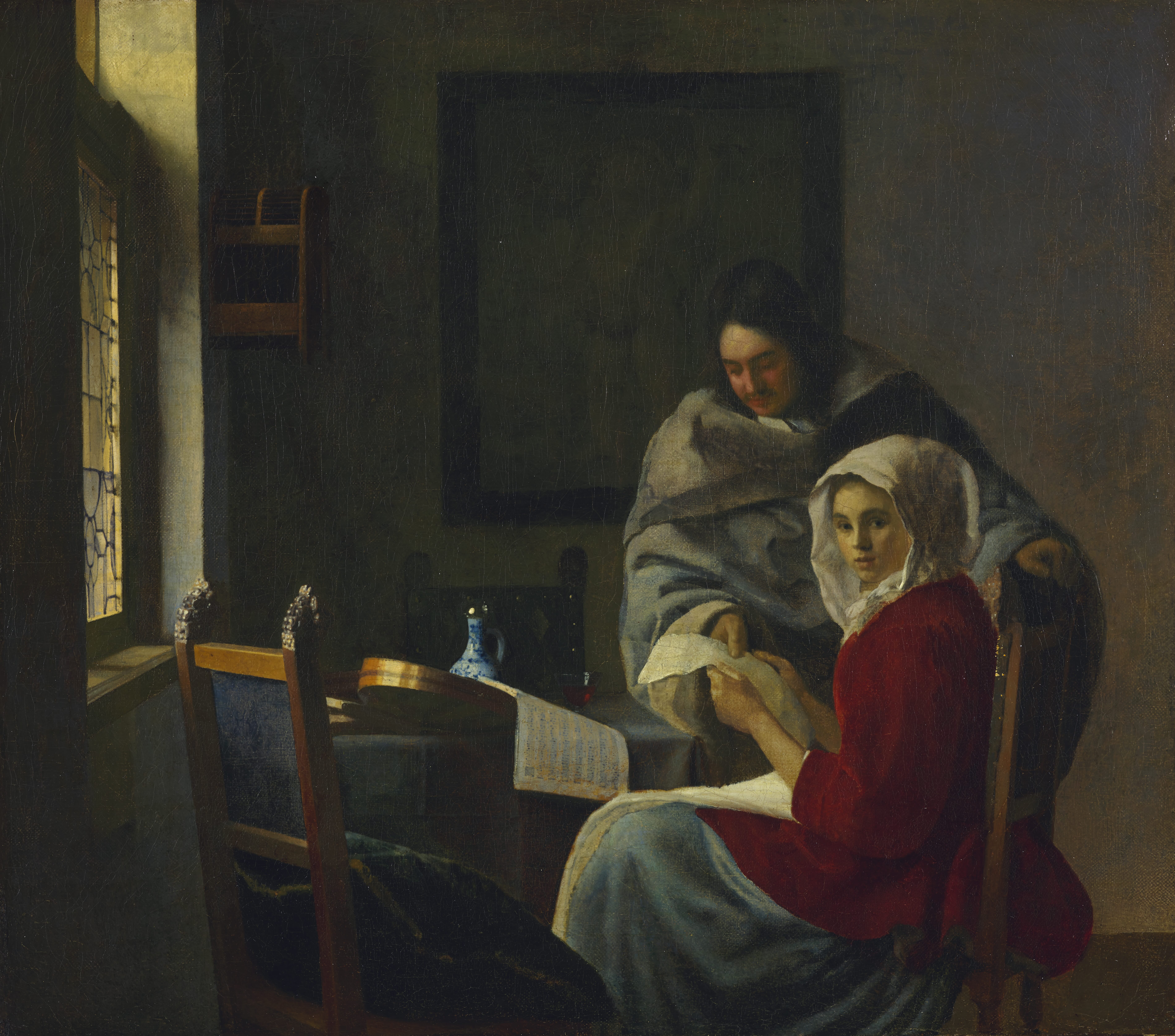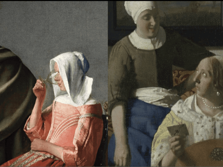
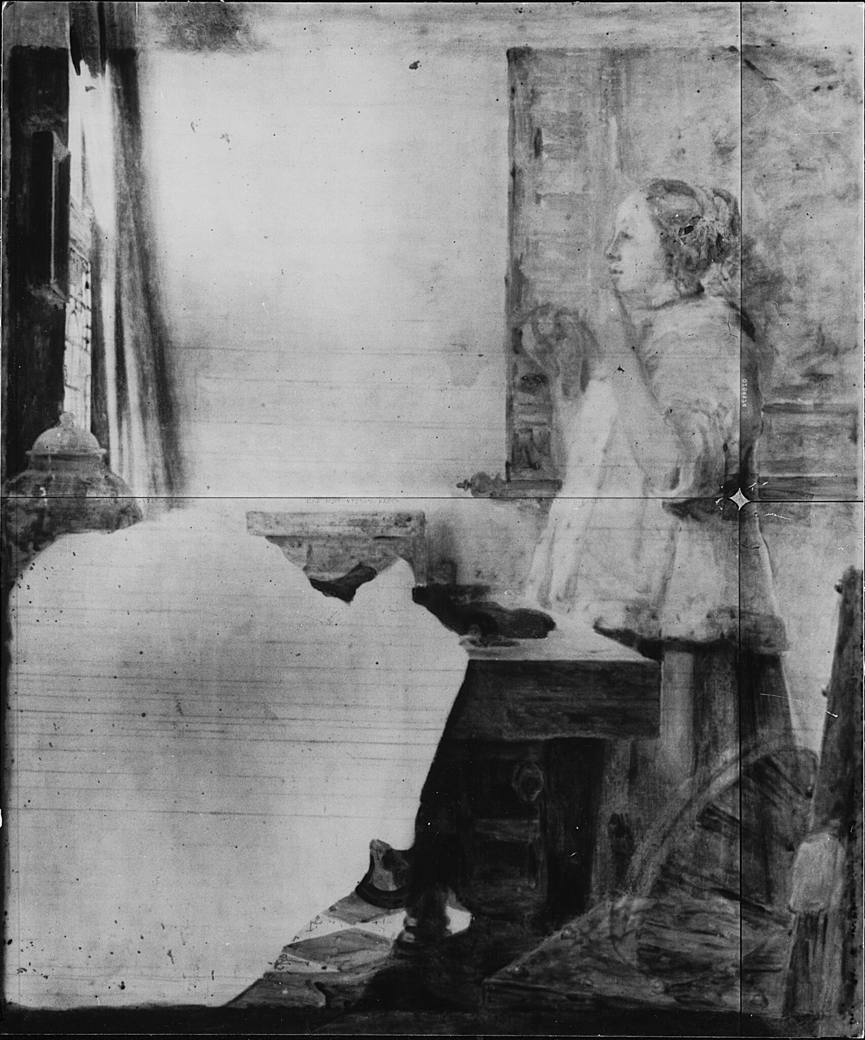
This article questions the attribution of The Glass of Wine (ca. 1662–1667; Staatliche Museen zu Berlin, Gemäldegalerie) and The Love Letter (ca. 1671–1677; Rijksmuseum, Amsterdam) to Johannes Vermeer (1632–1675) through close scrutiny and comparison of paint handling and stylistic features. It argues that the former is a pastiche of elements drawn primarily from Vermeer’s Woman Interrupted at Her Music (ca. 1660–1662; The Frick Collection, New York) and A Woman with a Wineglass (ca. 1661–1663; Herzog Anton Ulrich Museum, Braunschweig), and that the latter is a variation on several of the artist’s late works. The Glass of Wine likely originated from Vermeer’s studio. The same may be true of The Love Letter, although the presence of a signature warrants greater caution.
Introduction
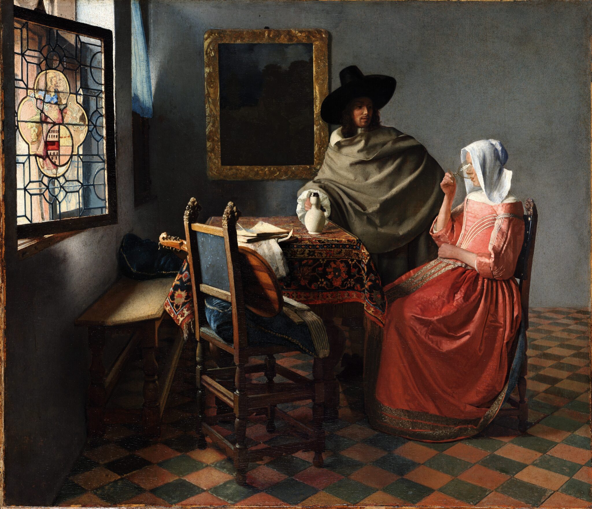
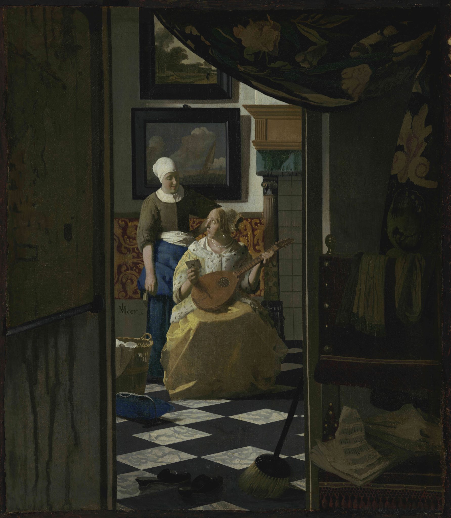
Scholars disagree on the scope of Johannes Vermeer’s oeuvre, with the authorship of a handful of paintings continuing to divide opinion.1 Beyond these, most art historians have long concurred that a group of thirty-four works is by his hand.2 In this article, however, I challenge this consensus by questioning the authenticity of The Glass of Wine (fig. 1) at the Staatliche Museen zu Berlin, Gemäldegalerie, and The Love Letter (fig. 57) at the Rijksmuseum, Amsterdam. This reassessment stems from research for my forthcoming book on Vermeer. During my efforts to establish his artistic development, I encountered a few discrepancies between these two works and the rest of his oeuvre. These initially took me by surprise but, over months of intensive analysis, grew in number and coalesced into coherent patterns.
To argue my case, I rely on connoisseurship: the scrutiny and comparison of paint handling and stylistic features through first-hand examination and ever-improving high-resolution imagery of works of art.3 I contend that The Glass of Wine and The Love Letter diverge so markedly from Vermeer’s exceptionally dexterous brushwork and highly individual style that their attribution to him is no longer sustainable.
The reader may wonder whether instrumental analysis has already arrived at a judgment on this matter, or whether it is better equipped to do so than the human eye. The wealth of recently published technical research on Vermeer includes a handful of studies on The Glass of Wine and The Love Letter. The Gemäldegalerie in Berlin subjected the former to neutron activation autoradiography, which revealed pentimenti and perspective lines used in the construction of the interior.4 Following the theft of The Love Letter in September 1971, the Rijksmuseum issued several articles on its recovery and subsequent restoration.5 Using a range of technical imaging and analytical techniques developed over the past few decades, more recent publications have focused on changes introduced during the painting process and the presence of certain pigments.6 None of these studies has confirmed or rejected the attribution of either painting to Vermeer. This is not surprising, as instrumental analysis—while often highly revelatory of the relationship between the visible paint layer and what lies beneath—rarely, on its own, offers conclusive evidence in questions of attribution. My hope is that the ideas and questions raised here will prove illuminating to future technical research on the Berlin and Amsterdam paintings.
I begin by comparing the paint handling and certain stylistic features of The Glass of Wine with those of undisputed works by Vermeer in order to demonstrate why the current attribution is difficult to uphold. This conclusion alone, however, does not explain how the Berlin picture relates to or derived from his work. Could Vermeer have devised the composition, only for another painter to complete it? Is The Glass of Wine perhaps a copy after a “lost” original? Or is the Berlin picture an independent work by a different hand comprising elements “borrowed” from compositions by Vermeer and perhaps other contemporary artists, in line with the lively exchange of ideas among genre painters at the time?7 I address these questions in relation to both The Glass of Wine and The Love Letter before offering some hypotheses on the authorship of both paintings and proposing dates for their execution.
A few disclaimers and preliminary remarks are necessary. First, this article does not present a definitive statement of fact but reflects the author’s personal scholarly assessment of the attributions of The Glass of Wine and The Love Letter. Second, every effort has been made to avoid conflating original brushwork with that of later restorations. However, since the examination of the paintings under discussion relied on observation with the naked eye and through high-resolution imagery, the possibility of such interference cannot be entirely excluded.8 Third, given the small number of works by Vermeer that serve as meaningful points of reference to the Berlin and Amsterdam paintings, some variations in scale in the visual comparisons presented in this article are inevitable. Those involving major discrepancies are either excluded or explicitly noted. Fourth, to avoid confusion, details from Vermeer’s paintings consistently appear on the left in comparisons, with those from The Glass of Wine and The Love Letter on the right. Finally, as the painters of the Berlin and Amsterdam pictures may not necessarily have been men, I refer to the individual artists as “they.”
The Glass of Wine: Paint Handling and Stylistic Aspects
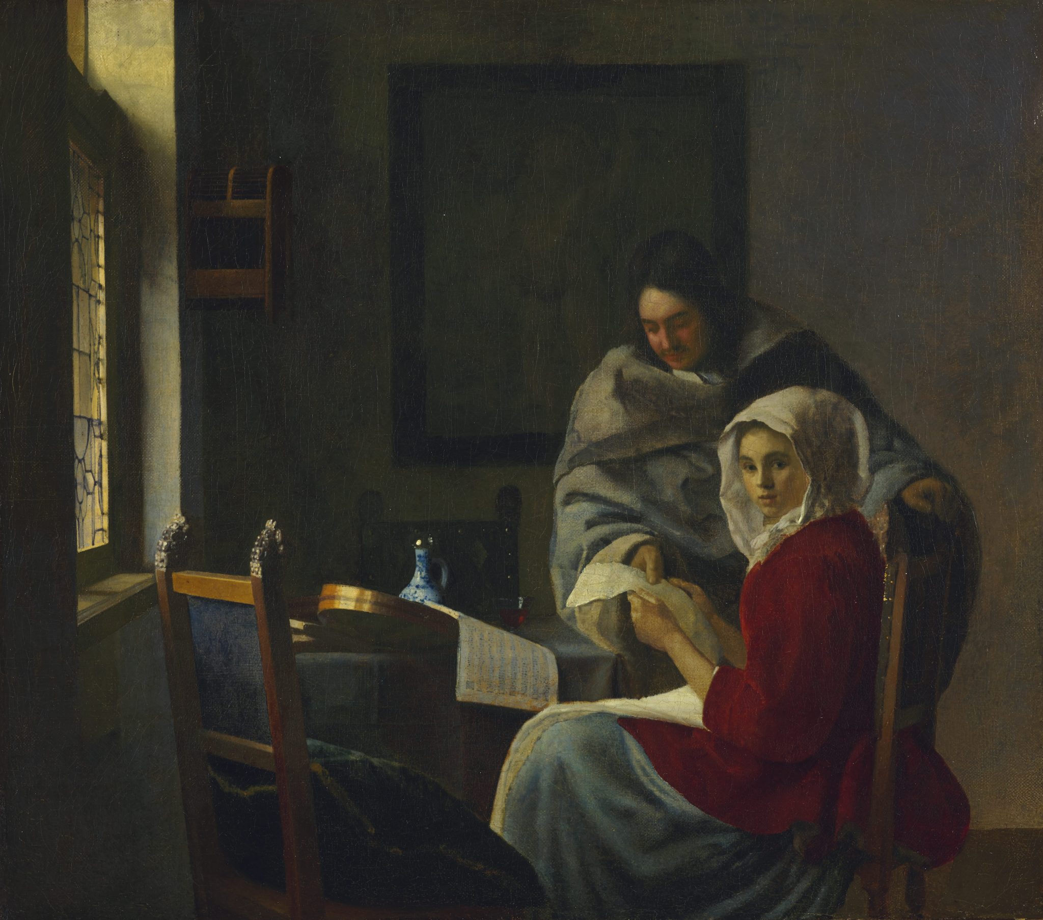
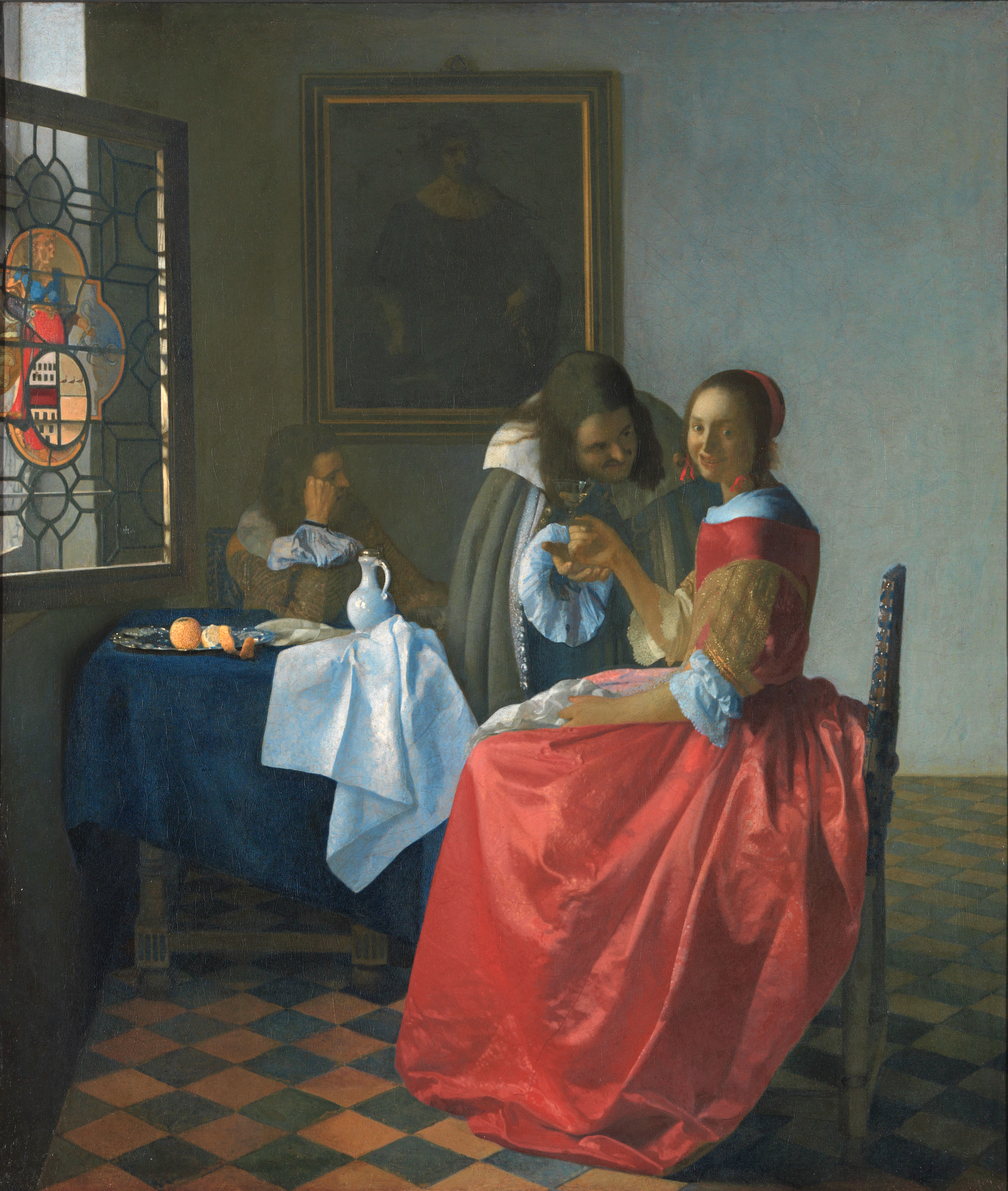
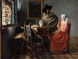
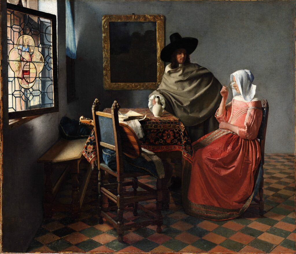
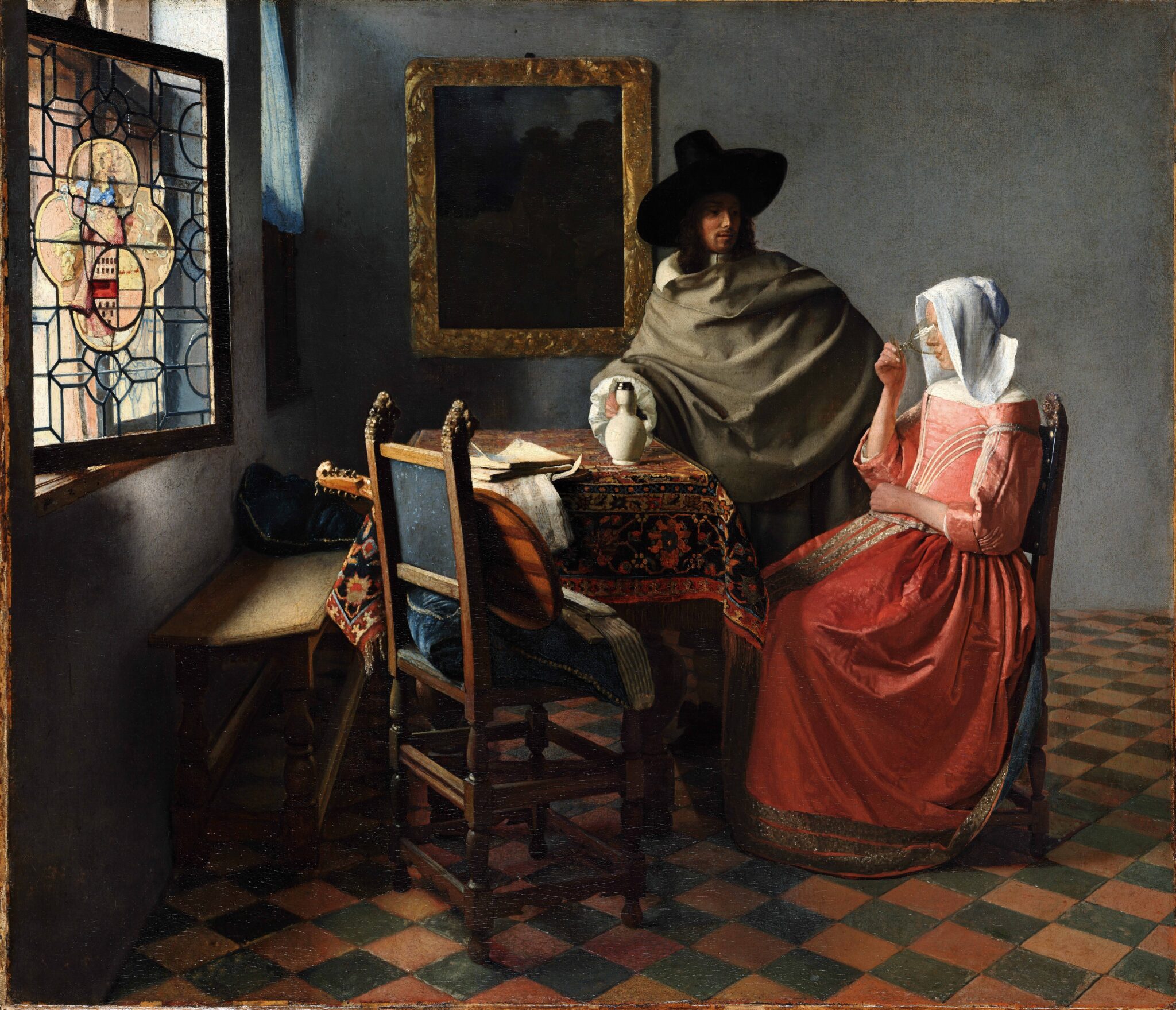
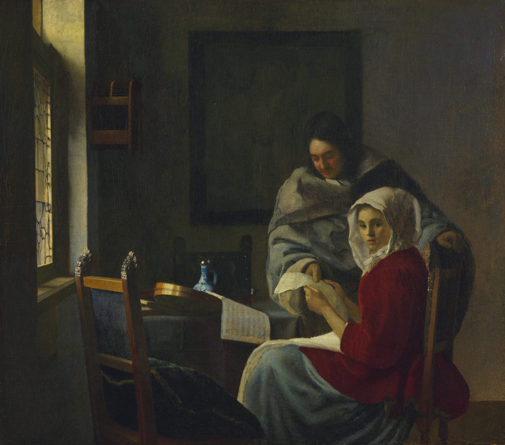
First recorded at a Delft auction in 1736, The Glass of Wine (fig. 1) represents a seated young lady dressed in a satin-woven bodice and skirt, drinking from a wineglass.9 A gentleman visitor stands motionless beside her, stoically observing her. His hand, clasping the handle of a faience jug, suggests that he poured the wine, evidently hoping to improve his romantic chances—a common motif in Dutch genre painting of the time. Art historians generally regard the Berlin picture as the first of three portrayals of courtship by Vermeer, followed by A Woman Interrupted at Her Music (fig. 2) at The Frick Collection, New York, and A Woman with a Wineglass (fig. 3) at the Herzog Anton Ulrich Museum, Braunschweig.10
Although The Glass of Wine has garnered praise for its spatial illusionism and evocative lighting, it has occasionally sparked criticism, mainly pertaining to the representation of the figures.11 Lawrence Gowing, for instance, maintained that the couple has “a mummified quality” and the scene has “the character of an exquisite tomb.”12 Edward Snow contended that “Vermeer’s unflattering depiction of the woman, who has captured the gentleman’s attention, seems willfully misogynistic.”13
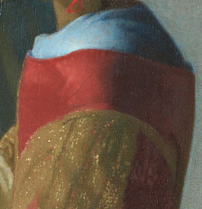
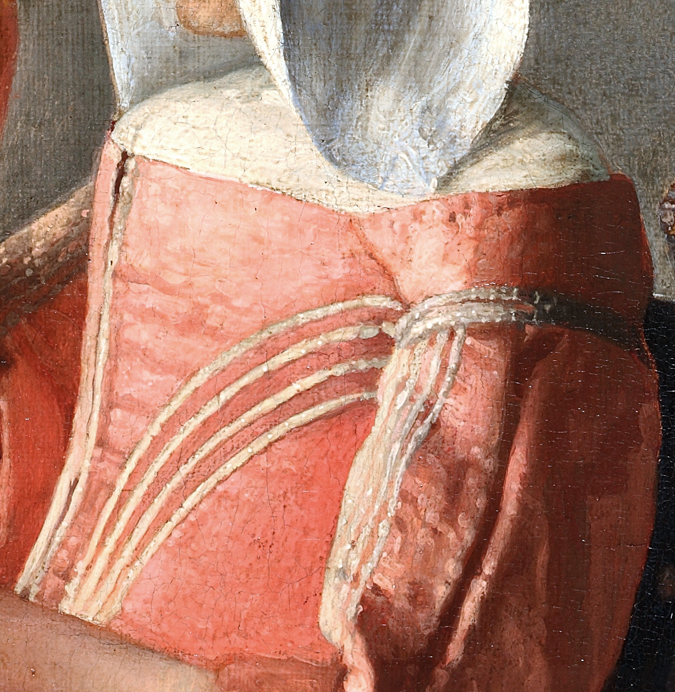
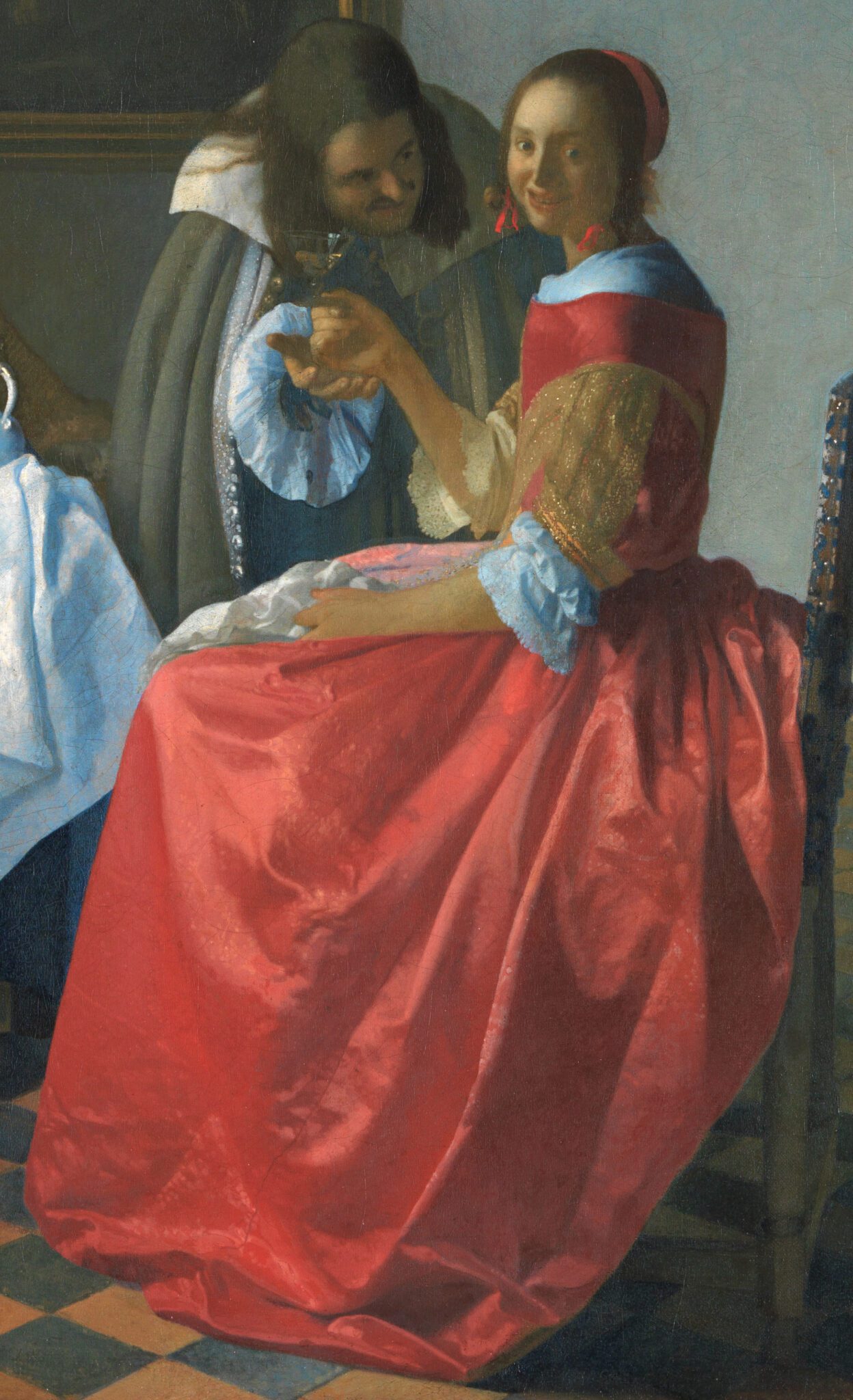
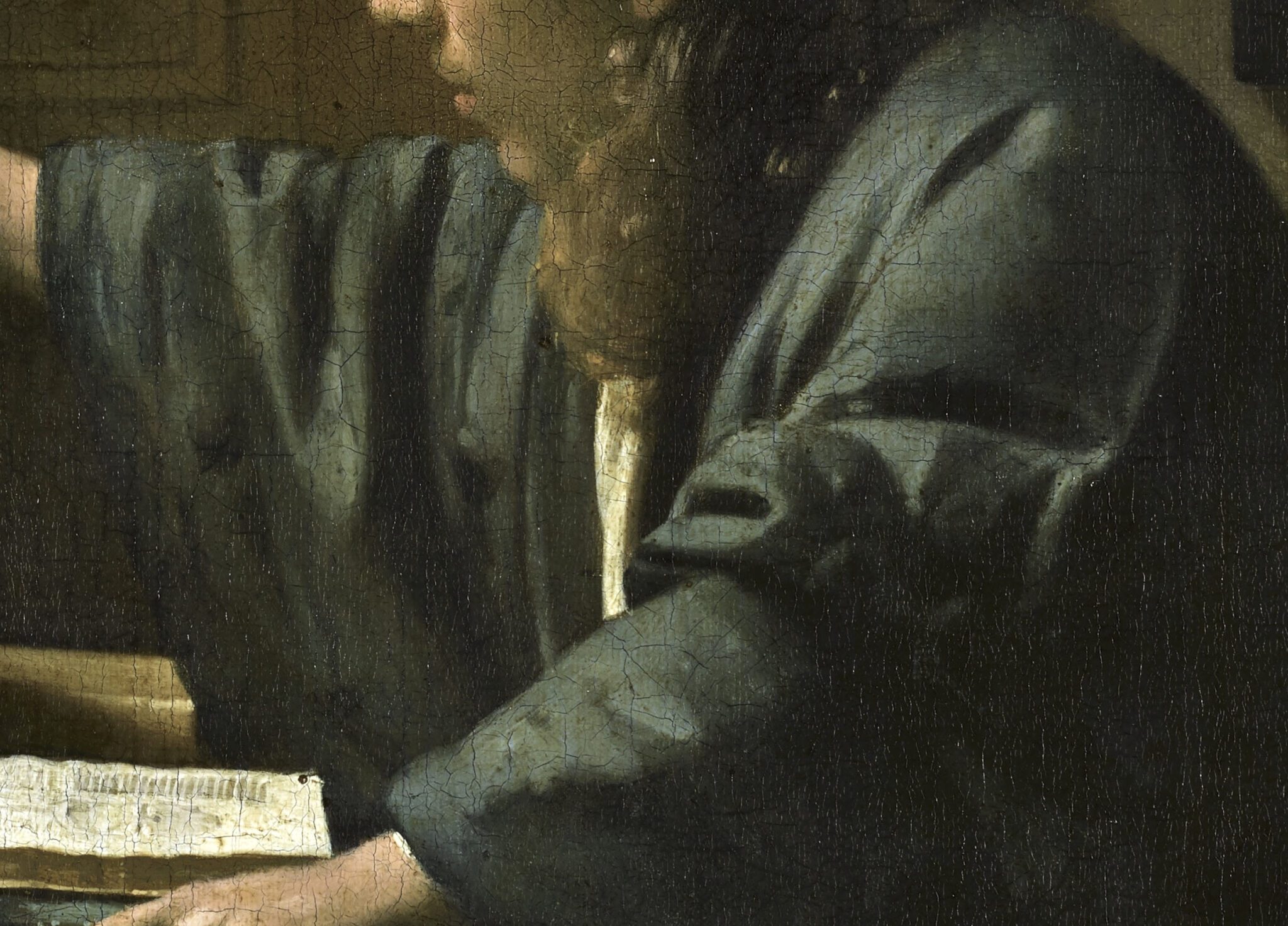
Indeed, the flattish appearance of the young lady’s top half diverges from the sophisticated modeling of the female figure in A Woman with a Wineglass (fig. 4). There, Vermeer employed hazy touches of light pink on a reddish-pink base to suggest the front of the woman’s satin bodice. The patchwork of light pink flicks of paint on the same garment in The Glass of Wine (fig. 5) appears untidy by comparison and contributes little to its convex shape. Equally inelegant is the modeling of the white decorative cords on the bodice, built up with short, slushy strokes, which result in variations in width, interruptions, and erratic contours. Moving up, a dearth of effective highlights and shadows imparts a rigid, two-dimensional quality to the woman’s white shirt.14 In A Woman with a Wineglass, by contrast, Vermeer created the illusion of roundness in the same garment—illuminated at the front and shaded at the back—by juxtaposing broad, smooth strokes in varying hues of light and dark bluish gray and positioning a subtle white highlight in front of the tip of her shoulder. The differences in paint handling speak volumes.15
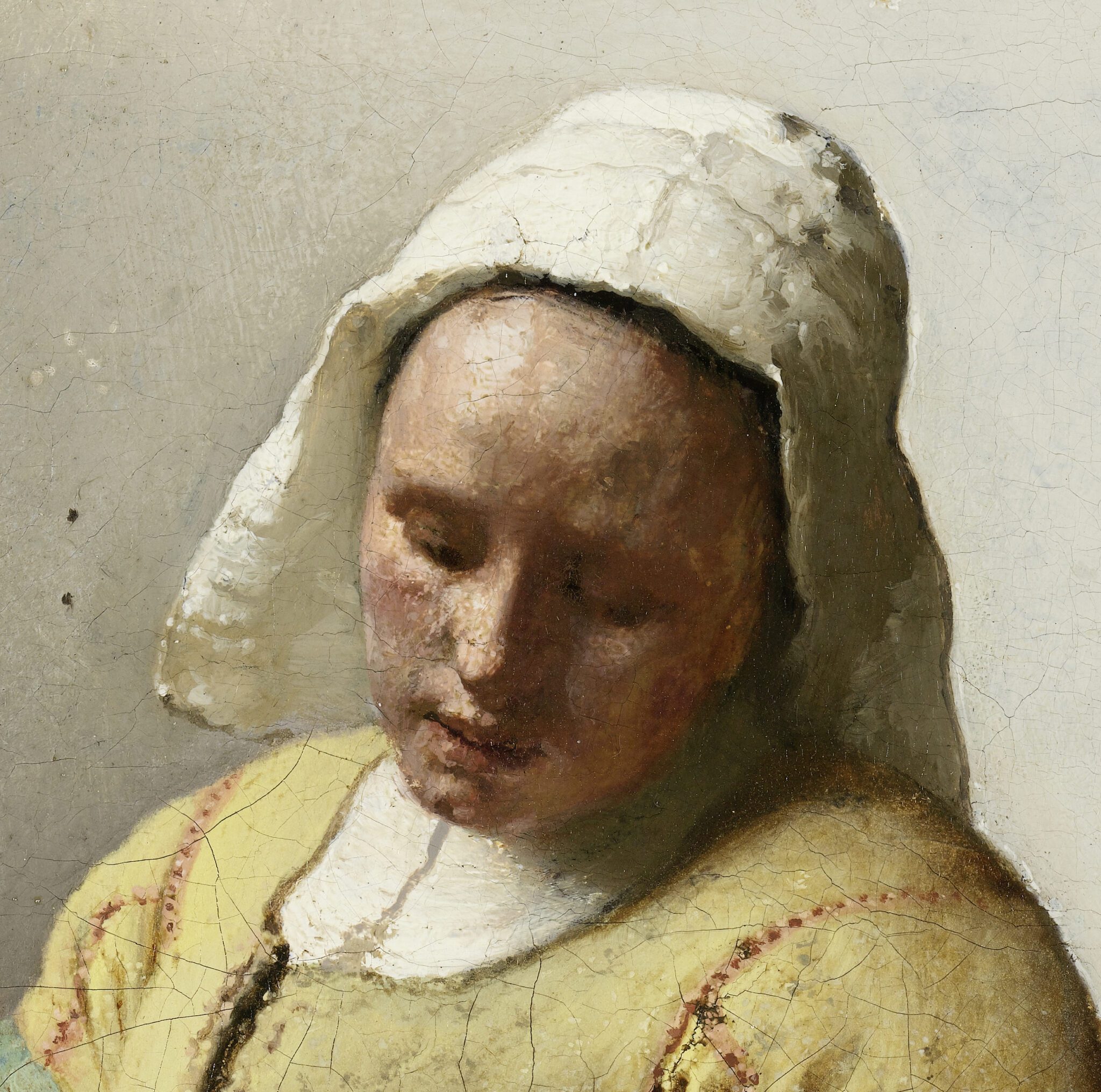
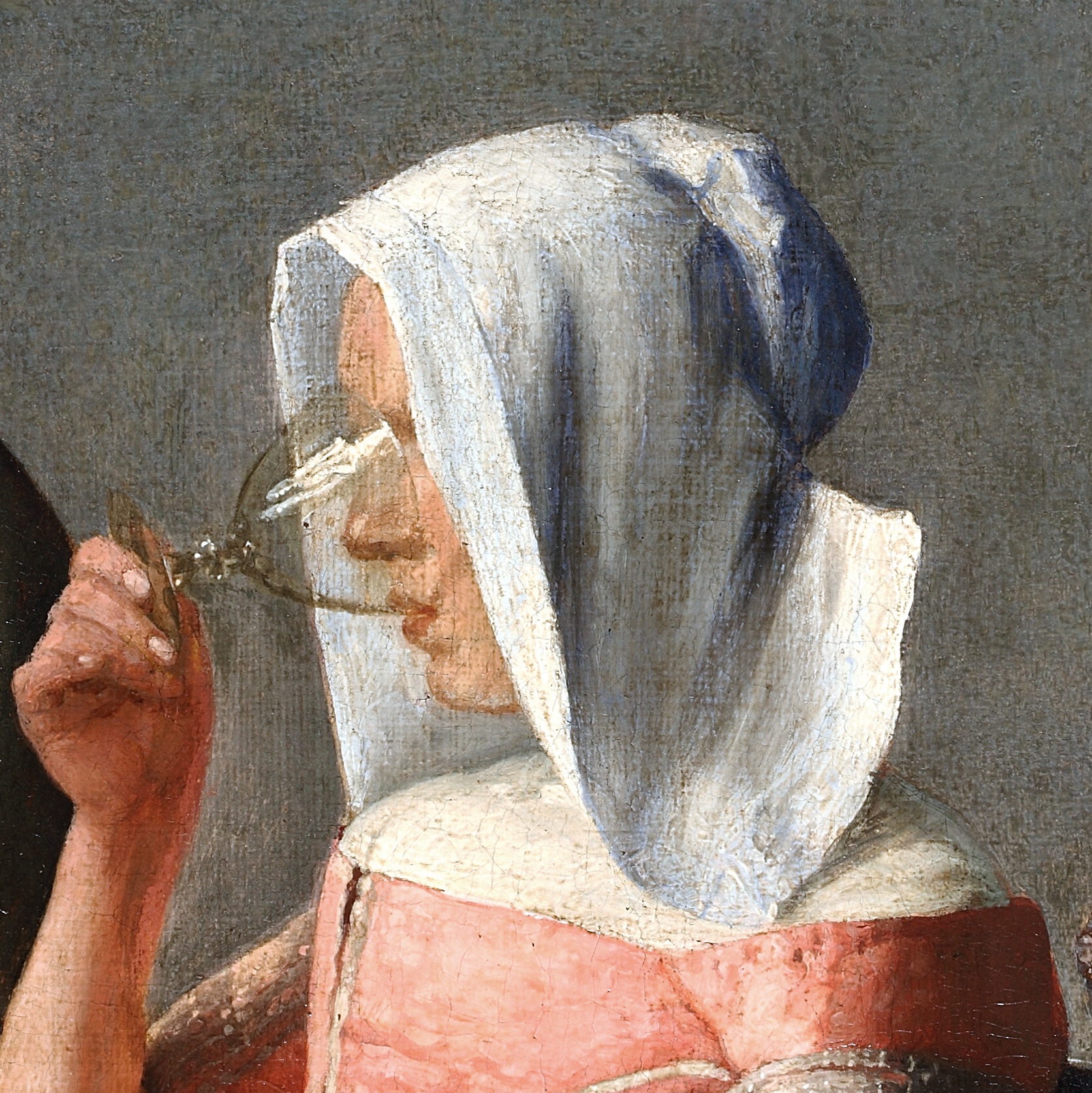
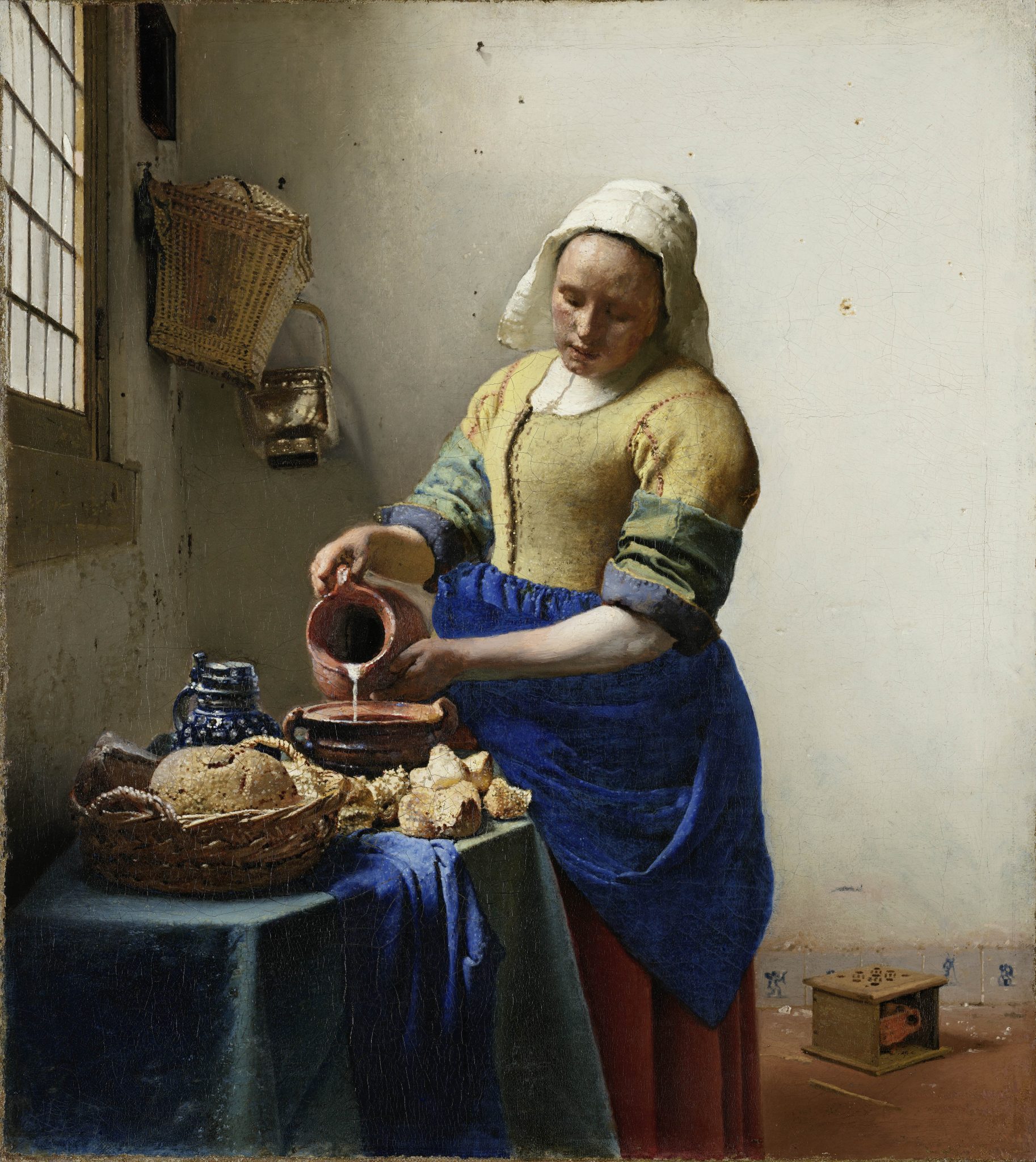
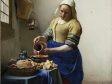
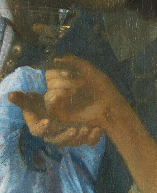
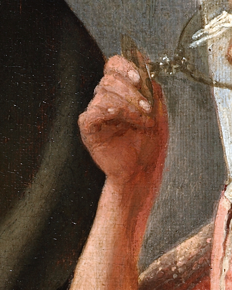
Even more unsettling is the young lady’s hooded face in The Glass of Wine. Although it does not lend itself to a one-to-one comparison with Vermeer’s works in New York or Braunschweig, it is evident that the artist defined her features sparsely and with little finesse, causing her face to look flat and her chin and lips slightly bulbous. It is hard to fathom that an artist who had recently sculpted a woman’s face (and cap) with such lively, textured brushwork in The Milkmaid (figs. 6, 7)—achieving a nearly unmatched sense of plasticity—would settle for this lackluster approach (fig. 8). A similar discrepancy in modeling is evident in the woman’s right hand and fingers, when viewed alongside those of the young lady in the Braunschweig painting (figs. 9, 10). The contrasting brushwork in The Glass of Wine looks patchy and pasty rather than delicate and cleanly defined.16
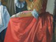
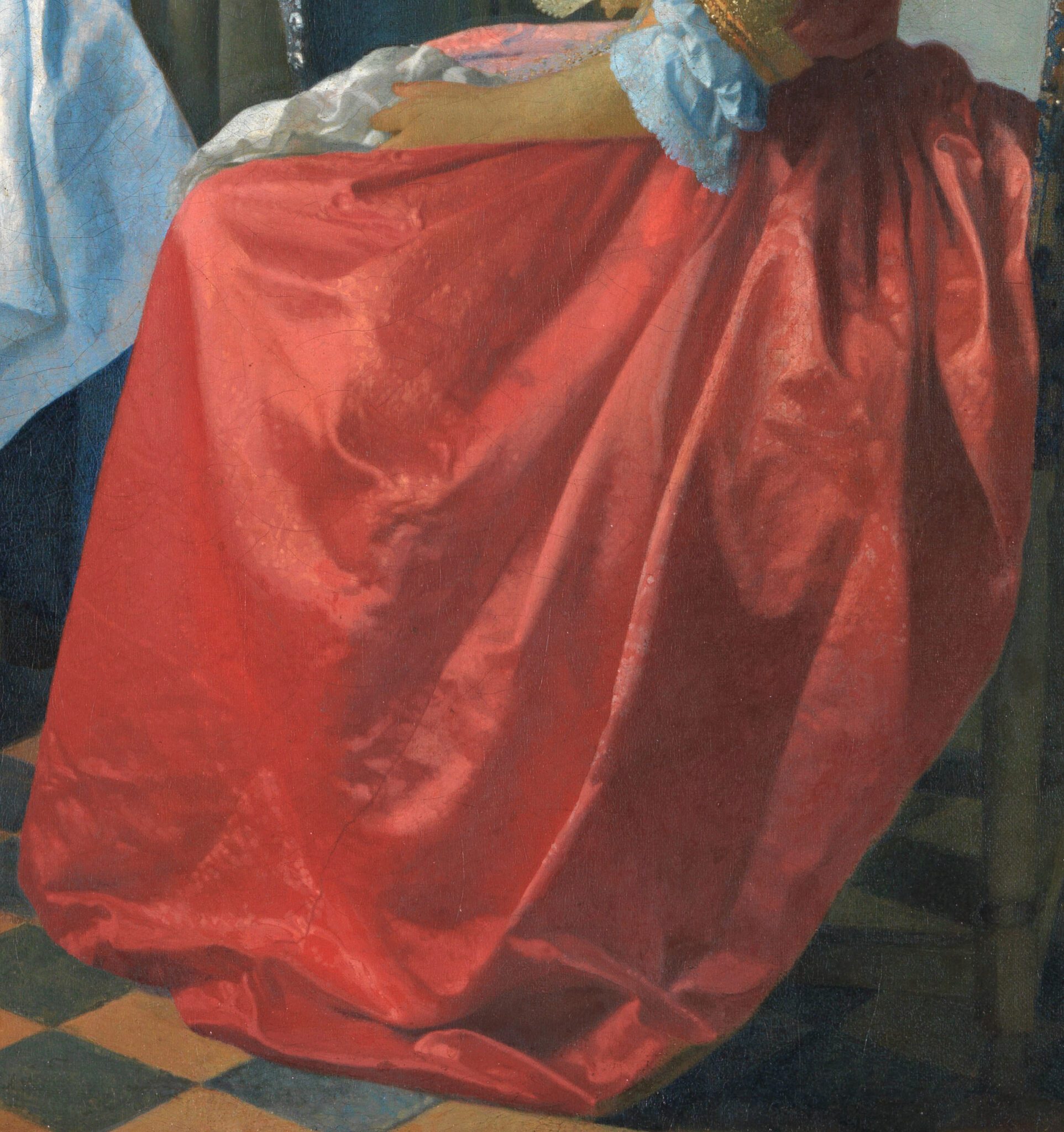
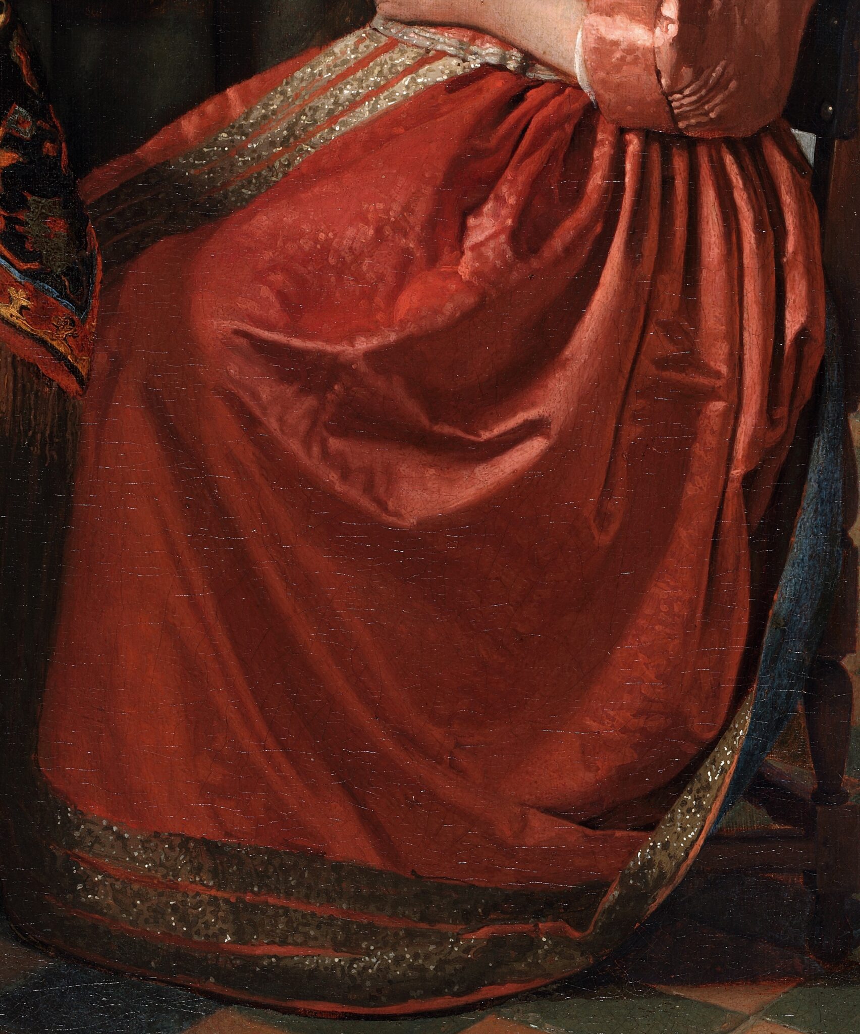
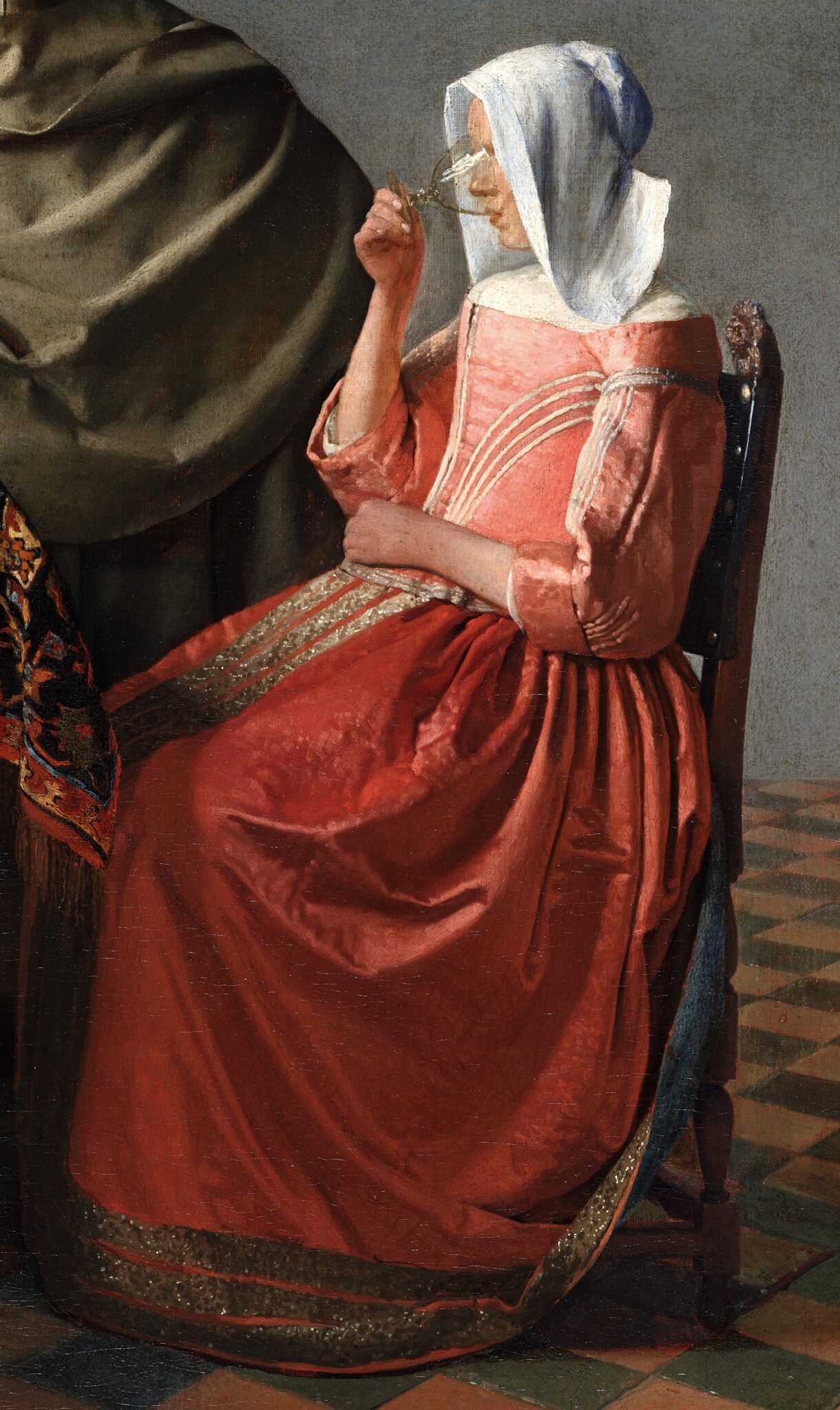
The reddish-pink skirt appears to be the most skillfully modeled passage of the female figure in The Glass of Wine (fig. 12), yet it differs from its counterpart in A Woman with a Wineglass (fig. 11). Note how the robust alternation between dark shadows and highlights on protruding folds in the former diverges from the gentle transitions between the various hues of reddish pink in the latter. In the Braunschweig painting, moreover, Vermeer sprinkled soft, unobtrusive dapples to create the illusion of diffused light raking along the crinkled textile. In the Berlin picture, the artist attempted to replicate the pictorial effect by applying coarse flicks and employing a greater contrast in color between the stippled highlights and the underlying material. Hence, the dots seem to lie on top of the fabric.
The same unsubtle modeling is apparent in the gentleman’s cape. The artist created its folds by sharply contrasting gloomy shadows—built up with strokes in dark green and black—with strips of light green, mimicking sunlight reflecting on protruding folds, and positioning midtones in-between. To the right, some of the outer ends of the strongest highlights appear squeezed in between the deepest shadows. Evocative as the undulation is, it jars with the more delicate, schematic handling of the green cape in A Woman with a Wineglass (figs. 13, 14).17
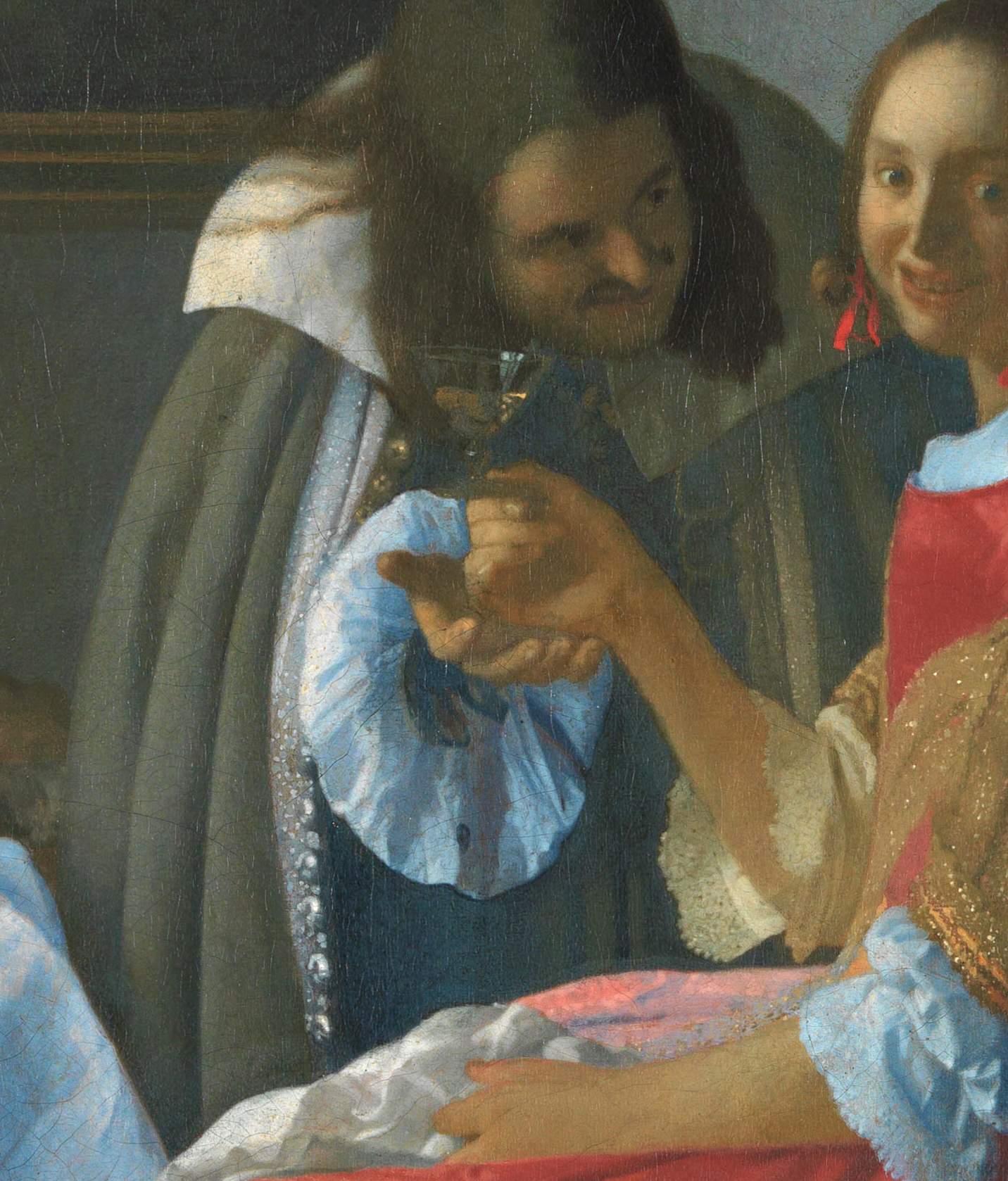
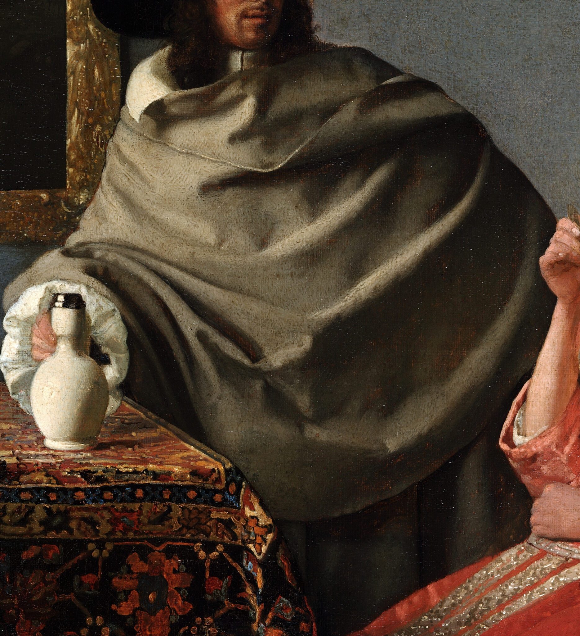
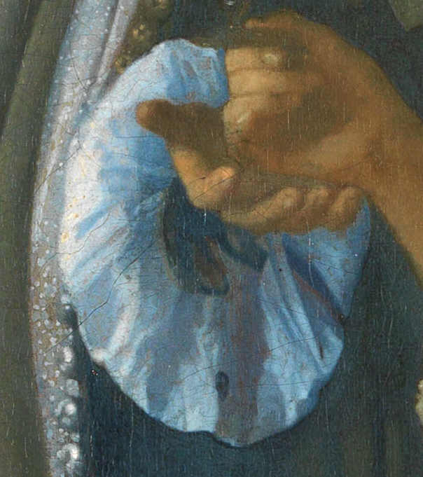
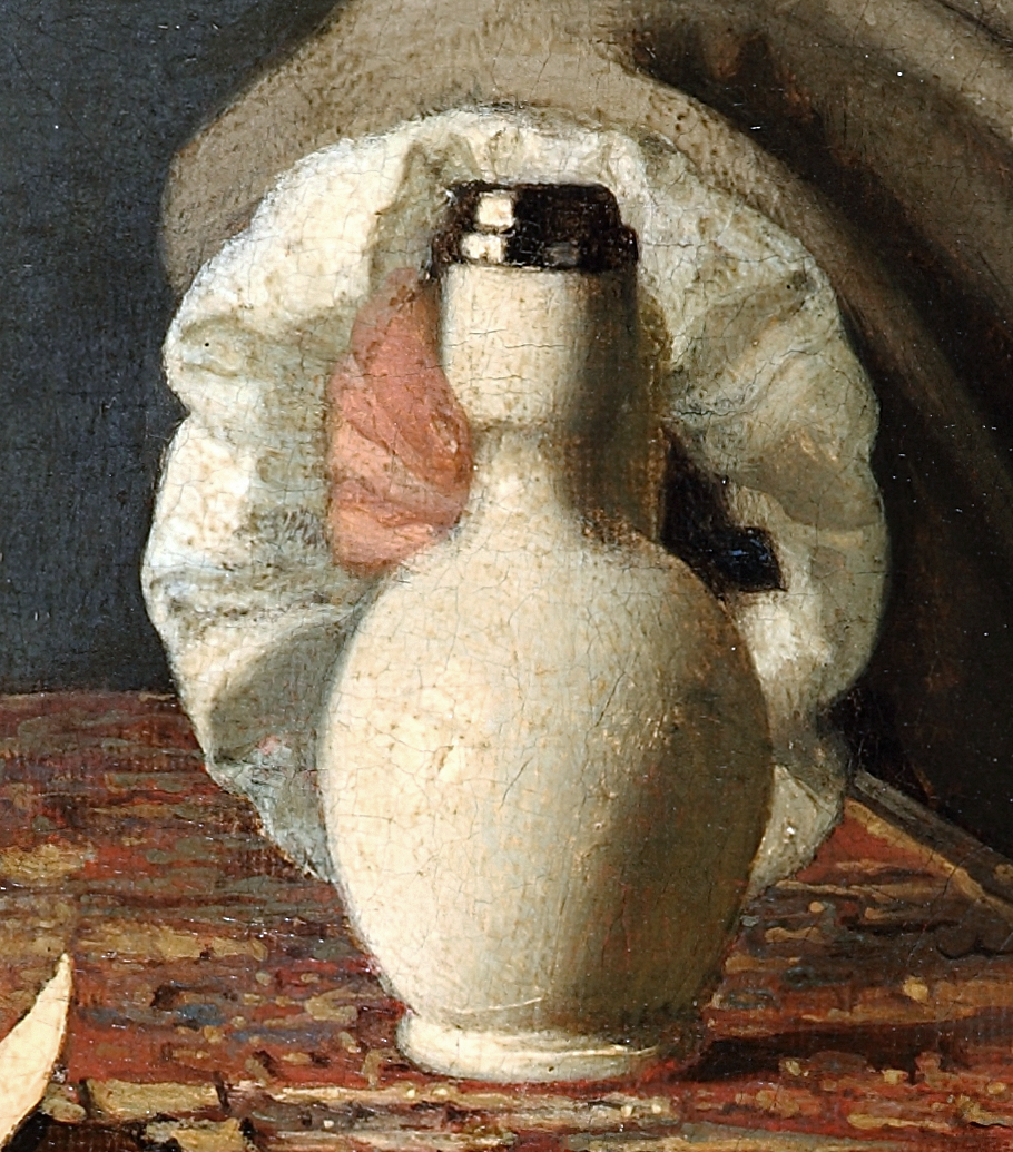
Furthermore, Vermeer created the rosette-shaped white sleeve in the Braunschweig picture with a seemingly infinite number of creases and crinkles by apposing strokes in different hues of blue, gray, and white (fig. 15). The same fashion detail in the Berlin painting, suggested by crudely juxtaposed patches in white and gray, registers as blobby by comparison (fig. 16).18
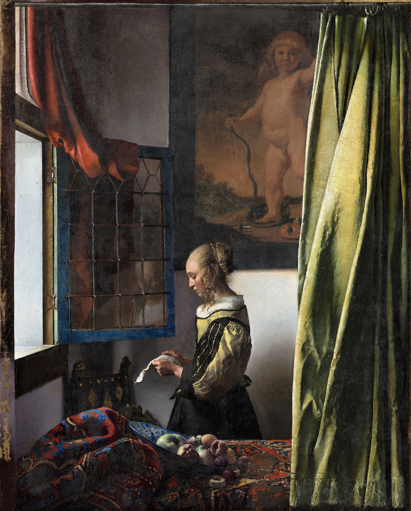
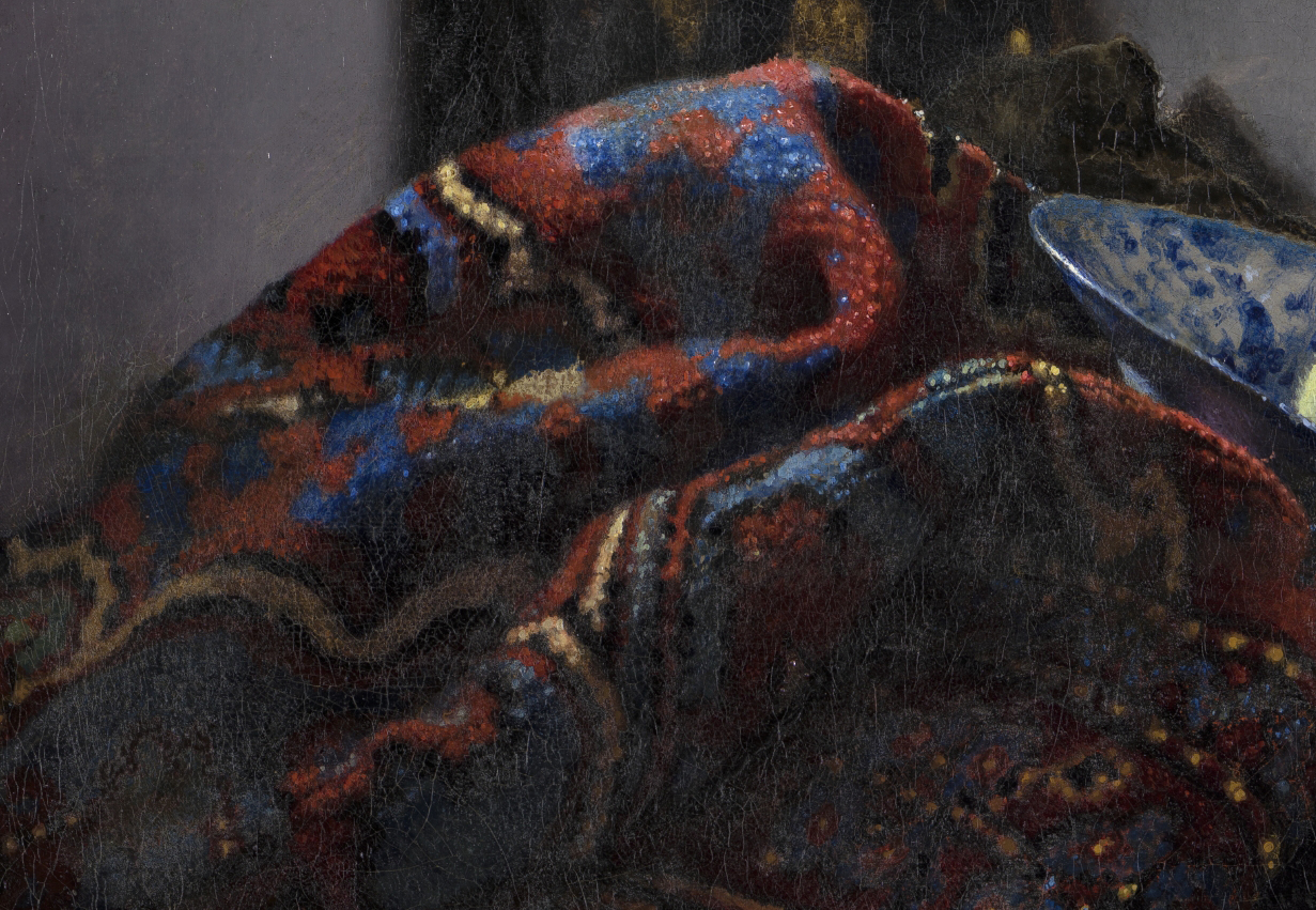
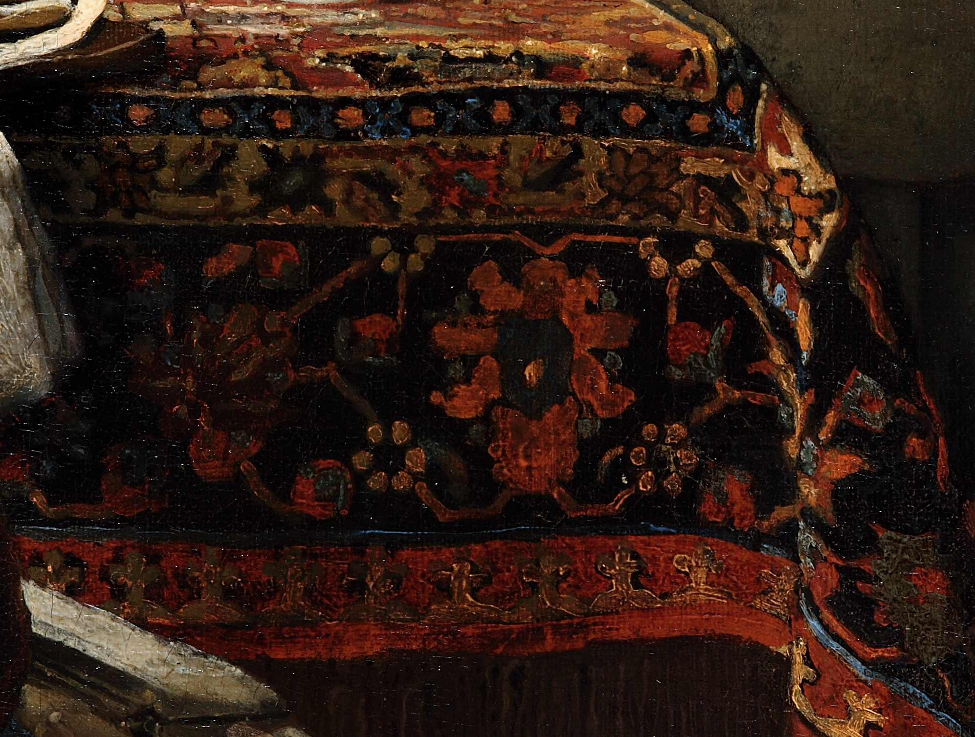
One of the areas in which the differences in painting technique between The Glass of Wine and Vermeer’s work are most apparent is the carpet. By the early 1660s, Vermeer had gained considerable experience in painting oriental table coverings on different scales. He had honed his proficiency in rendering the way the intricate weaving patterns of a rug follow the heavy fabric’s curves as it lies draped across a table. In A Woman Reading a Letter (fig. 17), Vermeer captured the fluffy yet rugged texture of a carpet with an enthralling mesh of dots and dabs in red, blue, yellow, beige, and black (fig. 18). In The Glass of Wine, the table covering rests flat on the table rather than buckled, as is the case in Vermeer’s earliest genre scenes (fig. 19). Despite this simplification, the fabric’s recurrent floral and geometric motifs are remarkably irregular in size, shape, and position. Moreover, the brushwork of the carpet appears gloopy in comparison to that of A Woman Reading a Letter.
Other nearby objects in The Glass of Wine display similarly careless modeling. The open music book on the chair invites comparison with the same item lying on the table in A Woman Interrupted at Her Music, which Vermeer depicted fastidiously, with an initial capital and notes arranged on eight staves (figs. 20, 21).19
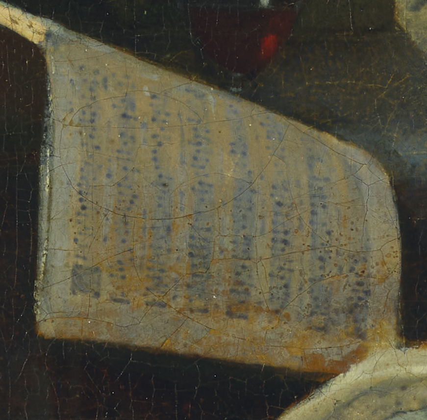
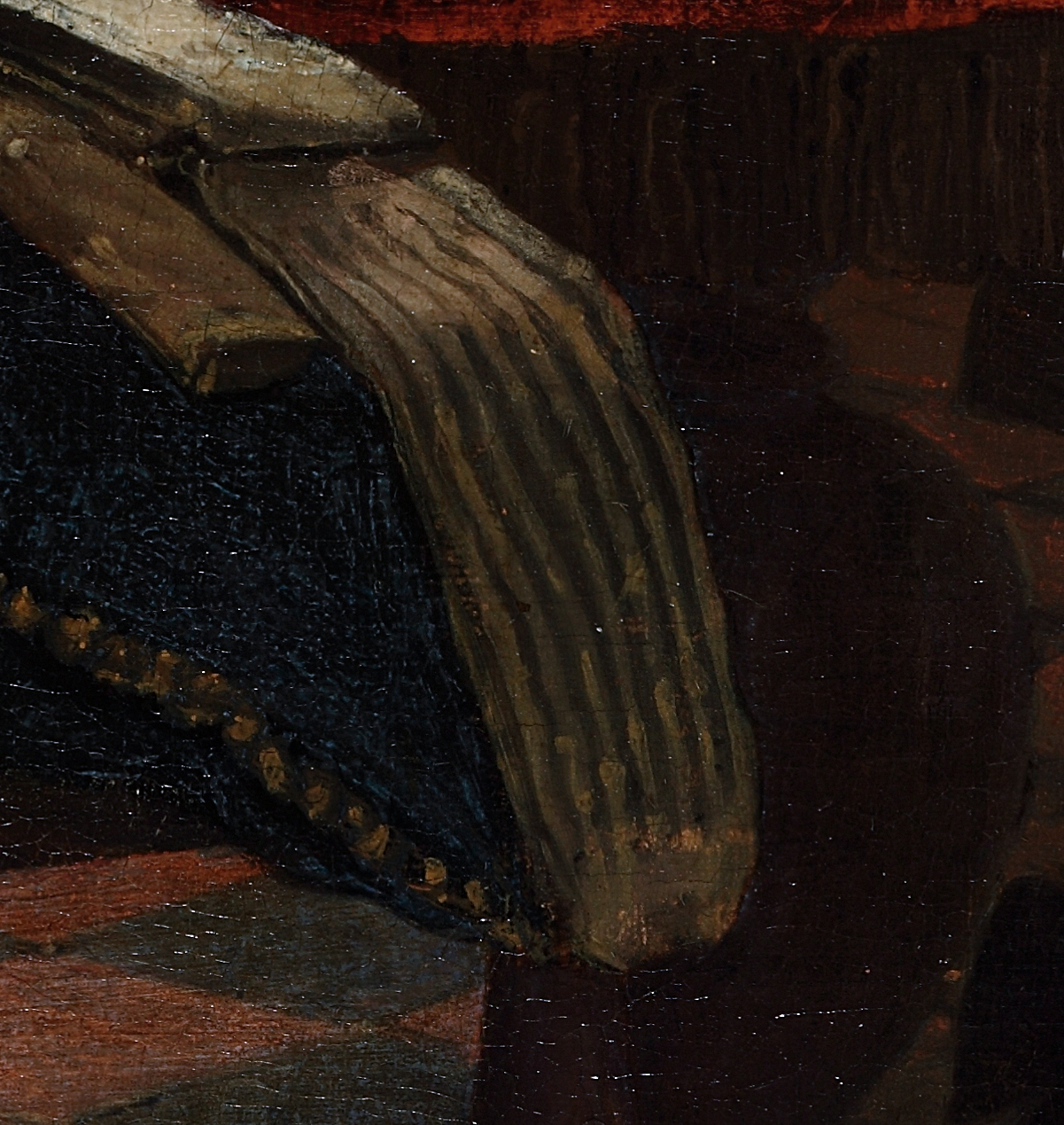
By contrast, in The Glass of Wine—which is larger than the Frick painting—the artist reduced the notations to stringy black lines.20 Furthermore, in A Woman Interrupted at Her Music, Vermeer’s assured brushwork suggests the smooth contours of the cittern’s lustrous back side (fig. 22). In the Berlin picture, short, jerky strokes at the rear of what appears to be the same musical instrument result in a jagged border between the wood and the music books behind it (fig. 23). Such a technique plausibly points to an artist carefully copying a painted object rather than confidently rendering a line freehand.
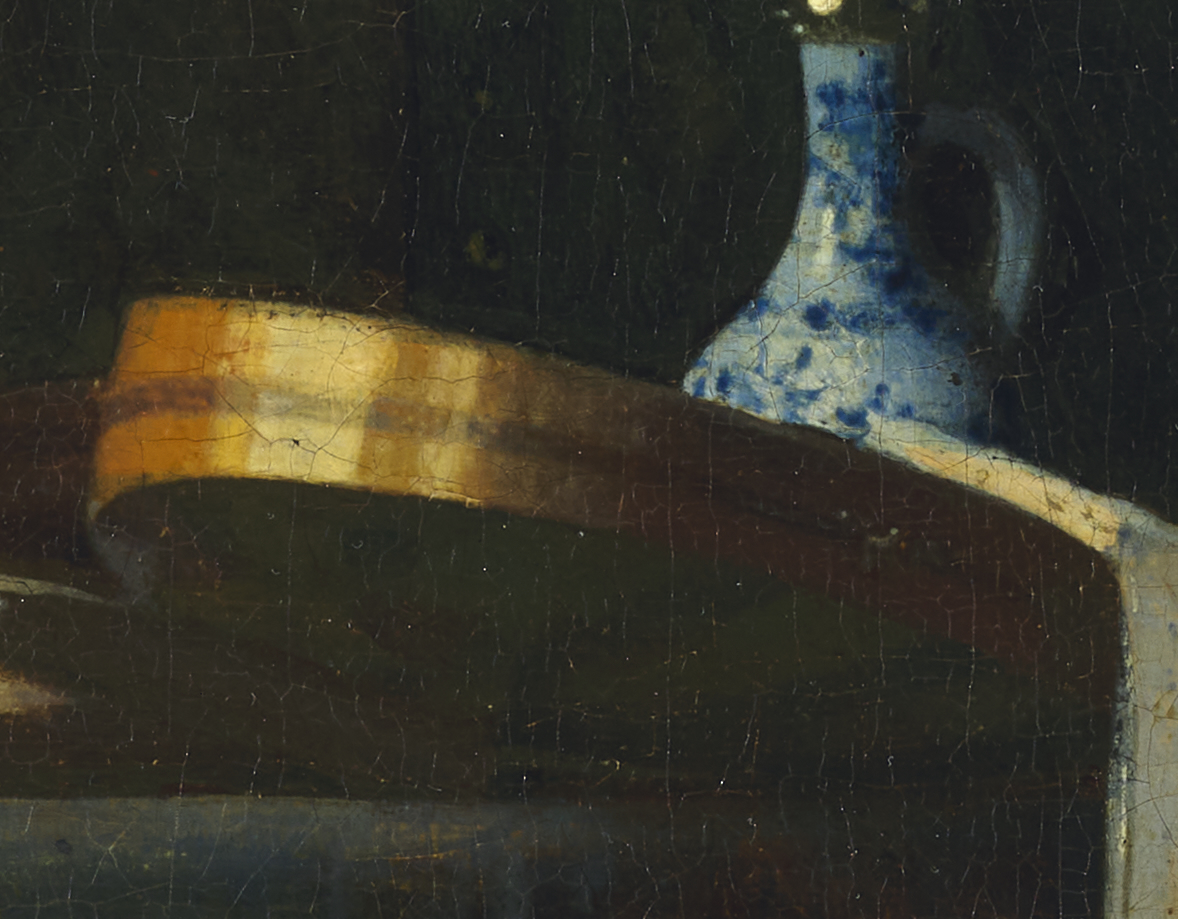
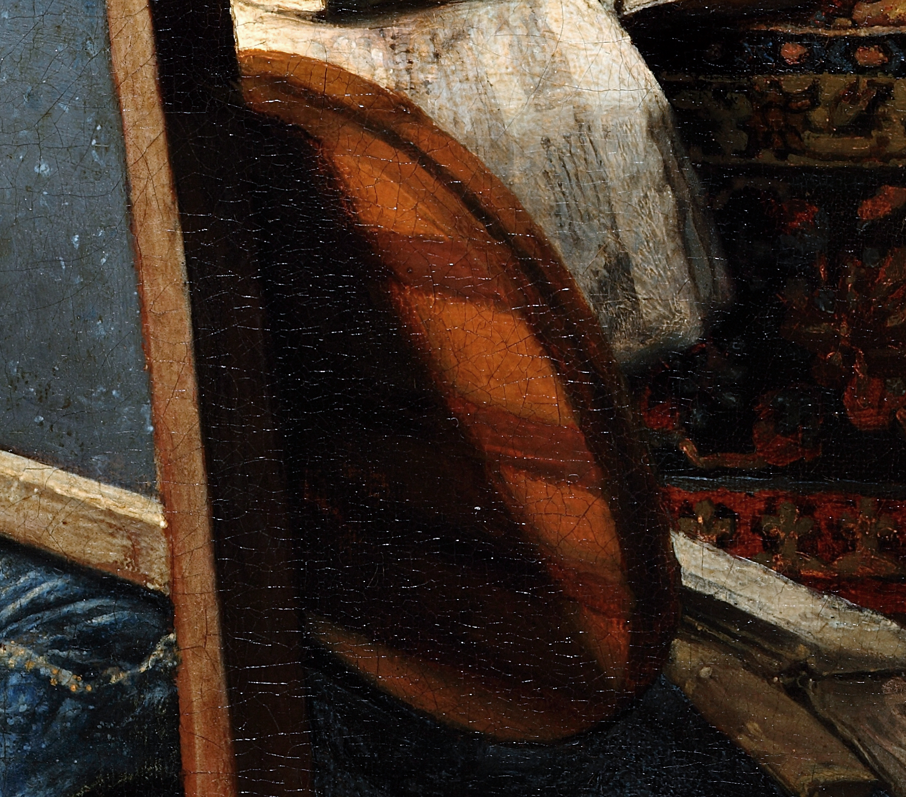
The lion’s-head finials on the chair lend themselves to a one-to-one comparison with those in A Woman Interrupted at Her Music (figs. 24, 25). In that painting, Vermeer created the diffused highlights sparkling across the ornament by drizzling, wet‑into‑wet, dots of yellow, beige, and orange‑brown paint on softly modeled planes of midtone colors. These pointillés, in turn, rest on top of hazy dabs and strokes ranging in tone from light beige to black, which make up the underlying structure. The artist of The Glass of Wine sought to replicate this technique without making much effort to prepare the wood carvings underneath. Moreover, they did not drop their highlights onto underlying midtones but rendered them in isolation. This reduces the “out‑of‑focus” effect and makes the surface of the finials look muddled.
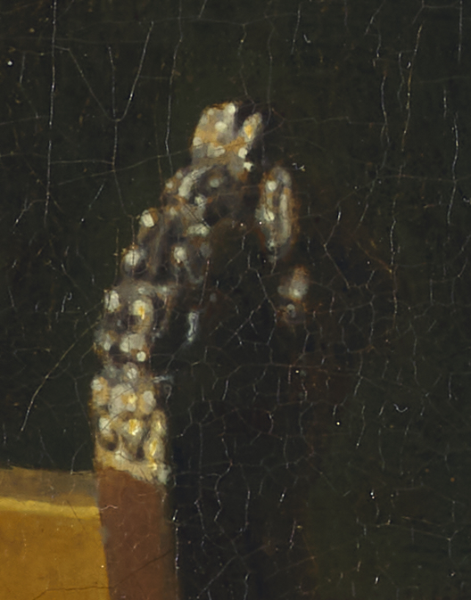
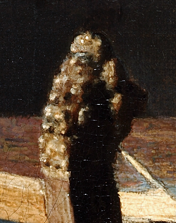
The open window in The Glass of Wine reveals similar discrepancies between the hesitant handling and pasty application in the Berlin painting and Vermeer’s deft, blended technique in A Woman with a Wineglass (figs. 26, 27). Take, for instance, the inside of the wooden frames. In the Braunschweig picture, Vermeer created the illusion of sunlight illuminating the grained wood, except in the small, tapered shadows cast by the lead came. In The Glass of Wine, the artist spread irregular splotches of paint on the inside of the frame to mimic the same light reflections, without endeavoring or being able to imply the underlying material. In the Braunschweig painting, moreover, Vermeer’s steady hand brushed the lead came as smooth, solid lines and the glass as relatively even, transparent-looking surfaces, neatly placed alongside each other. In the Berlin painting, however, blotchy strokes forge restless forms in the glass. Compare, for instance, the stop-and-start technique in the yellow band framing the colored area with the impeccable handling of the same feature, rendered in orange, in the window of A Woman with a Wineglass. Equally troubling, strokes suggesting the glass frequently overlap those indicating the lead came in The Glass of Wine.21
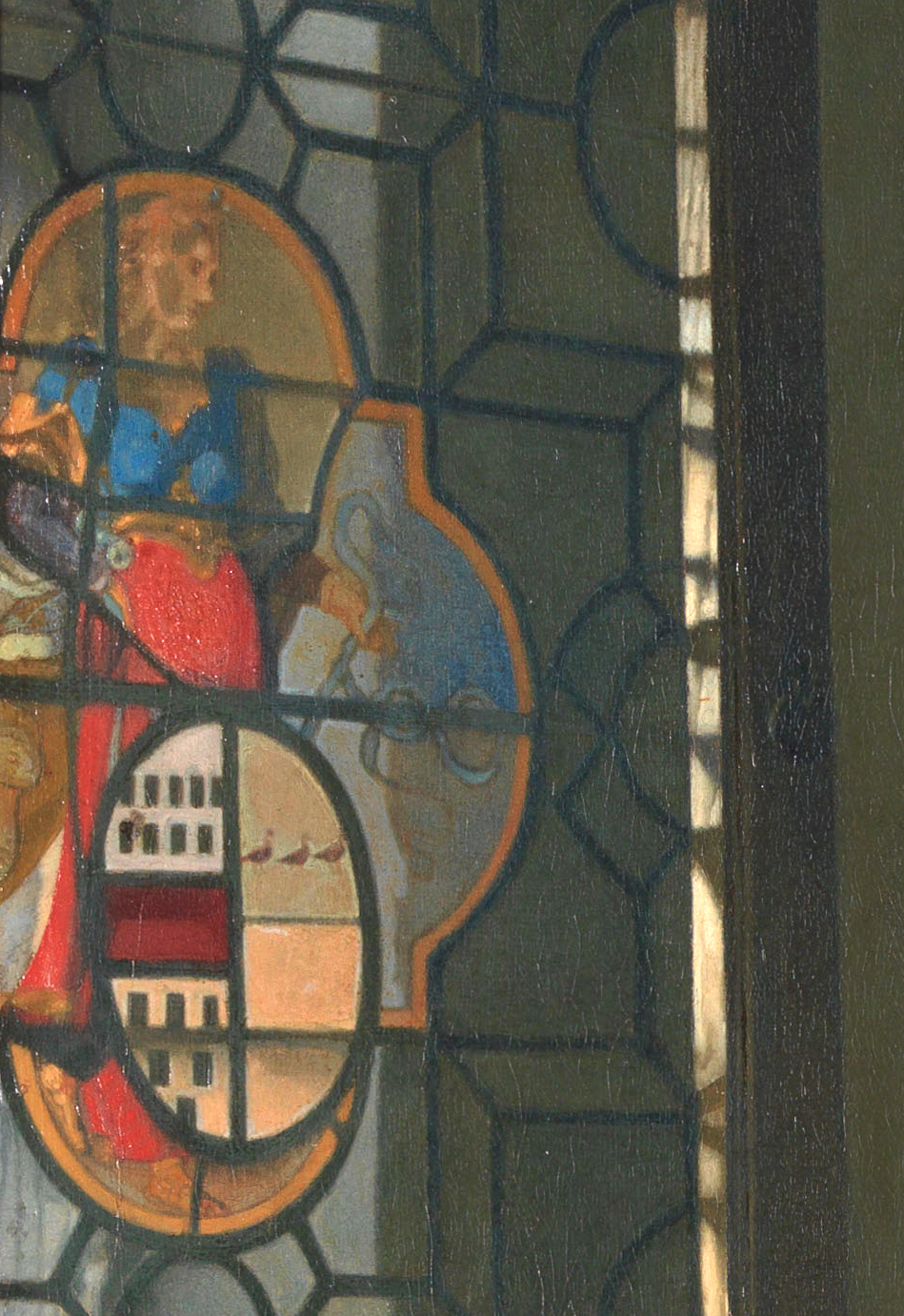
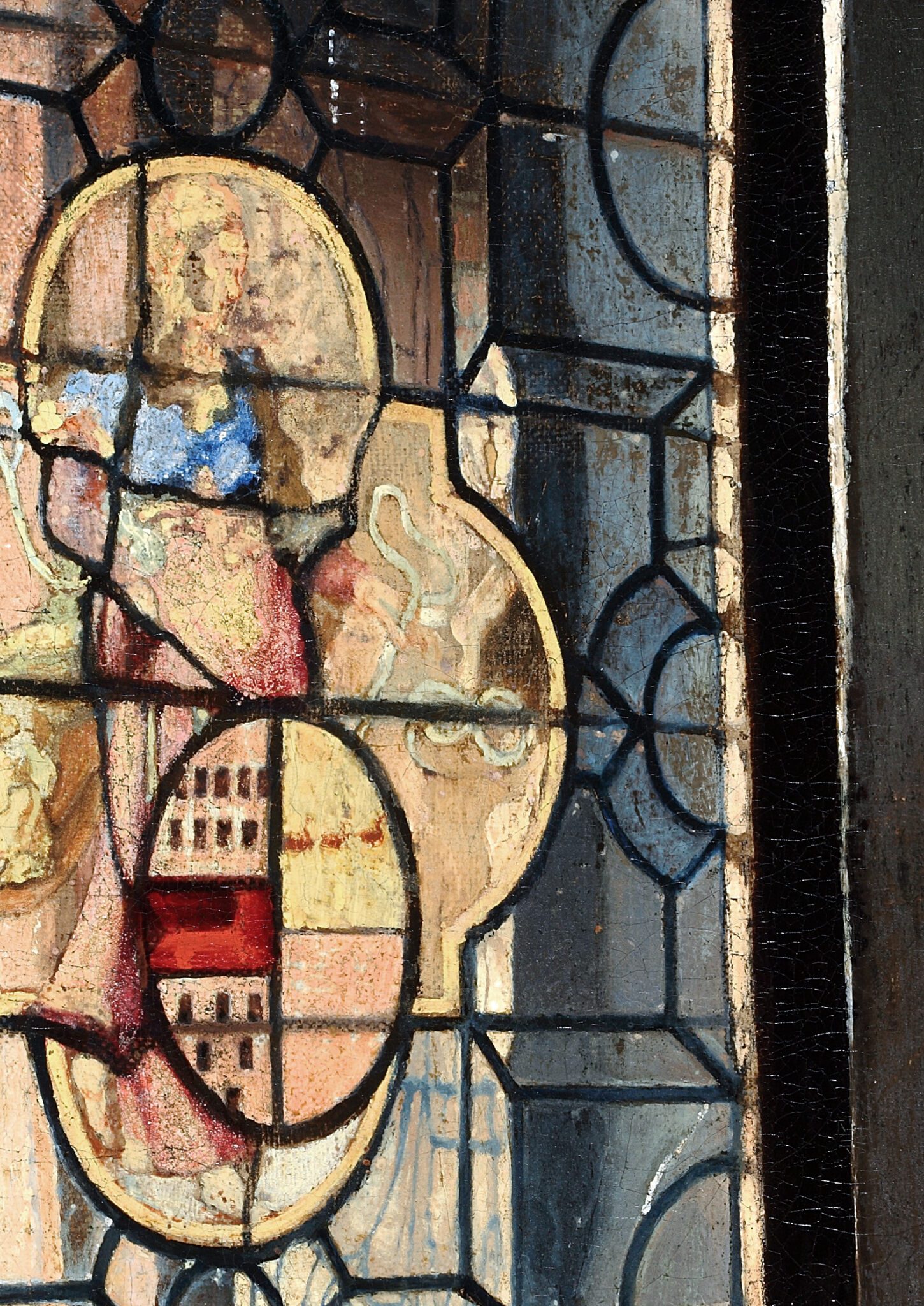
The Glass of Wine features several visually pleasing light reflections and contrasts between illumination and shadow that, upon close scrutiny, appear slightly excessive. The pool of daylight below the window, for instance, is inexplicably bright and focused. The spotlit triangle rapidly morphs into a dark gray shadow on the left, hovering in the corner like a tenebrous cloud.22 This juxtaposition of contrasting light levels is at odds with the subtle transitions from dark to light beneath windows in Vermeer’s earlier Officer and a Smiling Woman (ca. 1657–1658; The Frick Collection, New York) and A Woman Reading a Letter (figs. 28, 29).23
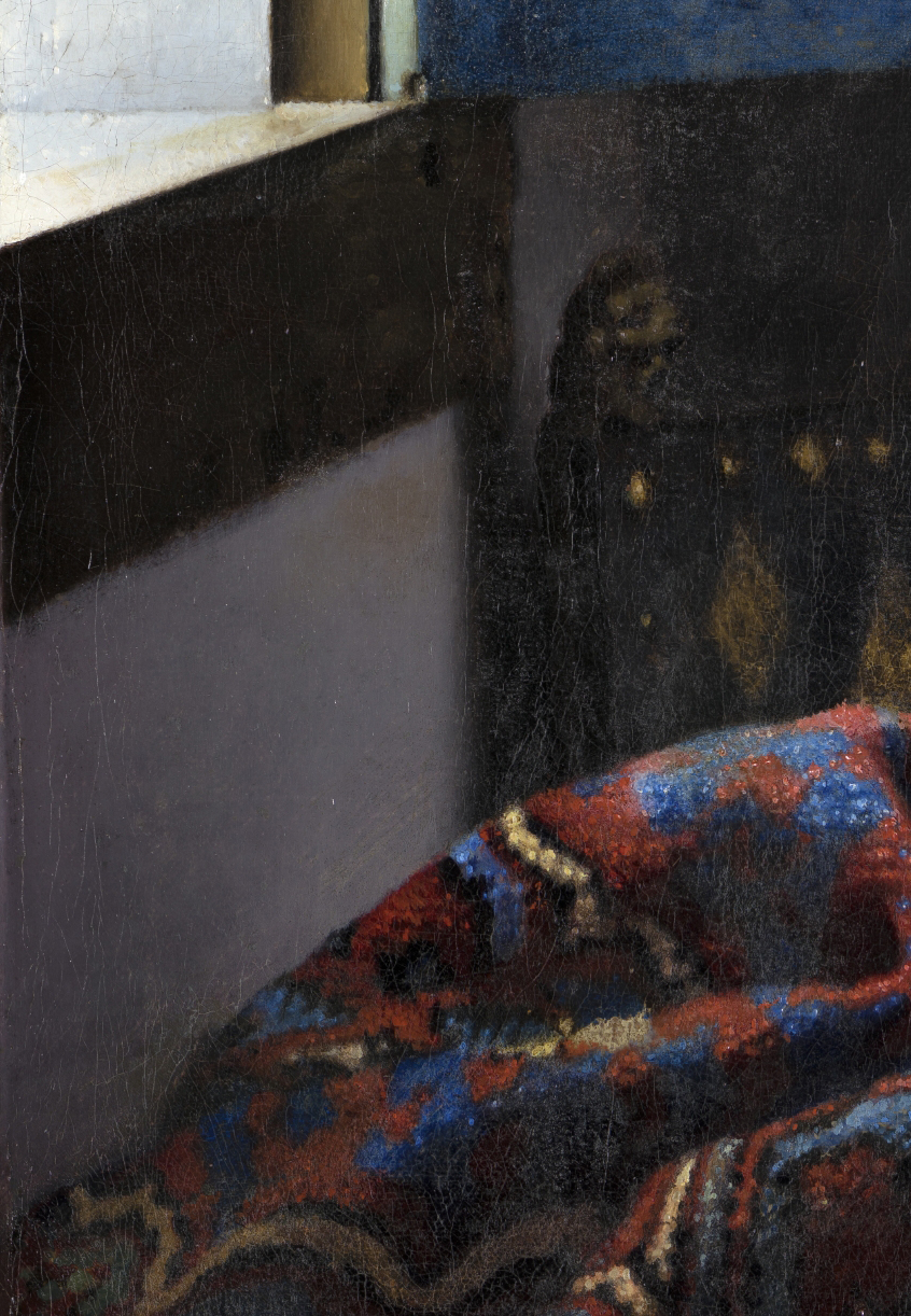
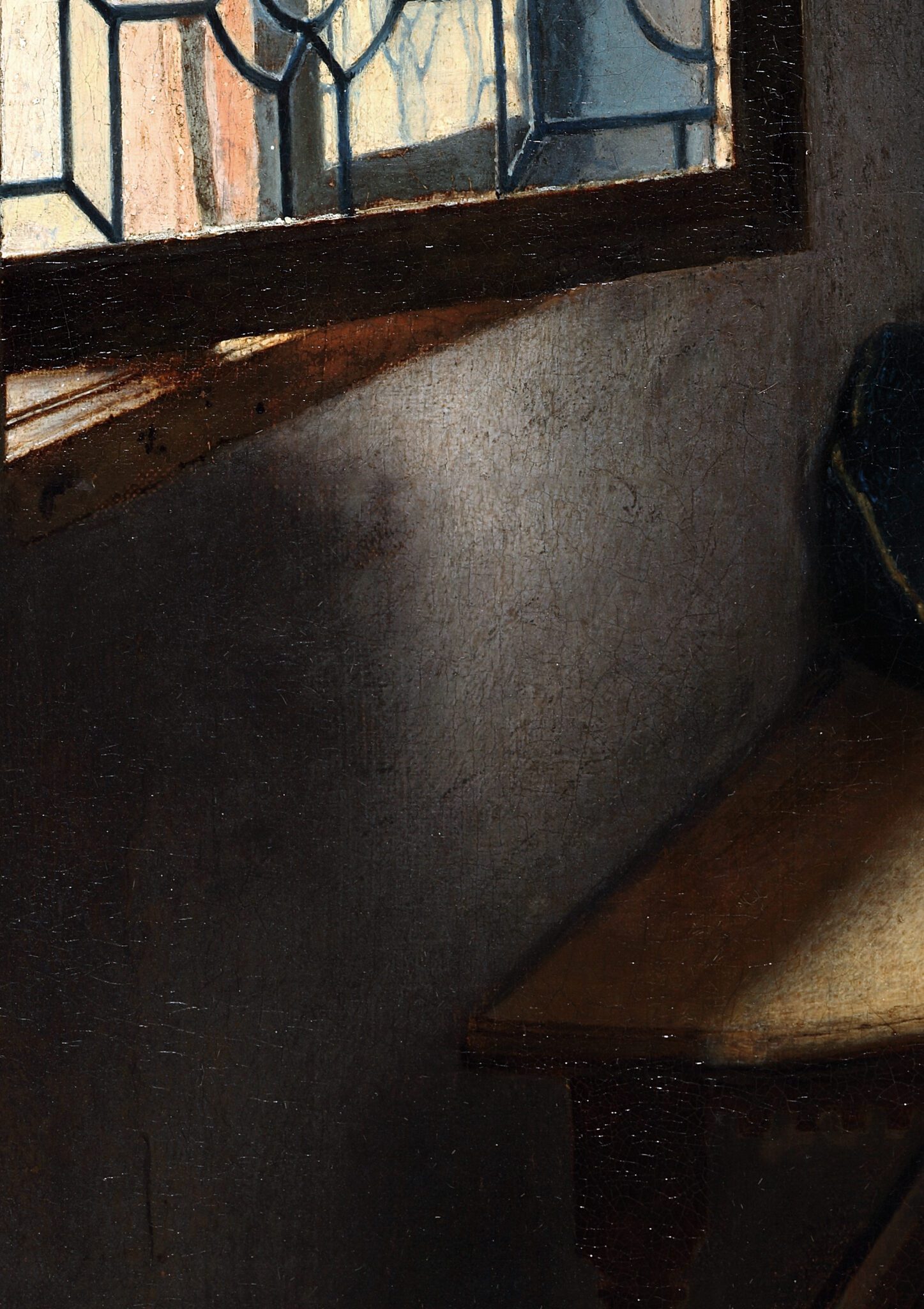
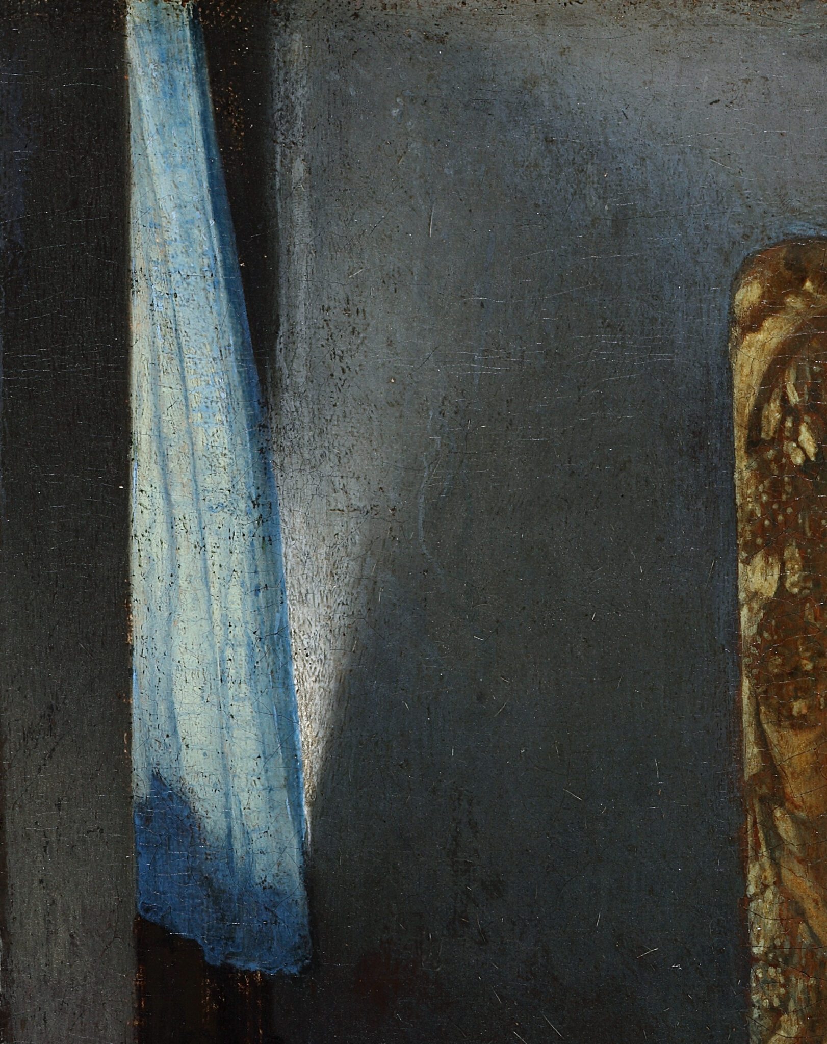
An equally peculiar passage is the white triangle on the back wall, suggesting how sunlight seeps past the light blue curtain, which seems unduly sharp-edged on the right side, considering the transparency of the fabric (fig. 30). 24 Moreover, the direction of the reflections and shadows conveys the odd impression that an external light source positioned beneath the window illuminates the plaster. 25
Some surfaces situated in areas of shade, however, are surprisingly dark. This is most evident in objects that are (nearly) identical to those in the New York and Braunschweig paintings, such as the sides of the lion’s-head finials and those of the back posts of the chairs (figs. 31, 32).
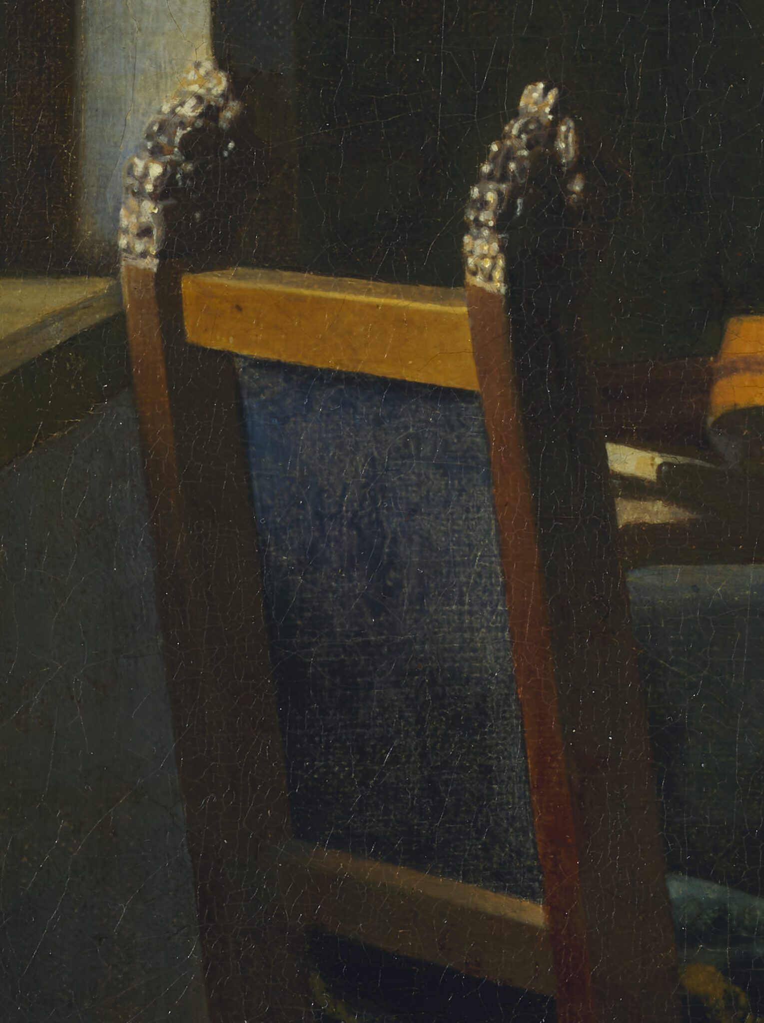
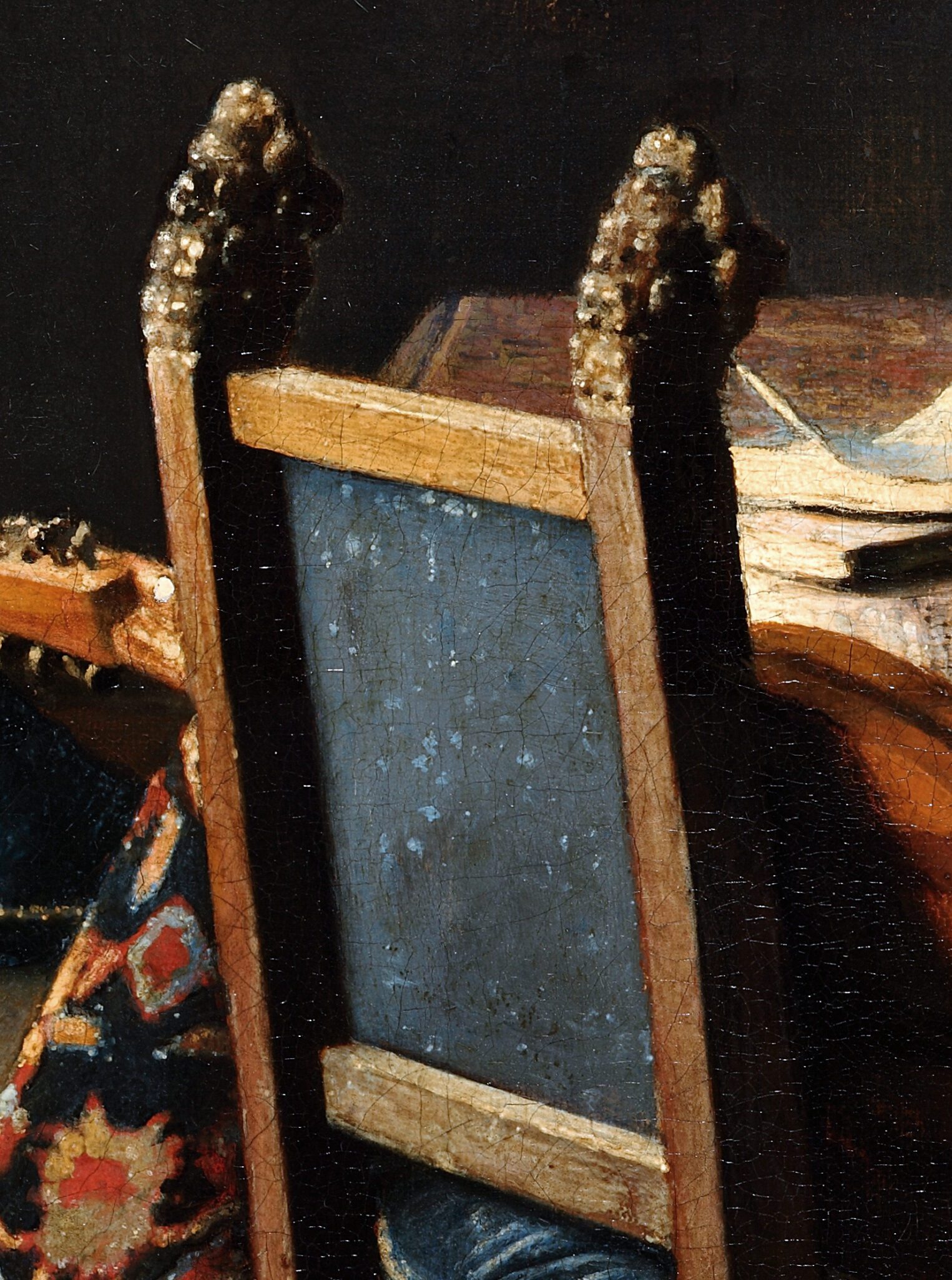
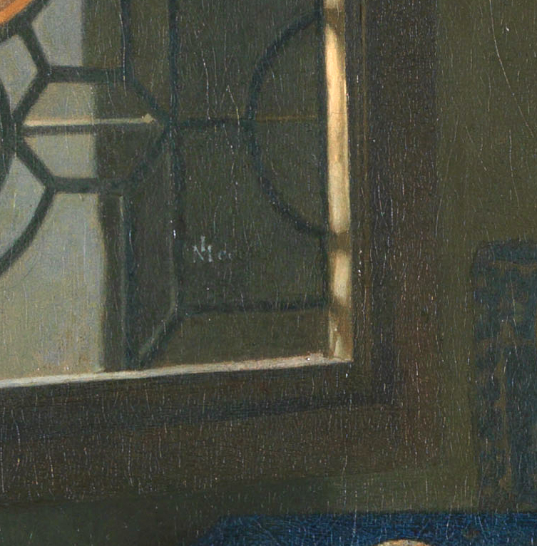
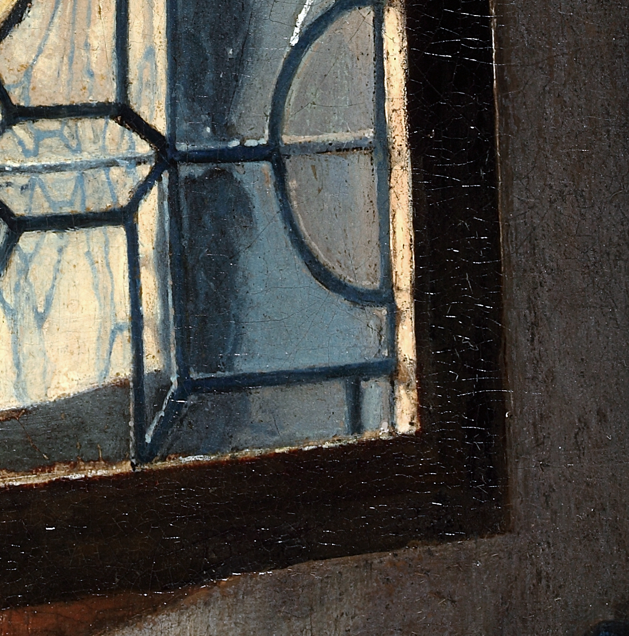
They are dark brown in A Woman Interrupted at Her Music but pitch black in The Glass of Wine. Similarly, the window frame in A Woman with a Wineglass is dark brown and turns lighter in tone toward the bottom right corner (fig. 33). Its counterpart in the Berlin painting varies from deep bistre brown to black (fig. 34).26
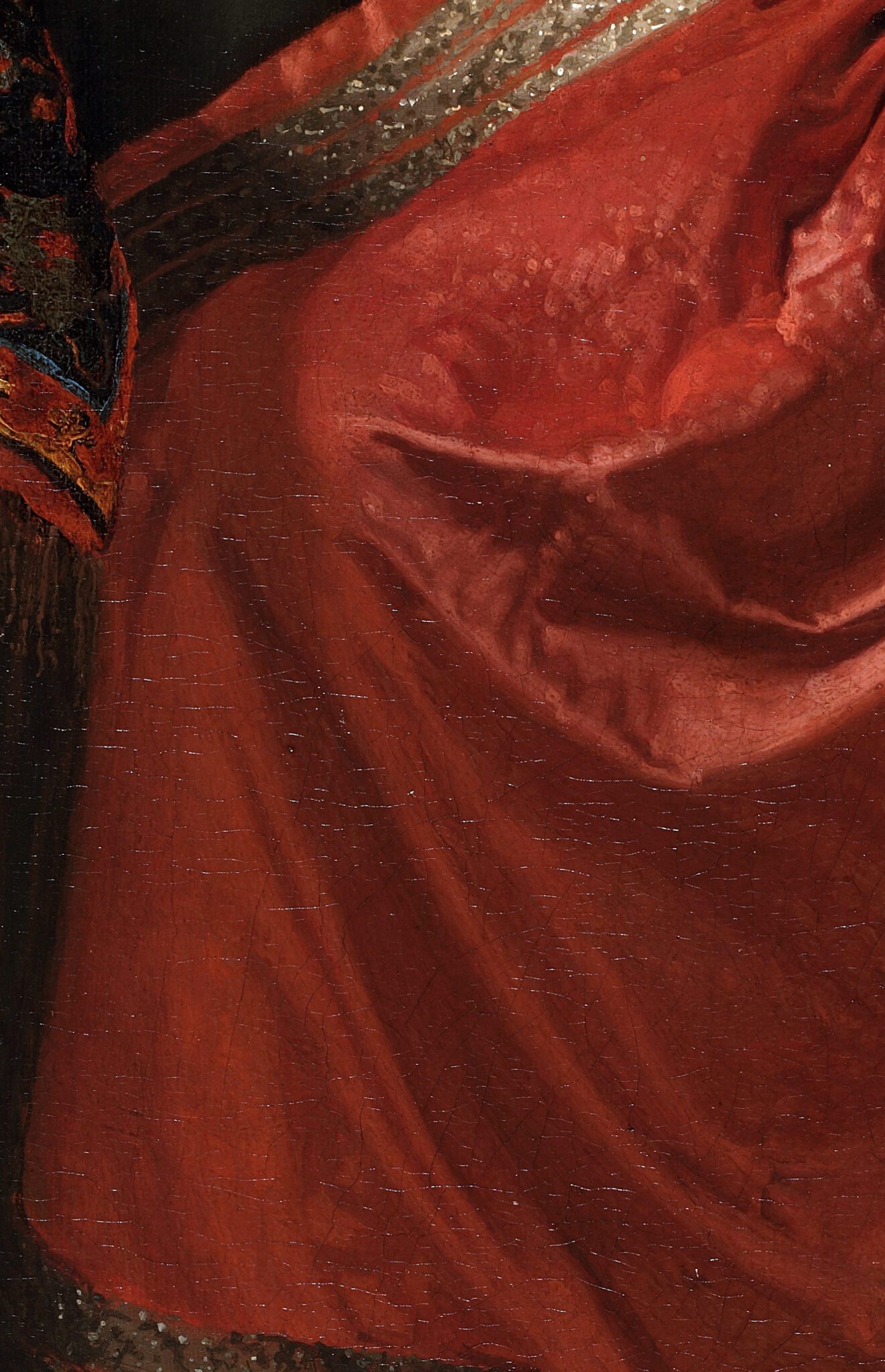
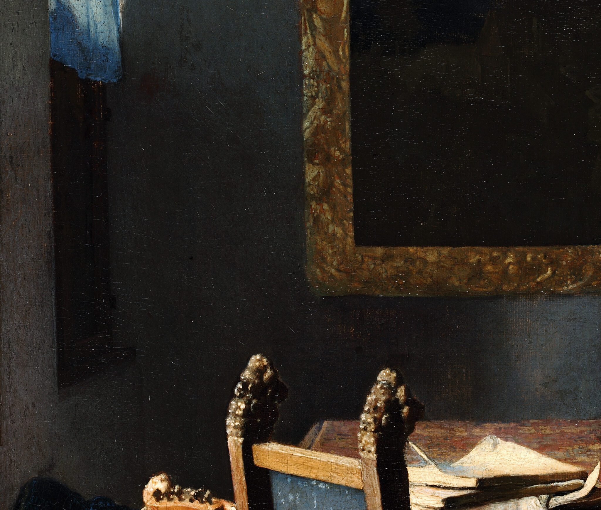
Conversely, some areas of The Glass of Wine are brighter in tone than one would expect, given their position in relation to the open window. Take, for instance, the front of the woman’s skirt, to the right of the metallic braiding (fig. 35). As the table blocks the sunlight, it casts a shadow on her knees. Below that, however, the reddish fabric turns lighter in tone again, despite appearing further from any (in)direct light source. Similarly, one would expect the bottom left corner of the gilded frame to be darker in color, since a large, gloomy shadow envelops it (fig. 36).27 The artist evidently had difficulties capturing the appropriate tonal values in these areas.
In summary, discrepancies in paint handling and style between The Glass of Wine and Vermeer’s works of the late 1650s and early 1660s are visible throughout the painted surface but are most evident in passages suited to one-to-one comparison, such as the carpet, music book, lion’s-head finials, and window. These differences are so numerous and substantial as to render the current attribution of the Berlin picture unconvincing.
The Glass of Wine: A Skillful Pastiche
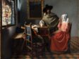
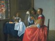
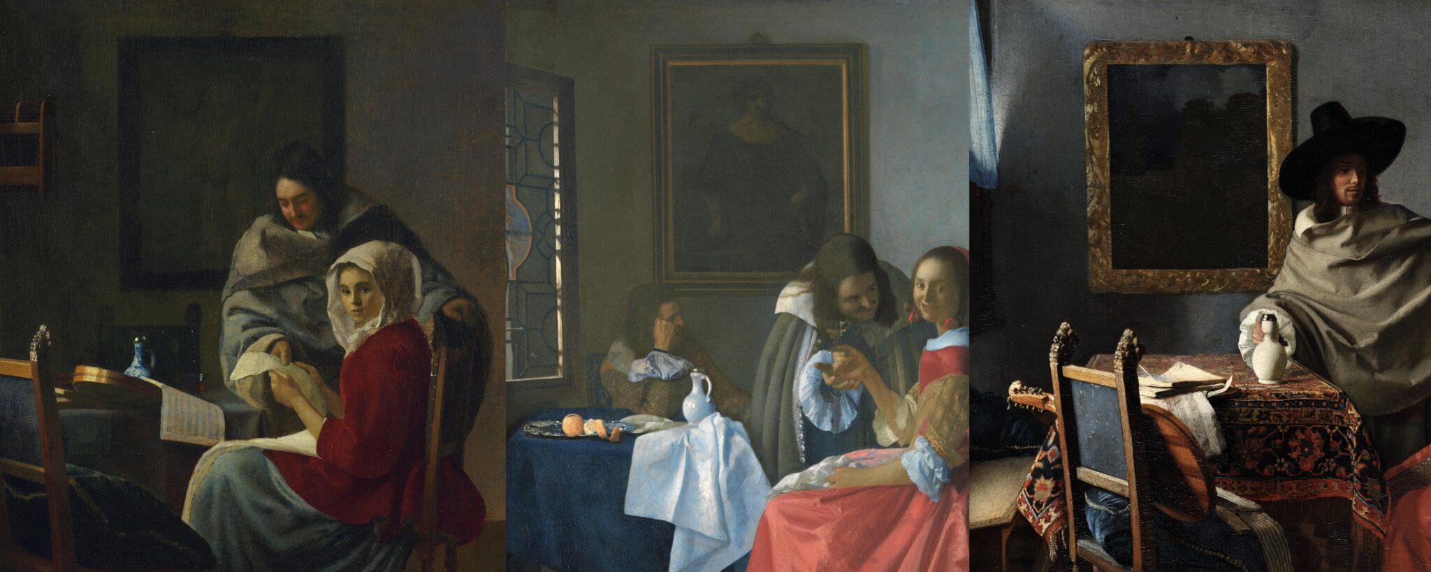
As mentioned above, scholars tend to group The Glass of Wine (fig. 1a) together with A Woman Interrupted at Her Music (fig. 2a) and A Woman with a Wineglass (fig. 3a)—and for good reason. All three paintings depict a caped gentleman standing to the right of a woman who sits more or less parallel to the picture plane. The couples appear right of center, near a table with objects on it, including a white faience jug. The scenes take place in an interior ordered by linear perspective, with a window on the left and a light gray wall in the background, decorated with a single painting.

Moreover, The Glass of Wine features pieces of furniture, items of clothing, and architectural elements that are also present in the New York and Braunschweig pictures in marginally or moderately altered form. Scholars have interpreted these similarities as Vermeer having first explored ideas in the Berlin painting that he later developed in A Woman Interrupted at Her Music and A Woman with a Wineglass.28 I argue instead that the sequence of creation occurred in reverse order and that The Glass of Wine is an independent work by another artist, composed of elements derived from Vermeer’s pictures in New York and Braunschweig.
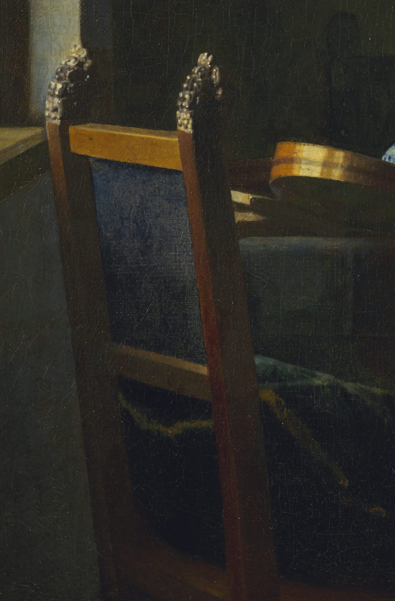
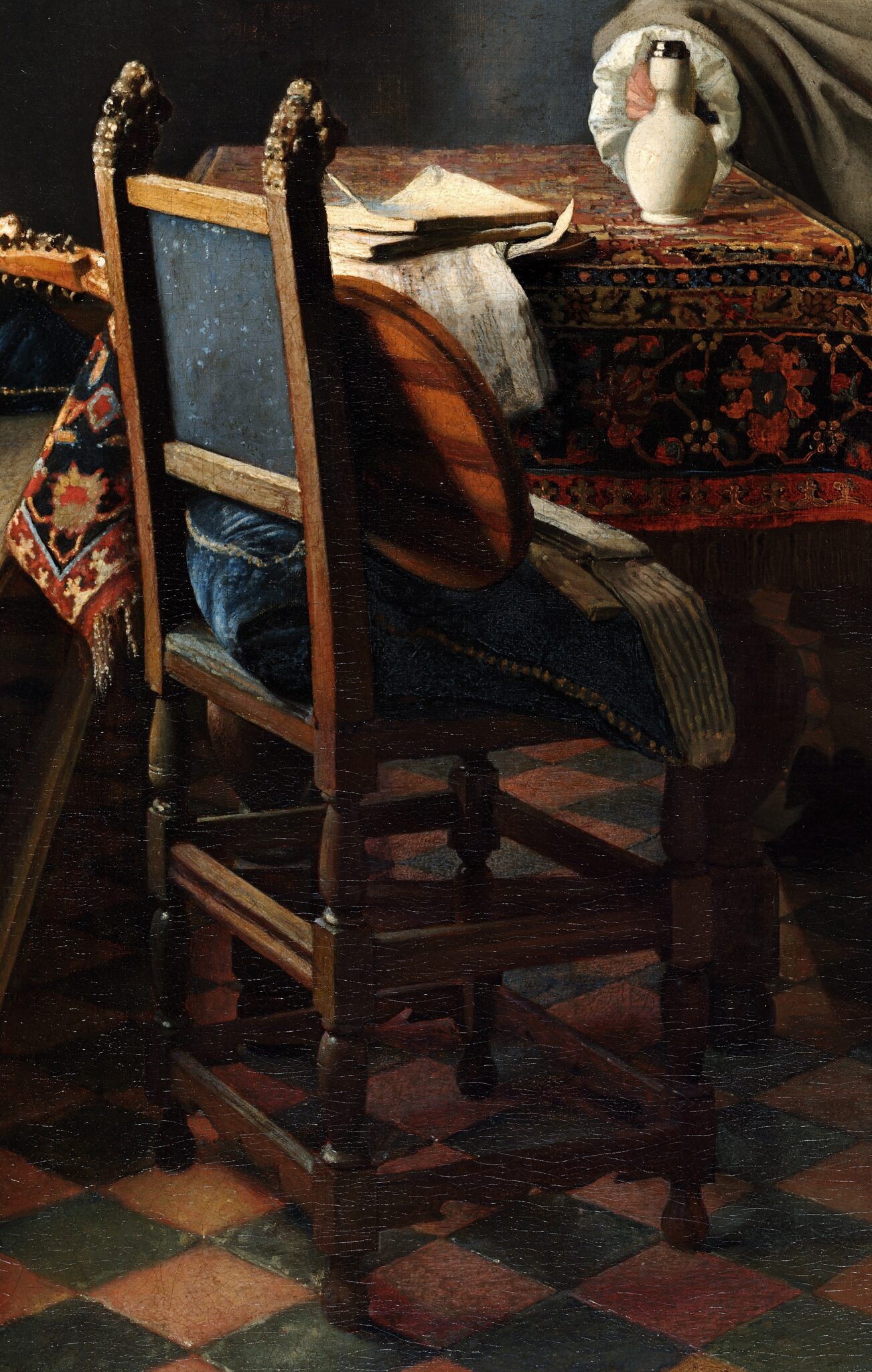
The anonymous painter began with a canvas nearly the same size as A Woman with a Wineglass. However, they turned it on its side, adopting the unusual landscape format—at least for a genre scene in the early 1660s—of A Woman Interrupted at Her Music.29 In response to the latter painting, the artist of the Berlin picture replicated the chair with lion’s-head finials and blue upholstery on the back in the foreground (figs. 37, 38). They even mirrored the puffy velvet pillow with gold trimmings, which squishes out of the opening on the back. However, the artist depicted the piece of furniture full length and added pointillés to the fabric on the back—rendering it even more “Vermeer-like” than the original. They also seized on the increased distance between the seat and the window to add disproportionally glaring reflections to the velvet surface of the pillow. The idea to include the small window in the corner presumably also derived from A Woman Interrupted at Her Music (figs. 39, 40). Recent technical imaging of the New York painting has demonstrated that it originally featured a window, covered by a translucent curtain, in the same location.30
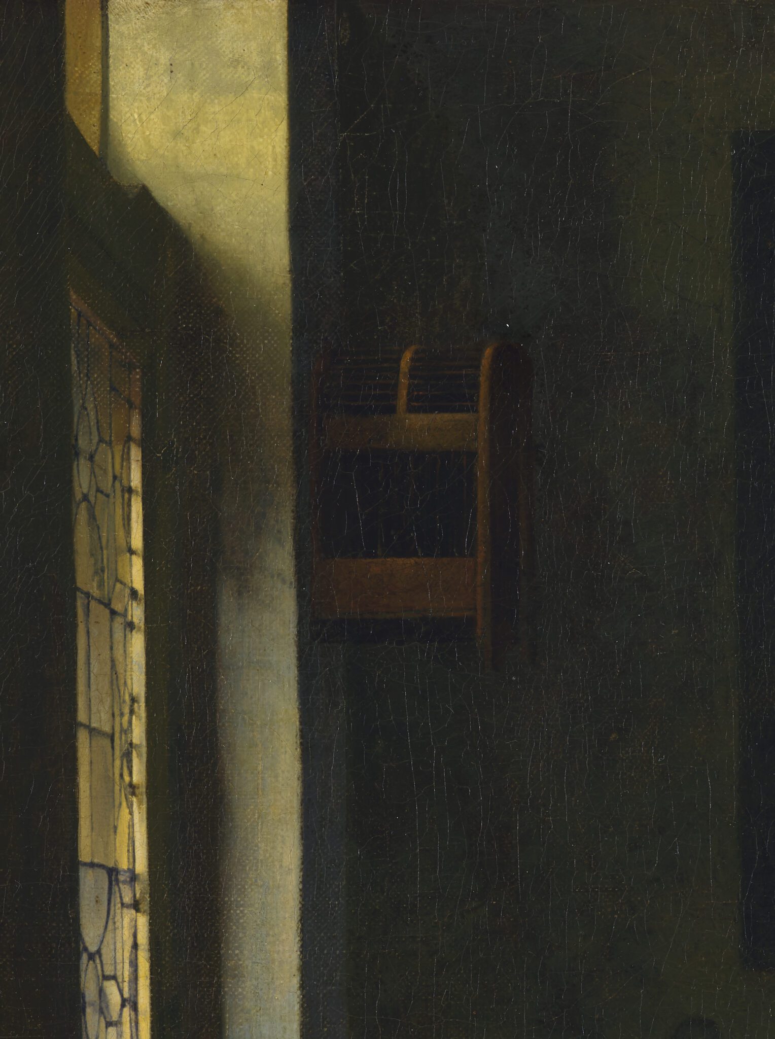
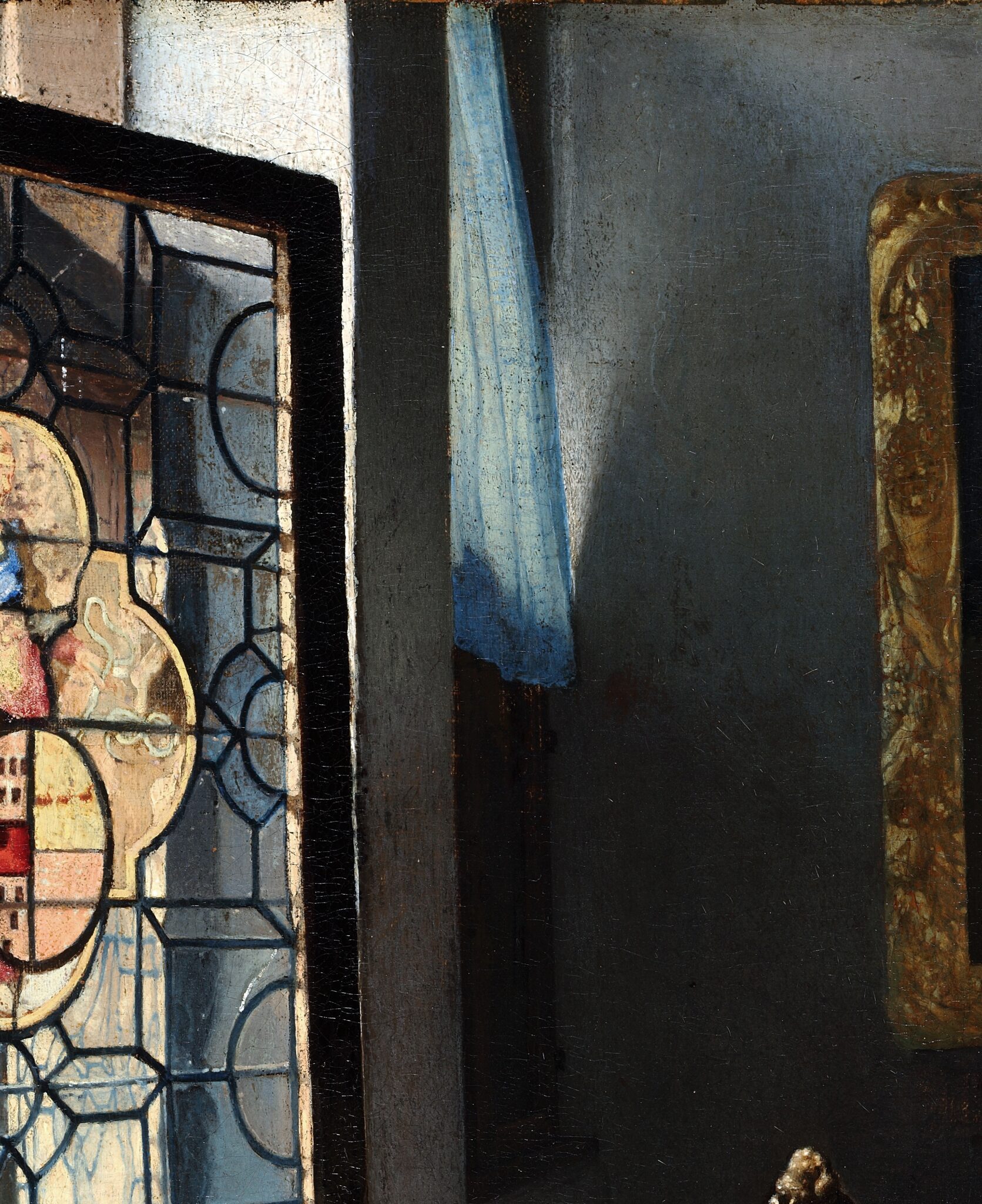
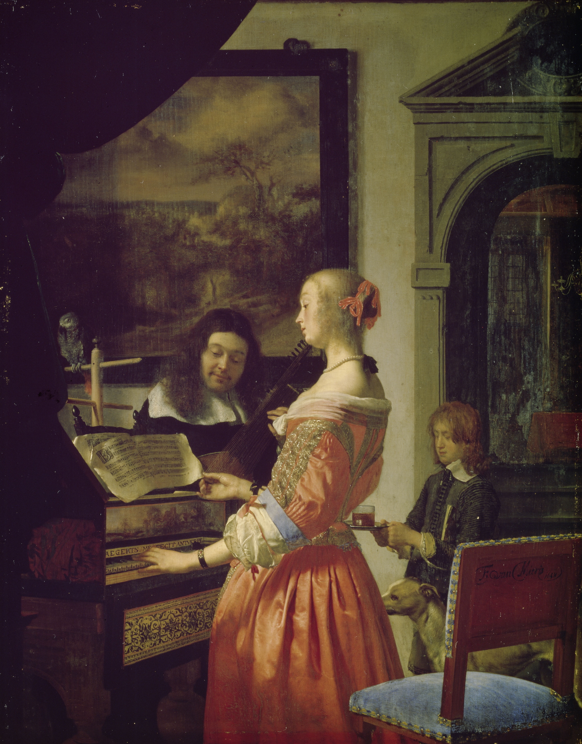
In depicting the figures and furniture full-length, the artist of The Glass of Wine appears to have followed A Woman with a Wineglass. They also loosely based the lady’s clothing on that in the Braunschweig picture (figs. 41, 42). One may be tempted to hone in on the differences between the two outfits, including the angle at which we view them or the way the folds of the skirt cascade.31 More important, however, is that the combination of a satin bodice and skirt in vibrant pink and red is virtually unique in Dutch genre painting of the early 1660s.32 In fact, it is safe to say that without the Braunschweig picture, the artist of The Glass of Wine would have never dressed a woman in such flamboyant colors. Then again, neither would Vermeer have done so without Frans van Mieris’s (1635–1681) Duet (fig. 43) of 1658.33
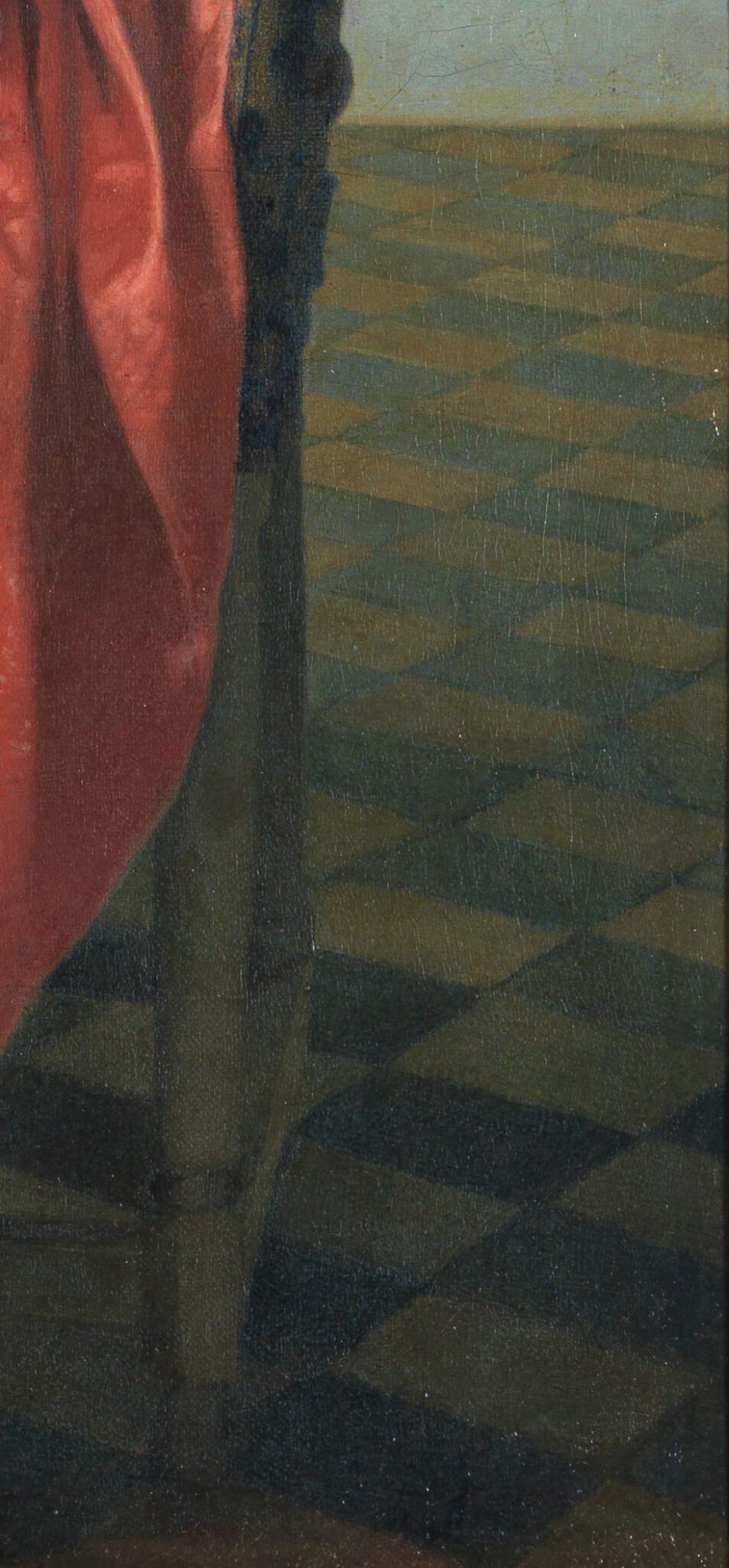
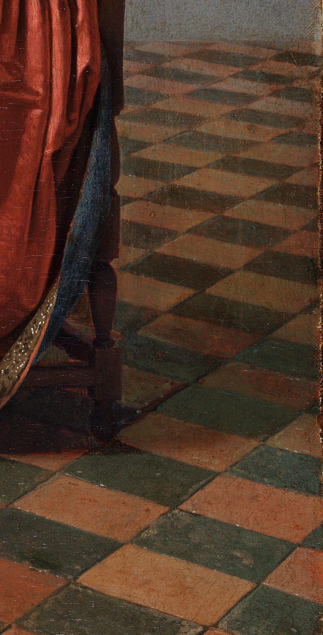
A Woman with a Wineglass also encouraged the artist of the Berlin picture to replicate the black-and-orange tiled floor, tilting forward like a raked theatre stage and receding awkwardly into the far-right corner (figs. 44, 45).
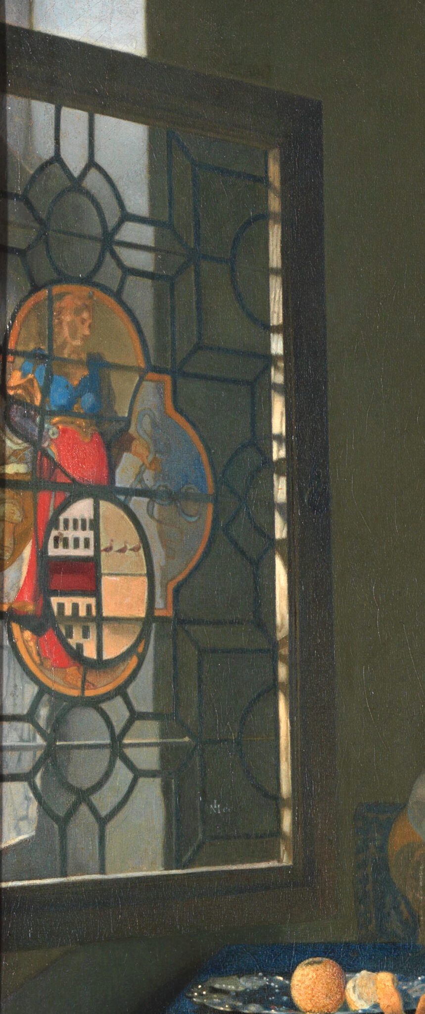
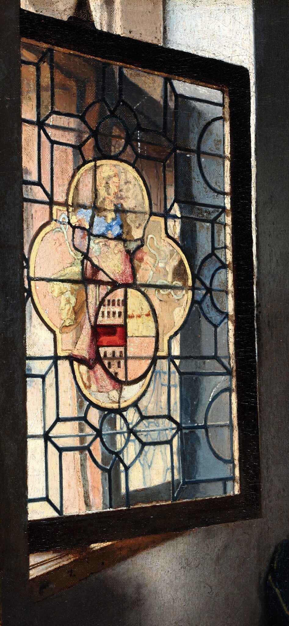
The same is true of the stained-glass window, although in The Glass of Wine the sidewall, rather than the edge of the picture, cuts it off on the left (figs. 46, 47). The artist opened the window at a smaller angle, causing the sidewall behind the window frame to extend beyond it.
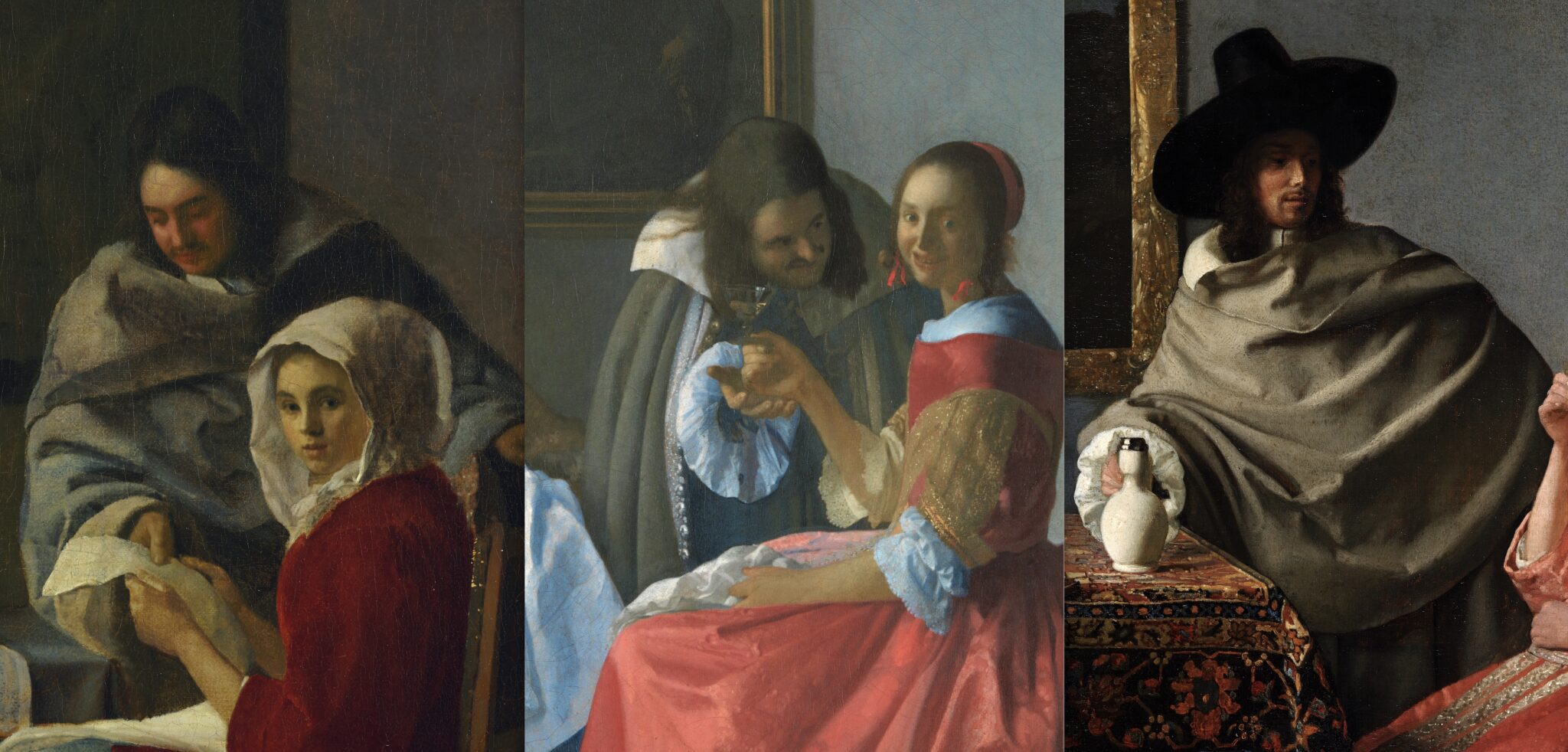
Other elements in the Berlin painting, such as the gentleman’s cape, derive from both A Woman Interrupted at Her Music and A Woman with a Wineglass (fig. 48). Its voluminous shape, with V-contoured folds across the width of the man’s body, and his right arm stretching out, mimics the New York painting. The cape’s green color, the sleeve ending in a rosette, and the white collar flopping out originated from the Braunschweig picture.
Both or either A Woman Interrupted at Her Music or A Woman with a Wineglass prompted the artist of The Glass of Wine to hang a painting on the back wall (fig. 49). However, they aligned it with the table, creating a “vertical stack” of large forms that conflicts with Vermeer’s compositional arrangements. Vermeer never positioned tables, chairs, and keyboard instruments in line with maps or paintings on the wall behind them. Doing so encourages the viewer’s eye to linger on a point of visual alignment rather than wander through the composition. The placement of the table and the landscape picture therefore provides a telling hint that Vermeer did not devise this composition.34
The frame in The Glass of Wine, moreover, is gilded. Although Vermeer included frames with parcel gilt in A Woman with a Wineglass and A Woman with a Balance (ca. 1664−1665; National Gallery of Art, Washington), fully gilded ones do not emerge in his work until the end of his career, in the first half of the 1670s, when his compositions evoke a greater sense of luxury. But the Berlin picture does not echo elements from other, late works by Vermeer and therefore should not be dated to this period. More likely, the artist gave the frame a gilded surface for stylistic reasons, considering their penchant for intense light effects.
Indeed, the painter of The Glass of Wine did not merely mimic the light reflections found in Vermeer’s work—as they probably would have if they had copied an original. Rather, spurred by a determination to ensure that viewers recognized and marveled at these hallmarks of Vermeer’s style, they amplified them or added them to areas where the latter did not. This phenomenon is known as the “peak-shift effect” in cognitive research and explains why paintings with exaggerated features by students and followers sometimes appeal as much, if not more, to modern art lovers than those by the master they aimed to emulate.35
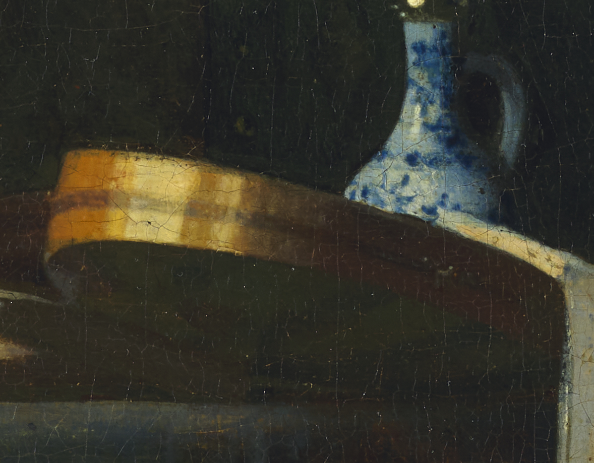
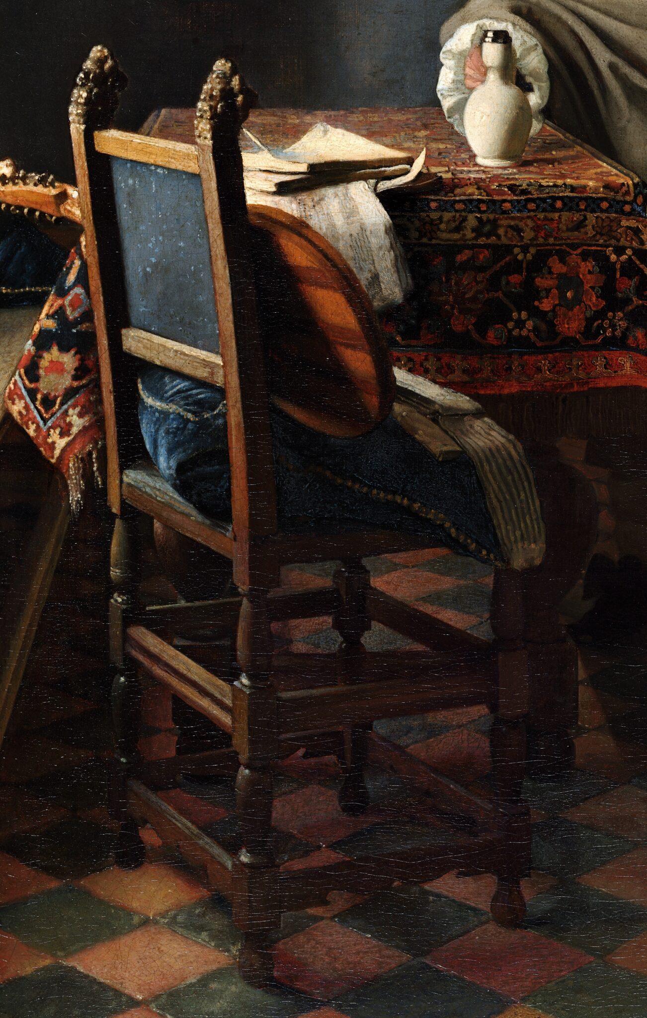
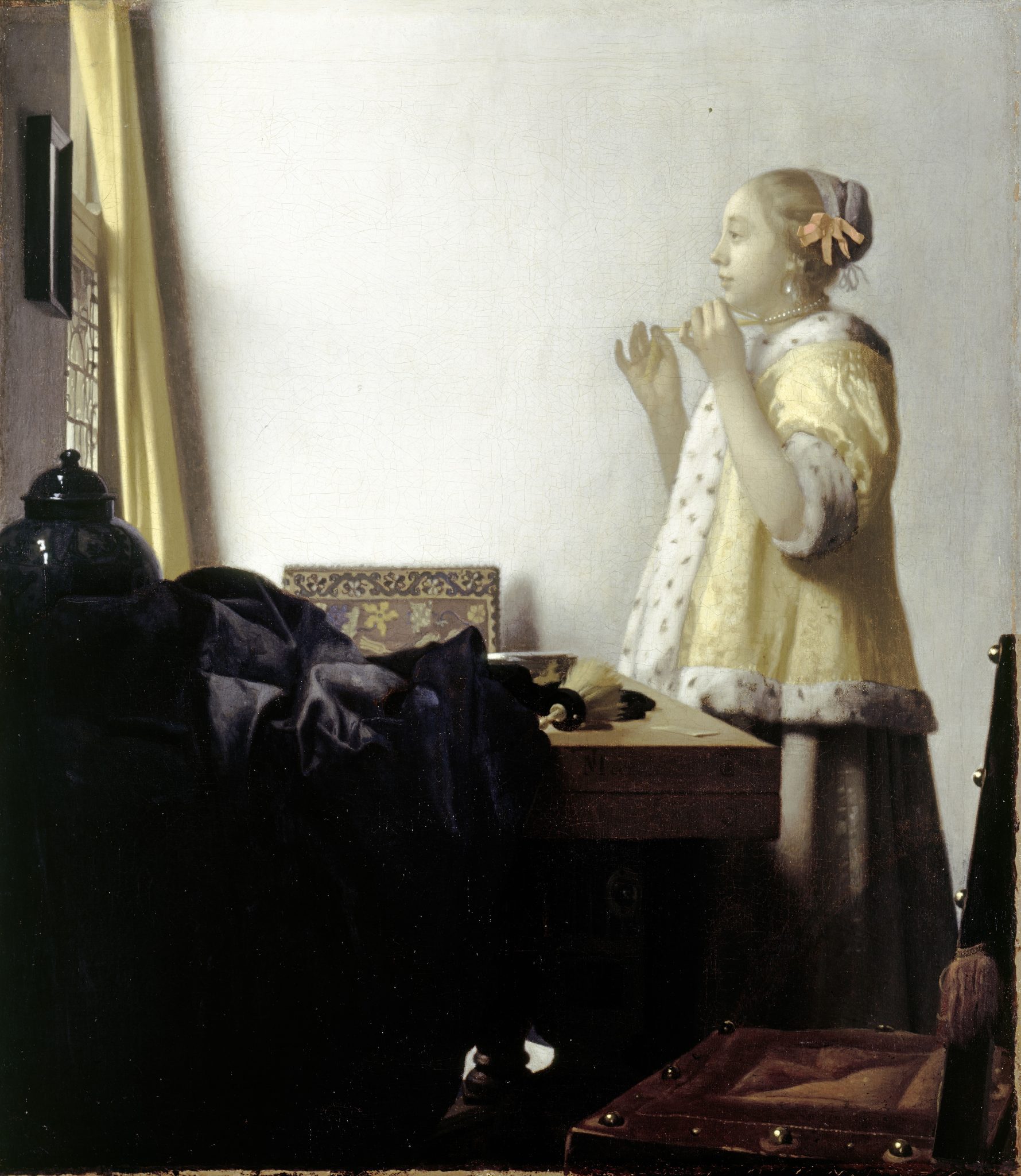
The cittern in The Glass of Wine may be the same instrument that appears in A Woman Interrupted at Her Music, but it differs in its placement on the chair, where it leans against the backrest, and the angle from which we view it (figs. 22a, 38a). In these respects, it bears a closer resemblance to a cittern Vermeer initially planned to include on the foreground chair in A Woman with a Pearl Necklace but omitted from the final version (fig. 50, 51).36 A neutron autoradiograph of this painting demonstrates that the instrument had a similarly striped back and a decorative line along the outer edge of its body. However, it did not rest on a pillow, nor did it have the harsh black shadow visible on the cittern’s back in the Berlin picture. Still, the similarities are so strong that the artist of The Glass of Wine must have known Vermeer’s painting at an early stage of execution, or perhaps a related preparatory drawing.
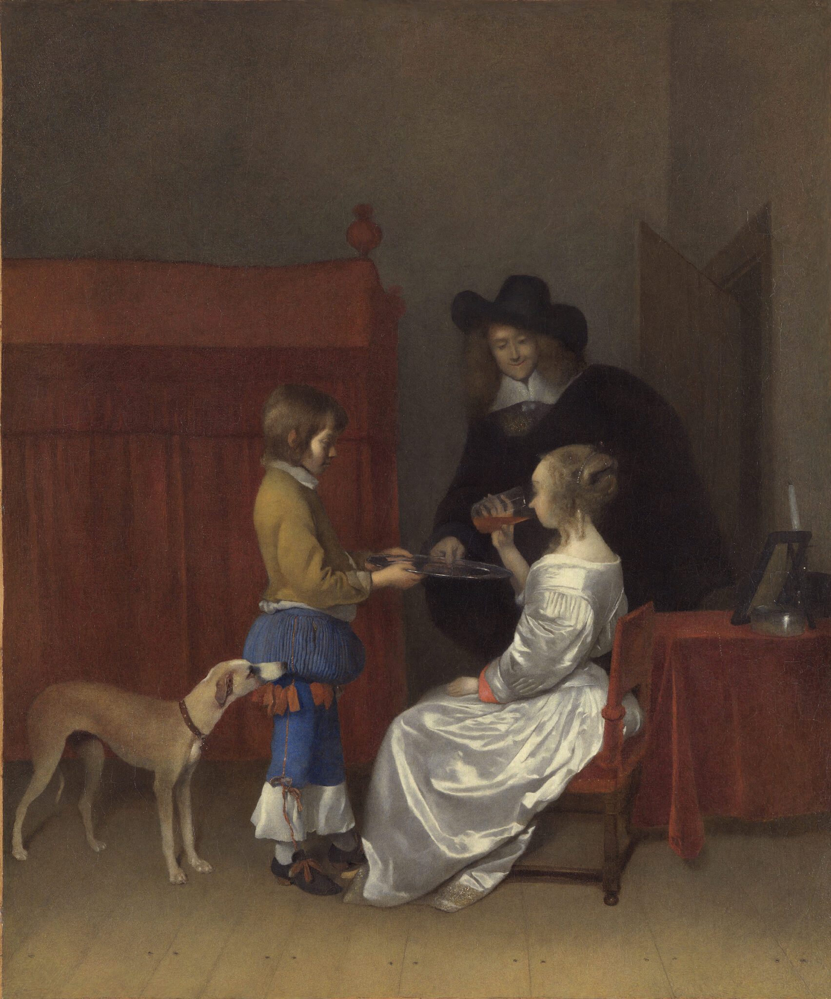
The gentleman’s passive demeanor toward his lover in the Berlin picture does not mirror the suitors’ assertive behavior in A Woman Interrupted at Her Music and A Woman with a Wineglass. Instead, it calls to mind the sparse dynamics between a couple in a “lost” painting by Gerard ter Borch (1617−1681), known through copies (fig. 52).37 Dating to about 1656, A Couple in an Interior, Served by a Page represents a young lady sitting in a chair, about to place a glass of lemonade to her lips. Her lover, wearing a voluminous cape and black hat, stands quietly to her right, clutching a silver tray, held by the page, with his left hand. The artist of The Glass of Wine adopted the idea of a man towering over his seated lover while silently observing her drinking from a glass. Additionally, they drew inspiration from Ter Borch’s Gentleman Pressing a Woman to Drink (fig. 53) of about 1658–1659, featuring a couple in a similar situation, though positioned next to a table and engaging with each other more intently.38 The man’s gesture of clasping the neck of a bottle prompted the artist of the Berlin picture to depict their figure gripping a white jug. Moreover, the man’s anchored gaze, his eyes shaded by the brim of his black hat, found resonance in The Glass of Wine.
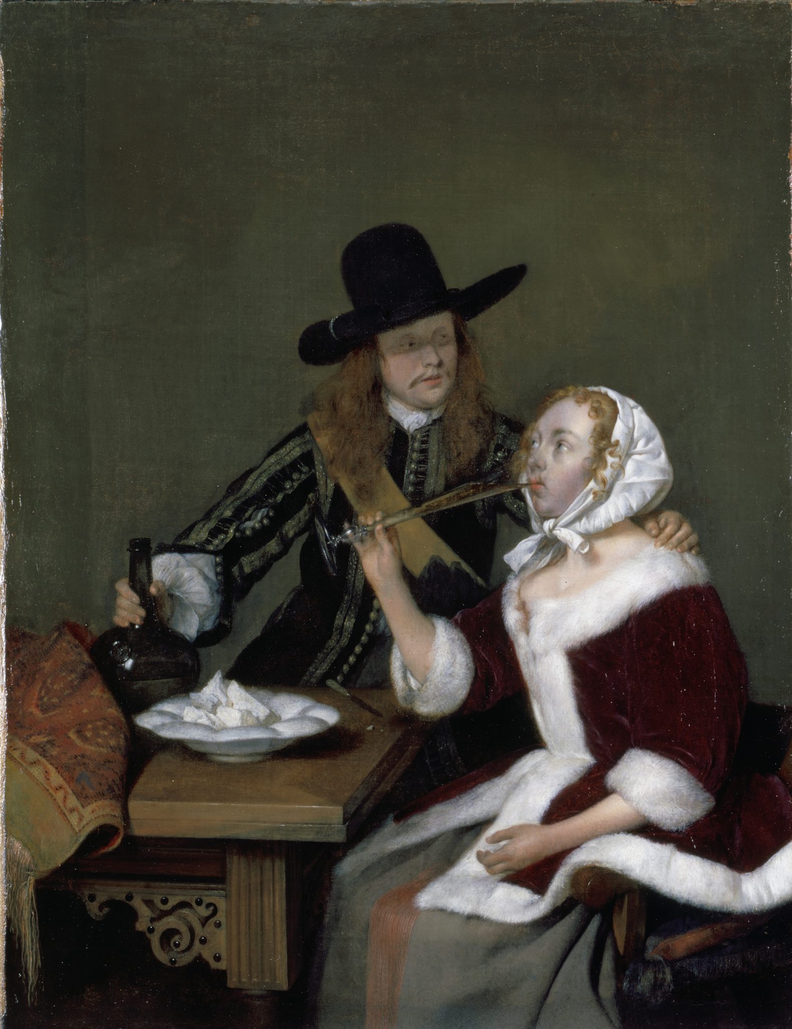
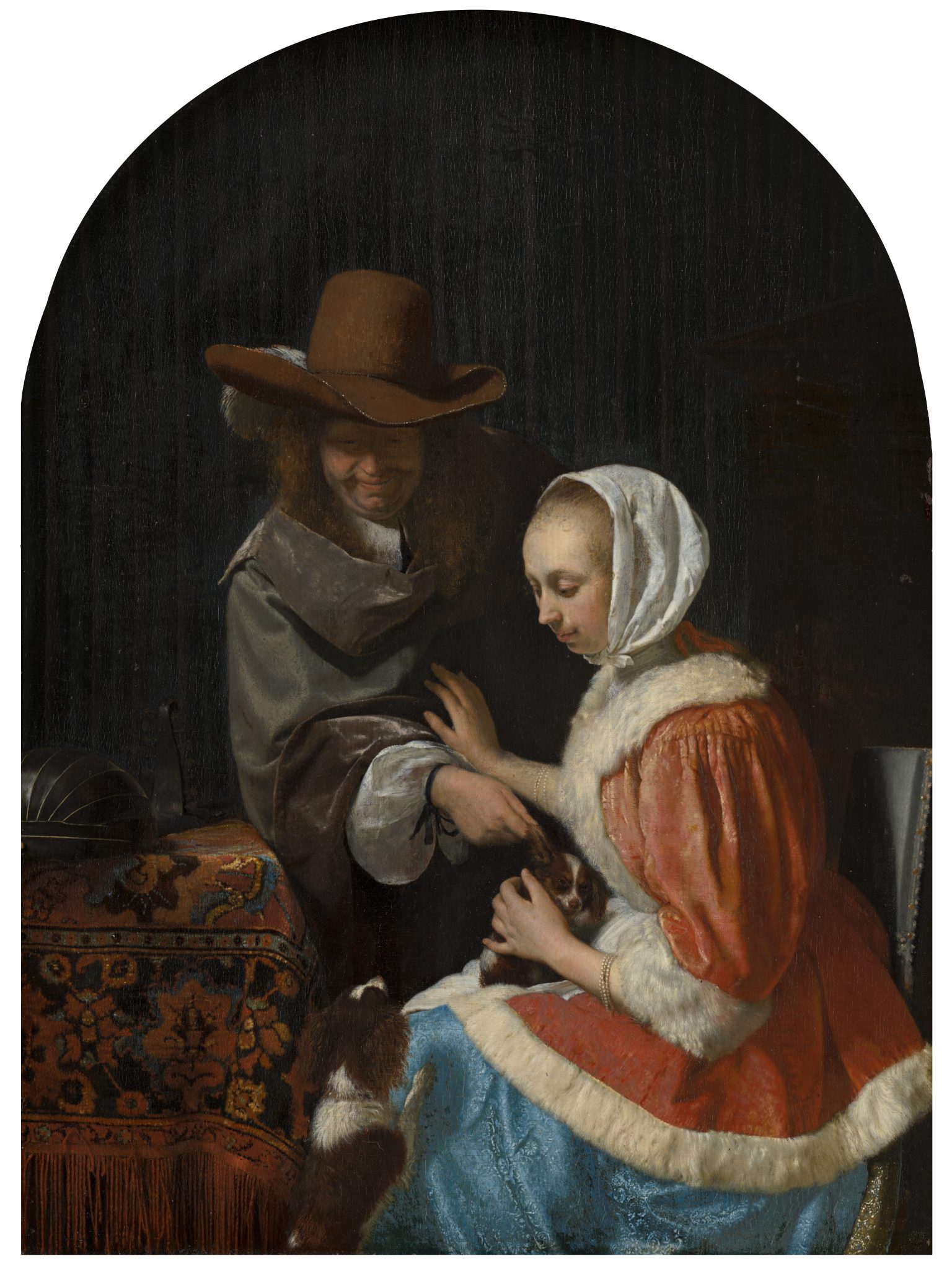
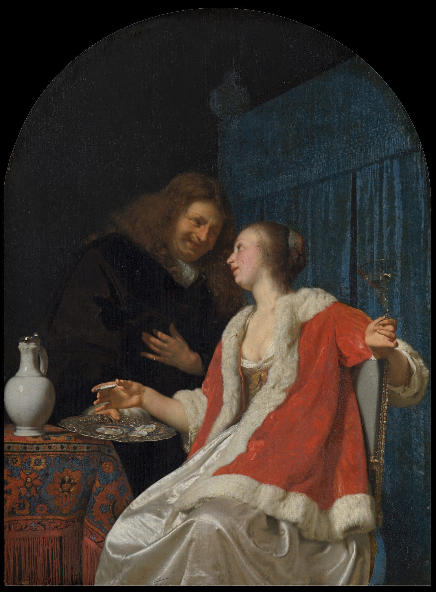
Earlier, Ter Borch’s Couple in an Interior, Served by a Page and Gentleman Pressing a Woman to Drink had played a pivotal role in Van Mieris’s conception of A Man and Woman with Two Dogs (“Teasing the Pet”) and The Oyster Meal, dated 1660 and 1661 respectively (figs. 54, 55).39 These companion pieces depict caped suitors standing to the right of a seated young woman, one grabbing a dog’s ear and the other proffering a silver tray with oysters. In turn, Van Mieris’s paintings—in addition to both of Ter Borch’s paintings—served as the key sources of inspiration for the figure groups in Vermeer’s Woman Interrupted at Her Music and A Woman with a Wineglass.40 The artist of The Glass of Wine probably did not respond directly to Van Mieris’s pendants, as scholars—including the present one—previously believed.41 More likely, they drew inspiration from Vermeer’s paintings in New York and Braunschweig and their “grandparents” by Ter Borch.
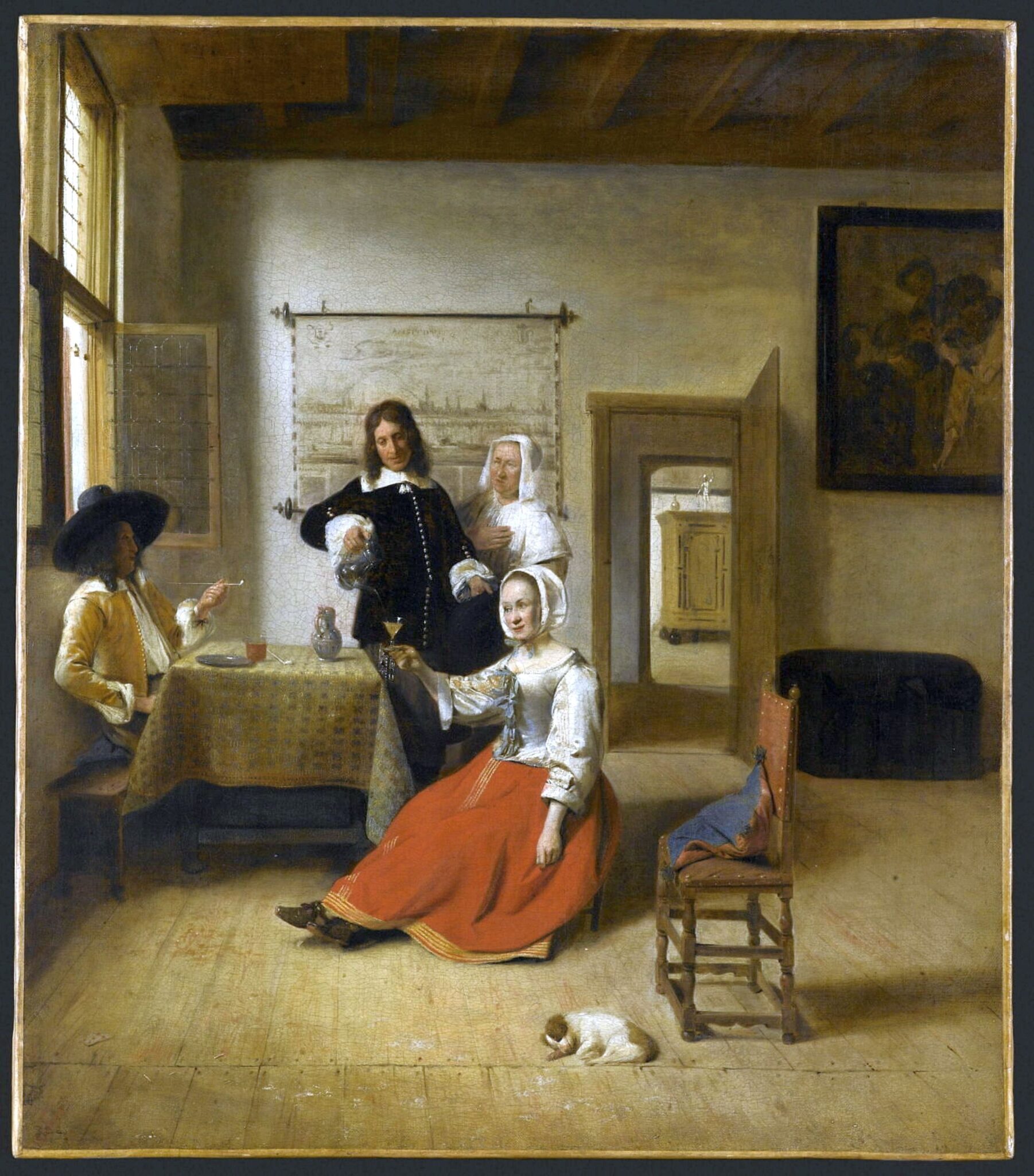
Pieter de Hooch’s (1629−1679) Young Woman Drinking with Two Soldiers (fig. 56), which Vermeer had studied in preparation for A Woman with a Wineglass, also contributed to the conception of The Glass of Wine.42 This composition of 1658 encouraged the artist of the Berlin painting to increase the distance between the figures and the picture plane and between the viewer’s standpoint and the wall on the left.43 The man’s position in relation to the table in The Glass of Wine echoes the same element in De Hooch’s painting. The artist also adopted the wooden bench, positioned below the window, from A Young Woman Drinking with Two Soldiers, yet they omitted the smoker and increased the bench in height and width. Moreover, the artist shortened the gradual transition between the shadow and the strip of full illumination on top of the bench, resulting in a starker contrast between the two areas.
In conclusion, The Glass of Wine appears to have the hallmarks of a skillful pastiche of elements originating from Vermeer’s Woman Interrupted at Her Music and A Woman with a Wineglass, further comprising ideas originating from A Woman with a Pearl Necklace and works by Ter Borch and De Hooch.44 No area in the visible painted surface can be safely attributed to Vermeer, so chances are slim that he started the Berlin painting and that another artist finished it. Even the underlying composition is unlikely to be Vermeer’s. True, the clever repurposing of elements from six different compositions recalls his ingenious amalgamation of borrowings from paintings by other artists.45 But, as some critics have observed, the resulting figure group is unsatisfactory, lacking the emotive dynamics of those in A Woman Interrupted at Her Music and A Woman with a Wineglass. The alignment of the table and painting on the back wall, moreover, deviates from Vermeer’s standard practice. Finally, if the artist of the Berlin work had faithfully copied an original by Vermeer, it is doubtful they would have rendered the light effects on the walls and pillow so intensely, or the contrasts between light and shadow on the bench and cittern so starkly.
The Love Letter: Paint Handling and Stylistic Aspects
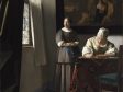
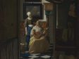
First documented at an Amsterdam auction in 1892, The Love Letter, now at the Rijksmuseum, represents a maid who has interrupted her mistress’s musical pursuits by handing her a letter (fig. 57a).46 While the lady’s upward gaze and parted lips suggest her apprehension about the letter, her servant offers a reassuring smile.47 A painting of a seascape with a ship with the wind in its sails serves as a visual metaphor for the amorous feelings the lady shares with her lover.48
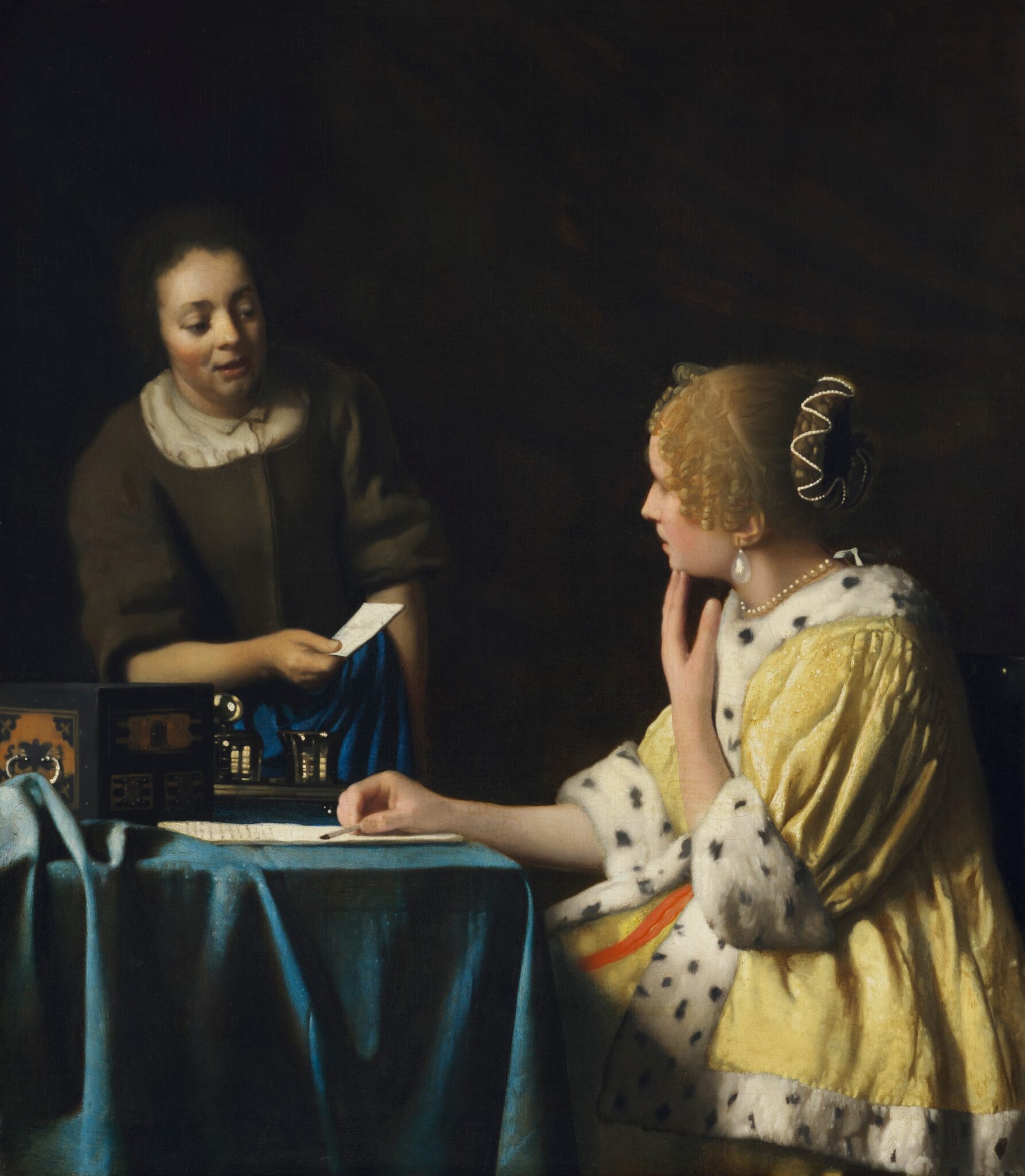
The subject of The Love Letter echoes that of Vermeer’s Mistress and Maid (fig. 58). There, a young woman’s slack jaw and left hand, reaching for her chin, hint at her unease about a letter she is about to receive from her servant. Her maid’s facial expression is harder to read. Moreover, the picture lacks an explanatory marine painting or any other objects providing visual commentary on the lady’s inner feelings.49 The subjects of both paintings are similar yet do not speak to us in the same language.
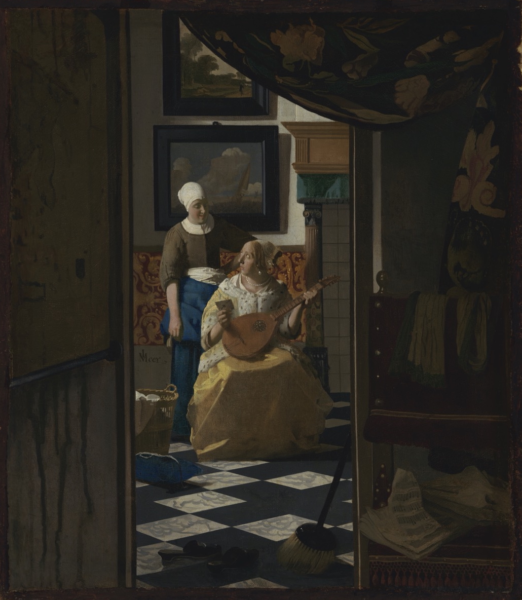
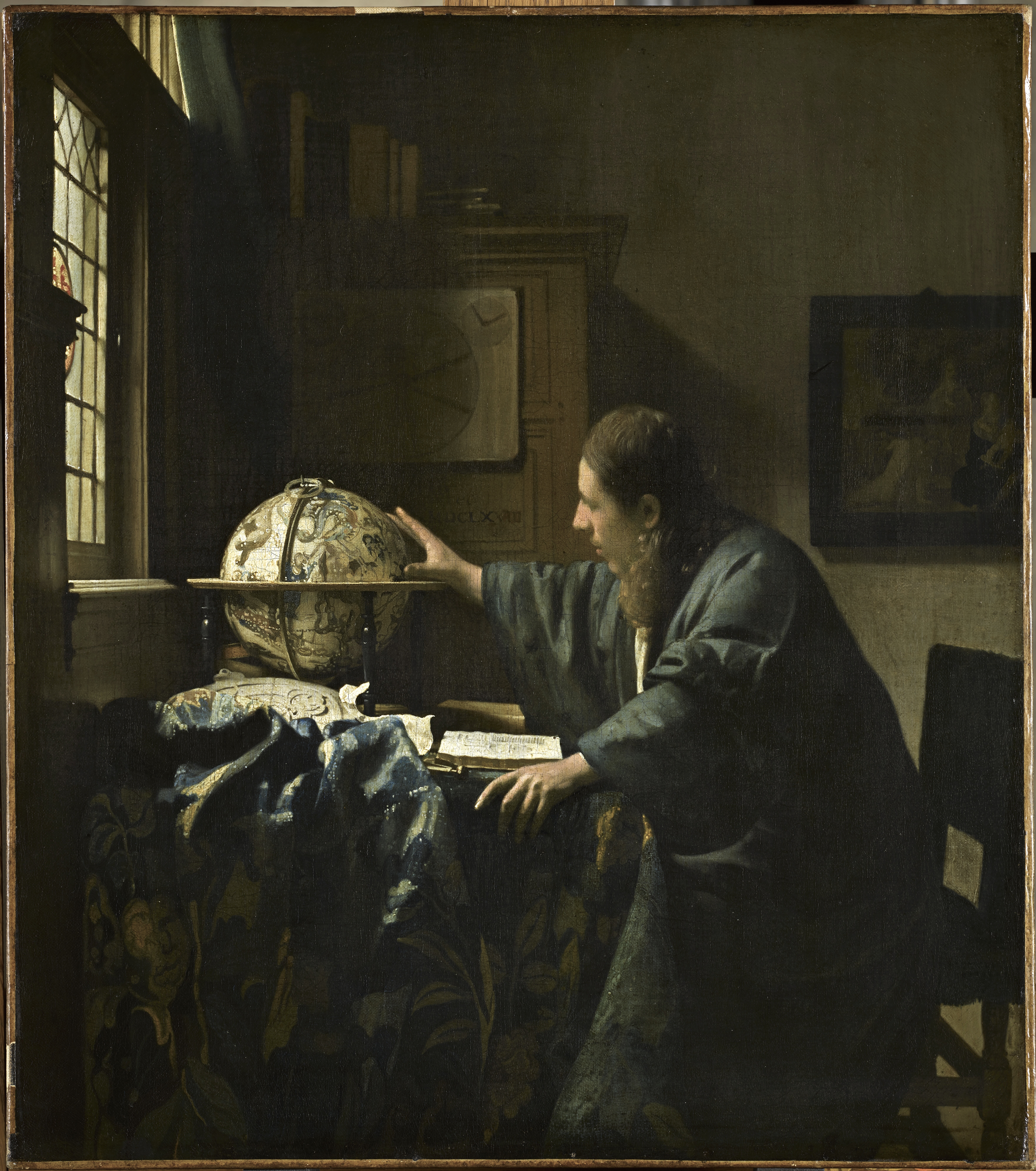
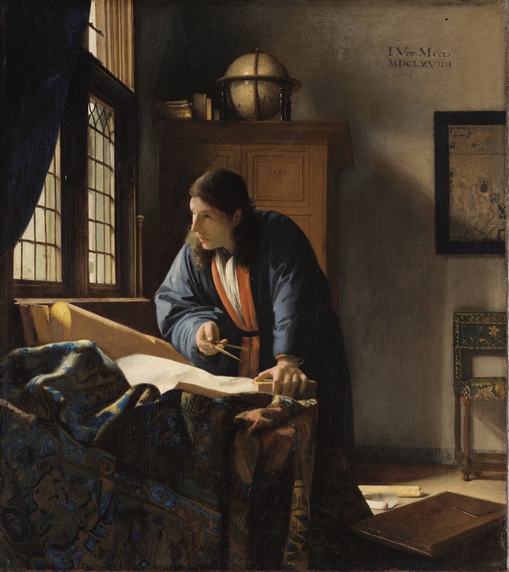
Most scholars regard The Love Letter as a late work by Vermeer, completed at the same time or not long after The Astronomer and The Geographer, dated 1668 and 1669, respectively (figs. 59, 60).50 Despite being a visually compelling picture, the Amsterdam painting has elicited negative responses. Abraham Bredius, for instance, advised against its purchase by the Vereniging Rembrandt (Rembrandt Association) in 1892: “I only hope we are not committing a folly; if we later acquire the two Vermeers from Six, this lesser work will surely be completely redundant.”51 Lawrence Gowing characterized The Love Letter as “a sidelong advance along a forbidden road,” in which Vermeer employed “contrasts of tone and color of a sharpness which is never approached elsewhere in his work.”52 John Nash labeled the painting “an oddity,” which is “saturated with imagery: it might be a parody of the letter theme.”53
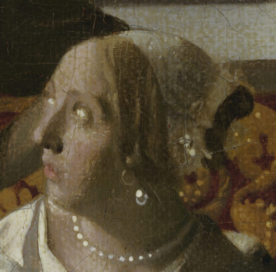
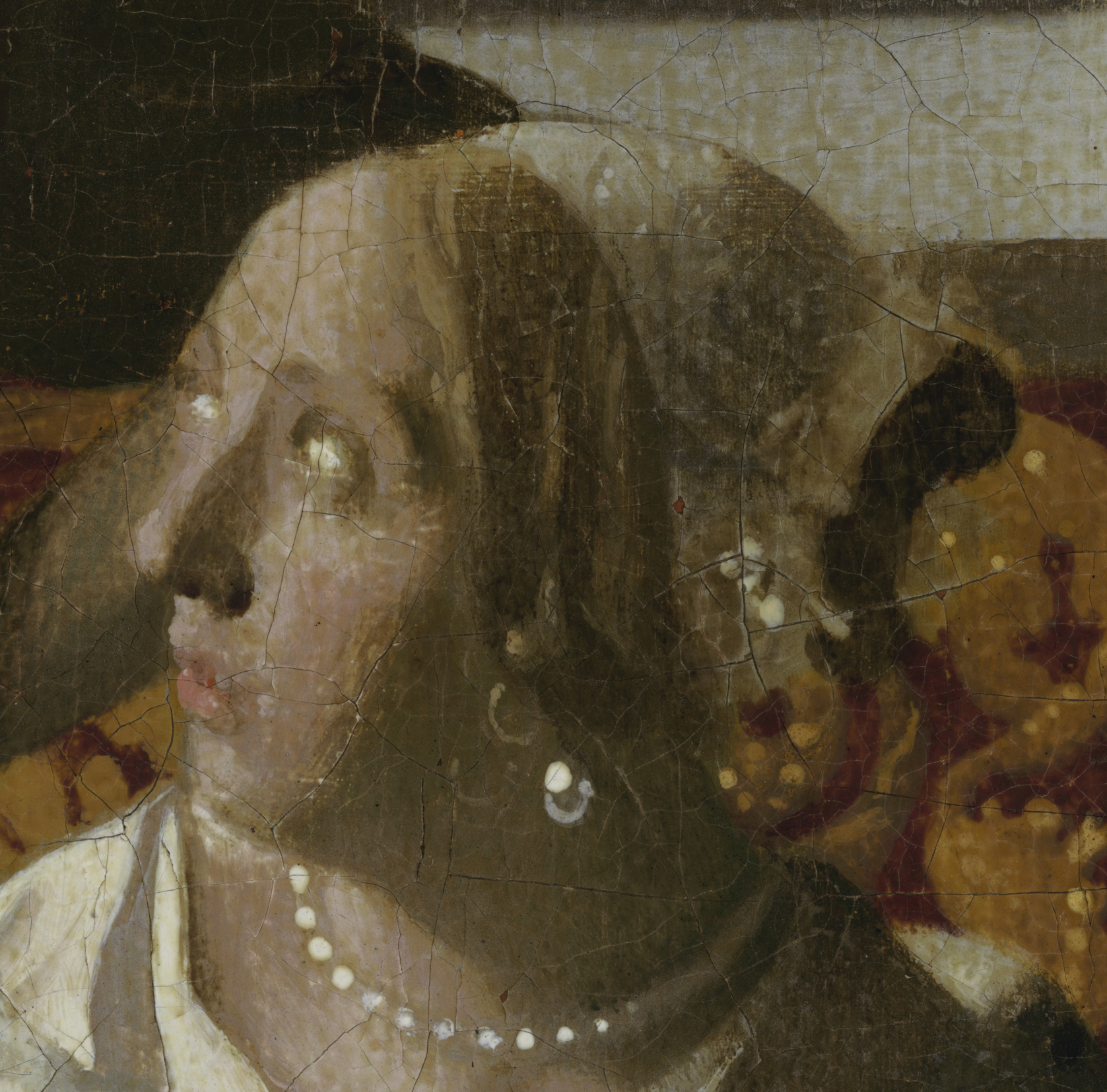
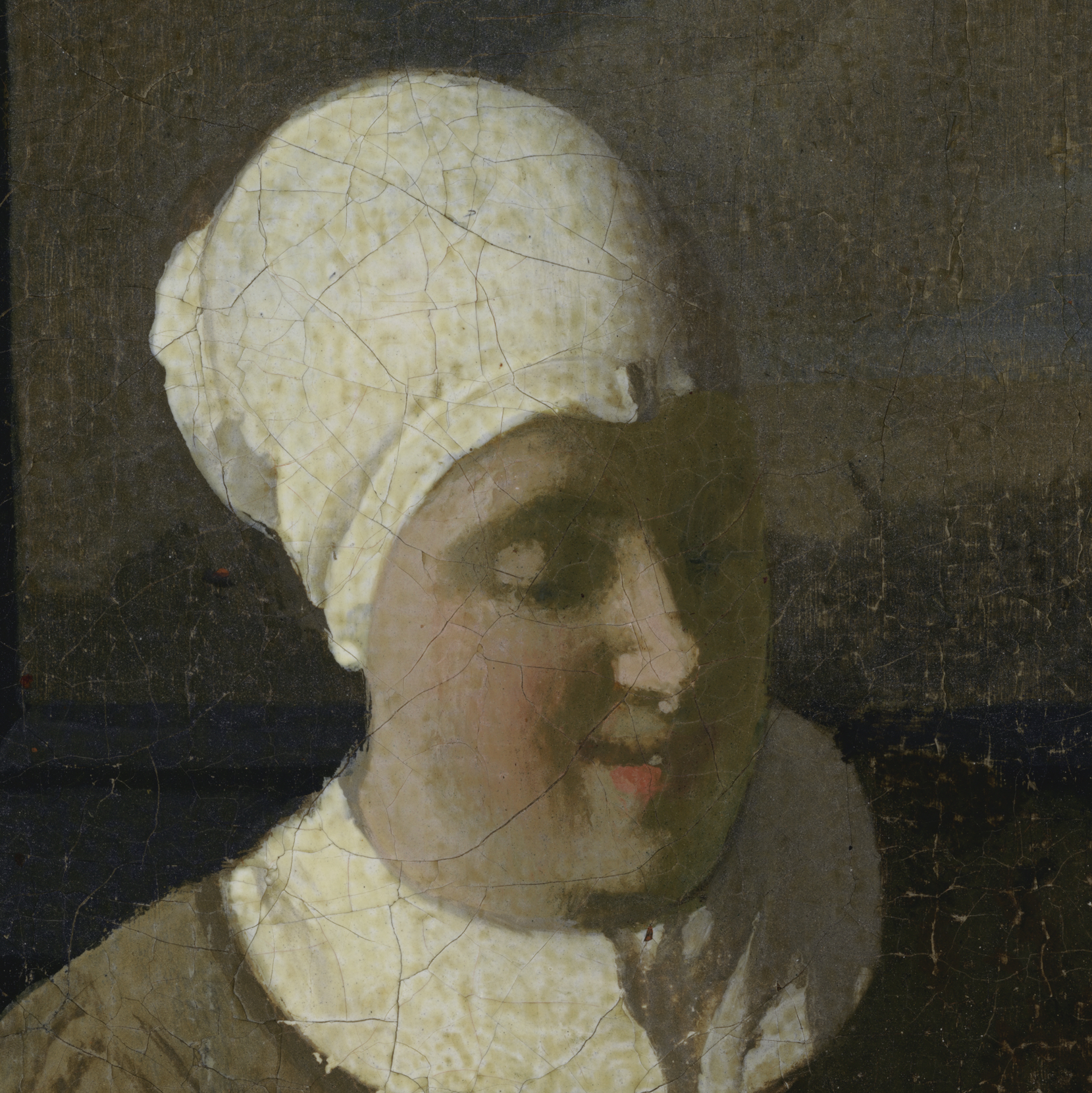
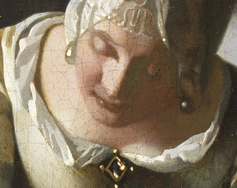
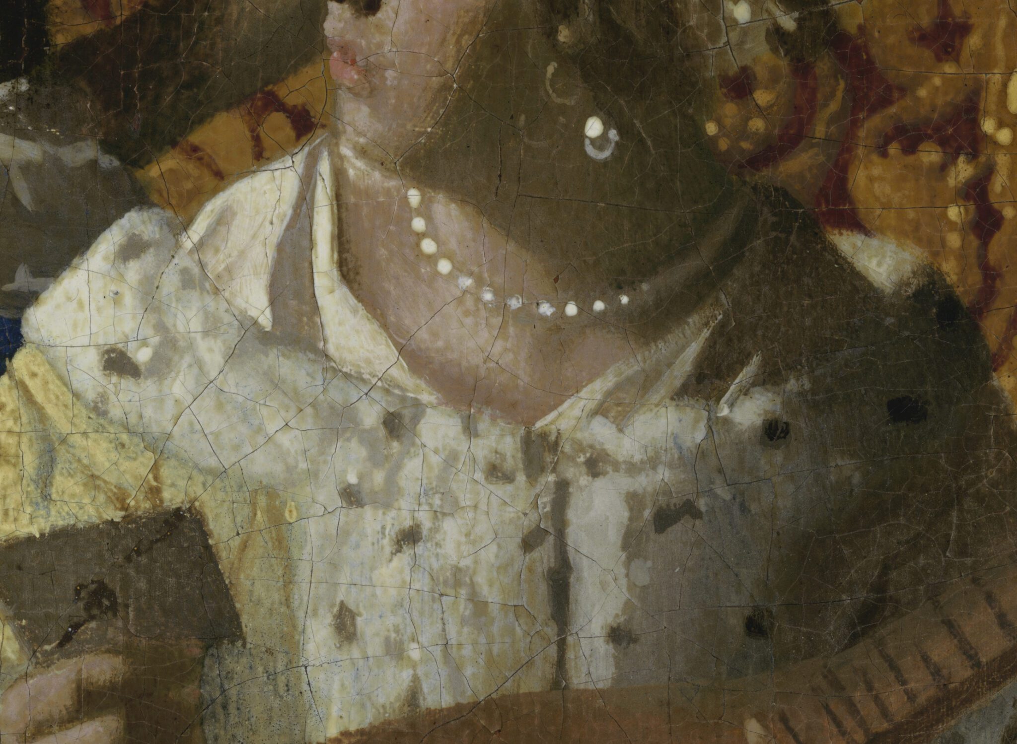
Indeed, the cluttered composition of The Love Letter is unsettling but does not by itself invalidate the authenticity of the painting. Of greater concern is its paint handling, marked by short, untidy brushstrokes and inelegant modeling of forms, materials, and surfaces. Take, for instance, the figures’ facial features. The artist built up the lady’s chin, philtrum, nose, and cheek by mottling ungainly light pink highlights on a peachy pink base, alongside starkly contrasting crude shadows in different hues of brown and black (fig. 61).54 They shaped her right eye, eyebrows, upper lip, and the top part of the bridge of her nose equally infelicitously. In an attempt to mimic Vermeer’s planar highlights in faces—such as those in The Astronomer and The Geographer—the artist suggested the lady’s forehead with a clumsily defined patch of pink, causing it to appear short and receding. They tried to achieve a similar effect in the servant’s nose but struggled to move beyond coarse strokes that do not coalesce into a neat form (fig. 62). Similar brushwork can be found in the area below. Note, for instance, that dabs of beige paint, indicating her chin, overlap those of her bottom lip for no apparent reason; her upper lip is missing; and her mouth opening appears serrated as a result of short, vertical strokes, brushed parallel to each other, starting and ending.55
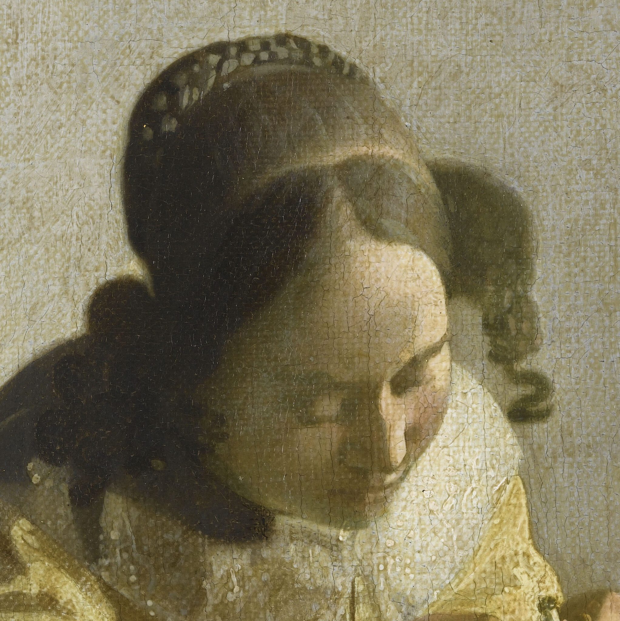
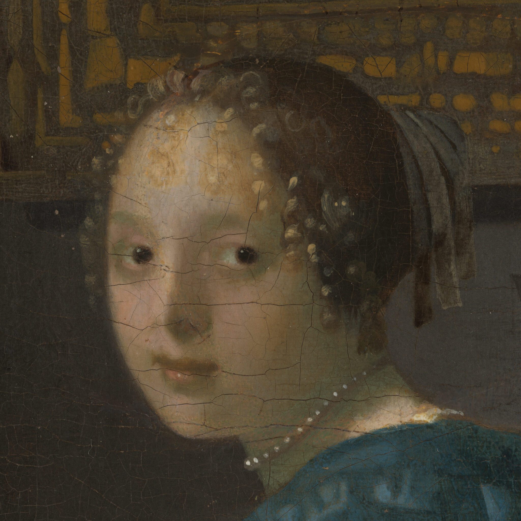
To understand how differently the artist handled these passages from Vermeer’s, the facial features of the lady and the maid are best compared with those of the young woman in The Lacemaker (figs. 63 and 64), brushed equally loosely yet more elegantly and effectively; and with those of the musician in A Woman Seated at a Virginal (figs. 65 and 66), rendered with greater tenderness and more gradual modulation. Note that both The Lacemaker and A Woman Seated at a Virginal are larger in scale than The Love Letter.
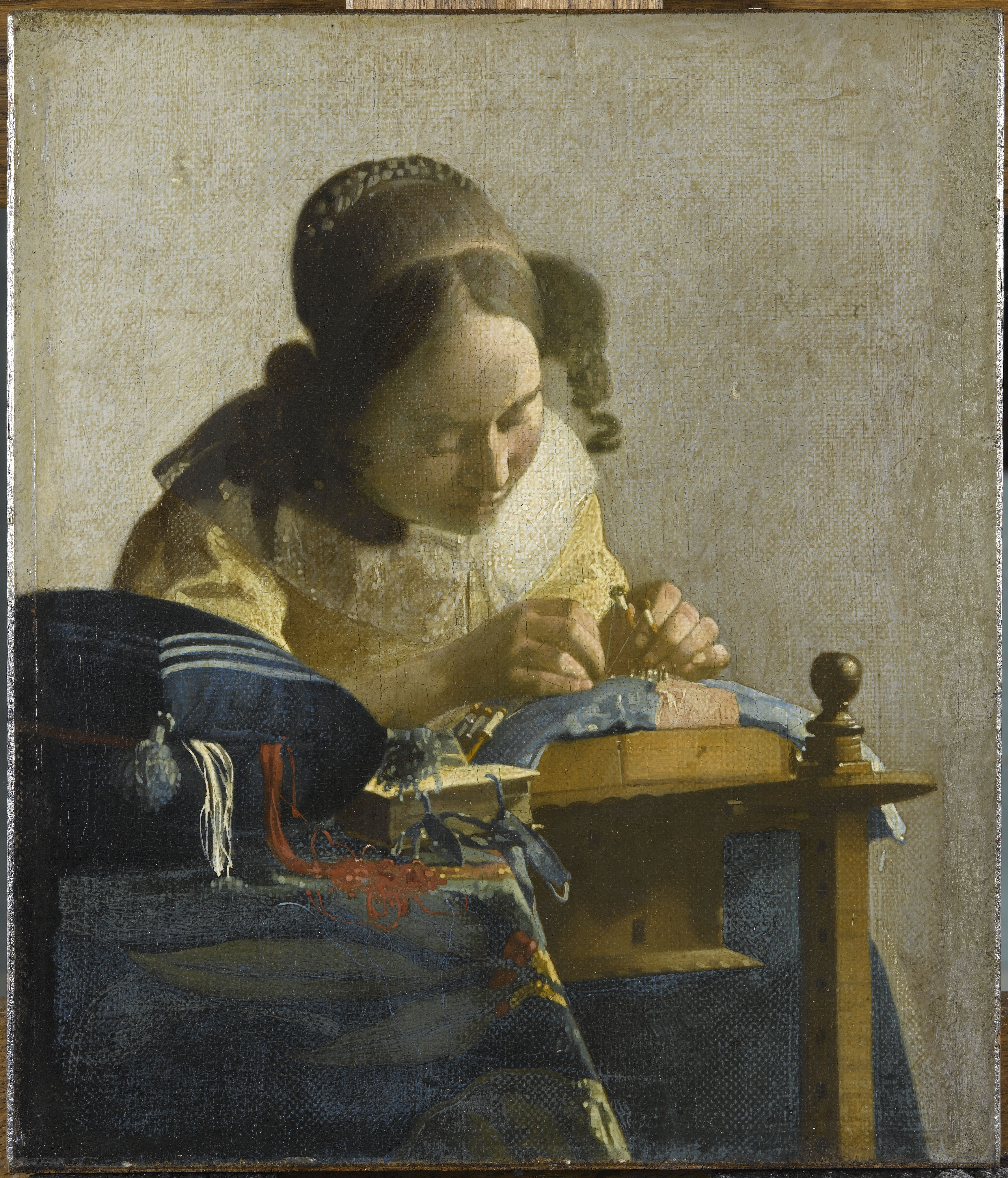
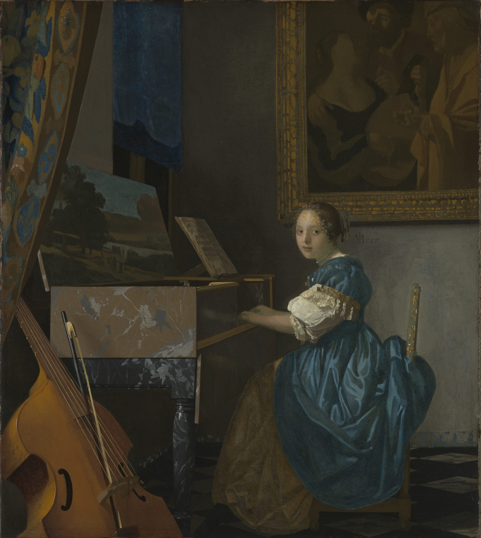
Strings of light brown paint, splotched on top of a dark brown underlayer, faintly suggest ringlets cascading down the side of the lady’s face, with the rest of her hair tied back beneath a white cap (see fig. 61).56 The unrefined description of her hairstyle is inconsistent with that of the neatly painted coiffures of the women in Vermeer’s late works (see, for example, figs. 64 and 66), although the two incomplete circles to the left of the lady’s earring mirror some of the curls hovering over the musician’s head in A Woman Seated at a Virginal.57 The modeling of the lady’s white cap, furthermore, is coarse and gives scant attention to perspectival recession. What the black blob (with touches of brown) behind the cap represents is puzzling.58
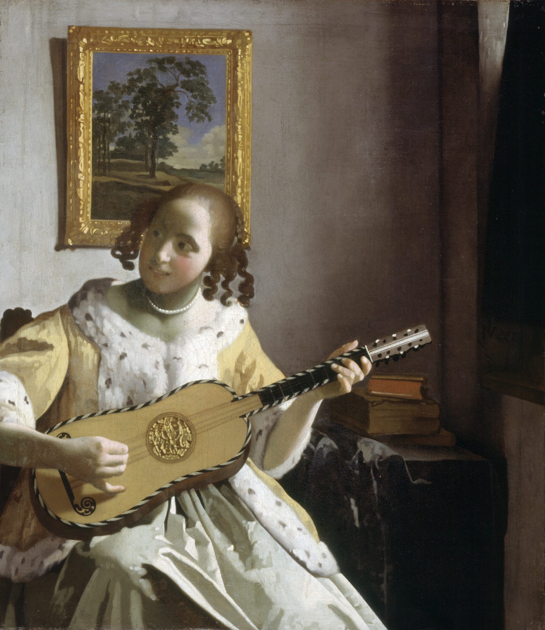
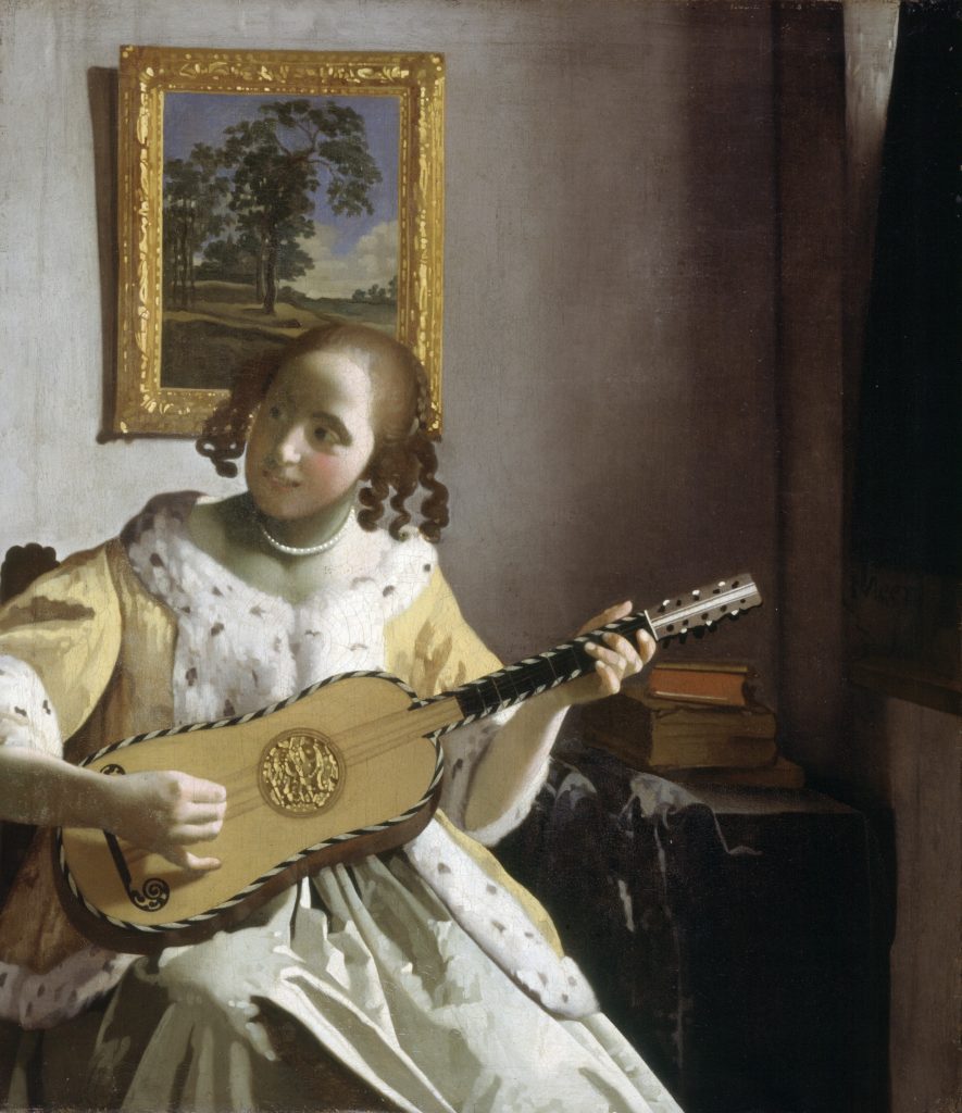
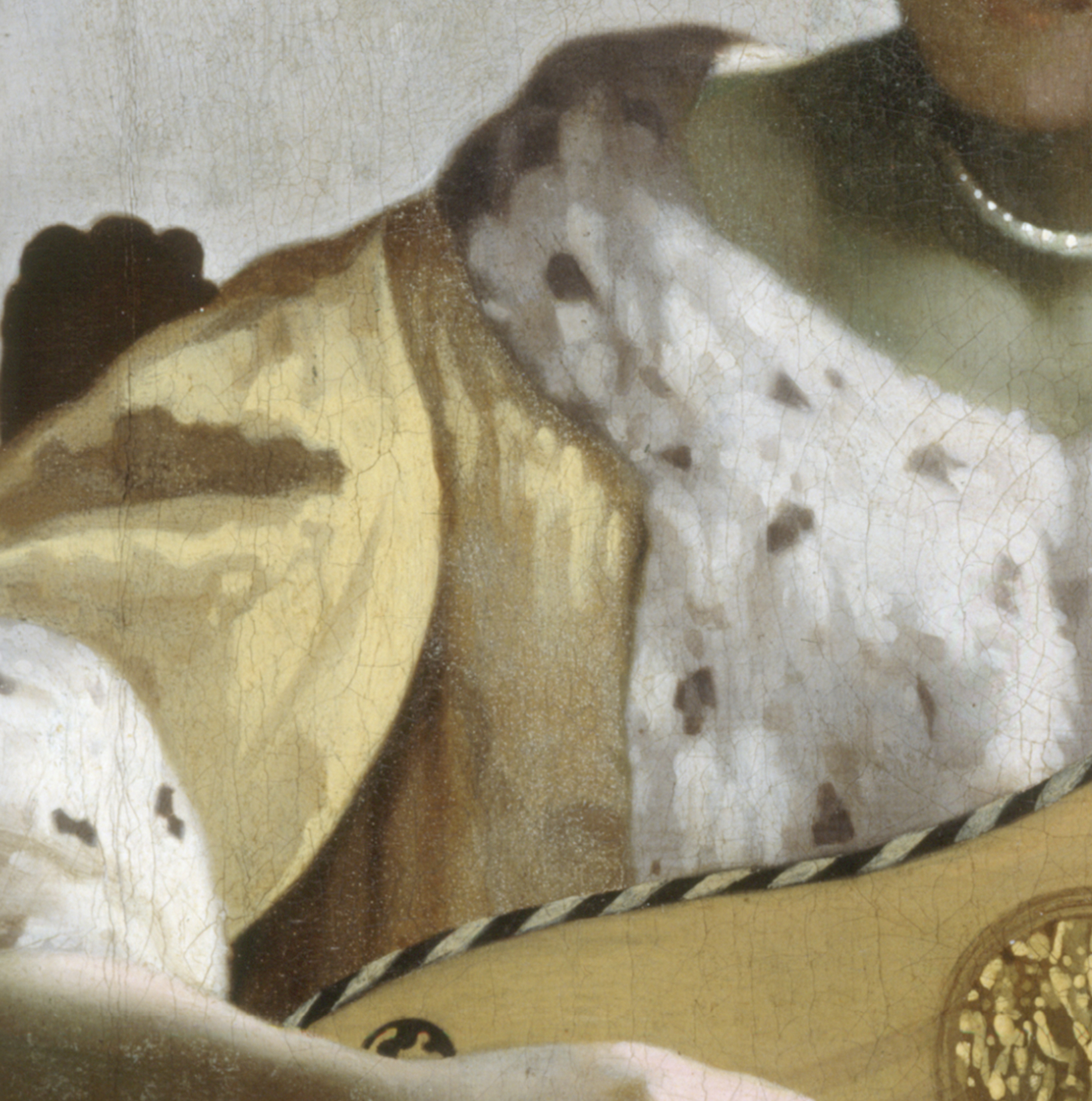
Discrepancies between The Love Letter and Vermeer’s work are also visible in the figures’ attire. For instance, the artist of the Amsterdam painting created the velvet of the fur-trimmed jacket with a blend of rugged strokes in yellow and brown, imparting a crude sense of the fabric’s texture. By contrast, in The Guitar Player (fig. 67)—whose scale is larger—Vermeer brushed bright yellow highlights on top of patches in darker yellow and beige, which border areas of warm brown, suggesting shadows (figs. 68, 69). The result is a voluminous garment that appears remarkably cushioned. A myriad of dabs ranging from pure white to bluish gray mimic the fluffy texture of the white fur, with dark brown, evenly distributed speckles indicating that the fur is ermine—or an imitation of it.59 In The Love Letter, by contrast, the artist painted the flecks in dark gray, scattering them irregularly across the white trims. The shorthand, haphazard rendering of the fur makes it look flat and patchy.60
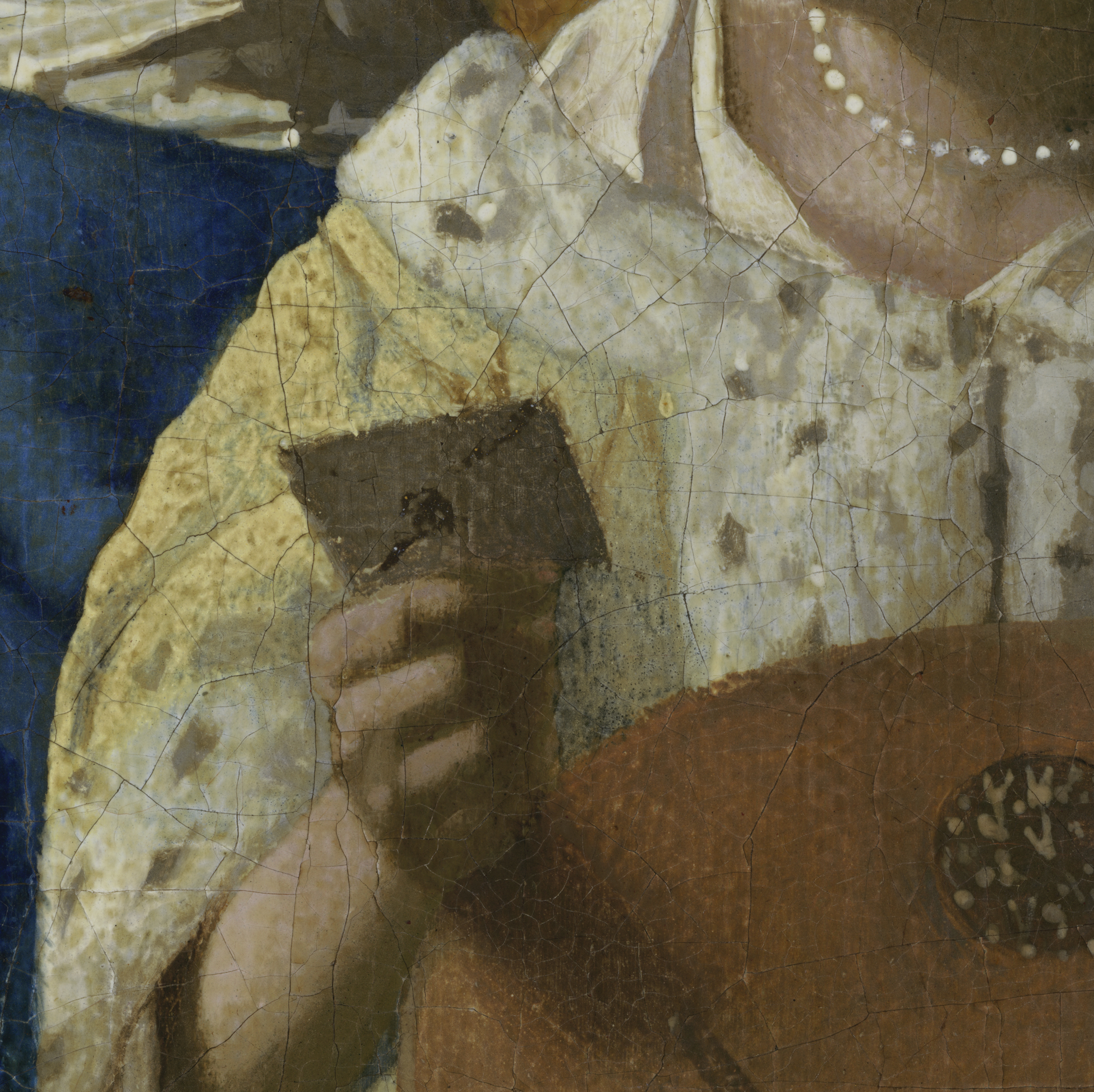
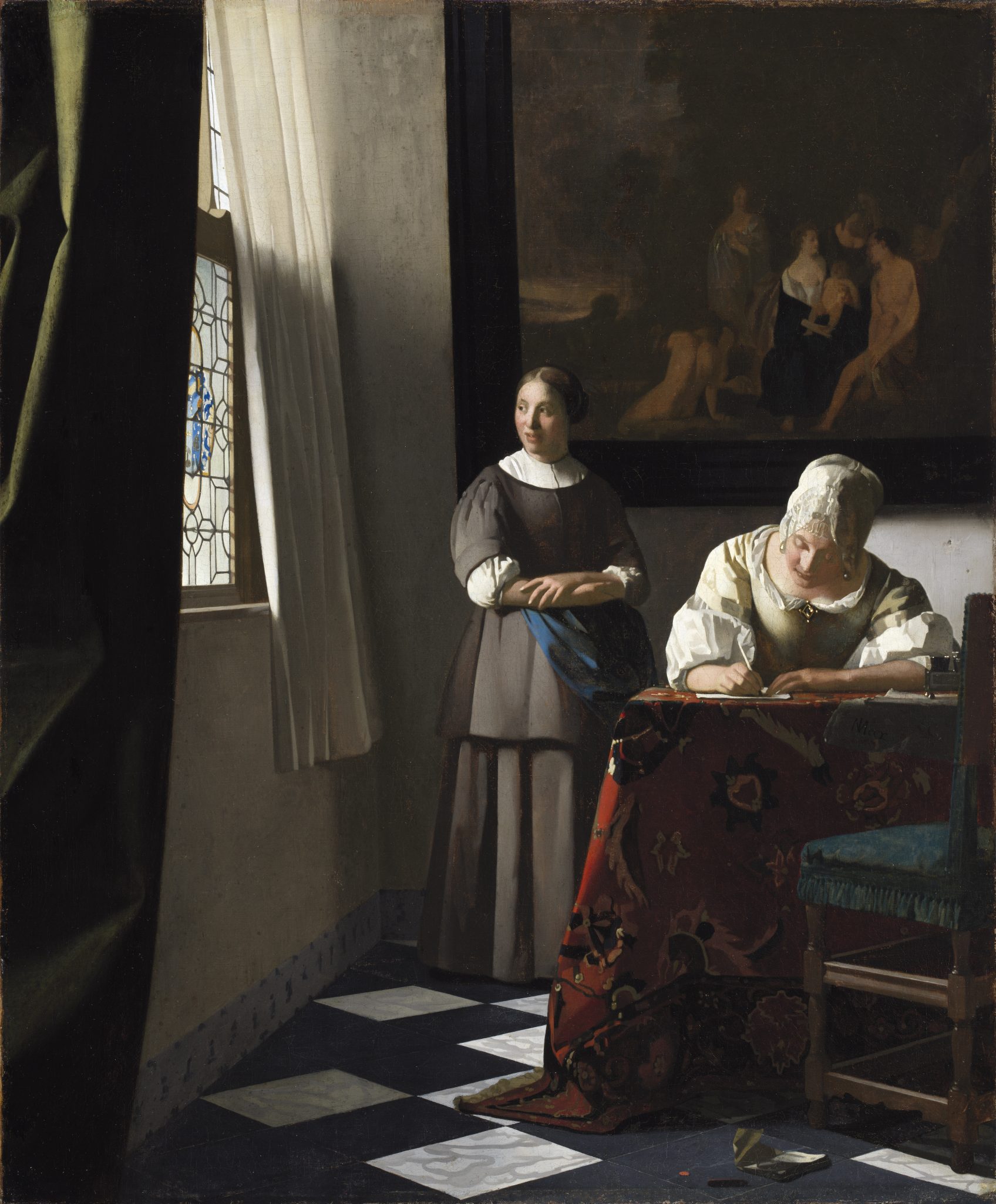
The brushwork of the lady’s white shirt popping out above her jacket in The Love Letter recalls Vermeer’s depiction of the same garment emerging from a young lady’s bodice in A Woman Writing a Letter, with Her Maid (figs. 70, 71, 72), now in Dublin, which is slightly larger in scale. In the latter, he applied relatively broad strokes in white and different hues of gray to suggest the irregular, angular crinkling of the fabric. The artist of the Amsterdam picture painted a coarse, summary version of this on the left. On the right, they swiped strokes in white with a half-loaded brush to create the illusion of folds catching daylight. Although the jacket’s trim should overlap the shirt, the artist started some of these strokes on top of the fur.
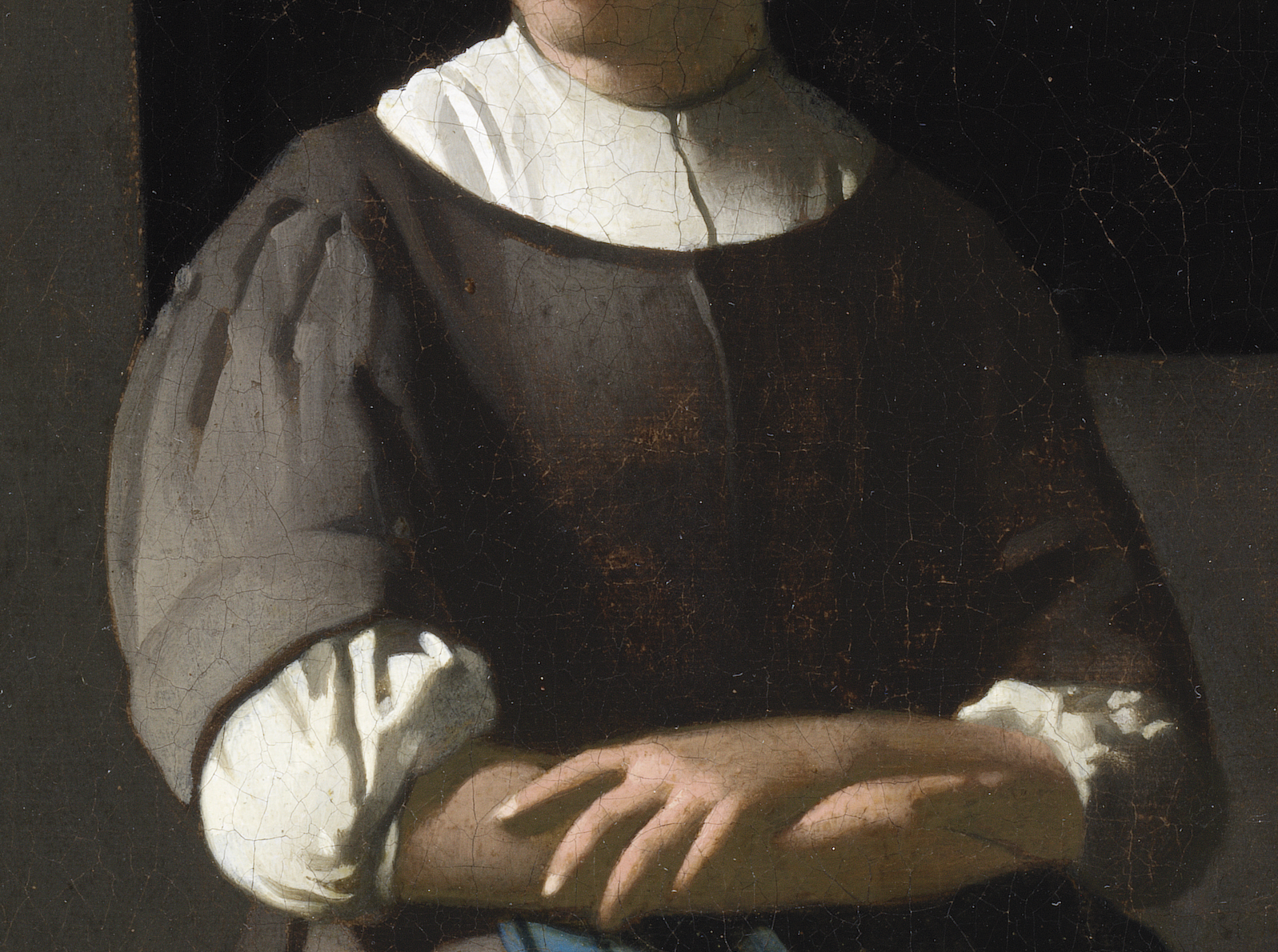
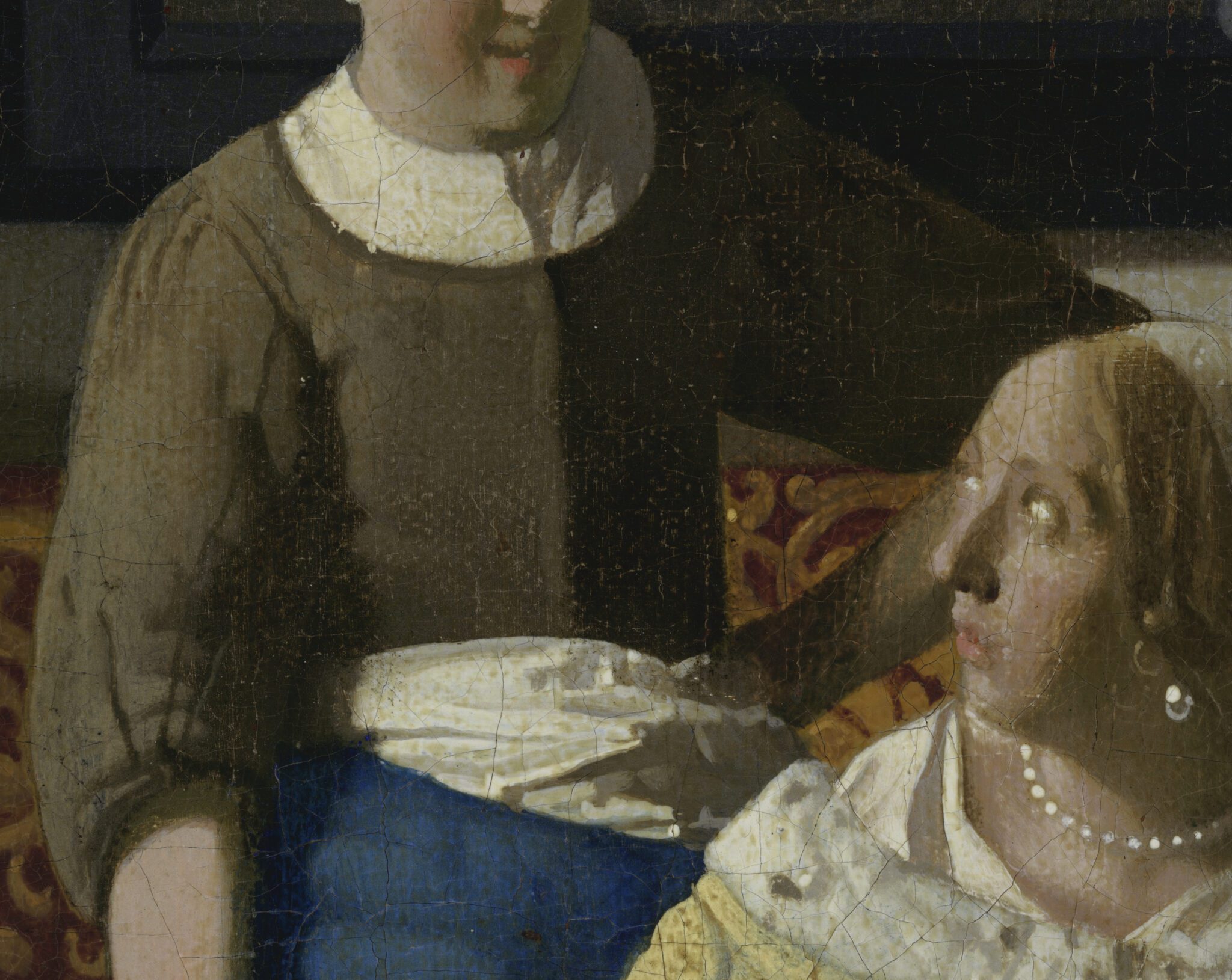
Similarly, the maid’s shirt and jacket call for a comparison with the same garments worn by the servant in A Woman Writing a Letter, with Her Maid (figs. 73, 74). There, Vermeer brushed broad but neat strokes in white and different hues of gray to suggest the shirt’s slightly crinkled surface lit by direct sunlight. Using a light gray tone, he rendered the sheen on the front of the maid’s otherwise brownish-gray jacket. Both the shirt as well as the jacket in The Love Letter, however, appear duller and flatter. Compare, for instance, the maid’s right sleeve with that in the Dublin painting, where Vermeer conjured volume by apposing and stacking broad strokes in different shades of gray. In the Amsterdam picture, the artist vertically dragged strings of dark brown paint across a mid-brown sleeve to create the impression of creases. This technique does little to convey three-dimensionality, instead imparting a muddy character to the fabric.
The modeling of the lady’s cittern exemplifies how the painter of The Love Letter was less preoccupied with, or less adept at, rendering smooth contours than Vermeer (fig. 76)—compare the sleekly delineated curves of the stringed instruments in The Guitar Player (see fig. 67) or A Woman Seated at a Virginal (figs. 75).
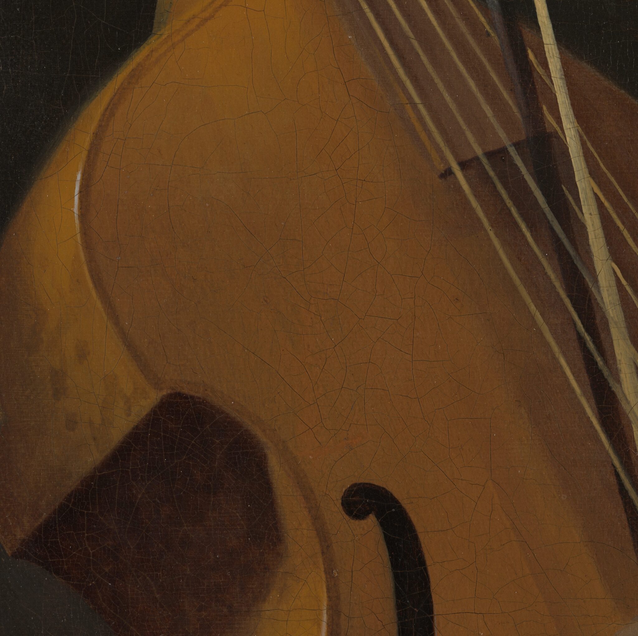
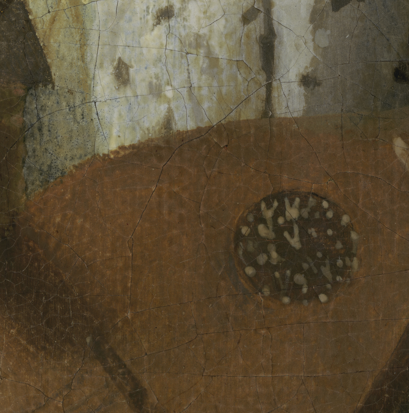
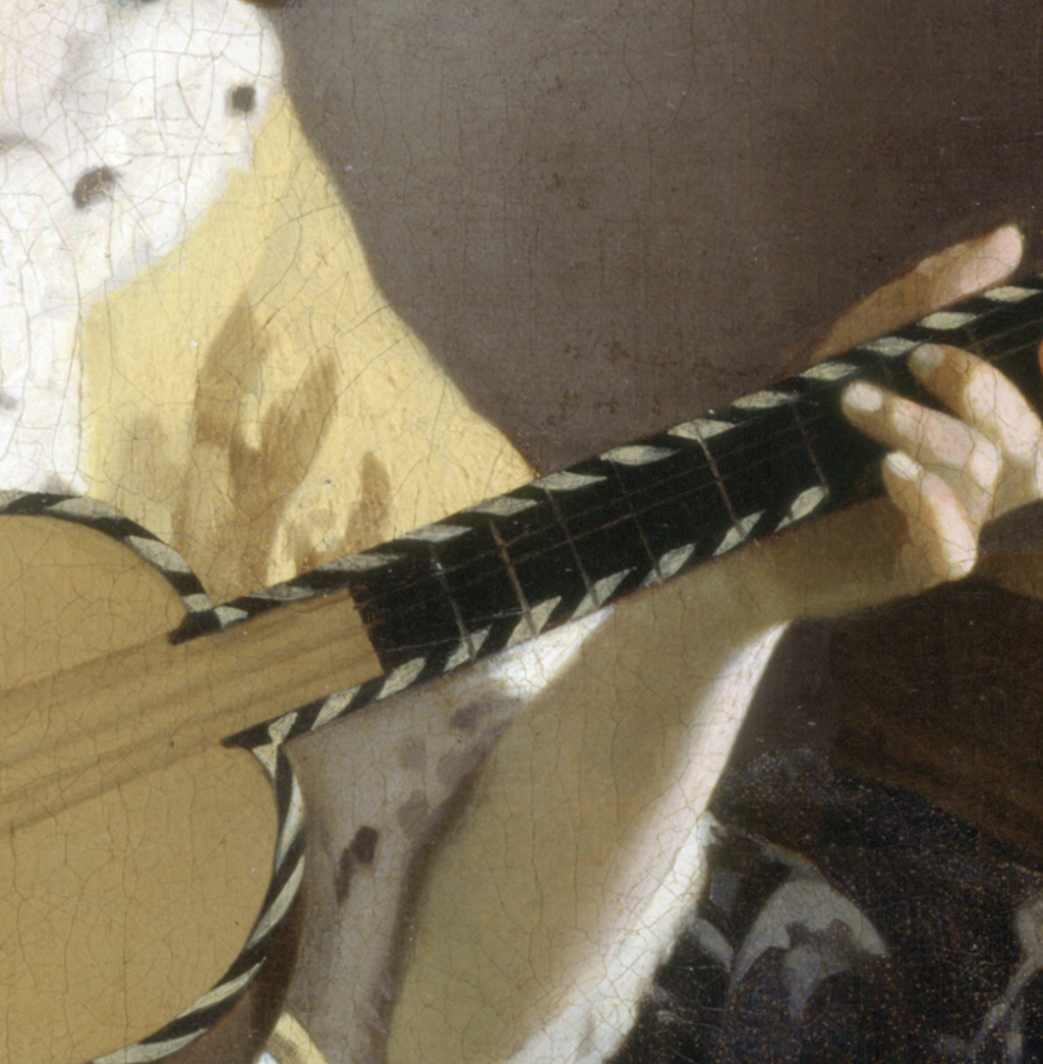
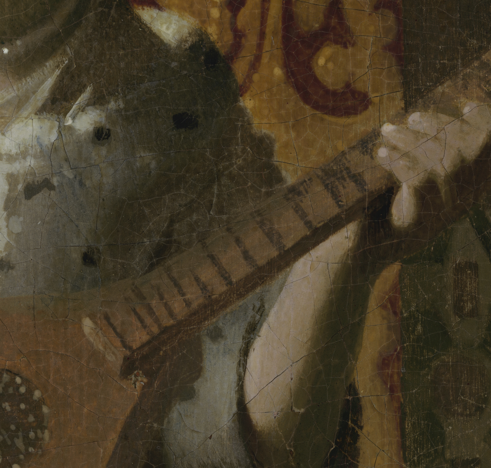
They created the top of the body of The Love Letter’s cittern by stopping and starting some strokes every few millimeters and brushing others vertically—that is, perpendicularly to the edge—giving it a serrated appearance. Only toward the neck of the cittern did the artist render the boundary between the wood and the fur of the lady’s jacket behind it in a fluent line. Similarly jagged edges and saw-toothed contours can be found throughout the Amsterdam painting. Likewise, the cittern illustrates the artist’s lack of precision and consistency: note how they suggested the frets on the neck of the instrument with unevenly spaced strokes of dark brown paint of different thicknesses (fig. 78). Compare them to those in Vermeer’s Guitar Player, which stand out for their impeccable execution (fig. 77).61
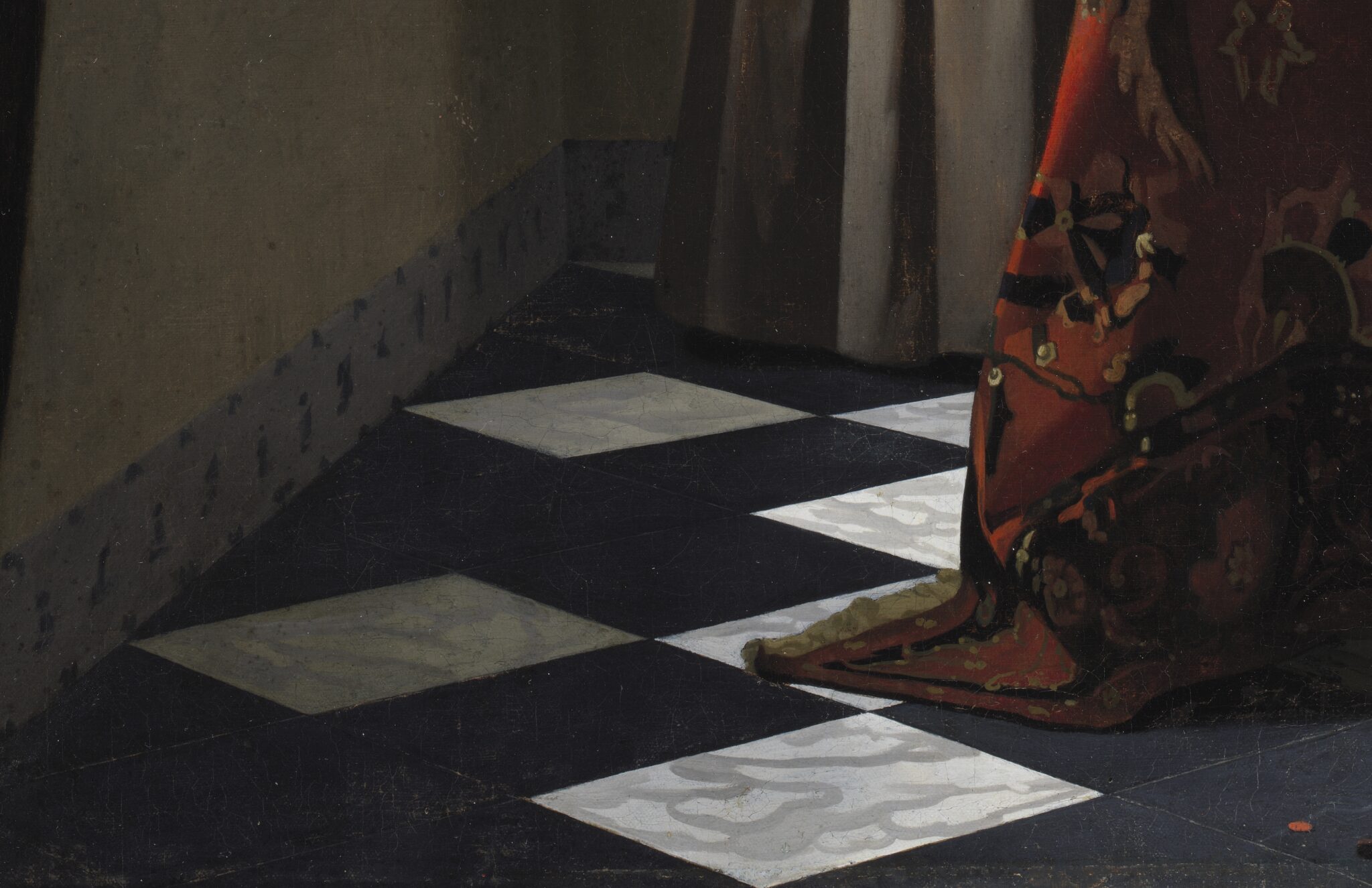
The discrepancies in paint handing extend to the interior and the objects within it, starting with the floor (fig. 80). Similar black-and-white tiles appear in nine of Vermeer’s extant works, ranging from the early 1660s until the mid-1670s (see, for example, fig. 79). Unsurprisingly, he varied the density and opacity of the gray veins on the white marble slabs in each painting. However, Vermeer’s technique for suggesting naturally occurring swirls did not change significantly over time: he brushed long, sweeping lines that divaricate into shorter branches, each of which curves differently. Cursory as they may seem, he painted them methodically, in accordance with the recession of the tiles in perspective. By contrast, the artist of The Love Letter created many of the veins with short, quickly brushed, cup-like, interlocking strokes that resemble one another—reflecting a repetitive manner of application. Moreover, because the curves do not adequately follow the recession of the tiles, they appear to lie on top of the stone rather than being integrated into it.62
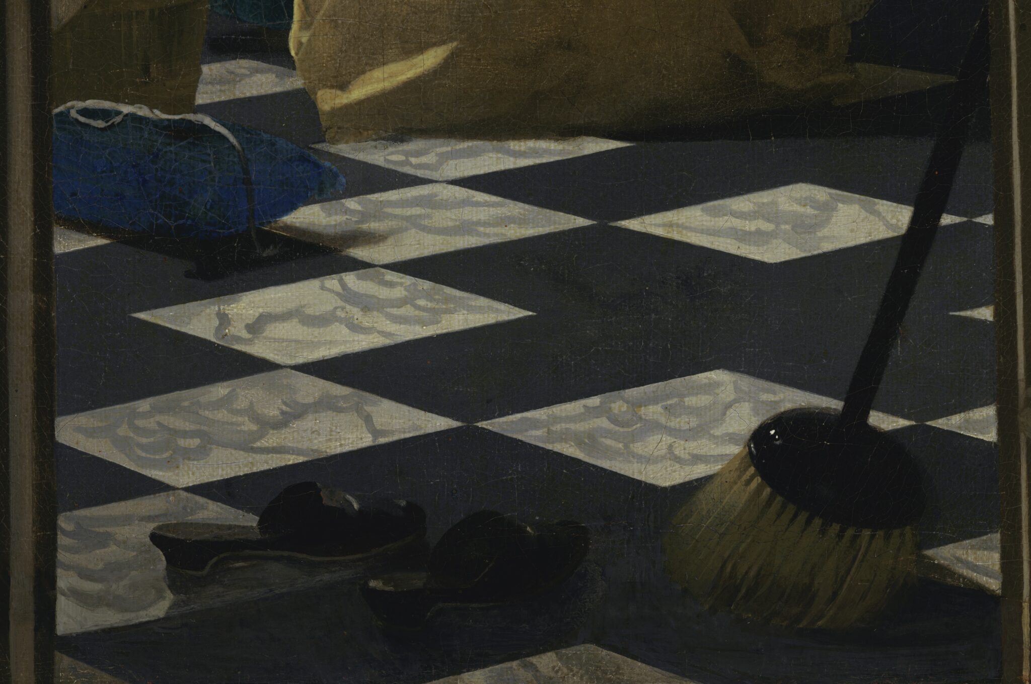
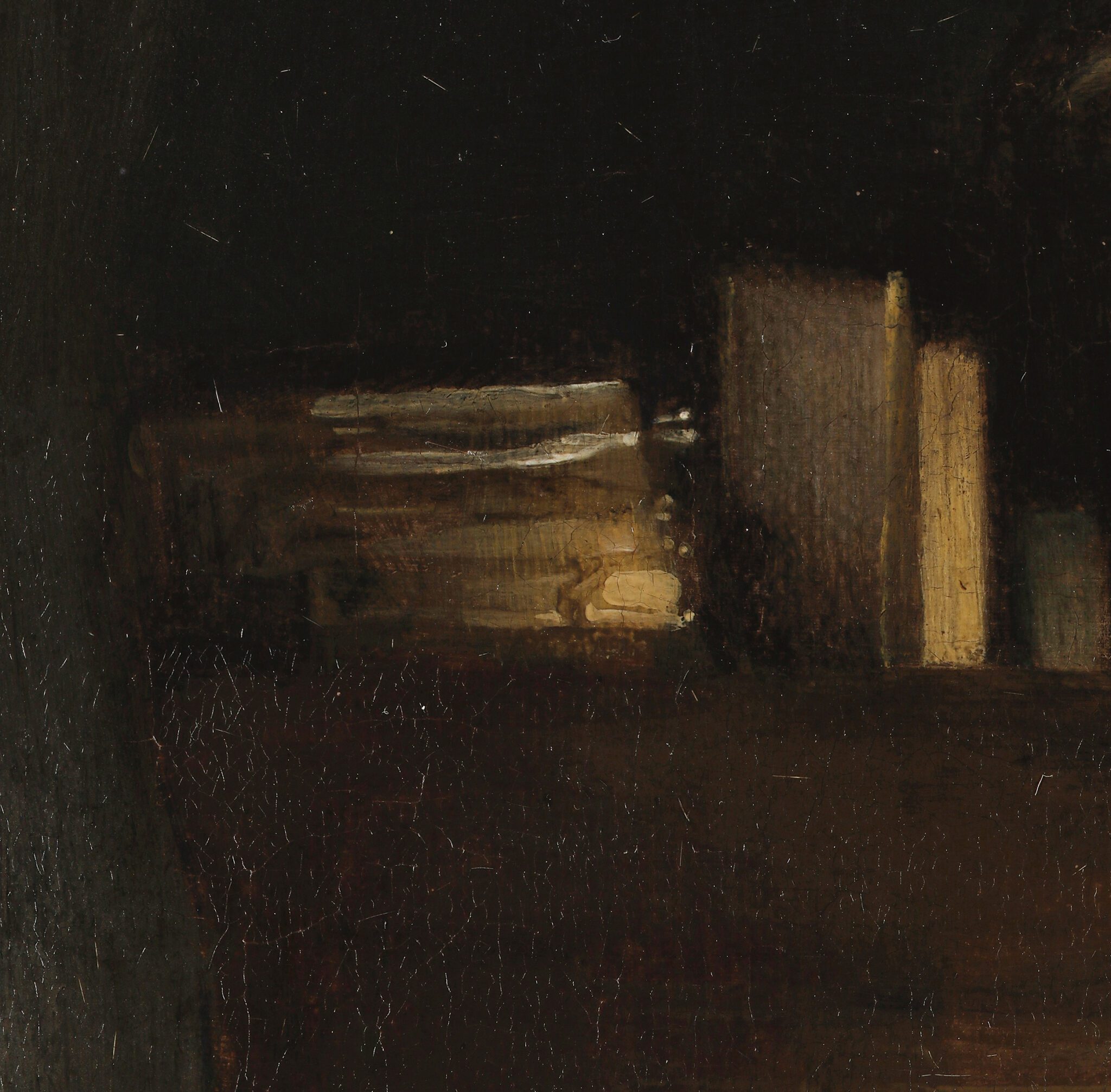
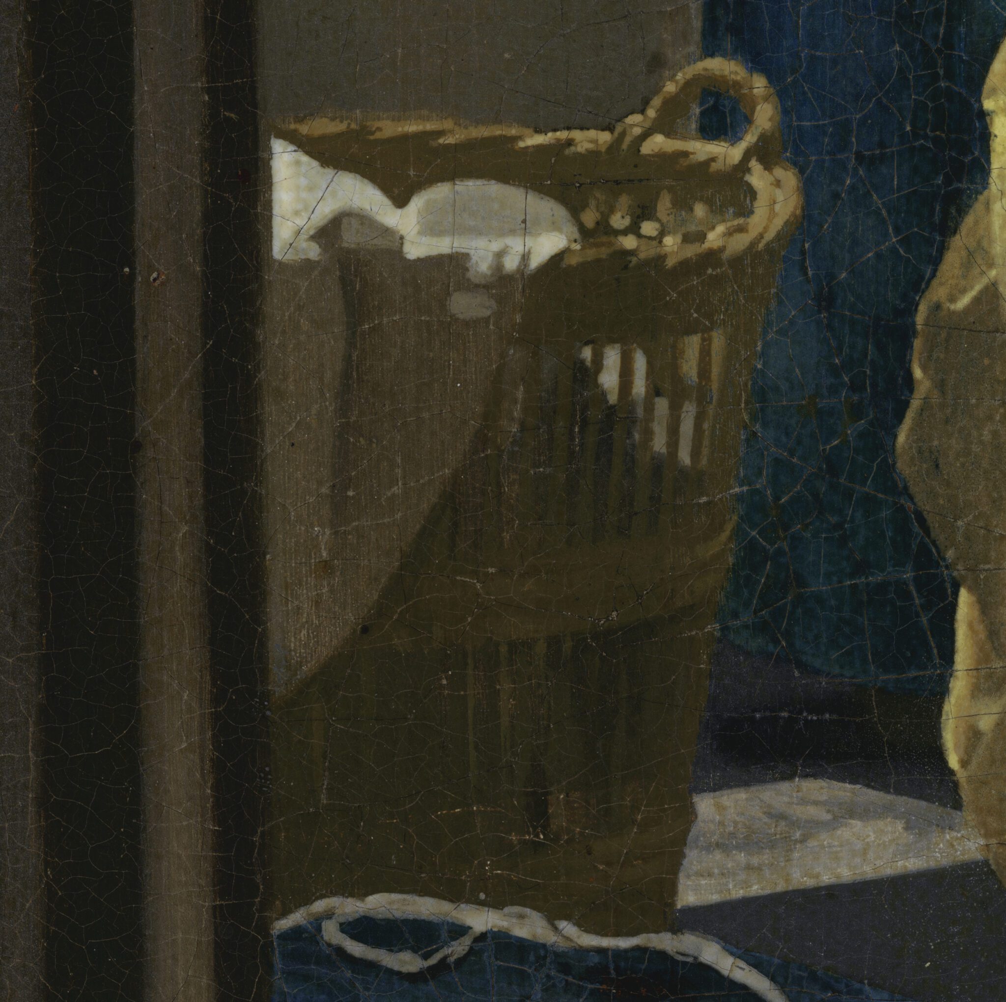
The artist of The Love Letter painted the objects on the floor with varying degrees of proficiency.63 Take, for instance, the wicker sewing basket. The artist painted its straw rim and handle sketchily but skillfully, embellishing them with light brown pointillés. However, the vertical brown lines below, which suggest individual straws, exhibit marked variation in opacity, coverage, thickness of application, and the tidiness of their contours, resulting in a streaky appearance. This may be due to the artist not fully loading their brush with each straw or applying the paint inconsistently. Streaky brushwork is occasionally visible in Vermeer’s mature work, though he generally employed it with a clear artistic purpose—for instance, to evoke the flimsy pages of books in the background of The Geographer (fig. 81). Throughout The Love Letter, one encounters streaky passages that rarely serve a clear pictorial objective (fig. 82).
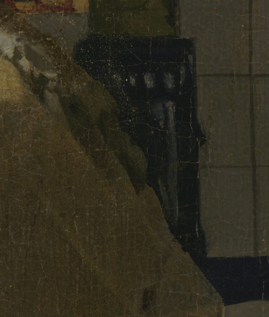
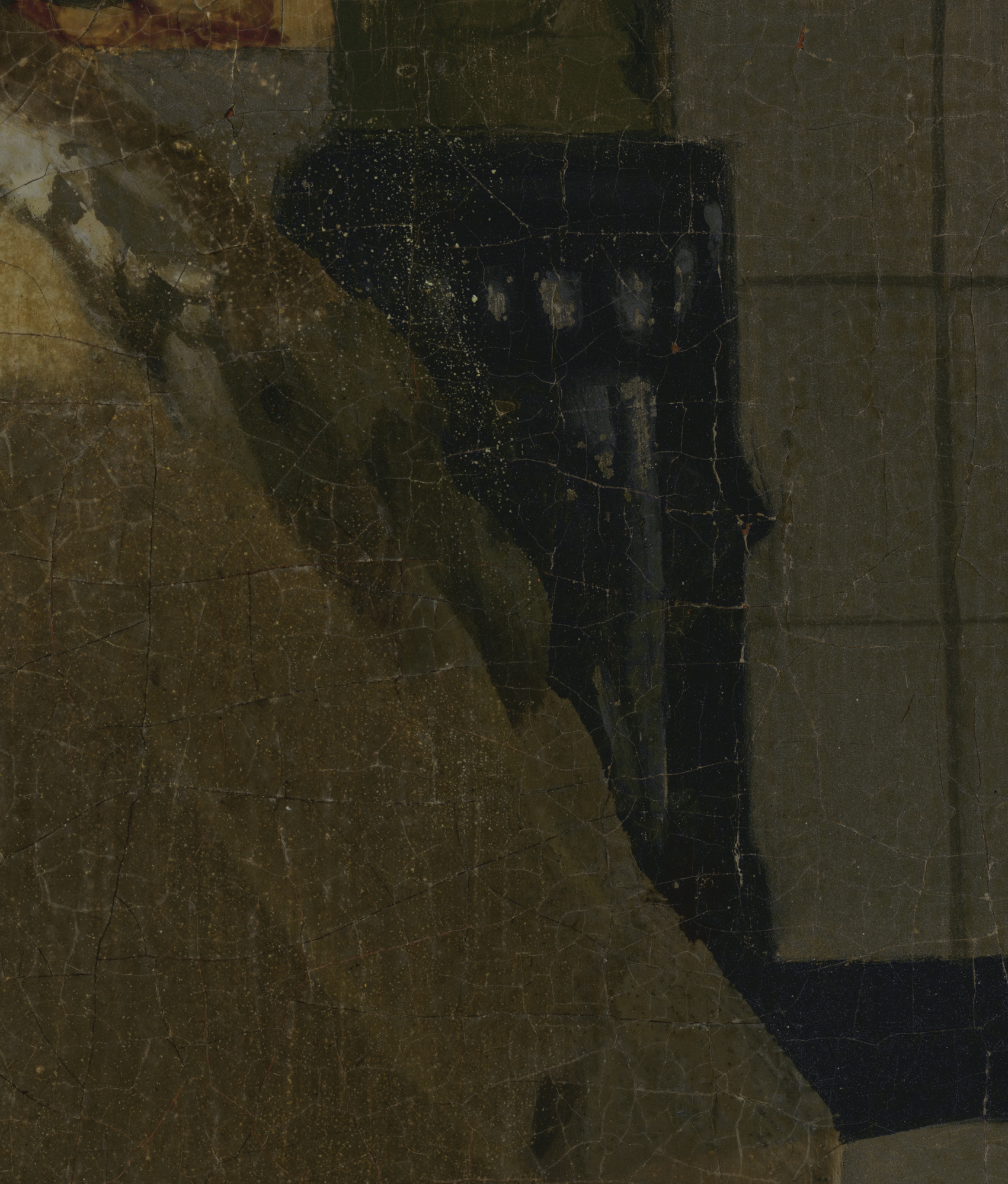
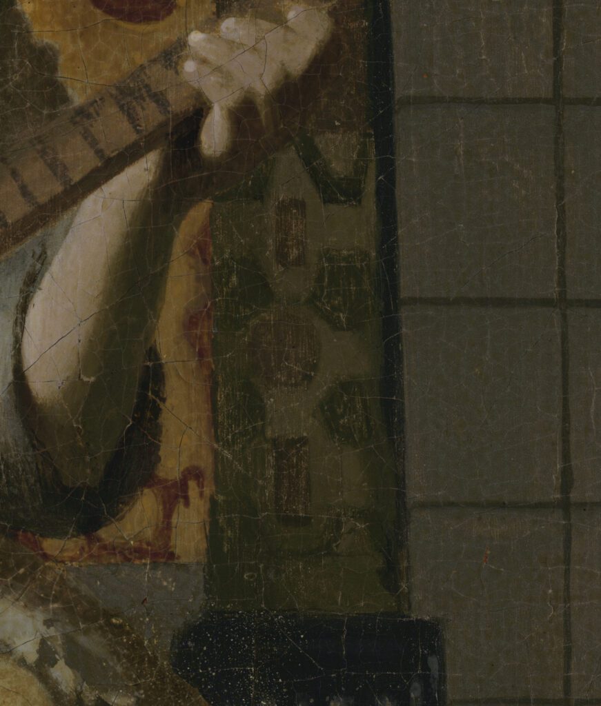
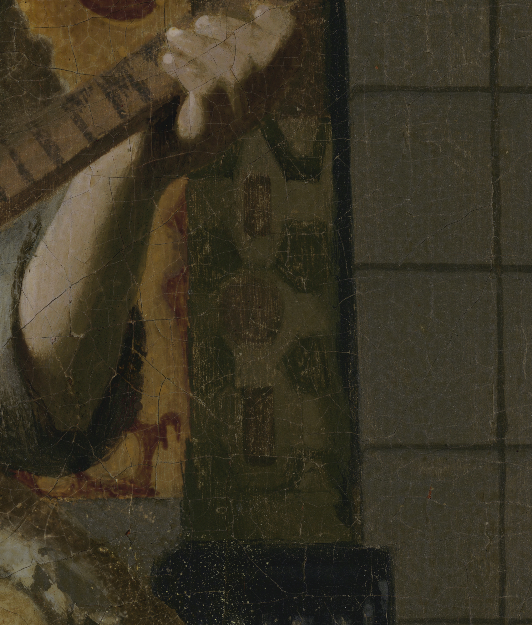
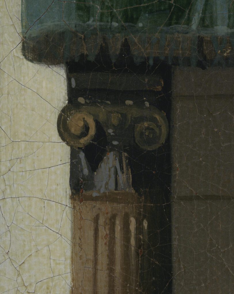
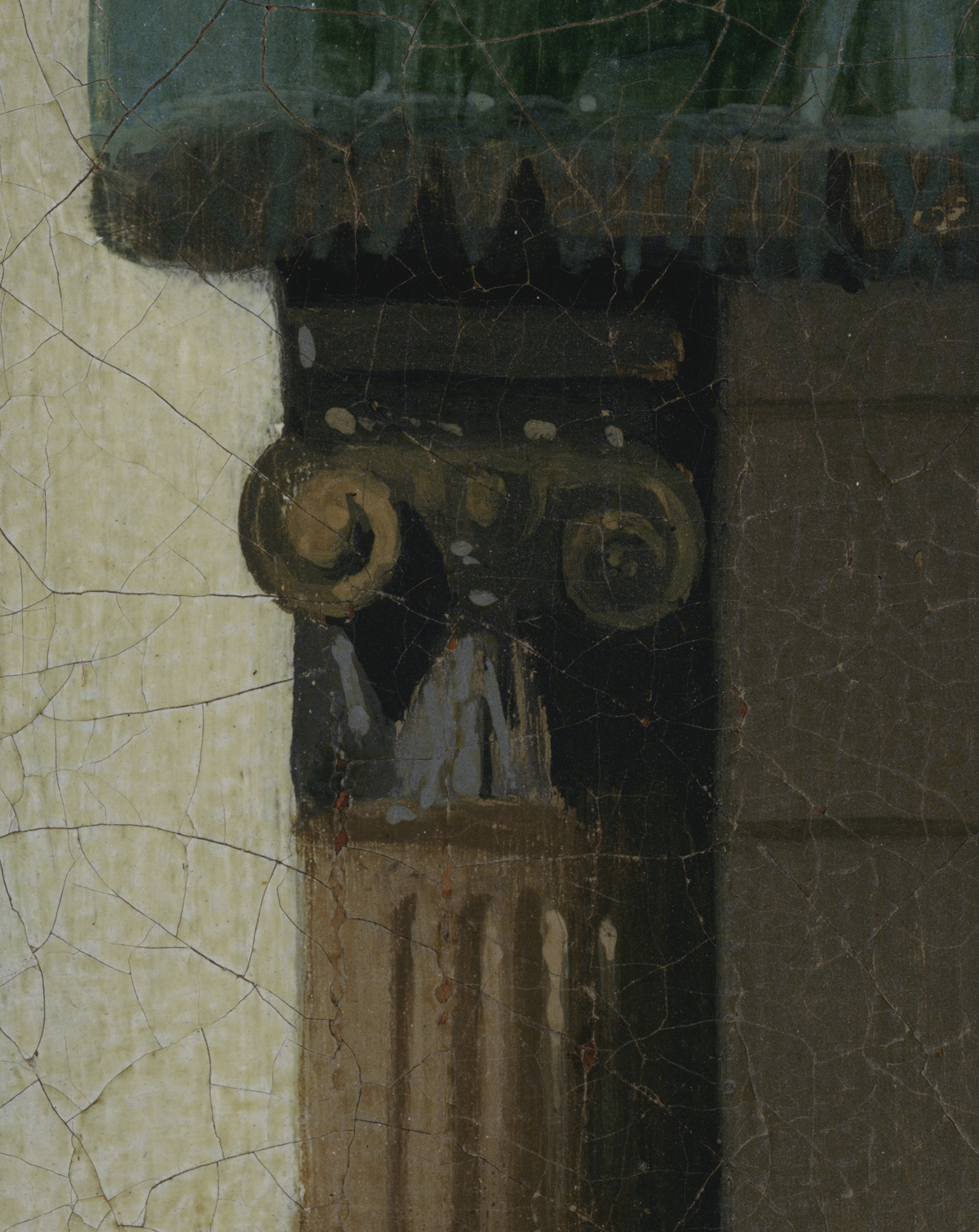
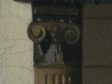
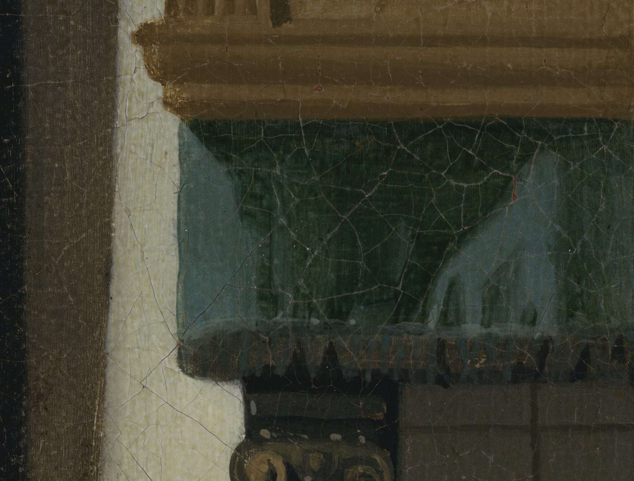
The fireplace surround is arguably the most carelessly painted area in the Amsterdam painting.64 In the black stone base, incised with cannelures, decorative lines run crooked, brushstrokes stick out, and mottles of gray paint appear where they were likely not intended (fig. 83). Above it, a piece of light green fabric, bearing a markedly unbalanced pattern of red and dark green shapes, jars in color and pattern with the gold leather to the left (fig. 84).65In the capital that tops the pilaster flanking the left side of the fireplace, the blotchy Ionic scrolls are not only different in size but also crooked in relation to each other (fig. 85).66 The purpose of the blue-grayish brushstrokes below is not entirely clear: some seem to represent diffused highlights, while others outline an unidentified triangular element.
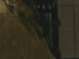
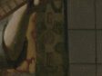
The rendering of the teal curtain, finally, appears to mimic Vermeer’s abstracted yet vivacious modeling of fabrics in his work of the late 1660s and early 1670s, such as that of the scientist’s sleeves in The Astronomer (figs. 86, 87). Yet the contrast between the illuminated and shaded parts of the fabric looks clunky and unconvincing by comparison.67
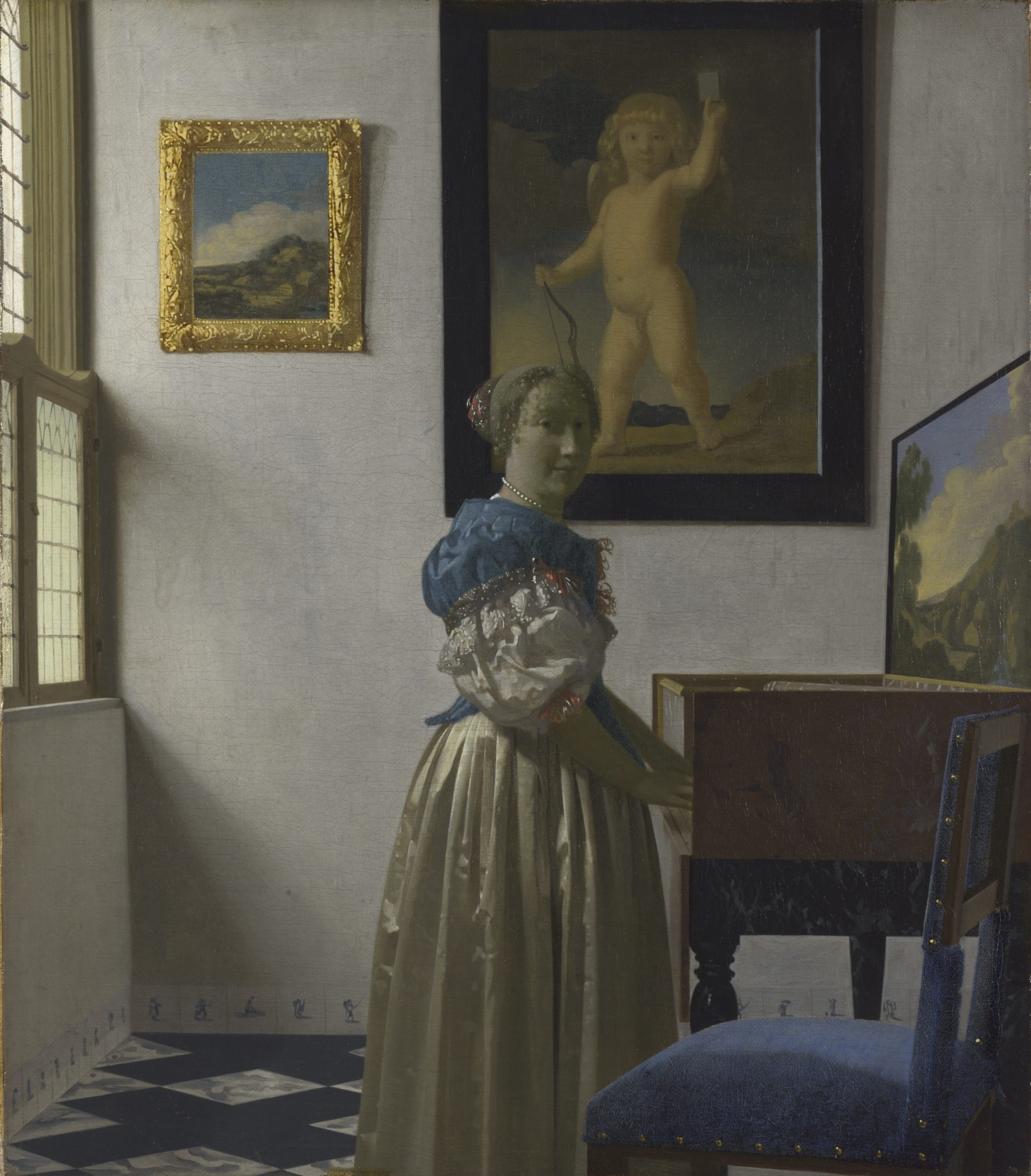
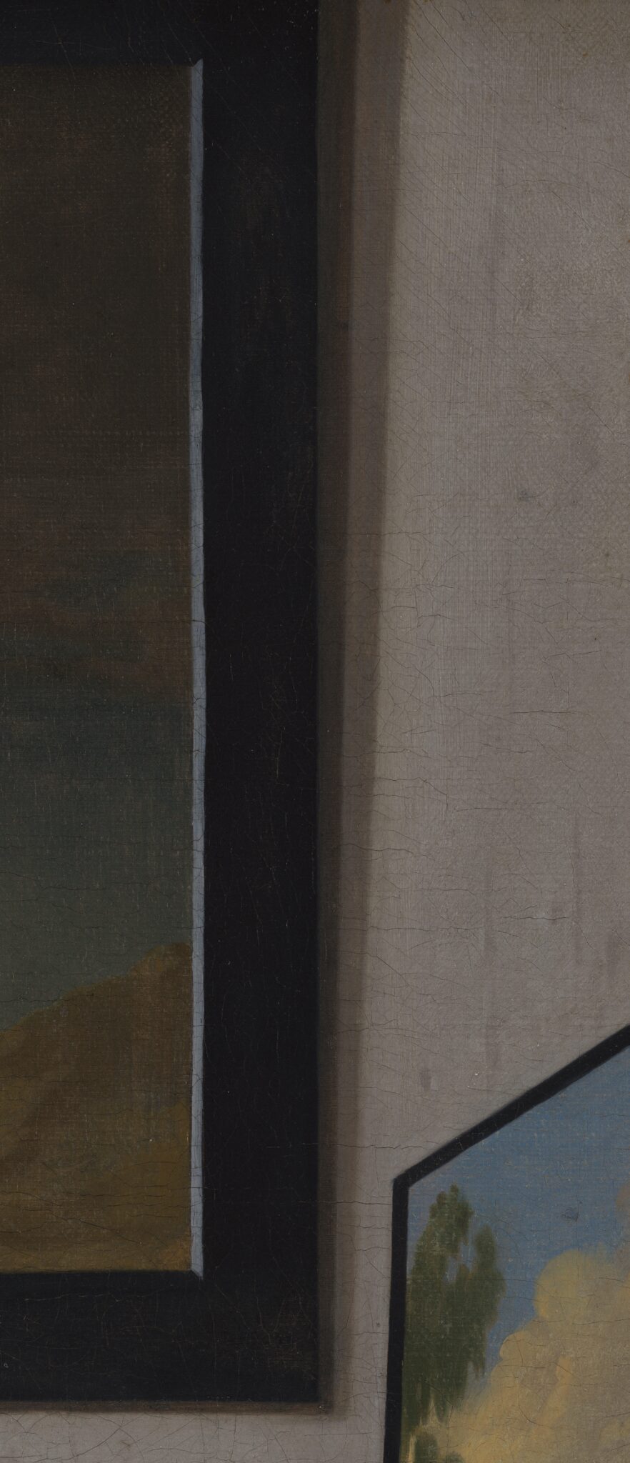
To the left of the fireplace, two paintings embellish the back wall. While this article does not address the execution of the land- and seascape proper, the light reflections on the frames and the shadows they cast lend themselves to a comparison with Vermeer’s work. For instance, by inserting the light bluish-gray strip on the right inside of the frame of the seascape, the artist mimicked an effect appearing in Vermeer’s work, including A Woman Standing at the Virginal (fig. 88).68 However, the artist of The Love Letter did not position the reflection flush with the painted surface, leaving a thin black line (partially covered with dark gray) visible between them.69
The angle of the shadows cast by the frames signifies that the window through which the light enters the room is situated considerably higher than both works of art (fig. 90). Yet the landscape on the top already hangs at a significant height in comparison to other paintings in Vermeer’s interiors. Still, Vermeer typically represented the angle of his shadows smaller than in The Love Letter, suggesting that the windows through which daylight illuminates his paintings are only marginally higher than his frames.70 Either the artist of the Amsterdam picture intended to imply windows placed at an unusually great height, or, more likely, they did not reflect properly on the angle of the shadows.
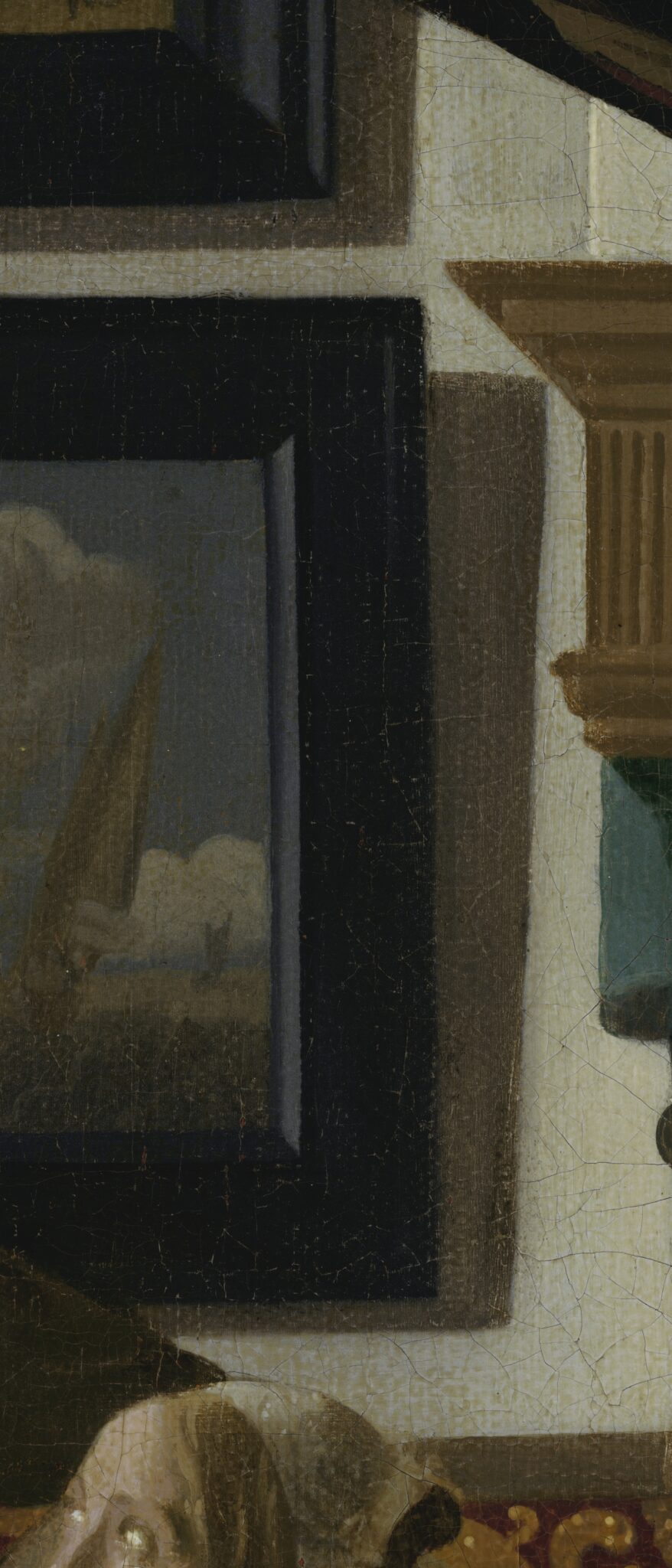
Moreover, the shadows register as stylistically peculiar. Vermeer’s frames (and maps) cast either soft or double shadows. In A Woman Standing at a Virginal and The Guitar Player (compare figs. 89 and 91), his double shadows appear a fraction harsher in accordance with the more schematic rendering of surfaces in his late work. Yet they remain nuanced because of their gentle coloring, hazy edges, and round corners. By contrast, the singular shadows on the back wall in The Love Letter leap out as dark, flat, and sharply edged and cornered, marking a notable deviation from Vermeer’s style (see fig. 90).71 Moreover, the close juxtaposition of the two frames, their shadows, and the wooden cornice of the fireplace surround creates an uncomfortable convergence of several spiky corners—a feature absent from Vermeer’s work.
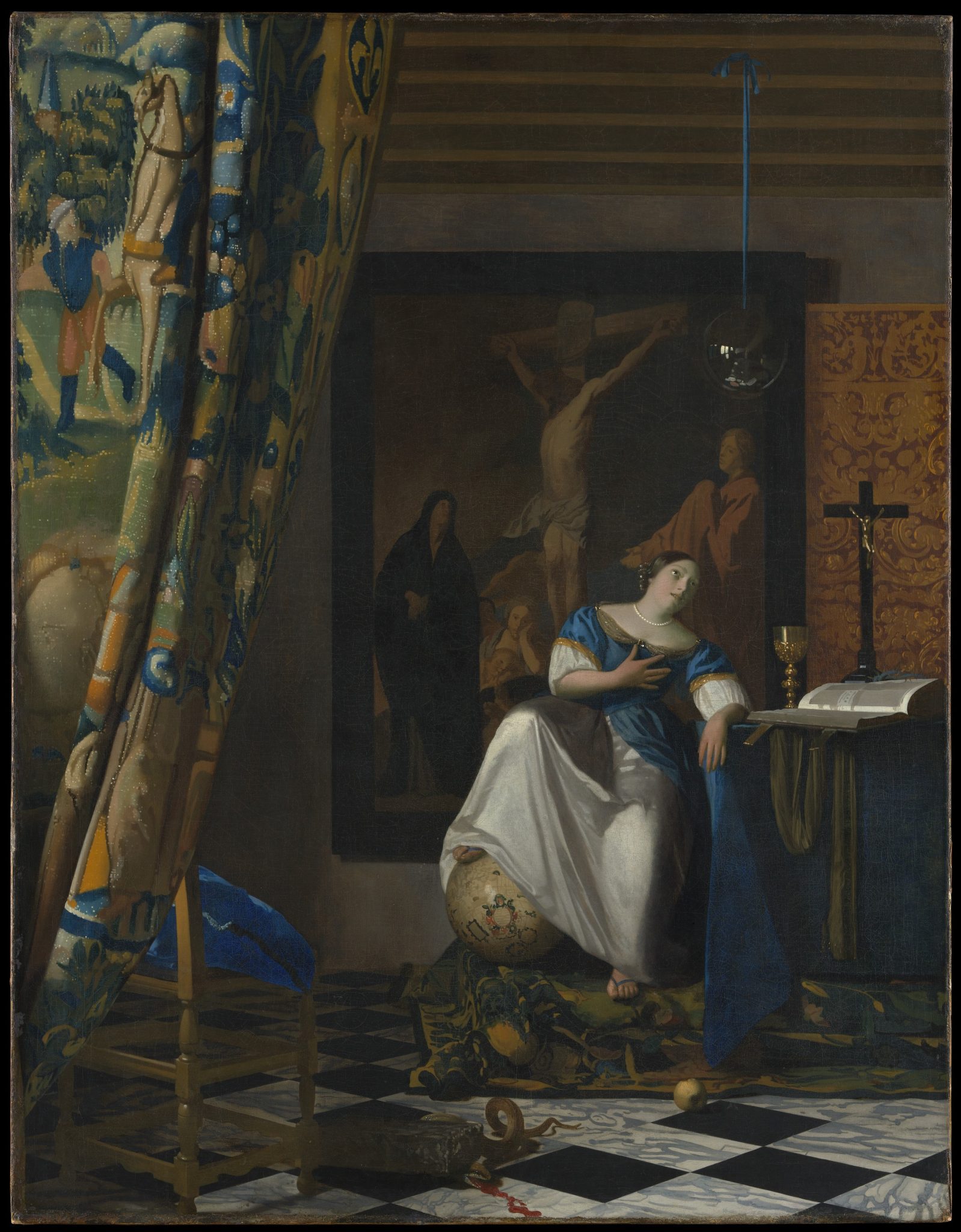
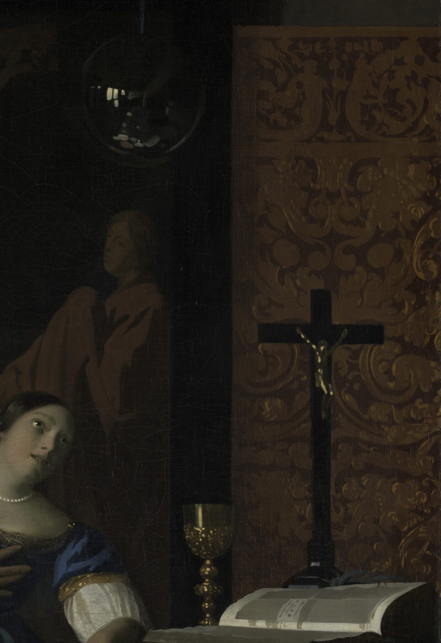
Another clash, this time in colors and patterns, occurs in the center of the composition as a result of the horizontal strip of red-gold leather on the back wall.72 The same gold leather appears in the background of The Allegory of the Catholic Faith (fig. 92), where it brightens an otherwise dark corner and highlights a black crucifix (fig. 93). Because of the differences in scale between the two paintings, it is risky to compare their execution of the gold leather. However, we can establish that the decorative pattern in the Amsterdam picture is a simplified version of that in the monumental allegory (fig. 94). Moreover, in The Allegory of the Catholic Faith, the meticulous rendering of the ornamental scrolls and their shimmering reflections along the edges of the curls—evoking embossed leather—suggests that Vermeer worked from direct observation. The shorthand execution of the gold leather in The Love Letter does not convey the same impression.
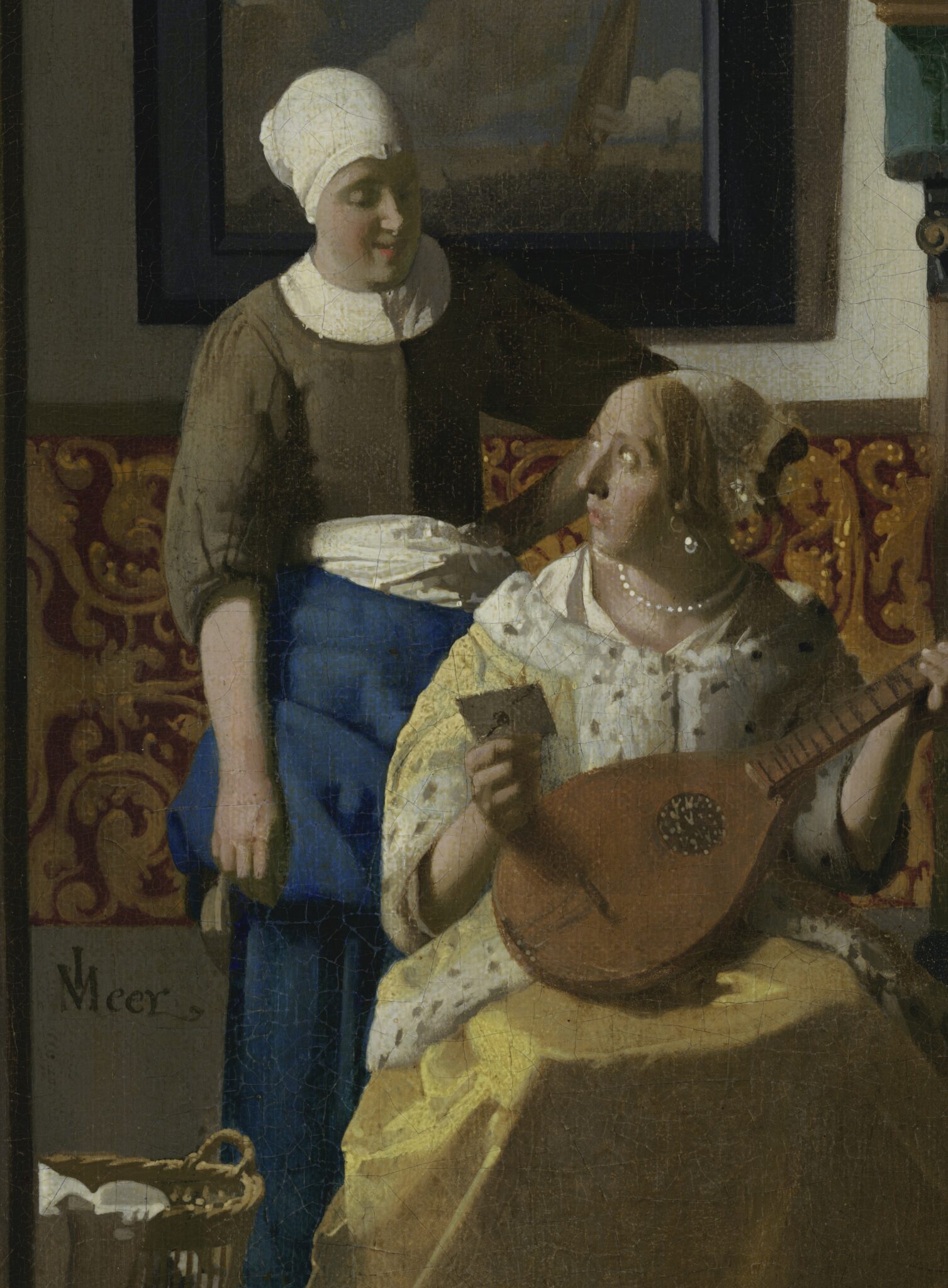
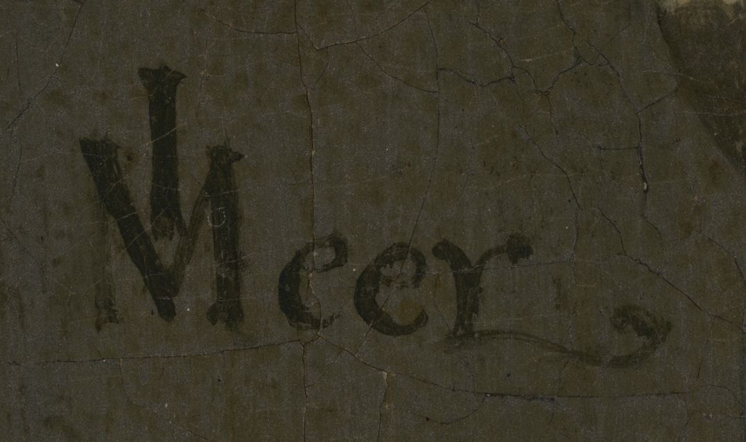
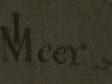
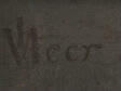
Finally, the Amsterdam painting bears a signature on the back wall, above the basket (fig. 95). Interrupted by the craquelure but preserved in good condition, it reads IVMeer, with the first three letters in ligature and the last ending in a fancy curl. This type of signature can be found on nine paintings by Vermeer, dating between the early 1660s and the mid-1670s.73 Close examination of the inscription suggests that the letters are rendered with conspicuously short, jerky strokes—possibly pointing toward an artist copying an example rather than confidently brushing continuous lines visualized in their mind’s eye. They diverge from each other (in the bottom of the “I”), stray outside the intended area (at the top of the “M”), create bulges and serrations on what should otherwise be straight or curved lines (in the second “e”), and result in crooked serifs (on the “I,” “V,” and “M”). This by no means implies that all lines, curves, and serifs in Vermeer’s inscriptions in his late works are straight and even, but they are more so than what is found in The Love Letter (compare figs. 96 and 97). Furthermore, the extended serif at the bottom of the “r” in the Amsterdam painting reveals a sense of bravado. By comparison, the signatures in Vermeer’s works, including the swirls on the final “r”s, consist of more steady, carefully applied strokes. It is impossible to establish with certainty whether the artist of the Amsterdam painting added the inscription, but the unsteady paint handling offers a hint in this direction.74 As far as a comparison with signatures of the same type in Vermeer’s late works permits, it is less likely to belong to him, but this remains debatable.75 The possibility that a third party placed the signature on the canvas should not be excluded either.
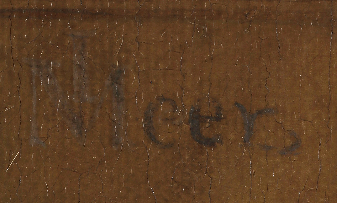
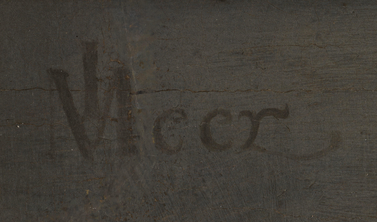
In summary, the attribution of The Love Letter to Vermeer is difficult to sustain because of its marked departure in brushwork and style from his undisputed works of the late 1660s and early 1670s. These discrepancies are evident throughout the visible surface of the Amsterdam painting but are especially apparent in areas that lend themselves to one-to-one comparison, such as the facial planar highlights, the yellow jacket, the maid’s sleeve, the marble floor, and the shadows cast by the frames.
The Love Letter: An Ambitious Variation
The relationship between The Love Letter (fig. 57b) and Vermeer’s works of the late 1660s and the first half of the 1670s is more complex than that between The Glass of Wine and his paintings of a decade earlier. The Amsterdam picture does not align as closely with any of Vermeer’s paintings as its counterpart in Berlin. In fact, the crammed composition, anecdotal storytelling, peculiar shadows, and clashing colors, patterns, and shapes distinguish it from Vermeer’s work. This makes it unlikely that Vermeer devised the composition and another artist completed it, or that the Amsterdam painting is a copy after a lost original.
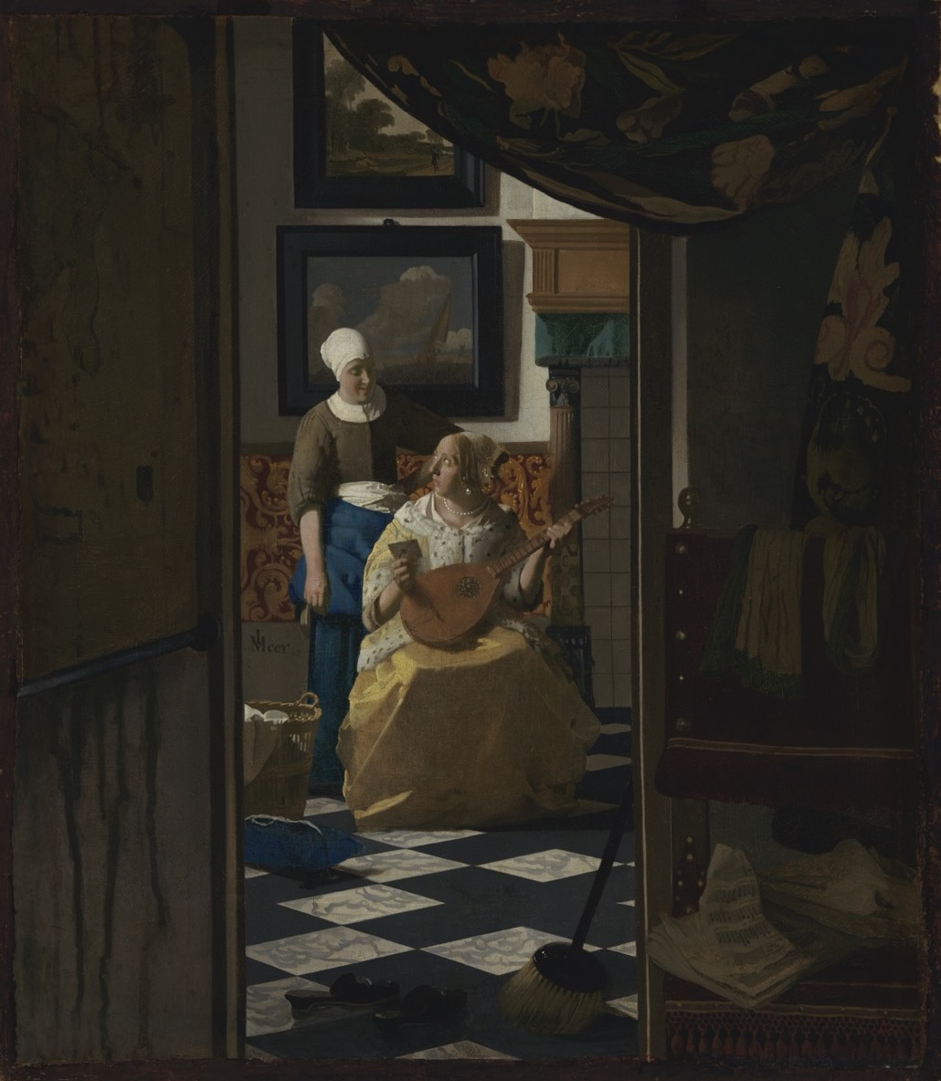
Still, The Love Letter comprises many elements that are also present in Vermeer’s work, notably the combination of a yellow “ermine”-trimmed jacket and a pearl earring and necklace, which appear in four of his compositions of the 1660s.76 Other aspects found in several of his works include the marble floor, the map of Holland and West-Friesland on the left, the curtain in the top right corner, the contrast between yellow and blue, items scattered on the floor, paintings on the back wall relating to the foreground scene, and the bars of a picture frame “stabilizing” a figure’s head and shoulders in front of it. Other elements in The Love Letter relate to one or two works by Vermeer in particular, such as the circular hair curls to A Woman Seated at a Virginal (see fig. 66) and the gold leather to The Allegory of the Catholic Faith (see fig. 93). Likewise, the reddish chair in the right foreground resembles the ones in The Art of Painting (ca. 1666−1668; Kunsthistorisches Museum, Vienna) and A Woman with a Pearl Necklace, while the green scarf draped over the chair in the foreground looks similar to the one lying on the table in The Allegory of the Catholic Faith (figs. 98, 99). Finally, as noted above, the subject of a maid delivering a letter to her unsettled employer echoes that of Mistress and Maid (see fig. 58).
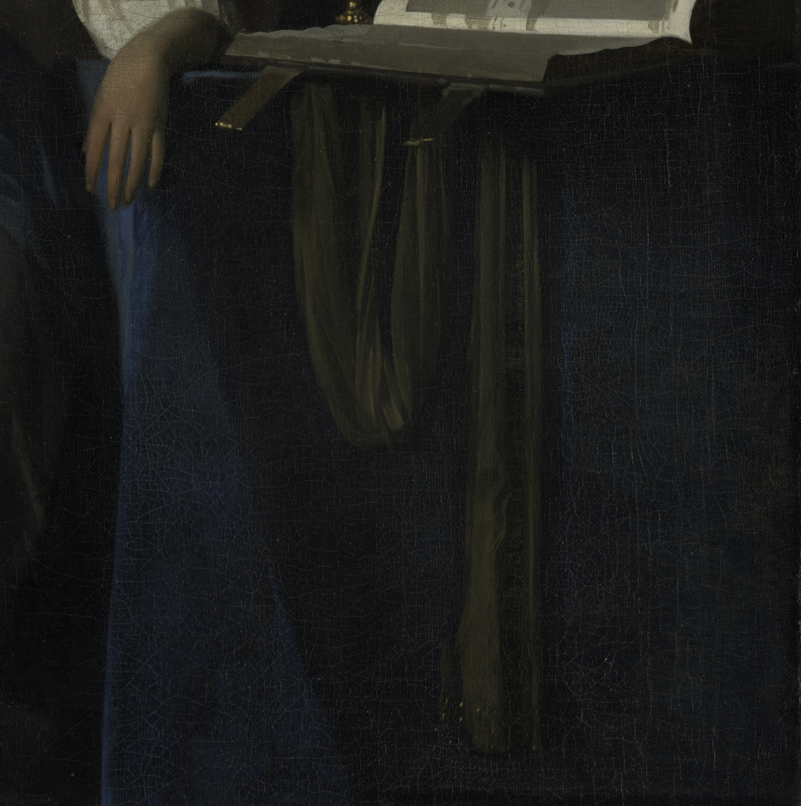
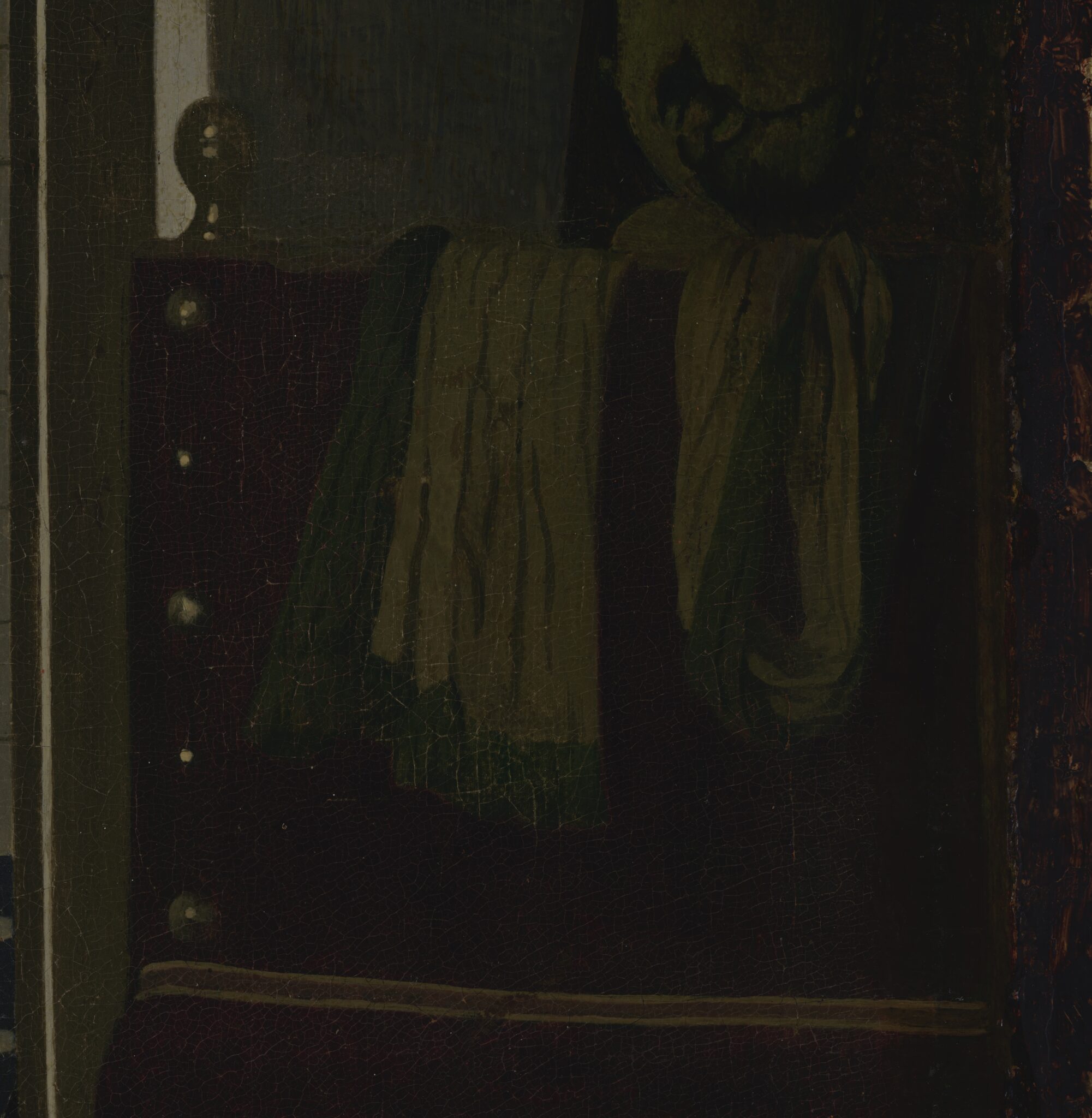
Other elements in The Love Letter are absent from Vermeer’s paintings: the fireplace, the sewing basket, the slippers, and the broom.77 What about the doorkijkje (see-through)? Vermeer had employed this pictorial device, providing visual access to an adjacent room, in his earliest domestic genre scene, A Woman Asleep (ca. 1656−1657; The Metropolitan Museum of Art, New York).78 Yet The Love Letter features a more ingenious construction, which places the viewer in a dimly lit hallway, peeping into a bright room, where the lady and her servant exchange glances. The artist of The Love Letter may have adopted this spatial arrangement from Vermeer’s Gentleman Washing His Hands, which surfaced at an Amsterdam auction on May 16, 1696, together with twenty of his other works, but has been missing ever since. The catalogue described it as “(A painting) in which a gentleman washes his hands, in a see-through room, with figures, artful and rare.”79 The fact that the auctioneer listed the words “in a see-through room” immediately after summarizing the protagonist’s principal action—while omitting such a reference in their description of A Woman Asleep—suggests that the painting included a more prominent doorkijkje, possibly similar to the one in The Love Letter.80 Still, there is no certainty that A Gentleman Washing His Hands preceded the Amsterdam painting, however logical this may seem.81 Either way, Vermeer likely did not invent this type of doorkijkje. The Dordrecht painter Samuel van Hoogstraten (1627–1678) explored it in A View of an Interior (“Les Pantoufles”) (fig. 100), which probably predates both A Gentleman Washing His Hands and The Love Letter.82 Van Hoogstraten’s enigmatic interior lacks any figures, but it does include a broom and a pair of slippers, which also appear in the Amsterdam painting. This is unlikely to be a coincidence.
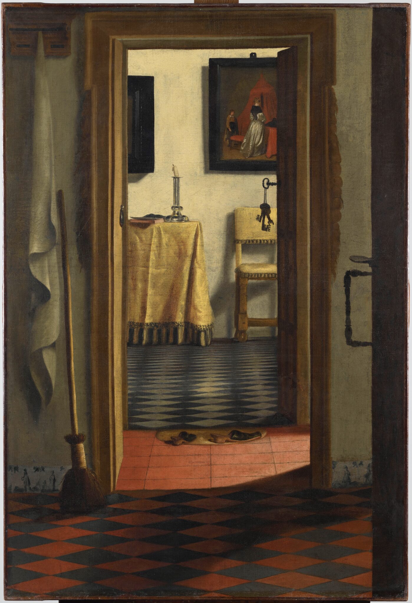
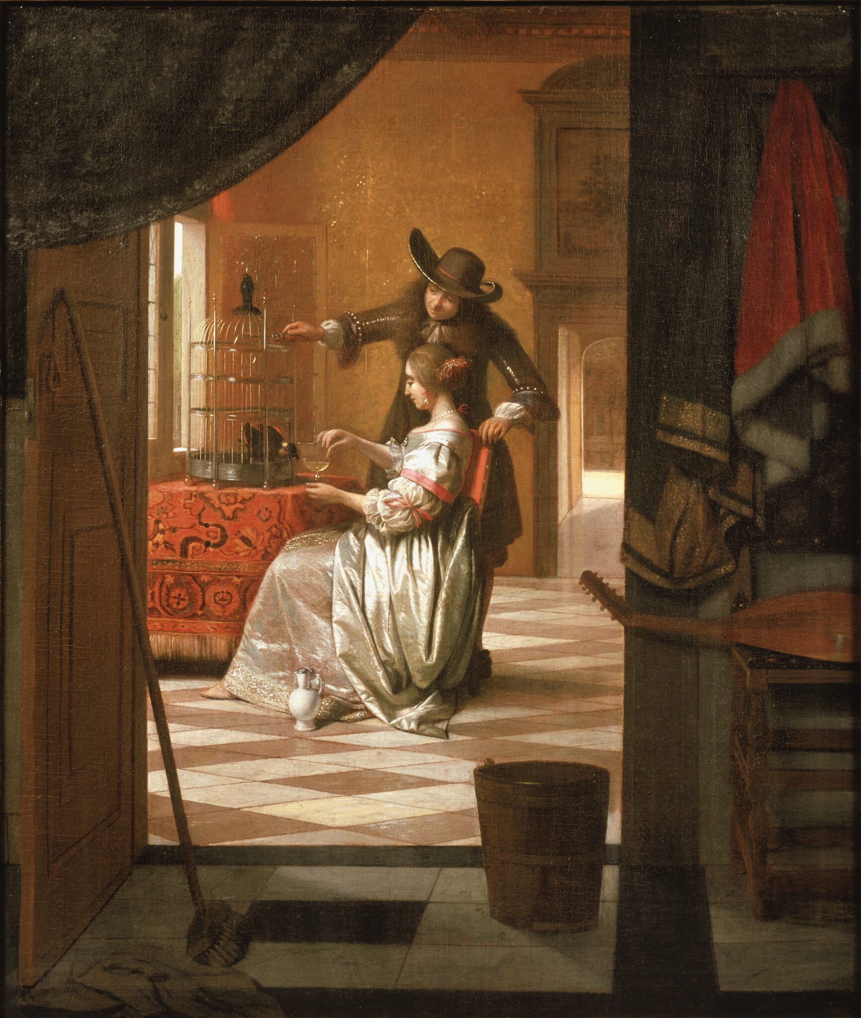
A similar doorkijkje is visible in De Hooch’s Couple with a Parrot, which, like The Love Letter, contains a curtain, broom, and chair in the foreground (fig. 101). Scholars tend to view De Hooch’s interior scene as a response to the Amsterdam painting.83 However, because this article questions the status of the latter painting as an authentic work by Vermeer, we also need to consider the possibility that the artist of The Love Letter instead drew inspiration from De Hooch.84 If so, De Hooch’s interior serves as an awkward terminus post quem; scholars date A Couple with a Parrot to about 1675 or shortly after, so the Amsterdam picture would likely have been completed after Vermeer’s death. However, around this time De Hooch painted one or two other works in which he adopted compositional and stylistic elements from Vermeer.85 This makes it more likely that De Hooch painted these works, including A Couple with a Parrot, following a sojourn from Amsterdam, his place of residence in the 1670s, to Delft. If so, one wonders whether he regarded The Love Letter as a work by Vermeer? Or did De Hooch draw inspiration from Vermeer’s Gentleman Washing His Hands?
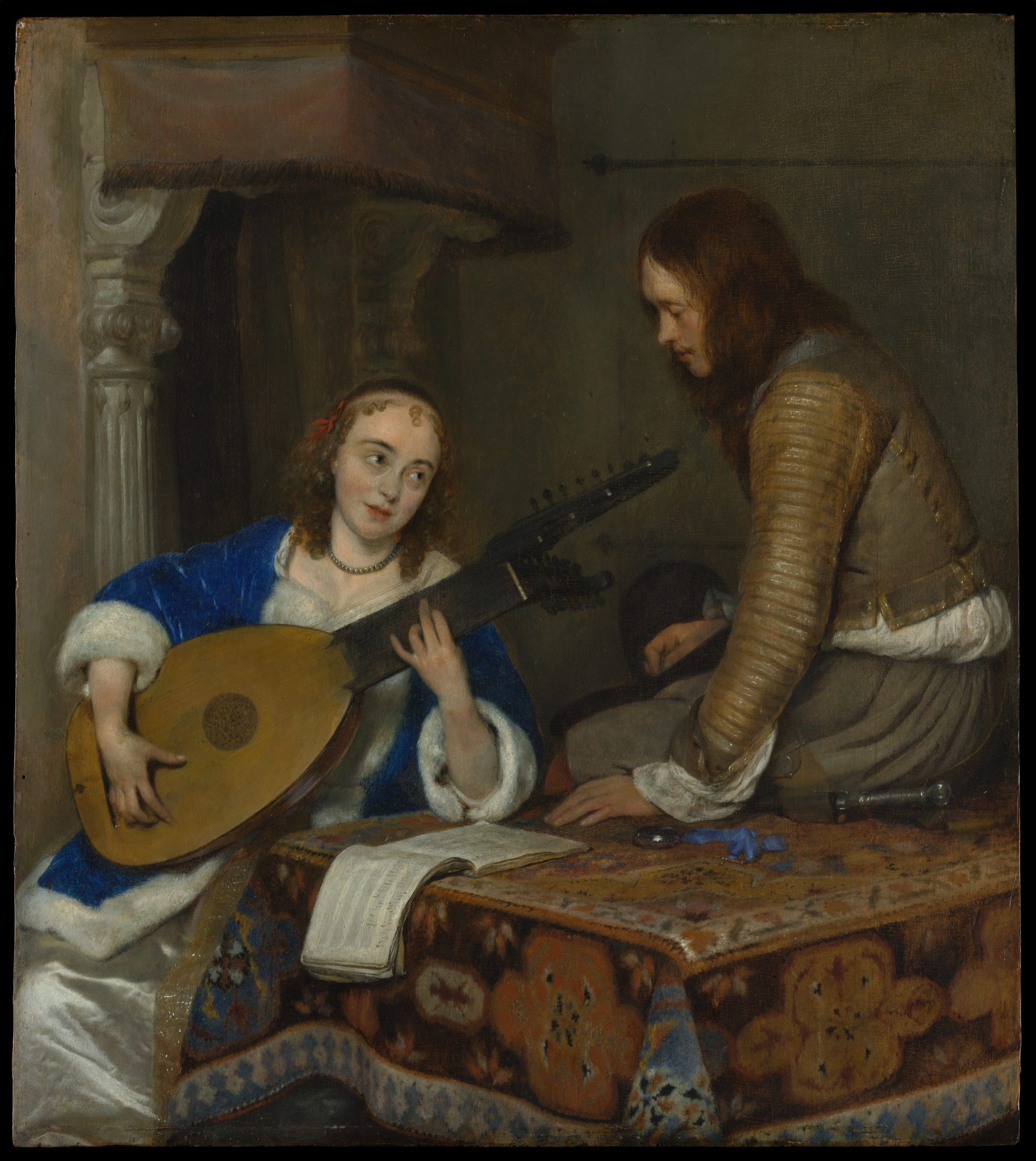
The Amsterdam painting also reflects Ter Borch’s direct or indirect impact. Not only did he popularize the theme of amorous correspondence among genre painters of the third quarter of the seventeenth century; he also introduced the motif of a letter perceived as conveying unwelcome news.86 Several figures glancing from the corner of their eye, sometimes out of worry, populate his genre scenes. Ter Borch also repeatedly depicted seated young ladies peering up at servants, suitors, or female companions, standing or seated at a table next to them (fig. 102). In other words, all the ingredients of the figure group in The Love Letter already appear in Ter Borch’s work, though not combined in this way.87
Finally, Gabriel Metsu’s (1629–1667) Woman Reading a Letter, dating to the mid-1660s, features, like The Love Letter, a maid who has delivered a letter to her seated mistress, standing in front of a seascape (fig. 103).88 It even includes a wicker sewing basket with a white cloth draped over the edge and a discarded slipper in the foreground, just as The Love Letter does. Metsu painted this interior in response to Vermeer’s work—though not to the Amsterdam picture, as some scholars previously assumed.89 In fact, given that The Love Letter dates from several years after Metsu’s death in 1667, it is likely that the anonymous artist drew inspiration from A Woman Reading a Letter.90
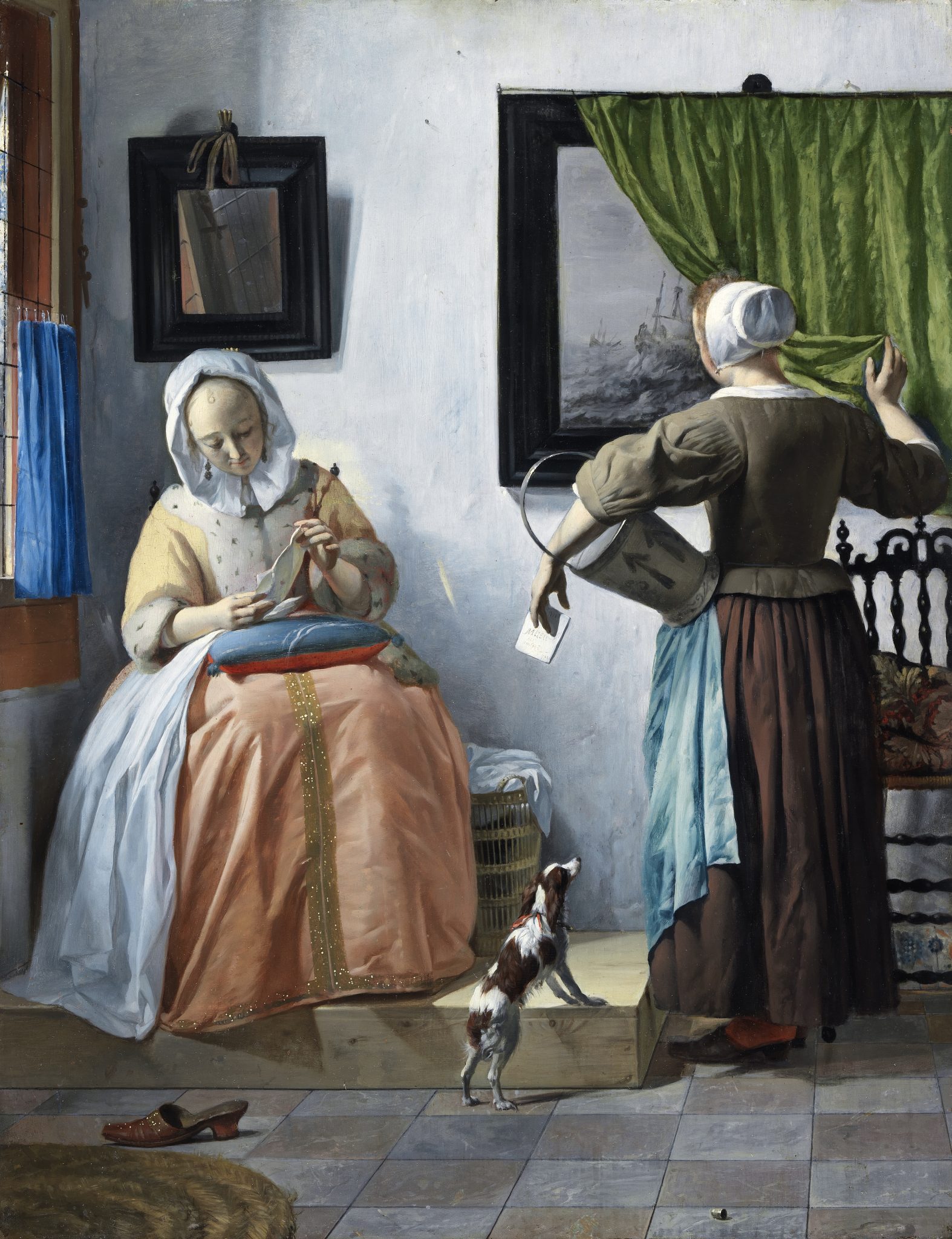
In conclusion, based on observations outlined above, The Love Letter may be best categorized as an ambitious variation on several of Vermeer’s late works, reverberating a range of thematic, stylistic, and compositional elements—with the caveat that it may have been compositionally closest to the untraced Gentleman Washing His Hands. The artist combined them with ideas originating from the work of other contemporary painters, probably including Van Hoogstraten, Ter Borch, and Metsu.
Hypotheses on Authorship
While both The Glass of Wine and The Love Letter feature short, untidy brushstrokes indicative of an unconfident hand, there are marked differences in technique and style between the two works.91 The painter of the former employed a slightly gloopy, pasty handling of paint; remained close to their models yet transcribed most of them in a shorthand manner; and favored harsh contrasts and intense light effects. The artist of the latter picture, by contrast, adopted a more suggestive, hurried, and unbalanced technique, with a characteristically streaky application and serrated contours, and demonstrated a limited ability to resolve visual clashes. We are, therefore, looking for two different artists. Efforts to match the brushwork of either the Berlin or Amsterdam pictures to that of works by named painters, however, have thus far yielded no results. This leaves open the question of whether the two were active inside or outside of Vermeer’s workshop.
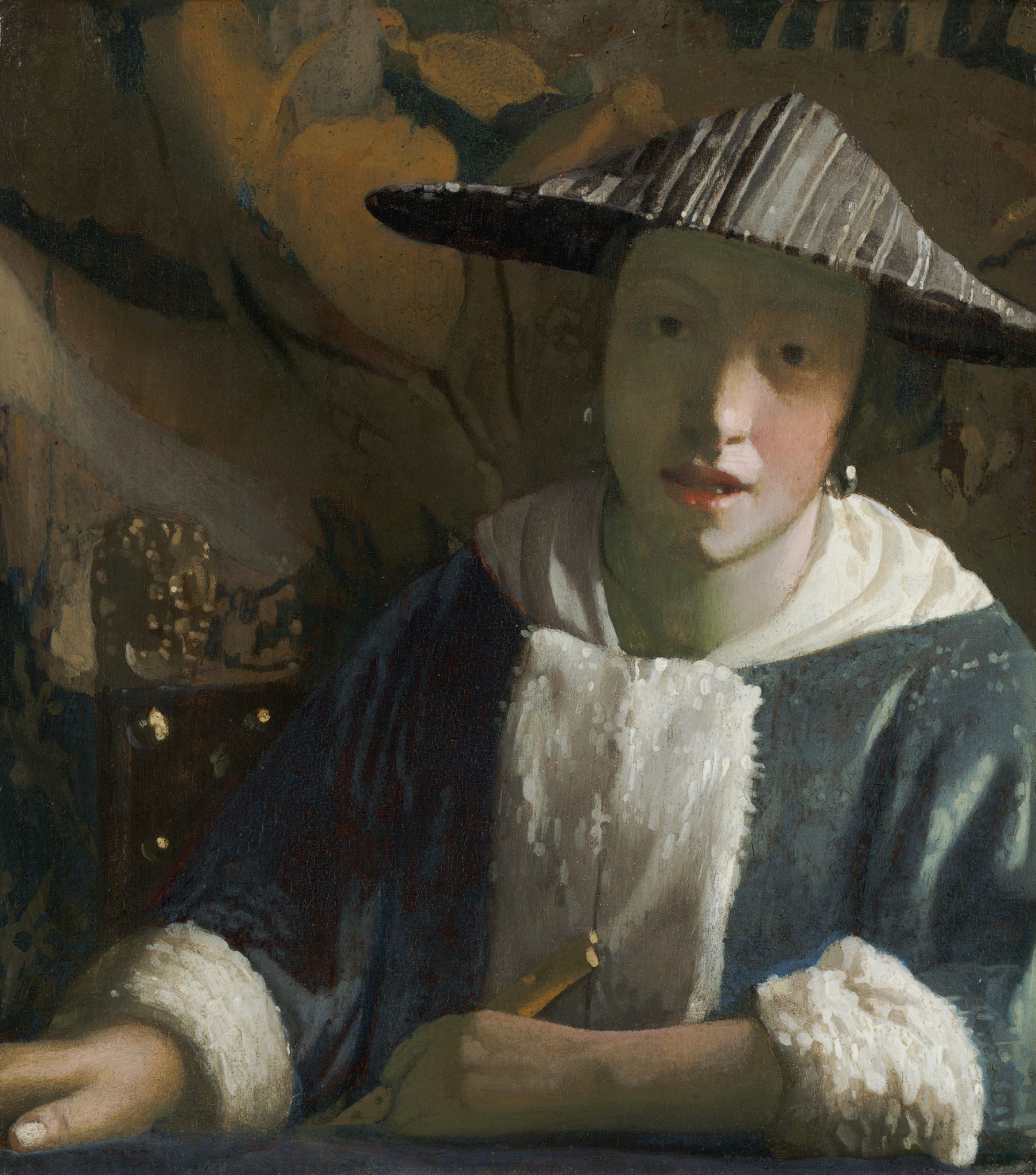
Although neither The Glass of Wine nor The Love Letter attains Vermeer’s technical brilliance, both are of considerable quality. They arguably differ in this respect from Girl with a Flute (fig. 104).92 The limited technical execution of certain passages in that tronie, along with its basic composition and the small format of the panel, point toward a lower level of ambition and accomplishment. Both the Berlin and Amsterdam paintings, however, indicate artists who had more experience in devising complex compositions, constructing challenging interiors, and rendering the play of natural light across figures, objects, and surfaces. This prompts the question whether we can assign them to members of Vermeer’s studio. If so, we must embrace the idea that he trained long-term or more advanced students.93
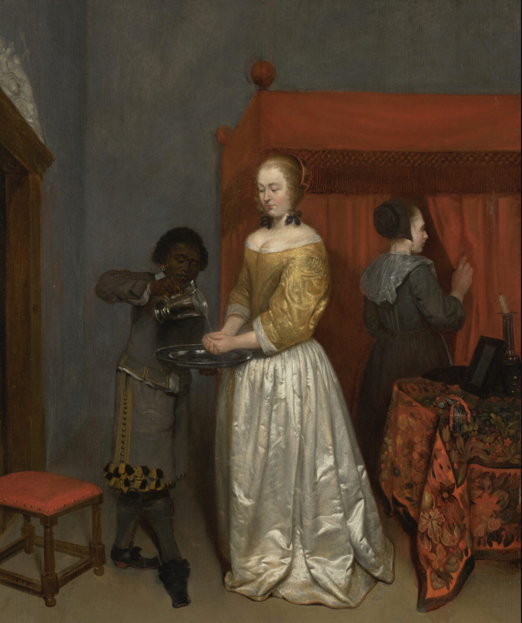
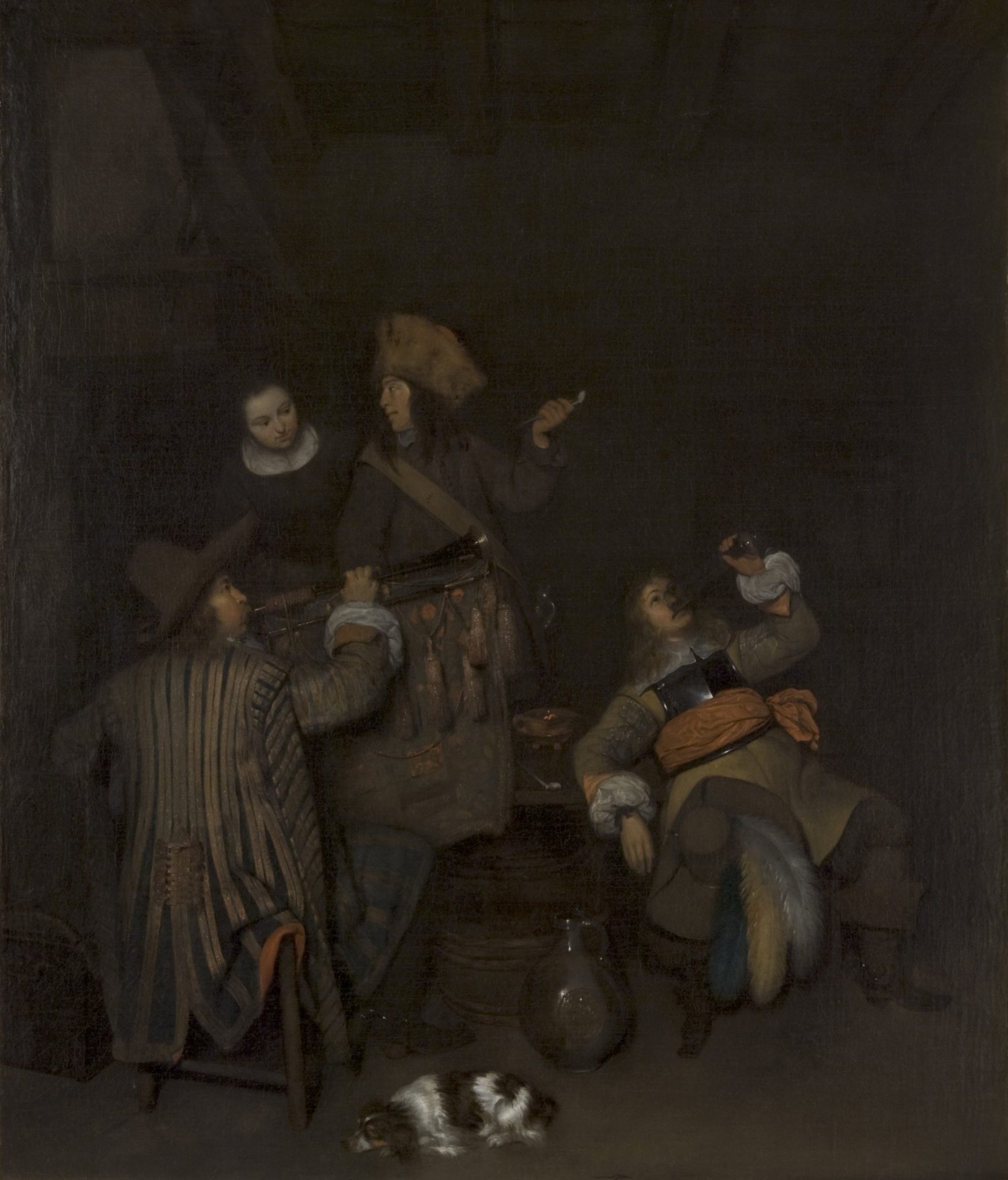
A comparison between The Glass of Wine and Caspar Netscher’s (1635/6−1684) earliest extant genre scenes does indeed hint at the possibility that the Berlin painting is the product of a mature apprentice. Netscher trained with Ter Borch in Deventer from about 1654−1655 until 1658−1660.94 His interior scenes from this period provide a rare insight into the type of work a student of one of the leading genre painters of this period made during an extended apprenticeship.95 One of them, A Woman Washing Her Hands, dated 1657, is a creative pastiche of two recent paintings by his teacher (fig. 105).96 Whereas the rendering of the white satin fabric—one of Ter Borch’s “style signifiers”—is impressive for a student at this level, the depiction of the carpet on the table—not a salient feature of his tutor’s work—is less so.97 Netscher’s Guardroom, completed the following year, is a free variation on a composition by his mentor that is of such high quality that Sturla Gudlaugsson regarded it as a work by Ter Borch (fig. 106).98 In it, the ambitious student markets himself as a skilled painter of fabrics, materials, and textures, much like his teacher. However, a critical eye notices that the soldiers’ faces in profile appear “flat,” and the relationship between the two top figures looks awkward.99 Similarly, The Glass of Wine is a pastiche that, due to its technically skilled repetition of signifiers of Vermeer’s style—an interior ordered by linear perspective, enhanced with spectacular light reflections—may pass as a work by the master. Yet it falls short in its paint handling and in meeting complicated artistic challenges, such as the convincing rendition of human interaction. What separates the Berlin painting from Netscher’s genre scenes, however, is that its composition and figure poses do not rely on one or two paintings but on six, including three by other artists. This required a higher level of artistic ingenuity. The possibility that Vermeer—who had himself responded to Ter Borch’s and De Hooch’s compositions (see figs. 52, 53, and 56) in the New York and Braunschweig paintings (see figs. 2 and 3)—assisted the artist of The Glass of Wine in this respect warrants consideration.100
An even stronger indicator that the Berlin painting originated from Vermeer’s studio is the presence of the cittern on the chair (see fig. 51). This detail demonstrates that the artist studied A Woman with a Pearl Necklace prior to its completion or examined a preparatory sketch by Vermeer of a cittern on a chair, now lost. In either case, they must have had access to his workshop.101
The signature on The Love Letter complicates efforts to determine whether its painter belonged to Vermeer’s workshop (fig. 95). If the inscription belongs to Vermeer, then the canvas undoubtedly sprang from his studio. If so, he followed the example of, among others, Rembrandt, who occasionally signed works by his students during his early Amsterdam years.102 However, this cannot be taken as a standard practice in workshops across the northern Netherlands, and certainly not that of a high-end genre painter in Delft three to four decades later. Ter Borch, for instance, allowed Netscher to sign his works with his own name. If a third party placed the signature on The Love Letter, then the inscription offers little information on the authorship and origin of the painting. However, if the artist of the Amsterdam picture applied the signature, then the canvas is less likely to have come from Vermeer’s studio, since it is improbable that he would have allowed a pupil to sign their work with his name. Then again, maybe The Love Letter left Vermeer’s workshop after the latter’s death.
Could The Love Letter be by an independent painter outside Vermeer’s studio who took a brief interest in his work?103 If so, this artist must have had ample access to the latter’s work in other places. This is far from impossible. A local couple, Maria Simonsdr de Knuijt and Pieter Claesz van Ruijven, purchased more than half of Vermeer’s oeuvre, including Mistress and Maid (see fig. 58) and A Gentleman Washing His Hands.104 There is little doubt that their collection was accessible, given the relatively large number of contemporary genre painters who responded to Vermeer’s works in their collection.105 Moreover, the pictures that De Knuijt and Van Ruijven did not acquire probably found their way to other art lovers in Delft, The Hague, and Amsterdam, who may have similarly welcomed artists into their homes.106
Although The Love Letter features a range of objects present in works by Vermeer, the artist did not repeat them in the same position or at the same angle as Vermeer did. Hence, it is likely they had seen the items with their own eyes, rather than adopting them from paintings or preparatory sketches. Indeed, the artist of The Love Letter could have chosen any chair or scarf but depicted the ones also appearing in Vermeer’s work. This suggests that they either wanted connoisseurs to recognize them as his studio props or, more likely, that these were the objects they had at hand. In the latter case, they had access to Vermeer’s studio.
Furthermore, The Love Letter mimics signifiers of Vermeer’s style, including the planar highlights in the faces and the pointillés on the sewing basket, cittern, and gold leather. Although not executed with the same technical subtlety, they come so close to those in Vermeer’s work that one might expect the anonymous artist to have had intimate knowledge of his working methods, possibly through personal tutelage. On the other hand, The Love Letter also exhibits characteristics that deviate from Vermeer’s style, including the blunt shadows and the clashing colors, patterns, and shapes. If the artist were an advanced pupil, one wonders why Vermeer would not have encouraged them to adhere more closely to his style. On the other hand, the painter of The Glass of Wine also amplified reflections and contrasts between areas of light and dark to such a degree that they also diverge from Vermeer’s work.107 If he had students, Vermeer apparently did not micromanage them.
Proposed Dates
The artist of The Glass of Wine likely started and completed their painting not long after Vermeer worked on A Woman Interrupted at Her Music and A Woman with a Wineglass. By comparison, Netscher painted his variations on Ter Borch’s genre scenes discussed above within three years after his teacher finished his original works. However, the appearance of the cittern on the chair stretches the final completion date of the Berlin picture to about 1667. The Love Letter likely dates to the early or mid-1670s—presumably after The Allegory of the Catholic Faith (see fig. 92)—but may also stem from soon after Vermeer’s death. Interest in his work dwindled soon after his passing in 1675, and contemporary genre painters ceased responding to it. 108 This minimizes the chance that The Love Letter dates from the end of the 1670s or later. Moreover, both the style of the painting as well as the lady’s outfit would have looked outdated by then. 109
Conclusion
The identities of the artists of The Glass of Wine and The Love Letter remain elusive. The former likely worked in Vermeer’s studio. The latter may have done as well, but the uncertainty surrounding the signature on the Amsterdam painting calls for greater caution. My hope is that future scholarship will shed more light on how the artists’ techniques, and their choice and handling of materials, relate to Vermeer’s. This, in turn, will prompt new theories about his studio, a relatively new area of inquiry in art history whose contours have yet to be defined.