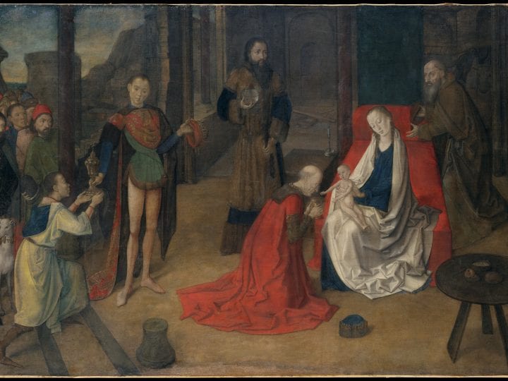
This paper presents the results of a noninvasive technical examination carried out on the Adoration of the Magi at the Metropolitan Museum of Art, New York (fig. 1) in 2014. The tüchlein has been attributed to Justus van Ghent. The examination sought to identify any underdrawing and to further understand the ways in which the painting technique relates to specific working practices found in contemporary tüchlein paintings and in the group of works directly associated with Justus van Ghent, who, next to Hugo van der Goes, is thought to be the most important painter active in Ghent after Jan van Eyck.
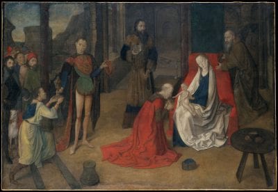
The Adoration of the Magi is one of the few surviving early Netherlandish paintings on cloth, and its complex composition and intriguing painterly quality have long captured the attention of scholars. Elongated figures inhabit a partially enclosed space, which appears to be a once-grand columned hall now in ruins. Far to the right of center the Virgin sits on a long bed, holding the Christ Child on her lap. At some distance from her the three Magi and Joseph look on in adoration, each exaggerated in their poses and slightly isolated from each other. From the left, a crowd pushes forward to witness the Epiphany in front of a rocky mountain landscape. In their midst a graceful greyhound peers out at the viewer. The large expanse of brown floor before them is carefully cluttered with objects: the base of a column, the eldest king’s hat, and a strange three-legged table upon which rests a bowl of milk soup, bread, a glass, a half-eaten piece of fruit, and a knife, arranged in what could be called an early still life. The muted palette and matte surface render the scene somewhat difficult to decipher, for, unlike most existing fifteenth-century paintings, the Adoration is not painted with oil or tempera on wood but with distemper on canvas. The following remarks will focus more closely on the materials and painting technique in the context of the study of late medieval canvas paintings in Northern Europe.
The Adoration of the Magi and Giusto di Guanto
The Adoration of the Magi is an artistically outstanding example of Northern painting on canvas that was likely not intended as an ephemeral object, but rather made for permanent display. This conclusion may seem at odds with what is known about the peripatetic afterlife of the painting. Scholars first took notice of the Adoration after it entered the New York art market in 1924 upon the death of Jacques Seligmann, its first documented private owner. After the death of Seligmann, the Adoration of the Magi was acquired by Georges Blumenthal in 1924 and entered the collection of the Metropolitan Museum with the Blumenthal bequest in 1941. Louis Demonts mentioned that it came from the convent of Santa Clara in Medina de Pomar near Burgos without giving further details.1 The painting probably changed hands in the 1880s, when financial problems forced the convent to sell part of its treasury, not in Spain, but in Paris. Another famous object from the treasury of Santa Clara, the Saint Agnes Cup,2 entered the collection of the British Museum in 1891 after a lawsuit, and the well-documented history of this famous golden cup may help to shed new light on the story of the Metropolitan tüchlein. D. Juan Fernández de Velasco, the sixth duke of Frías, constable of Castile and ambassador to England, traveled to England with a convoy in 1603 to negotiate a peace treaty with the newly invested king, James I; among the gifts he received from the English monarch was the Saint Agnes Cup, once in the possession of the French king Charles VI. The cup was included with several gifts that the duke then gave to the convent in Medina de Pomar in 1610.3 He was responsible for the construction of the Capilla Mayor in the same convent from 1616 onward, and his early donation to the church demonstrates his desire to increase the importance of Santa Clara, which was founded by the Velasco family in 1313 as their ancestral burial church.4 It has been suggested that during a short trip to the Southern Netherlands upon the convoy’s return, including stops in Brussels, Ghent, Courtrai, Ypres, and Bergues (in modern-day northern France),5 the duke might have acquired the Metropolitan Adoration, brought it back to Spain, and given it to the convent of Santa Clara along with the Saint Agnes Cup and other gifts he had received on his journey.6 However, the transcript of the list of these gifts, preserved in the British Museum, does not mention the Adoration, and it must for now remain a hypothesis that the duke brought the tüchlein to Spain after his journey to England.7
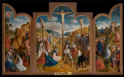
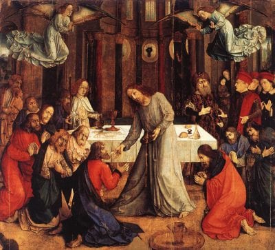
As this compositionally and technically remarkable painting only came to the attention of art historians when it entered the international art market in the early twentieth century, the question of authorship became crucial. Max Friedländer attributed the painting to Justus van Ghent with some precautions8 and, soon after, Louis Demonts discussed the Adoration of the Magi in an extensive article and strengthened the attribution to Justus van Ghent.9 Demonts’s article came after Friedrich Winkler had already attributed the Crucifixion triptych (fig. 2) in Ghent’s Saint Bavo Cathedral to this master10—since the far more famous Ghent Altarpiece is also kept in the cathedral this triptych had long been overlooked by scholars. Antoine de Schryver proposed that the Crucifixion had been commissioned by Laurent de Maech for his chapel at some point between 1462 and 1469.11 Winkler’s attribution was of particular importance for the study of painting in Ghent after Van Eyck, as the work of the painter called Justus van Ghent is only documented in Italian sources and owes its early fame to a note in Vasari’s Vite de’ piu eccellenti architetti, pittori et scultori italiani. Remembering the trip he took to Urbino in 1548, Vasari mentions a Giusto di Guanto who painted the Communion of the Apostles for the altar of the Confraternity of Corpus Domini in Urbino together with a Maestro Marlino (Melozzo da Forlì).12 This monumental painting (fig. 3), measuring 111½ x 119½ inches (283.3 x 303.5 cm) and now in the Galleria Nazionale delle Marche in Urbino, is the only painting firmly connected to Justus van Ghent on the basis of documentary evidence.13 However, the artist left the painting, begun in 1473, unfinished; the Spaniard Pedro Berruguete was ultimately commissioned by the friars of the confraternity to finish it in 1475–76.14 As early as 1900, Georges Hulin de Loo proposed identifying the painter of the Communion with Joos van Wassenhove, but he failed to make the connection between the Italian work and the Crucifixion triptych in the cathedral in Ghent. Hulin de Loo instead attributed the latter to Daniel de Rijke, a Ghent painter known only from archival evidence.15 Winkler and Friedländer, on the other hand, believed Joos van Wassenhove to be an excellent candidate for both the Crucifixion triptych and the Italian work,16 and this view was also shared by Demonts17 and Wehle.18 In 1957, when the first show dedicated to Justus van Ghent was held in Ghent, the Metropolitan Adoration of the Magi was accepted as a work of Justus van Ghent, but it could not be shown in the exhibition.19
This Justus van Ghent, alias Joos van Wassenhove, became a member of the Saint Luke’s Guild of Antwerp in 1460 and four years later a member of the guild in Ghent. When the painter Hugo van der Goes entered the guild in 1467, Justus van Ghent was one of his guarantors. They worked together that same year painting the papal coat of arms on the occasion of indulgences granted to the city by Pope Paul III, and both then vouched for Sanders Bening, the father of the famous illuminator Simon Bening, upon his admission to the guild in 1468. In the summer of 1468, both Justus and Hugo van der Goes were involved in the preparation of festivities in honor of the marriage of Charles the Bold to Margaret of York in Bruges.20
Whether one accepts the identification of the oeuvre with the historical name or not remains a question of weighing the arguments, since there is no documentary evidence for Joos van Wassenhove’s authorship of the Crucifixion triptych.21 But what has become apparent over decades of research is the remarkable influence that these works had on the artistic landscape both in the Netherlands and in Italy, particularly in Urbino and surely elsewhere. In the ongoing scholarly discussion, the Metropolitan tüchlein is usually mentioned only as a side note, perhaps due in part to the challenges that condition and technique pose to its study.
Tüchlein Paintings: Material Characteristics and Questions of Display
The beginnings of modern canvas painting are rooted in the medieval tradition of painting on cloth. Northern paintings on cloth were typically executed in distemper paint on sized linen and are known as tüchlein paintings. Tüchlein refers to the fabric support and is derived from a term that Albrecht Dürer used in his journal to describe such a piece;22 as a group these paintings share several technical characteristics that are important to keep in mind. There was usually no ground preparation applied, but instead a glue size, that was sometimes toned.23 The painting medium was distemper, which is a catch-all term used to refer to pigments bound in a water-based medium, sometimes gum or egg-white, but most often animal glue.24 This lean paint resulted in a matte surface, with the texture of the fabric remaining very evident. Furthermore, a tüchlein was not intended to receive a protective coating or varnish, which would have mediated the matte appearance of the painting materials. The lack of both a ground preparation and a varnish have rendered tüchleins more vulnerable to damage than panel paintings, damage that has often been exacerbated by later attempts at restoration. The varied state of preservation of fifteenth- and early sixteenth-century tüchleins, combined with the small number of surviving examples, has long complicated comprehensive technical studies.
Diane Wolfthal’s 1989 survey of late medieval canvas paintings produced in Flanders and the Netherlands presented scholars with an extensive catalogue listing over 130 surviving examples, as well as an overview of original sources and technical analysis.25 In contrast to the general conception that paintings on cloth were ephemeral works of art far less valuable than panel paintings, the latest research suggests that not only were the surroundings and occasions of display quite varied,26 but that paintings on cloth have been recorded in collections as early as the fifteenth century, especially in Italy, and sometimes in even greater quantities than panel paintings.27
The flexible support of tüchleins rendered them easily transportable, adding to the diversity of their display. In attempting to understand how these objects were valued it is important to consider that in the fifteenth and sixteenth centuries tüchleins were not attached to a stretcher like modern canvas paintings but were often nailed or glued between a wooden board and a frame, which would have imparted a flatness more akin to panel paintings.28 The theory that tüchleins were considered an equivalent but less expensive and more portable substitute for panel paintings among Italian collectors remains to be confirmed, as does the concept of a permanent installation and whether that might also have played an essential role in the distribution of tüchlein paintings not intended for export. In other words: could a tüchlein be valued for the same artistic reasons as a panel painting?
Banners or pennants painted on cloth were viewed as ephemeral commodities or heraldic semaphores and so their material properties might not have had as great an effect on their intended purpose. For example, the choice of a red lake as opposed to vermilion did not alter the meaning of a red passage in a heraldic painting. But for a work meant for permanent display, the technique and painting materials would have had a greater impact, and, consequently, the intentions and choices of the artist must be considered, aspects that are still largely unexplored for paintings in this rare medium. In late medieval Flanders tüchlein painters were organized into guilds and quarreled with their colleagues over the same rights and privileges as members of other professions.29 Painting on cloth was an independent craft, like panel painting or manuscript illumination, and by the sixteenth century was considered a technique equal to painting in oil.30 With its complex composition and painterly excellence, the Adoration of the Magi is a work of high quality and was no doubt intended for permanent display. To begin to appreciate Justus van Ghent’s approach to tüchlein painting, and to situate this work within his oeuvre and other artistic output at the time, the noninvasive examination of materials and painting technique is an indispensable starting point.
Material Aspects and Technique
The Fabric Support
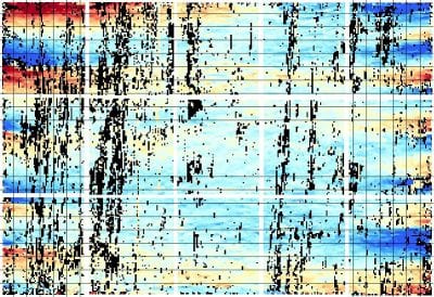
The Metropolitan Adoration is very large for a tüchlein painting, measuring 109.2 x 160 cm, making the fact of its survival and generally good state of preservation particularly remarkable. The support is a plain-weave canvas, which appears to be linen but was not analyzed as part of this investigation. The X-radiograph (fig. 4) of the painting was analyzed by D. H. Johnson, co-director of the Thread Count Automation Project, who measured an average of 16.7 x 16.4 threads per square centimeter and judged that the warp is oriented in the horizontal direction and the weft in the vertical.31 The original dimensions of the painting are nearly preserved. Photographs taken during a 1957 treatment at the museum show an unpainted margin of canvas along the top edge, indicating that the original edge of the painting is intact. The bottom edge has been damaged, particularly toward the center, where a piece of floral fabric has been inserted as part of an old repair. The thread count report found that the cusping pattern along the bottom is nearly identical to that at the top edge, suggesting that very little canvas has been lost along the bottom (fig. 5a). Dark reddish-brown painted borders, measuring 1.5–2.5 cm, are present along the left and right edges. Cusping is present along the left and right edges, although there is slightly less than that found at top and bottom edges, which is in accordance with the weft being in the vertical direction (fig. 5b). There is slightly more cusping at the left, suggesting that the canvas was slightly trimmed on the right after the painting was prepared, although only a very small amount could have been removed, as the painted borders are roughly the same width. The exact function of the borders remains unclear, but the existence of other painted borders on tüchleins offers interesting comparisons.
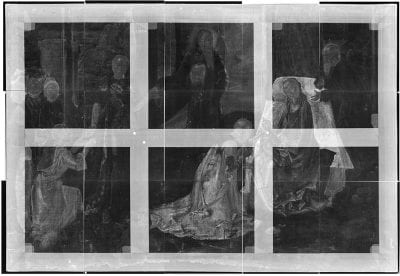
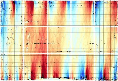
Similar reddish-brown painted borders, all judged to be original, have been noted on three tüchlein paintings by Dieric Bouts: the Entombment in the National Gallery, London; the Annunciation in the J. Paul Getty Museum, Los Angeles; and the Resurrection in the Norton Simon Museum, Pasadena.32 Such painted borders surely served to enclose the composition, but scholars are divided as to whether the borders would have been left visible as a primary or auxiliary framing device or would have been hidden by a separate frame.33 This discussion is complicated by the fact that borders are present around all four edges of the Bouts tüchleins, but only on the left and right edges of the Metropolitan Adoration. As noted above, the original top edge of the Adoration is preserved with no trace of a painted border, and the bottom, although damaged, also appears to be nearly the original edge. And so, if the painted borders were meant to be visible, it would be an odd aesthetic choice to paint borders along the sides only. Thus, it is more likely that the borders played a role in delineating the composition in preparation for framing and would ultimately have been concealed.
The large size of the canvas would have necessitated a secondary support of some type, most likely a solid wood panel or a strainerlike device. Several series of old tacking holes are evident on the front of the painting, at the left, right, and upper edges, but the original means by which the canvas was mounted to a secondary support is not clear.
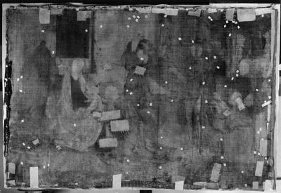
The back of the painting is currently obscured by a lining canvas, but a 1957 treatment photograph recorded the staining on the verso where the distemper paint has soaked through the fine canvas resulting in a ghost composition in reverse (fig. 6). During that treatment an old glue lining was removed, patches were applied to the reverse of the canvas to repair tears, and the support was wax-lined to a modern canvas of a slightly heavier weave and stretched onto a seven-member stretcher. The painting remains stable and has not received structural treatment since that date.
Preparation and Underdrawing
The canvas was likely sized with glue prior to painting, but neither a ground nor a toning layer is present. The identification of underdrawing was complicated by the graphic technique the painter used throughout his composition. Linear hatching and cross-hatching were used extensively while contours were delineated with dark colored, often black, paint (fig. 7). Upon close examination it becomes clear that these lines were all brushed on top of paint layers during the painting process, rather than serving as an initial preparatory drawing. For the most part, no underdrawing was detected beneath the paint layers with infrared reflectography, with the sole exception of a passage of drawing in the Virgin’s blue mantle. A few minor alterations to the composition were observed both in infrared examination and in the X-radiograph, but only one clear pentimento is present around the two feet of the youngest king (fig. 8). This pentimento was outlined with black paint, raising the possibility that other contours were underpainted with black paint. In general the elegant design of the composition was executed with confidence, and for such a large and intricately orchestrated composition, it seems that some sort of initial planning would have been necessary. Underdrawing in a liquid medium not detectable in infrared or covered by subsequent paint layers could be present, or, alternatively, drawing in a soft, dry medium could have been brushed off prior to painting, or concealed by the painted black contours.
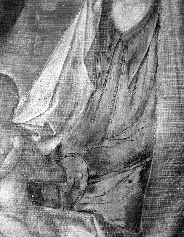
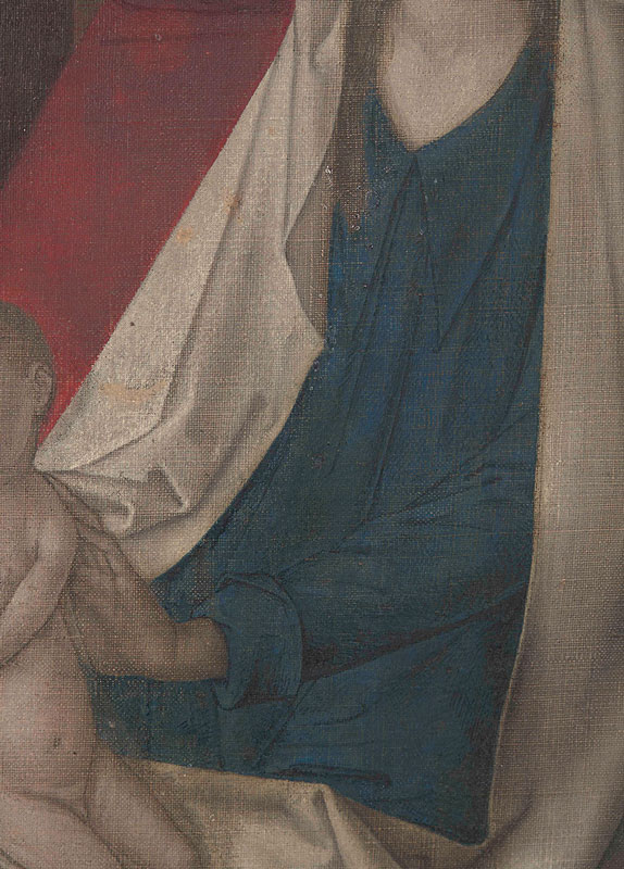
The only instance of underdrawing found, apparently executed with a dry medium, describes the folds of the Virgin’s blue mantle (fig. 9a and fig. 9b).34 The handling is slightly different from the painted hatching visible on the surface: the strokes are looser and sketchier and often shorter in length, but the character is essentially the same. The source of the subtle difference is likely rooted in function; the quicker, looser drawing will later be obscured by paint as opposed to the more precise, studied lines that lie on the surface.
The appearance of the underdrawing is difficult to judge as so few technical studies of underdrawing in tüchlein paintings have been published. Where underdrawing has been detected in other tüchlein paintings, it seems to have been painted with a liquid medium35 and often plays an essential role in the modeling of the surface as the technique seems to encourage the blending of preparatory lines and contouring with layers of paint.36 Most recently, Cathy Metzger and Diane Wolfthal proposed a new evaluation of two tüchleins by Dieric Bouts, the Getty Annunciation and the Pasadena Resurrection. A previous infrared examination of the Getty Annunciation carried out in 1988 had not detected any underdrawing, but a study with new equipment revealed that there is indeed a carbon-based underdrawing, which Metzger and Wolfthal described as having been carried out using a “dilute aqueous solution.”37 The “soft broad lines” used to delineate contours and to frame the composition seem different in character and purpose from the underdrawing observed in the Metropolitan Adoration, and so do not offer much comparison to the present study, beyond suggesting that tüchleins may contain more underdrawing than is often assumed, which future examinations will hopefully reveal.38
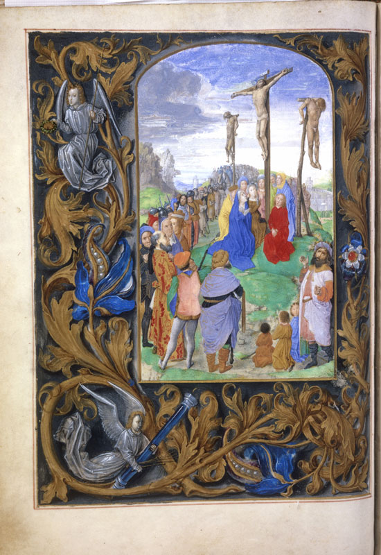
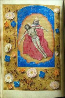
In the absence of other comparable underdrawings, the painted “drawing” on the surface of the Metropolitan Adoration becomes more important to understanding the artist’s technique. The similar handling between underdrawing and painted “drawing” allows comparison of the painting technique with Justus’s other output. In the Metropolitan Adoration the graphically painted contours and hatching are an essential and interwoven part of the artist’s technique. This differentiates his approach from the traditional technique in panel paintings, the object of more frequent technical attention, where the oil paint is executed atop and largely obscures the underdrawing. The interplay of painting and drawing makes the Adoration in some way comparable to manuscript illumination, where one frequently finds that the background and larger areas are initially blocked out with paint and then compositional features are outlined with fine, dark brushstrokes. The most important compositional elements are again colored and sharpened or further refined with modeling and finishing brushstrokes. Illuminators sometime even use a black color that is as thick and opaque as ink applied with a pen, as seen, for example, in the circle of Jean Fouquet39 or in the work of the Berlin Master of Mary of Burgundy (fig. 10). Furthermore, the intense hatching and contouring in the Adoration is not necessarily typical of Northern tüchlein paintings, as exemplified by work attributed to Dieric Bouts and Hugo van der Goes. Those artists’ styles are also closely related to Justus van Ghent’s presumed work; however, both applied paint in a more fluid manner, resulting in smooth modeling effects.40
Condition and Painting Technique
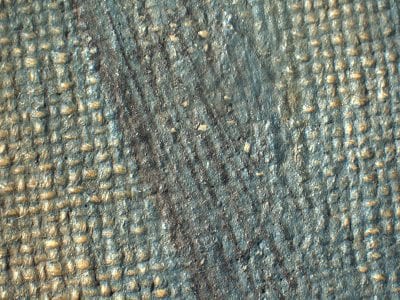
Following the tradition of tüchlein painting, the distemper paint was applied directly to the canvas using thin washes, resulting in a muted palette and a matte paint surface. The delicacy of this technique, combined with some condition issues, have greatly impacted the painting’s current appearance. The cross-over points of the canvas weave are exposed throughout the painting, imparting a pale brown tonality to the entire composition. This visual phenomenon could be attributed to abrasion of the delicate distemper paint at the highest points of the weave, but it could also be related to the technique; when applied in very thin washes the paint would have collected in the low points of the weave. Most likely a combination of both factors is at work: the paint film was thinner on the cross-over points and so more vulnerable to abrasion there (fig. 11).
The partially exposed canvas is darker now than it would have been at the time of painting. This is owing in part to the natural darkening of the fabric with age and in part to staining from the many materials that were applied to the verso as lining adhesives or to the recto as varnishes.41 The paint layers have also been affected by the many materials applied during past restorations, particularly the glue residue and the current wax lining. Yet, despite the inherently fragile nature of the tüchlein technique and past attempts to stabilize the painting, the subtleties of tone and shading remain remarkably legible and the composition largely intact.
The painting techniques and color combinations are elaborate and the latter would have been far more vibrant when the painting was first created. The pigments used and the fabric they were meant to depict would have conveyed a sense of great luxury. The changeant drapery of the robe worn by the black servant at left provides a spectacular entering point into the composition from the lower left. However, the robe would have been far more striking originally, as the pink passage was painted with what appears to be a red lake that has faded. This faded pink can also be seen in the hose of the youngest king and the two-tone doublet of the spectator in the crowd at the upper left. The red lake would have been complemented by instances of bright red, identified as vermilion, scattered throughout the composition, for example in the eldest king’s robe and the bed coverlet.42 A sophisticated sensitivity to color effects is also apparent in the use of red to delineate the contours of the eyelids around the blue pupils and lend a particularly animate and lively expression to the figures’ gazes (fig. 12).
Other passages are more difficult to appreciate due to their condition. For example, the middle king’s robe was painted as an intricate brocade in yellows, blues, and greens, which is now abraded and appears mainly brown. Joseph’s robe also appears largely brown, but highlights were painted with blue and white pigments applied in parallel hatches with thin brushstrokes. And traces of blue pigment are present in the shadows, indicating that blue was mixed with brown to create a deeper, almost black, shade of brown (fig. 13). These deep shadows would have contrasted more strongly with the humble brown of his cloak. Color, as opposed to a black admixture, was used to create shadow.
The degree to which the painter was fully aware of the technical prerequisites of the medium and the painterly effects that could be achieved by a slightly adapted use of paint becomes apparent in his pigment choices and layering of color. The blue sleeves of the youngest king, painted with azurite, have been underpainted with lead white.43 This may represent a change in costume, but is more likely to have been a strategic decision: layering blue upon a solid white would have produced a more vibrant blue than painting directly onto the unprimed canvas. With a hint of the lead white shimmering through the blue, the painter could achieve an effect that resembles the diffuse glow of satin. The same effect is repeated on the left sleeve of the middle king. But as he stands indoors and is not directly touched by sunlight, the tiny strip of light blue creates a mere glancing light that animates the surface of the costly material.
The painter’s proficiency with the medium is also apparent in his choice of chalk white in some passages. He took advantage of the lower refractive index of the glue binder, in which chalk appears opaque, whereas it becomes far more transparent when mixed with oil. The relative radio-transparency of white passages in the X-radiograph helps to differentiate between chalk and lead white. For example, the white underpainting in the black servant’s robe is radio-opaque while the white underpainting in the youngest king’s hose is radio-transparent (see fig. 4). David Bomford and Ashok Roy also noted this practice in the Dieric Bouts Entombment in London44 and the Getty Annunciation;45 it was further confirmed by Metzger and Wofthal in the Pasadena Resurrection.46
On the other hand, some of the choices made in the Metropolitan Adoration seem to be unique. Whereas the combination of both chalk and lead white can be found in Bouts’s tüchlein paintings, he used chalk white for the flesh tones of his main figures, while Justus chose to use lead white to underpaint the heads of most of the major figures, with the practical exception of the black servant. In the X-radiograph this underpainting appears as loose ovals, approximating the shapes of the heads, that were not strictly followed in the painting. This strategy of underpainting the flesh with lead white could have been a means of approximating the conventional Netherlandish panel painting practice of building up flesh tones with thin glazes of a warmer tone, applied directly onto the bright white ground. One finds a quite comparable technique in the early French tüchlein in the Musée Crozatier in Le Puy where, according to Bruno Mottin, the liquid underdrawing was covered with a first layer of a light lead-containing color to lay out the ground for the detailed modeling of the faces, much like an illuminator would do.47 The ground preparation of the heads is similarly apparent in the X-radiograph.48
Painting on Unprimed Canvas: A “Hybrid” Painting Technique?
The main aspects of the handling of body color and modeling in the Metropolitan Adoration are consistent with surviving examples of contemporary tüchlein paintings, first and foremost those of Dieric Bouts, which is in accordance with the observation that the works of Justus van Ghent also share stylistic particularities with the painter from Leuven. On the other hand, several more concrete, detailed and—one could say—personalized responses to the exigencies of medium and technique lie at the core of a clearer delineation of Justus van Ghent’s distinct approach to the artistic possibilities of tüchlein painting.
The exceptional character of the highlights, the sharp dark contours, and the deep shadows give a very graphic quality to the modeling of the painted surface. For example, the manner in which Joseph’s mantle is treated reinforces this impression: the artist developed the sharp-edged folds with a dense network of parallel hatching of lighter and darker nuances on top of the medium brown body color of the cloak. Parallel hatching and occasional cross-hatching in either black or in colors darker than the base color reinforce the shadows and give additional volume throughout the painting, especially in the fabrics. The distemper medium certainly favors the use of discrete hatch marks as opposed to painting in oil, which is more suited to color application in multiple layers. It seems as if the artist combined the necessities of the medium with a specific artistic expression that, when thought of in terms of Netherlandish panel painting, is rather dry and graphic. However, when compared to contemporary drawing, it reveals an outstanding mastery of monochrome modeling that might be compared to the technique found in drawings on colored grounds from the middle of the fifteenth century onwards.
Colored ground drawings in metalpoint, chalk, or ink with lead white highlights were common in Italy from the first half of the fifteenth century onward. Cennino Cennini described the technique of drawing on colored ground paper or parchment in his Libro dell’arte together with different recipes for their preparation.49 Early examples are attributed, for example, to Giotto and Taddeo Gaddi (Louvre, Département des arts graphiques, inv. nos. 2664 and 1222) and to Lorenzo Monaco (Berlin, Kupferstichkabinett, inv. nos. KdZ 608 and 609; Metropolitan Museum of Art, inv. no. 1975.1.335).50 In the course of the fifteenth century, the liquid white highlights were applied with broad and fluid brushstrokes that do not resemble hatching but the building up of highlights in paint, for example in drawings made by Filippo Lippi (London, British Museum, inv. no. P&D 1895,0195.442; Metropolitan Museum of Art, inv. no. 1998.193, fig. 14) and Botticelli (London, British Museum, inv. no. P&D 1895,0195.447). On the other hand, an artist like Benozzo Gozzoli developed a meticulous network of parallel hatching, on top of a blue ground that serves to draws attention to the graphic character of the drawing (e.g., the Nude Man Holding a Horse, London, British Museum, inv. no. P&D Pp, 1.18).
At the same time, colored-ground drawings with white highlights remain not only unusual in the Netherlands, but so unique that only a handful of examples can be cited.51 Right after the middle of the fifteenth century, almost all are associated with the circle of Hugo van der Goes, with whom Justus van Ghent was well acquainted. Van der Goes entered the monastery of Oudergem near Brussels some time between 1475 and 1478 and died there four years later.52 One must wonder if such experiments in colored-ground drawings were not the result of a direct contact with Italian examples, especially with regards to the drawing of the Meeting of Jacob and Rachel in Oxford (Christ Church, fig. 15), as Fritz Koreny has proposed.53 The “assemblage of isolated motifs,” as Stephanie Buck called it,54 does not only resemble compositional strategies found in painted Italian cassoni or spalliere,55 but the elongated female figures seem reminiscent of such Florentine types as one would associate with Lippi and later Botticelli. Hugo van der Goes’s particular hatching technique—not merging the hatches into one dense area and thus omitting a “gradual transition from illuminated to shaded areas”56—reinforces the graphic qualities of the drawing, while the white highlights add a painterly dimension of modeling volume through intense contrasts of light and dark and thereby developing the appearance of volume through light.57 The dramatic and effective use of white highlights on colored-ground papers is apparent in another drawing attributed to a close follower of Hugo van der Goes: in the drawing of the crucified Christ (The Royal Collection, Windsor Castle, inv. no. 12951), the white highlights are not only applied in parallel brushstrokes but in dots and larger patches that form on the knees and upper legs, chest, and shoulders of Christ, as well as on his loincloth, which enhance the plasticity and superpose the graphic build-up through regular hatchings.
The possibility that Justus van Ghent was familiar with these three-tone modeling techniques gains greater credence after examining the Metropolitan tüchlein. For example, Joseph’s brown cloak is created out of three different colors so neutral that they act as tones: brown, bluish-white, and black mixed with blue. The modeling becomes even more complex in the Virgin’s white mantle, where different nuances of white are used together with gray layers and black hatching to model the folds. In fact, considering the beautifully modeled drapery which falls down from her shoulders onto her knees in a large elliptical forms, coming to rest in a remarkable pile of angular folds on the ground, and the presence of underdrawing in her blue robe, it seems possible that this figure was developed from a drapery study.58
When Was the Metropolitan Tüchlein Made?
Authors who made the connection to the Crucifixion triptych in Saint Bavo have usually dated the Metropolitan Adoration of the Magi to between 1464 and 1468, the brief period during which Joos van Wassenhove is mentioned in the guild registries of Ghent. Considering that the name of Joos van Wassenhove has not only been invoked for the authorship of the Crucifixion triptych in Saint Bavo but also for one of the most well-known “portraits” made in the last period of Valois-ruled Burgundy, the depiction of a noblewoman in the so-called Hours of Mary of Burgundy (Vienna, Österreichische Nationalbibliothek, Cod. 1857, fig. 16),59 it seems necessary to examine whether attempts to reconstruct the master’s work in illuminated manuscripts could shed further light on this evaluation of the Adoration. The identification of the Master of Mary of Burgundy as the author of the Crucifixion triptych in Saint Bavo was first proposed by Schenk zu Schweinsberg in 1975, after De Schryver had already remarked on the close stylistic relations between the Vienna manuscript illuminations and the triptych in Ghent.60
While the general confusion about the dating of the manuscripts and the growing number of associated examples deepened, Anne van Buren reduced the number of ascribed works and gave the larger part to the so-called “Ghent Associates.”61 An attempt to recover these works under the name of the “Berlin Master of Mary of Burgundy”62 afforded a new opportunity to reconstruct the development of the style, as this workshop or group of illuminators seems to have worked in the aftermath of the Vienna Master. But Eberhard König found convincing arguments for the patron of another book of hours illuminated by these painters: the Voustre Demeure Hours today dispersed between Berlin, Philadelphia, and Madrid.63 If the Voustre Demeure Hours were indeed a wedding present for Margaret of York, its miniatures would be contemporary with the presumed activity of Joos van Wassenhove in Ghent.
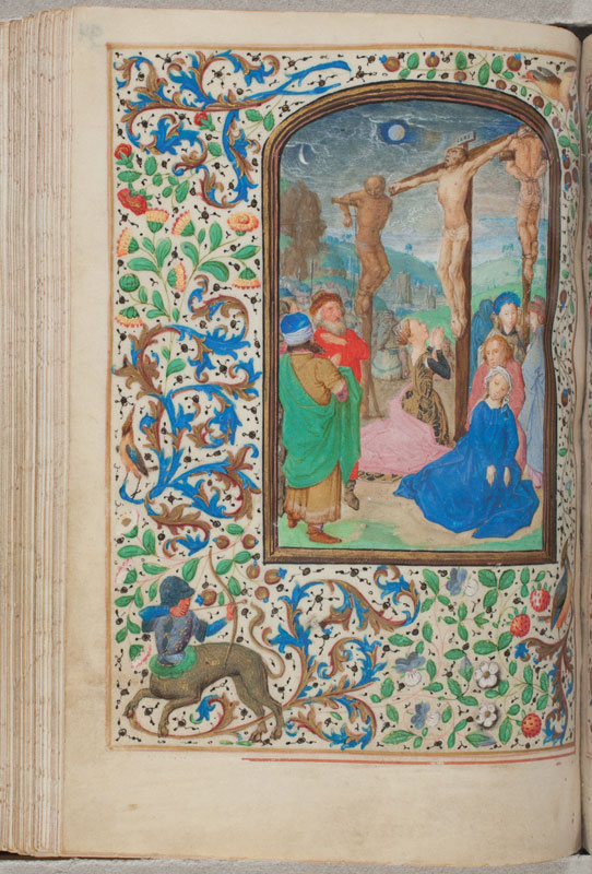
Although this paper is not the place to unfold the entire history of research concerning the Vienna Master of the Hours of Mary of Burgundy, two works have been discovered in recent years that might also help us with a more precise dating of the Adoration of the Magi. The Trivulzio Hours in The Hague (Koninklijke Bibliotheek, SMC 1) resurfaced in 2002 when they were given to the library and exhibited shortly thereafter for the first time.64 Lieven van Lathem, who frequently worked for the Burgundian dukes Philip the Good and Charles the Bold, painted the major part of the manuscript together with Simon Marmion,65 while the Vienna Master of Mary of Burgundy was responsible for only one miniature: the Crucifixion (fol. 94v, fig. 17) for the Friday Hours of the Holy Cross.66 The composition of the Crucifixion is of a remarkable density and seems almost too small for the book: the crucified thief on the right, blindfolded and turned away, barely fits into the dynamic diagonal composition of the scene. A reduced palette of bright colors characterizes the foreground, most notably a pale rose in Mary Magdalene’s mantle and Saint John’s dress, and the changeant gray cloak of the woman to the right, both of which are in strong contrast to the grayish aerial perspective of the view into the valley in the background and the group of horse riders approaching. The vibrant red contouring of the facial features and the blue irises surpass the idea of eyes reddened by tears, as they are used for all the foreground figures. Significantly, this was also one of the notable features observed in the Metropolitan Adoration of the Magi.
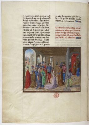
In 2003, Thomas Kren published his findings about the participation of the Vienna Master of Mary of Burgundy in a second previously overlooked manuscript, which is moreover connected with a concrete date and therefore indispensable to the dating of the Metropolitan Adoration. In November 1470, the illuminator Loyset Liédet was paid for the decoration of a history of Alexander made for Charles the Bold (Livre des faits d’Alexandre le grant, Paris, Bibliothèque Nationale de France, Ms. fr. 22547). But it was not Liédet alone who painted all of the miniatures: Kren proposed the attribution of several to the Vienna Master of Mary of Burgundy (fig. 18).67 As Kren indicated, these miniatures are the key to dating the distinct appearance of the Metropolitan tüchlein with its notable contrast to the Crucifixion triptych in terms of spatial and figural construction. The Metropolitan Adoration forms a closely related stylistic group with the The Hague Trivulzio Hours and the miniatures in the Alexander manuscript in Paris, allowing us to propose a dating around 1470, right before Justus van Ghent must have left for Italy.68
Conclusion
The rarity and often poor condition of tüchlein paintings complicates their study, but close technical analysis combined with a broader view of an artist’s output in other media may help to situate the tüchlein practice within Netherlandish artistic practice. In fact, the particularity of the technique can give further insights into the artist’s working methods and his formative influences, as we hope to have shown in this paper. The observations made during the examination of the Metropolitan Adoration of the Magi revealed several aspects that set the painting technique apart from other contemporary examples studied in detail thus far, in particular those of Hugo van der Goes,69 whereas Metzger and Wolfthal’s new study of the Bouts group of tüchleins suggests a closer relationship and the possibility that underdrawings might have been overlooked in the past. Not only did the examination of the Metropolitan Adoration reveal underdrawing rarely observed in tüchlein paintings, but it also pointed to the constructional function of drawing in paint as it visibly shapes the painting’s surface appearance. In terming the technical particularities observed in the Metropolitan Adoration a “hybrid technique” we propose emphasizing this interplay of drawing and painting, while acknowledging aspects that could not be clarified during the noninvasive examination, namely the exact method by which the composition was prepared. Underdrawing not detectable in infrared reflectography may be present, or underdrawing may have been removed during the painting process.
On a broader note, we hope to demonstrate how this new finding relates to Northern tüchlein painting, a more diverse practice than conventionally thought. The underdrawing revealed in the Virgin’s mantle appears to have been executed in a dry medium, using a carbon-containing material, a technique also used more commonly in small-scale media such as drawings and manuscript illumination.70 In attempting to situate the Metropolitan Adoration within the broader development of Ghent’s artistic landscape after Jan van Eyck, we might conclude that the experimentation with and versatility in multiple media led to an original approach to a conventional medium and the formation of an individual hand recognizable through both its technical and imaginative distinction.
