
A comprehensive technical analysis of still life paintings from the Mauritshuis has unveiled new insights into their ground layers. Based on technical examinations using optical microscopy, imaging techniques, and analyses of cross-sections, this article presents an overview of ground layers found in still lifes in the museum’s collection. Analysis of eighty-three paintings showed general trends within the dataset. After describing these trends, this article focuses on two aspects: the use of dark upper ground layers and the use of locally available grounds. Several artists employed a remarkably dark upper ground layer, which was left uncovered in specific places to function as a backdrop for the still life. Some painters worked on grounds that conform to local preferences, while others seem to have chosen grounds specifically for the visual effect and the composition they had in mind. These findings may give insight into the chronology of the oeuvre of an artist and provide a deeper understanding of how material choices impacted the creative process of still life painters in the seventeenth century.
Introduction
Still lifes first flourished and became a popular standalone genre in the Netherlands during the seventeenth century.1 Stylistically, the still life developed from objects arranged systematically, so that all objects are clearly visible, to looser and more refined compositions with more attention to the rendering of light and shadow. The Royal Picture Gallery Mauritshuis in The Hague houses a remarkable collection of seventeenth-century Dutch and Flemish paintings in which still lifes are well represented. The collection shows the diversity of the genre, with examples by artists from the Northern and Southern Netherlands, dating from the sixteenth to the eighteenth century. The subjects of these paintings range from small, delicate flower still lifes on copper to large hunting still lifes on canvas (see table 1).
Over a period of four years, Mauritshuis conservators carried out a thorough technical examination of eighty-three still lifes for a forthcoming collection catalogue.2 Each painting was studied closely under the microscope, complemented by infrared reflectography, X-radiography and X-ray fluorescence (XRF) spectroscopy (both scanning and point measurements). Several cross-sections were also taken from each painting to study the paint stratigraphy and pigment composition. This led to a wealth of information about the materials and techniques used by seventeenth-century Netherlandish still life painters, including the composition of the ground layers. By considering and comparing the data from the significant number of paintings studied, we detected trends and outliers related to the types of grounds that were used. Following a discussion of these trends and their relation to the type of support and geographic preferences for certain ground layers, two phenomena are discussed in depth in this paper: first, the use of dark gray grounds for still lifes with dark backgrounds, showing how material choices impact the artist’s working process and current appearance of a painting; and second, grounds employed by artists that lived and worked in several locations—such as Jan Davidsz. (1606–1684) and Cornelis de Heem (1631–1695), and Jan Fijt (1611–1661)—which show specific characteristics depending where the paintings were executed. This may aid in establishing a chronological order in the oeuvre of the artists.
Support and Number of Ground Layers
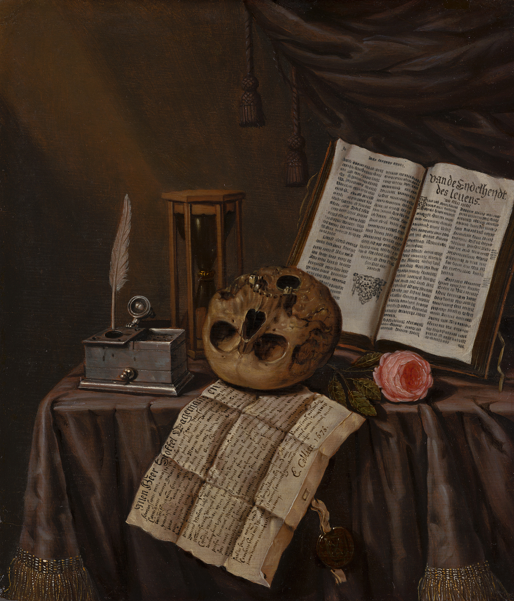
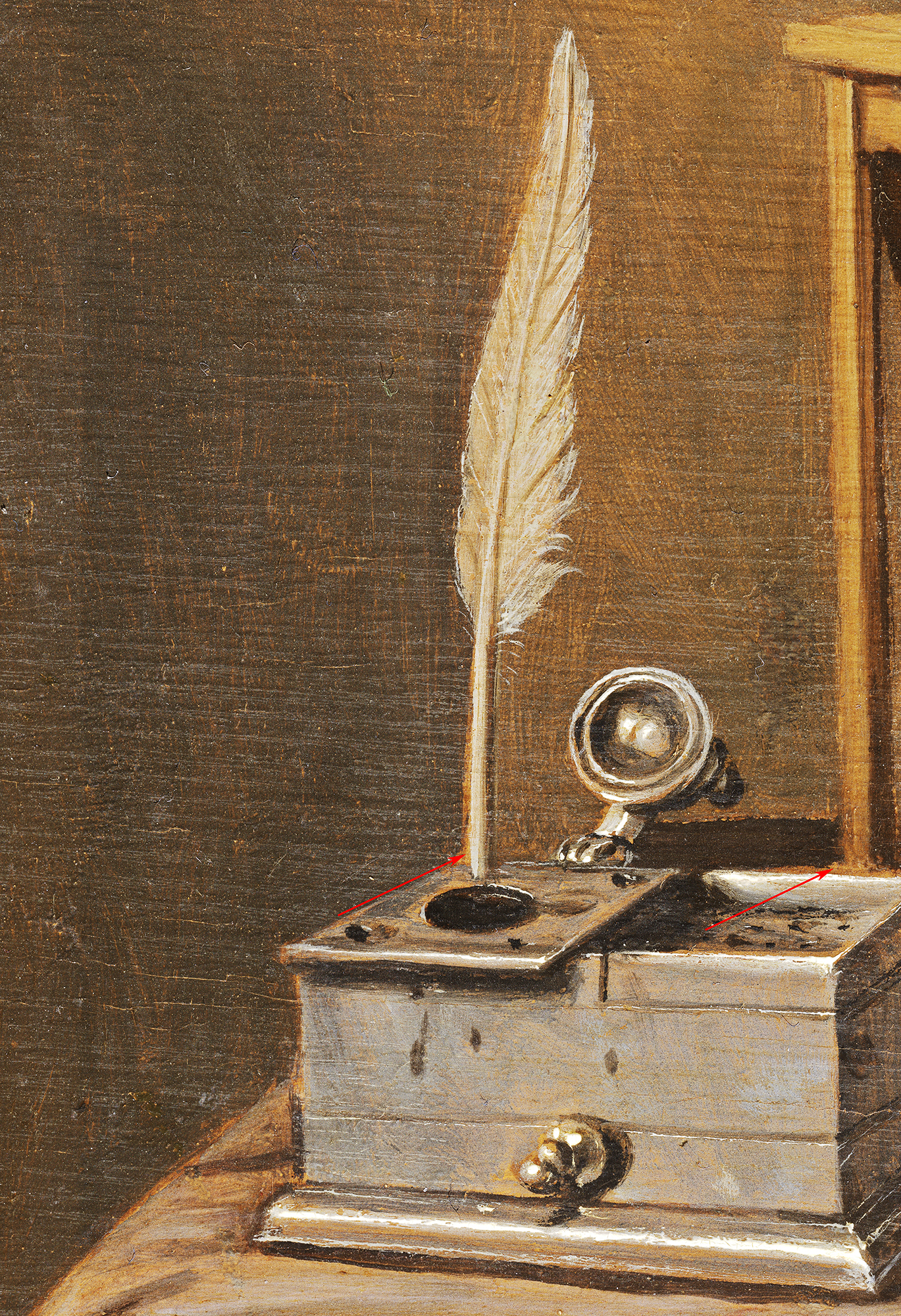
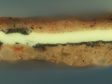
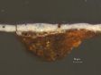
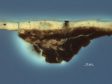
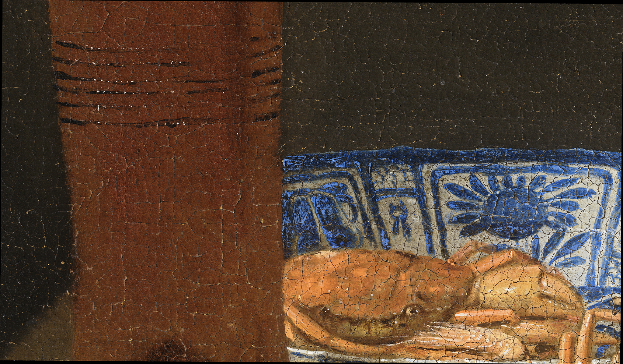
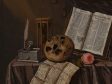
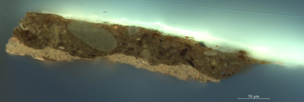
Technical examination of the eighty-three still lifes in the Mauritshuis collection (see table 1) revealed that there is a notable difference in the ground layers applied to different types of supports, with canvas paintings being generally more varied (in terms of color and number of layers) than panels.3 Twenty out of the thirty-one paintings on wooden panels have a double ground, where the lower ground contains chalk. This was common practice for panel paintings for centuries. While in the fifteenth and sixteenth century the chalk grounds were quite thick, they became thinner in the seventeenth century, sometimes only filling the wood grain, resulting in a fairly dark surface on which to paint. The upper ground layer is usually toned, with colors varying from light gray to light brown. An exception is the small Vanitas Still Life panel by Edwaert Collier (1642–1708), which contains three ground layers: a light red layer of earth pigments and lead white; a light gray intermediate layer; and a chalk layer at the bottom (fig. 1). The warm tone of the ground impacts the appearance of the painting—for instance, where it is visible between open brushstrokes in the background. A detail of the inkpot and quill shows that the ground is visible around the contours of objects, where the paint layers do not quite overlap (fig. 2). Another exception is the small A Single Tulip in a Vase by Balthasar van der Ast (1593–1657), which also contains three ground layers: a chalk bottom layer, a light peach intermediate layer, and a gray layer.
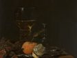
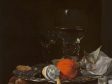
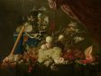
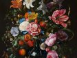
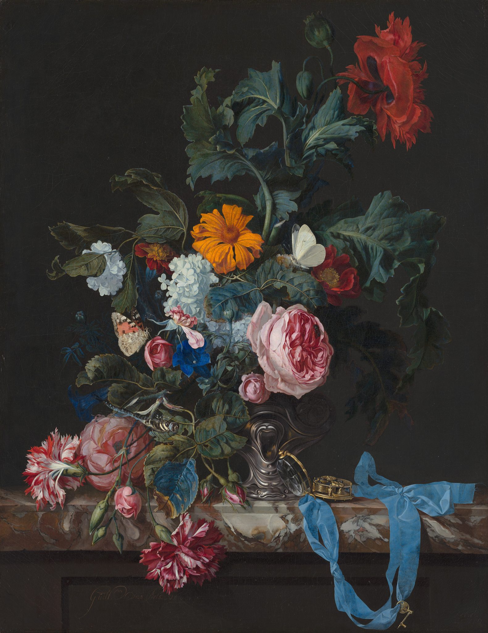
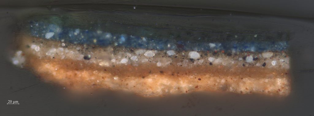
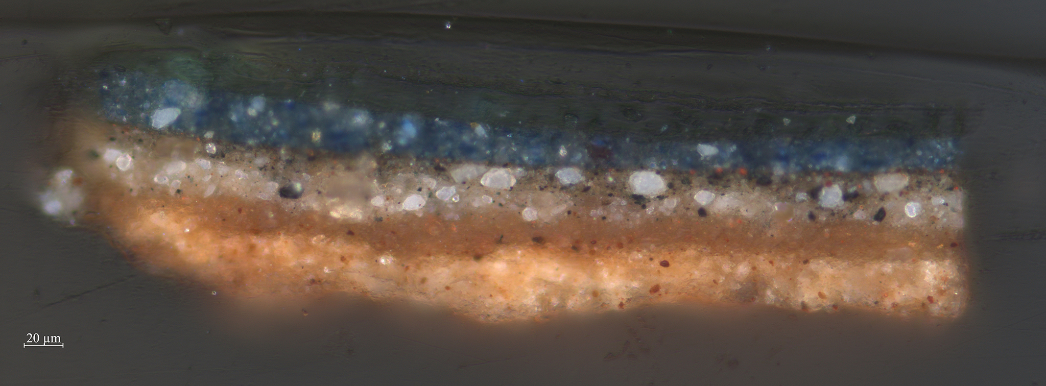
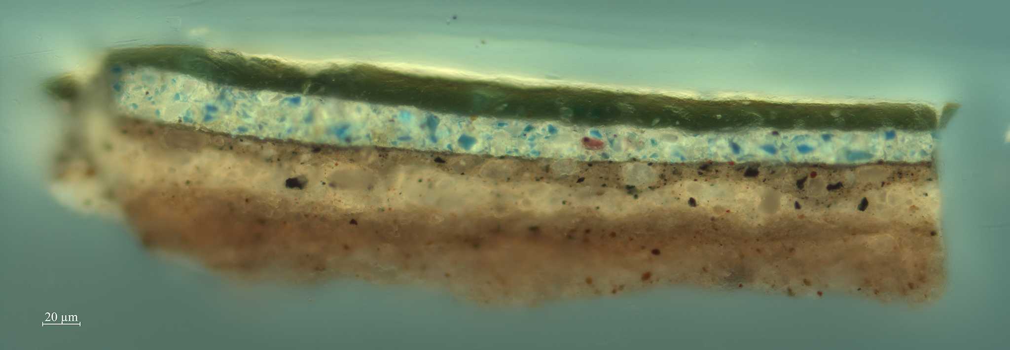
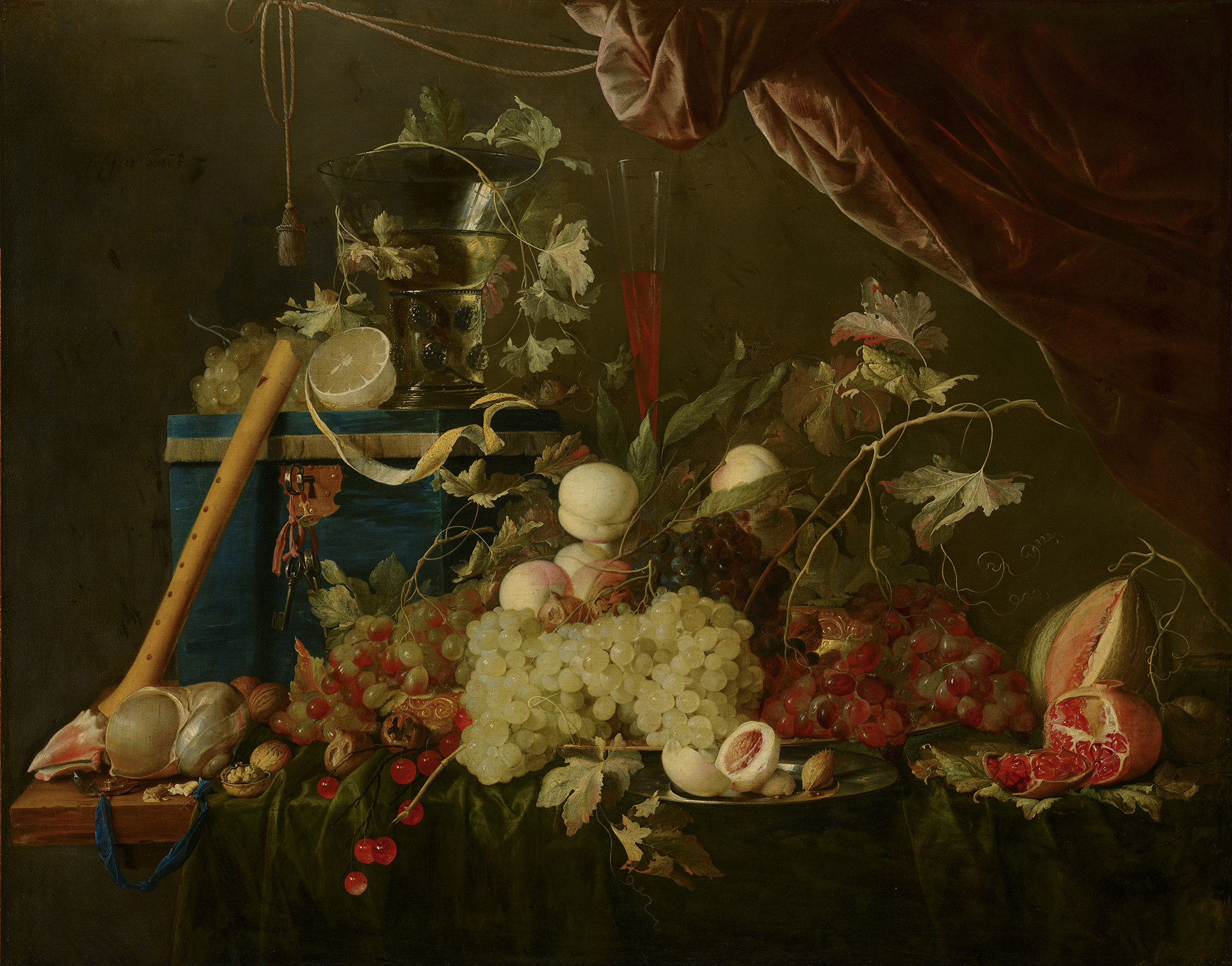
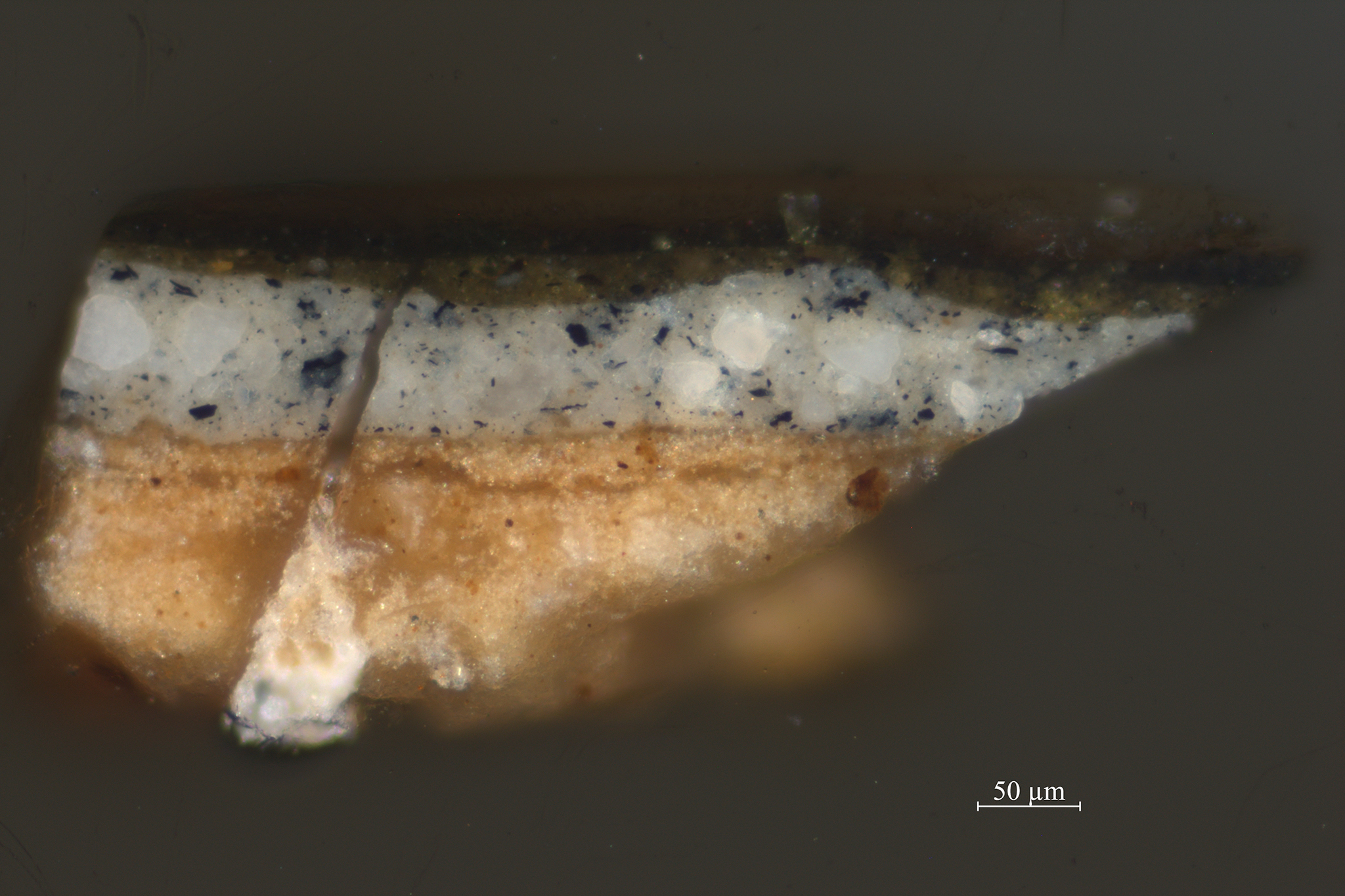
The forty-five paintings on canvas show the largest variety in terms of ground layer composition, number of ground layers, and color. The number of ground layers ranges from one to four; more than half of the paintings on canvas (twenty-three paintings) have a double ground. Of those works with a double ground, approximately half (ten paintings) have a red or reddish lower layer with a gray top layer. The group of paintings with a gray-over-red double ground all originated in the Northern Netherlands (Amsterdam, Utrecht, Nijmegen, or Alkmaar) between about 1650 and 1680, which seemingly substantiates theories that in different artistic centers certain ground compositions were preferred.4 Based on these findings, it seems likely that of the three ground layers found in Willem van Aelst’s (1627–1683) Flower Still Life with a Timepiece, which was painted in Amsterdam, the uppermost layer was applied by the artist himself onto a commercially primed canvas (fig. 3). The upper layer is brown and applied thinly on top of a double ground. The lower ground layers seem to have a common build-up and composition: gray over reddish-tan (figs. 4 and 5).

All six paintings on copper supports contain one or two ground layers consisting predominantly of lead white, with varying quantities of chalk and earth pigments mixed in. Since this is just a small sample, only limited conclusions can be drawn. For Daniel Seghers (1590–1661) and Balthasar van der Ast, both works on copper and works on other supports have been analyzed. In each case, the ground layer on copper differs from that on canvas or panel. Van der Ast’s panel paintings all contain two or three ground layers, while Shells on a Table—painted on a copper support—contains only one. The color of the upper ground layer, however, is similar for all four Van der Ast paintings, regardless of the type of support. In all four paintings, the upper ground is almost completely covered by subsequent paint layers. In this case, the choice for the number and type of ground layers seems to have been inspired more by the type of support than by the artists’ specific working methods.
From Flowers to Fish: Subjects of Still Lives
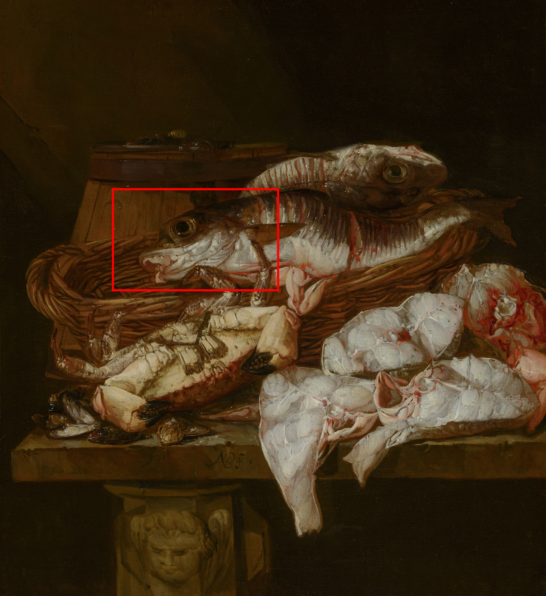
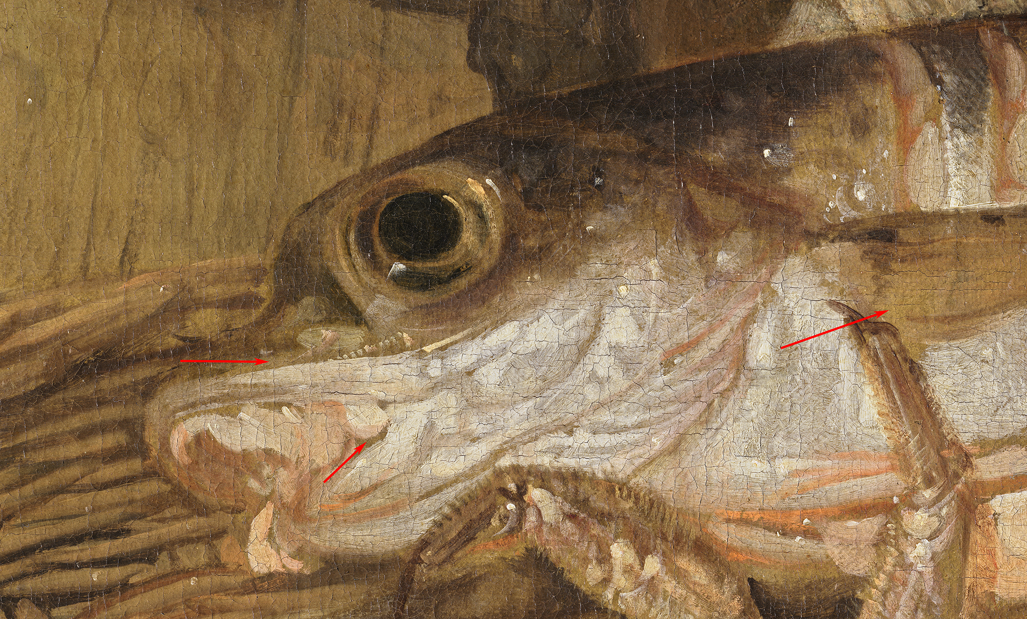
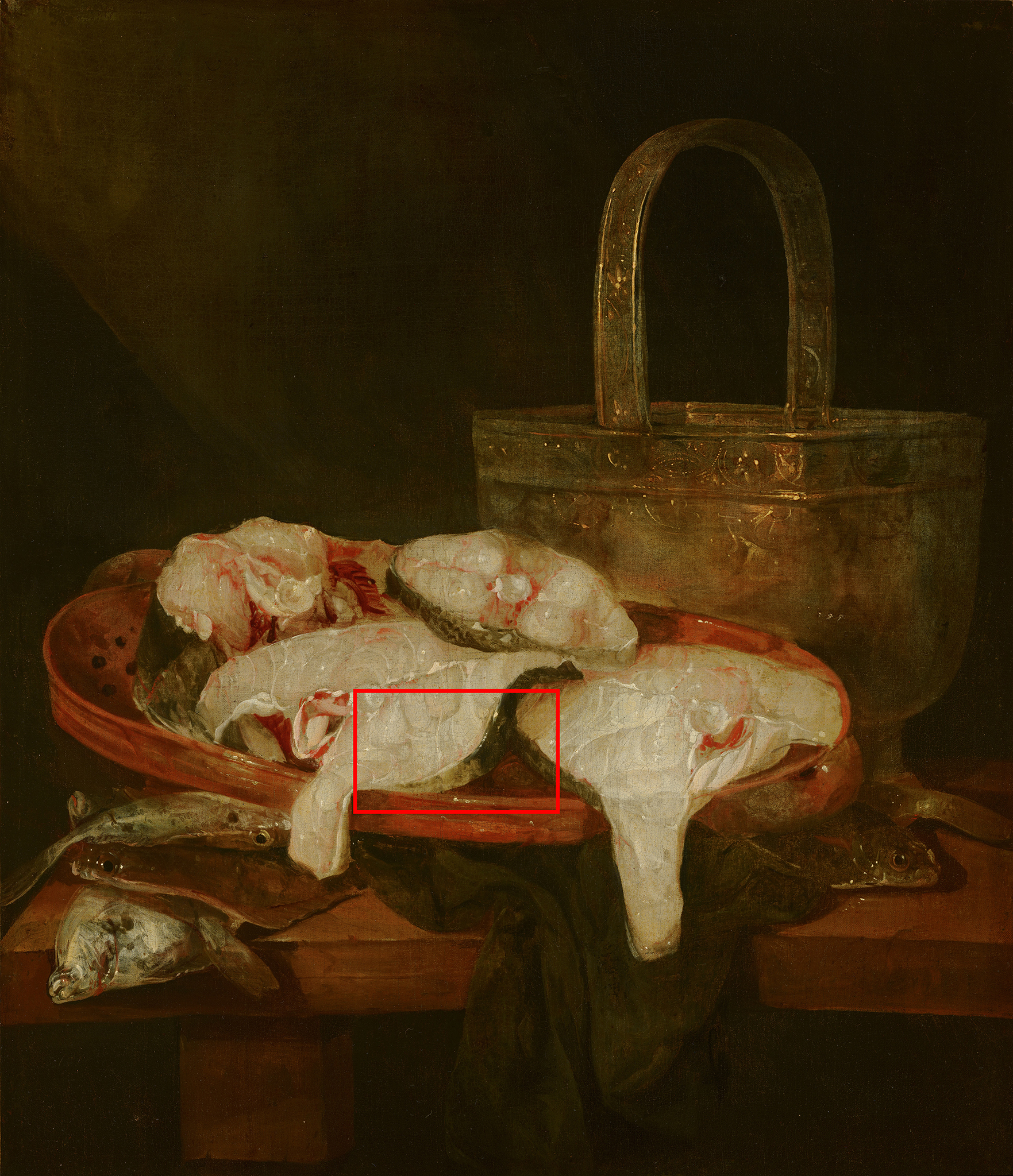
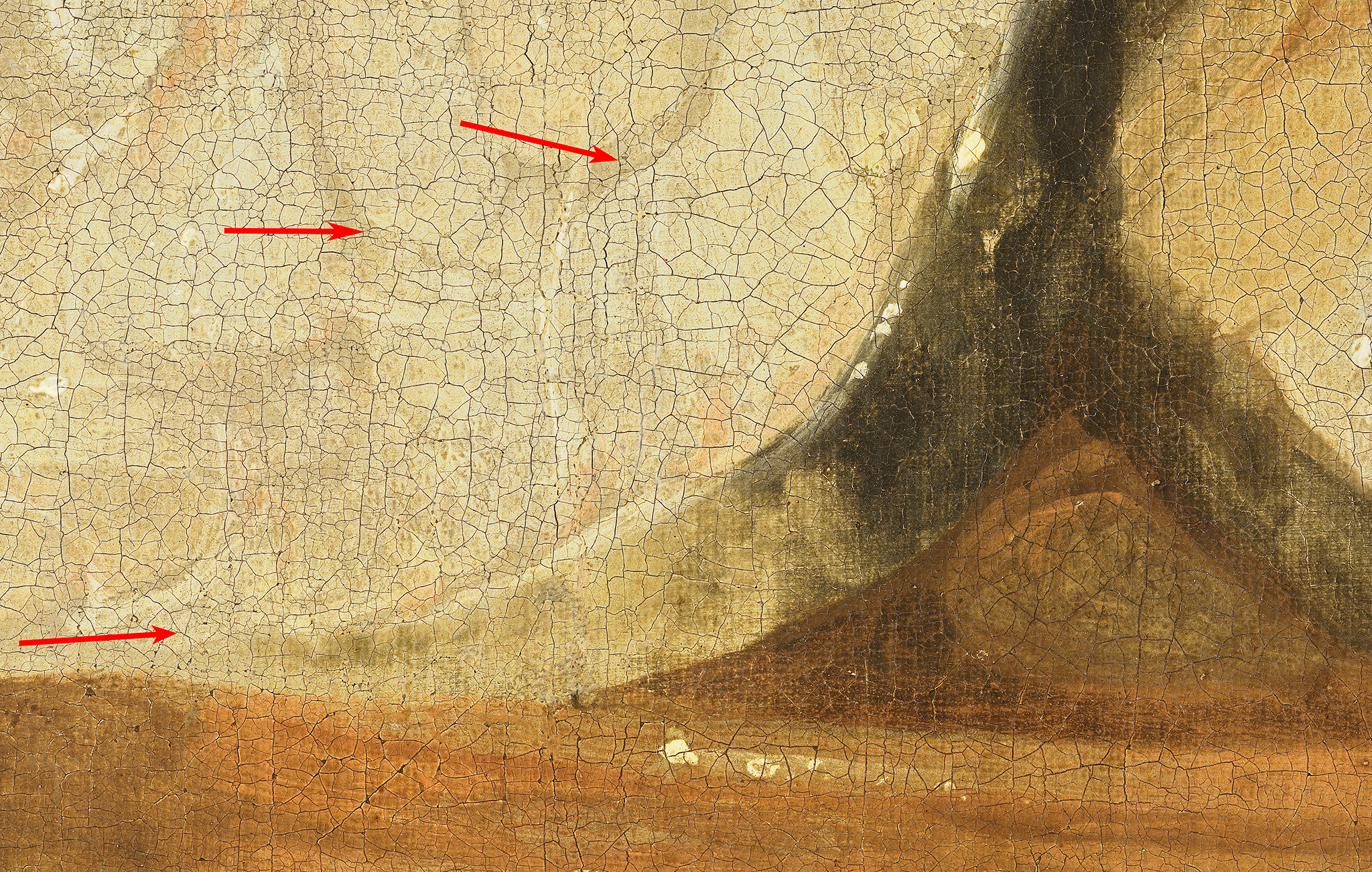
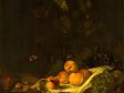
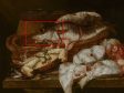
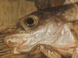
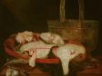
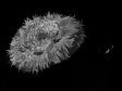
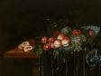
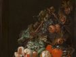
When filtering the data based on the subject matter of the still life, no clear trends appear. There seems to be no link between the color of the ground layer and the type of still life. There are, however, paintings by the same artist, with similar subject matter, on different ground colors. This is the case for Abraham van Beyeren’s fish still lifes in the Mauritshuis collection. Still Life with Seafood (fig. 6) is painted on a brown ground layer, while Fish Still Life is painted on a gray ground layer (fig. 8). In both cases, the ground layer is left “open” (visible) to contribute to the modeling of the pieces of fish. In Still Life with Seafood, Van Beyeren started by applying a dark undermodeling, serving as the darkest upper parts of the fish, leaving the ground layer uncovered to serve as midtones (fig. 7). The light belly of the fish is painted with soft yellow tones created with a mixture of lead white and lead-tin yellow. Red brushstrokes are applied for blood, and glazes are added for more depth. Short, hatched brushstrokes delineate the scales of the fish, applied crisscross or in one direction. In the white slices of fish, modeling is achieved by varying the thickness of the white layer, thus allowing the ground layer to shine through in varying degrees. Similarly, in Fish Still Life, the exposed ground creates the grayish tones in the pieces of fish (fig. 9). The lightest areas are achieved with thin layers of lead white mixed with a black pigment, and the blood at the center of each slice of fish is painted with vermilion (mixed with lead white) and a red lake glaze.
The lack of any association between type of still life and type of ground seems to reflect writings from contemporary sources. The relationship between ground color and subject matter is mentioned by several authors; however, no explicit mention of ground colors or build-up specifically for still life paintings has yet emerged.5 In Willem Beurs’s 1692 treatise on painting, known for its extensive descriptions of how to paint various objects often included in still lifes, there is a short chapter on preparing the support for painting.6 Beurs writes that for panels, a first layer of chalk in oil should be applied to fill the wood grain. For a second ground, a thick coat of umber and lead white is advised. For canvases, the same colors should be applied, but as a first layer.7 Beurs does not say whether these grounds are suited for still life painting. The only genre he mentions specifically are portraits, for which he advises a ground of black mixed with lead white.
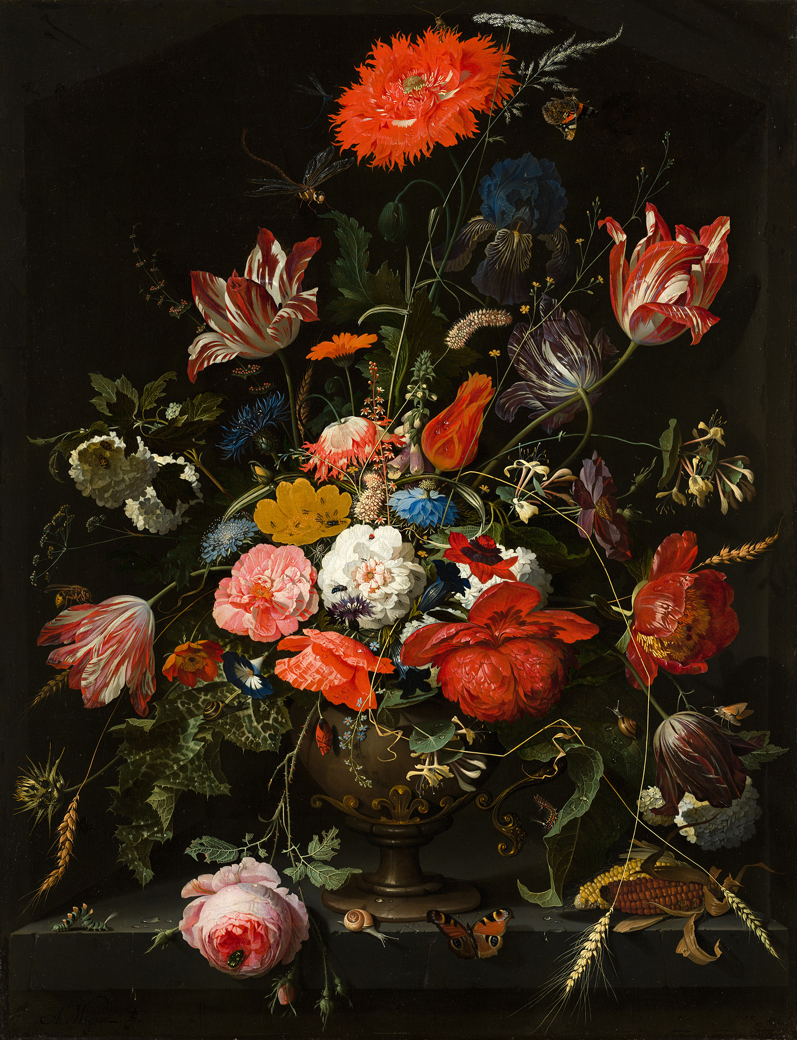
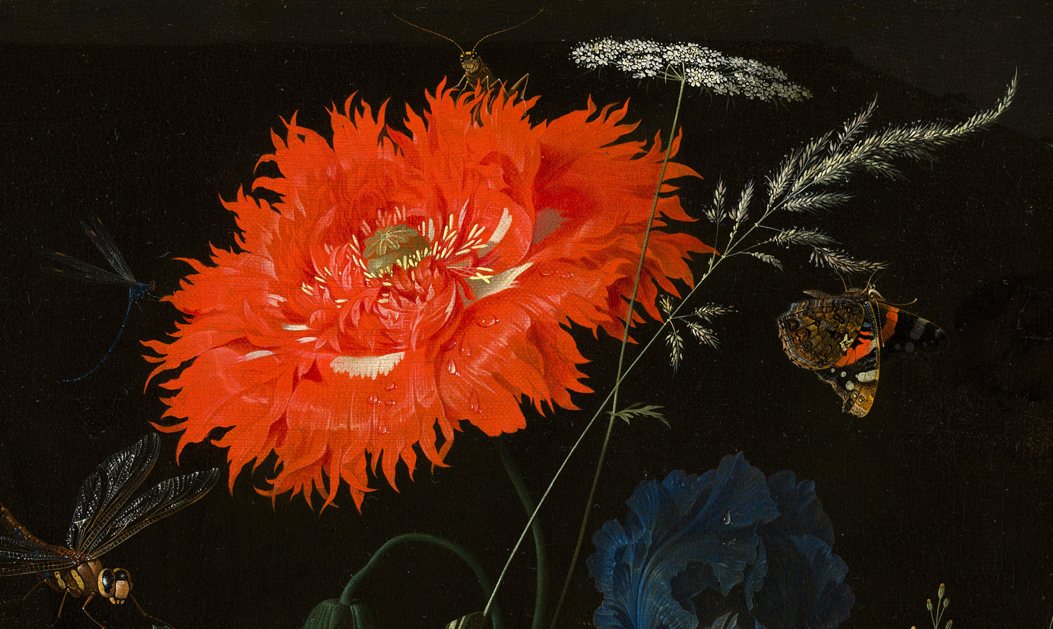
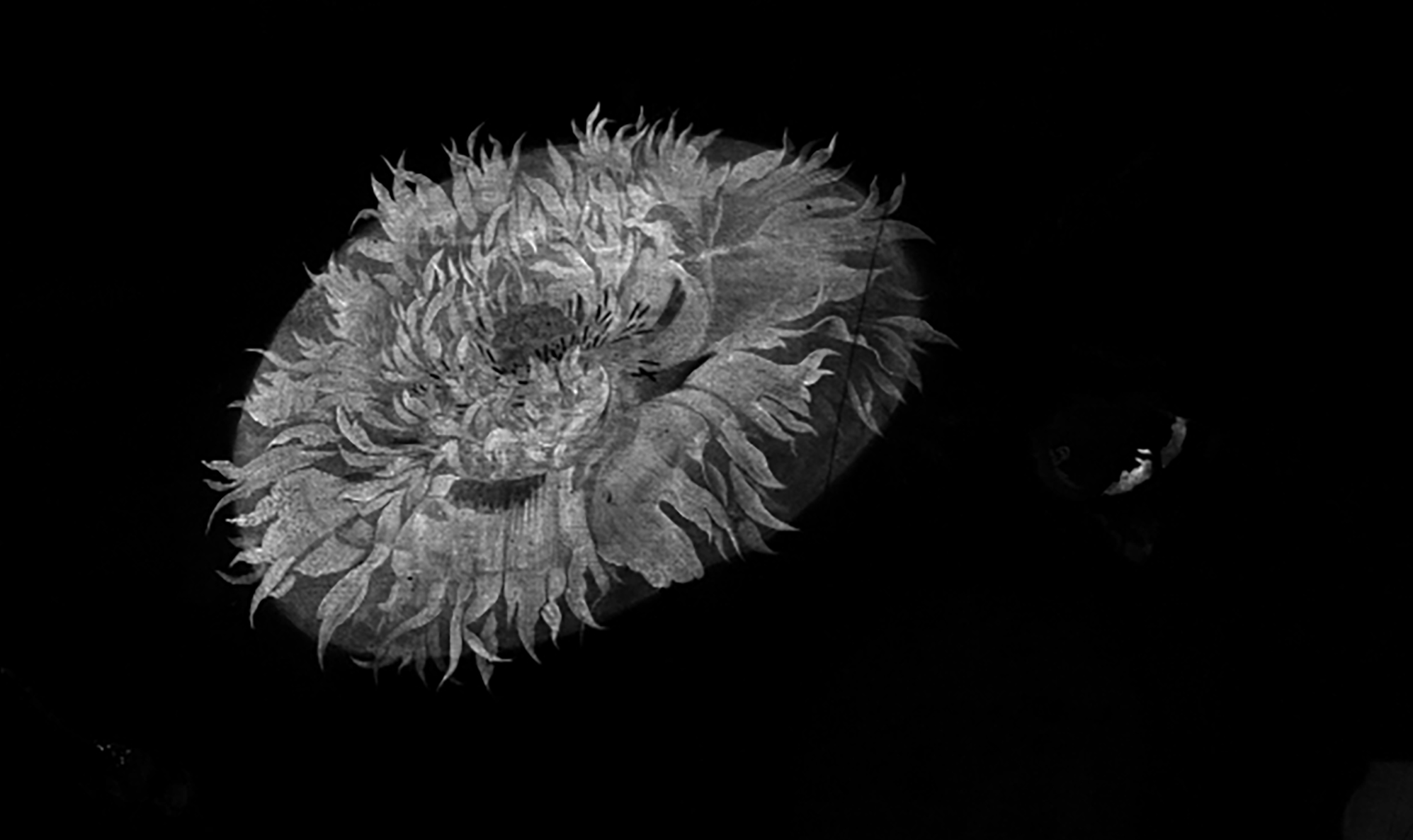
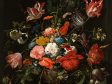
The Teycken bouck voor de jonge jeught (part of the 1701 Wiltschut manuscript, Frits Lugt Collection, Fondation Custodia, Paris) is an illustrated treatise specifically devoted to still life painting.8 Although no recipes for ground layers are included, there is an important mention about the use of local underpaints on top of ground layers for flowers in still lifes.9 In flower still lifes—by, among others, Seghers, Jan Davidsz. de Heem, and Abraham Mignon (1640-1679) as in figure 10—these local underpaints have been detected in earlier studies using scientific technologies. On top of an even-colored ground, circles or ovals were painted in colors and shapes related to the final flowers. This was a way of blocking out the composition, but it also provided a suitable base color to work up further.10 These local underpaints are sometimes visible through the upper paint layers but can also be made visible with imaging techniques like infrared reflectography (IRR) or macro-X-ray fluorescence (MA-XRF) scanning. Within the Mauritshuis collection, this working method was found in still lifes by Seghers, Jan Davidsz. de Heem, Maria van Oosterwijck (1638–1693), and Mignon. In Mignon’s Flowers in a Metal Vase, for instance, the large poppy at the top of the bouquet contains a local undermodeling in vermilion, as can be seen in the MA-XRF map for mercury (Hg-L). When comparing this undermodeling with the upper paint layers, it becomes clear that the individual petals of the poppy were defined by partially painting the background over the undermodeling (figs. 11 and 12).
Dark Grounds in Still Lifes
Although it seems that no ground layer was specifically recommended for still lifes, a number of paintings with remarkably dark upper ground layers were found among the still lifes from the Mauritshuis. These layers are either left completely uncovered, to function as a background, or barely covered with transparent glazes. This begs the question of whether these dark layers should be classified as grounds, preparatory layers, or paint layers. Stols-Witlox classifies a preparatory layer as a uniform layer that is applied to the entire surface of the support, thus differing from local underpaints.11 Underlayers covering the entire surface of the support are sometimes found in landscape paintings; however, since their tone often varies, these are not classified as preparatory layers.12 In the still life paintings discussed here, the dark layers cover the entire surface and seem to be uniform in color and composition. We therefore consider them part of the preparatory system, rather than undermodeling, and refer to them as a ground layer.
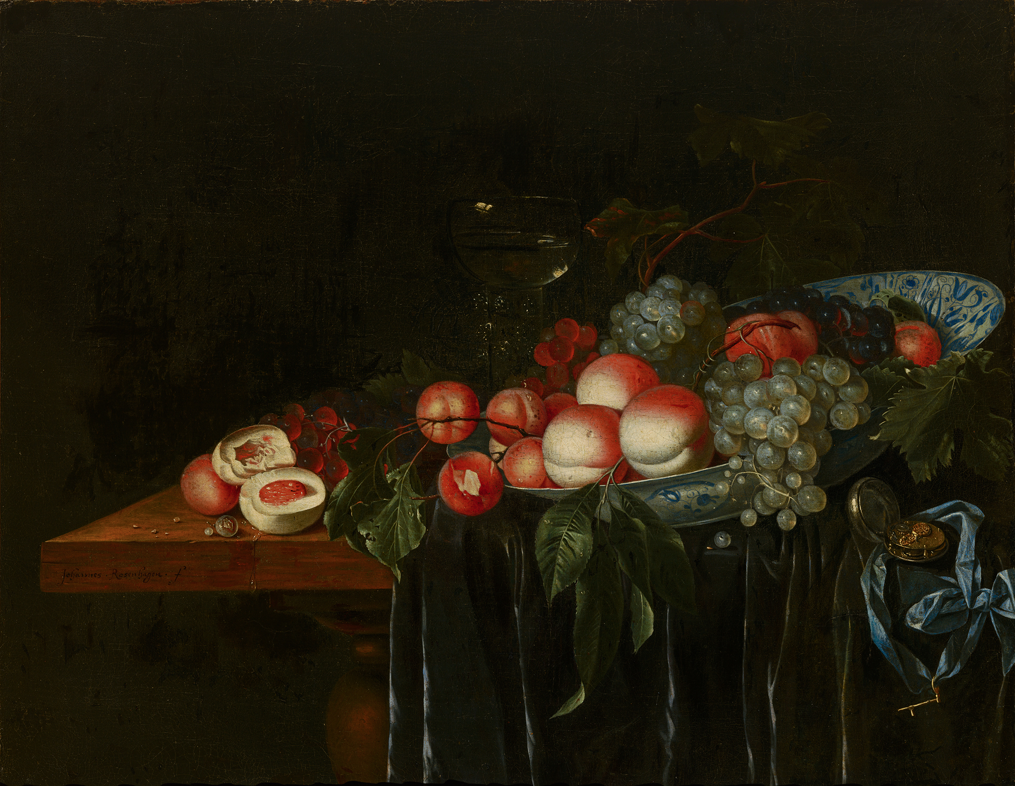
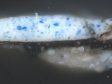
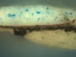
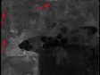
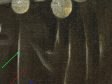
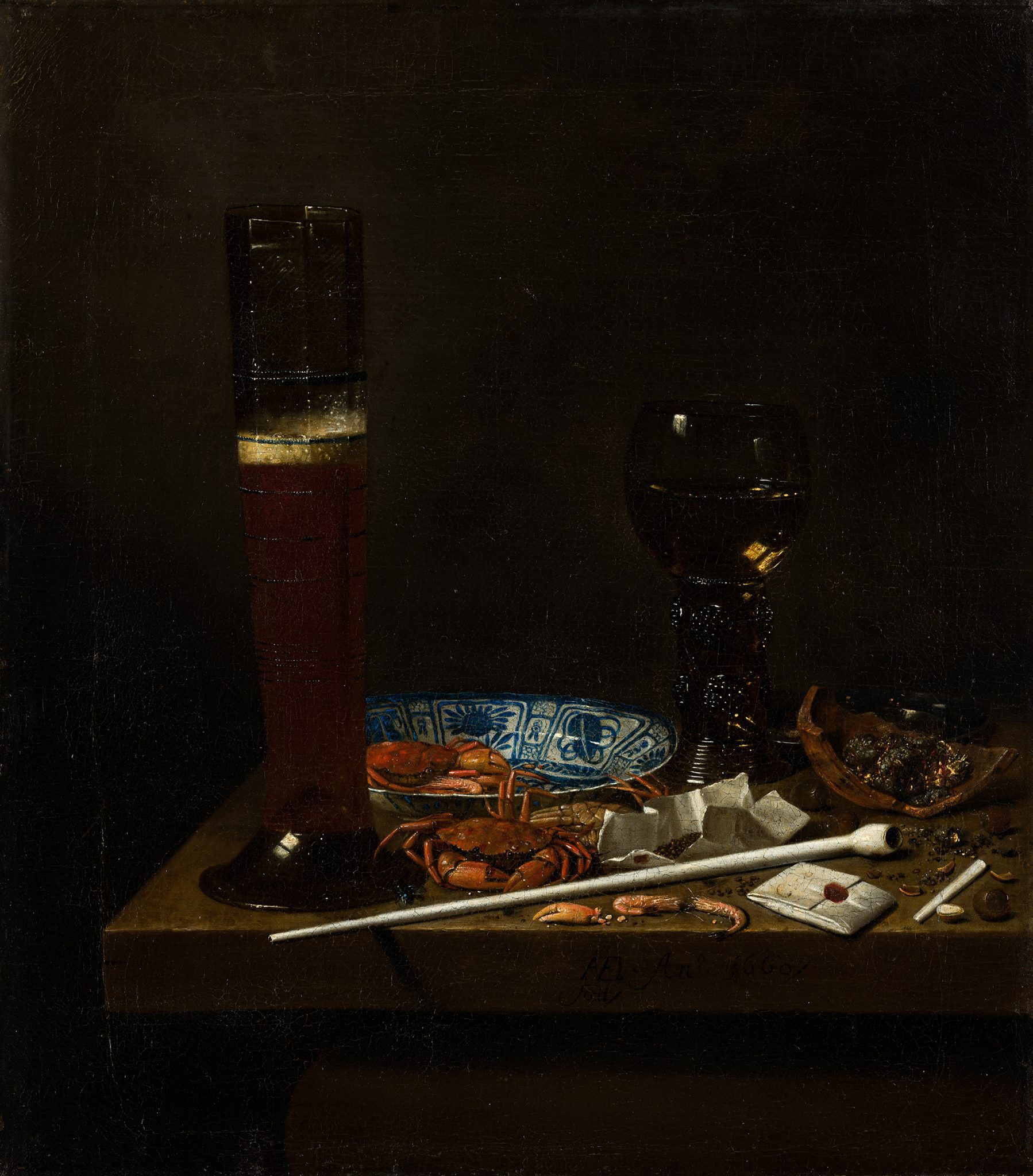
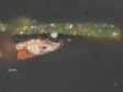
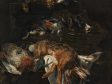
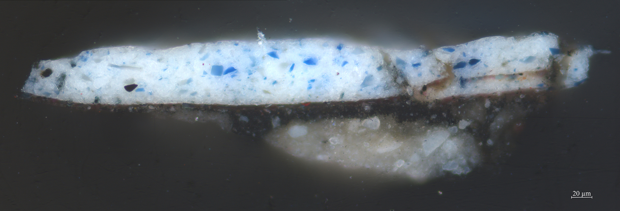
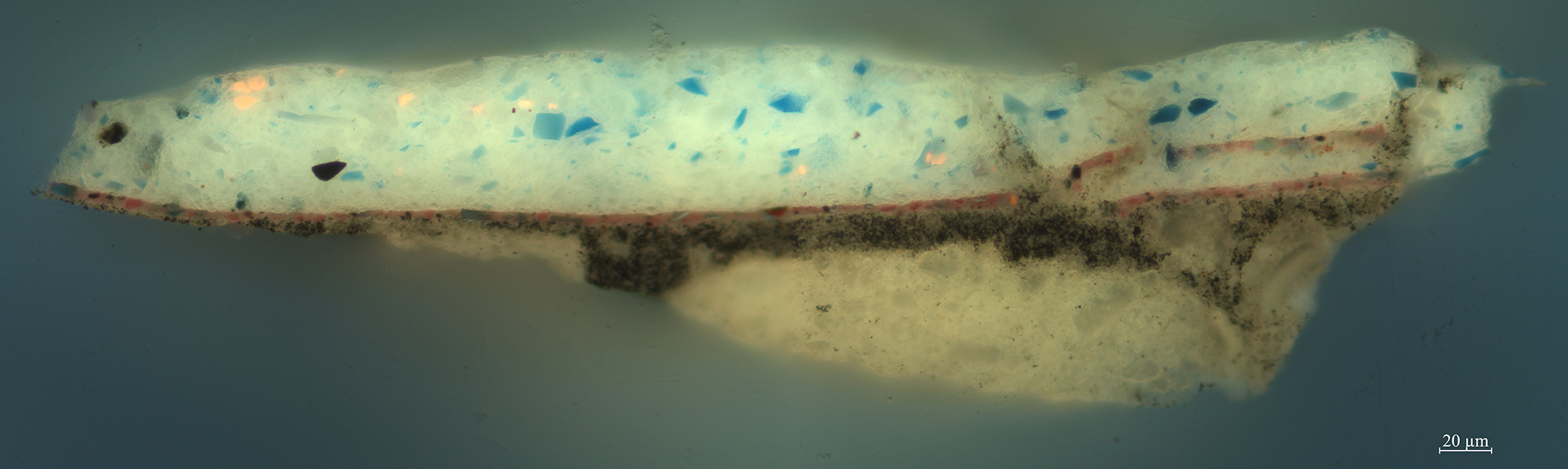
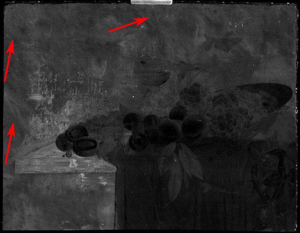
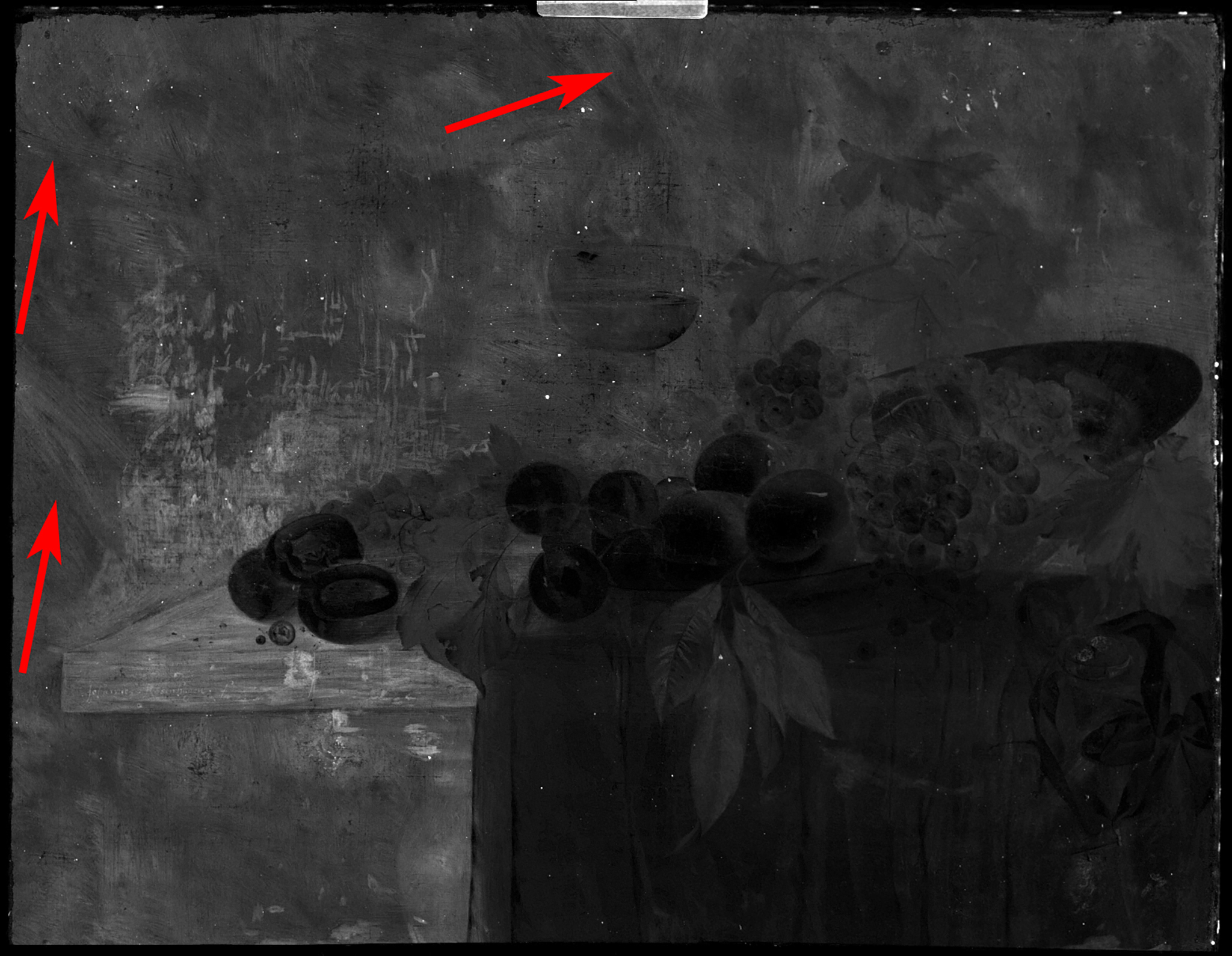
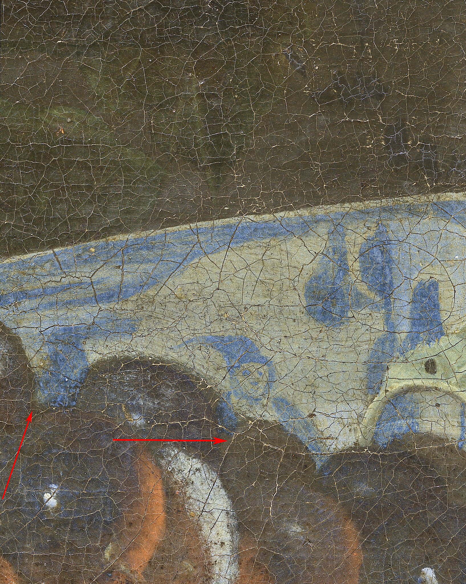
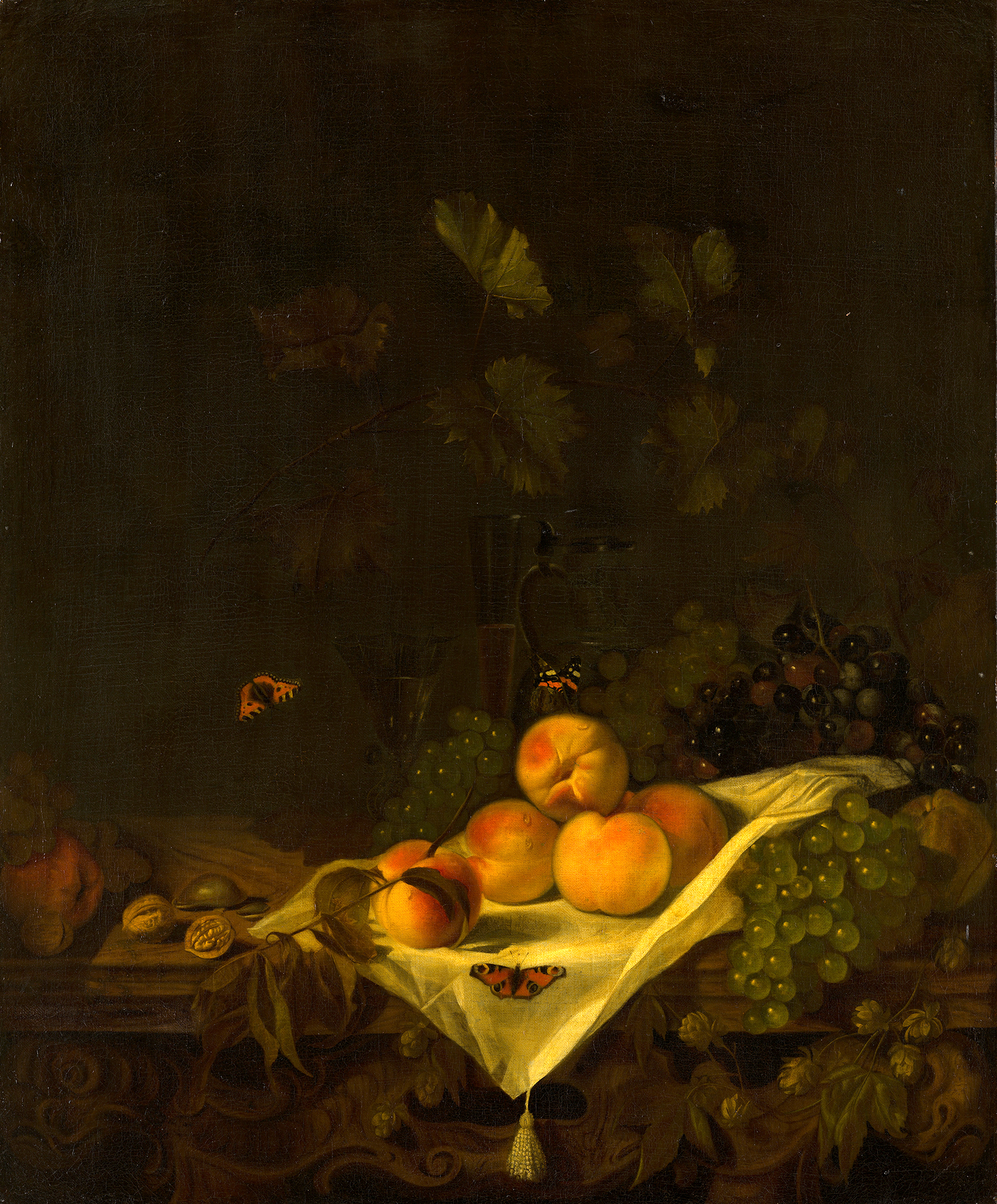
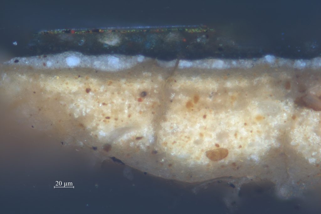
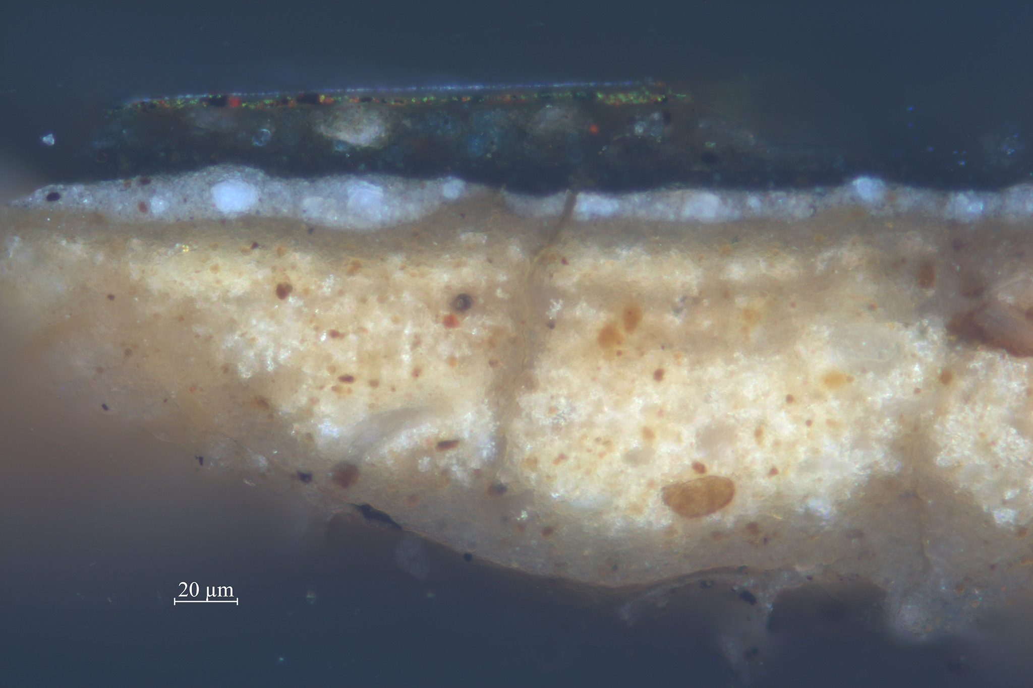
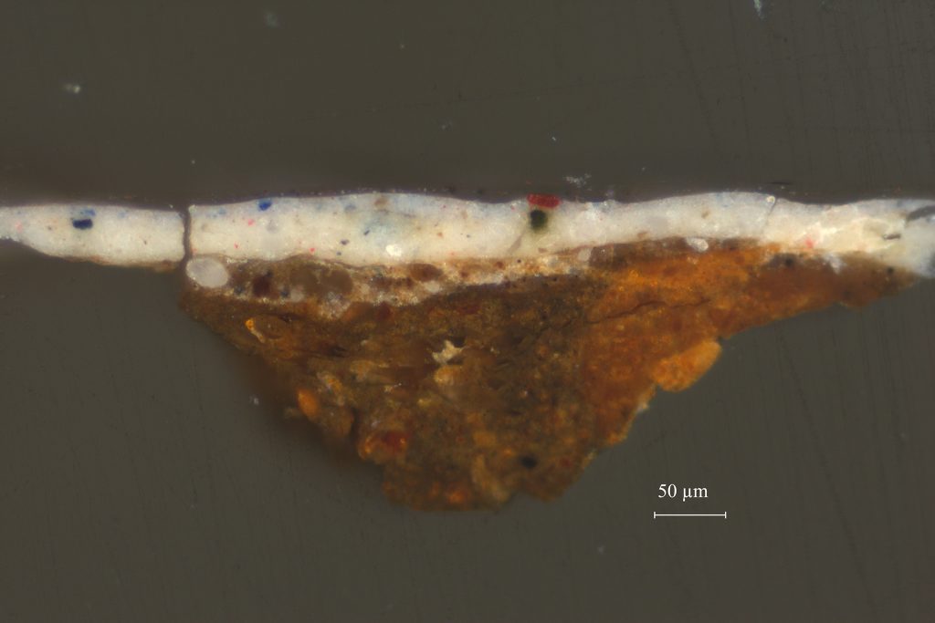
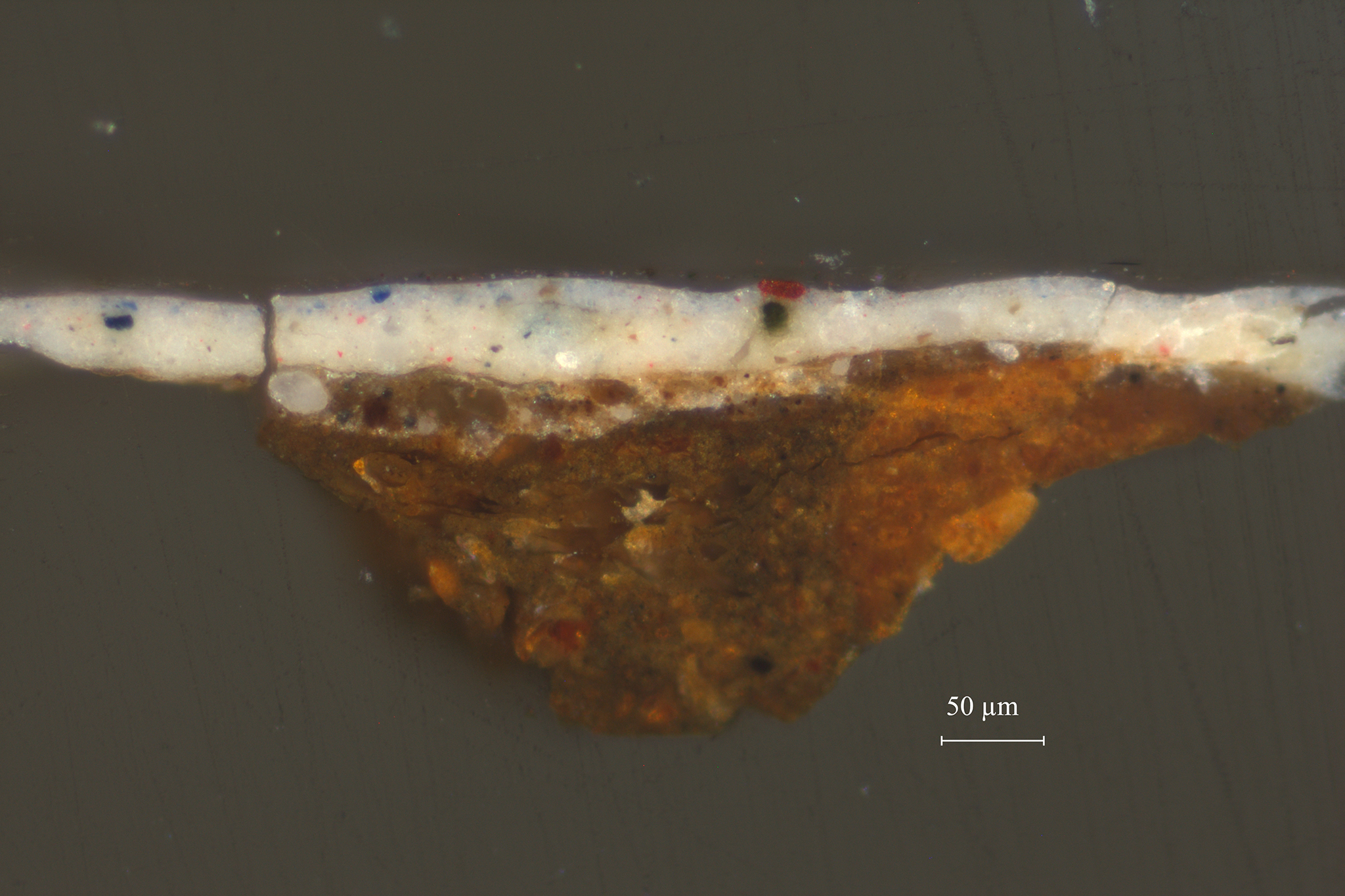
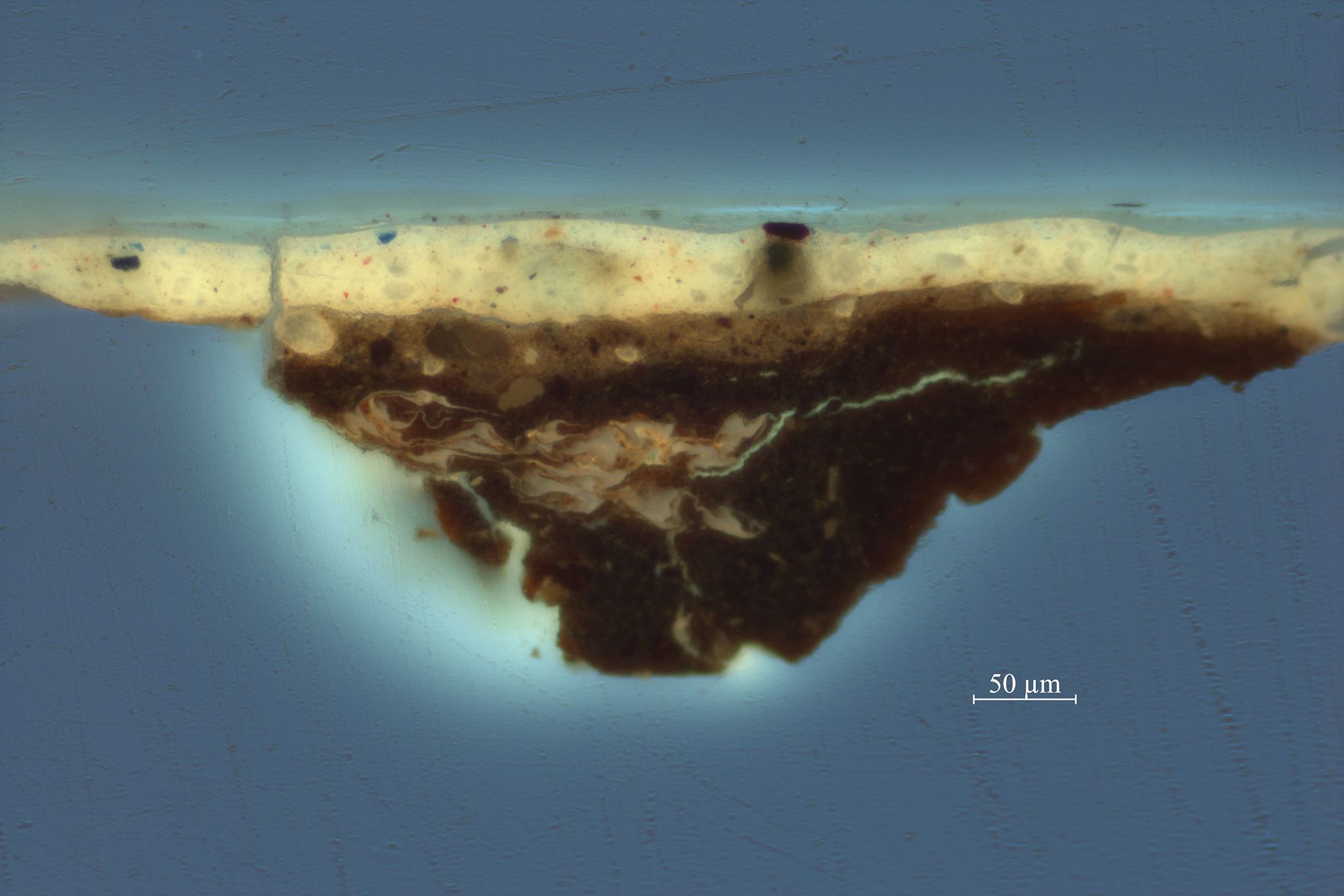
One such example is Johannes Rosenhagen’s (1640–1668) Fruit Still Life (fig. 13). Rosenhagen is a relatively unknown artist who was active in The Hague from about 1658 to 1668. The canvas is covered with a double ground, of which the lower layer is a light gray mixture of lead white and a small amount of fine black pigment (figs. 14 and 15). The upper ground layer is dark gray in color and is applied more thinly. It consists of a fine black pigment with some finer particles of lead white and a small quantity of fine yellow earth. This upper ground layer is applied streakily, with diagonal crisscross brushstrokes that are clearly visible in the MA-XRF scan for the element iron (FeK), related to a yellow earth pigment (fig. 16). The still life was painted on top of this dark gray layer and left uncovered in the background. This became clear when small losses and abraded areas were examined under the microscope. In the background, only the lower light gray ground layer is visible in paint losses, whereas in the rest of the still life, the dark upper ground/ background is also visible in losses, indicating it is present beneath the entire surface of the painting. In the grapes, the dark upper ground was also left uncovered and serves as the darkest tone in the modeling (fig. 17). Similarly, the upper ground plays a significant role in the modeling of the blue tablecloth. There, the light blue highlights were painted using lead white and ultramarine, whereas the midtones were painted with a copper-containing blue pigment mixed with some red pigments. The shadows were created by applying a transparent glaze of red lake and ultramarine on top of the dark gray ground layer (fig. 18).
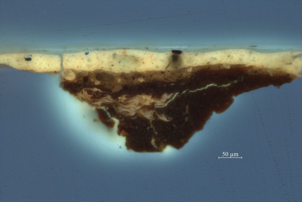
Similarly, Abraham van Calraet (1642–1722) used a dark gray upper ground layer in his Still Life with Peaches and Grapes from about 1680 (fig. 19). Van Calreat lived and worked in Dordrecht, where he was a pupil of Aelbert Cuyp (1620–1691). As in Rosenhagen’s painting, the second ground layer is dark gray and consists mainly of black pigments (figs. 20 and 21). It is present under the entire composition, but an extra-thin gray layer was applied on top of it to further model the background. Unfortunately, as both Van Calraet and Rosenhagen are relatively obscure painters, there is no technical data from other paintings available to compare with our findings. Since Van Calraet was active in multiple genres, it would be interesting to find out if this working method was unique to his still lifes, or whether he applied it to other types of paintings as well.
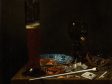
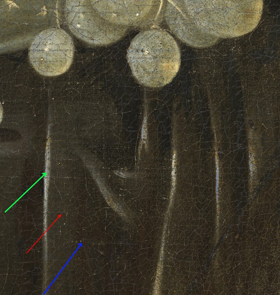
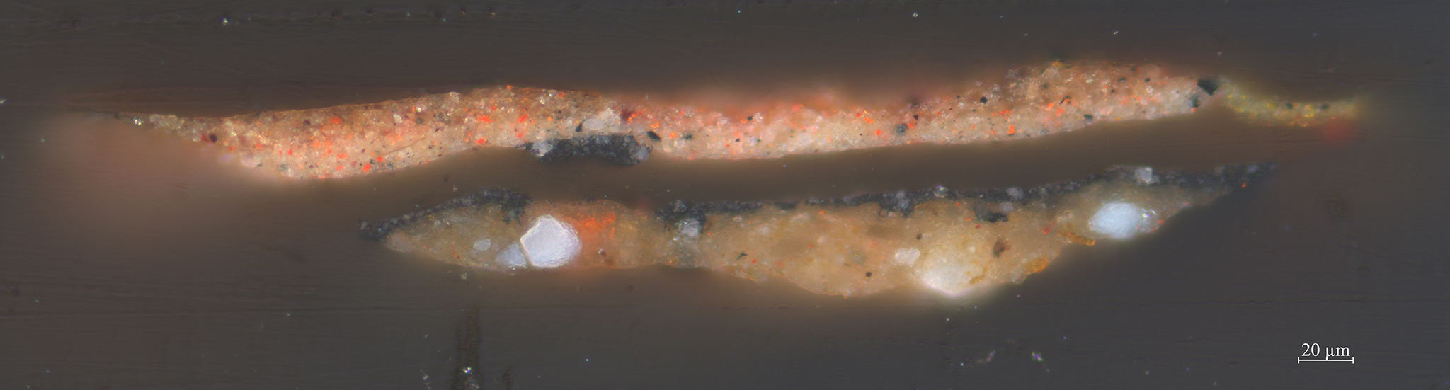
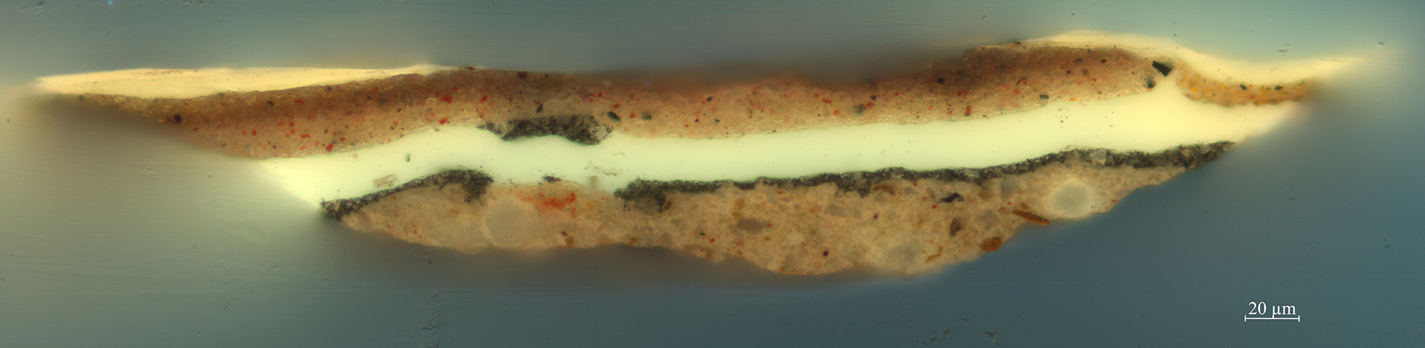
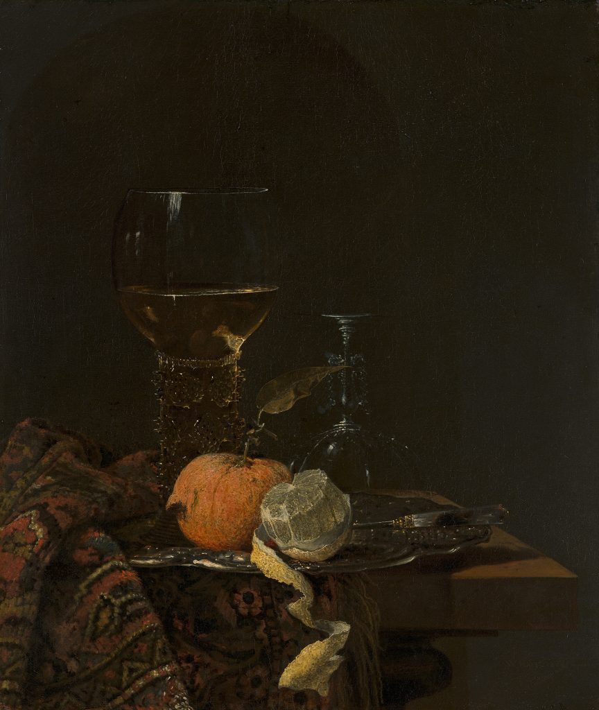
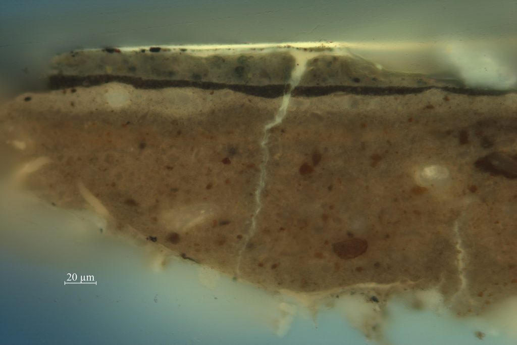
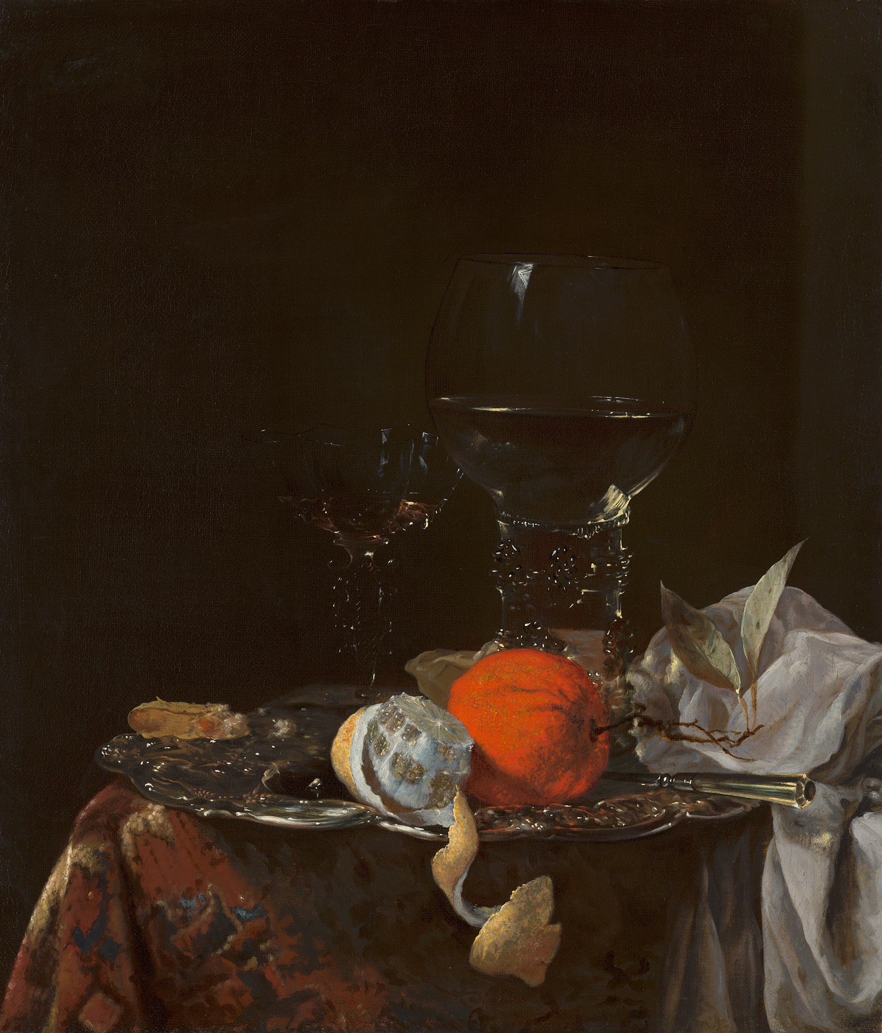
Rotterdam-born artist Willem Kalf (1619-1693) used a very dark gray upper ground in his Still Life with a Roemer of 1659 (fig. 22). The painting must have been made in his Amsterdam period, as Kalf moved to Amsterdam in 1653 and died there in 1693. The canvas support is prepared with three ground layers, of which the bottom one contains chalk and yellow and brown earth (figs. 23 and 24). It is followed by a thinner light gray layer of lead white, fine black, and brown earth. The uppermost layer is equally thin but very dark, and it contains bone black, brown earth, and some lead white. The lower two layers seem to be more common for ground layers, judging by other examples of double grounds on canvas found in this study. Therefore, it seems likely that Kalf used a pre-primed canvas onto which he applied the dark upper ground layer. In the background, that uppermost layer remains visible in many areas, as it is only partially covered with transparent glazes to model an alcove and wall. It shines through all the objects, giving the painting a dark appearance. A similar working method was reported by Wallert for Kalf’s Still Life with Silver Jug from the collection of the Rijksmuseum (tentatively dated 1656).13
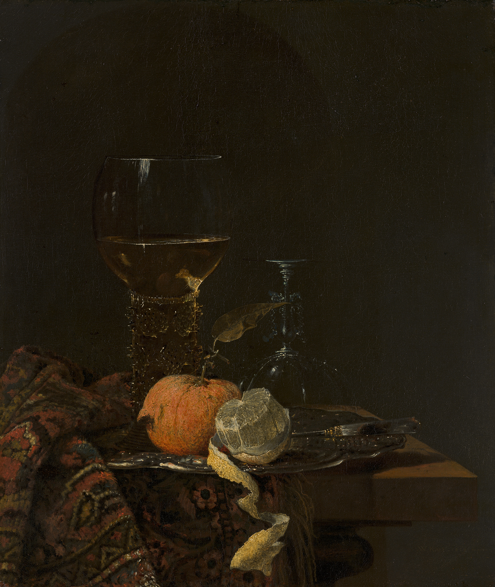
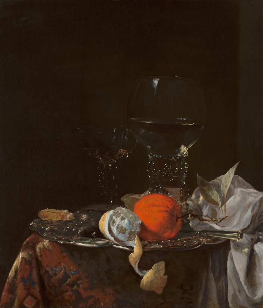
Interestingly, in the artist’s Still Life with Fruit and Wineglasses on a Silver Plate, a different build-up of layers was found (fig. 25). Here, a brown bottom ground layer is followed by a light tan upper layer (figs. 26 and 27). The background was then applied as a separate paint layer, reserving spaces for the still life and objects in the foreground. The difference in appearance between the two paintings is striking: while Still Life with a Roemer is darker and has a more subdued tonality, Still Life with Fruit and Wineglasses on a Silver Plate shows starker contrasts and more vibrant colors. Ageing paint layers must also have played a role in this. Due to their increased transparency over time, and to abrasion, the effect of the dark top ground layer in Still Life with a Roemer has become more pronounced in the overall visual effect of this painting.
The use of a dark gray upper ground layer may seem highly efficient, as there is no need to apply a separate paint layer for the background, thus saving a step in the painting process. There are, however, consequences to consider when working on such a dark layer. Elsewhere in this issue of JHNA, Stols-Witlox and d’Hont write about a Mauritshuis painting by François Ryckhals (1609–1647) that has a black ground layer. Making reconstructions using historically appropriate materials, they experienced that painting on such a dark ground layer can be challenging, as the tonal range must be established early in the painting process. Furthermore, the opacity/ transparency of the paints has a different effect on a dark ground than a light ground. Leaving a dark ground visible through transparent paint leads to lower tonal contrasts, whereas a light ground has the opposite effect, strengthening the luminosity of the paint.14
This study found that using a dark gray upper ground layer does not seem to be a common working method for still life painters; it was found in only three of the eighty-three paintings analyzed. In all the other still lifes with a dark background, it was locally applied and did not extend under the objects. In Still Life with Passglas by Jan van de Velde III (1620–1662), for example, the dark background is executed on top of the lighter gray ground layer (fig. 28). It is applied around the larger objects in the still life, such as the passglas, roemer, plate, and pewter dish. For the glasses, the background only continues under the empty and transparent parts of the glass, not under the parts filled with liquid (fig. 29).
Geographic Preferences
Previous studies about paintings of various genres have indicated that there were local customs for ground layers in the seventeenth century. Such preferences concern the color of the ground, the number of layers, and the pigment composition, and they are possibly linked to the existence of independent primers or suppliers of painting materials in larger cities like Haarlem or Amsterdam.15 Within the still life dataset created through this study, several artistic centers in both the Northern and Southern Netherlands are represented. Filtering the data per city may substantiate the existence of local preferences. As mentioned previously, all canvas paintings with a gray over red double ground originated in the Northern Netherlands. There seems to have been a strong preference for this type of ground in Utrecht, as all paintings originating there (six canvas paintings) share this common feature. It is important to note that the data is biased: the Southern Netherlands (present-day Belgium) are underrepresented. Only seventeen of the analyzed paintings originated there. Within the smaller dataset for paintings originating in Antwerp and Brussels, paintings on wooden panel presented a clear trend. Thick chalk lower grounds with a thin and streakily applied upper ground were found only among these works, as, for instance, in Clara Peeters’s (1588–1636) Still Life with Cheeses, Almonds, and Pretzels (ca. 1615). The thin, streaky upper ground layer is characteristic of Southern Netherlandish panel paintings, where Rubens was one of the first to use it systematically.16 Panel paintings with only a single ground layer all originated in the Northern Netherlands.
Another way of analyzing the existence of local preferences for ground layers is by researching artists who moved around and whose differences in ground layers correspond to where they worked at a given time. An example of this is Jan Steen (1626-1679), who was active in The Hague, Delft, Leiden, Warmond, and Haarlem. Detailed analysis of the ground layers of forty of his paintings showed specific trends per location.17 There were marked differences in ground layer composition and materials, which correspond to the different places he worked. This has led to a clearer understanding of the chronology of his oeuvre. Like Jan Steen, still life painters Jan Davidsz. de Heem and Jan Fijt moved around and worked in several locations. Studying the ground layers on their paintings shows a similar phenomenon.
Mobility and Ground Color in Still Lifes: Father and Son De Heem
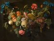
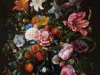
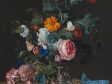
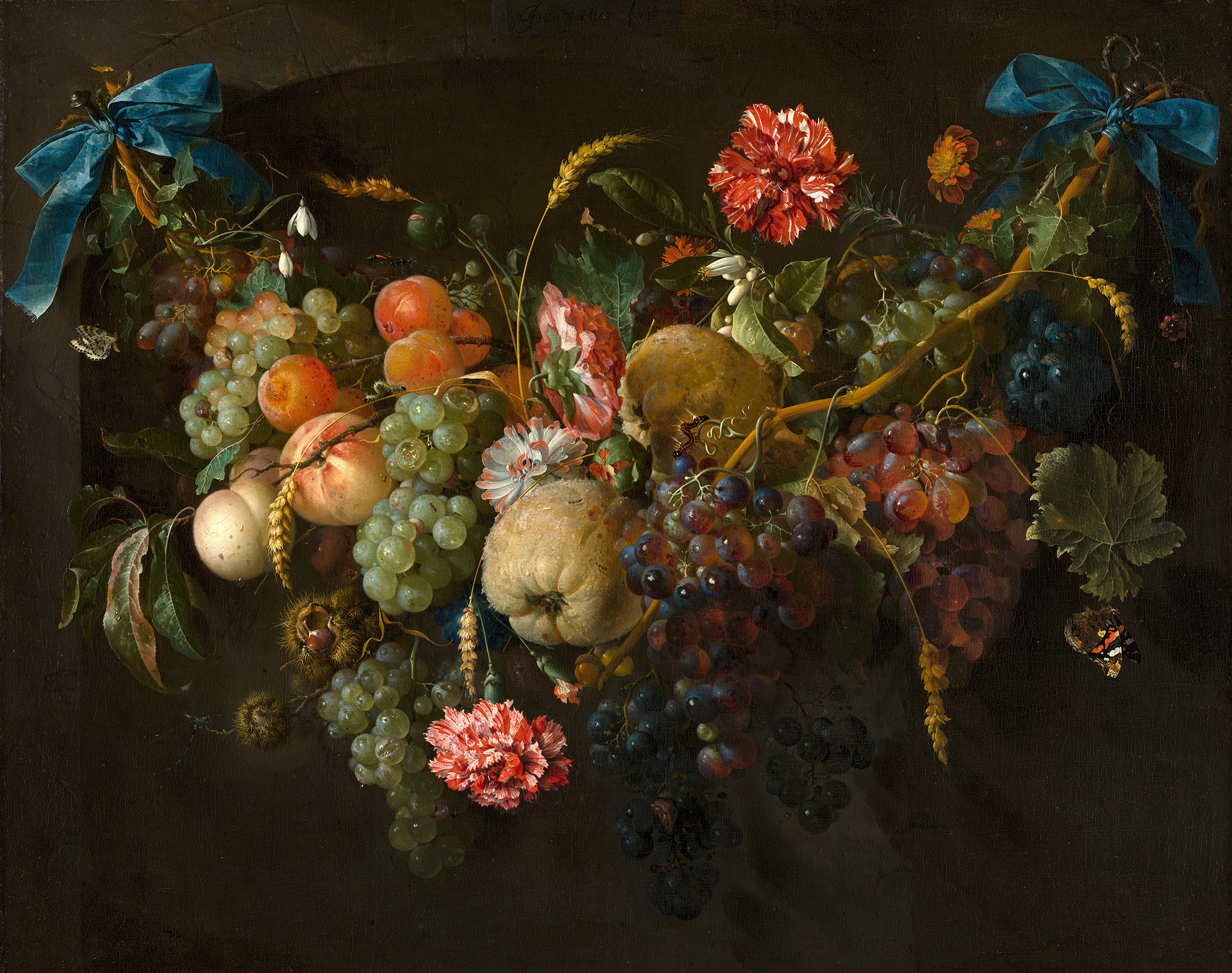
Jan Davidsz. de Heem was born in Utrecht around 1606 and started his career in Leiden in 1625. Ten years later he moved to Antwerp, and from 1658 onward he traveled back and forth between Utrecht and Antwerp until 1672. The last decade of his life was spent working in Antwerp, where he passed away in 1684. De Heem’s Garland of Fruit and Flowers dates to about 1650–1660, when he was active both in Antwerp and Utrecht (fig. 30). The still life is painted on an individually prepared canvas with a double ground.18 The lower ground layer is red and consists of red earth; the upper layer is a brownish-gray mixture of lead white and earth pigments (figs. 31 and 32). He used a similar layer build-up in his masterpiece Vase of Flowers (fig. 33): this canvas was also individually prepared with a lower red ground layer and a grayish upper ground layer (figs. 34 and 35). This layer build-up was relatively common in paintings made in Northern Netherlandish cities like Utrecht and Amsterdam, making it likely that both paintings were created in Utrecht rather than Antwerp. In studies of canvas paintings by this artist in other collections, similar ground layers were reported.19
The largest painting by Jan Davidsz. de Heem in the Mauritshuis collection, Sumptuous Fruit Still Life with Jewellery Box, is dated to around 1650–1655 (fig. 36).20 This canvas also has a double ground, but it differs in composition from the other two paintings (figs. 37 and 38). The lower layer is pale yellow in color and contains chalk with small amounts of earth pigments. The upper ground layer is a light gray mixture of lead white, charcoal black, and some earth pigments. Similar ground layers were found in canvas paintings from Antwerp, such as Frans Snijders’s (1579–1657) Still Life with a Hunter (ca. 1615) and Still Life with a Dead Stag (ca. 1650). In various portraits from Antwerp in the Mauritshuis collection, comparable ground layers were noted.21 This confirms that Sumptuous Fruit Still Life with Jewellery Box was made in Antwerp.
Apart from the difference in ground layers, a slight difference in pigments in the paint layers was also noted between Vase of Flowers and Garland of Fruit and Flowers, and Sumptuous Fruit Still Life with Jewellery Box. In the latter, smalt and lead-tin yellow were used, while they were absent in Vase of Flowers and Garland of Fruit and Flowers. Orpiment might be expected in the lemon peel in Sumptuous Fruit Still Life with Jewellery Box, but it is not present there. Instead, De Heem opted for a combination of lead-tin yellow and yellow lake. Yet in both Vase of Flowers and Garland of Fruit and Flowers, orpiment is present in several flowers. Besides the difference in materials, there is also a difference in handling. The larger Sumptuous Fruit Still Life with Jewellery Box is slightly less refined in its handling of paint. This difference may also substantiate an Antwerp origin of the painting, since according to Fred Meijer, De Heem tended to work in a more refined manner after he moved to Utrecht.22
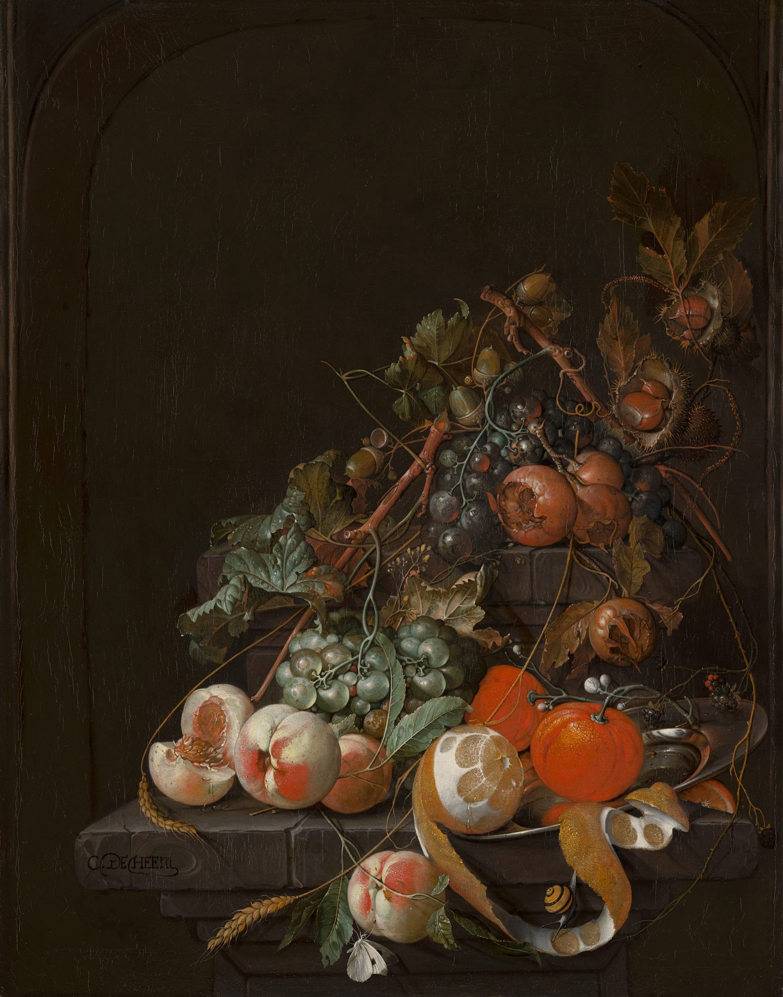
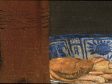
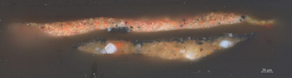
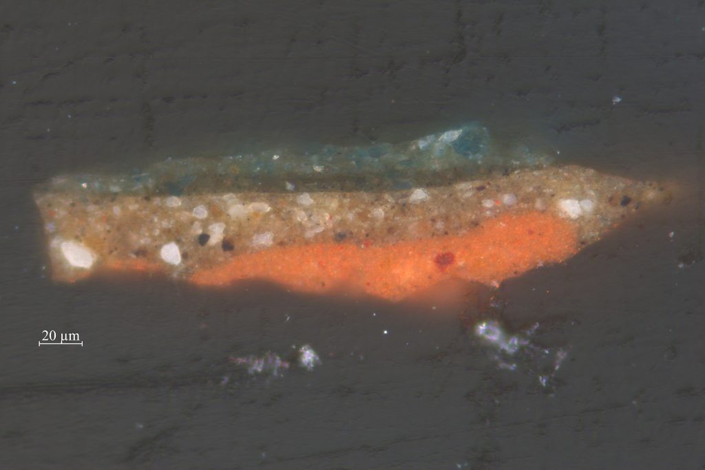
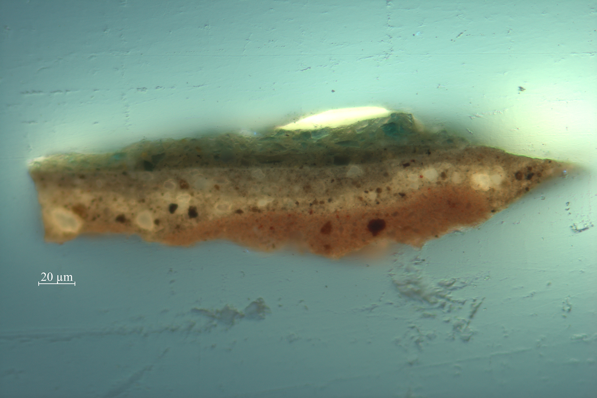
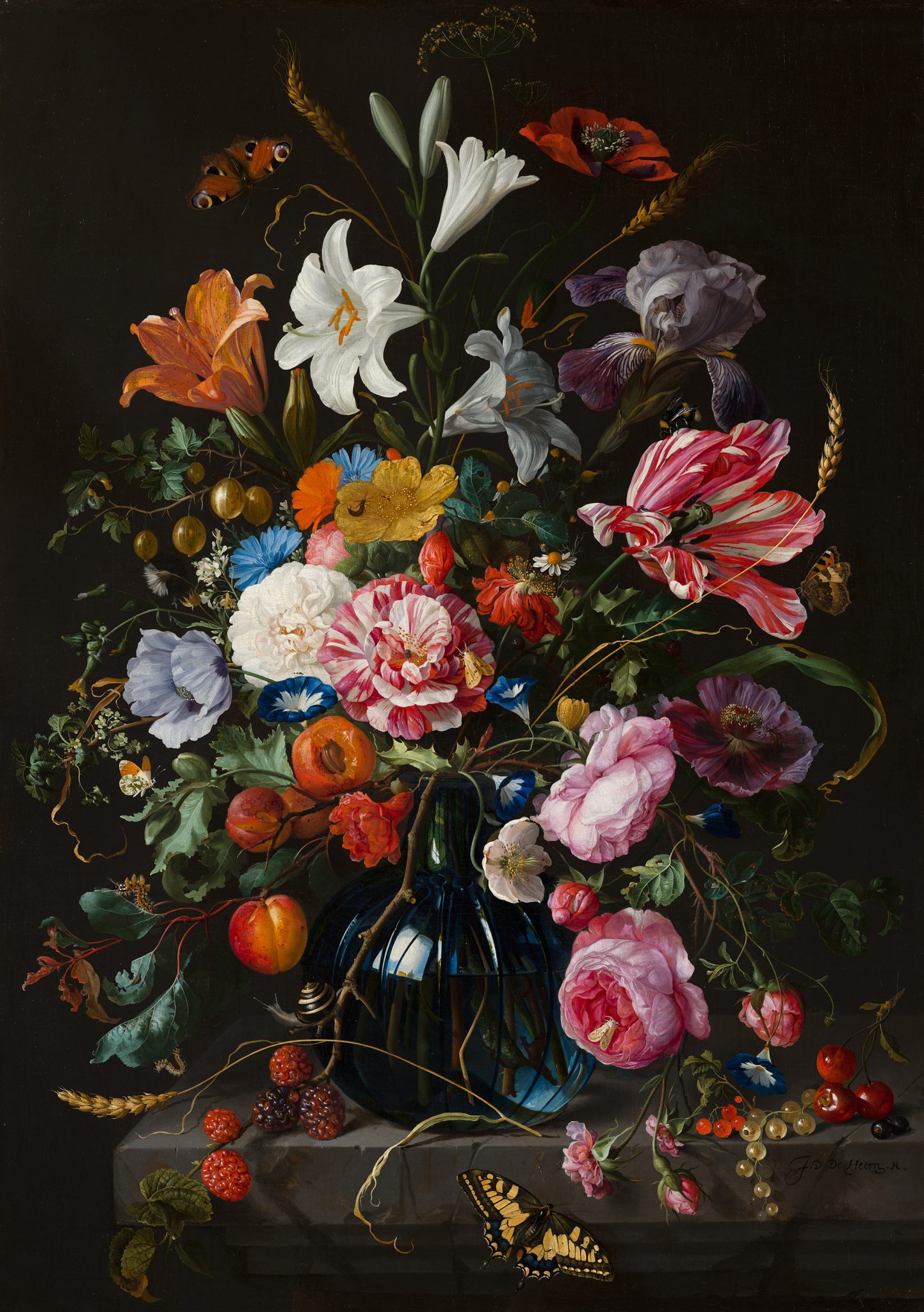
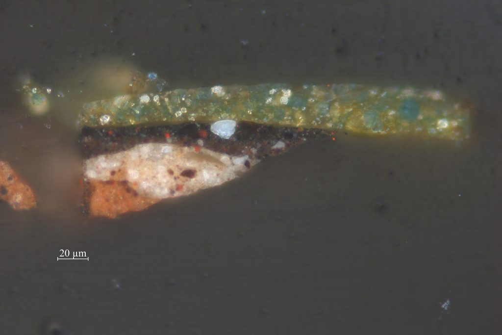
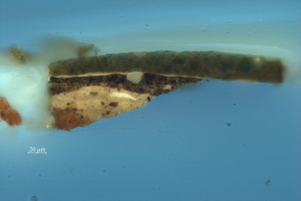
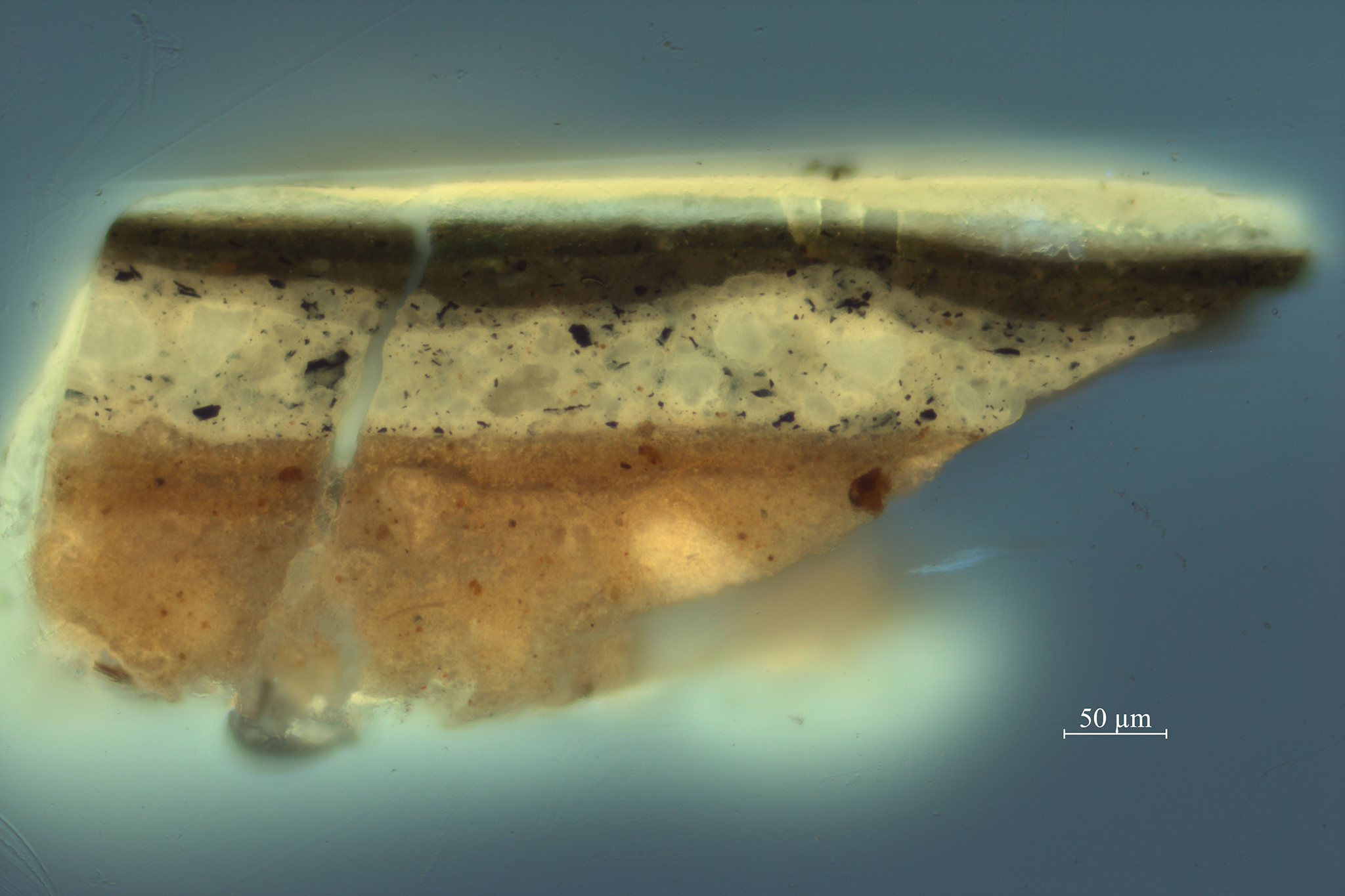
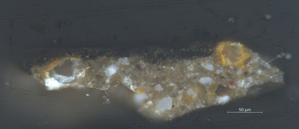
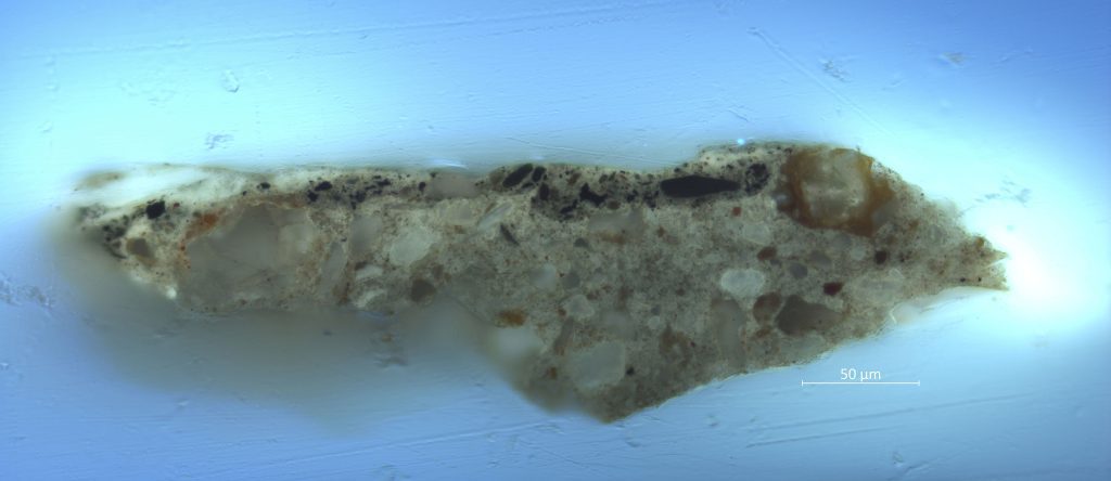
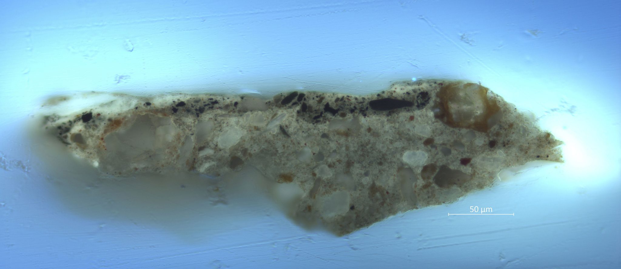
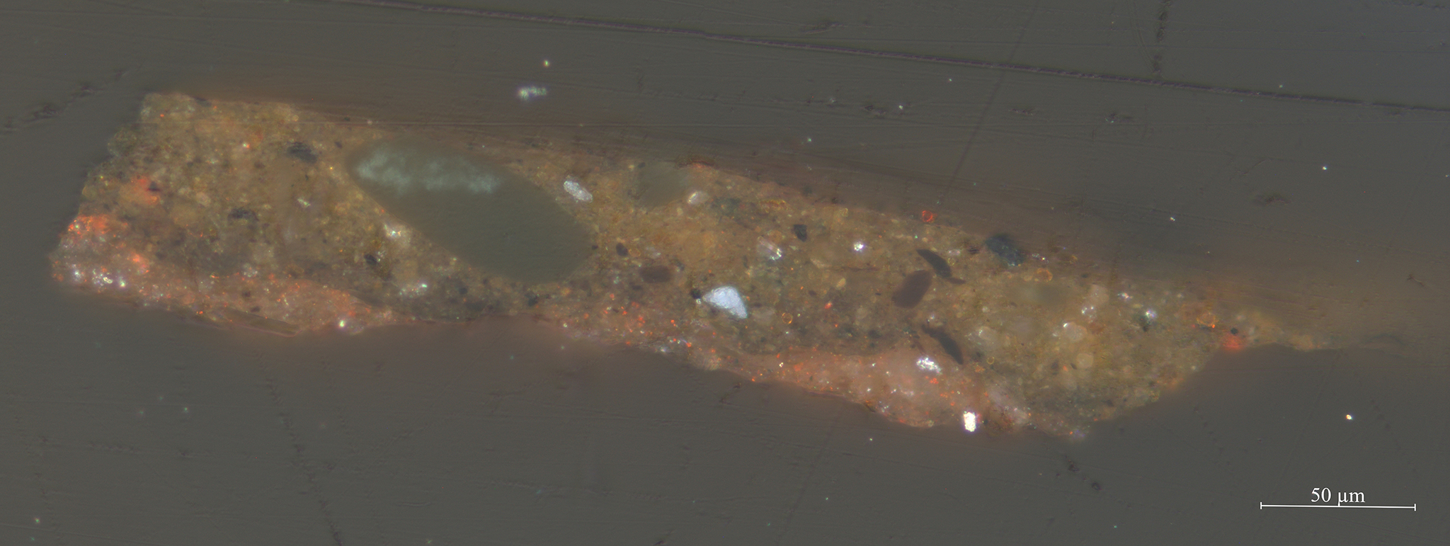
Jan Davidsz. de Heem was twenty-five years old when his son Cornelis was born in 1631 in Leiden. Cornelis was taught by his father and worked in Antwerp, Utrecht, IJsselstein, and The Hague before returning to Antwerp, where he passed away in 1695. Cornelis de Heem’s Fruit Still Life (fig. 39) is signed on the stone slab with C.DE HEEM and has been given the tentative date of 1670, which suggests it was made when he worked and lived in Utrecht. The still life with fruit, acorns, and chestnuts is painted on a canvas support. Close visual examination under magnification determined that the ground is a warm-to-neutral mid-gray color and is sometimes used as a midtone in the composition. Samples embedded as cross-sections revealed a single ground composed of lead white with large colorless inclusions surrounded by yellow-orange earth pigments (figs. 40 and 41). Fine black pigment particles are evenly dispersed throughout the ground, as well as small clumps of orange-red pigments dispersed somewhat unevenly throughout the layer. The large, transparent particles with a ring of finer orange particles are very distinctive. Microscopic analysis immediately identified the mixture with these particles as a ground commonly employed by artists working in The Hague, like Mattheus Terwesten (1670–1757), Giovanni Antonio Pellegrini (1675–1741), and Aert de Gelder (1645–1727).

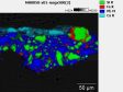
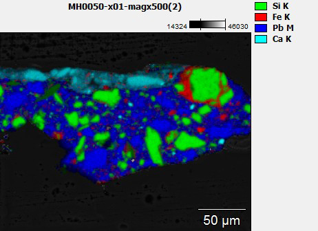
A cross-section of Cornelis de Heem’s Fruit Still Life was investigated further with scanning electron microscopy–electron dispersive spectrometry (SEM-EDS) to compare it to paintings by the aforementioned artists (fig. 42). The transparent particles in the ground proved to be of a similar composition to the ones found in other paintings from The Hague. They are composed of silica and aluminosilicate, and some of the silicate particles have rings of brightly colored iron oxide particles around them. Furthermore, small amounts of fine iron oxide and black pigments are present throughout the layer.23 In the Pellegrini paintings from the Mauritshuis’s Golden Room, the ground layers also showed a presence of silicate particles: specifically, quartz or sand and an aluminosilicate clay. The quartz particles were surrounded with finer reddish-orange clay particles made up of the elements iron, aluminum, and silicon.24 The presence of clay particles, and the fact that this ground seems to be common for The Hague, suggests the use of a local clay. The Eikelenberg manuscript (1679–1704; Regional Archive Alkmaar) mentions the use of “potter’s earth” for ground layers, which would have been readily available due to the large number of potteries in Delft, in close vicinity to The Hague. An eighteenth-century source on the pottery industry specifically mentions the use of clay from Rijswijk, a town on the outskirts of The Hague, for making Delftware.25 The presence of this ground in Fruit Still Life by Cornelis de Heem makes it likely that the painting was created in The Hague rather than Utrecht, which indicates a slightly later date, after 1676.
From Antwerp to Italy and Back: Jan Fijt
Similar to Jan Davidsz. and Cornelis de Heem, Johannes Fijt worked in several locations during his career. Johannes (Jan) Fijt was born in Antwerp in 1611 and was an apprentice of Hans van den Berghe (1587/1588–1650/1655) and Frans Snijders, for whom he must have worked until 1631. When he was in his early twenties, he traveled to Paris and Italy, where he spent time in Venice, Florence, Rome, and Naples. In Rome, he joined the Bentveughels artists’ group, where he was known as “the Goldfinch.” After his sojourn in Italy, he returned to Antwerp in 1641, where he died in 1661 at the age of fifty. Although primarily known for his animal paintings, Fijt also painted other subjects, including landscapes and still lifes.
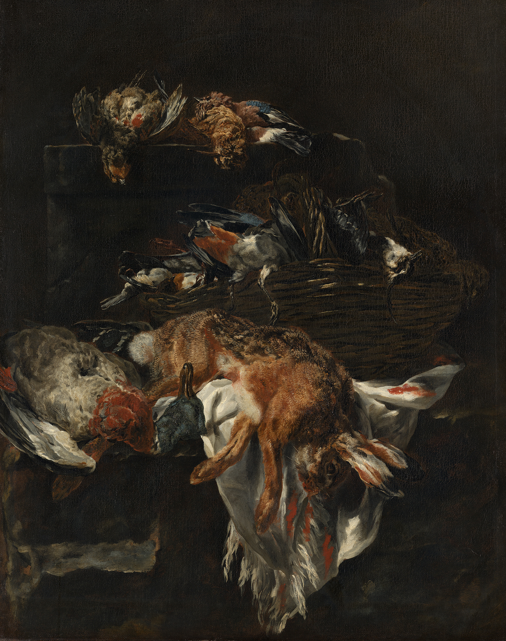
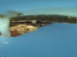
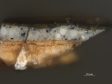
Still Life with Game is the only painting by Johannes Fijt in the Mauritshuis collection (fig. 43). The painting is tentatively dated 1640–1650, which would mean it was painted in Antwerp, after Fijt returned from Italy.26 It is on a canvas primed with a single brownish ground layer containing chalk and red earth pigments (figs. 44 and 45). This type of ground does not match those of other contemporaneous paintings from Antwerp found in the Mauritshuis, such as those by De Heem and Snijders mentioned above. Based on results from this study, a lighter ground layer appears to have been more common for paintings on canvas in Antwerp. Both De Heem and Snijders used a double ground with lower layers of mostly chalk and an upper layer of light gray containing lead white and black. The brownish ground layer found in Still Life with Game seems to correspond more with those made in Italy: specifically Rome, where a brownish ground layer, sometimes containing clay, seems to have been common. As reported in a study headed by Loa Ludvigsen, the Roman painter Girolamo Troppa (1630–1710) used a double ground mainly of brown27 Similarly, Maite Jover de Celis and Maria Dolores Gayo report the use of clay grounds by Diego Velázquez (1599–1660) when he was working in Rome.28 Apart from the ground, several other technical aspects of this painting point in the direction of an Italian provenance. Green earth, the common name for the iron potassium aluminosilicate minerals glauconite and celadonite, was found in several green and blue areas. It consists of large particles that are bluish green in color and contain silicium, aluminum, magnesium, and potassium. Although green earth was used as a pigment by some Dutch masters, such as Jan Steen and Johannes Vermeer (1632–1675), it was not a common pigment in the Netherlands; it was used more abundantly in Italy.29 Another indication of this painting’s Italian provenance is the type of canvas used as a support. With an average thread count of only 7 x 6 threads per centimeter, it has a very open weave (fig. 46). The average thread density of the other still lifes analyzed in this study is about 13 x 13 threads per centimeter, with extremes of 10 and 19 threads per centimeter. This makes the open canvas of Fijt’s Still Life with Dead Game a distinct outlier. Within the Mauritshuis collection, similarly open-weave canvases have been found only in Italian paintings, where it was more common to have very coarse canvases.30 The Italian origin of this painting has implications for the date. Rather than tentatively dating it 1640–1650, the painting can be dated to Fijt’s Roman period, between 1635 and 1641.
Conclusions
This article presents the results of an extensive study into the materials and techniques used in seventeenth-century Netherlandish still life paintings. Focusing on the ground layers, several general conclusions can be drawn. There appears to be no special choice of ground layers (in terms of color or material) that are specific to still life painting. Within the genre, no clear correlation can be discerned between the choice of ground layer and still life subject matter. However, an interesting finding was the use of a very dark gray upper ground layer by a number of painters, which was left largely uncovered in backgrounds and thus functioned as the backdrop for the painted still life. This way of working was highly economical, since much less paint needed to be applied. It seems logical, therefore, that it would have been used more often; the fact that it was not may have to do with a different approach to building the light and shadows.
A large variety of grounds was found in this study, sometimes within the oeuvre of a single artist. The results substantiate the existence of local preferences or customs for ground layers. Certain painters seem to have used ground layers that were locally available. For example, the paintings that Jan Davidsz. de Heem created in Antwerp contain different materials than those he created in Utrecht. The composition of the ground layer in a painting by his son Cornelis clearly indicates that it was created in The Hague, although he was active in several cities in the Netherlands. The ground layer technique should be considered in combination with technical findings concerning other materials and layers. The case study of Jan Fijt’s Still Life with Game highlights this; the combined scientific information about the ground, pigments, and canvas made it clear that the painting was created in Italy rather than Antwerp. These case studies show that technical findings, especially those considering ground layers, can shed more light onto the geographical origin of a painting and therefore can help to better establish the chronology of an artist’s oeuvre.
________________________________________________________________
Table 1 – Overview of Analyzed Paintings
| Artist and Title | Signature and Date | Dimensions (hxw, cm) | Support | Inv. no | City of Origin | Composition and color of ground layer (1: top layer) |
|---|---|---|---|---|---|---|
| Willem van Aelst Flower Still Life with a Timepiece | “Guill.mo van Aelst. 1663” | 62.5 x 49 | Canvas | 2 | Amsterdam | 1. brown: earth pigments, black, lead white |
| 2. gray: lead white, black, some earth pigments | ||||||
| 3. reddish tan: chalk, earth pigments | ||||||
| Willem van Aelst Still Life with Partridges | “Guill.mo. van Aelst./1671” | 58.8 x 47.8 | Canvas | 3 | Amsterdam | 1. gray: lead white, fine black, earth pigments |
| Anonymous (Northern Netherlands) Vanitas Still Life | Undated, ca. 1650 | 45 x 56 | Canvas | 654 | ? | 1. gray: lead white, brown earth, black (several applications of the same mixture) |
| 2. red: red earth, umber, silicates | ||||||
| Anonymous (Southern Netherlands) Vanitas Still Life | Undated, ca. 1530 | 34.2 x 26 | Panel | 694 | ? | 1. off-white: chalk |
| Pieter van Anraadt Still Life with Earthenware Jug and Clay Pipes | “Pieter van / Anraadt / Ano1658" | 67 x 58.8 | Canvas | 1045 | Amsterdam | 1. gray: lead white, earth pigments, fine black |
| 2. beige: chalk | ||||||
| Balthasar van der Ast Shells on a Table | Monogram BA, ca. 1620–1640 | 7.8 x 12.5 | Copper | 399 | Middelburg/Utrecht/Delft | 1. light tan: lead white, chalk, earth pigments, fine black |
| Balthasar van der Ast Fruit Still Life with Shells and a Tulip | “.B. vander. Ast. Fe. / .1620.” | 46 x 64 | Panel | 1066 | Utrecht | 1. light gray: lead white, fine black, fine red earth |
| 2. chalk | ||||||
| Balthasar van der Ast Flowers in a Wan-Li Vase | “.B. van deR. Ast. Fé.,” ca. 1624 | 41 x 32 | Panel | 1073 | Utrecht | 1. light beige: lead white, some yellow and brown earth |
| 2. chalk | ||||||
| Balthasar van der Ast Flowers in a Wan-Li Vase, with Shells | “.B. vander.Ast,” ca. 1640–1650 | 53 x 43 | Panel | 1108 | Delft | 1. light gray: chalk, lead white, earth pigments |
| 2. white: chalk? | ||||||
| Balthasar van der Ast A Single Tulip in a Vase | “.B. vander. Ast.,” ca. 1625 | 26.2 x 29.8 | Panel | 1229 | Utrecht | 1. light gray: lead white with a little bit of black |
| 2. light peach: lead white with fine red particles | ||||||
| 3. chalk | ||||||
| Joachim Beuckelaer Kitchen Scene with Christ at Emmaus | Unsigned, ca. 1560–1565 | 109.5 x 169 | Panel | 965 | Antwerp | 1. light gray: lead white, earth pigments, fine black, azurite |
| 2. chalk | ||||||
| Abraham van Beyeren Still Life with Seafood | “.AVB f.,” ca. 1645–1660 | 75.8 x 68 | Canvas | 401 | ? | 1. yellow-brown: chalk, earth pigments, black, transparent gray particles, and lead white |
| 2. brown: chalk, earth pigments, black, transparent gray particles, and lead white | ||||||
| Abraham van Beyeren Flower Still Life with a Timepiece | “.AVB f.,” ca. 1663–1665 | 80 x 69 | Canvas | 548 | The Hague? | 1. ocher colored: lead white, yellow earth, umber, red earth, bone black. The top layer is slightly darker than the lower layer. |
| 2. ocher colored: lead white, yellow earth, umber, red earth, bone black. | ||||||
| Abraham van Beyeren Sumptuous Still Life | “AVB,” ca. 1655 | 98 x 76 | Panel | 665 | ? | 1. light beige: chalk and lead white with fine black and fine earth pigments |
| 2. chalk | ||||||
| Abraham van Beyeren Fish Still Life | Unsigned, ca. 1645–1660 | 68 x 59 | Canvas | 678 | ? | 1. warm gray: chalk, lead white, earth pigments, charcoal black |
| Abraham van Beyeren Still Life with Game and Poultry | Unsigned, ca. 1650–1660 | 79.5 x 68 | Canvas | 697 | ? | 1. beige: earth pigments, charcoal, lead white, some smalt. The upper ground layer contains a larger proportion of lead white than the lower ground. |
| 2. beige: earth pigments, charcoal, and lead white | ||||||
| Abraham van Beyeren Banquet Still Life | “AVB f,” after 1655 | 99.5 x 120.5 | Canvas | 1056 | ? | 1. brown: yellow and brown earth, orange-red arsenic containing pigment, coarse lead white, coarse dark-brown pigments |
| Ambrosius Bosschaert de Oudere Vase of Flowers in a Window | “.AB.,” ca. 1618 | 64 x 46 | panel | 679 | Utrecht | 1. gray: lead white, earth pigments, fine black |
| 2. white: lead white and chalk | ||||||
| Dirck de Bray Still Life with a Bouquet in the Making | “1674 D.D.Bray. F.” | 40.5 x 35.7 | Panel | 1166 | Haarlem | 1. light brown: lead white, some yellow and brown earth, some black |
| 2. off-white: chalk | ||||||
| Jan Brueghel the Elder Wan-Li Vase with Flowers | Unsigned, ca. 1610–1615 | 42 x 34.5 | Panel | 1072 | Brussels | 1. light gray: lead white and black |
| 2. chalk | ||||||
| Jan Brueghel the Elder and Hendrik van Balen Garland of Fruit Surrounding a Depiction of Cybele Receiving Gifts from Personifications of the Four Seasons | Unsigned, ca. 1620–1622 | 106.3 x 69.9 | Panel | 233 | Antwerp | 1. thin gray layer: charcoal black and lead white |
| 2. chalk | ||||||
| Abraham van Calraet Still Life with Peaches and Grapes | “A v Calraet,” ca. 1680 | 89 x 73 | Canvas | 754 | Dordrecht | 1. dark gray: fine black, lead white |
| 2. warm beige: chalk, earth pigments, lead white | ||||||
| Jean-Baptiste-Siméon Chardin Still Life with Copper Kettle, Cheese, and Eggs | “chardin.,” ca. 1730–1735 | 33 x 41 | Canvas | 656 | Paris | 1. light gray: chalk, lead white, charcoal black |
| 2. red: red earth | ||||||
| Pieter Claesz Vanitas Still Life | “PC. Ao. 1630” | 39.5 x 56 | Panel | 943 | Haarlem | 1. light brown: lead white, earth pigments, bone black |
| 2. white: chalk and some lead white | ||||||
| Pieter Claesz Still Life with Burning Candle | “PC Ao 1627” | 26.1 x 37.3 | Panel | 947 | Haarlem | 1. off white: lead white, chalk, umber |
| Pieter Claesz Still Life with Tazza | “PC 1636” | 44 x 61 | Panel | 1125 | Haarlem | 1. light brown: lead white, charcoal, umber, earth pigments |
| 2. chalk | ||||||
| Edwaert Collier Vanitas Still Life | “E. Collier. 1676.” | 19.5 x 17 | Panel | 810 | Leiden | 1. light red: earth pigments, some lead white |
| 2. off-white: chalk, lead white, earth pigments | ||||||
| 3. cream: chalk | ||||||
| Adriaen Coorte Still Life with Wild Strawberries | “A. C…… / 1705” | 16.5 x 14 | Paper on panel | 1106 | Middelburg | 1. reddish brown: red earth, black, lead white, translucent particles |
| Adriaen Coorte Still Life with Five Apricots | “A. Coorte. / 1704” | 30 x 23.5 | Canvas | 1154 | Middelburg | 1. yellow: yellow earth and chalk |
| Gonzalez Coques (with many other artists) Interior with Figures in a Picture Gallery | Unsigned, 1667–1672, 1706 | 176 x 210.5 | Canvas | 238 | Antwerp | 1. gray: lead white and charcoal black |
| 2. beige: chalk and earth pigments | ||||||
| Caesar van Everdingen Trompe l’Oeil with a Bust of Venus | “CVE AͶo .16.65.” | 74 x 60.8 | Canvas | 1088 | Alkmaar | 1. gray: coarse lead white, coarse charcoal black, some earth pigments |
| 2. red: red earth and chalk | ||||||
| Jan Fijt (attributed to) Still Life with Dead Birds, a Cage and a Net | Unsigned, ca. 1645–1650 | 48.4 x 71.5 | Canvas | 687 | Antwerp? | 1. light-gray: lead white mixed with charcoal black |
| 2. beige: chalk, some earth pigments | ||||||
| Jan Fijt Still Life with Game | Unsigned, ca. 1640–1650 | 121.5 x 97.5 | Canvas | 925 | Rome | 1. brown: chalk and earth pigments |
| Jacob de Gheyn II Flowers in a Glass Flask | “J G 12” (to be interpreted as 1612), “JACOBVS DE GHEYN FE:” | 58 x 44 | Copper | 1077 | The Hague | 1. off-white: lead white, small amount of earth pigments, fine black |
| Johan Haensbergh Still Life with a Wager Cup | “Joh: Haensbergh. Gorco. Fec. 1665.” | 40 x 30.2 | Panel | 601 | Gorinchem | 1. light beige: lead white, earth pigments, chalk, coarse black |
| 2. similar to layer 1 but slightly lighter in tone | ||||||
| Willem Claesz. Heda Still Life with a Roemer and Watch | “.HEDA. / 1629” | 46 x 69.2 | Panel | 596 | Haarlem | 1. gray: lead white, fine black, small amount of yellow earth |
| 2. cream colored: chalk, small amount of yellow and brown earth, fine black | ||||||
| Willem Claesz. Heda (attributed to) Still Life with Nautilus Cup | “.HEDA. / 1640” | 68.5 x 50 | Panel | 936 | Haarlem | 1. light gray: lead white, chalk, yellow and brown earth, fine black |
| 2. off white: chalk | ||||||
| Cornelis de Heem Fruit Still Life | “C. DE HEEM,” ca. 1670 | 65 x 50 | Canvas | 50 | The Hague | 1. warm gray: lead white, earth pigments, fine black |
| Jan Davidsz. de Heem Sumptuous Fruit Still Life with Jewellery Box | “J. De Heem f.,” ca. 1650–1655 | 94.7 x 120.5 | Canvas | 48 | Antwerp | 1. light gray: lead white, charcoal black, some earth pigments |
| 2. beige: chalk with some earth pigments | ||||||
| Jan Davidsz. de Heem Garland of Fruit and Flowers | “J. D. De Heem fecit,” ca. 1650–1660 | 60.2 x 74.7 | Canvas | 49 | Utrecht | 1. gray: lead white, earth pigments |
| 2. red: earth pigments | ||||||
| Jan Davidsz. de Heem Still Life with Books and a Violin | “Johannes.de./Heem./1628.” | 36.1 x 48.5 | Panel | 613 | Leiden | 1. cool gray: lead white, charcoal black, some chalk |
| 2. beige: chalk | ||||||
| Jan Davidsz. de Heem Vase of Flowers | “J.D. De Heem. R.,” ca. 1670 | 74.2 x 52.6 | Canvas | 1099 | Utrecht? | 1. gray: lead white and earth pigments |
| 2. red: earth pigments | ||||||
| Jan van der Heyden Still Life with a Bible | “I.v.d.Heyde 1664” | 27 x 20.7 | Panel | 531 | Amsterdam | 1. gray: lead white, coarse black pigment, fine red earth pigments |
| 2. white: chalk | ||||||
| Melchior d’Hondecoeter (possibly) Dead Cock Hanging from a Nail | “M:d’Hondekoeter,” ca. 1670. | 76 x 62.5 | Canvas | 968 | Amsterdam? | 1. yellow: yellow earth, chalk, lead white |
| Jacob van Hulsdonck Roses in a Vase | “IVHVLSDONCK.FE.,” ca. 1640–1645 | 35 x 28.4 | Copper | 1214 | Antwerp | 1. yellow brown: lead white, charcoal, yellow and lake, yellow and brown earth |
| 2. light gray: chalk, lead white, small amount of black | ||||||
| Jan van Huysum Fruit Still Life | “Jan Van Huijsum fecit,” ca. 1605–1615 | 21 x 27 | Copper | 70 | Amsterdam | 1. beige: lead white, yellow earth, some brown earth and fine black (four applications of the same mixture) |
| Jan van Huysum Flower Still Life | “Jan Van / Huijsum fecit,” ca. 1605–1615 | 21 x 27 | Copper | 71 | Amsterdam | 1. beige: lead white, yellow earth, some brown earth and fine black (four applications of the same mixture) |
| Willem Kalf Still Life with Roemer | “W.KALF.1659” | 49.9 x 42.4 | Canvas | 927 | Amsterdam | 1. dark gray: bone black and brown earth |
| 2. light gray: lead white, fine black, brown earth | ||||||
| 3. light tan: chalk, yellow and brown earth | ||||||
| Willem Kalf Still Life with Shells | “W KALF,” ca. 1690 | 25 x 33 | Panel | 971 | Amsterdam? | 1. gray-brown: chalk, charcoal black, fine earth pigments, lead white |
| 2. chalk | ||||||
| Willem Kalf Still Life with Coral | “W KALF,” ca. 1690 | 25 x 33 | Panel | 972 | Amsterdam? | 1. gray-brown: chalk fine earth pigments, fine black and lead white |
| 2. chalk | ||||||
| Willem Kalf Still Life with Fruit and Wineglasses on a Silver Plate | “Kalf,” ca. 1659–1660 | 49.3 x 42.9 | Canvas | 1126 | Amsterdam | 1. tan: yellow earth, lead white, fine black |
| 2. brown: brown and yellow earth, some red earth, fine black, some lead white | ||||||
| Isaac van Kipshaven Sumptuous Still Life | “IV Kipshaven 1661” | 84 x 73 | Canvas | 814 | Nijmegen | 1. gray: lead white, coarse black, earth pigments |
| 2. red: red earth and chalk | ||||||
| Simon Luttichuys Still Life with Chinese Vase, Hazelnuts and Orange | “S.L. fc,” ca. 1650–1660 | 30.2 x 22.7 | Panel | 1223 | Amsterdam | 1. light brown |
| 2. off-white | ||||||
| Abraham Mignon Flowers and Fruit | “AB. Mignon:fec.,” ca. 1670 | 75 x 63 | Canvas | 110 | Utrecht | 1. gray: lead white, chalk, brown and yellow earth |
| 2. red: chalk and earth pigments | ||||||
| Abraham Mignon Flowers in a Metal Vase | “AB. “Mignon:fec.,” ca. 1670 | 90 x 72.5 | Canvas | 111 | Utrecht | 1. gray: lead white, red earth and fine black |
| 2. red: earth pigments and chalk | ||||||
| Abraham Mignon Flowers in a Glass Vase | “AB. Mignon: Fec.,” ca. 1670 | 90 x 72.5 | Canvas | 112 | Utrecht | 1. gray: lead white, red earth. and fine black |
| 2. red: earth pigments and chalk | ||||||
| Jean Baptiste Morel (attributed to) Portrait of a Lady Encircled by a Wreath of Flowers | Unsigned, ca. 1690 | 36.8 x 27.6 | Panel | 702 | ? | 1. light brown: earth pigments, charcoal black |
| 2. beige: chalk, lead white, earth pigments | ||||||
| Jean Baptiste Morel (attributed to) Portrait of a Man Encircled by a Wreath of Flowers | Unsigned, ca. 1690 | 37.3 x 28.8 | Panel | 703 | ? | 1. light brown: earth pigments, charcoal black |
| 2. beige: chalk, lead white, earth pigments | ||||||
| Maria van Oosterwijck Flowers in an Ornamental Vase | “MARIA VAN OOSTERWYCK,” ca. 1670–1675 | 62 x 47.5 | Canvas | 468 | Amsterdam | 1. gray: lead white, fine black pigment |
| 2. brown: earth pigments, black | ||||||
| Clara Peeters Still Life with Cheeses, Almonds, and Pretzels | “.CLARA.PEETERS.,” ca. 1615 | 34.5 x 49.5 | Panel | 1203 | Antwerp | 1. light gray: lead white and black |
| 2. chalk | ||||||
| Giovanni Antonio Pellegrini Flowers in a Vase | Unsigned, 1704–1718 | 88.5 diam. (round) | Canvas | 1144 | The Hague | 1. orange-brown: chalk, red and yellow earth, some lead white, umber and fine black |
| Giovanni Antonio Pellegrini Flowers in a Vase | Unsigned, 1704–1718 | 88.5 diam. (round) | Canvas | 1145 | The Hague | 1. orange-brown: chalk, red and yellow earth, some lead white, umber, and fine black |
| Giovanni Antonio Pellegrini Flowers in a Vase | Unsigned, 1704–1718 | 88.5 diam. (round) | Canvas | 1146 | The Hague | 1. orange-brown: chalk, red and yellow earth, some lead white, umber, and fine black |
| Giovanni Antonio Pellegrini Flowers in a Vase | Unsigned, 1704–1718 | 88.5 diam. (round) | Canvas | 1147 | The Hague | 1. orange-brown: chalk, red and yellow earth, some lead white, umber, and fine black |
| Giovanni Antonio Pellegrini Flowers in a Vase | Unsigned, 1704–1718 | 88.5 diam. (round) | Canvas | 1148 | The Hague | 1. orange-brown: chalk, red and yellow earth, some lead white, umber, and fine black |
| Giovanni Antonio Pellegrini Flowers in a Vase | Unsigned, 1704–1718 | 88.5 diam. (round) | Canvas | 1149 | The Hague | 1. orange-brown: chalk, red and yellow earth, some lead white, umber, and fine black |
| Ludger tom Ring the Younger Narcissi, Periwinkle and Violets in a Ewer | “LV [….] RIN[G],” ca. 1562 | 35.1 x 15.3 | Panel | 1212 | Antwerp | 1. white: lead white |
| 2. thick chalk layer | ||||||
| Johannes Rosenhagen Fruit Still Life | “Johannes.Rosenhagen. f,” ca. 1650–1660 | 55 x 70 | Canvas | 150 | The Hague | 1. dark gray: fine black, some fine lead white, yellow earth |
| 2. off-white: lead white and fine black | ||||||
| Rachel Ruysch Vase with Flowers | “Rachel Ruysch F: 1700” | 79.5 x 60.2 | Canvas | 151 | Amsterdam | 1. dark brown: earth pigments, chalk and lead white. Contains more and finer particles of lead white than the bottom layer |
| 2. dark brown: earth pigments, chalk, and lead white | ||||||
| Roelant Savery Vase of Flowers in a Stone Niche | “.R.SAVERY.FE.1615.” | 63.5 x 45.1 | Panel | 1213 | Amsterdam | 1. light gray: lead white with some black pigment |
| 2. chalk | ||||||
| Otto Marseus van Schrieck Plants and Insects | “OTTO / Marseus.D.Schrick / 1665. / 9:5” | 102.3 x 75.8 | canvas | 532 | ? | 1. dark gray: black and a little bit of lead white and red and yellow earth |
| 2. light gray: lead white with a little bit of black and earth pigments | ||||||
| 3. buff: chalk and earth pigments | ||||||
| Daniël Seghers Garland of Flowers Surrounding a Sculpture of the Virgin Mary | “D.Seghers. Soctis Jesu / 1645” | 151 x 122.7 | Canvas | 256 | Antwerp | 1. ocher colored: lead white, charcoal black, orange and brown earth pigments |
| 2. gray: lead white, charcoal black, earth pigments (two applications of the same mixture) | ||||||
| 3. semitransparent: chalk, traces of black and orange pigments | ||||||
| Daniël Seghers Portrait of Stadholder-King William III (1650–1702) Surrounded by a Garland of Flowers | “D.Seghers.Soctis. JESV,” ca. 1660 | 122.5 x 10⁷ | Canvas | 257 | Antwerp | 1. gray: lead white, charcoal black (two applications of the same mixture) |
| 2. buff: chalk and earth pigments | ||||||
| Daniël Seghers and Jan Cossiers Bust of Constantijn Huygens (1596–1687) Surrounded by a Garland of Flowers | “D.niel.Seghers.Soc.tis Jesu 1644” | 86 x 63 | Copper | 1216 | Antwerp | 1. light gray: lead white with charcoal black and a little earth pigment |
| 2. light gray: lead white some chalk a little bit of black and earth pigments | ||||||
| Frans Snijders Still Life with a Huntsman | Unsigned, ca. 1615 | 113.7 x 205.5 | Canvas | 258 | Antwerp | 1. light gray: lead white, charcoal black, some chalk and some earth pigments |
| 2. beige: chalk and some earth pigments | ||||||
| Frans Snijders (studio of) Still Life with a Dead Stag | Unsigned, ca. 1610–1640 | 120 x 180.3 | Canvas | 794 | Antwerp | 1. light gray: lead white, charcoal black |
| 2. beige: chalk and yellow earth | ||||||
| Jan van de Velde III Still Life with Passglas | “IANVANDEVELDE [in ligature]. Ano. 1660 / Fecit/” | 54 x 47.5 | Canvas | 533 | Amsterdam | 1. gray: lead white, mixed with some earth pigments, fine black, and charcoal black |
| 2. warm beige: chalk mixed with yellow earth and some particles of organic brown | ||||||
| 3. warm beige: chalk mixed with yellow earth and some particles of organic brown. Similar to layer 2 but slightly lighter in tone. | ||||||
| Jan Vermeulen Still Life with Books and Musical instruments | “JVM,” ca. 1660 | 81.5 x 63.5 | Panel | 402 | ? | 1. beige: lead white, earth pigments, fine black |
| 2. white: chalk | ||||||
| Jan Vermeulen Still Life with Books, a Globe and Musical Instruments | “J.V.Meulen,” ca. 1660 | 30 x 38.5 | Panel | 662 | ? | 1. brown: lead white, fine carbon black particles, earth pigments, and possibly some quartz particles |
| 2. white: chalk | ||||||
| Elias Vonck Dead Birds | “[…]CK,” ca. 1630–1650 | 35.5 x 54 | Panel | 404 | Amsterdam | 1. light brown: lead white, earth pigments |
| 2. white: chalk and lead white | ||||||
| Jan Weenix Hunting Still Life | “I We […] ,” 1706 or 1708 | 79.2 x 69.5 | Canvas | 207 | Amsterdam? | 1. yellow-brown: yellow earth, some red and brown earth particles, lead white, fine black |
| Jan Weenix Dead Hare | “J.Weenix.f 1689” | 115.3 x 92.3 | Canvas | 642 | Amsterdam | 1. gray: lead white, fine black, and brown earth pigments |
| 2. dark gray: fine black, with some lead white and brown earth mixed in | ||||||
| 3. brownish gray: earth pigments mixed with fine black and some lead white | ||||||
| Jan Baptist Weenix Dead Partridge, Hanging from a Nail | “Gio.Batta: Weenix f.,” ca. 1650–1652 | 50.6 x 43.5 | Canvas | 940 | Utrecht | 1. brownish gray: chalk, earth pigments, lead white |
| 2. red: red earth and chalk |


