A technical investigation of a group of sixteenth-century Leiden School paintings, this article focuses on specific aspects of technique: the visibility of underdrawing, the use of isolation layers and underlayers, unconventional sequences used to apply paint layers, surface effects, and the creation of a wide range of tones with a limited number of pigments. The examined works include paintings by Cornelis Engebrechtsz (ca. 1465–1527) and works by two of his pupils, Lucas van Leyden (1489 or 1494–1533) and Aertgen van Leyden (ca. 1498–ca. 1564). It appears that certain techniques were transmitted from master to pupil, but that each artist achieved certain pictorial effects using personally developed methods.
If several painters work in the same milieu, have access to a similar range of materials, and are taught within a single workshop, they will logically share certain techniques. The school of painters active in Leiden at the beginning of the sixteenth century is no exception: the artists’ techniques have many similarities but diverge in individual ways. The paintings owned by the Stedelijk Museum de Lakenhal in Leiden and the Rijksmuseum in Amsterdam give an overview of Leiden’s artistic production between 1500 and 1535. In the Schilder-boeck (1604), Karel van Mander described the master of the Leiden School, Cornelis Engebrechtsz, as an “energetic and skillful painter (cloeck en veerdigh schilder).”1 This praise could equally be applied to his pupils and followers.
In many ways, the painting techniques of Leiden School artists are comparable with those of their Northern Netherlandish contemporaries and the Flemish painters who preceded them. The traditional technique of early Netherlandish painters has been described in terms of superimposed layers and transparent glazes that were applied directly over the ground or on top of opaque light-colored underlayers.2 Although Leiden School painters often built up areas of color in a traditional way, in some cases they appear to have intentionally modified earlier painting techniques. In the workshop, their innovations were transmitted from master to pupil and may have inspired other artists in the region.
This paper focuses on aspects of their technique as revealed by technical examination, including close-up scrutiny of surfaces as well as the study of cross-sections.3 These features comprise: the visibility of underdrawing, the use of isolation layers and underlayers, unconventional sequences used to apply paint layers, surface effects, and the creation of a wide range of tones with a limited number of pigments. Representations of fabrics, draperies, and clothing were examined to gain insight into artists’ materials and methods of modeling in different colors. The way these artists exploited the properties of the oil medium through layering and blending was also considered.
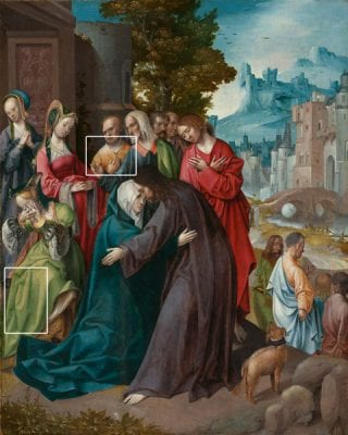
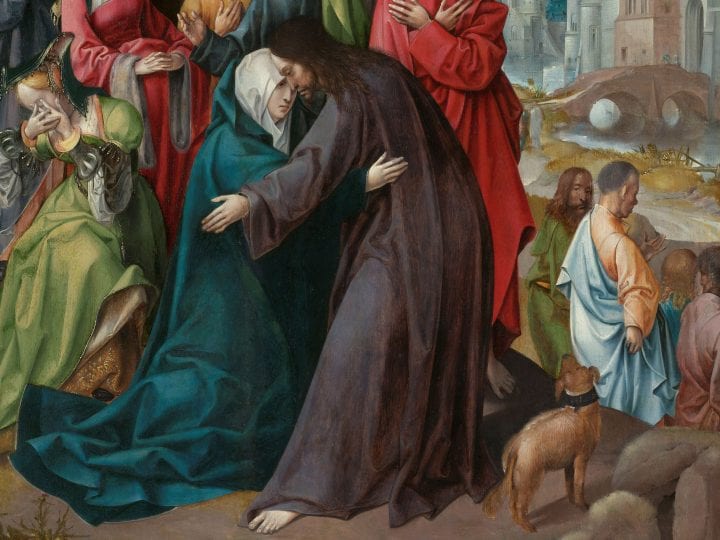
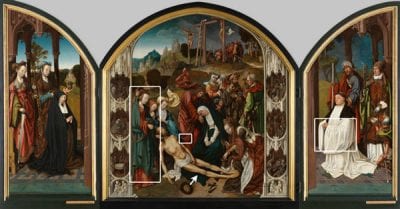
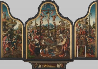
The logical starting point for exploring the techniques of the Leiden School is Cornelis Engebrechtsz (ca. 1465–1527), the master of a large and productive workshop in the first decades of the sixteenth century. Two of Engebrechtsz’s most significant works are the altarpieces he made for the Marienpoel cloister: the Lamentation (ca. 1508) (fig. 1) and the Crucifixion (ca. 1515–18) (fig. 2). Both triptychs were mentioned by Karel van Mander and are now owned by the Lakenhal.4 A recent conservation treatment of the Lamentation provided the opportunity for a thorough technical examination, which included: inspection through a stereomicroscope, infrared reflectography, x-radiography, and light microscopy of paint samples mounted as cross-sections.5 Concurrently, the Rijksmuseum undertook the conservation of two small paintings by Engebrechtsz, Christ Taking Leave of His Mother (fig. 3) and Christ in the House of Martha and Mary (ca. 1515–20), using methods similar to those mentioned above.6 The examination of these slightly later paintings has provided insight into Engebrechtsz’s development, as well as allowing comparison of his large and small works. My own examination under magnification of Christ on the Cross (ca. 1500) and Carrying the Cross (ca. 1510) has allowed me to make observations about technique and layer build-up.7
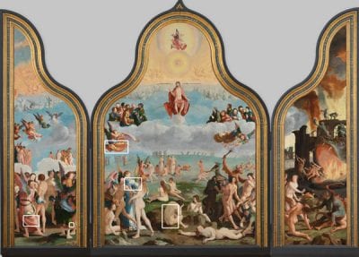
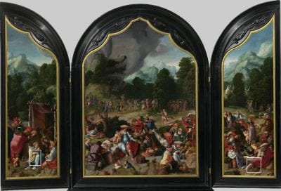
Engebrechtsz’s workshop profoundly influenced the techniques of the sixteenth-century Leiden School. Karel van Mander mentions five of his pupils, two of whom will be covered in this study: Lucas van Leyden (also known as Lucas Hugensz or Lucas Jacobsz, 1489 or 1494–1533) and Aertgen van Leyden (also known as Aert Claesz, ca. 1498–ca. 1564). Lucas van Leyden’s Last Judgment (1526–27) was studied extensively before and during a conservation treatment in the mid-1970s, and technical observations and a large amount of sample material were published (fig. 4 and fig. 5).8 More recently, another relatively late masterwork from Lucas van Leyden’s oeuvre, the Dance around the Golden Calf (ca. 1530), has also been examined (fig. 6).9
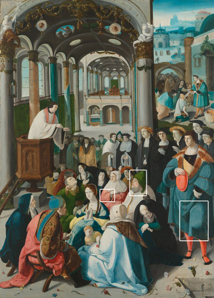
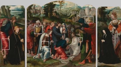
Two works attributed to Aertgen van Leyden are discussed here: the Church Sermon (also known as the Calling of Saint Anthony, ca. 1530–35) (fig. 7),10 and the Raising of Lazarus triptych (ca. 1535) (fig. 8).11 I also examined an anonymous Leiden School painting, Christ on the Cross (ca. 1520), to determine whether the painting technique was influenced by the works of recognized masters.12
Visible Underdrawing
All of the aforementioned artists laid out a painting’s composition with underdrawing, which usually included contour lines as well as areas of shadow indicated by hatching or cross-hatching. The underdrawing is often visible to the naked eye through thin or semitransparent paint layers. Presumably it has become more pronounced over time due to the increasing transparency of the paint layers; often the visibility of underdrawing is interpreted as an accidental effect of ageing.13 However, I would like to propose that in some cases Leiden School artists appear to have intentionally exploited this effect.14
In the Schilder-boeck, Karel van Mander specifically refers to Cornelis Engebrechtsz as one of the painters who used the direct “ten eersten opdoen” method.15 This usually involved mixing a desired color on the palette, then applying it in a single layer on top of the underdrawing.16 This economical painting method contrasts with that used by fifteenth-century Flemish painters, which often involved the laborious application of (semi)opaque paints and glazes in many layers.17 When Engebrechtsz used translucent paint layers, a consequence of the more direct “ten eersten opdoen” method is that the underdrawing might be visible during or soon after painting, and it could become even more obvious over time.18
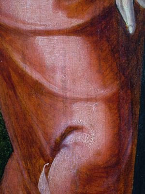
On the interior of the Crucifixion triptych (fig. 2), Engebrechtsz used a brush and black liquid to create a meticulous system of hatching and cross-hatching.19 This underdrawing is often visible through the translucent organic red glazes in, for example: Saint John’s cloak, Abraham’s cloak (fig. 9a), and the stockings of a man on the right wing (see fig. 20a).20 The underdrawing is obscured in the highlights through the application of opaque underlayers that lie between the underdrawing and the red glaze (fig. 9a-1, fig. 9b).21 The underdrawing remains visible in the midtones and shadows, where the underlayers are thinner or nonexistent, and the glaze applied on top is thin and transparent enough that the underdrawing shows through. The hatching creates a midtone (fig. 9a-2), and the cross-hatching produces a shadow (fig. 9a-3). Engebrechtsz produced the deepest shadows by applying a thicker glaze on top (fig. 9a-4); however, in many areas, he painted shadows more thinly so that, in effect, the underdrawing replaced the function of dark paint. It can be argued that the visible underdrawing in these areas contributes significantly to the modeling. Because the red glazes were presumably transparent or semitransparent when they were first applied, this effect must have been apparent to Engebrechtsz.22
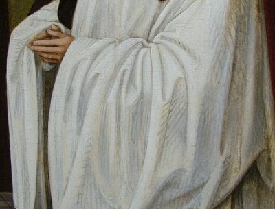
Underdrawing is also visible through transparent red glazes in several of his smaller paintings, including Christ Taking Leave of His Mother (fig. 3) and Christ in the House of Martha and Mary.23 Furthermore, in the small Carrying the Cross, he applied hatched lines of glaze in combination with visible underdrawing.24 Engebrechtsz also made use of visible underdrawing in other colors, as seen in the donor’s white garment in the Lamentation triptych (fig. 10). The underdrawing is composed of black chalk in a liquid medium, applied with a brush in hatched and cross-hatched strokes.25 On top of this he applied a layer of lead white (12–25 µ thick) over the whole area reserved for the cloak. Where the underdrawing shows through this thin white layer, it creates midtones and shadows. To create highlights, Engebrechtsz applied a second layer of lead white, which made the structure more opaque and concealed the underdrawing.26
Visible underdrawing played a role in works by some of Engebrechtsz’s pupils and followers, although they used other materials and achieved different effects. In the Last Judgment (fig. 5), Lucas van Leyden applied several different types of underdrawing, using both wet and dry media.27 Washes and wide strokes of dilute black liquid create undermodeling in many areas of the altarpiece, especially in the semitransparent draperies and flesh tones. Lucas’s intention may have been for the washes to play the role of a dark underpainting. For instance, in the pink clothing of an angel on the left wing, it gave a slight purplish cast to the folds and contributed to the modeling (fig. 11).28 In the flesh tones on the interior of the triptych, the underdrawing also seems to have a modeling function, though perhaps an unsuccessful one that Lucas seems to have struggled with during the painting process.29
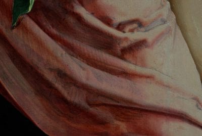
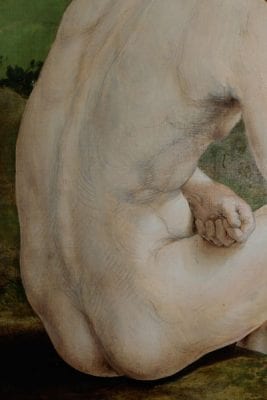
Initially, the washes could have served as an underpainting that was meant to remain visible through the flesh paint in the shadow areas. They were most likely still visible through the first flesh-colored paint layer that was applied.30 However, the paint layers that Lucas subsequently applied contained highlights, midtones, and shadows, which suggests that he was not entirely satisfied with the modeling provided by the washes alone. Now, the washes are visible through the flesh as a bluish tone, particularly in the lighter, cooler flesh tones of the female figures. In a detail of a man’s back, the wash underdrawing is visible through the paint, yet there is additional modeling supplied by the paint layers (fig. 12). There are also lines of dry underdrawing, probably applied on top of the initial flesh-colored paint layer.31 These lines were used to accentuate details – in this case, the musculature and shadows of the back – and in other areas, to make alterations or corrections to the areas of shadow defined by the washes.32
The overrall effect of Lucas van Leyden’s various types of underdrawing in the Last Judgment is different from the aforementioned examples of hatching and cross-hatching in paintings by Engebrechtsz. The visual difference is fundamentally related to the type of underdrawing material used in each painting, and its method of application. Engebrechtsz’s hatching and cross-hatching in a liquid medium has a precise draftsmanlike quality. In contrast, Lucas’s dry drawn lines are more spontaneous and free, and his dilute washes function like a thin underlayer intimately related to the paint. In the work of Engebrechtsz and Lucas van Leyden, the underdrawing not only had a practical function, it also had a visual effect.
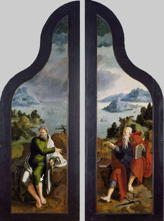
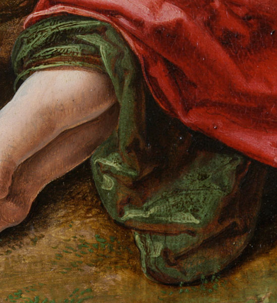
In the paintings by Aertgen van Leyden, it is less obvious whether Aertgen intended the underdrawing to play an important role in the final effect. In the Church Sermon, the dry underdrawing seems to indicate only contours, with minimal hatching. In the Raising of Lazarus, the underdrawing is somewhat imprecise and sketchy, but it includes contours, hatching, and lines that suggest volume or folds.33 In the leg of Saint Jacob on the left wing, the dry underdrawn lines are unevenly obscured by a textured white (or light pink) underlayer (fig. 13). The underlayer is overlaid with a red glaze that has been reinforced with additional glaze in the shadows. Although the underdrawn lines are more closely spaced in the darkest areas, they do not strongly define the shadows. Instead they give an impression of the contours, the direction of the folds in the fabric, and the volume of the saint’s leg. Generally, in paintings by Aertgen, the underdrawing is visible only in the translucent or thin paint layers and does not appear to contribute to the modeling in the same way that it did in the works by Engebrechtsz and Lucas van Leyden.
Isolation Layers and Underlayers
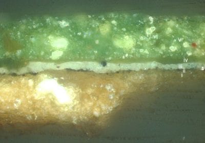
In his paintings, Engebrechtsz sometimes applied a thin (2–5 µ) translucent layer between the ground and paint layers. In a sample from Christ Taking Leave of His Mother (fig. 3), it is visible toward the top of the ground, with particles of underdrawing within or beneath it (fig. 14b, layer ii). This is most likely an isolation layer applied over the whole surface of the ground after the underdrawing was made. It could have been used to seal the underdrawing in order to prevent the drawing from smearing during the application of subsequent paint layers.34 Such a layer also functions to isolate the ground, thereby preventing it from absorbing oil medium from the paint layers. The isolation layer contains no pigments, and the binding medium of the isolation layer was probably animal glue or oil; the latter would have turned the white ground slightly beige.35
The evidence that the isolation layer may have slightly discolored the ground may be one of the reasons why Engebrechtsz also chose to apply additional lead white underlayers beneath certain colors. A layer of lead white was locally applied after the underdrawing (and presumably, over an isolation layer), but its thinness (2–10 µ) probably allowed the drawing to remain visible.36 In Christ Taking Leave of His Mother, white underlayers are present beneath a woman’s green dress and a man’s orange robe (fig. 14b, layer iii, and fig. 15b, layer ii).37 In the highlights of Saint Martin of Tours’s green cloak in the Lamentation (fig. 1), the green glaze is very thin, allowing the white underlayer to shine though.38 Lead white underlayers were also found beneath red paint layers in samples from both of the aforementioned paintings and are suspected to be present under red areas in the Crucifixion triptych, Carrying the Cross, and Christ in the House of Martha and Mary.39
The use of light underpainting layers was a widespread practice in early Netherlandish painting.40 However, Engebrechtsz’s technique is unique and remarkable in that he applied white layers locally beneath certain colors: red, yellow, and green draperies. White underlayers would reflect light from beneath transparent paint layers and make the colors appear bright and glowing. They could also have had a secondary function similar to that of the unpigmented isolation layer: to prevent the ground from absorbing oil medium from the paint. In areas where the lowermost layer was an oil-rich paint or glaze, Engebrechtsz applied white underlayers to seal off the ground more effectively.41 This could explain why he often applied a white layer beneath dark blue draperies, where the azurite paint film presumably contained a lot of oil medium.42 As will be explained in the section on the layering of opaque paint and glazes, white underlayers also underlie yellow and green areas where glazes were applied as lower layers.
To date, similar localized white underlayers have not been found in works by other Leiden School painters.43 Usually they built up their colors in a rather traditional way: by applying glazes over opaque or semiopaque underlayers. By applying underlayers in different colors, however, the artists could produce a wide variety of tones that would become apparent once glazes and upper layers were applied. The importance of the underlayers in establishing the overall tone of the painting is evident in Lucas van Leyden’s Dance around the Golden Calf (fig. 6). It has been suggested that the color notations – at least twenty combinations of letters that he wrote with black chalk throughout the painting at the underdrawing stage – served as a guide for applying the underlayers.44 Often, a combination of two letters was written beneath a single area of clothing, suggesting that two colors were used in the underlayer (see fig. 36b). Lucas van Leyden is known to have used this technique in several areas of the Last Judgment (fig. 4); the light and dark areas in a single piece of fabric sometimes had separately colored underlayers. In the green skirt worn by an angel on the left wing, the highlights have a yellow-green underlayer, containing a significant amount of lead white, lead-tin yellow, and a copper green (fig. 16). In the shadow, the underlayer is blue-green, containing copper green, some lead white, a small amount of azurite, and a very small amount of lead tin yellow. Over the underlayers, Lucas applied a green glaze that is somewhat darker in the shadow areas.45
In Aertgen van Leyden’s Raising of Lazarus, a pale blue layer was revealed in a man’s sleeve where a green glaze was abraded (fig. 17). This color is restricted to light areas; in the darkest shadows, the underlayer is darker. Aertgen then brushed an even layer of glaze over the whole surface of the garment.46 Here, and in the preceding example from Lucas van Leyden’s Last Judgment, the underlayer varies in color, rather than being applied as a flat, continuous tone. It seems that using two colors in the underlayer of a single area of clothing allowed the Leiden School painters to enhance the contrast between the parts of the drapery that were in the light or shadow. This suggests that they had a conception of the final three-dimensional appearance of the clothing or drapery from the start. However, it is unlikely that they completed large passages of the painting at this initial underpainting stage. More often, they seem to have painted each color area – from the underlayers to the glazes – within the reserve left for it. Afterward, they would move on to the next area of color.47 The suggestion that entire color areas were completed before the adjacent areas were begun is also demonstrated by green areas in Aertgen van Leyden’s Church Sermon. Traces of the final glazes of green clothing lie beneath adjacent areas of flesh, which suggests that the green clothing was largely completed before the flesh areas were begun (see fig. 26a and fig. 26b).48
The underlayers beneath green areas of Leiden School paintings often varied in color and texture. For example, in Lucas van Leyden’s Last Judgment, yellow-green, blue-green, dark green, and reddish underlayers are found beneath green glazes.49 They were sometimes textured, so that subsequently applied glazes pooled in the depressions. In the green areas of Engebrechtsz’s smaller paintings, the underlayers were often vigorously painted with small strokes. In red areas as well, the texture of the underlayer served an important visual function in making the fabrics appear rough or tactile. This technique also appears in the works of some of Engebrechtsz’s followers. For instance, in Lucas van Leyden’s Dance around the Golden Calf (fig. 6), a textured light-colored underlayer can be seen beneath a red glaze in the cloak of a man with his back turned to the viewer.50 A similar effect was used in a red garment in the Raising of Lazarus (fig. 8) attributed to Aertgen van Leyden.51 In the highlights of Saint Jacob’s leg, Aertgen used short vigorous brushstrokes to impart texture to the white underlayer. When a red glaze was applied on top, it pooled between the ridges of the paint (see fig. 13).
The relationship between opaque layers and glazes was critical to the technique of the Leiden School painters. In the preceding examples, the basic layer structure was similar to the traditional painting technique of their predecessors: a translucent glaze was applied on top of an opaque – usually light-colored – underlayer. However, as will be discussed in the next section, the layer structure was sometimes altered in order to achieve a new variety of effects.
Layering of Opaque Paint and Glazes
In several garments in Christ Taking Leave of His Mother (fig. 3), Engebrechtsz reversed the traditional build-up by applying glazes beneath opaque paints. This technique is remarkable because of the position of the glaze within the layer structure. In a sample from a woman’s green dress, his customary white underlayer (3–10 µ thick) was present, followed by a thin layer of copper green glaze (see fig. 14b, layers iii and iv).52 He applied the glaze as a base tone, within the reserve left for the garment. In this sense, it functions as an underpaint, although it is transparent. Remarkably, on top of this, Engebrechtsz applied a semiopaque paint layer containing copper green, lead white, and a few particles of earth pigments. This upper layer varied in thickness: in the midtones of the dress, it is thin enough to allow the glaze to shimmer through (see fig. 14a). The unconventional application of a transparent glaze beneath an opaque layer would have expanded the range of tones that Engebrechtsz could achieve. Where the upper layer was thin, the underlying glaze gave extra intensity to the dress, augmented by the additional reflectivity provided by the white underlayer.
These reasons could explain why Engebrechtsz also reversed the layering in some yellow and orange garments. In the same painting, he used this reversed layering technique in a man’s orange robe (see fig. 15a and fig. 15b).53 On top of a locally applied white underlayer, he applied a very thin transparent glaze. This was followed by a more opaque paint containing lead white and earth pigments, with small touches of red earth to intensify the modeling. Visual observation of the Crucifixion (fig. 2) indicates that several of the yellow garments were built up with glazes beneath opaque paint. In a sleeve in the middle panel, an opaque yellow was layered over a transparent orange base tone. In other areas, such as Isaac’s sleeve on the left wing, opaque yellow paint was applied over a transparent brown. A sample from a yellow garment in Christ in the House of Martha and Mary had a comparable build-up: a thin transparent brown layer was overlaid with an opaque yellow highlight.54
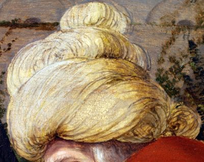
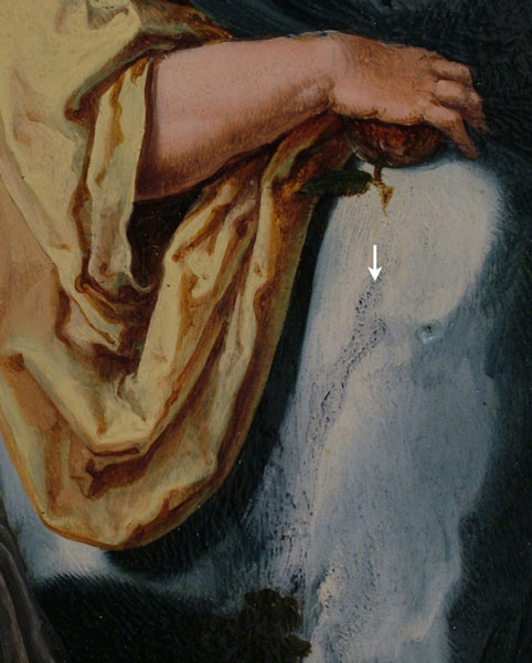
The layering of opaque yellow paint over a transparent brownish or yellowish glaze was adopted by many of the artists in Engebrechtsz’s circle.55 Aertgen van Leyden used this technique in at least two of his paintings: the Raising of Lazarus (fig. 8)and the Church Sermon (fig. 7). In the Raising of Lazarus, a man’s yellow cloak was built up from a semitransparent brown layer, over which he applied either brown lines to create folds or a more opaque light yellow paint to create highlights (fig. 18).56 In another area of the same painting, a man’s yellow turban appears bare and unfinished in comparison to the opaque, saturated colors surrounding it (fig. 19). Only greenish-brown shadows and fine opaque highlights are visible. The lowest layer – probably a yellow lake – may once have created the midtones but has now completely lost its color. Similar fading may have occurred in the baby’s yellow clothing in the Church Sermon.57
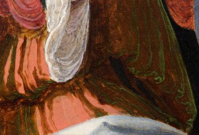
In these examples of reversed layering technique, the colors of the glazes and opaque layers were similar; that is, a green highlight was applied over a green glaze, and a yellow highlight was applied over a brown or orange glaze. In the Crucifixion, Engebrechtsz used contrasting color combinations to create nuances in a man’s robe (fig. 20a and fig. 20b). The underlayer is reddish-brown and semitransparent, and the upper layer is an opaque light green paint.58 He used a similar technique in the green sleeves of a woman in the foreground of the middle panel. In the lining of a woman’s cloak in Carrying the Cross, this technique was replicated on a smaller scale. Engebrechtsz’s pupils and followers also embraced this approach. Lucas van Leyden used this technique in a woman’s dress in the Dance around the Golden Calf by first applying a transparent reddish-brown layer as a midtone (fig. 21).59 An opaque green-blue was painted fluidly on top, followed by small highlights. Finally, dark lines were applied over the red-brown midtone to create the shadows. Aertgen van Leyden used a more complicated method to construct a woman’s dress in the Raising of Lazarus (fig. 22). A transparent dark brown initial layer was covered with opaque pink, followed by more transparent brown to create shadows. An opaque green was applied last as a scumble. This green-brown color combination could have been an attempt to depict shot silk. Other examples of shot color in Leiden School paintings are discussed in the Concluding Remarks section below.
Blotting and Surface Effects in Glazes
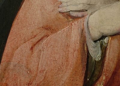
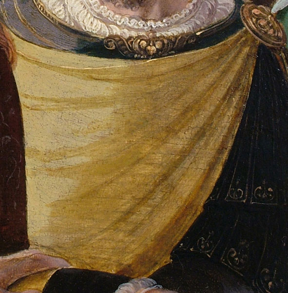
Translucent glazes played a vital role in the modeling of fabrics and draperies in Leiden School paintings, whether they were lower layers in the reversed layer structure just discussed, or applied as a top layer as in traditional Netherlandish technique. Handling or drying problems influenced how the glazes were applied, but these consequently also gave them a distinctive appearance. In Aertgen van Leyden’s Church Sermon (fig. 7), the clothing of the man in the bottom left and a woman in the crowd are pink and somewhat blotchy (fig. 23).60 The regular pattern of small red dots visible in the woman’s hands suggests that the glaze was blotted with a cloth. The dots of glaze seem to underlie the flesh paint, but they have become visible where the paint is abraded. Organic glazes could be viscous and difficult to handle with a brush, so artists sometimes dabbed glazes with their fingers,61 a cloth, or a fabric-covered pad to mitigate the effects of a thick or uneven glaze.62 A cloth could be used in one of several ways: to apply the glaze thinly, to spread it within the intended area, or to remove excess glaze from the surface of the painting.63 It seems that the artists blotted their red glazes because of handling problems,64 not necessarily because they wanted to impart texture to the fabric. However, one could argue that they did not try to conceal this effect; perhaps they did not mind the stippled surface texture in certain draperies.
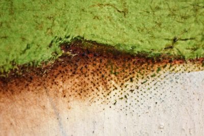
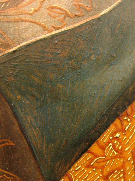
Copper green glazes were blotted for similar reasons. Depending on how they were prepared, green glazes could be very viscous and hard to handle.65 Evidence of blotting is visible in several green areas within this group of paintings, including Martha’s dress in Engebrechtsz’s Christ in the House of Martha and Mary. Her dress has discolored to a dark brown, but it was originally greenish – built up from a single layer of verdigris (ca. 10 µ), containing a few white particles and earth pigments.66 A cloth was used to push the glaze over the contour of the cloak and left a regular pattern of dots on top of the pinkish background (fig. 24).
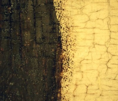
Blotted glazes are not unique to the Leiden School, but they seem to be frequently found in paintings from this group.67 Engebrechtsz’s followers also blotted their green and red glazes. In Aertgen van Leyden’s Raising of Lazarus, dots of red glaze from Saint John’s cloak have become visible through the hand of the woman in front of him. On the outside of the left wing of Lucas van Leyden’s Last Judgment, the green glaze of Saint Peter’s robe was blotted with a cloth, and dots of green glaze are visible outside the contours of his robe (fig. 25).68 There is also evidence of blotting in the green draperies on the inside of the triptych (see fig. 16). In the green draperies in Aertgen’s Church Sermon, some green dots are visible through adjacent areas of flesh paint that have become abraded (fig. 26a and fig. 26b).69
In the Church Sermon, Aertgen van Leyden took care to apply the red glazes thinly, and often in a single layer. Generally, if a red glaze were applied too thickly, it dried slowly, and was prone to cracking or wrinkling. In order to avoid these problems, some Leiden School painters sometimes created intense shadows by incorporating blue or black pigments into dark areas.70 The dark areas of Saint John’s purplish-red cloak in the Lamentation (fig. 1) demonstrate how Engebrechtsz incorporated black into every layer (fig. 27-1–4).71 The artist first applied a thin white underlayer. The next layer is composed of vermilion, organic red, and charcoal black, followed by several layers of dark red glaze containing mostly organic red with a small amount of vermilion and charcoal black. In the darkest folds, Engebrechtsz touched in a glaze composed of only organic red and black.

In the lighter parts of the cloak – for example, near the hem – Engebrechtsz used a different technique based on a light underlayer, and he manipulated the glaze in a distinctive way in the midtones.72 He first applied touches of light-colored paint – probably containing lead white and some red pigments – to create highlights (fig. 27-1). Then the whole area reserved for the cloak was covered with an organic red glaze (fig. 27-2). Interestingly, shadows were built up by applying more glaze with diagonal hatched lines (fig. 27-3).73 These lines not only give depth to the folds but also impart texture to the cloak. As a final step, the darkest shadows were painted with a deep red, which probably contained organic red and black (fig. 27-4). Engebrechtsz applied hatched lines of glaze in the shadows of red draperies in other areas of the Lamentation: in Saint John’s sleeve and in Saint Cecilia’s dress.
Engebrechtsz also applied diagonal hatched lines of glaze in the red areas of his smaller works. In the Carrying the Cross, they appear in Saint John’s clothing, and in the shadows of a bearded man’s robe. In the man’s robe, hatched lines of underdrawing are also visible (fig. 28). The painted lines of glaze are both parallel and perpendicular to the underdrawn lines, creating a cross-hatched pattern. The presence of both visible underdrawn lines and reinforcing lines of glaze suggests that the visual effect was the result of Engebrechtsz’s conscious decision.
It seems that Engebrechtsz used several methods to intensify the color or deepen the shadows in the red areas without resorting to applying the red glazes very thickly. He allowed the underdrawing to contribute to the modeling (as previously described in the Visible Underdrawing section), applied diagonal hatched lines of glaze on the surface, and/or incorporated dark pigments into the shadows.74 Other Leiden School paintings were examined to see whether painters from his circle used similar techniques. In the anonymous Christ on the Cross, Saint John’s cloak is an intense red, and the modeling is rather schematic. To create the base tone, the artist applied an opaque light-colored underlayer, followed by a red glaze. The midtones were produced with a darker glaze, and in some areas this glaze was applied with small diagonal lines (fig. 29). The similarity of these lines to those found in the Lamentation and Carrying the Cross suggests a familiarity with Engebrechtsz’s working methods. Alternatively, it could suggest familiarity with a more traditional painting technique; some fifteenth-century Flemish painters also painted hatched lines of glaze in their red draperies.75
Large Range of Blues
The range of blue pigments available to early Netherlandish painters was limited to ultramarine, azurite, smalt, and indigo.76 While Flemish painters like Jan van Eyck and Rogier van der Weyden had access to ultramarine for their prestigious commissions, ultramarine is rarely encountered in Northern Netherlandish paintings of this period.77 Perhaps this limitation caused the Leiden School painters to experiment with different ways of modeling blue passages. More than with other colors, Leiden School painters exploited the properties of their blue paints to achieve different effects and a variety of tones.
Azurite was the most commonly used blue pigment in the works of the Leiden School. The intensity of the azurite’s color was dictated by the size of the particles: larger and coarser particles generally created a darker blue.78 Artists could create a range of blues by selecting different grades of azurite. The most intense – and generally, the most expensive – blue was often reserved for important areas such as the Virgin Mary’s robe.79
Engebrechtsz often used a layered system to achieve dark blues in depictions of the Virgin’s robe. In Christ Taking Leave of His Mother (fig. 3), he applied a thin underlayer of lead white, followed by a coarse layer of azurite, and then covered that with a thicker layer of even coarser azurite.80 In the Lamentation (fig. 1), he used a similar technique (fig. 30): he applied a thin layer of lead white, followed by two layers of coarsely ground azurite.81 On top of this, he painted a thicker layer of even coarser and more intensely colored azurite mixed with red lake. Azurite often has a greenish hue, so Northern artists sometimes added organic red to the blue paint to intensify it and to give it a more purplish hue.82 For instance, Lucas van Leyden mixed red pigments into some of the blues in the Last Judgment (fig. 5). He achieved his darkest blues by using coarsely ground azurite mixed with organic red, or occasionally red ocher, and by applying the layer relatively thickly (up to 60 µ).83
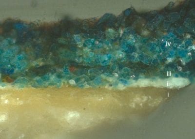
As described in the Isolation Layers and Underlayers section, varying the color of the underlayers increased the range of tones that could be achieved. Engebrechtsz applied blue paint layers over a warm underlayer in several garments in the Crucifixion (fig. 2). The lining of the dress worn by one of the women in the foreground ranges from icy blue to whitish, but the fabric as a whole has a warm tone. This effect is created by a semitransparent orange underlayer, which is visible between the brushstrokes (fig. 31). This orange layer continues under the adjacent areas of brocade fabric and thus provides a base tone for the entire area. Similarly, in Aertgen van Leyden’s Raising of Lazarus (fig. 8), a reddish-brown layer is visible between the fluid brushstrokes of the blue paint, giving Christ’s blue mantle a purplish tone.
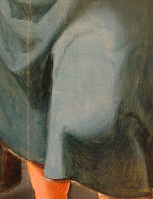
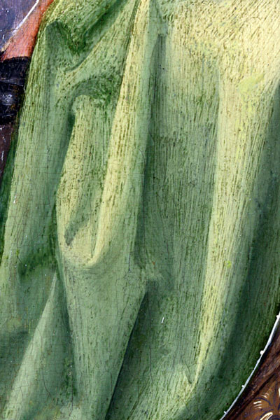
Aertgen van Leyden used several different colors as underlayers in the dark blue garments in the Church Sermon (fig. 7). In the skirt of the woman with an owl on her back, a layer of azurite was applied over a black underlayer, which itself is on top of a yellow-white layer.84 The dark blue clothing of the woman in the bottom left corner was achieved with a layer of azurite applied on top of a grayish underlayer.85 Perhaps these underlayers provided a base tone that gave more covering power to the azurite paint.86 In both of these areas, the thick azurite layers were applied with short, choppy brushstrokes. This was often necessitated by the poor handling properties of azurite, caused by the coarse pigment particles and the relatively large quantity of oil used for grinding during paint preparation. The paint was easier to handle if the azurite particles were smaller or more finely ground; however, this sacrificed the intensity of color.87 In some articles of clothing, the paint has a fluid consistency and a grayish hue. The cool gray-blue garments in Aertgen van Leyden’s Raising of Lazarus (fig. 8) and the Church Sermon may have been painted with finely ground azurite.88 The blue robe worn by the man in the bottom right-hand corner of the Church Sermon was applied with fluid paint and vigorous brushstrokes (fig. 32). The rheology (ability to flow) of the paint in this area – the long, smooth brushstrokes that do not have the same “gloopy” texture as other blue areas in the painting – suggests that he may have incorporated a diluent or volatile oil into his paint to improve handling.89
The color and handling properties of azurite-containing paints could also be altered by adding other pigments. For instance, adding finely ground lead white improved the paint’s rheology because the paint would require less oil and would retain the oil better.90 By manipulating this principle, Engebrechtsz created a wide range of blue tones. For instance, a woman’s robe in the Lamentation has a smooth texture with almost no visible brushstrokes, which suggests that its handling was more straightforward than with very coarse azurite (fig. 33a and fig. 33b). Cross-sections reveal that Engebrechtsz first applied an underlayer of lead white and finely ground azurite, and in the light areas he then covered this with a layer containing coarser azurite and less lead white.91 Although this layer structure is quite traditional, the type of azurite resulted in a distinctive greenish-blue color, which recurs in several areas of the Crucifixion triptych and also in his other large altarpieces.
Engebrechtsz did not use this technique in the small panels from this group. Instead, the smaller works feature lighter blues with strongly contrasting whitish highlights and dark blue shadows. The high-contrast blue draperies were adopted by other painters, albeit on a larger scale, and became a distinctive feature of the sixteenth-century Leiden School. In Aertgen van Leyden’s Raising of Lazarus, two women in the center panel wear light blue cloaks; in the clothing of the kneeling woman, it appears that Aertgen first applied a layer containing lots of white and a small amount of blue over the whole area reserved for the cloak (fig. 34).92 The midtones – a mixture of blue and white – were painted on top of the underlayer. The deepest shadows were applied with hatched brushstrokes in a darker blue paint, both adjacent to and on top of the midtones.93 This type of blue also fits in with the overall light tonality of the Church Sermon, where Aertgen van Leyden used it to model several of the women’s dresses.
Lucas van Leyden’s Last Judgment contains several passages of high-contrast blue, including an angel’s robe on the inside of the triptych (fig. 35). The highlights are very pale and contain lead white with a small amount of fine azurite. Lucas did not create the modeling through layering; instead, blues of increasing intensity were blended into one another, wet-in-wet. Different shades of blue were achieved by varying the coarseness of the azurite or the thickness of the paint layers, or by adding additional pigments such as lead white, organic red, or red ocher. A similar wet-in-wet technique was used in Saint Peter’s cloak on the outside of the left wing; here, the transition between the midtone and shadow is more abrupt than in the angel’s robe.94
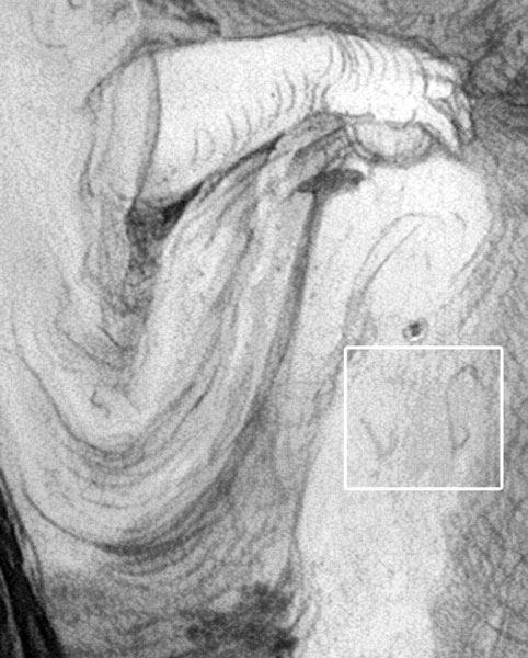
High-contrast blue draperies are also present in Lucas van Leyden’s Dance around the Golden Calf – for example, in the blue skirt of a woman holding a baby on the left wing (fig. 36a). A combination of two color notations in the underdrawing suggests that he conceived of strongly defined areas of light and shade (fig. 36b). Beneath the highlight, the notation reads “v b,” presumably referring to the colors white and blue (vit and blauw).95 At the painting stage, Lucas began by applying the dark blue shadows with short, choppy brushstrokes. The highlights and midtones were applied afterwards, and blended wet-in-wet.
The preceding examples demonstrate the range of techniques that were used to create high-contrast blue draperies. Whereas Engebrechtsz generally applied the shadows, midtones, and highlights in discrete layers, Lucas van Leyden often used wet-in-wet blending. Other examples by Leiden School painters combine both techniques, with less overlapping between adjacent areas of highlight, shadow, and midtone, and more use of blended brushstrokes.
These high-contrast blue draperies are a distinctive feature of sixteenth-century Leiden School paintings, perhaps because they fit in with the overall lighter tonality and heightened distinction between light and dark. Other advantages to these types of draperies were that fine (and thus cheaper) grades of azurite could be incorporated into the highlights and midtones. Perhaps this experimentation with a wide range of blues arose out of necessity – making good use of the grades of pigment available and incorporating white into the viscous paint to improve its handling. Although high-contrast blues were not necessarily unique to the Leiden School, they seem to recur in many of their paintings and may be considered a hallmark of their technique.96
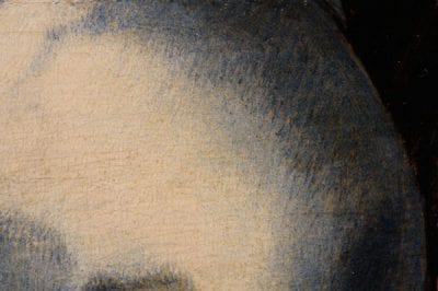
A technique that seems to be specific to Lucas van Leyden is one that he used in Saint Paul’s bluish-gray robe on the outside of the right wing. Remarkably, the color is achieved without using any blue pigments, apart from in his sleeve. The paint is built up in very thin gray layers, containing only lead white and an extremely fine black pigment.97 Certain garments in Lucas van Leyden’s Dance around the Golden Calf have a similar hue and may have been painted using a comparable technique: for example, the purplish-gray robe of the crouching woman with a baby in the bottom right of the middle panel.
Concluding Remarks
Sixteenth-century Leiden Schoolpainters exploited the properties of the traditional oil medium. The transparency, fluidity, ease of handling, and slow drying time of linseed oil allowed them to create the sophisticated effects that have already been described: allowing the underdrawing to show through glazes and creating a variety of colors by layering opaque paint layers on top of glazes. A related technique – scumbling – was used to its full effect in the changeant (shot silk) fabrics.98 In Mary Magdalene’s sleeves in the Lamentation (fig. 1) opaque highlights skim across the smooth surface of the glaze. The sleeves were first modeled in pink tones, then finished with a transparent rose-colored glaze. Light green touches were applied when the glaze was relatively dry, so that the opaque paint spread fluidly over its surface. Other changeant draperies in Engebrechtsz’s paintings featured wet-in-wet blending, where the fluid and slow-drying oil medium allowed contiguous areas to be blended together. In Christ in the House of Martha and Mary, a sample from Mary Magdalene’s sleeve shows that the crimson and light blue tones were blended into each other wet-in-wet (fig. 37a and fig. 37b). Within a lead white matrix, particles of azurite and organic red are intermixed. Small red particles are concentrated at the bottom of this layer, which suggests that the light blue was applied over the pink paint while it was still wet. Later, when the paint was relatively dry, Engebrechtsz applied highlights and lines of red glaze to define the folds.
Lucas van Leyden used a similar technique in many areas of the Last Judgment, where different colors were applied separately, then blended together to create nuanced modeling. An angel’s robe changes imperceptibly from yellow to orange to a reddish color (fig. 38). Apart from some final red glazes, Lucas applied the paint in a single layer, with the transition between the different colors blended wet-in-wet.99 This example illustrates the overall simplification of the layer structure that occurred in the early sixteenth century.100 In comparison to the techniques of the Flemish Primitives, the Leiden School painters generally applied fewer layers of paint, sometimes only one or two in an area of color, and used mixtures of pigments more frequently. Rather than building up shadows by superimposing pure transparent glazes, artists like Engebrechtsz incorporated black pigments into the shadows of red areas, which allowed them to apply tones more quickly and directly. In the Last Judgment, Lucas van Leyden always used a mixture of pigments in his yellow and greens and often incorporated black, brown, or red ocher into his reds.
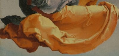
As has been shown, the Leiden School painters also created sophisticated color effects by layering. The application of blue and green paint over warm underlayers appears in the work of Cornelis Engebrechtsz, Aertgen van Leyden, and Lucas van Leyden. The layering of opaque paint over glazes is also found in the work of all three painters. Engebrechtsz probably passed on many of these techniques to the pupils in his workshop.
The characteristic techniques these Leiden School artists used to model different colors of drapery are a testament to their skill and efficiency. Their more direct, simplified manner of painting in no way compromises the impact of their work. It is no wonder that Karel van Mander described the technique of Engebrechtsz as “energetic and skillful.” This praise can equally be granted to the distinctive, forceful character of works by other Leiden School painters in Engebrechtsz’s immediate following.
