
In 1876 the French painter and art critic Eugène Fromentin (1820–1876) wondered how Dutch seventeenth-century painters achieved the remarkable lifelikeness for which they were noted. He suspected it had, in part, something to do with painting on colored grounds. This article argues that recent research into colored grounds in Dutch paintings made between roughly 1580 and 1720 confirms Fromentin’s suspicion. Technical studies conducted since about 1990 suggest that painters approached the specific color of the ground with a fair degree of pragmatism and flexibility but also that painting on colored grounds allowed artists to achieve a new level of realism through a more convincing suggestion of the position of objects in space. This recent research helps us to see and understand how colored grounds contribute to one of the most famous characteristics of Dutch art, just as Fromentin suspected.
Introduction: Wondering About Dutch Grounds with Eugène Fromentin
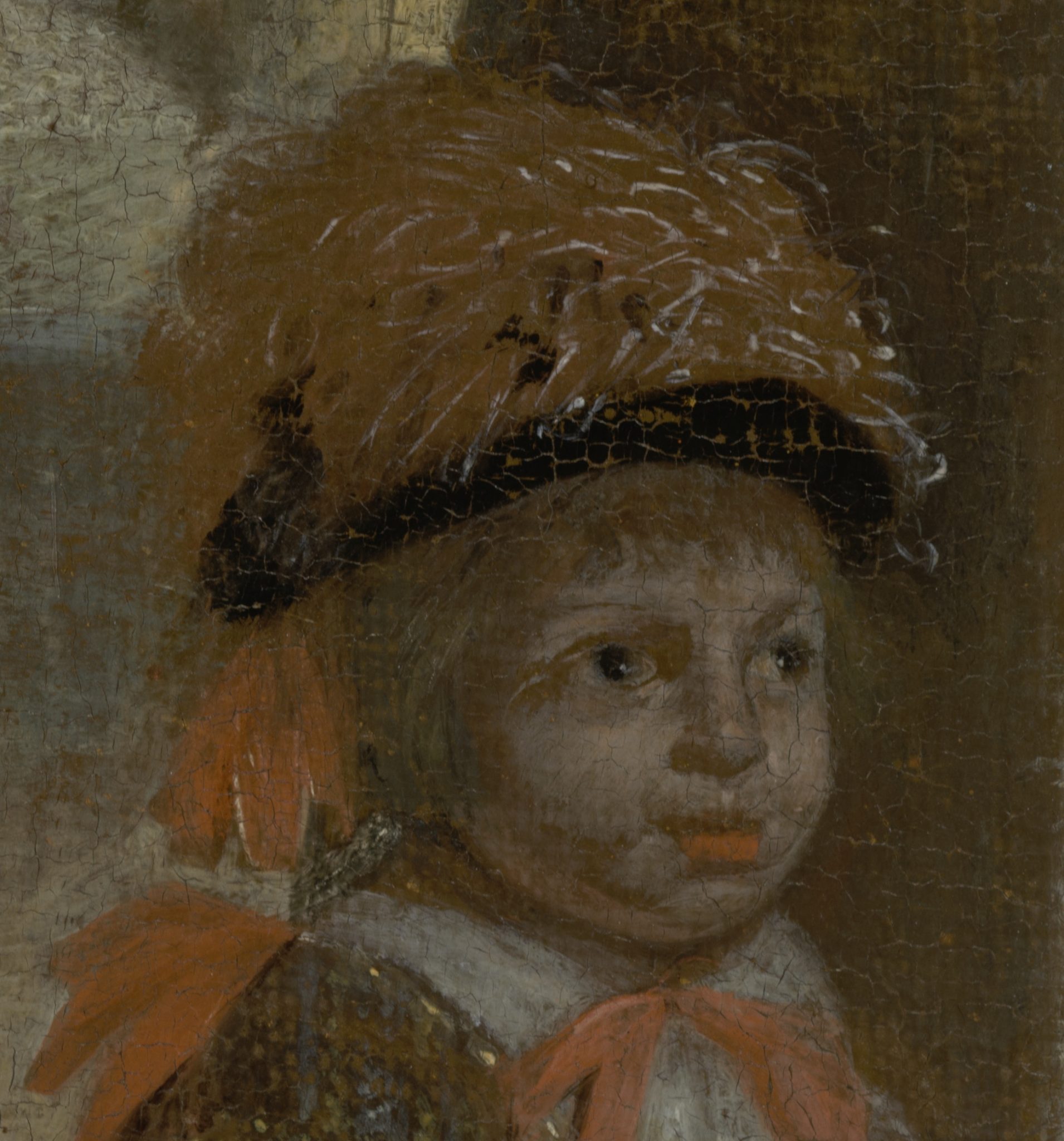
To scholars of Dutch art, the French painter Eugène Fromentin (1820–1876) is better known for his book, Les maîtres d’autrefois (1876), than for his picturesque North African scenes.1 In it, he describes painting from Jan and Hubert van Eyck to Rembrandt, with a heavy emphasis on the Dutch seventeenth-century art that he had studied intensely and with a painter’s eye in Dutch museums in 1875. As the Dutch art historian Hans van de Waal has argued, Fromentin describes paintings as if they were being made before the reader’s eyes.2 This sets his book apart from those of such contemporaries as Theophile Thoré (1807–1869), Charles Blanc (1813–1882) and Henri Havard (1838–1921), who, like Fromentin, greatly appreciated Dutch painting for what they saw as its veracity.3 In a chapter on the character of the Dutch school, Fromentin calls Dutch painting “a portrait” and explains: “This word says everything. Dutch painting, as one very soon perceives, was not and could not be anything but the portrait of Holland, its external image, faithful, exact, complete, lifelike, without adornment. The portrait of men and places, of bourgeois customs, of squares, streets, the countryside, of sea and sky—such was bound to be reduced to its primary elements, the program adopted by the Dutch school; and such it was, from its first day until its decline.”4

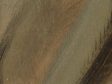
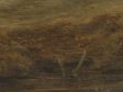
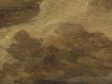
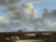
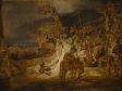
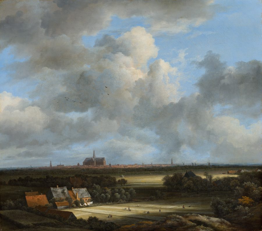
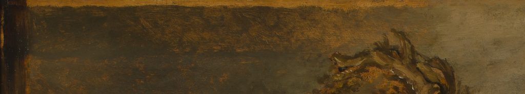
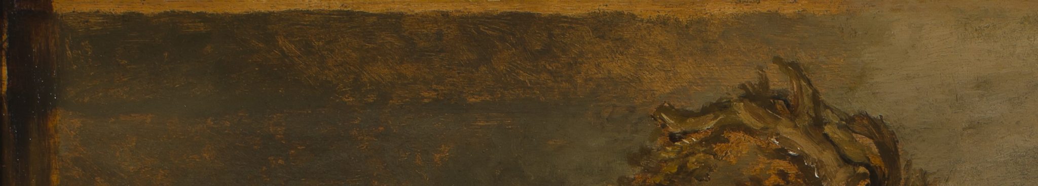
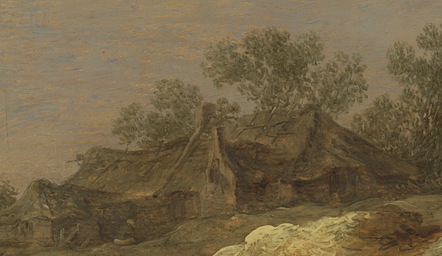
At the end of the chapter, Fromentin elaborates on the pictorial means Dutch painters employed to achieve this realistic effect. First he mentions the centripetal composition of space, which gives the viewer the idea that he can wander and “live in the picture.”5 Next, he refers to the narrow tonal range (“almost monochromatic”) and the clever clair-obscur (chiaroscuro) that is always entirely artificial but feels real nonetheless.6 Finally, he points to painting technique, mentioning the use of the brush, whether painters worked on light or dark grounds, and whether they followed the fifteenth-century method of applying color in the first stage or instead applied color only in the final stages.7 Then he concludes: “All these questions, especially the last, have been the subject of much conjecture and have never yet been properly elucidated or settled.”8 In general, he mentions no specific pictures here. However, Jacob van Ruisdael’s (1628/1629–1682) View of Haarlem with Bleaching Grounds comes to mind (fig. 1). Fromentin greatly admired it and describes it extensively elsewhere in the book.9
Fromentin wondered how Dutch painters created that remarkable appearance of naturalism. It seems that, as a painter, he intuitively grasped it had something to do with the color of the ground and the paint layers that immediately followed it. The ground is a preparatory layer that serves to regulate the absorption of the paint layers. Through its color, it also influences the overall tonality of the finished painting, as will be explained below. As a nineteenth-century painter, Fromentin most likely worked on the very light grounds that were customary in his time, but he must have realized that Dutch old masters achieved their effects differently.10
Taking recent literature on colored grounds in Dutch painting as a starting point, the present essay demonstrates why it is important for anyone interested in Dutch art to be aware of the ubiquitous presence of colored grounds, the ways in which painters exploited their optical effects, and their connections to realism as one of the most distinctive aspects of Dutch art.11 The published literature has advanced our understanding of the use, function, and visual impact of colored grounds in ways that are helpful for art historians and conservators alike, giving us a better understanding of why colored grounds matter.
The essay starts with a short introduction to colored grounds and to naturalism in Dutch art. The next two sections explore the implications that emerge from the research on colored grounds that has been published so far. The conclusion circles back to Fromentin and Dutch naturalism and summarizes why colored grounds matter.
What is a Colored Ground, and How Does It Make a Painting Look Real?
Despite what captions reading “oil on canvas” or “oil on panel” suggest, Dutch artists, and early modern painters more generally, did not apply paint directly onto a canvas or panel. Between a painting’s support and its paint layers there is always a ground.12 It is a thin layer that covers the entire painted surface. On panels in Northern art since the fifteenth century, it usually consists of chalk and animal glue. For canvas, lead white and/or cheap pigments bound in oil were most commonly used. The number of layers normally varied between one and three. On panels, the ground might be so thin that it only fills the grain, creating a smooth surface on which to paint. In such cases, the slightly moderated color of the panel forms the basic tone on which the artist starts to work. If the chalk-glue layer is thicker, the basic tone is white. On canvas, lead white in oil gives a similarly white surface. In both cases, the addition of pigments to the mixture provides a tone. While white grounds were standard until the late sixteenth century, colored grounds became the norm in the seventeenth century. Gray, beige, brown, and red are the most frequently encountered.13 They occur in different shades, but the shade is always the same across the entire surface of the support. Applying a quality ground required skill. In the seventeenth century, this task had developed into a specialist job that could be outsourced—as Moorea Hall-Aquitania addresses in her article for this issue—although some painters also applied the ground themselves or had assistants who did this for them in the studio.14
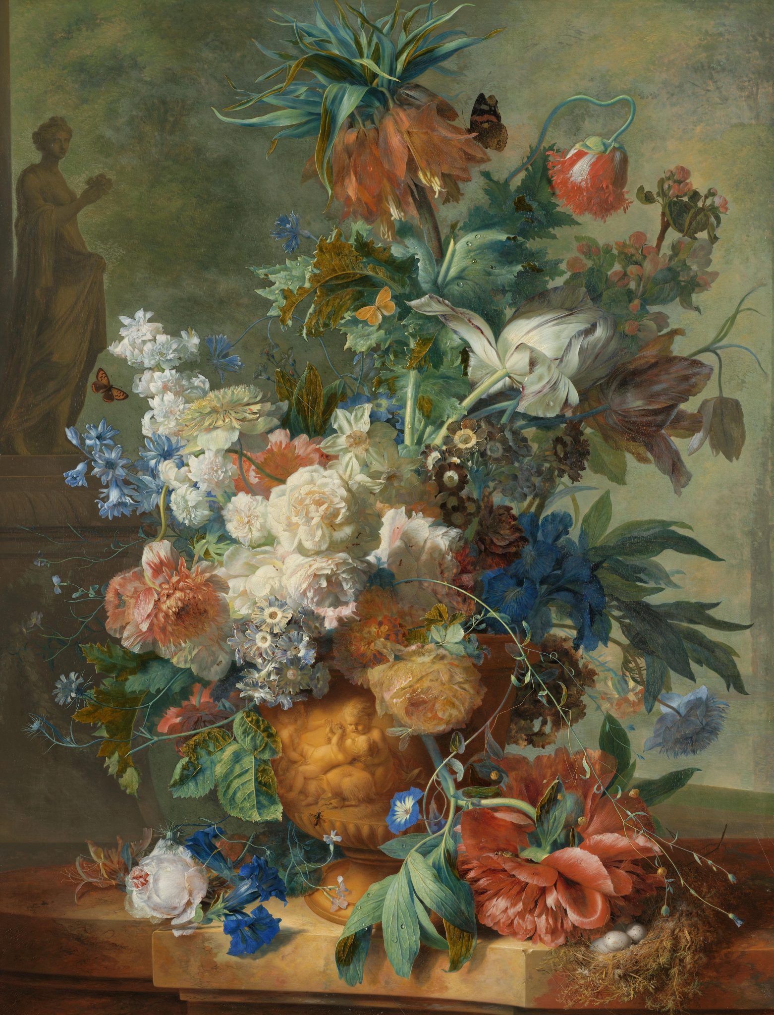
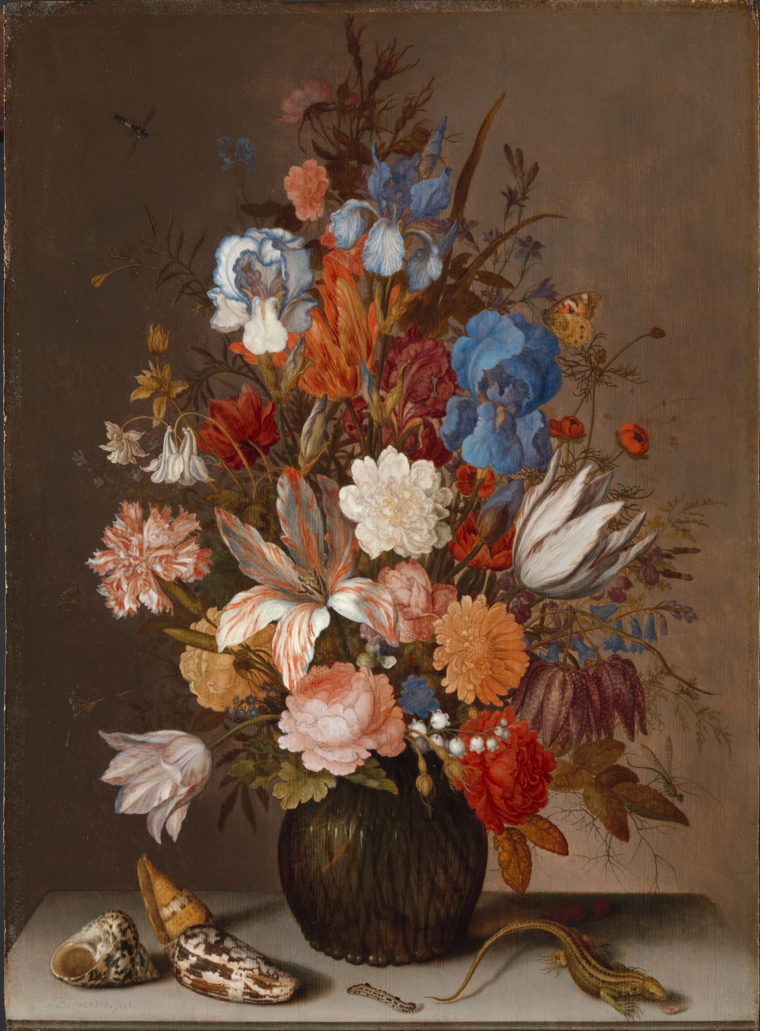
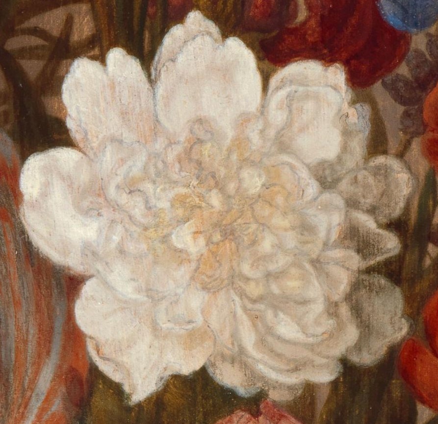
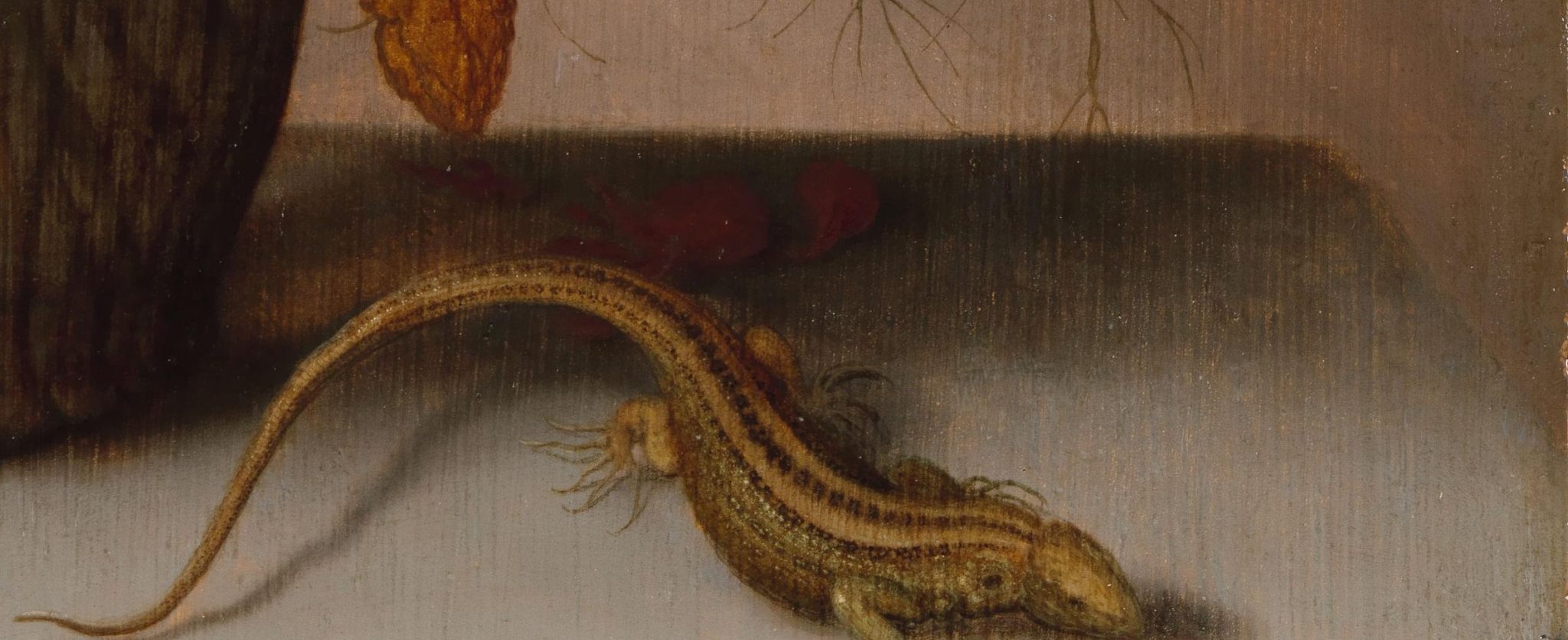
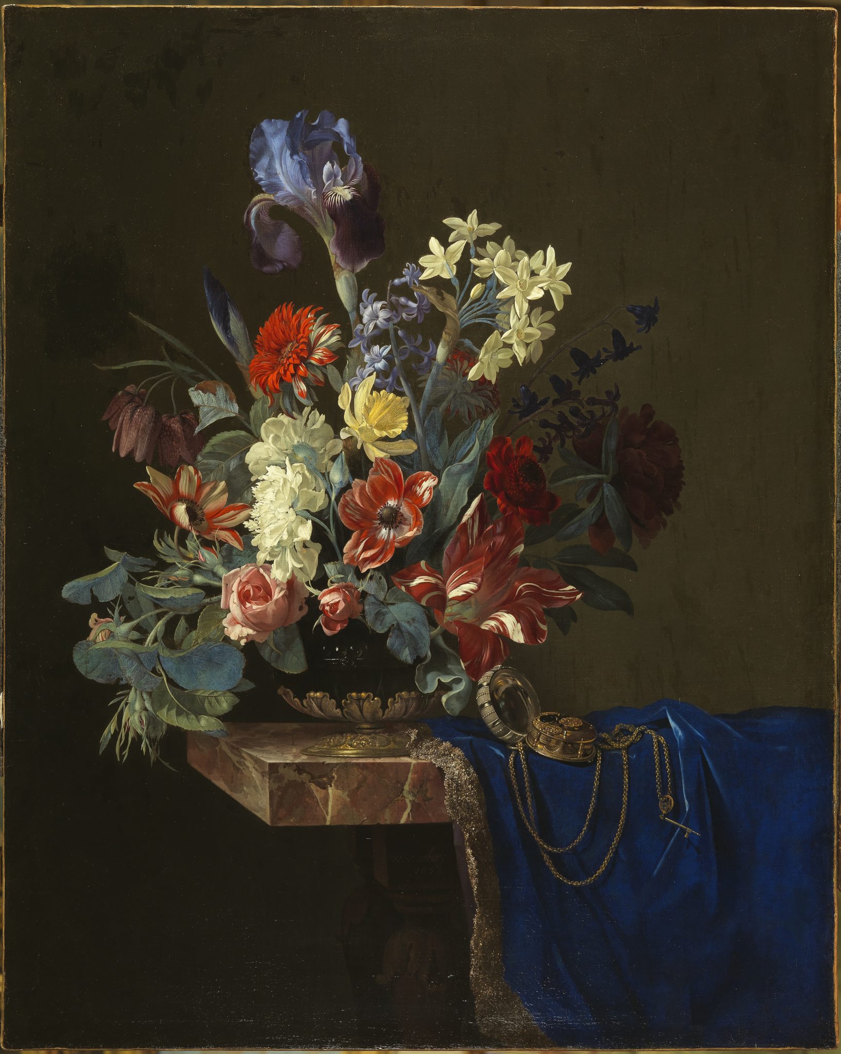
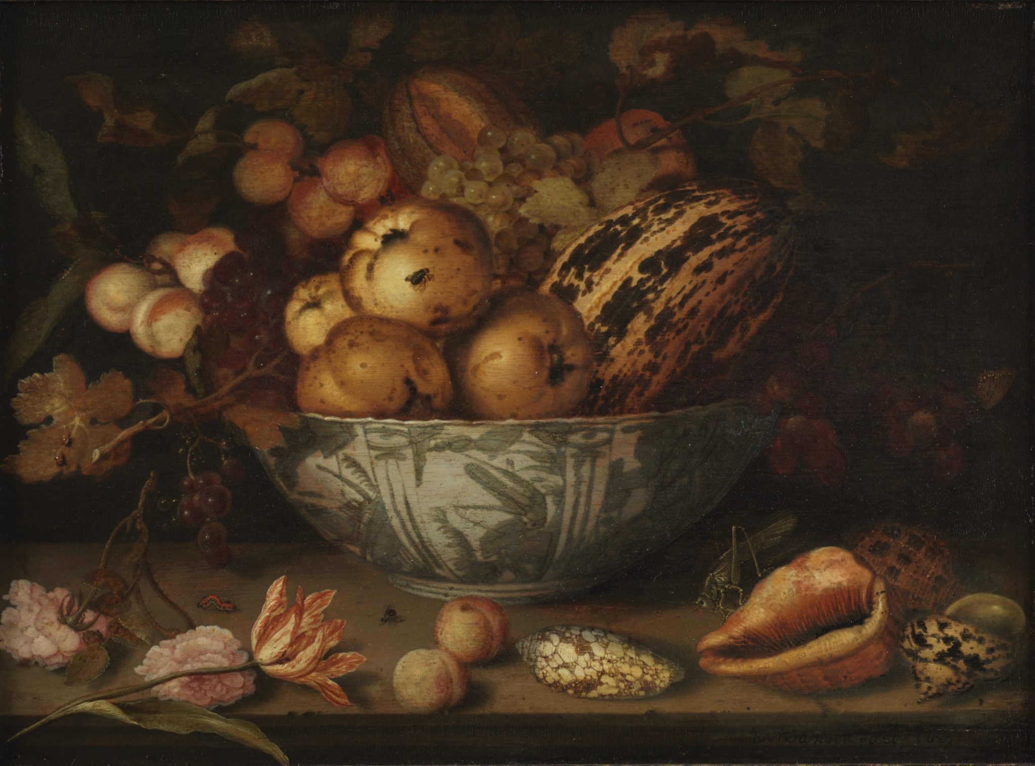
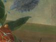
The color of the ground affects the tonality of a painting and makes a great difference to its final appearance. Therefore, before putting their brushes to the panel or canvas, artists had already made a number of decisions about the ground, the qualities of the paint, their painting techniques, and the relations between them. Jan van Huysum’s (1682–1749) Still Life with Flowers, for example, is painted on a white ground. It has a cool tone, largely due to light penetrating the paint layers and reflecting off the white ground (fig. 2).15 In contrast, Balthasar van der Ast’s (1593/94–1657) Still Life with Flowers is painted on a yellow ocher ground (fig. 3).16 Its tonality is much warmer, because more light is absorbed by the dull-colored ground. Consequently, less light reflects back. This effect works not only when the ground is, to a greater or lesser degree, covered with paint but also, and even more so, when the ground is exposed. Painters usually did not leave large areas exposed; only small, strategically chosen ones. The heart of Van der Ast’s white rose, for example, exposes much of the ground (fig. 4). The petals on the left are painted with opaque paint that covers the ground completely. The petals on the lower right are painted over the dark green leaves in the background, which gives them a darker appearance. Discoloration of the white has increased this effect, but it would have been there originally as well, in a more subtle way. Our eye interprets the dark side as shadow and the light side as light. In the intermediate part, the exposed ground performs two functions. It provides the basis for the midtone between the light on the left and the shadow on the right, and it suggests the deeper shadow in the heart of the flower, where the dark lines of the underdrawing add extra depth. Comparison with other paintings of white flowers by Van der Ast tell us that, originally, he relied on the interplay of white and gray paint to define the petals and their relation to each other. In those earlier examples he also let the underdrawing and ground shine through, but much more subtly than in Still Life with Flowers, that seems to have suffered from some abrasion.17 Needless to say, it took great sophistication, knowledge, and training to exploit the play between the color of the ground and the paint layers in such a varied and effective way.
At first sight, Van Huysum—who was as sophisticated a painter as Van der Ast, if not more so—seems to be using the same technique in the white rose at the center of his flower piece (fig. 5). Its heart is beige; the white petals on the left are light; and those on the right are darker. However, there are two important differences between the two. The beige at the center in Van Huysum’s rose is not the ground but a very thin reddish-brown underpaint, applied over the white ground. In other words, on a white ground, Van Huysum needed an extra step to create a midtone. This underpainting does not cover the entire surface but provides a first layout of light, dark, and intermediate tones. The second difference is that the contours of the petals in the heart of Van der Ast’s flower are soft and blurry, while those of Van Huysum are sharp and crisp. This disconnects them from the background and creates an illusion of depth. This technique makes the appearance of Van Huysum’s white rose much more detailed than that of Van der Ast’s.
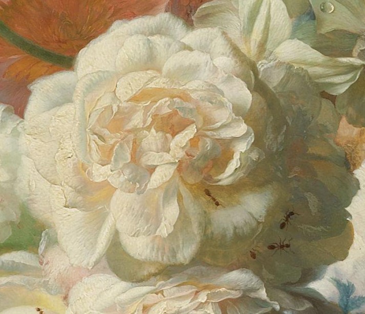
Van Huysum’s illusion of reality is further enhanced by the slightly textured paint in the petals on the outer left, in the light part of the rose. Here the artist relied on something called kenlijkheid, best translated as perceptibility. It relies on the optical illusion that textured paint seems to advance when used in combination with smooth areas that appear to recede.18
In broad terms, painters working in a loose technique have more opportunity to exploit the color of the ground as a midtone. Painting on a white ground facilitates a brighter tonality, but it is also a slower process because it demands more work. Toned or colored grounds provide a warmer tonality, are more suitable for suggestion than for precise description, and can be faster because they require less actual painting when they are exploited skillfully. The edges of the tables in the still lifes by Van der Ast and Van Huysum bring out many of these features (figs. 6 and 7). In Van der Ast’s painting, the exposed ground helps to create a soft contour at the edge that suggests space between the table and the background. The back edge of Van Huysum’s tabletop is sharp and does not expose any of the ground. To separate it from the background, Van Huysum lets white ground shine through the green background, but the sharp line creates a much harder effect than in Van der Ast’s painting.
Both approaches result in a naturalistic appearance, but in totally different ways. Van Huysum’s detailed rose can be appreciated from a distance and from close up, but Van der Ast’s vaguer flower works best from a little distance. White grounds tend to provide harder and brighter paintings with clearly defined objects, while colored grounds are more suitable for softer and more suggestive effects. Since the mid-nineteenth century, the latter was more appreciated than the former. Jan van Huysum, who was one of the most appreciated flower painters of the eighteenth and early nineteenth centuries across Europe, fell out of favor around 1860.19 For example, the influential art critic Théophile Thoré, writing under the pseudonym William Bürger, opined that Gabriël Metsu (1629–1667) would have painted better flowers than Van Huysum had he tried.20 Thoré, who with his publications revived the fame of Frans Hals (1582/1583–1666) and Johannes Vermeer (1632–1675), and who had a decisive impact on the canonization of Dutch art, greatly favored the more painterly and suggestive style over a smooth and meticulous finish.21 For him, the bright, refined style of Van Huysum resulted in a superficial kind of realism. This view has dominated until the present day.22
Rembrandt van Rijn’s (1606–1669) loose, painterly handling, with its exploitation of exposed ground, was and still is seen as exemplifying the opposite of Van Huysum’s approach.23 As Frances Suzman Jowell puts it, Thoré presented Rembrandt as “the great visionary naturalist,” who was able to observe and depict simple nature with deep-felt emotion, charging his paintings (and prints) with universal meaning.24 The same was said about Van Ruisdael, who was then generally considered second only to Rembrandt, and who, for Fromentin, epitomized Dutch realism: “With tapering lines, a severe palette, in two great expressly physiognomic traits—grey limitless horizons, grey skies, skies which vie with infinity—he must have left us a portrait of Holland; I will not say a familiar one, but an intimate portrait, attractive, admirably faithful and one which does not grow old. By other claims, too, Ruysdael is, I certainly think, the greatest figure of the school after Rembrandt.”25
Fromentin used the word “portrait” to connote the highest degree of realism, as did other nineteenth-century critics such as Thoré, Charles Blanc, and Henry Havard. For them, the naturalism of Dutch art was rooted in closely observed everyday life, depicted with all the nuances of light, midtone, and shadow that define people, landscapes, and objects in art as in real life.26 In particular, the suggested presence of objects and bodies in midtones and shadows allows viewers to finish in their minds what they think they see with their eyes. This personalized sense of observation creates a convincing illusion of reality.27
In art theoretical discussions, the suggestive, painterly approach has traditionally been associated with the primacy of color over line.28 In that discussion, color is generally connected to observation of nature, realism, and even emotion, while line is associated with imagination, idealized forms, rules, and ratio. In general, Dutch art has been placed on the side of color. When a painter did not conform to that ideal, he was considered atypical or even degenerate. This fate befell late seventeenth- and early eighteenth-century classicizing artists like Gerard de Lairesse (1641–1711) and Jan van Huysum, among others.29 The so-called fijnschilders (fine painters) like Gerrit Dou (1613–1675) and Frans van Mieris (1635–1681) formed a more complicated in-between group. Their work was considered realistic but also overly meticulous, impersonal, and finicky, and therefore less interesting and relevant than that of Rembrandt, Van Ruisdael, Johannes Vermeer or Frans Hals. By the late nineteenth century, their descriptive kind of realism was not particularly appreciated. This notion also shows in Willem Martin’s influential handbook De Hollandse schilderkunst in de zeventiende eeuw (1935–1936). The reputation of the fijnschilders continues to suffer by comparison to the more suggestive realism of the better known Dutch masters.30
In pictorial terms, the kind of realism that Thoré, Fromentin, and their peers appreciated demanded paintings with a wide range of midtones, and this is where colored grounds come in. Fromentin believed that Van Ruisdael painted on a brown ground: “In short, his color is monotonous, strong, harmonious and not very rich. It varies from green to brown; a bituminous ground constitutes its basis.”31 Bitumen, which yields a fairly dark or reddish brown color, was not used in seventeenth-century grounds, but otherwise Fromentin’s description is well observed. Although not much is known about the grounds in Van Ruisdael’s work, the View of Haarlem that Fromentin had carefully studied and that he presents as one of the Dutch artist’s masterpieces indeed has a reddish-brown double ground (see fig. 1).32 Fromentin’s suspicion that Dutch artists relied on colored grounds for many of the effects that make paintings look convincing has been confirmed amply in the art historical and technical literature on colored grounds and their use since the early 1990s.
Flexibility and Pragmatism: The Function of Colored Grounds and Trends in the Technical Literature
Over the past three decades, enough research has been published to present some preliminary ideas about the main trends in the use of colored grounds. It has become clear that colored grounds spread rapidly across the Netherlands and became ubiquitous in the first decades of the seventeenth century, that artists approached the precise color of the grounds with a degree of flexibility and pragmatism, and that colored grounds were used as an efficient means to achieve a convincing representation of space, which greatly contributed to effects of realism.
However, we should not forget that the data and findings presented in the literature can be quite dissimilar, that research on Rembrandt and Vermeer towers over everything else, and that the terminology is not always consistent.33 It is also important to realize that some of the recent and current research conclusions referred to in the present paper will be revised or refined in the future due to evolving examination techniques, just as past results have been modified by later insights. Nevertheless, the bigger picture, as articulated here, will likely remain valid in the near future.
Most of the publications on colored grounds rely on the research of a limited group of Dutch, American, British, and some German conservators, and of art historians with technical training. Recent research is deeply informed by enhanced optical and technical examination in conservation departments.34 Often the focus is on one artist, although some studies analyze trends in a specific genre, location, or group of artists. Some discuss one or two paintings, while others are based on a sizable sample of an artist’s or a group of artists’ work.35 Few of these studies focus specifically on grounds; most discuss them in the context of the materials and techniques of an entire painting.36 The most recent study of colored grounds is Moorea Hall-Aquitania’s admirable dissertation “Common Grounds: The Development, Spread, and Popularity of Colored Grounds in the Netherlands 1500–1650.” While the present article—which relies heavily on published literature on colored grounds—focuses on aspects of realism, specifically in the next paragraph, Hall-Aquitania’s research has a much wider scope and is rooted in a database of colored grounds in Dutch art that is part of the Down to the Ground project. This database contains both published and original source material, which has been very creatively and usefully combined with methods from conventional, technical, and digital art history.37
Many authors simply aim to describe the materials and techniques as precisely as possible. They present a lot of technical data and often zoom in on the ways in which artists achieved certain characteristic effects. Others examine whether stylistic developments of individual artists are reflected in materials and techniques, or whether stylistic and technical changes are connected to local traditions and art markets.38
In a much-quoted article published in 1979, the art historians Hessel Miedema and Bert Meijer posited the hypothesis that the technique of working on a colored ground may have traveled from Venice to the North. At the time, they could only rely on a limited amount of technical data, and they largely followed Karel van Mander’s (1548–1606) ideas about the relationship between Dutch and Italian art, which were valid primarily for history painting.39 Intermittently, they refer to local traditions of painting on a tinted imprimatura for panel painting, but they also suggest close investigation of painting techniques in Fontainebleau, Vienna, and Prague that may have inspired Dutch artists to work on colored grounds.40 Not until recently have any of these suggestions been taken up in the literature. Instead, Miedema and Meijer’s main hypothesis of the Italian origin of colored grounds was simplified and gradually turned into perceived fact.41
Knowledge transfer from master to pupil, or within a studio, is a topic that remains largely unaddressed for ground layers. The relationship between colored grounds and condition is another field that is virtually unexplored, but this probably reflects the fact that the majority of art historical and art technical texts on colored grounds have appeared in exhibition catalogues, written for a general audience, or in collection catalogues, journal articles, and edited volumes for an art historical audience, rather than in publications for conservators.42 The overview of scholarship that follows largely excludes short technical catalogue notes that merely describe materials and techniques without any further context, as such texts do not aim to offer an interpretation of the data they present.
From the literature, three main themes emerge: first, the composition, application, and general function of grounds; second, the artistic effects that could be achieved with their use; and third, the relationship between the ground and the support, the geographical place of origin of a painting, the period in which a painting was made, and/or the subject or genre of a painting. While the literature suggests that artists were pragmatic and flexible about the color of the ground they painted on, this does not mean that colored grounds did not matter to them. On the contrary, painters understood that colored grounds were instrumental to creating the look of the real that was so new and exciting in their time. The literature helps us to understand how these painters so efficiently and convincingly achieved the illusionistic effect that became fundamental for Dutch art of the seventeenth century.
In this period, the general function of the ground did not change from that in earlier painting practice. It served to level the unevenness of the support, to prevent the binding medium of the paint from sinking into the support, and to provide a basic tone for the paint layers. The widespread historical references to recipes testify to a general awareness among artists of the compositions of grounds and ways to apply them.43 Although it is not entirely out of the question that some artists applied their own grounds in the studio, most authors agree that many painters worked on grounds that were applied by professional primers who operated locally. The main arguments for this are references in the archives of priming as a specialized craft, a certain degree of consistency in the grounds used by individual artists working in one place, and some variation of grounds when artists worked interlocally. 44 It is also suggested that painters may have adapted the final color of the ground to their requirements by adding an additional ground layer themselves.45 This additional layer could consist of palette scrapings; Maartje Stols-Witlox has found a small number of authors who discussed this practice.46
The tremendous success of the colored ground was new in the seventeenth-century Netherlands, after at least two centuries of dominance by white grounds. This did not mean that very light and white grounds disappeared, but technical research has established that colored grounds were used more frequently.47 Most grounds on seventeenth-century panels consist of a chalk-glue layer, usually with a pigmented oil-based layer on top that provided a warm tone, ranging from light beige to light brown. Some painters, like Esaias van de Velde (1587–1630), Jan van Goyen (1596–1656), and Pieter Saenredam (1597–1665), regularly or incidentally exploited the color and the grain of the wood, which suggests that their grounds were very thin or semitranslucent.48 Grounds on canvas are more varied, as published cases demonstrate, but are predominantly double grounds bound in oil. The first layer appears to act as a filler and is composed of cheaper pigments. Often a second layer was applied, typically based on lead white and tinted with various combinations of pigments (often earth pigments and/or a black). Occasionally there is a third layer. A very common double ground is gray-over-red, which provides an overall tone that ranges from gray to beige-brown depending on the pigmentation of the top layer.49 The quartz-clay ground seems to be an idiosyncrasy, as it has so far been found only in paintings by Rembrandt and Samuel van Hoogstraten (1627–1678).50 Mainly consisting of quartz-rich potter’s clay, it was gray-brown in color, as Petria Noble explains in her essay “The Role of the Colored Ground in Rembrandt’s Painting Practice.”
One of the functions of grounds on canvas is to even the support, and it has been remarked that the surfaces of Dutch paintings tend to be smoother than those of sixteenth-century Italian paintings.51 The kind of rough brushwork that merely scrapes the knots of the weave when the ground is less smooth, and which seems to have been one particular effect in sixteenth-century Italy, is less evident in Dutch art. In easel paintings, such effects remain more or less limited to Rembrandt and his followers. Most likely the relative rarity of this technique is related to the generally smaller size and shorter viewing distance of Dutch paintings.52
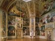
So far, no clear relationship between the color of the ground and the subject matter or genre of a painting has emerged, despite the advice that grounds be adapted to subject in historical art writing.53 Insufficient data exists to solidly refute or confirm the assumption that, with the rise of bright, classicist painting styles, grounds became lighter in the last quarter of the seventeenth century. What has been published seems to argue against it.54 It should also be kept in mind that classicist styles had already emerged by midcentury, with, as a highpoint, the paintings for the Oranjezaal in Huis ten Bosch in The Hague, which were done on a light beige ground (fig. 8). Although the literature shows no clear development in the color of grounds over the course of the century, individual tendencies have been described. Rembrandt’s grounds became darker as his career progressed, as did those of Pieter de Hooch (1629–1679) when he moved from Delft to Amsterdam around 1660.55 Carel Fabritius (1622–1654) went in the opposite direction in 1650, when he started to paint on lighter grounds.56
At the moment, the literature describes only broad trends in the use of grounds.57 Current research suggests that colored grounds in general came into use in the Dutch Republic between about 1590 and 1625. Little is known about local variations between cities. Before 1650, light peachy beige colored grounds are often found in Haarlem, while artists in Delft tended to paint on single, warm cream-colored layers.58 In Amsterdam, different variations of the gray-over-red ground on canvas are frequently observed.59 These types seem to be dominant in, but not exclusive to, these urban centers. There is no clear information on Utrecht, Leiden, The Hague, or Dordrecht, cities that lack deeply researched artists like Frans Hals, Vermeer, or Rembrandt and their circles.60 The streaky grayish layer often referred to as imprimatura in literature on Rubens and other Antwerp painters remains almost completely limited to Antwerp.61
Contrary to what one might expect, it is not self-evident that artists working abroad painted on completely different grounds. Willem van Aelst (1627–1683) and Michael Sweerts (1618–1664) did while working in Florence and Rome, but Cornelis Norbertus Gijsbrechts (1625–1675), working in Copenhagen, and Sir Peter Lely (1618–1680), in London, apparently did not.62 Possibly, grounds available in England and Denmark were similar, or at least comparable to, those in the Netherlands. The less likely alternative is that the artists imported pre-primed canvas from the Netherlands.
The role of primers and art dealers in the spread of colored grounds has remained elusive and is discussed in detail in Hall-Aquitania’s contribution to the present volume.63 Technical data points to local traditions, but the scarce information in the literature also suggests interlocal trade in artist’s materials. For example, in the 1650s the Rotterdam dealer in painting supplies Leendert Hendricks Volmarijn (1611/12–1657) also operated in Delft and Haarlem. In the early 1670s, Abraham Lamberts van Bubbeson (dates unknown), also from Rotterdam, traded in imported primed canvases from Antwerp. In 1676, painters in Leiden complained that, following the death of a local frame maker who also supplied prepared supports, they were obliged to obtain their primed panels and canvases out of town.64 These cases suggest that interlocal art dealers operated alongside local primers. However, their activities have not been confirmed by technical data, so their impact may have been small.
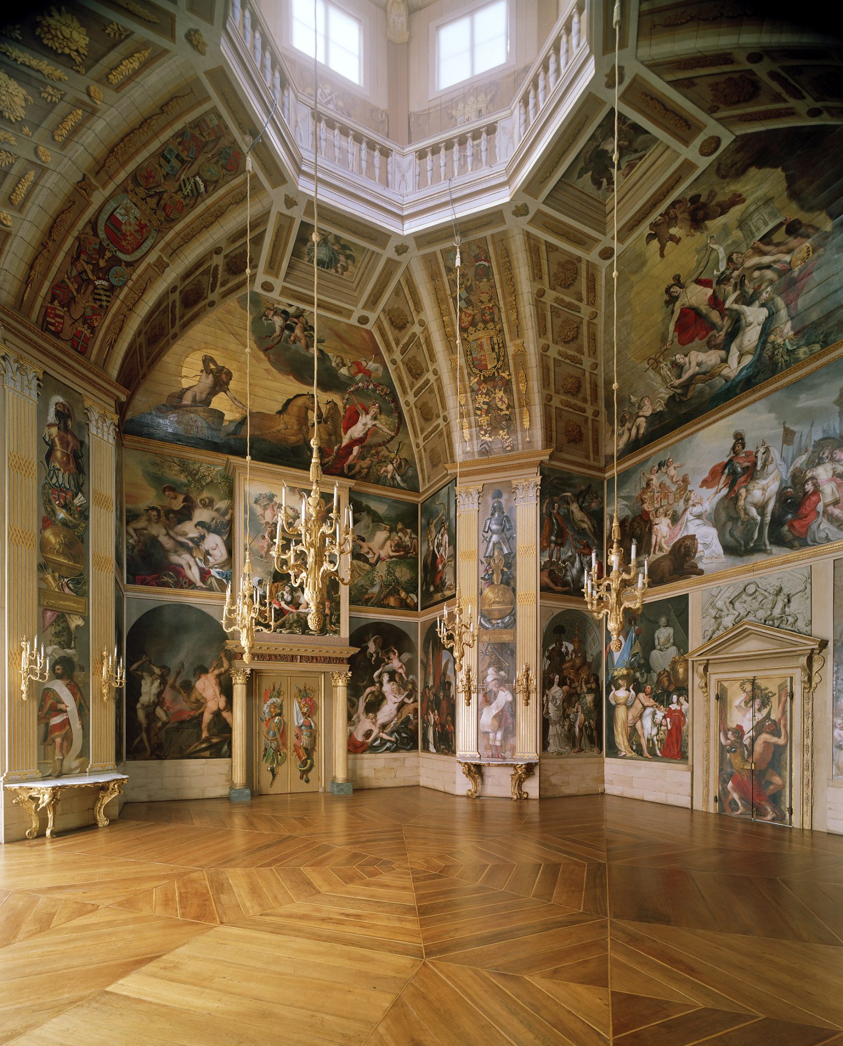
A good example of the interlocal spread of colored grounds is the aforementioned Oranjezaal. For this project, painters working in The Hague, Haarlem, Alkmaar, Amsterdam, and Amersfoort all worked on canvases that were prepared with a similar light beige ground. These were commissioned by Jacob van Campen (1596–1657), who was from Amersfoort, from François Oliviers (1617–1690), a primer working in Haarlem. While efficiency and costs were no doubt relevant, the main reason for this complicated distribution was to guarantee the tonal unity of the paintings. This was important because they were intended to contribute to the overall illusionistic effect of the room, meant to suggest a space of triumphal arches (see fig. 8).65 Like the situation with dealers trading beyond city borders, the case of the Oranjezaal suggests that a clear view of the use and spread of local grounds requires a combination of technical analysis with specific archival data on networks of dealers, primers and of patronage, along with knowledge of the destinations and functions of paintings.
At present, the data in the literature is still too fragmentary and incomplete to allow for a clear assessment of how colored grounds spread across art centers. Nor has it been possible to identify who the main agents were and how they operated: painters, primers, dealers in artists’ materials, or even patrons, even if they were less likely to influence the choice of grounds on a large scale. However, the database compiled by Moorea Hall-Aquitania, with the aid of Paul J. C. van Laar, in the Down to the Ground project is a promising start for discovering such trends.66
It is well known that painters were trained to work in the styles and techniques of their masters. Aert de Gelder (1645–1727), for example, applied Rembrandt’s lessons the best way he could, including the visible exploitation of the ground in his paint layers.67 But published cases demonstrate that artists could also be flexible and pragmatic. Ferdinand Bol (1616–1680) and Govert Flinck (1615–1660) deviated from Rembrandt’s style and technique once they left his studio, even as they continued to paint on colored grounds, often Rembrandt’s preferred gray-over-red.68
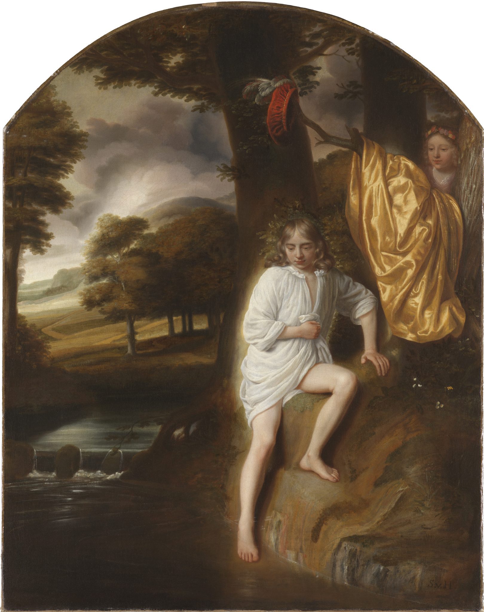
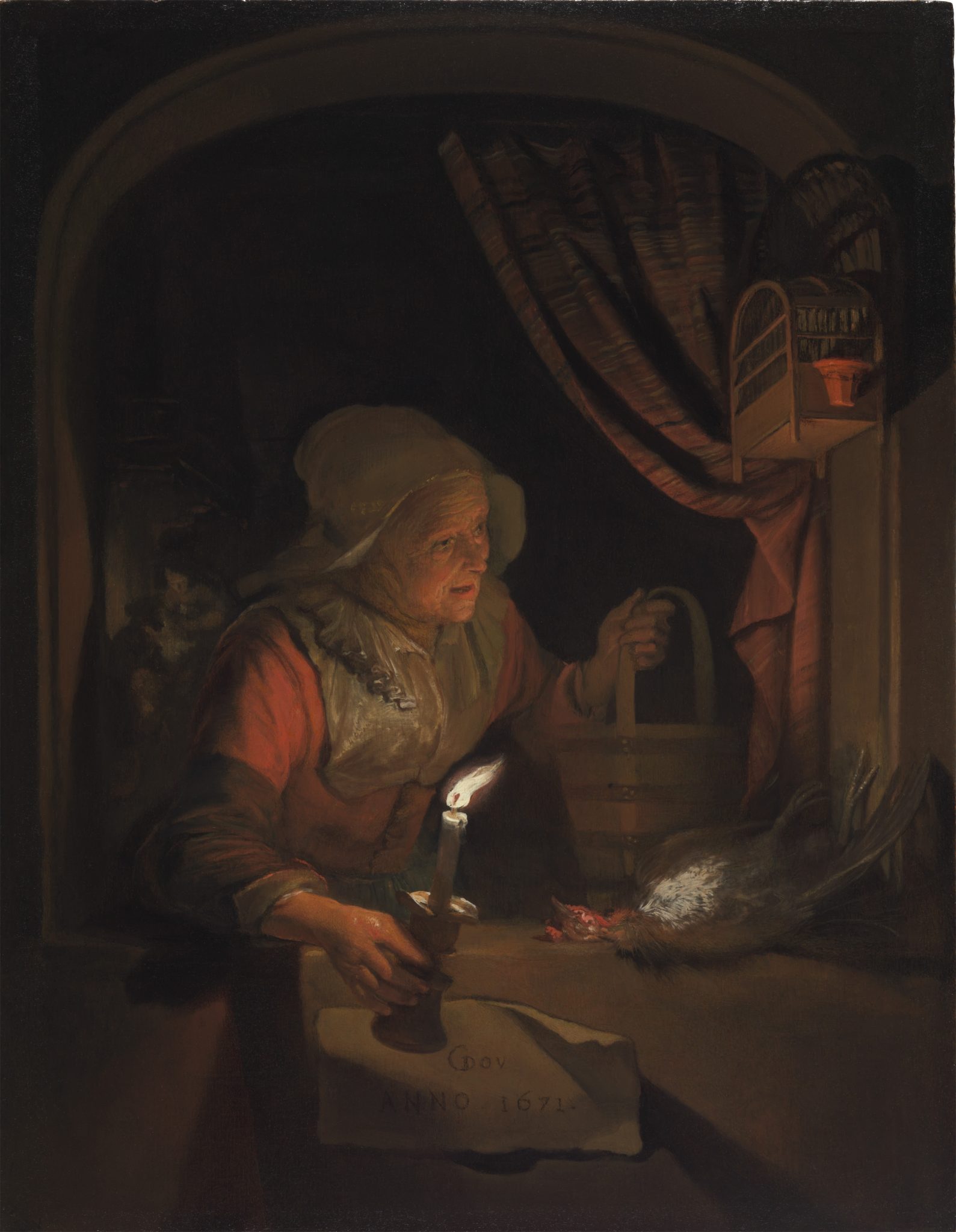
An interesting case is Godfried Schalcken (1643–1706), who had two masters (fig. 9). He was trained in the studio of Van Hoogstraten between 1658 and 1660 before he went to Gerrit Dou by 1662/1663.69 Schalcken emulated Dou’s refined style of painting, resulting in smooth surfaces that he managed to combine with soft contours he seems to have learned from Van Hoogstraten. Van Hoogstraten painted his Salmacis and Hermaphroditus (fig. 10) on a light-colored first ground covered by a second brown one, which allowed him to to give his contours a sense of depth by leaving the ground partially exposed in those areas70 Dou, on the other hand, exclusively painted on panel, generally covered with thin, light grounds.71 His Old Woman at a Window with a Candle was painted on a thin, light-colored ground that does not mask the grain of the wood (fig. 11).72 Optical investigation of the painting indicates that Dou did not employ the light color of the ground in this night scene.
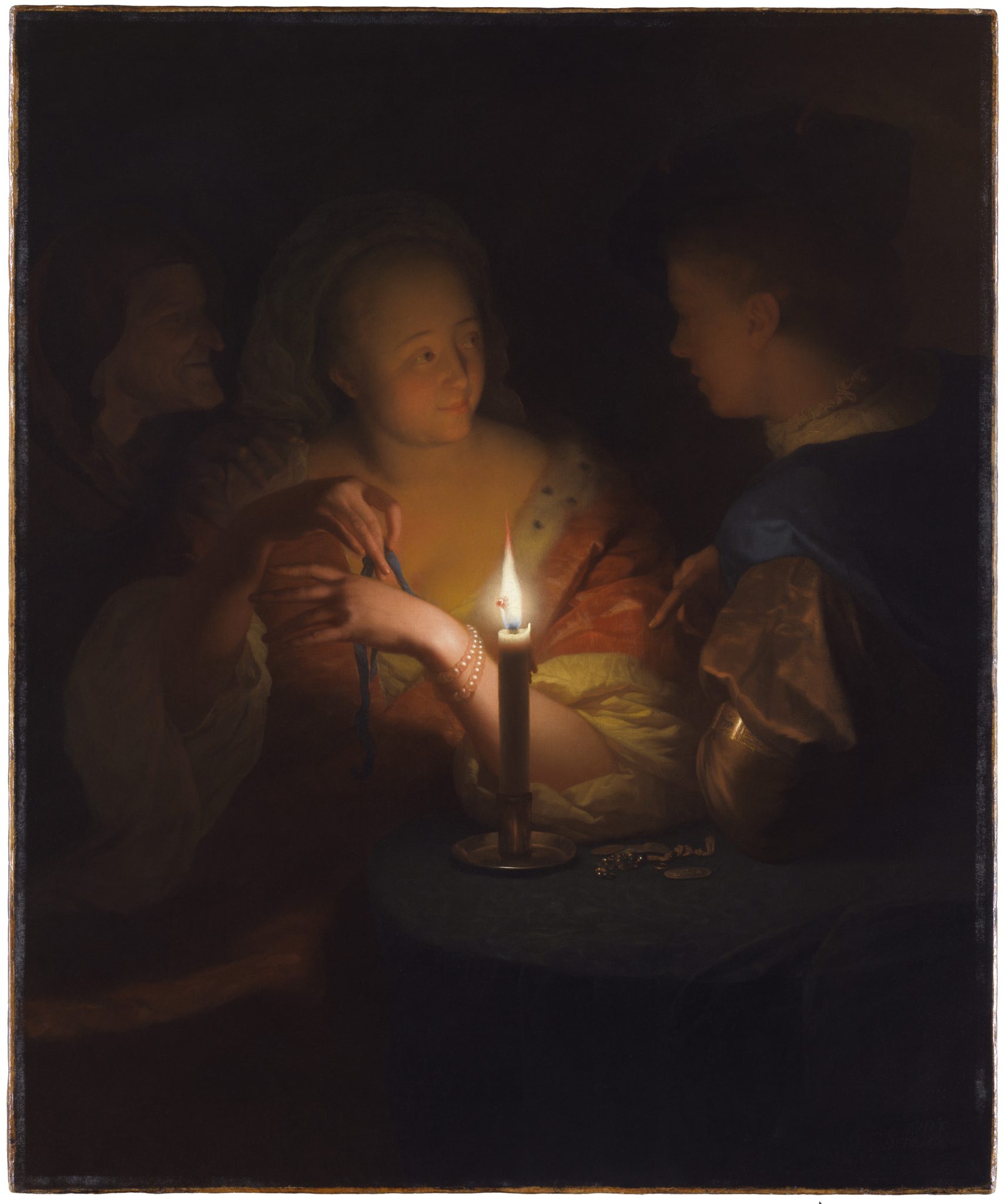
The different approaches of these two masters prompts the question of how Schalcken decided to use ground. Ann Massing and Karin Groen, as well as Caroline von Saint George, have shown that Schalcken worked on colored grounds on different supports: panel, copper, and canvas.73 In his Lovers (The Prodigal Son) (see fig. 9), a night scene like Dou’s, Schalken used a light-colored ground and, rather than choosing a standard canvas like van Hoogstraten’s, used a fine canvas that resulted in a smooth surface. Even though he would have learned from Van Hoogstraten how to exploit the color of a relatively dark ground, in this painting at least he preferred to stay closer to Dou’s technique and took it for granted that he had to paint in the soft contours atop the ground. The conclusion we can take from this is that painters’ training evidently prepared them for great technical flexibility. This equipped them to find their own way, which was very important in the competitive market for paintings.74
A certain degree of flexibility and pragmatism is also suggested by the literature that describes the materials and techniques of traveling artists who adapted to locally available grounds, a fact that confirms the use of local primers who provided prepared supports.75 One of the most vexing questions, however, is whether artists adapted their grounds for reasons of local availability or for artistic reasons connected to the aesthetic appeal or marketing of their art. Melanie Gifford has convincingly argued that Van Aelst and Metsu changed their styles to adapt to new markets.76
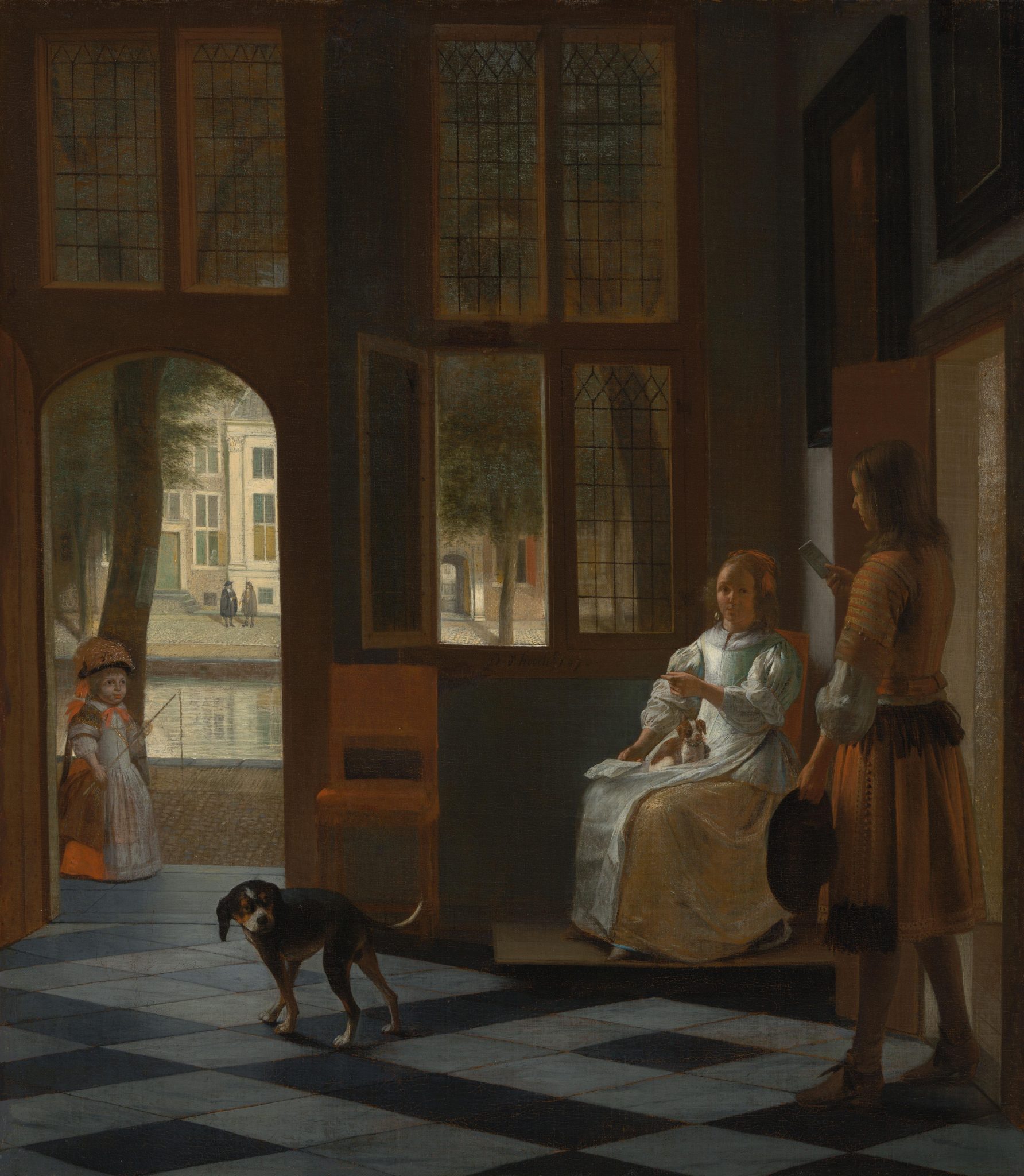
Things are more ambivalent with Fabritius and De Hooch.77 As we saw, both adapted the choice of the ground to local availability. However, at the end of his career De Hooch clearly relied on dark grounds for efficiency, developing a much looser handling. Fabritius, after his move to Delft, turned to exploring space and light in perspective pieces; working on lighter grounds may have had an aesthetic motivation that was perhaps prompted by the locally available grounds in combination with the general interest in architectural painting in Delft. The question of which came first, the ground or the artistic impulse, cannot be answered.
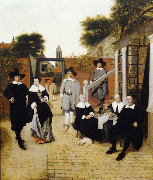
It is also important to note that De Hooch’s move and subsequent choice of ground does not seem to have affected the way he employed the ground optically; he kept using it to define shadowed areas in details and for the overall tone of the entire painting. For example, Anna Krekeler has demonstrated how De Hooch left the gray ground exposed to define the shadows in the faces of the sitters in Portrait of a Family from Delft, painted in Delft 1657 (figs. 12 and 13). In Man Handing a Letter to a Woman (1670), painted in Amsterdam on a darker, orange-brown ground, the same technique results in a different effect (figs. 14 and 15). The distinct appearance follows from changes in the color and the size of the areas of the exposed ground: gray, light, and small in the painting from 1657; brownish, dark and larger in the work from 1670.78 The result is that the tonality in the former is much lighter than in the latter. This is more fitting for a scene in full, open light than for the shaded street, but it also reflects local preferences; figure paintings for the Amsterdam market in general seem darker than those in Delft.
Another interesting case is Aelbert Cuyp (1620–1691), who changed his style in the late 1640s from cabinet-size tonal landscapes toward scenes bathed in Italianate light, often quite large. Available data shows that beige grounds dominated until the early 1650s, both in smaller panel paintings and larger ones on canvas. In the large paintings from the late 1650s, Cuyp seems to have switched to the gray-over-red grounds that had become widespread throughout Holland.79 Since Cuyp remained in Dordrecht all his life, the switch may reflect a change in local supply, but it was also apparently a response to the changing, local market. Unlike Cuyp, Jan Lievens (1607–1674) traveled extensively. Melanie Gifford has demonstrated that he took a most liberal attitude to the grounds of his paintings, either exploiting their tones to create a sense of depth or suppressing their possible effects almost completely with his paint layers, just as he required.80
Although individual painters may have had certain preferences, by and large their training equipped them to work on any type of colored ground. This made them both flexible and pragmatic. As I will argue below, it seems as if the most crucial decision was the choice between a very light ground a darker one. The precise color seems to have been of secondary importance. Painters were aware that specific techniques could produce totally different styles on comparable grounds. So far, the data suggest that a colored ground had more importance for artists working with a loose handling of paint than for those whose tight paint handling left no gaps between brushstrokes. For instance, the brushwork of Frans Hals and Cornelis Verspronck (1600–1603) could not be more different, yet their grounds are comparable.81
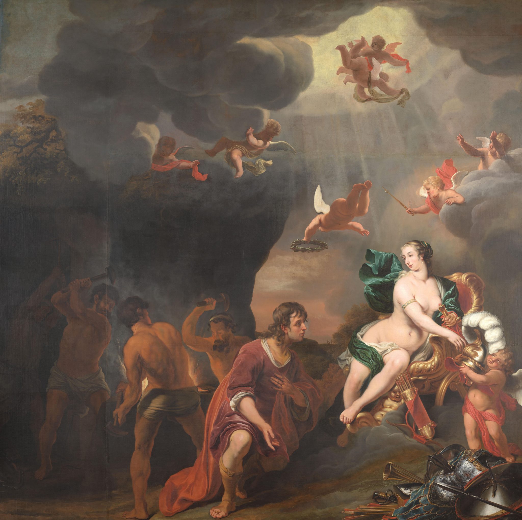
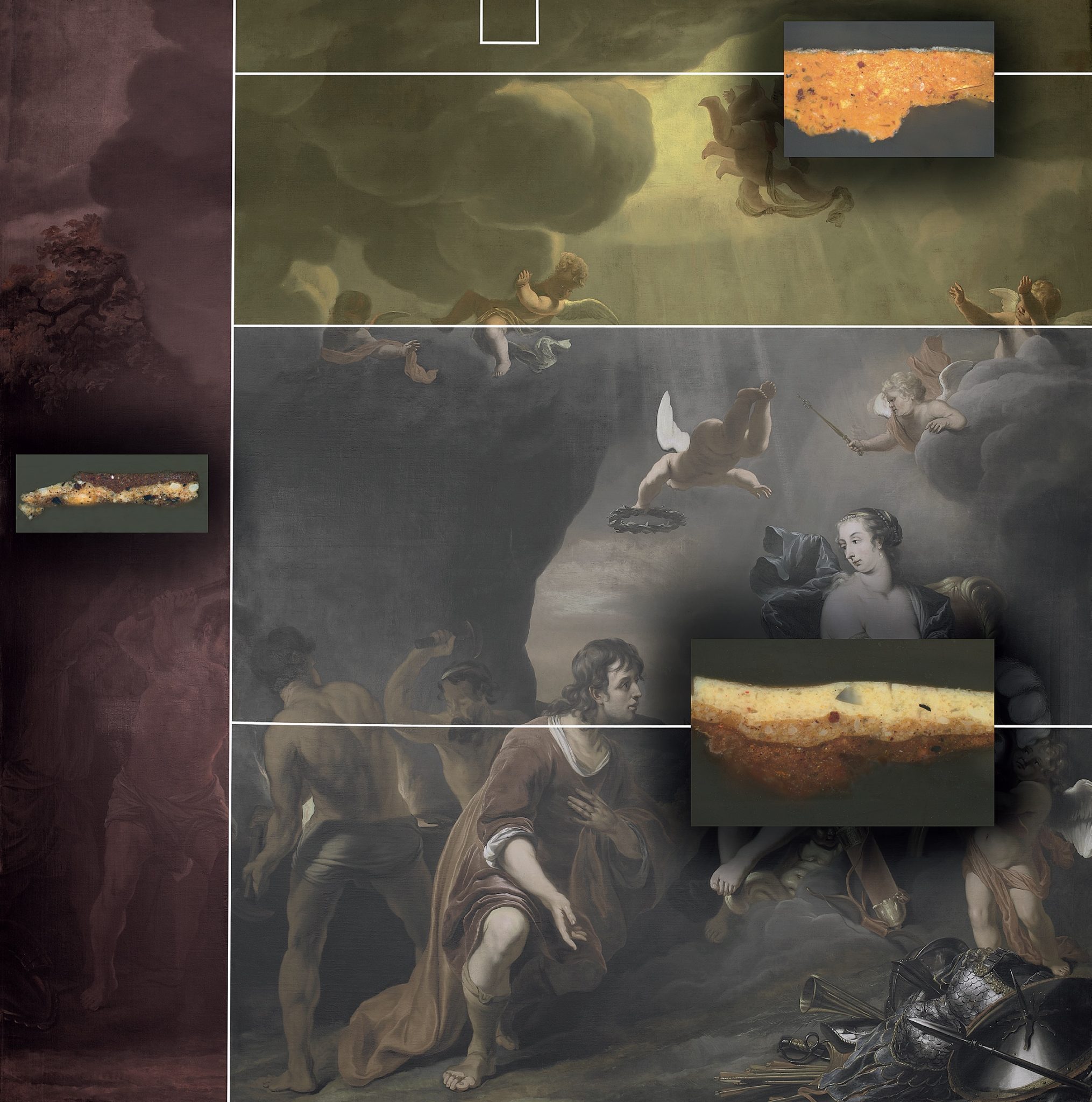
The practice of Ferdinand Bol is particularly revealing of this pragmatic approach to the precise color of grounds. Margriet van Eikema Hommes shows that, in large-scale wall decorations, Bol worked on canvases of two or even three differently colored strips of canvas.82 It seems that he simply exploited the differences in ground where he could throughout the overall composition. In Aeneas Receiving a New Set of Armor from Venus, the ground on the two central pieces is gray (figs. 16 and 17). The first addition, at the top, is yellow and was used for the light of the sun; adding the dark clouds to this relatively light ground would have been easy. The second addition is the strip on the left, which was red and darker than the others. Bol used this part for some of the darkest shadows in the background of the composition. This pushes the figure in the back to the front of the middle ground, while his diagonal position takes the eye to the back again (fig. 18). In this way, Bol combined two well-known strategies for creating the illusion of space: one coloristic and the other linear.
Colored Grounds at Work: Artistic Practice and Seventeenth-Century Art Theory
The current state of research does not allow for unequivocal explanations for changing ground colors in time, place, or even artists’ careers. Choices for grounds emerged from a complicated mix of local or temporal availability, preferred style and technique, and changes in aesthetic preferences in the art market. But it is also evident that artists who exploited the color of the ground in their final compositions were highly skilled at this, which indicates a high degree of consciousness about the technique and the visual effects that it could help to achieve. Virtually all texts on the materials and techniques of Dutch painters studied for this paper have sections that describe the optical effects of the ground. Despite the different painters, genres, time periods, and the precise ground colors they discuss, the authors are remarkably consistent in their description of the ways artists exploited colored grounds in the final image. The ground provides the general tone of the image; it is used to define the position of objects in space; and it allows painters to work efficiently.

With regard to the general tone of paintings, Ashok Roy, for example, remarks that the Utrecht Caravaggisti made “important use of the color of the canvas priming [the ground] to influence the overall tone of the picture and its lighting effect.”83 The example he gives is Gerard van Honthorst’s (1592–1656) Christ Before the High Priest, painted in Rome (fig. 19). Roy explains that the red-brown color of the ground, modified by thin layers of semitranslucent paint, adds depth and warmth to the entire composition, providing a base tone and unifying the composition. Discussing the work of Rembrandt, Ernst van de Wetering calls this “the tonal cohesion.” He explains that the ground functions as “a safety net” for tonal balance.84
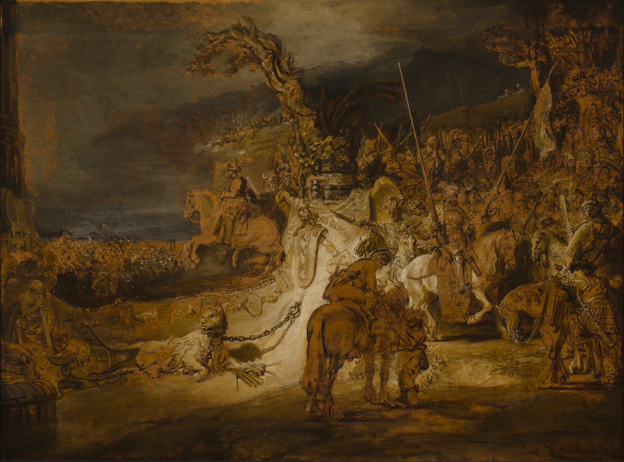
Van de Wetering offers as an example Rembrandt’s oil sketch The Concord of State (fig. 20), which is painted on panel atop a double ground with a brownish top layer.85 The brown ground is visible everywhere: in the foreground, middle distance, background, and sky (figs. 21, 22, 23 and 24). The Concord of State is an oil sketch, but the principle also works in fully worked up paintings, by Rembrandt and others. The colored ground facilitates the organization of light and shadow precisely because it provides the midtone from which the painter could build up lighter or darker sections and accurately define the positions of figures and objects in space. For Honthorst and Rembrandt, the ground did precisely what Fromentin thought the imagined bituminous ground in Van Ruisdael’s landscapes did; it provided and served as the touchstone for “the monotonous, strong, and not very rich color harmony,” to repeat the Frenchman’s words.86


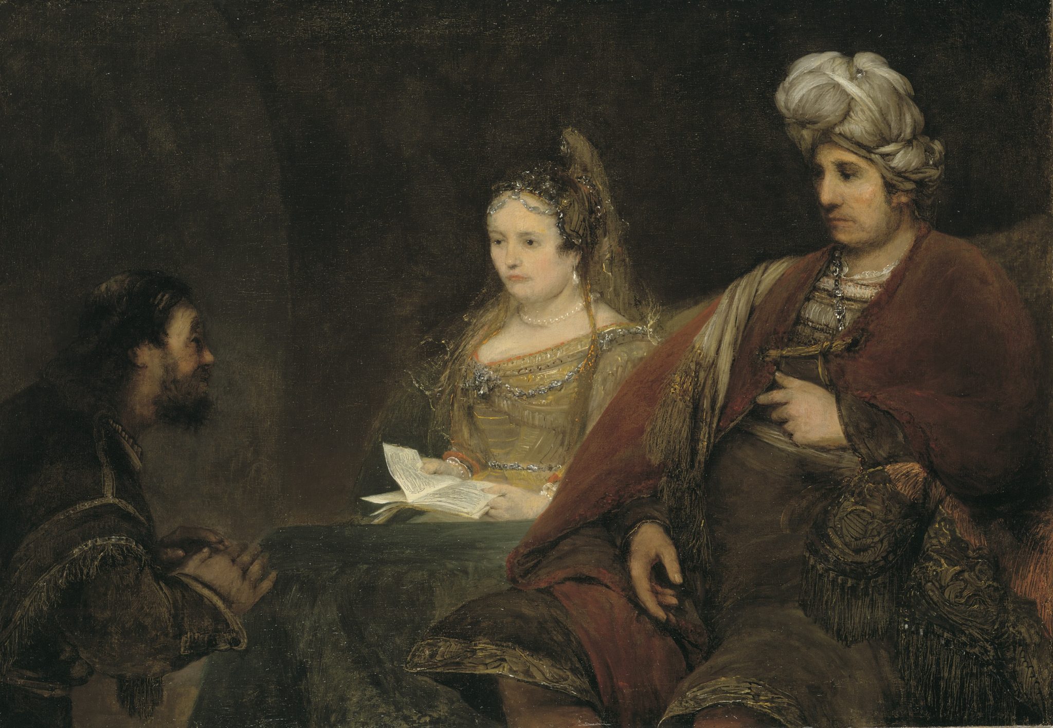
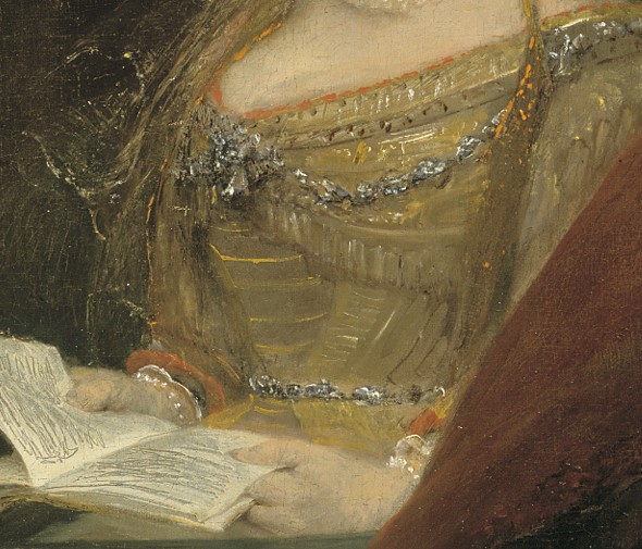
That Rembrant shared this technique with his pupils is evident in the paintings of Aert de Gelder, for whom—according to Van de Wetering—“the colored ground functions as a kind of basso continuo that does not only integrate the image as a whole, but that also plays a unifying role in the interplay of tone and color.”87 The example Van de Wetering gives is De Gelder’s Esther, Ahasuerus and Hamman (or Mordechai), in which the gray ground is left uncovered in many places, especially Esther’s dress, and optically shifts from cool gray to warm olive depending on the adjacent colors (figs. 25 and 26).88 The same effect has been described in more general terms by Stols-Witlox: “The more strongly colored grayish, drab brownish grounds were used to enhance the unity and harmony of a painting, often acting as a middle tone between the shadows and the highlights.”89

Providing a tonal balance worked on a more detailed level as well. In those cases, the colored ground became a useful tool to define the precise position of objects in space, for which the art theoretical term houding was used (described in more detail below). For this, artists often left the ground exposed to function as the contour of an object or figure. Arie Wallert has pointed out that flower painter Jan Davidsz de Heem (1606–1684) actually advised painters to “leave the ground a little to be seen between light and shadow.”90 Acting as a midtone, a small area of uncovered ground detaches the object or figure from the background and simultaneously provides a smooth and natural looking transition between shadow and highlight that suggests the object’s three-dimensionality.
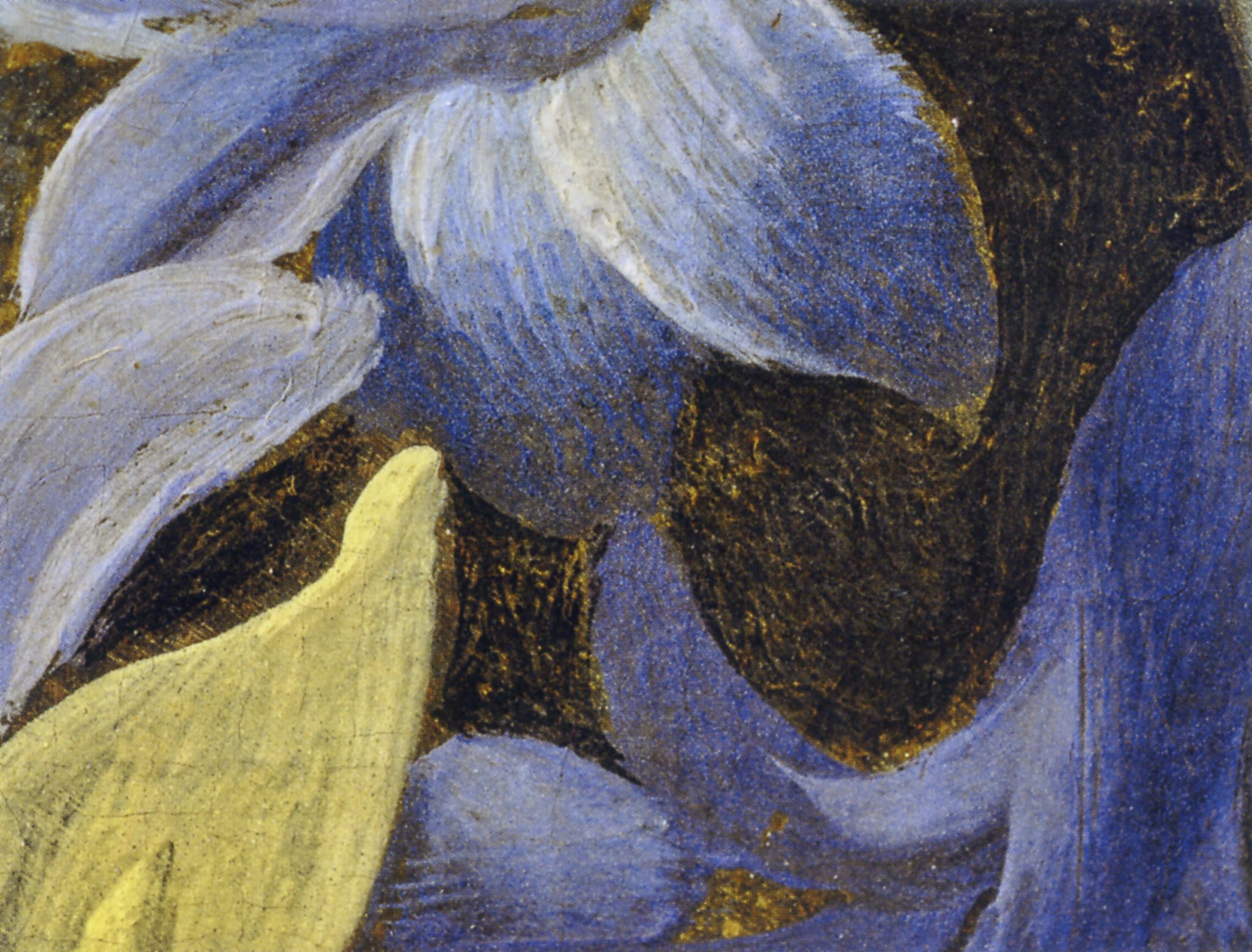
A detail in Willem van Aelst’s Still Life with Flowers on a Marble Ledge (figs. 27 and 28) exemplifies this.91 The brownish gray line between the right edge of the hyacinth’s blue petal and the dark background, just above the center of the composition, is the exposed ground. When seen from a normal viewing distance and not close up, as here, the eye interprets this line as the edge of the petal that recedes into the shadowed space of the background. In doing so, the line helps to define the petal’s, and therefore the flower’s, spatial position with great precision—or, perhaps more accurately, with “suggested” precision, because it all takes place in the brain, which is being manipulated by a highly skilled artist.
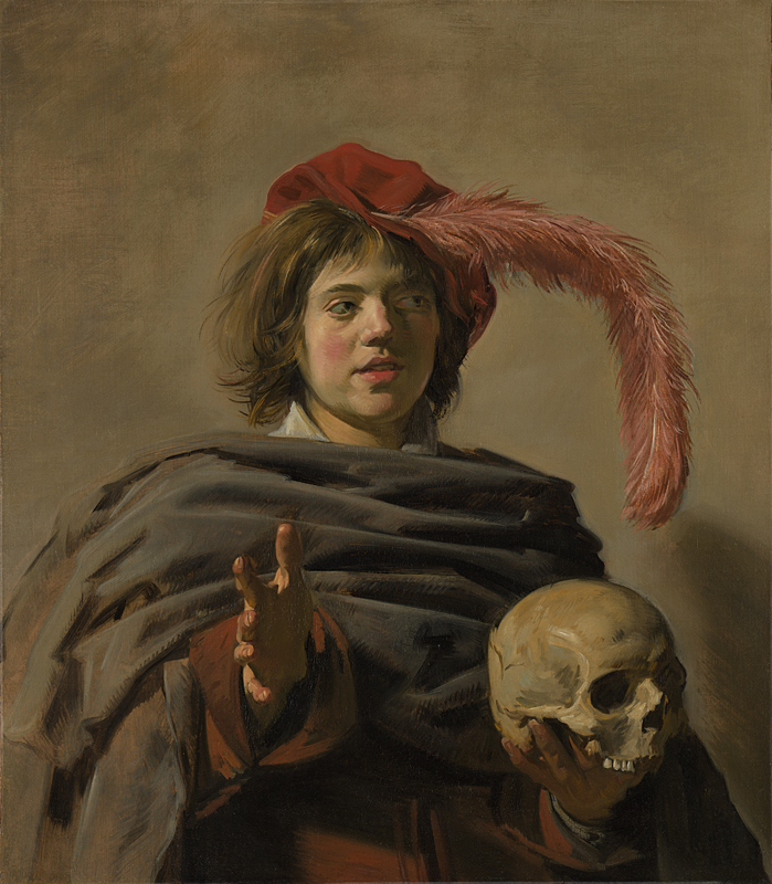
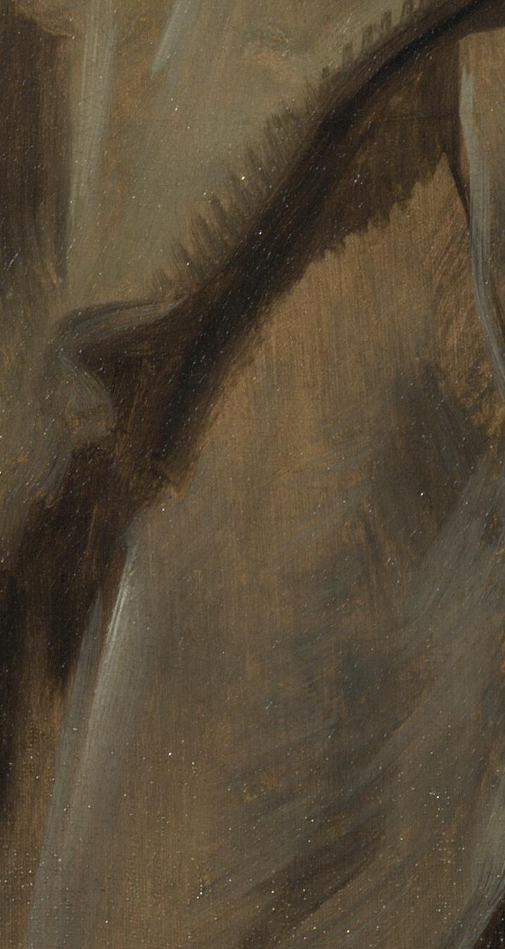
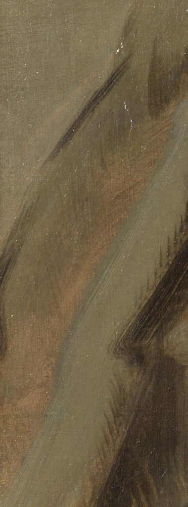
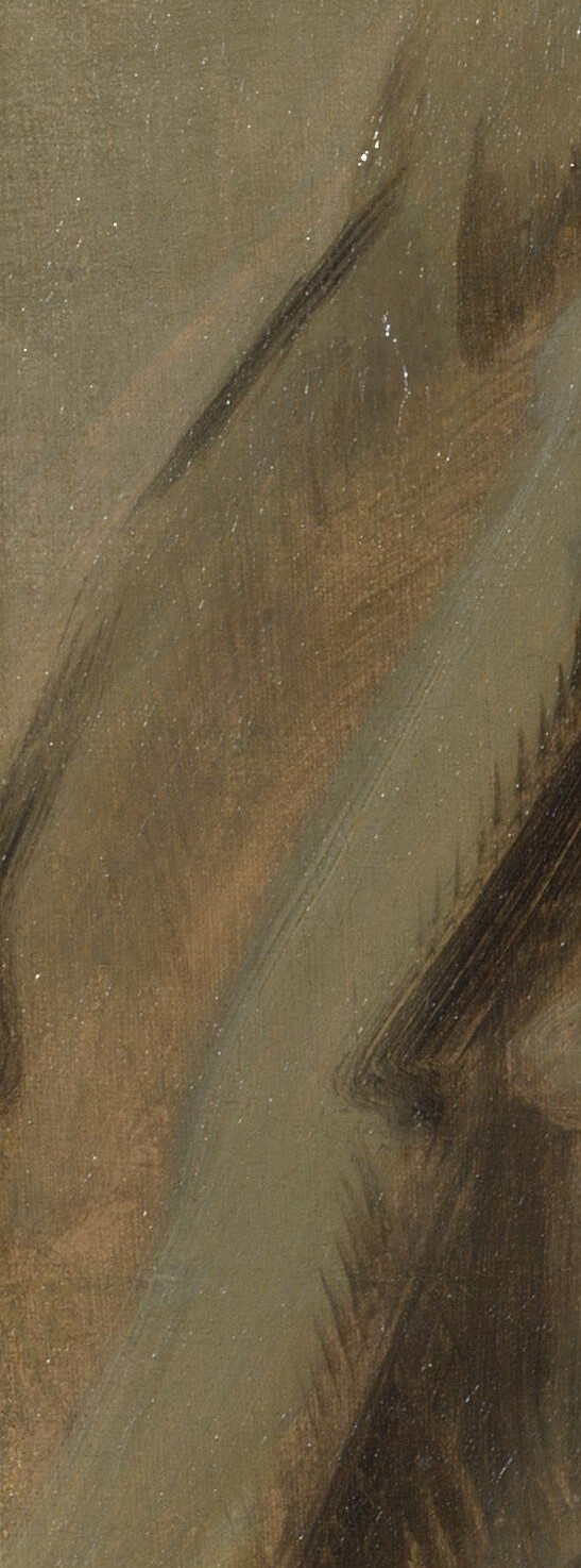
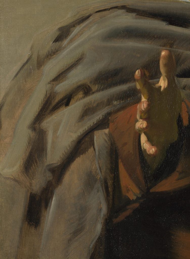
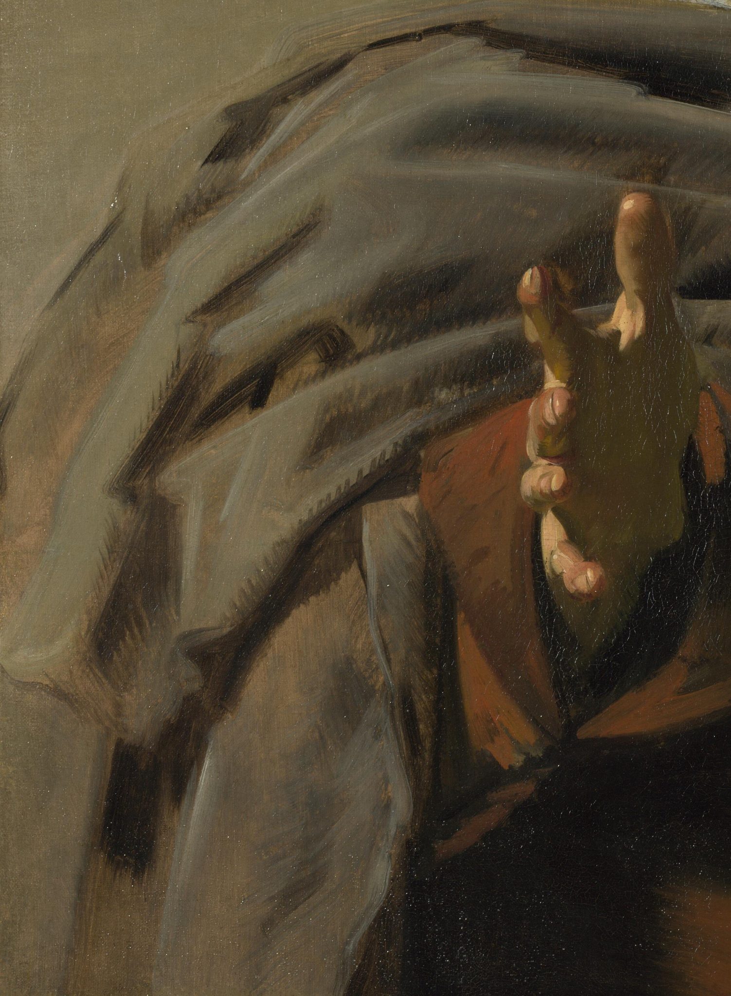
Artists also used the ground as a midtone to define the exact positions of objects, such as folds in cloth or the socket of an eye. For example, Karin Groen and Ella Hendriks have described how Frans Hals, in Young Man Holding a Skull, used the reddish tint of the ground as a light midtone in the folds of the sitter’s cloak in the lower left foreground, subtly varying the final tone with thinner or thicker paint applied with more open or more dense brushwork (fig. 29).92 The skillfully painted dark shadow of the fold in the foreground turns the adjacent uncovered reddish-brown ground into a light midtone (fig. 30). When surrounded by more muted colors, the ground also takes on a muted appearance, as can be seen in the folds along the left edge (fig. 31). Combined, these strategies create a striking diagonal of light from the lower right to the upper left and imitate the way we see depth (fig. 32). The folds in the foreground appear sharp, while those in the background are slightly blurred, with the foreshortened Caravaggesque hand pushing all of this back to the middle distance.93 In other words, Hals relies on the ground as a base to define the folds and to express very precisely how the cloak itself recedes into the background, giving shape to the young man’s body and anchoring him clearly and solidly in space. The painting is also a fine example of the way portrait painters, especially, tended to leave the ground exposed, or shining through: to provide some light in the background, “to warm up the general tone,” and to provide “tonal cohesion,” as Roy put it in discussing the Utrecht Caravaggisti.94

In their description of the painting, Groen and Hendriks point to Hals’s technically simple but virtuoso execution. This connects to the third point that is often made in the literature about colored grounds, and that logically follows from the first and second one: colored grounds allow for great efficiency in the painting process.95 Efficiency has an artistic as well as economic side. Most authors concerned with describing the materials and techniques of painters acknowledge but usually do not elaborate on the economic advantages of painting efficiently and quickly. Melanie Gifford is an exception. She connects changes in the techniques of Van Aelst and Metsu to their engagement with local markets, and she considers the swift techniques of Van de Velde and Van Goyen in relation to the market for landscape painting.96

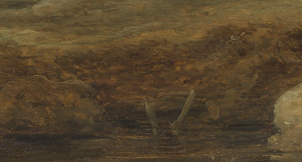
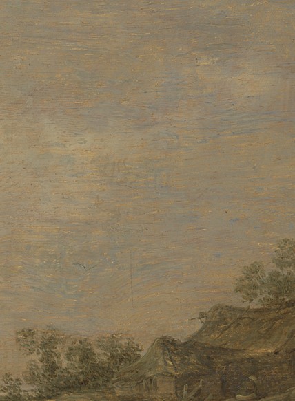
Gifford shows that Van Goyen’s Cottage on a Heath, which is typical of the artist’s work of that time, was painted in only two stages (fig. 33).97 After a rudimentary underdrawing, he added a monochrome sketch in brown pigment. On top of and in combination with the warm beige ground, this created the first division of light and dark. In the final painting, the sketch remains uncovered to form the darkest parts in the shaded bank of the pond, for example, and in the shadowed parts of the dunes on the right (fig. 34). Together, the blotchy paint and the lively lines of the underdrawing efficiently suggest the bare shrubs that often cover the sides of low dunes. When the sketch had dried, Van Goyen added the final paint layer, starting with the sky and working gradually from the horizon in the background to the water and the road in the foreground. He applied his paint layer very lightly to ensure that the warm tint of the ground played a unifying role in the entire composition. The warm ground can clearly be seen under the blue-gray brushstrokes of the sky (fig. 35) and under the olive-green paint of the roof and walls of the cottage (fig. 36). In the sandy dune in the foreground, it acts as a midtone to form a smooth transition from the shaded to the lit parts (fig. 37). Finally, Gifford argues that Van Goyen’s technique followed not only from an economic necessity to paint quickly in a competitive art market but was also motivated by the ambition to achieve a “very lifelike effect” and “a convincing depiction of Dutch landscape.”98 We saw Fromentin make a similar observation about Van Ruisdael.

The examples given above unequivocally demonstrate how important the colored ground had become for the effects that many Dutch painters wanted to achieve. This is confirmed by painters who, for undocumented reasons, did use a light ground but covered it in certain areas to create a toned base. When the Dutch-trained, England-based portrait painter Sir Peter Lely, who expressed his dislike for light grounds in a letter, nevertheless used them for unknown reasons, he first locally glazed the area of the face with cologne-hued earth and bone black.99 In other words, he locally repaired the tone of the light ground with an extra layer of a darker color, which functioned as a midtone for a specific section of the painting.100
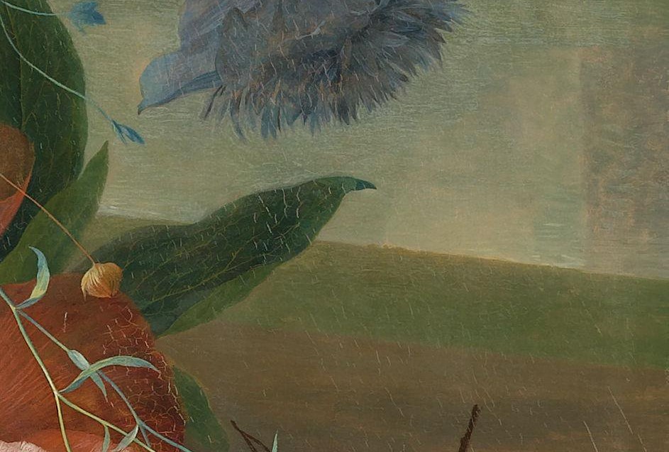
Balthasar van der Ast had another way to add local tone to a light ground. We have already seen how Van der Ast used a colored ground for tonal cohesion and for the efficient suggestion of depth in a flower in a painted still life (see fig. 3). Arie Wallert described a case in which Van der Ast worked on a white ground, for reasons that are not clear (fig. 38). Van der Ast first applied the background in dark paint and reserved space for the future objects.101 Next, he brushed the still-wet paint slightly and lightly over the edges of the reserves to prepare the smooth transition between object and background. This layer shows up in the infrared reflectography as a fuzzy gray area in the left side of the reserve for the leaf.102 This step would have been unnecessary on a tinted ground like the one in the example from Van Aelst (see figs. 27 and 28).
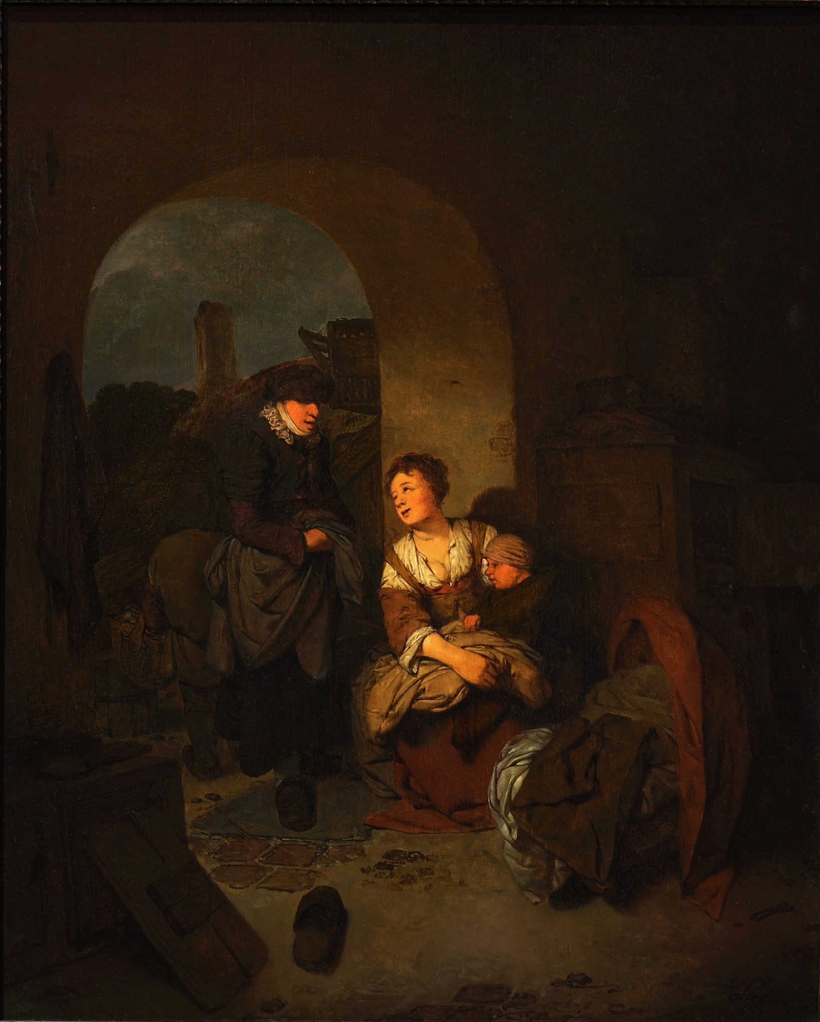
Ulrike Villwock has found that in his Visit to a Mother and Child, Cornelis Bega (1631–1664) toned down the brightness of a very light ground with a darker layer that was applied almost, but not quite, everywhere (fig. 39).103 This act in itself, and the inexpert and uneven application of this layer, suggests it happened in the painter’s studio rather than at a professional primer’s studio. Demonstrating that not all solutions were equally successful, Villwock argues that the light ground shining through the paint layers in places, such as the lower right foreground, falsely gives the impression of overcleaning.104
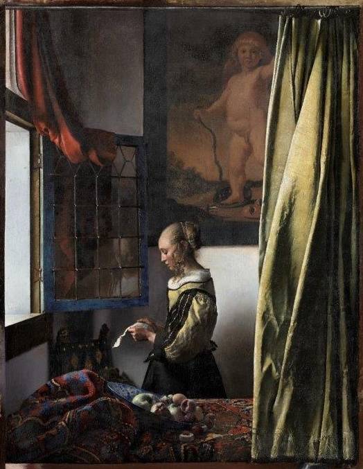
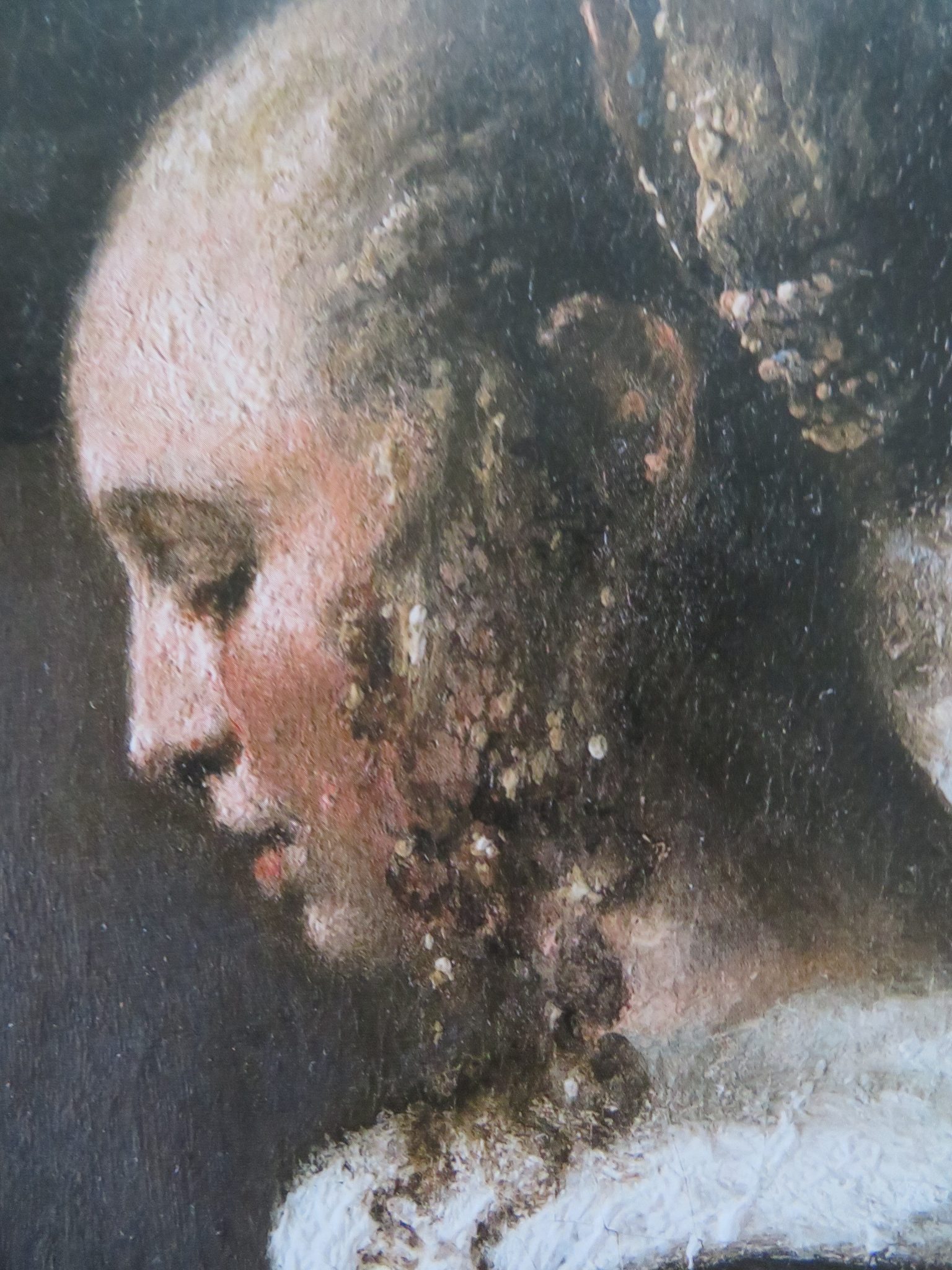
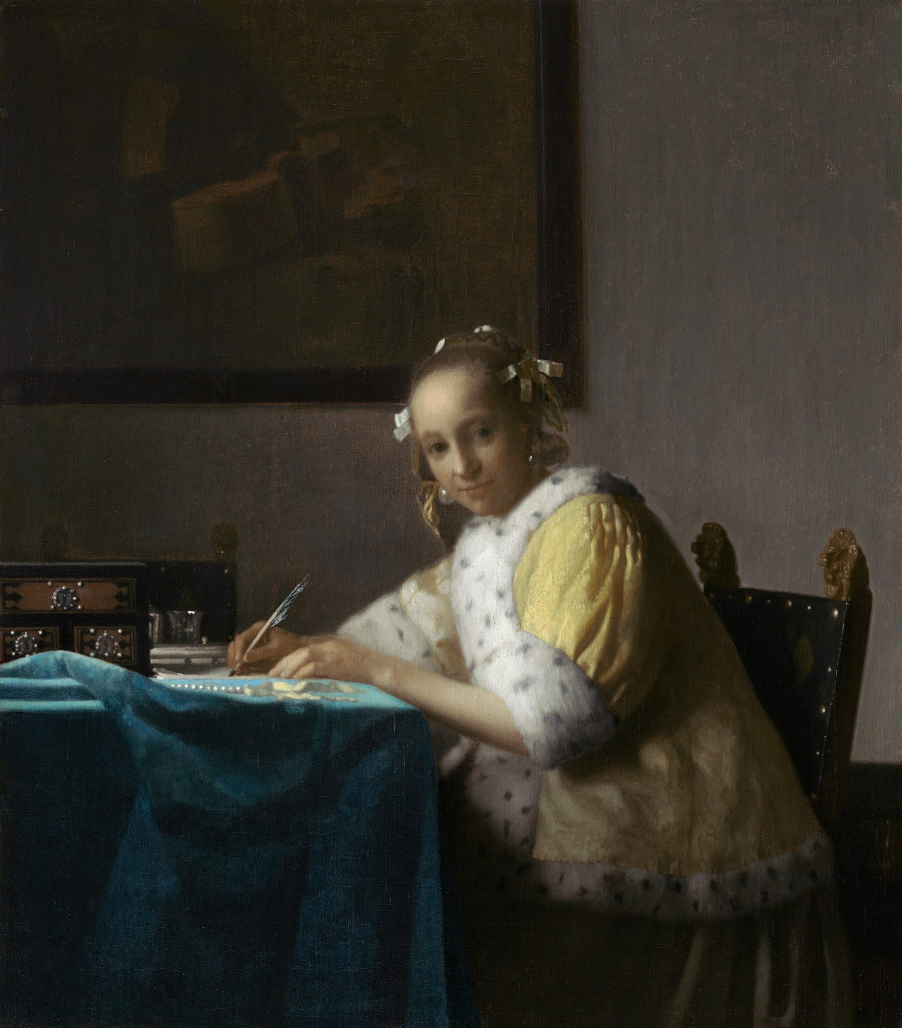
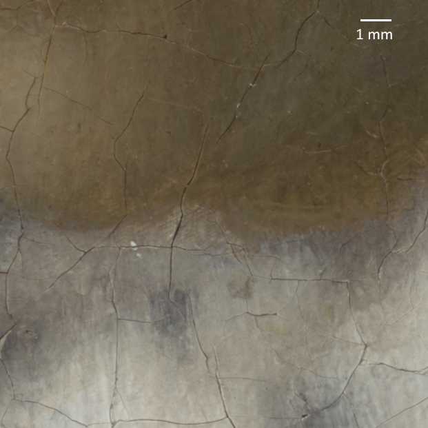
Vermeer was more subtle. His grounds vary greatly, and among them are a number of white ones. In these instances, Gifford and her coauthors explain that, in an early stage, the artist “used his painted sketch to define and emphasize the play of light,” brushing broad zones of shadow and leaving “the light-colored ground exposed to serve as highlights.”105 These zones functioned as reminders for himself and were later almost entirely covered by paint. Unfortunately, they give no examples where this can be seen. In 1998, Nicola Costaras labeled the ground in Girl Reading a Letter by the Window as white, which has recently been confirmed by Christoph Schölzel (fig. 40).106 A detail of the girl’s forehead shows how Vermeer created the soft half-tones necessary for the sfumato-like transitions that subtly distinguish and position different parts in space relative to each other (fig. 41). The contour is formed by the light brown underpainting left exposed between the flesh tones and the background. This is a technique that Vermeer also employed with great subtlety in paintings with colored grounds, such as Lady Writing (fig. 42). Gifford shows that Vermeer left a tiny gap in the chin, where the textured underpaint becomes visible, to define the spatial relationship between the chin and the fur collar (fig. 43).107 Clearly, artists who worked at the highest level of the art market, who aspired to great sophistication and who possessed the necessary skills, could afford not to have a routine but to vary their technique according to different circumstances and different effects that they wanted to convey.
Although a very light ground may have its advantages in terms of luminosity and clarity, it also demands more work to suggest space. Conversely, on a colored ground, painters who work with loose handling have less work to do. This is one of the reasons that colored grounds became so attractive for many Dutch painters, even for architectural painters like De Hooch and Emanuel de Witte (1617–1692), who relied as much on color as on linear perspective.108 Simply put—and from a painter’s perspective—on a colored ground, less is more, while on white ground, less is actually less.
The literature that describes how colored grounds contribute to the optical effects in paintings shows that the painters discussed used these grounds as a fundamental tool to create pictorial harmony and to convincingly render objects in space. These two concepts were so important in Dutch art that artists and patrons developed specific words for them: welstand and houding.109 Welstand describes the tonal harmony that paintings were expected to display and is often translated as “optimal quality,” “harmony,” “consonance,” or “good appearance.”110 From Karel van Mander in 1604 to Gerard de Lairesse in 1707, art theorists connected this rather vague term to coherence as a requisite of beauty. According to these authors, welstand occurs when things in a work of art are connected, or held together, in a beautiful or pleasing way.111 The examples above show how much artists relied on colored grounds to create the tonal cohesion that contributed to a painting’s welstand. We have already seen that, without specifically using the term welstand, Van de Wetering described the function of the ground as “a safety net.” Roy and Gifford explained how the ground created welstand, also without naming it, in paintings by Honthorst and Van Goyen. Even Fromentin referred to it when he described the colored ground in Van Ruisdael’s View of Haarlem as responsible for the painting’s color harmony. Although he was most likely unfamiliar with the term, this art-critic-cum-painter clearly recognized the concept when he saw it.
Closely connected to welstand was the concept of houding, an untranslatable term (“position” approaches aspects of it) that was used to describe the suggestion of the placement of objects in space.112 It allowed viewers to navigate the space in their minds. Paul Taylor, who has written a foundational article on the term, explains that in seventeenth-century art theory houding combined two concepts: illusion and harmony.113 The seventeenth-century author Willem Goeree (1635–1711) foregrounded the aspect of illusion: houding “gives the same sensation to the eye, that we enjoy in the contemplation of natural objects. For whenever Houding is not found in representational images, such Drawings and Paintings are senseless, and more than half dead.”114 Painter and art theorist Samuel van Hoogstraten characterized houding as a way to suggest spatial harmony. As Taylor put it: “A plausible illusion of spatial relationships is to be thought of as harmonious, giving a pleasure analogous to that of music.”115
Seventeenth-century viewers and painters used welstand to describe the pleasant harmony that follows from a consistent and convincing suggestion of space (houding). Taylor observes how artists achieved houding, and thus welstand, by manipulating the color, light, and shadow of objects by varying the hue, saturation, and tone within a painting and by making use of the effects that colors and tones have on adjacent colors and tones—just as we saw in the example of the cloak in Frans Hals’s Young Man Holding a Skull.116 Taylor does not mention colored grounds, but the technical literature reviewed above shows that they were essential in facilitating an efficient creation of houding and welstand. Conversely, most authors of the technical literature tend not to connect the phenomena they describe so articulately to these art theoretical concepts.117
Conclusion: Grounds, Space and the Dutchness of Dutch Art
Eugène Fromentin and other authors of the second half of the nineteenth century considered unparalleled naturalism to be the distinctive feature of the art of the seventeenth-century Northern Netherlands. For them, it was what made Dutch art so Dutch. The sources of this naturalism lay in an iconography that favored the local over the imaginative, especially when combined with a technical virtuosity that was able to conjure up an entire world so convincingly that the paintings were likened to “a sort of photography.”118
In line with a tradition that dated back to the late seventeenth and early eighteenth centuries, Fromentin and his peers suggested that this unique Dutch realism spontaneously followed from the Dutch national character, geography, and history.119 Modern art historians have challenged this view.120 In the 1990s, Lawrence Goedde convincingly argued that, in Dutch landscape painting, the rise of naturalism was the result of conscious artistic choices of style and iconography.121 Shortly after, Eric Jan Sluijter explained these choices as the painters’ responses to the developing art market, while Thijs Weststeijn, among others, demonstrated how deeply embedded this notion of naturalism was in the art theory of the time.122 Broadly speaking, the ideas of Goedde, Sluijter, and Weststeijn apply to all categories of painting that became popular in the first decades of the seventeenth century, notably genre and still life. They can also be recognized in history painting and portraiture.
Over the past forty years or so, technical analysis of paintings has uncovered the workshop practices behind naturalism as a conscious style. Notably, Ernst van de Wetering has extensively argued that a convincing spatial illusion was key in the creation of an illustionistic effect.123 But it was Melanie Gifford who first described the important role of the ground in the naturalistic expression of space and spatial unity in early seventeenth-century Dutch landscape painting, in her article on Jan van Goyen referenced above. She showed how, between 1625 and 1633, Van Goyen’s practice developed from a conservative mannerist technique that relied on zones of underpainting—brown for the earth in the foreground, green for the landscape in the middle distance, and blue for the background and sky—to a more tonal approach that used the visibility of the ground in the final paint layers throughout the composition. Arguing that these were deliberate technical choices made to achieve a new level of suggested naturalism, she aptly titled her essay “Jan van Goyen and the Practice of the Naturalistic Landscape.”124
The naturalism that Van de Wetering, Gifford, and others describe with so much enthusiasm and admiration relied more on techniques of suggestion than of description. That these authors all begin by describing the colored ground is not a coincidence but a pattern. Following the convention of analyzing paintings from the bottom up, it also demonstrates that, literally and figuratively, the colored ground is the basis of a convincing suggestion. Although not the only instrument used in the Dutch quest for illusionism, it became a dominant one. This makes an understanding of colored grounds important to anyone interested in Dutch art of the seventeenth century.
In 1876, Eugène Fromentin suspected that the new Dutch naturalism went hand in hand with changes in painting techniques. He noticed the tonal harmony of Dutch paintings and was curious about the color of the grounds. The study of colored grounds in Dutch paintings, as laid down in the technical literature of the past forty years or so, has confirmed the intuition of this nineteenth-century painter, who had nothing but his eyes and painter’s experience to rely on. The rise of the colored ground was fundamental to the development of the unprecedented naturalism that Fromentin, and so many others after him, found so exciting about Dutch art.


