Rembrandt van Rijn (1606–1669) is widely regarded as one of the most innovative artists of seventeenth-century Dutch painting. His free and open manner of painting meant that the color of the ground was of great importance, especially in terms of its tonal function. Apart from his very early paintings, colored grounds ensured pictorial unity from the beginning of the painting process. Using selected case studies from the collections of the Rijksmuseum and the Mauritshuis that span Rembrandt’s entire production, including works from both Leiden and Amsterdam, this essay explores Rembrandt’s use of colored grounds over time. From the light-colored grounds of his early paintings to the dark grounds he started using in 1640 in preparation of The Night Watch, the color of the ground played an important role in the creation of light effects, color harmonies, and pictorial unity, key elements that contributed to the successful houding and welstand of his paintings. Case studies include history paintings, commissioned portraits, self-portraits, and tronies (character heads).
Introduction
Where previous publications on Rembrandt’s ground layers have focused on characterizing the types of grounds, this essay explores Rembrandt’s use of colored grounds over time, specifically the way they function as part of his painting practice for the creation of visual and pictorial effects. Research results from ten case studies on different supports—spanning his entire career and covering history paintings, commissioned portraits, self-portraits, and tronies (character heads)—are presented, supplemented with relevant examples from the literature. The technical investigation of these works was carried out in the Mauritshuis and the Rijksmuseum during their research and treatment, or in the context of dedicated research projects. Research methods included X-radiography, infrared photography and infrared reflectography (IRR), X-ray fluorescence (XRF) imaging, reflectance imaging spectroscopy (RIS), and the examination and analysis of paint cross sections. For this essay, the paintings and technical images were studied anew, and historical treatises were consulted. While the case studies represent only a small portion of the Rembrandt paintings in the Mauritshuis and the Rijksmuseum, they are considered good representative examples of Rembrandt’s use of colored grounds in the creation of visual and pictorial effects at key moments in his career.
With the exception of his earliest paintings, Rembrandt exploited the possibilities of the colored ground from very early on. His use of colored grounds was one of his most effective tools for the creation of pictorial unity, color harmonies, and visual effects, key elements that contributed to the successful welstand and houding of his paintings, two related seventeenth-century concepts. Historical written sources state that welstand occurs when all the components in a work of art are connected in a beautiful or pleasing way.1 Houding was used to describe the tonal and spatial organization of objects in space.2 Together, they contribute to the creation of convincing three-dimensionality and spatial depth through a harmonious relationship of color, light, and shadow. In the early decades of the seventeenth century, artists realized that colored grounds greatly facilitated the creation of tonal harmony to bind everything together in suggested space.3 Rembrandt was highly praised by his contemporaries for his mastery of houding, and his use of colored grounds was an important means in achieving it.4
The Painting Process
In order to fully comprehend the significance of colored grounds in Rembrandt’s paintings, it is important to have an understanding of how his paintings were constructed, along with his handling of the paint. Like all seventeenth-century artists, Rembrandt built up his paintings in layers on top of a ground, which differed in color and structure depending in part on the type of support. On top of the ground, Rembrandt roughly sketched in his compositions, which depending on the size, function, and type of the painting were further worked up in more or less detail in various tones of translucent brown and black. This is variously called the “painted sketch” or “dead coloring.” Together, the ground and the sketch layer/s provided a range of midtones, on top of which Rembrandt then applied his finishing layers. In this way, Rembrandt could accurately define the position and intensity of the highlights and shadows.5 The free and open brushwork that he used for the majority of his paintings also meant that the color of the ground was of great importance. Together with his rich and varied paint handling and strategic use of the ground, Rembrandt created a cohesive, harmonious, and visually unified effect that contributed to the houding and welstand of his finished works. These steps in the painting process correspond with those described by Gerard de Lairesse (1640–1711) in his Groot Schilderboek, published in Amsterdam in 1707: the dead coloring (doodverven) and the working-up (opschilderen), followed by revision or “retouching” and finishing (retocqueeren/ nazien).6
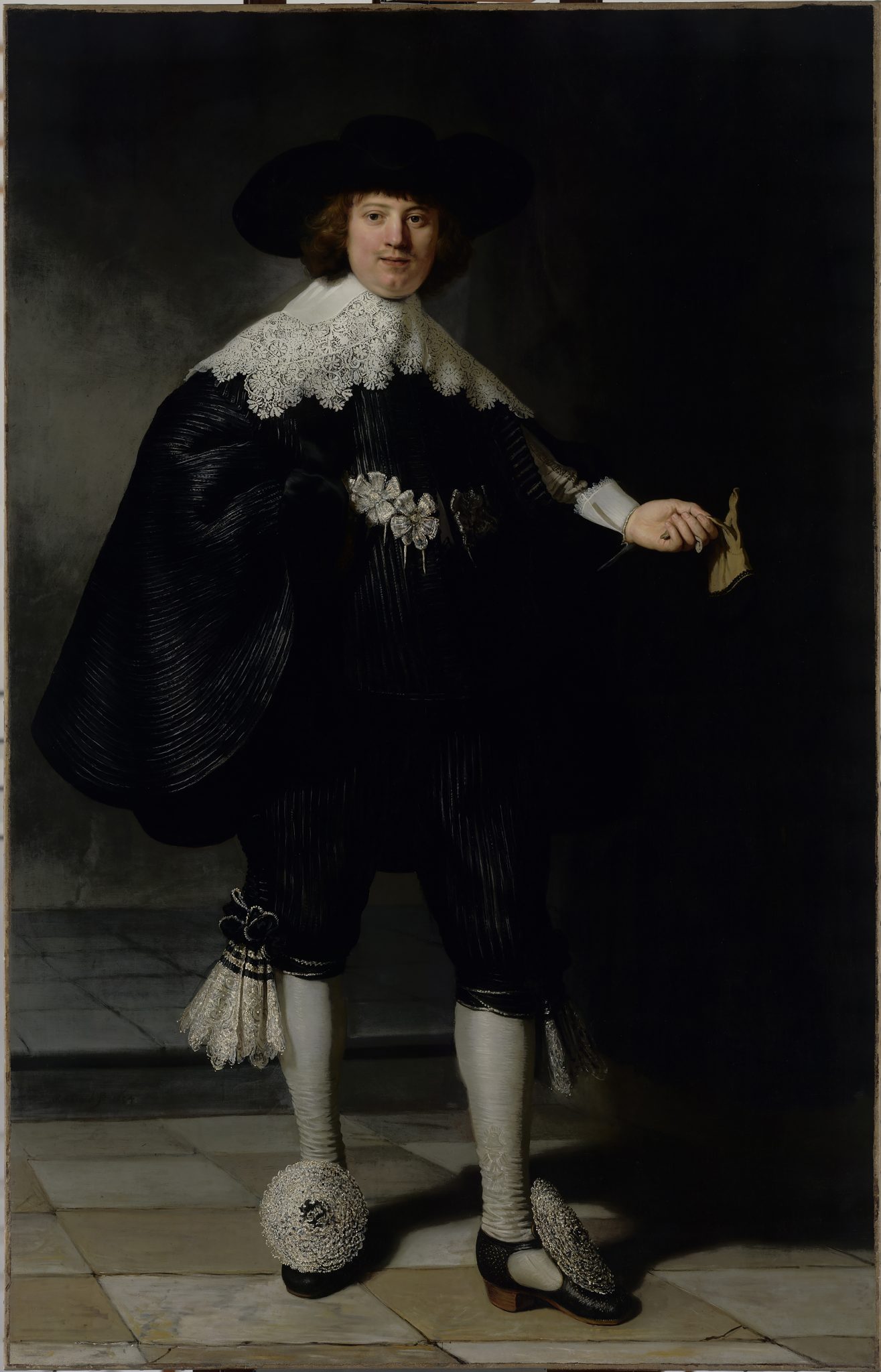
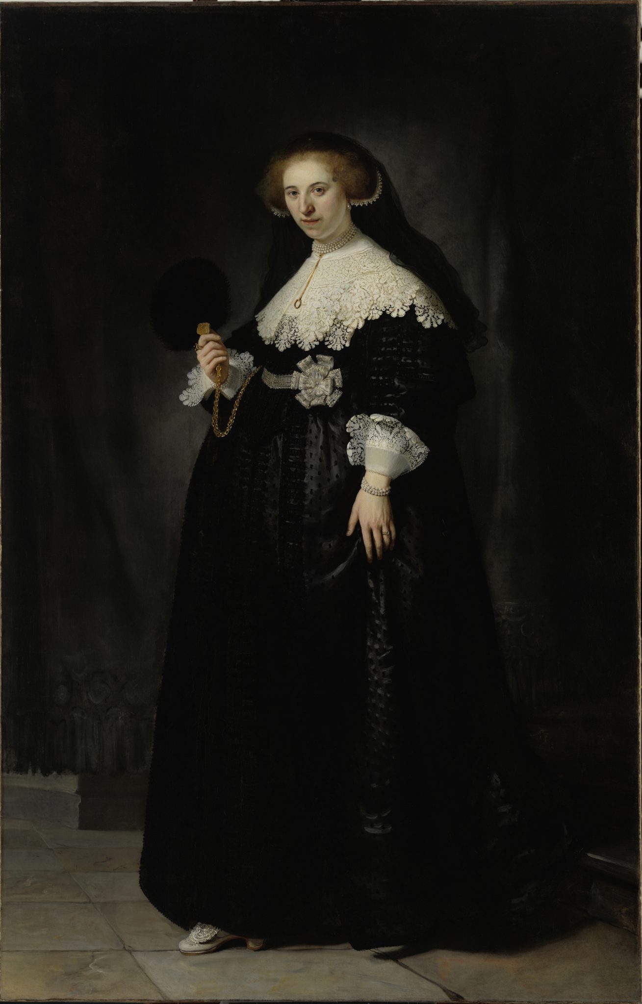
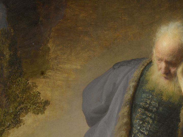
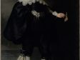
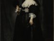
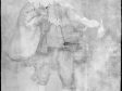
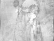
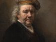
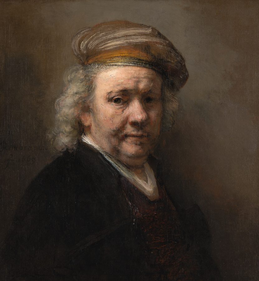
Rembrandt worked on both light- and dark-colored grounds. These different approaches are exemplified in the pendant portraits of Marten Soolmans and Oopjen Coppit, painted in 1634 at the high point of his early Amsterdam period (figs. 1 and 2), and Portrait of an Elderly Man, an example of Rembrandt’s late, fully mature style from 1667 (fig. 3). In the portraits of Soolmans and Coppit, Rembrandt laid in the compositions on top of the light ground with a few fine sketch lines, followed by a broadly applied painted sketch in brown and black paints.7 During the working-up phase, areas of the light ground and brown sketch layer/s were left partially exposed in the open brushwork. This interplay of the ground and sketch layers with the final paint layers had an important role in the creation of light effects, half-shadows, color harmonies, and pictorial unity and is characteristic of Rembrandt’s early painting technique.8 In Portrait of an Elderly Man from 1667, which has a warm brown ground, Rembrandt left large sections of the warm brown ground exposed to function as shadows and half-shadows, unifying the composition and speeding up the painting process by eliminating the need for an elaborate sketch or dead-coloring stage.9 The use of a dark ground, however, required a new approach to introduce light into the composition. Whereas the light-colored grounds used for his panel paintings and early canvas paintings provided an ideal foundation for lit areas, Rembrandt’s later works demanded thick, high-impasto applications to achieve brightness over the dark ground.10 In terms of chiaroscuro effects, paintings with light grounds generally display stronger contrasts, while paintings with dark grounds and broad handling resulted in softer, more naturalistic modeling, especially when viewed from a distance.
Ground Layers
Essentially, Rembrandt’s ground layers can be organized into light and dark grounds, with commercially available light grounds used for his panel paintings and early paintings on canvas, and custom-made dark grounds for paintings on canvas from 1640 onward. Further subdivisions of the light grounds relate to the type of support: chalk-glue grounds with a lead-white rich layer for panels, lead-white rich oil grounds for copper supports, and gray-over-red grounds for the early canvas paintings from the 1630s. The dark-colored grounds used for canvas paintings from 1642 onward can be subdivided into quartz-clay grounds and several other types of other dark grounds.
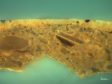
The most extensive survey of ground layers in Rembrandt’s paintings was published by the late Karin Groen in 2005 in the fourth volume of A Corpus of Rembrandt Paintings, in the framework of the Rembrandt Research Project.11 Based on light microscopy, scanning electron microscopy with energy dispersive X-ray (SEM-EDX) analyses, and small-angle X-ray diffraction (XRD) of paint samples, this valuable research resource offers detailed descriptions of grounds on sixty-one panels and 159 canvas paintings by Rembrandt and his workshop, as well as grounds on canvas paintings produced by other painters in Amsterdam between 1640 and 1669. Groen’s detailed analysis of paint cross sections identified the exact pigment compositions of the different types of grounds, making it possible to organize them into groups according to support, composition, and number of layers (single or double). Special attention was also given by Groen to the characterization of “quartz” grounds used by Rembrandt from 1640 onward.
Grounds on Rembrandt’s panels consist of two ground layers: a chalk-glue layer that was applied to fill the coarse grain of the wood, followed by a light, oil-based layer, invariably very thin (between five and ten microns), containing lead white and a little earth pigment. The upper ground layer, often referred to as the “priming” in English, made the panel less absorbent and provided a smooth surface and warm light tone on which to paint. This type of two-layered ground was commonly used for panels in the seventeenth century and earlier and has been identified by Groen in all of Rembrandt’s panel paintings.12 In general, both layers are usually thin enough to permit the wood grain of the panel to be perceived on the surface of the painting. It should be stressed that the complete layer structure of the ground can often only be seen by studying a cross section of a paint sample; the layers are sometimes barely perceptible, even with magnification, due to their thinness and/ or increased transparency (loss of opacity) from saponification of lead white particles in the upper ground.13
Rembrandt’s early paintings on copper have light, lead white–rich grounds common for copper plates.14 The exception to this is Old Woman Praying (1629–1630; Residenzgalerie Salzburg), where no ground at all was detected.15 For the three small tronies from 1629 to 1630, the copper support was covered with a novel layer of gold leaf, which I will come back to later.
His early canvas paintings from the 1630s also have grounds consisting of two layers, but the composition and colors of the layers are different from those used for panel and copper supports and consist of a layer of red earth followed by an opaque light gray layer, rich in lead white.16 These gray-over-red grounds—which fall into the category of double grounds, a term specifically used for layered grounds on canvas—first appeared in Utrecht and Haarlem as early as 1590 but only came into use in Amsterdam in the 1620s. They were employed by many Dutch painters throughout the seventeenth century and well into the eighteenth century.17
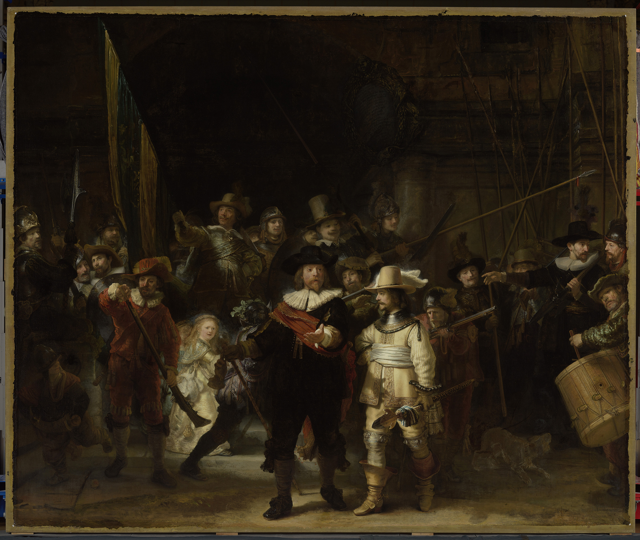
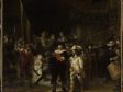
In 1640 Rembrandt started using brown “quartz” grounds for canvas paintings, mostly applied in a single layer, which he continued using with few exceptions, along with other dark grounds, until his death in 1669. First identified by Herman Kühn in 1962 from the Doerner Institute and later characterized by Groen, the so-called quartz ground (hereafter referred to as quartz-clay grounds) is the most common ground used by Rembrandt for paintings on canvas in the period between 1642 and 1669.18 This darker ground seemingly allowed Rembrandt to use a more direct painting method, eliminating the extensive dead coloring stage that would have been required for the large-scale works he began creating in 1635 after leaving the studio of the art dealer, Hendrick Uylenburgh (1587–1661). It can be no coincidence that the first quartz-clay ground he used was in preparation for the large group portrait commonly known as The Night Watch commissioned for the Kloveniersdoelen the civic guard headquarters of the Kloveniers in Amsterdam (fig. 4). This painting, whose official title is Officers and Other Civic Guardsmen of District II in Amsterdam, Under the Command of Captain Frans Banninck Cocq and Lieutenant Wilhem van Ruytenburch (1642; Rijksmuseum) originally measured some four by five meters and was one of seven painted for the Kloveniersdoelen that included three monumental canvases from 1642 (including Rembrandt’s). The canvases were the largest civic guard portraits in Amsterdam at the time.19
The division of light and dark grounds described above is also supported by the numerous mentions of colored grounds in contemporaneous art treatises, which reveal great interest in the subject of colored grounds in relation to painting technique, especially in terms of their tonal function. Rembrandt’s use of light-colored grounds in his early works seems to align with Roger de Piles’s (1635–1709) advice to young painters in his Elémens de la peinture pratique (1684), where he writes that a three-dimensional effect was more easily achieved on a light ground. For more advanced painters, De Piles advises a light grayish colored ground.20 Samuel van Hoogstraten (1627–1678)—who studied and worked with Rembrandt from 1642, shortly after The Night Watch was completed, until about 1648—describes the effective use of colored grounds in his Inleyding, where he states, “it can happen that the priming of your canvas or panel helps in the coloration, and, assisted by a few little touches, eases your labour.’’21 Gerard de Lairesse, in his Groot Schilderboek, discusses in considerable detail the influence of ground color on a painting. He relates his experience regarding an ensemble of ceiling paintings, three with a light gray ground and one with a dark ground, stating that deeper and more glowing shadows could be achieved on a dark ground. He concludes by saying that the trouble of preparing a canvas in such a way is small compared to the great advantage it produces in the painting process.22
Rembrandt’s Early Works, 1625–1639
During his early career in Leiden, Rembrandt used oak panel almost exclusively as a support. From this period there are also four securely attributed paintings on copper and one on paper.23 Rembrandt is thought to have begun working on canvas only in 1631, when he started working for Hendrick Uylenburgh in Amsterdam.
As discussed above, Groen found that Rembrandt’s panel paintings are all prepared with the same type of conventional ground consisting of two layers: a chalk-glue layer followed by a very thin, oil-based light brown upper ground layer.24 Where the ground is visible to the naked eye it appears beige or light brown in color, often translucent. Given that this type of ground was employed on a large scale in the seventeenth century and earlier, the grounds on Rembrandt’s panel paintings are generally thought to have been applied by professional primers, frame makers, or suppliers of artists’ materials. However, it is possible that Rembrandt primed his own panels, especially considering that there was no shop dealing in artists’ materials in Leiden until 1643.25
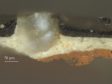
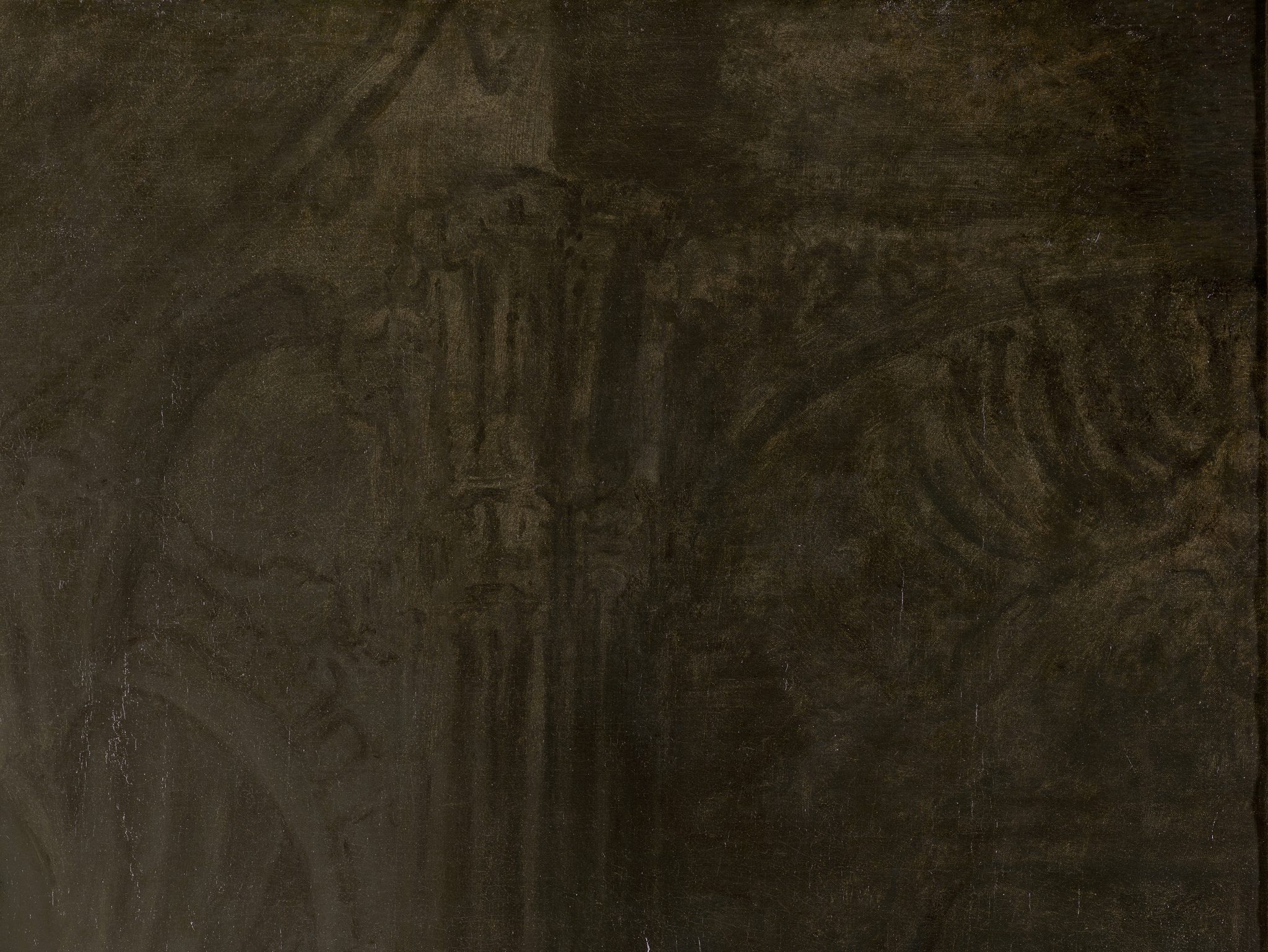
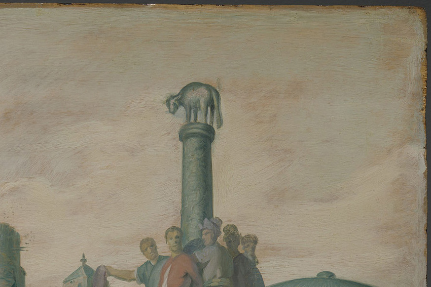
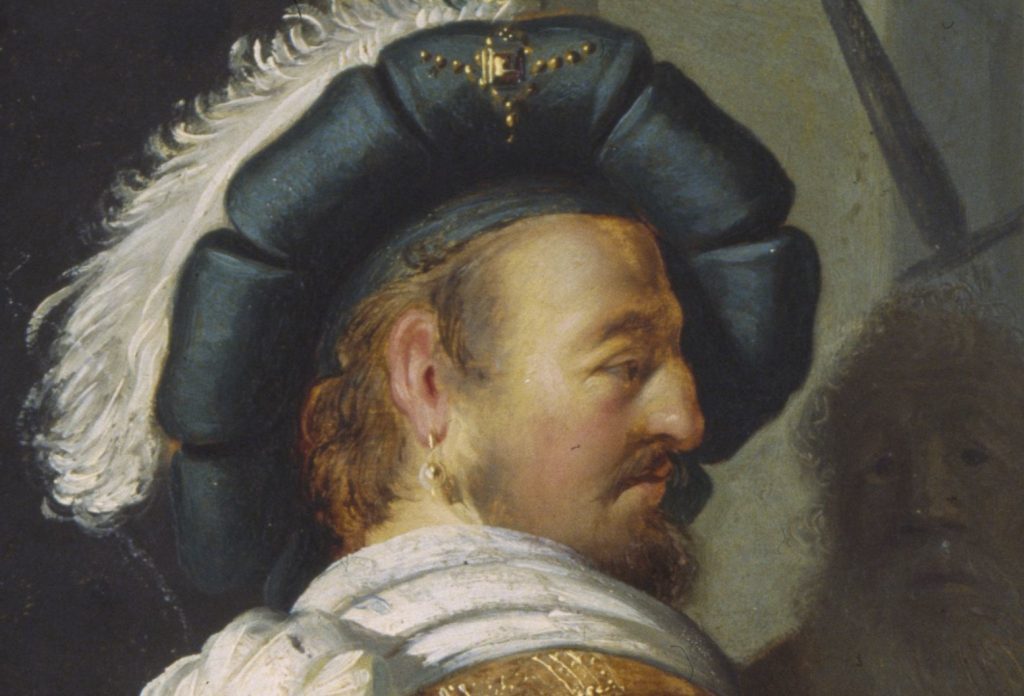
In his earliest small panel paintings, belonging to The Five Senses series from about 1624–1625, the ground appears to be of little or no consequence, given the dense application of paint. After completing his training with Pieter Lastman (1583–1633) in Amsterdam in 1625, Rembrandt embarked on a period of intense experimentation and started to use the light ground to create light effects. His first major history paintings, The Stoning of St. Stephen (1625; Musée des Beaux-Arts, Lyon) and History Painting of 1626 (fig. 5), both signed and dated, are remarkably direct and economical.26 The latter was researched and treated in the Rijksmuseum between 2015 and 2016, where analysis of paint samples showed that the light ground consists of a chalk-glue layer followed by a light brown layer containing lead white with a small amount of brown umber. The ground is evident over the entire surface of the panel, giving an overall light tonality to the open-air scene.27 Here Rembrandt experiments with using the ground to suggest spatial depth, albeit rather clumsily. The ground shows through numerous areas in the painting, including the sky, the upper part of the architecture, and the faces of the foreground figures (fig. 6). It is also visible in the broadly laid-in background at the right, surrounding the legs of the soldier wearing a sash and beret. In this painting Rembrandt also experiments with scribbling and scratching into the wet paint, using a variety of tools to create light effects in the hair and clothing of many of the figures (fig. 7). A striking area where the light brown ground was used for its tonal function is the shaded contour of the forehead and nose of the standing figure with the plumed beret at the far left (fig. 8).28

Toward the end of the 1620s, Rembrandt began to employ the ground and brown sketch more strategically, using it to structure the composition’s tonal contrasts by leaving key areas in reserve. This approach resulted in a more focused arrangement of light and shadow, as exemplified in his Self-Portrait from about 1628 (Rijksmuseum). He also abandoned the bright hues of his early paintings in favor of subdued, “broken” colors to achieve a more naturalistic rendering that allowed for gradual transitions in tone and hue.29 To this end, he employed complex pigment mixtures as well as optical mixing through an increased use of translucent paint layers. In this way, by allowing the underlying ground to show through, he also created more convincing light effects.
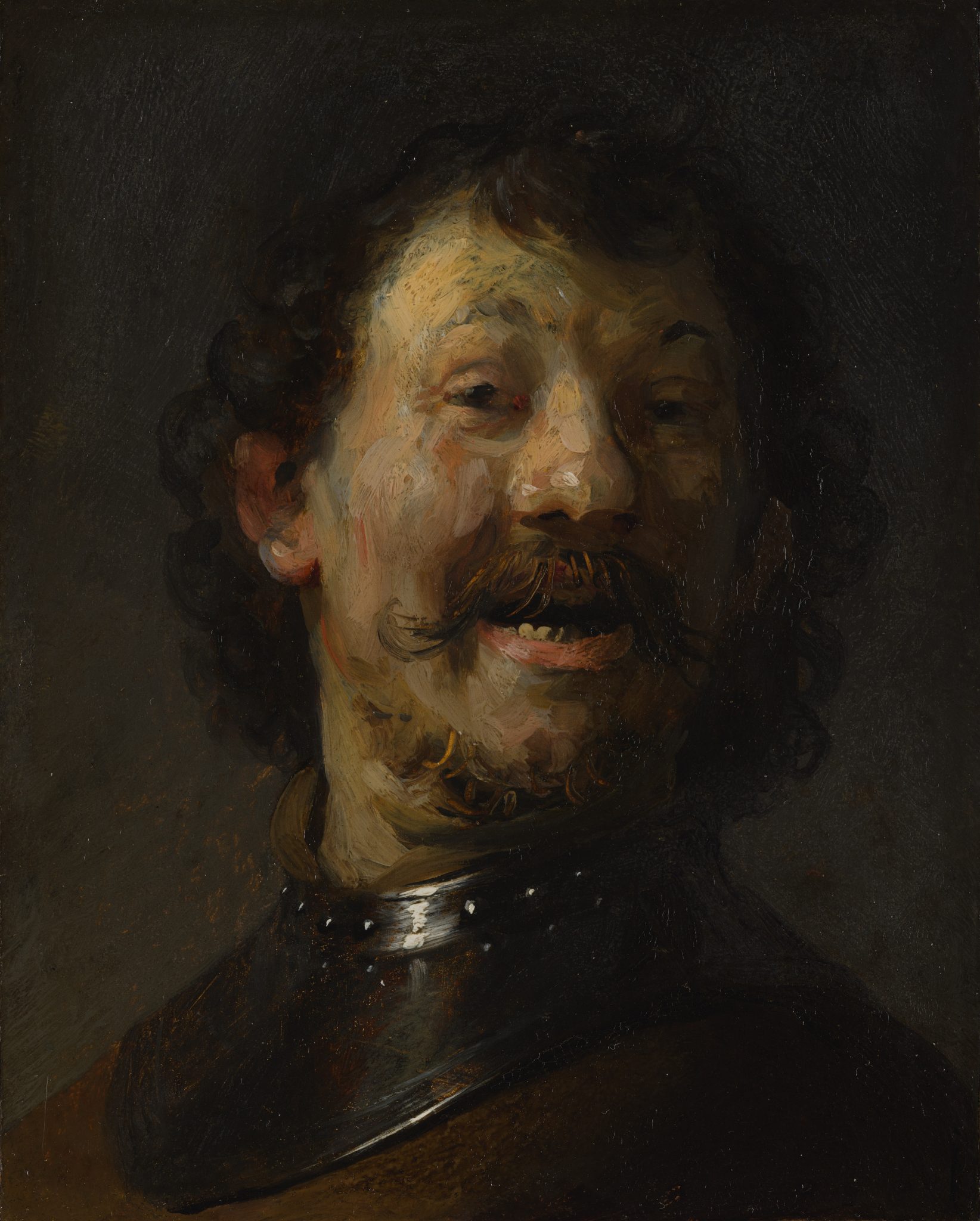
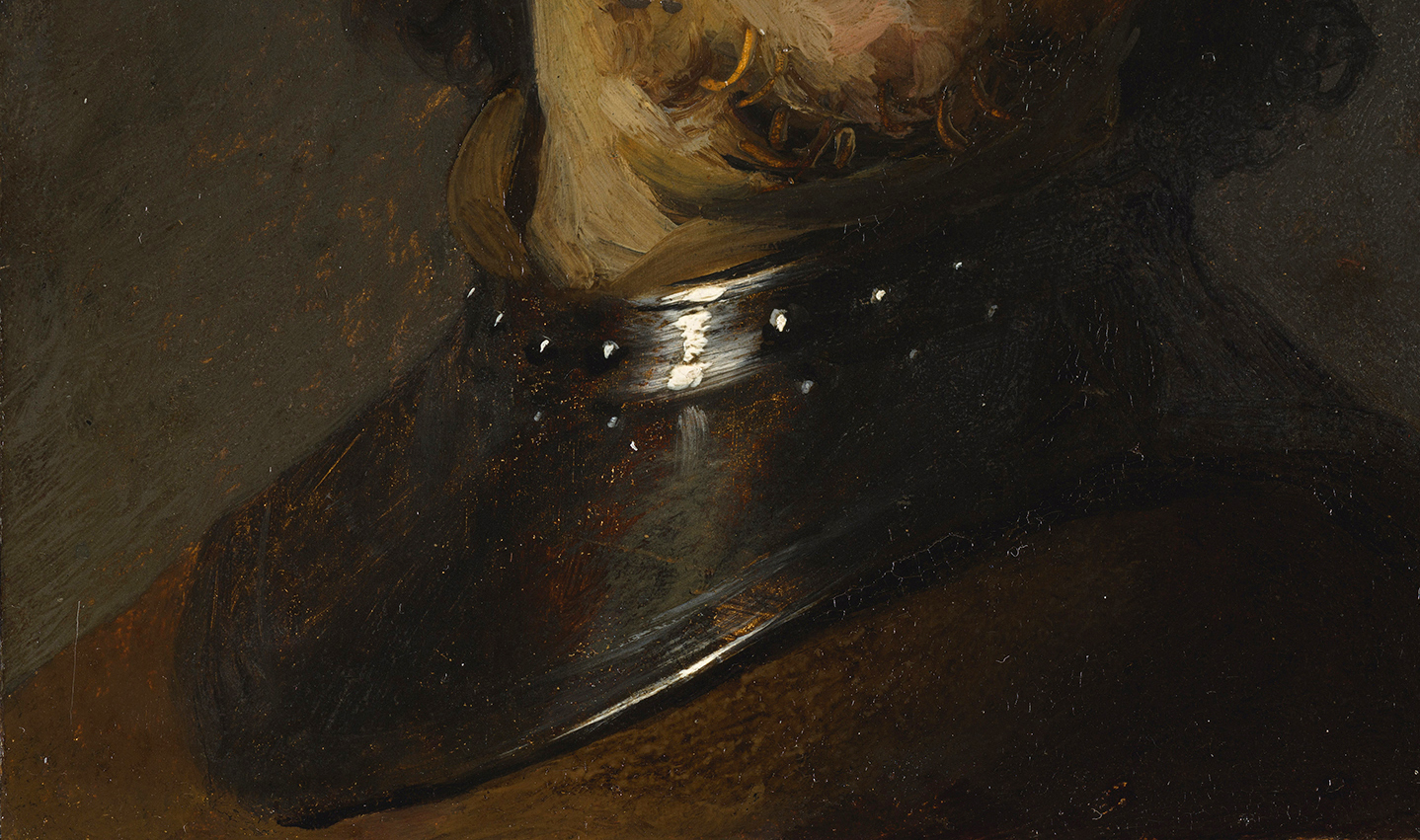
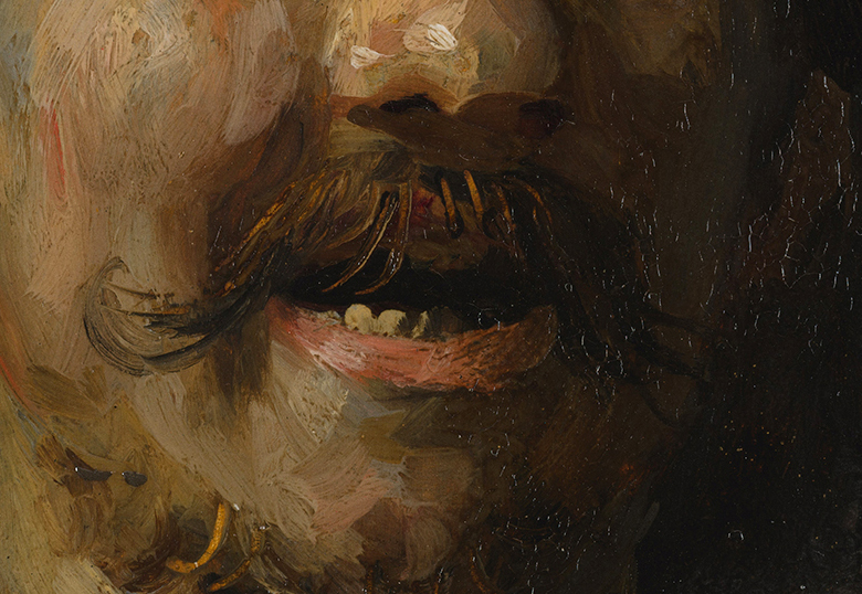
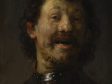
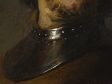
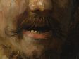
Rembrandt’s The Laughing Man from 1629–1630 (fig. 9), part of a series of three tronies painted on gilded copper, is a good example. Here Rembrandt’s interest in the underlying gold layer is related to the creation of luminous light effects, similar to his use of light grounds on panel supports. Although gilded copper seems a unique choice, he may have been inspired by the luminosity of works on copper by Adam Elsheimer (1578–1610), whose Stoning of Saint Stephen (ca. 1603–1604; National Galleries of Scotland, Edinburgh), is painted on copper with a silver-colored metallic coating. Rembrandt must have known or heard about this work, given the compositional similarities with his own 1625 The Stoning of Saint Stephen.30 The support of The Laughing Man was prepared with a ground containing lead white with a little earth pigment and bone black, on top of which the thin layer of gold leaf was applied.31 The gold layer shines through the thinly applied shadows in the face, in the scumbles where the left shoulder and neck meet the background, and at the bottom of the gorget, where the underlying gold creates a shimmering mimetic effect. It was also used to create lustrous highlights in the moustache and beard where Rembrandt scratched into the wet paint with a blunt tool, exposing the gold, and along the right side of his neck, where it was left exposed to create a subtle contour (figs. 10 and 11). The subdued colors of the tronie are also striking: its gray background, brown gorget, and pink-yellow, thickly impastoed flesh tones with blue-gray half-shadows, together with the golden highlights, create a refined harmony.
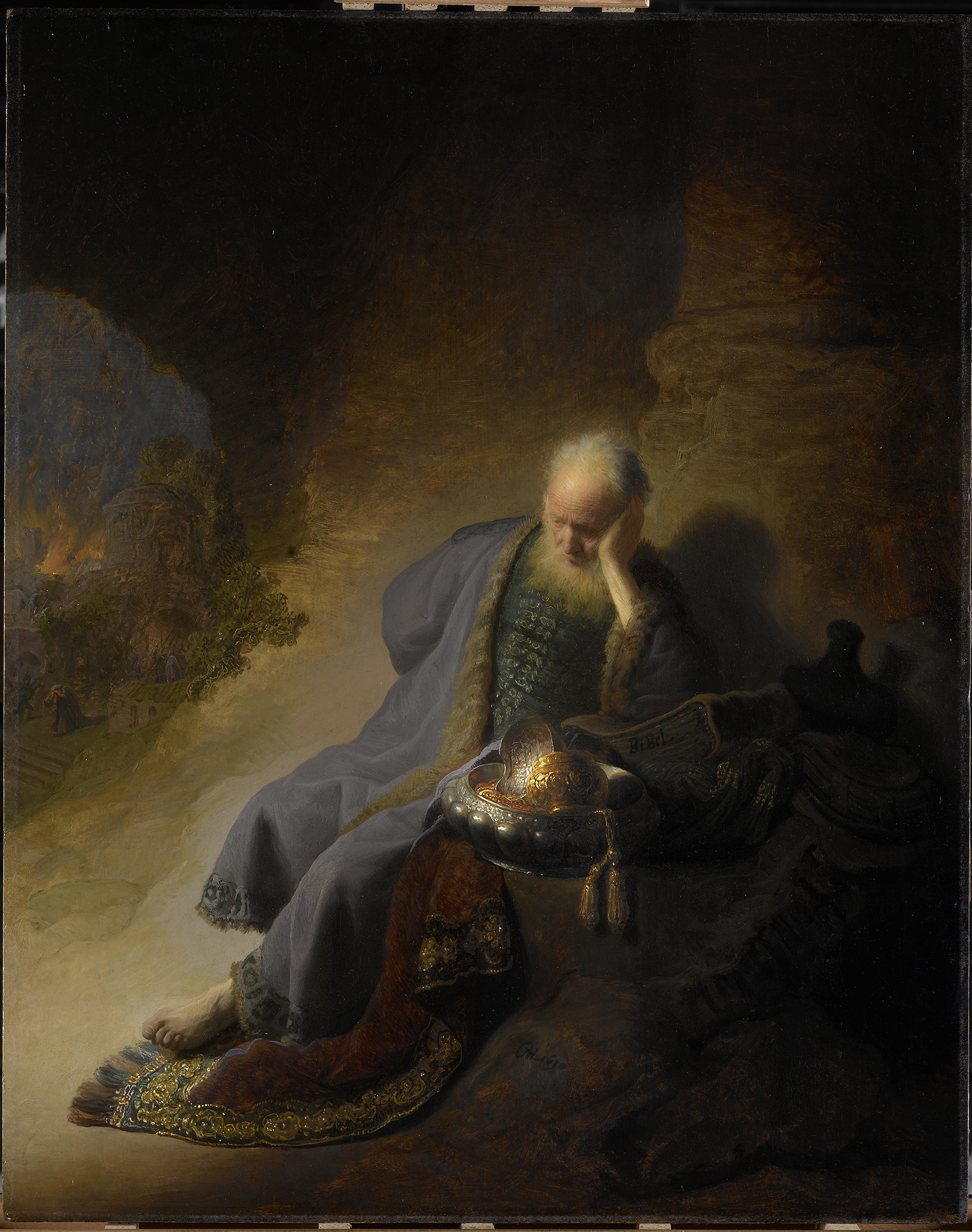
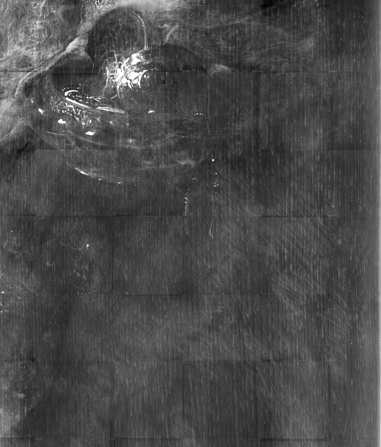
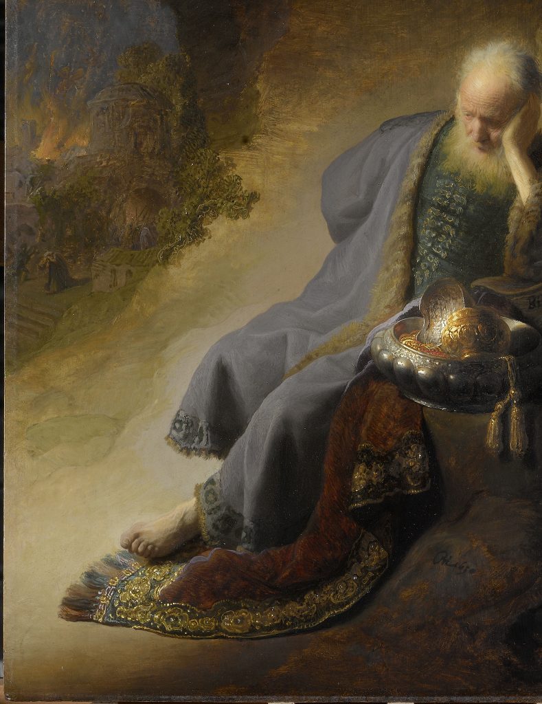
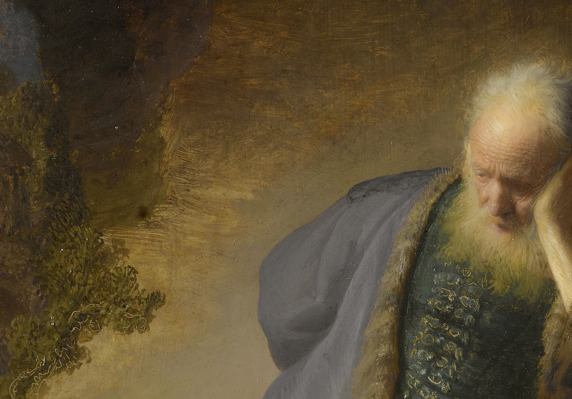
Rembrandt’s interest in creating a more convincing depiction of nature led him to exploit the possibilities of light-colored grounds to suggest light and space.32 His early masterpiece Jeremiah Lamenting the Destruction of Jerusalem from 1630, a groundbreaking painting due to its innovative technique and psychological intensity (fig. 12), represents a high point of this more tonal approach and shows how he achieved both houding and welstand by making use of the ground. The conventional ground comprises an upper ground layer of lead white and a little brown earth pigment, applied over the lower chalk ground.33 The lead white in the upper ground layer absorbs X-rays sufficiently to show the grain of the wood (fig. 13). The ground shimmers through the areas of open brushwork, providing luminosity to the scene. It is also left exposed in a few areas of broad scratching inscribed into the wet paint of the braiding on the doublet and in the foliage at the left. A large, diagonal section of ground to the left of the prophet shows through the thinly applied ocher-colored paint used to evoke the sandy desert landscape (figs. 14 and 15). Remarkably, the reflective properties of the exposed ground appear to emanate from within the painting itself, providing an indirect source of light that illuminates the figure of Jeremiah and intensifies the purplish hue of his cloak. This subtle interplay between the warm-toned ground and the cool purple of his garment creates a sophisticated color harmony. The ground’s luminous quality transforms what might otherwise be empty space into an active participant in the painting’s narrative—setting Jeremiah apart from his vision, depicted in the background on the left, while simultaneously fusing the two pictorial realms and opening the painting up to complex theological interpretations.34 Fine, diagonal scratches in the ground, possibly with a pumice stone, are visible in the thinly painted lower foreground, suggesting Rembrandt went to considerable effort to enhance the optical properties of the ground.35


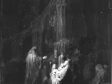
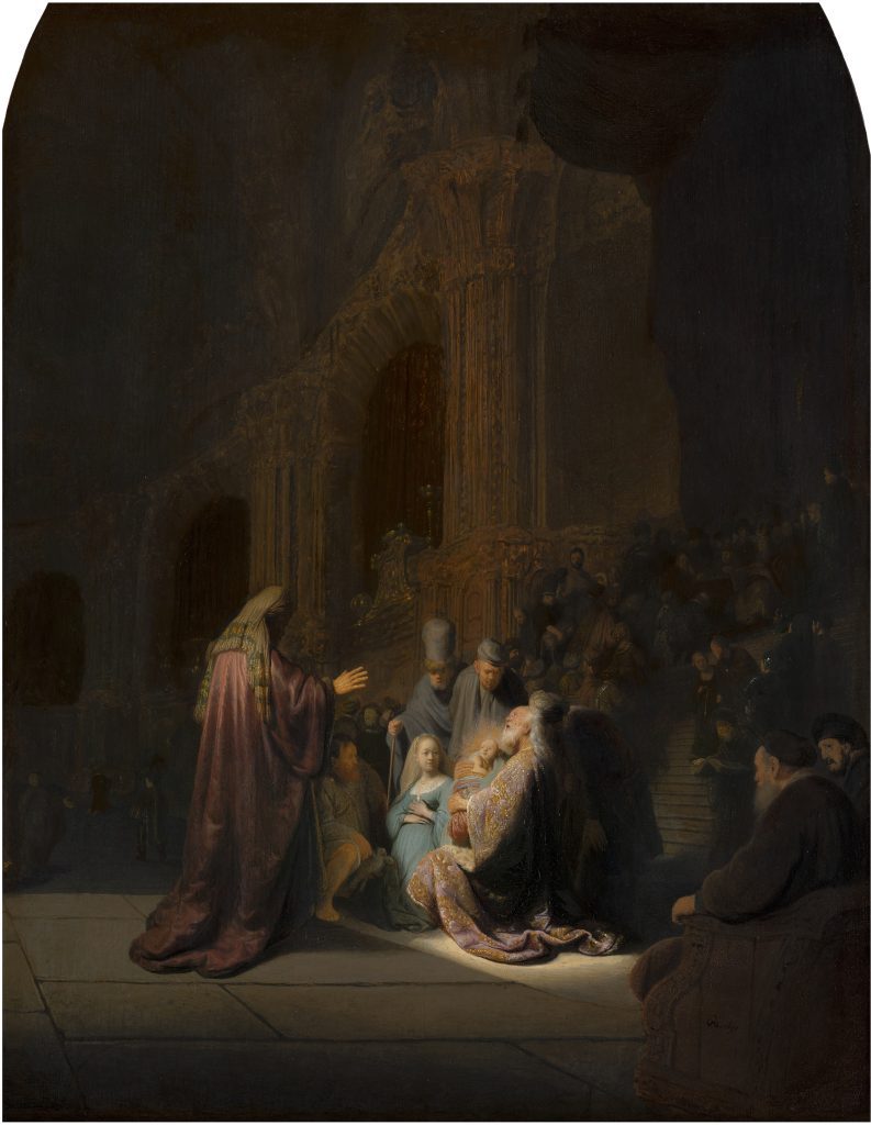
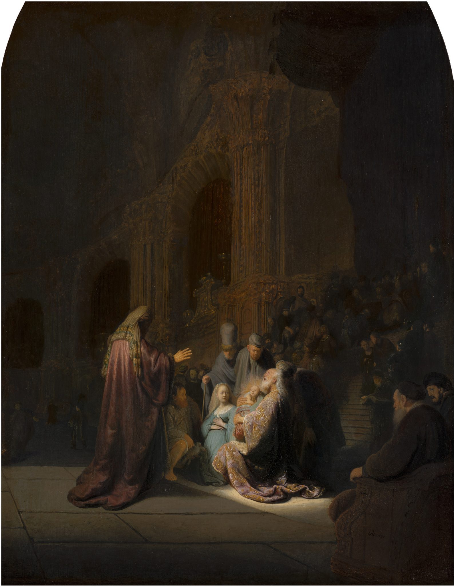
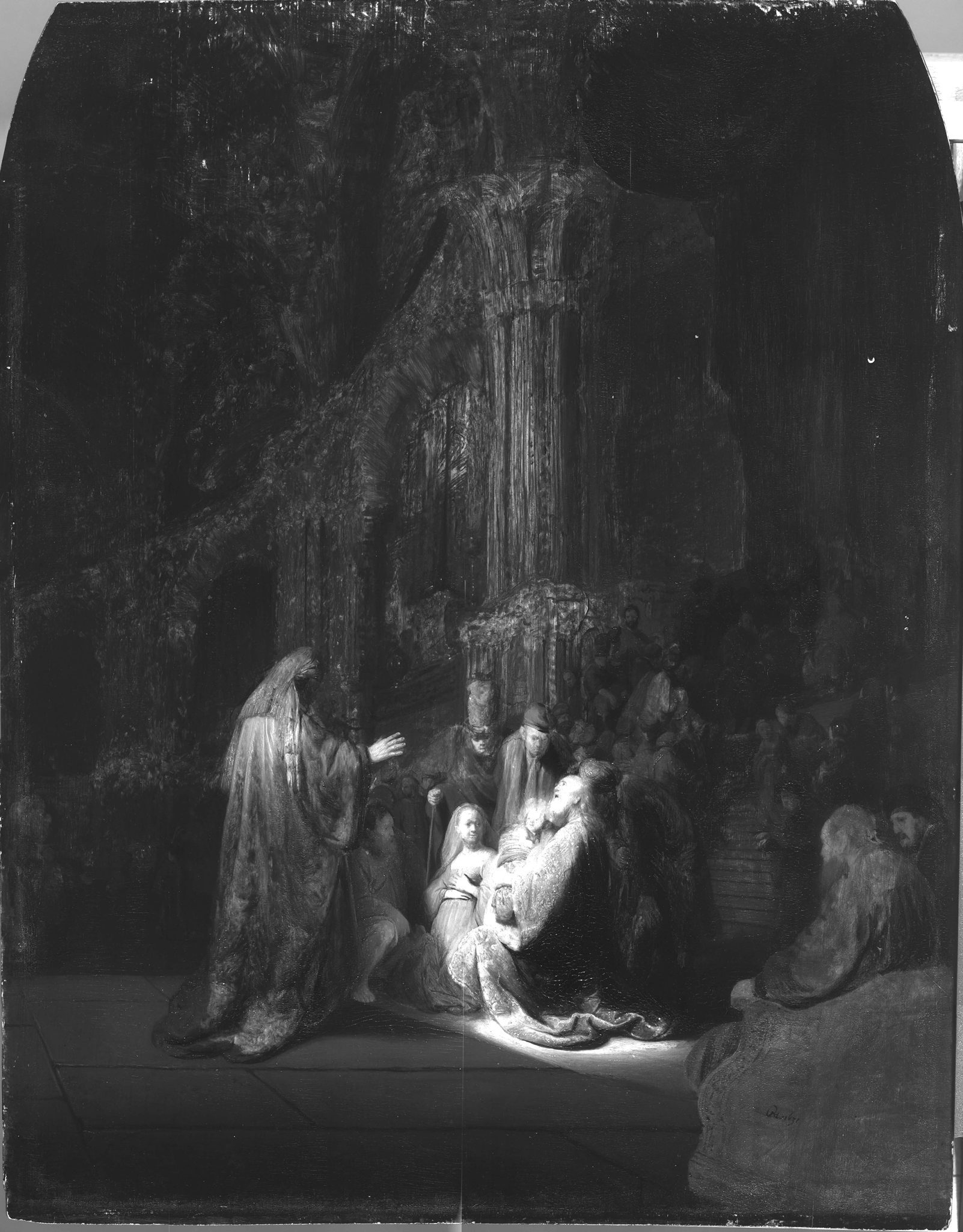
Simeon’s Song of Praise from 1631 (fig. 16) is a good example of where Rembrandt exploits both the ground and the brown sketch for the creation of dramatic light effects. The layers of ground—composed of a compact chalk layer followed by a light layer containing large aggregates of lead white with some chalk, earth particles, and fine carbon black—are so thin that the grain of the oak panel can be discerned on the paint surface. In a paint sample from the canopy in the upper right, the brown sketch layer is also visible (fig. 17).36 The darkness of the temple interior depicted in the background is largely suggested by allowing the light ground to show through the streaky layers of the brown sketch and the dark background paint, forming lively golden tonalities and highlights on the capitals and columns, an effect clearly revealed in the infrared image (fig. 18).37 In this way, Rembrandt exploits the reflective properties of the ground to suggest divine light shining from above, underscoring Simeon’s moment of revelation. Rembrandt continued this free technique for the creation of dramatic light effects in his later panel paintings.


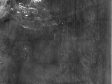
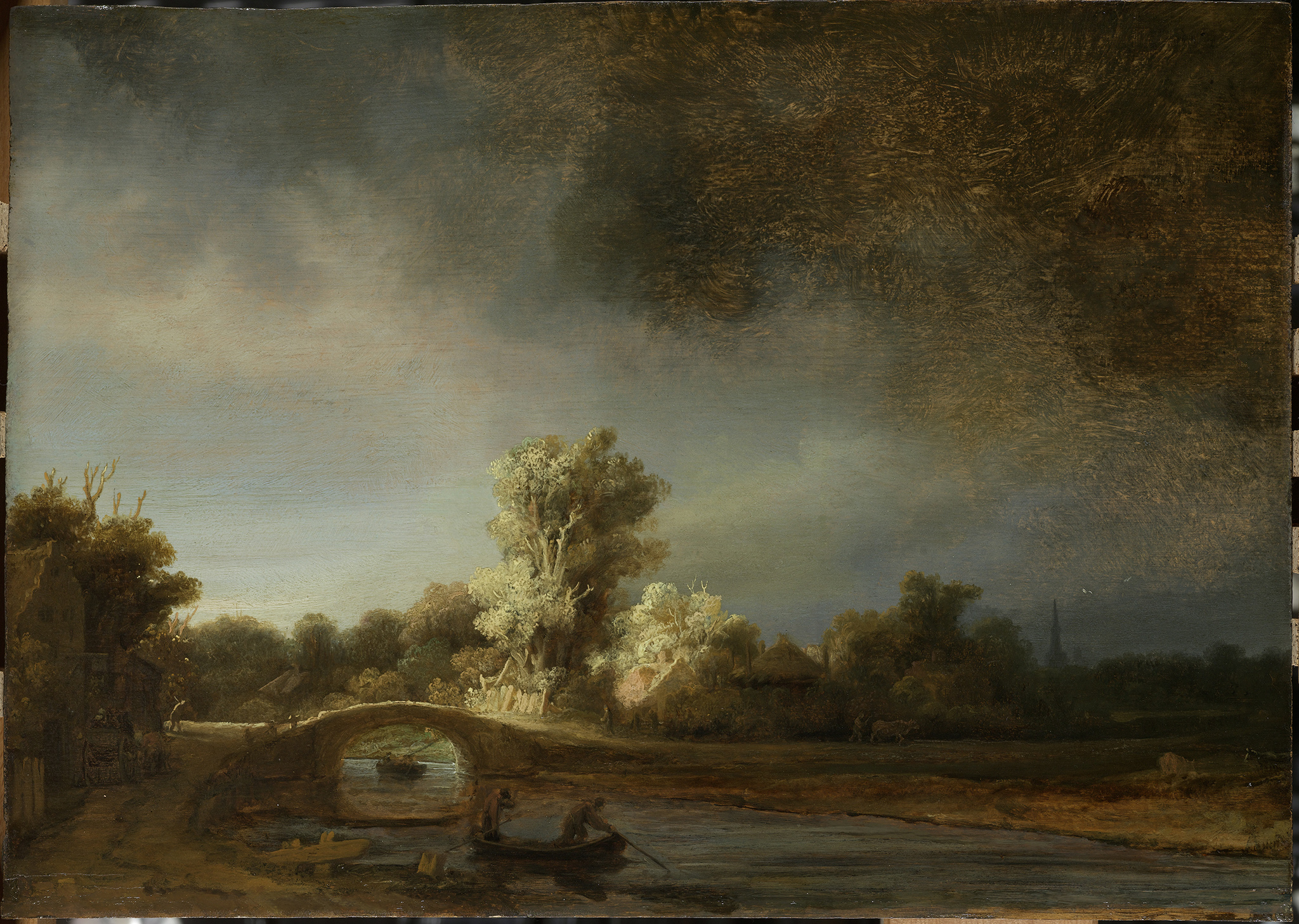
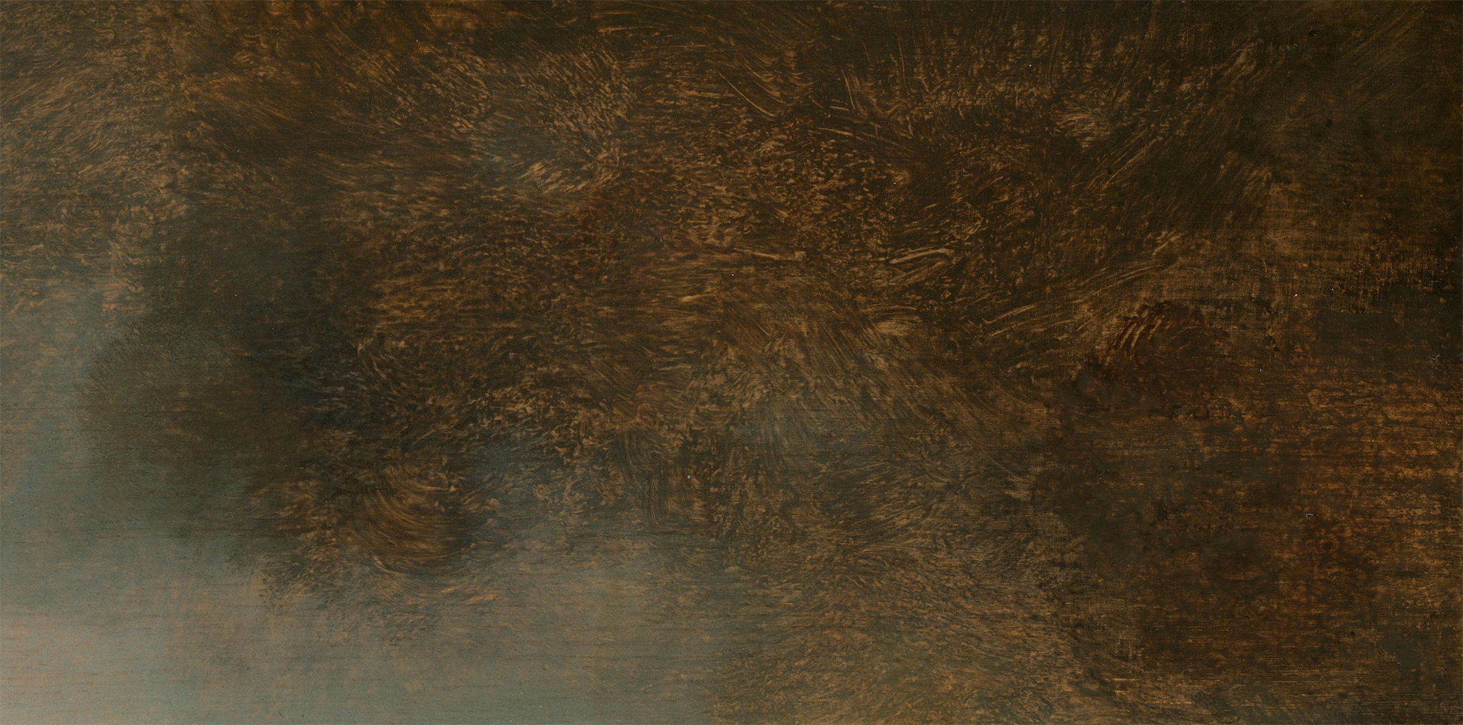
In Landscape with Stone Bridge from about 1639, the light ground is boldly exposed in the open brushwork of the dark sketch paint to suggest a stormy atmosphere (figs. 19 and 20).38 An even more impressive example is the unprecedented A Woman Bathing in a Stream from 1654 (National Gallery, London), where Rembrandt left large areas of the light brown ground exposed at the bottom of the woman’s raised shift, along the upper edge of her right arm, in the wrist and hand, and in between the vigorous brushstrokes, imbuing the intimate, informal study of Hendrickje Stoffels with a great sense of immediacy.39

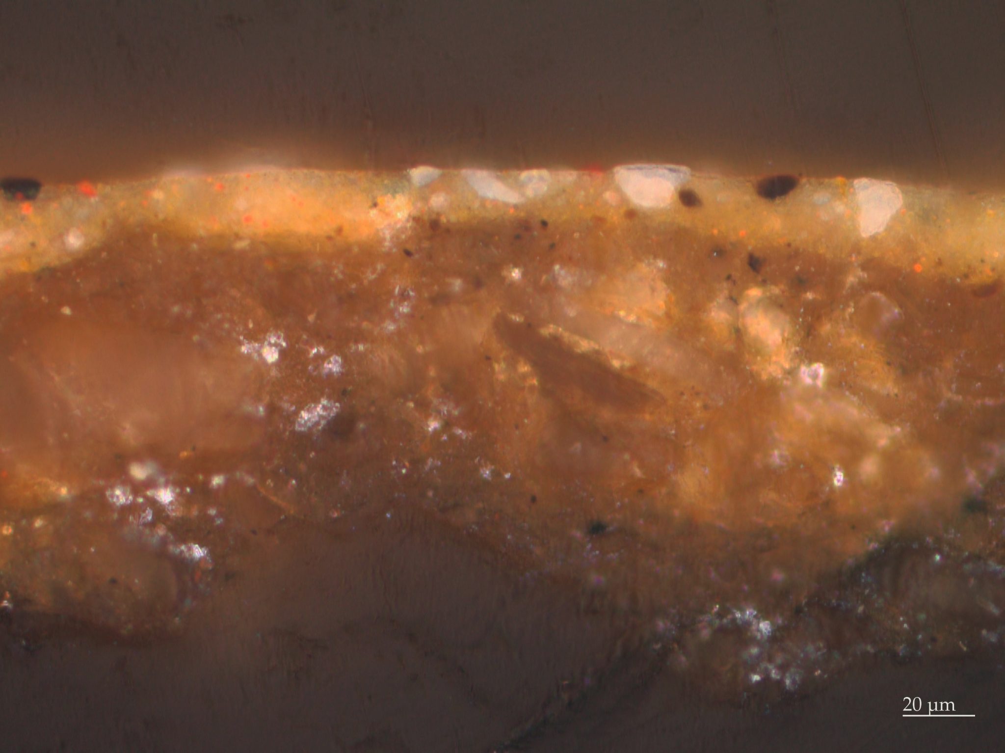
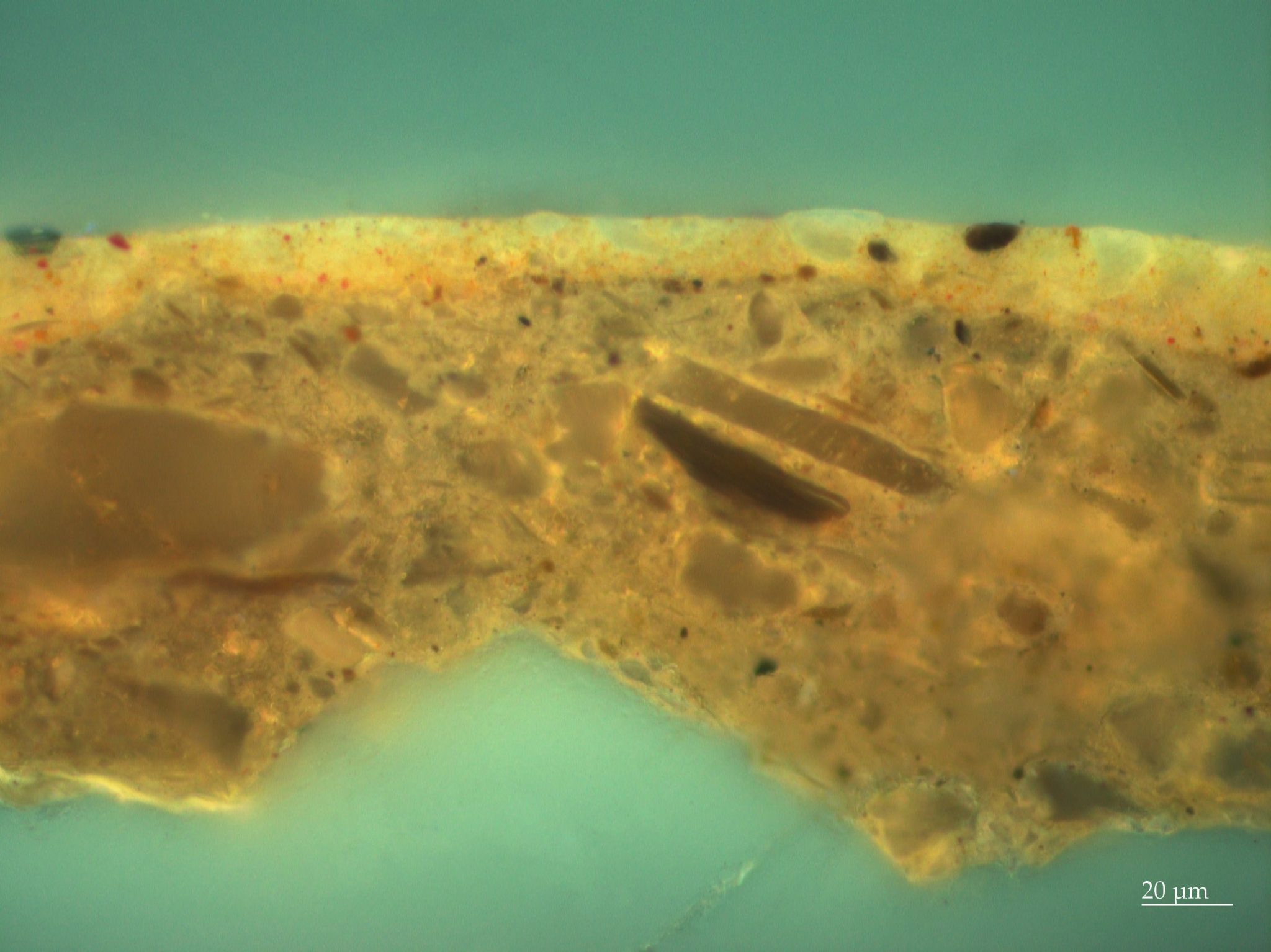
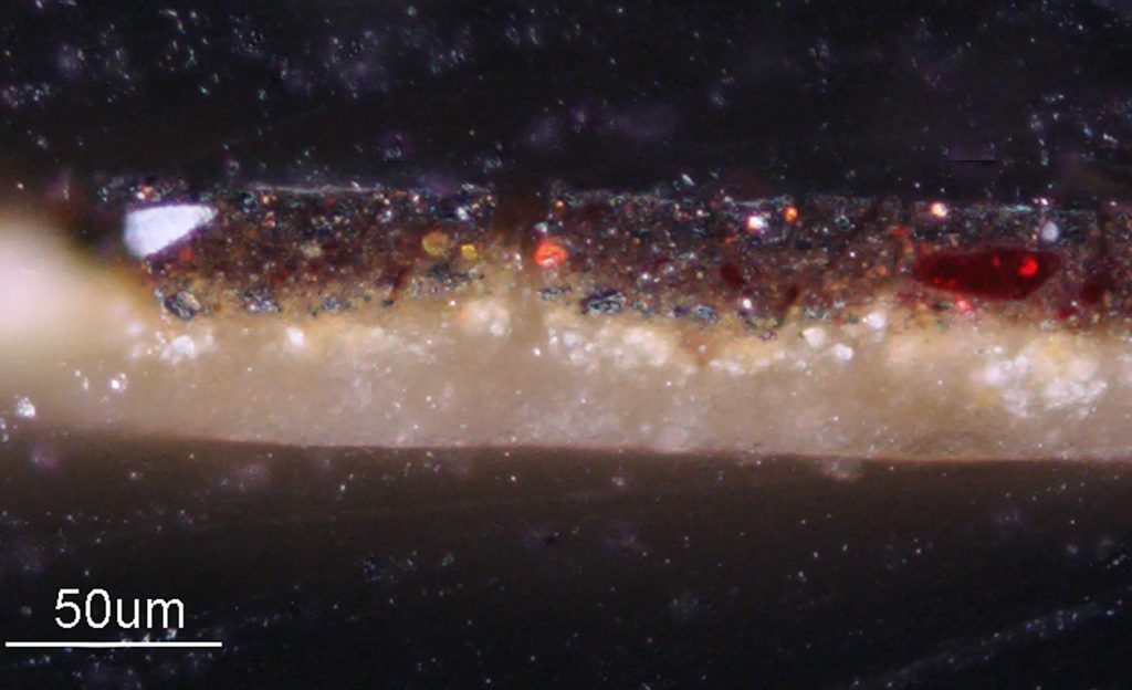
From Groen’s investigation of Rembrandt’s works on canvas from the 1630s produced in Amsterdam, all were found to have been prepared with light-colored grounds. Her investigations, which included some thirty-eight canvas paintings produced between 1632 and 1640, either formerly or still attributed to Rembrandt, showed a conventional double ground consisting of a layer of red earth followed by a gray upper layer rich in lead white.40 Based on detailed SEM-EDX analyses of paint cross sections, Groen found that the layers can vary slightly in composition. From this she identified several clusters of paintings whose upper gray ground layers are so similar that the canvases can be assumed to have come from a single batch of primed canvas. A cluster of paintings from 1632/33 includes The Anatomy Lesson of Dr. Nicolaes Tulp, an important commission from 1632 (fig. 21).41 Interestingly, the aforementioned full-length wedding portraits of Marten Soolmans and Oopjen Coppit from 1634, another important commission (see figs. 1 and 2), were also found to have the exact same ground, composed of a lower layer of red ocher, umber, and a little lead white followed by a light gray layer containing lead white with a small amount of lamp black, yellow ocher, and red lead (figs. 22, 23, and 24).42 Given the identical composition of the ground layers, the primed supports of all three paintings must have been purchased from a professional primer in Amsterdam, either by Rembrandt or by the clients themselves.43

Only hints of the ground can be discerned in The Anatomy Lesson of Dr. Nicolaes Tulp. Although generally painted in a smooth and careful manner, the light ground layer shows through the open brushwork in the upper corners of the dark background, creating an atmospheric sense of space in the architectural setting (fig. 25). Analysis of paint cross-sections also revealed how the light ground lends luminosity to the flesh tones of the figures. The lit areas of the faces were painted directly onto the gray ground, while the shadow areas were underpainted with the translucent warm brown sketch layer containing the organic brown pigment Cassel earth.44
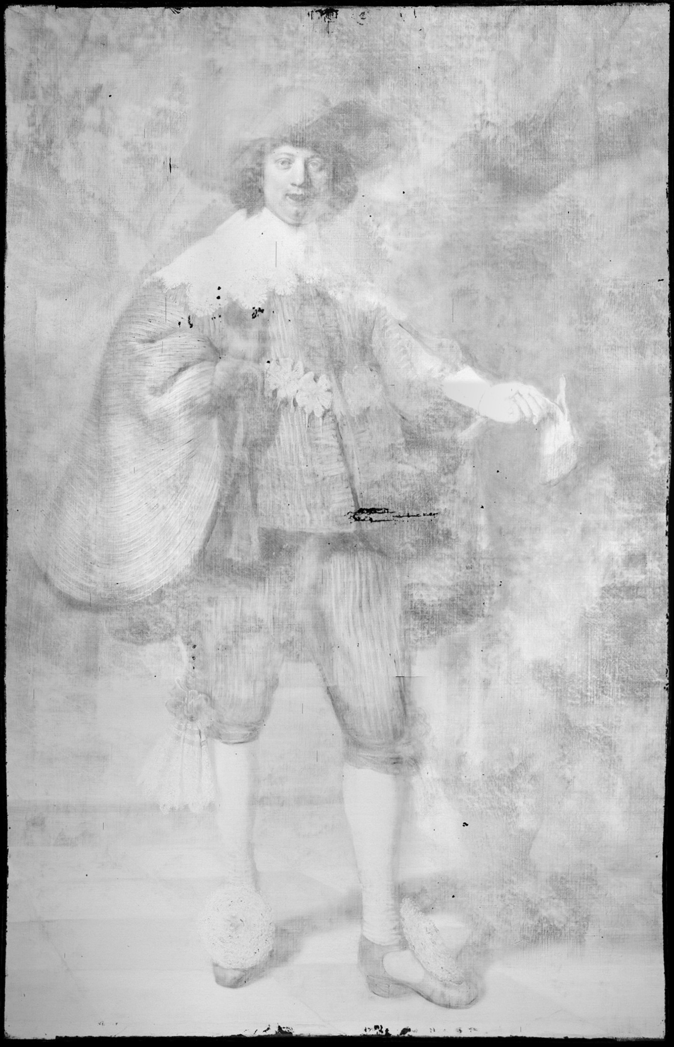
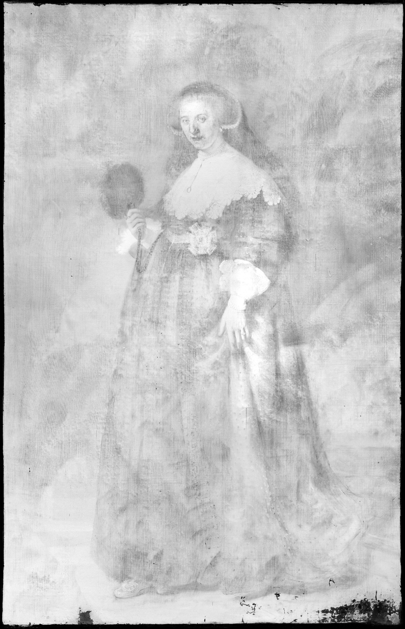
In the portraits of Soolmans and Coppit from just a year or two later, which are equally large and fully worked up, the light ground and brown sketch seem to play a more significant role in ensuring tonal unity and creating a broader range of tones. The light gray ground, which can be visualized in the x-radiographs and lead-distribution XRF images due to the presence of lead white, were left in reserve for the light areas in the paintings, including the faces (figs. 26 and 27).45 For the lit areas of the faces, opaque paints were applied directly on top of the light ground. Examination with the stereomicroscope, coupled with IRR, XRF imaging, and especially RIS-SWIR in the short-wave infrared spectral region (900 to 2500 nanometers), shows that Rembrandt laid in the compositions using a broadly applied painted sketch in various tones of brown.46 Visible on the paint surfaces, where the final brushwork is thinner or more open, the sketch layers show through in many areas of the paintings: in the dark backgrounds, the hair, the faces, the clothing, the cast shadows on the floor, and the dark gray curtains.47 In Soolmans’s face, which is more strongly lit than that of Coppit, the warm brown sketch has been left visible for the shadow along the contour of his face (fig. 28). For their black clothing, which is essentially painted in a single layer of ivory black on top of the brown sketch, both the ground and the sketch show through the loosely painted half-shadows in the folds, decorative braiding, and contours of the figures, creating subtle tonal transitions that play an essential role in the modeling and convincing positioning of the figures in space (figs. 29 and 30).


Rembrandt continued to use gray-over-red double grounds for canvas paintings until around 1640, and only sporadically thereafter. Investigation of Rembrandt’s Standard Bearer (1636; Rijksmuseum) also identified a gray-over-red ground.48 This is also the case with Still-Life with Peacocks (ca. 1639; Rijksmuseum), although in this painting the upper gray ground layer is slightly warmer in tone, composed of lead white, a little bone black, and umber.49 Nevertheless, the ground still appears light, contrasting with the dark background paint, where it is visible between the forceful brushstrokes in the architecture at the top of the painting and in the sketchy brown paint used to suggest the soft down feathers of the peafowls’ plumage. In the face of the girl in the dark window opening in the left background, the light ground shimmers through the thin orangey-brown paint. Her gaze is directed toward the similarly colored extended wing feathers of the hanging peacock, whose bold plumage is one of the most striking aspects of the painting.
Brown Quartz-Clay Grounds in the Later Rembrandt, 1640–1669

Rembrandt first used a quartz-clay ground for The Night Watch, which was painted between 1640 and 1642 (see fig. 4). Consisting of quartz-rich clay and, in some cases, small amounts of earth pigments, this type of ground is a drab gray-brown in color and has been found in portraits, tronies, and history scenes of varying dimensions. The slight variation in composition, number of layers, and color of the quartz-clay grounds indicates that different mixtures were made for different paintings, and moreover that these grounds were made and applied in Rembrandt’s studio. The material advantages of quartz-clay grounds is reflected in a recipe in the 1679–1704 manuscript by Simon Eikelenberg (1663–1738), a Dutch painter and historian who describes a ground of potter’s clay (potaarde) bound in oil for both panel and canvas, and praises it for its low cost and stability, due to its tough and heavy particles (“taije en sware deeltjes”).50 As Groen suggests, this was likely copied from the many recipes for clay grounds that appeared in foreign written sources from the mid-seventeenth century, although Giorgio Vasari (1511–1574) had described the use of potter’s clay for preparing canvases as early as 1550.51 In her study of the grounds used by some sixty artists active in Amsterdam between 1640 and 1669 with no connection to Rembrandt’s workshop, not a single quartz-clay ground was identified.52 This is still the case, which means that quartz-clay grounds can be used as a marker for paintings created in Rembrandt’s workshop. Erma Hermens’s suggestion that Samuel van Hoogstraten’s Christ and the Women of Jerusalem, (Glasgow, Hunterian Art Gallery), which is traditionally dated to 1665–1675 and recently identified as having a quartz-clay (lower) ground, was produced earlier, during Van Hoogstraten’s years in the workshop, is therefore reasonable.53
Although we cannot know for sure where Rembrandt found inspiration for choosing a clay-based ground, he must have been aware of the long Italian tradition of strongly colored grounds, which by 1600 were commonly used throughout Italy.54 The Venetian artists Titian (ca. 1488–1576) and especially Jacopo Bassano (d. 1592) and Tintoretto (1518–1594) worked on dark grounds, as did Caravaggio (1571–1610), who exploited dark grounds in a highly sophisticated manner, not dissimilar to what we find in paintings by Rembrandt.55 By the mid-seventeenth century, clay-based grounds were used for the preparation of canvases in many parts of Europe. The use of clay as a ground was highly praised the Spanish painter and writer Francisco Pacheco (1564–1644) in his 1649 treatise, El arte de la pintura, who describes how it was used on canvases starting in 1600.56 Recent research that identified potter’s clay in the grounds of Caravaggio shows that Italian workshops were using the same clay to prepare canvases that was used to create pottery and clay sculptures (terracotta).57 Rembrandt would have seen the paintings by Italian and Spanish masters that are known to have been in Amsterdam in the early seventeenth century. For instance, the 1633 inventory of Samuel Godijn and the 1638 list of paintings owned by Lucas van Uffelen and Jacomo Noirot, described by Amy Golahny, include works by Palma Giovane (1544–1628), Guido Reni (1575–1642), and Jusepe de Ribera (1591–1652).58 The presence of these paintings in Amsterdam indicates that collectors were aware of developments in Italian painting, and Rembrandt would have been as well. For the development of Rembrandt’s late style, Titian’s The Flaying of Marsyas (ca. 1570–1576; Kroměříž, Palace of the Archbishop), which was in Amsterdam in the 1640–1660s as part of the Arundel collection, is also relevant.59
The large size of The Night Watch, some four by five meters, may have motivated Rembrandt to seek an alternative to the gray-over-red double ground. Although the saving in cost and a reduced risk of cracking associated with conventional lead white–rich grounds are usually cited as key factors, there were pictorial reasons as well, particularly considering that the quartz-clay ground was also used for paintings of smaller dimensions. Perhaps the dark quartz-clay ground was a better base tone for the dramatic lighting and illusionistic effects Rembrandt had in mind for the location of The Night Watch in the great hall of the Kloveniersdoelen, and perhaps locally sourced river clay offered just the right color as well as being cheaper, less heavy, and more flexible—allowing for the painting to be rolled—compared to the lead white–containing gray-over-red grounds.60
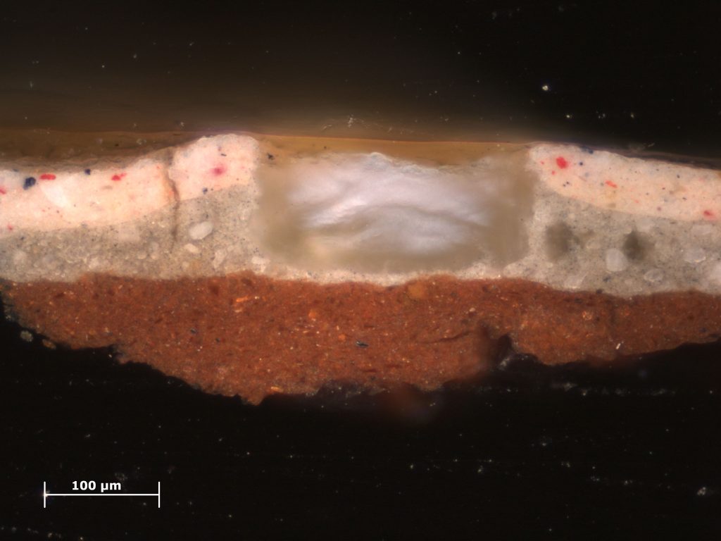
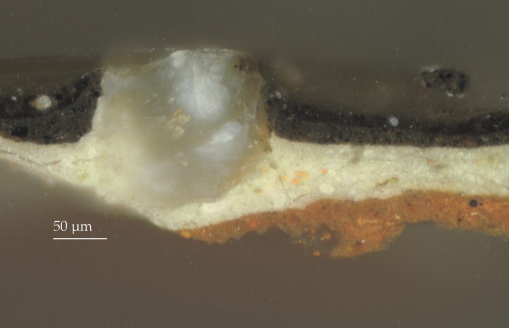
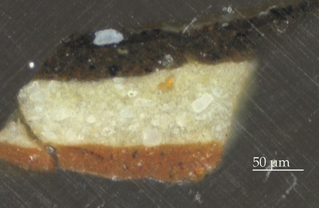
New research carried out by the Rijksmuseum as part of Operation Night Watch, using advanced imaging and highly specialized instrumentation, shows that the ground, which in some samples is extraordinarily thick (up to three hundred microns), is composed of quartz-rich micaceous (mica-containing) clay (figs. 31 and 32). Detecting clay minerals in paint cross sections using light microscopy, however, is extremely difficult due to the low refractive index of both the quartz and the clay minerals. SEM-EDX also has its limitations due to the extremely small size of the clay minerals. New imaging techniques, however, have made it possible to visualize areas of exposed ground in titanium-distribution XRF images due to the presence of titanium-rich minerals in the clay (see fig. 34).61 The muscovite (mica) in the clay can also be imaged with reflectance imaging spectroscopy (RIS).62 These advances in imaging technologies are extremely helpful, since quartz-clay grounds do not register strongly in x-radiographs.
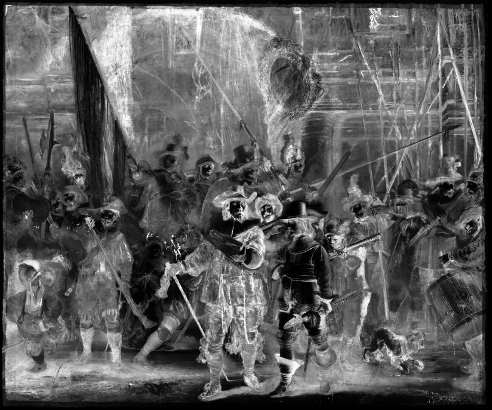
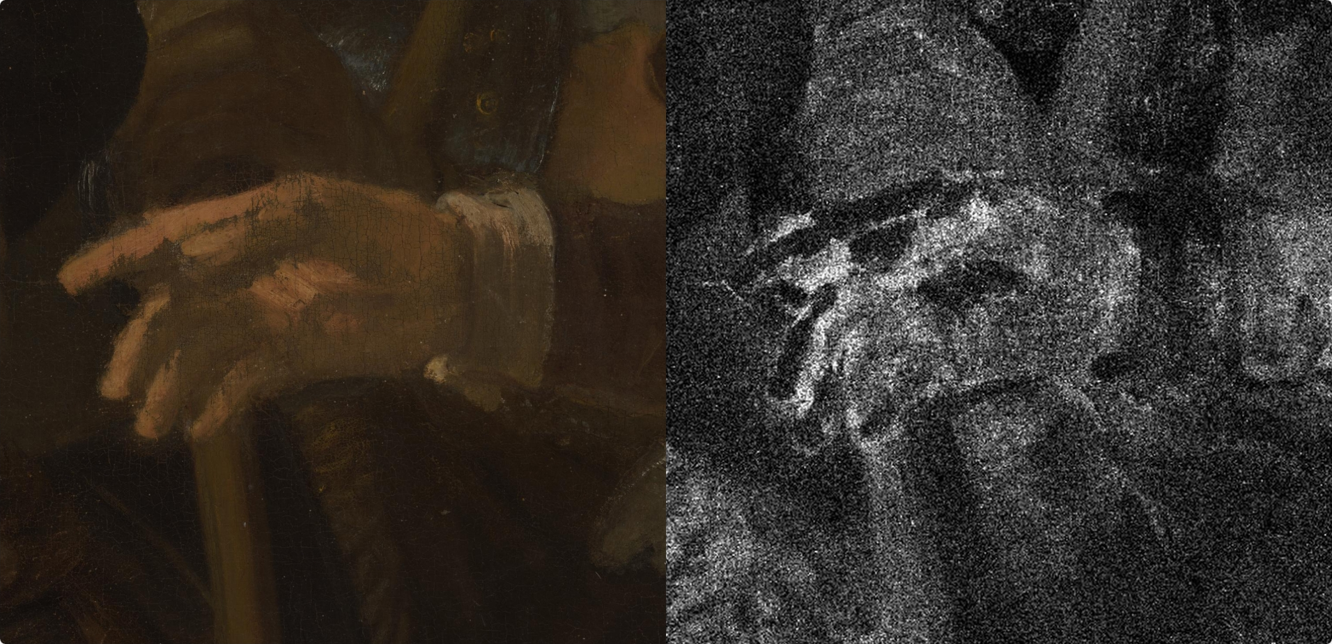
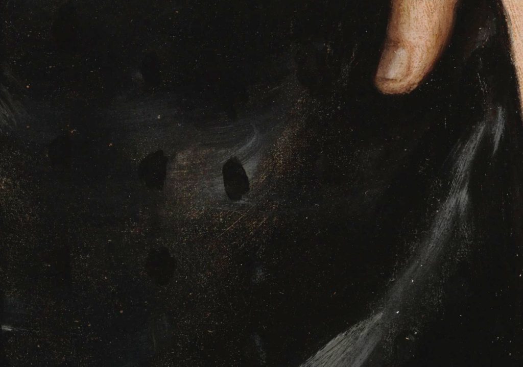
The use of a dark ground in The Night Watch marks an important stylistic development in Rembrandt’s use of colored grounds. Instead of the combination of light ground and dark painted sketch he used for his earlier canvas paintings, Rembrandt chose a brown ground in combination with a painted sketch in a light-colored chalk-rich paint. The compositional sketch, which could be visualized for the first time in the calcium-distribution XRF image associated with the chalk (calcium carbonate)—particularly in the upper part of the picture, where the sketch layer is only covered with a single layer of the earth-rich background paint—represents an important new discovery regarding Rembrandt’s painting practice (fig. 33).63 Parts of the sketch are also exposed in the dog at the lower right due to abrasion of the thin surface paint. Rembrandt sketched additional forms in dark brown paint, some of which can be seen with the naked eye, such as the earlier position of the feet of the musketeer to the right of Wilhem van Ruytenburch, one of the central figures. Apart from the illuminated figures in the foreground, the final paint layers were applied with great economy, in just one or two paint layers, leaving areas of the brown ground deliberately exposed as part of the modeling, such as we see in Sergeant Rombout Kemp’s outstretched hand, where the brown ground was left unpainted for the shadow areas of his open hand (fig. 34).64
Unlike Rembrandt’s earlier canvas paintings, which have conventional light grounds with an elaborate painted sketch in various tones of brown, the brown ground in The Night Watch simplified the painting process, providing a readymade midtone on top of which darker and lighter tones could be added—not dissimilar to the unfinished Portrait of a Boy in a Fancy Costume (ca. 1655; Norton Simon Museum, Pasadena), which also has a brown ground. As Ernst van de Wetering explains, working on a colored ground had an immediate advantage since, in this way, a convincing rendering of forms could more easily be achieved.65
The choice of a dark ground may have been fueled by a desire to speed up the working process. Perhaps, as De Piles described in his 1673 translation of Charles Alphonse du Fresnoy’s art theoretical treatise, L’art de peinture (1668), Rembrandt disliked the fact that light grounds required too much working up before a three-dimensional effect or a unified image could be achieved.66 The brown ground not only eliminated the need for extensive dead coloring in brown and black paints, but it also meant that the ground instantly unified the composition, as it could be used to fill transitional areas between forms and highlights and act as an underpaint for translucent passages. On top of the readymade midtone, light and shadow could be created efficiently and the positions of figures and forms in space more accurately defined. The vague contours that are so important for the creation of houding could also be adjusted more easily during the painting process.
However, in working from dark to light rather than light to dark meant that light passages had to be built up thickly with layers of lead white. In his earlier works, Rembrandt produced brightness by exploiting the luminosity of light grounds, but on dark grounds he had to build up the light passages using new methods and materials to produce the effect of “light within”—traditionally created by the light ground. A nineteenth-century instruction book on painting techniques addresses this approach: “It matters not, however, whether the brightness reside in the ground, or is reproduced at any stage of the work. Thus, Titian frequently obtained the effect of luce di dentro (light within), so much extolled by the Italians, by painting with white opaque colour over the dark or red grounds he frequently employed, and then glazing over this opaque colour.” 67 Observations with the stereomicroscope, coupled with advanced imaging, indeed show that the richly textured yellow costume of Wilhelm van Ruytenburch, in the center foreground, is built up in multiple layers of lead white underpaint, which were fully dried before application of the final paint layers.68
The approach used in The Night Watch brings to mind another remark by Van Hoogstraten in the Inleyding about dark grounds, in the chapter “Of Advancing, Receding, and Foreshortening”:
The Italians think they can make their background work recede through mezzotints or half colors. Some want to bring their work forward by force with dark and black grounds and assign that power to their piercing lights. These ascribe that trait to beautiful colors and of necessity want the gray and dull ones to recede.69
Here Van Hoogstraten seems to disapprove of the bright colors and strong contrasts. In a separate passage, Van Hoogstraten specifically refers to The Night Watch. Although he praises the way Rembrandt achieved unity (eenwezich) in the composition, he says that many think he went too far (al te veel) and that he himself would have preferred if he had “sparked a bit more light into it” (dat hy’er meer lichts in ontsteeken had).70 Van Hoogstraten’s observation about unity, which was so important for the creation of welstand, relates to Rembrandt’s mastery of using related (bevriende) colors, but at the same time also underscores the importance of the dark ground in unifying the composition, since exposed areas of the ground were incorporated into the pictorial layer.71 Moorea Hall-Aquitania goes so far as to argue that colored grounds are “broken” colors by nature, since they played a role in the painting process by replacing areas, such as shadows, where otherwise a broken color would be used.72 Van Hoogstraten’s remark about putting more light into it possibly alludes to Rembrandt’s use of sophisticated secondary light reflections, which Van Hoogstraten praises, a technique that Rembrandt increasingly relied on to help address the problematic spotlight effect evident in this and earlier paintings.73
Other Dark-Colored Grounds in the Later Rembrandt, 1640–1669
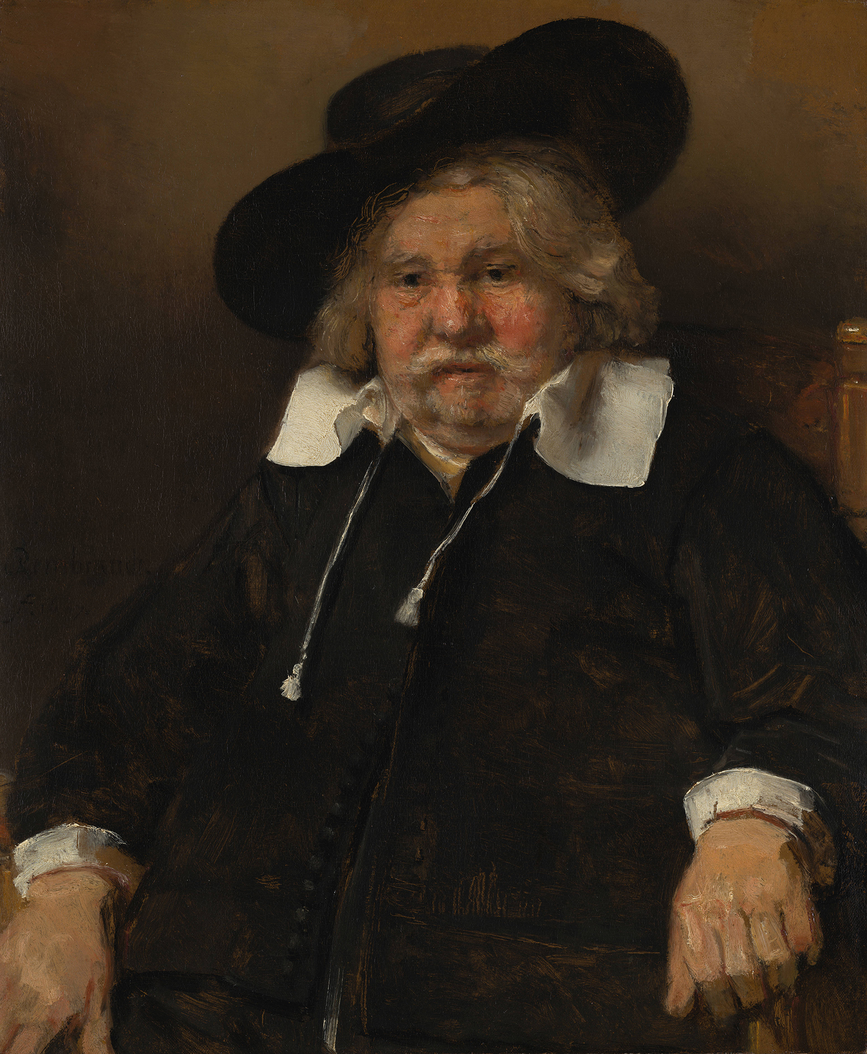
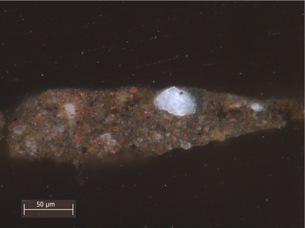
In addition to brown quartz-clay grounds, other types of dark grounds were identified by Groen in Rembrandt’s late canvas paintings, suggesting a certain degree of practicality regarding the precise compositions of ground layers.74 A cluster of grounds containing lead white and umber, applied in one or two layers, were identified in paintings from the 1650s and 1660s. Examples include Saul and David (1651–1654/ 1655–1658; Mauritshuis), which has a gray-brown ground consisting of two layers that are essentially completely covered by the subsequent paint layers.75 Rembrandt’s Self-Portrait from 1669 (see fig. 37), also in the Mauritshuis, has a similar ground applied as a single layer. Individual pigment particles of organic brown, bone black, yellow earth, organic lake, smalt, quartz, and a single vermilion particle identified in the upper ground layer of Saul and David suggest a mixture of paint residues from the palette or rinsing pot.76 Complex mixtures of pigments have also been identified in the ground of Rembrandt’s Self-Portrait at the Easel (1660; Musée du Louvre, Paris), suggesting that these grounds, like the quartz-clay grounds, were made and applied in Rembrandt’s studio.77
Another group includes brown grounds rich in chalk that occur in paintings made after about 1650. Examples include Titus in Monk’s Habit (1660; Rijksmuseum), The Sampling Officials of the Amsterdam Drapers’ Guild, known as “The Syndics” (1662; Rijksmuseum), and Homer (1663; Mauritshuis), whose double ground consists of a grayish brown upper ground layer composed of lead white with a little chalk, earth, and black pigment applied on top of a thick, orangey lower ground containing chalk, with some additions of earth pigment.78 This painting, which was part of a series of three commissioned by the Sicilian collector Antonio Ruffo, features thickly applied paint, and the warm brown ground plays no apparent part in the final composition—although one should exercise caution with such statements, considering the picture is a fragment of a much bigger painting, cut down as a result of damage from the earthquake in Messina of 1783. Nevertheless, the Homer demonstrates—and there are other examples where the paint is laid on so thickly that the ground is not visible, such as Portrait of Margaretha de Geer (ca. 1661; National Gallery, London)— how Rembrandt’s technique could vary depending on the circumstances and different effects he wanted to convey.79

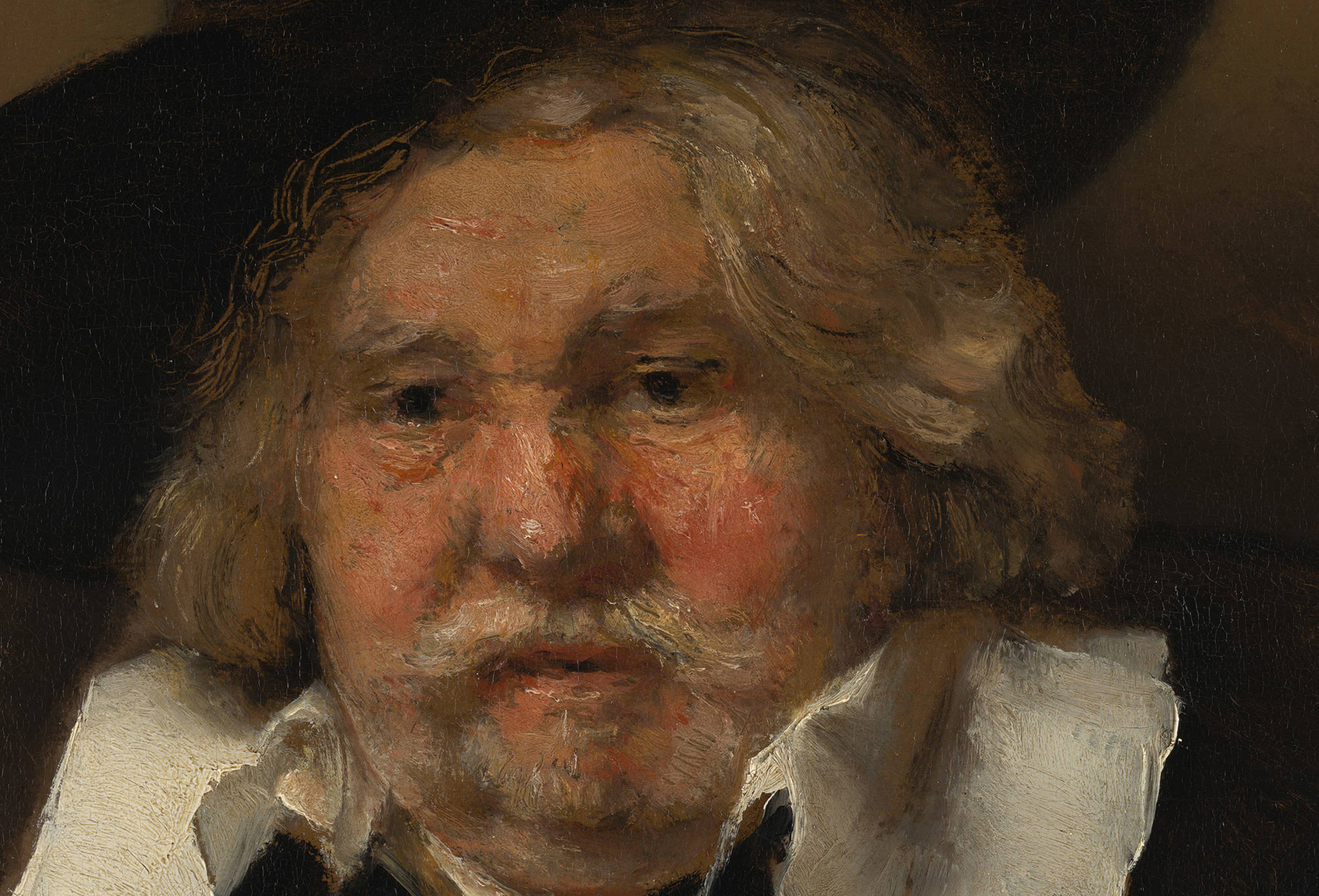
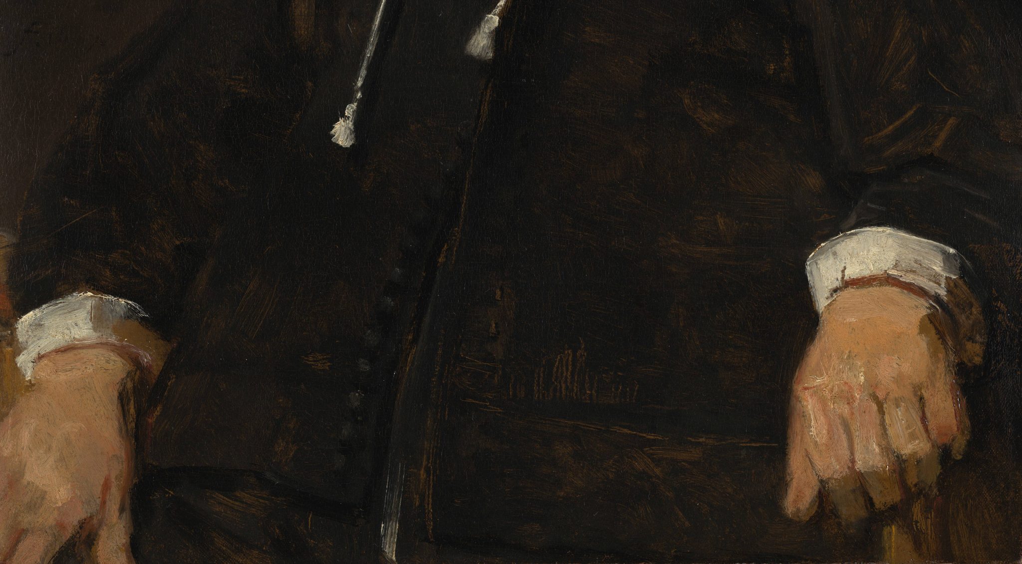
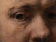
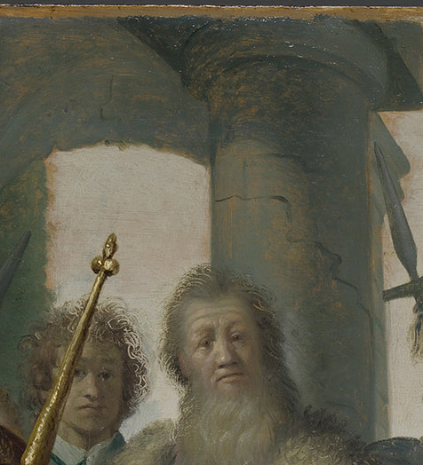
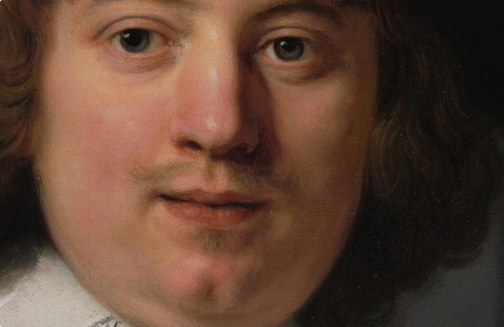
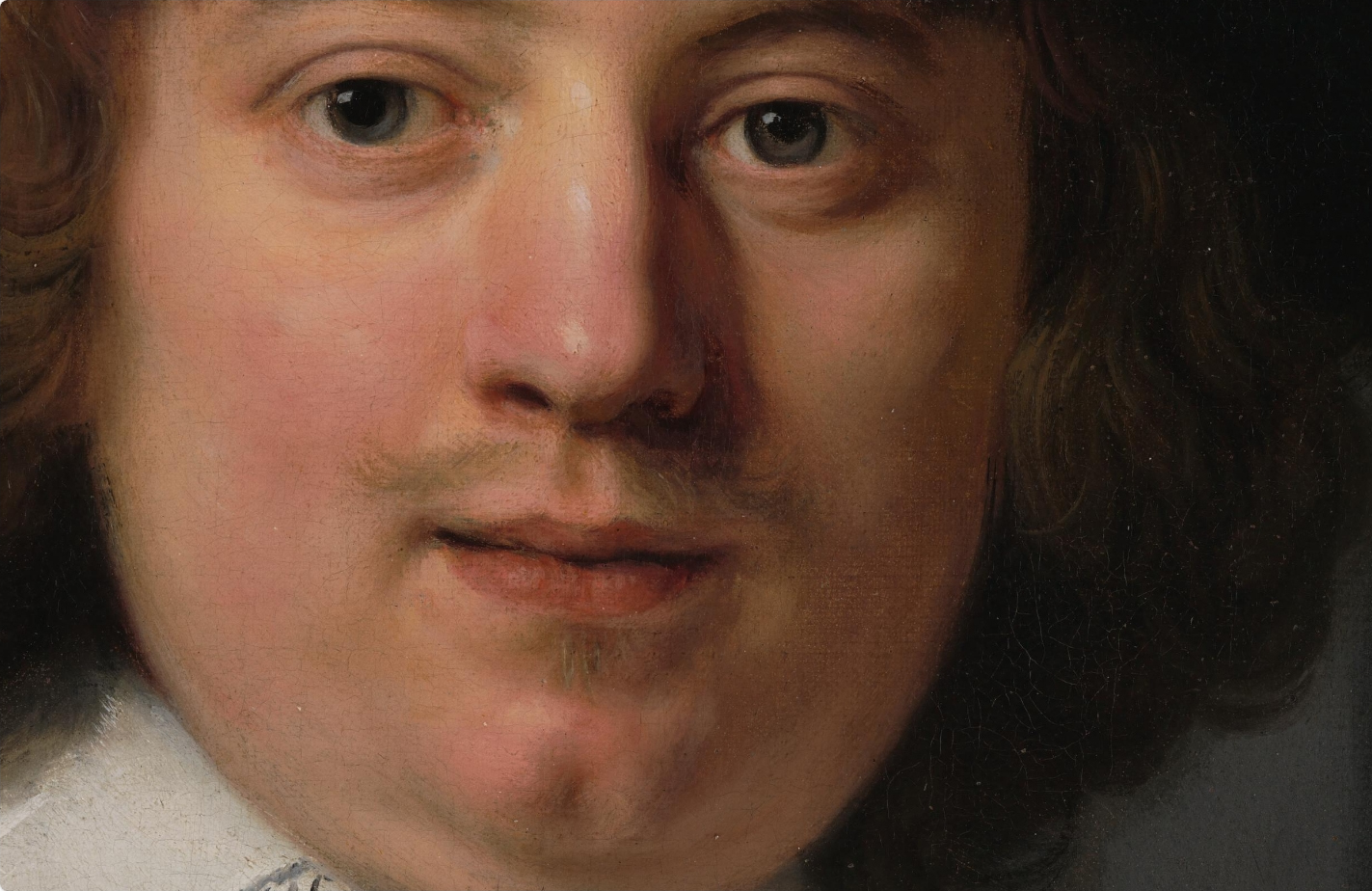
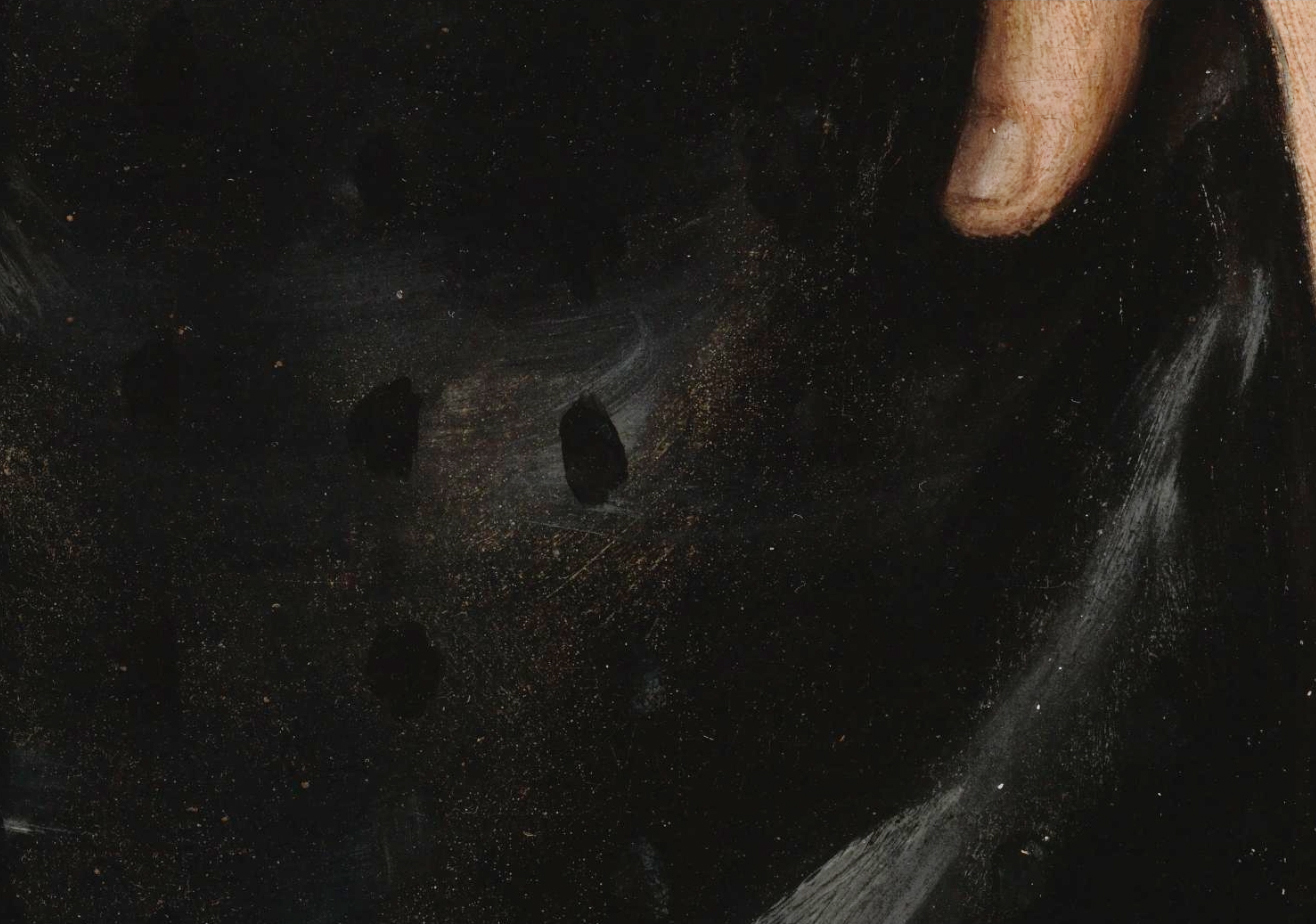
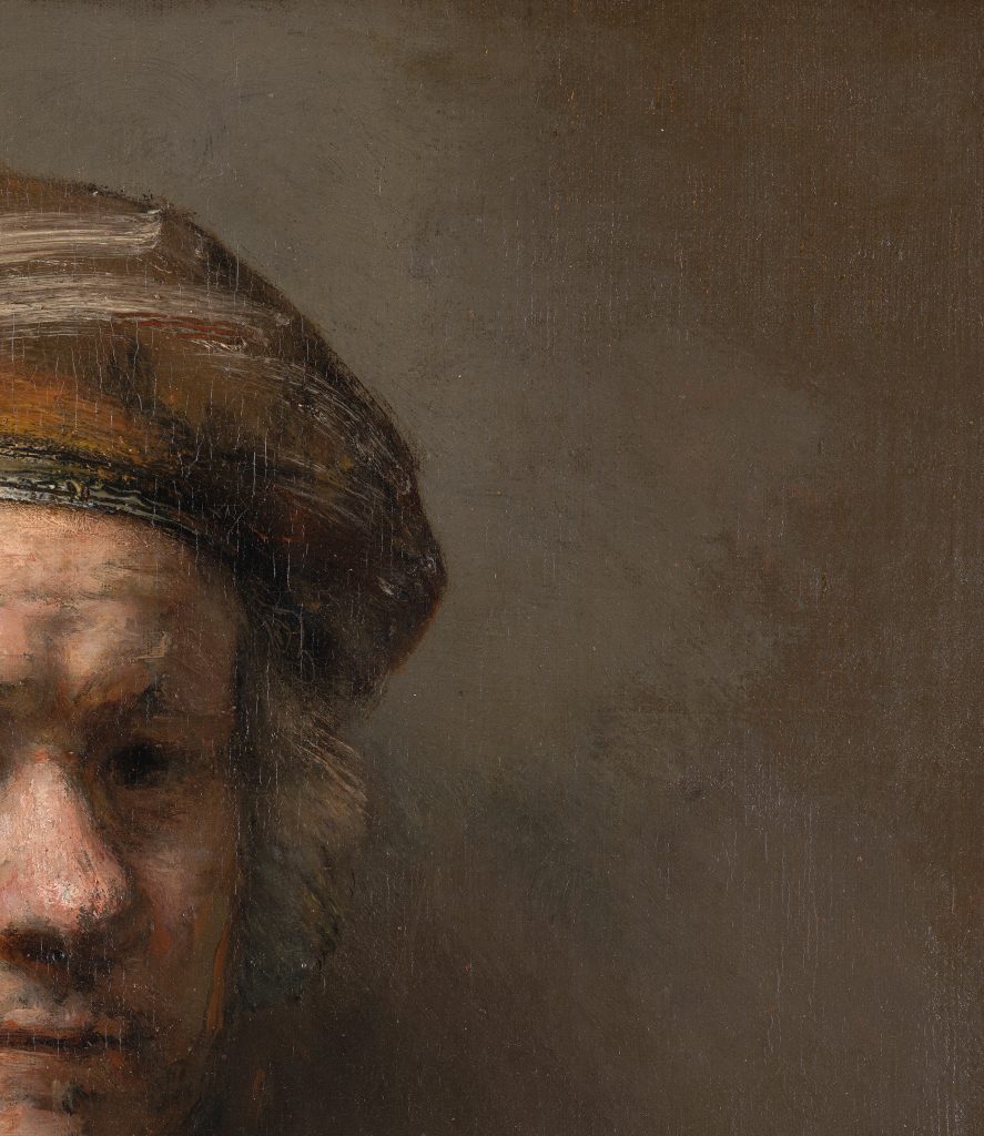
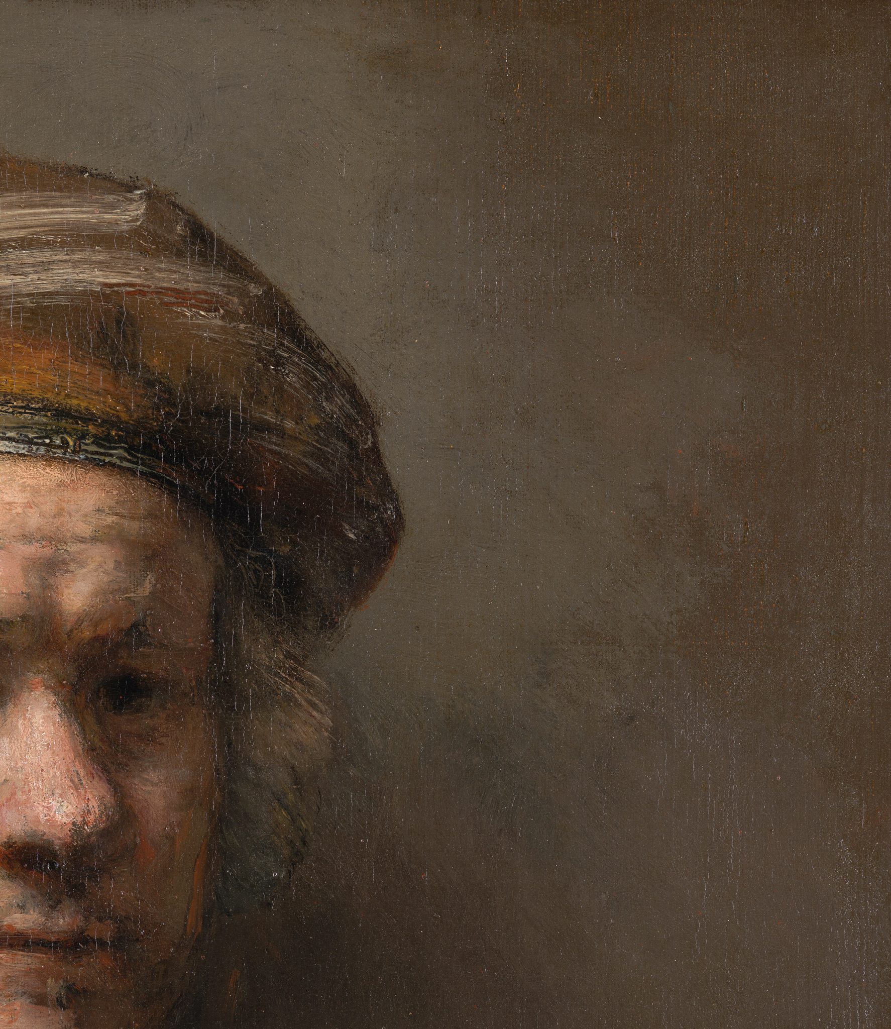
There are also dark grounds composed primarily of brown earth pigments, which include Portrait of an Elderly Man (fig. 3), mentioned in the introduction, whose ground consists of a warm brown layer containing brown and red ocher, chalk, lead white and a little charcoal black over a red-brown lower layer. The bold technique of this informal late portrait, evidently painted from life, is immediately striking. The warm brown ground, which acts as a base tone unifying the composition, exerts a strong influence on the painting’s overall tonality, as large areas of the ground were deliberately left unpainted to function as zones of shadow and half-shadow in the hair and in shaded areas of the sitter’s face, white collar, cuffs, and his left hand. The ground also shows through the broadly applied brushstrokes and scratch marks in the hair and black doublet, enhancing the extraordinary naturalism of the man’s slumped pose (figs. 35 and 36). The warm flesh tones, modeled wet-in-wet with high impasto, in considerable detail compared to the rest of the figure, stand in marked contrast to the areas of exposed ground and contribute to the exceptionally convincing three-dimensionality of the portrait.80 This painting is another good example of how Rembrandt achieved the much-desired effects of welstand and houding by relying on the interplay between the ground and subsequently applied paint layers. Here Rembrandt also exploits the fact that the ground visually recedes, as it does in Woman Bathing in a Stream. The economy of finish in both these works is intriguing.81 Whether it relates to the sitters having been painted from life; the informal, intimate character of the paintings, giving the impression of capturing a fleeting moment in time; or a conceit for the appreciation of art connoisseurs remains unclear. Despite the appearance of being unfinished, both paintings are signed and dated.

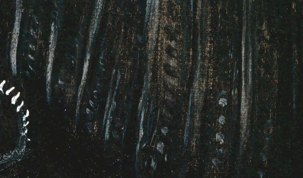
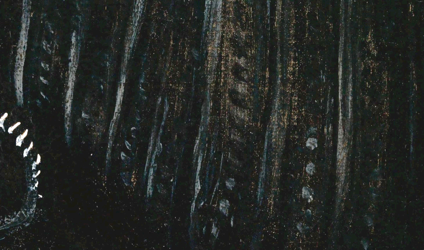
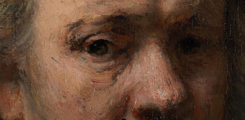
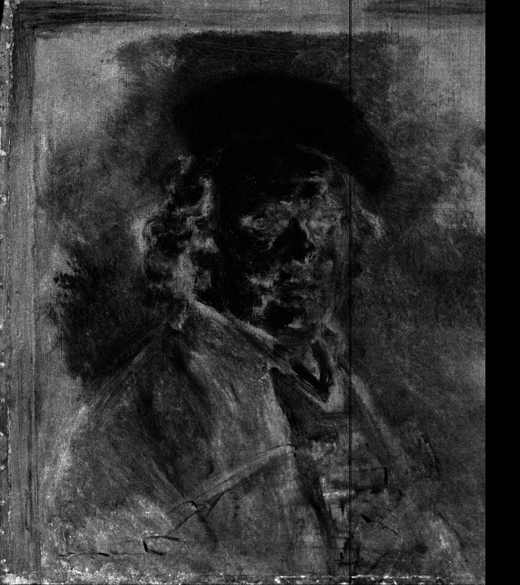
Rembrandt’s Self-Portrait of 1669, painted in the last year of his life, is an outstanding example of Rembrandt’s virtuoso handling of paint (fig. 37). The single layer of gray-brown ground is not quartz-clay but is composed of manganese oxide–rich umber, some lead white, yellow and red ocher, and fine charcoal black (fig. 38).82 During the painting process, Rembrandt left the dark ground deliberately exposed in numerous small areas around the eyes, mouth, and neck as well as in a large section of the background at the upper right (figs. 39 and 40). These areas of unpainted ground, which function as shadows in the pictorial image, correlate with the high-signal areas (light areas) in the manganese- and iron-distribution XRF images, both elements that are associated with umber in the ground (fig. 41).83 The ground in Self-Portrait at the Age of 63 (1669; The National Gallery, London), also dark brown, was identified as being of the quartz type.84 Significantly, the different compositions of the grounds indicates that it was not the quartz itself that was important to Rembrandt, but rather the dark tonality of the ground. In the Mauritshuis painting, which is painted in a more direct manner than the London picture, Rembrandt seems to have abandoned the underlying sketch layer completely, leaving areas of the brown ground exposed for the shadows in the face and upper part of the background.85 These areas, which are situated deep in the painting structure, contrast with the lit areas of the face and turban, which were built up thickly with lead white using high impasto, a feature often observed in Rembrandt’s late paintings. This was necessary not only to fully cover the dark ground but also to avoid one of the problems associated with dark grounds: the loss of opacity in thinly painted light tones that could otherwise become grayish and ghostly.86


Conclusion
Rembrandt’s ground layers can essentially be organized into light and dark grounds. Light-colored grounds were used for his panel paintings and early canvas paintings, while dark grounds predominate his paintings on canvas from 1642 onward. This division into light and dark grounds is supported by numerous mentions in historical sources that reveal a great interest in the relationship between ground color and painting technique.
Based on the study of the existing data, literature, and observations of Rembrandt’s grounds, a clear development emerges in Rembrandt’s material and stylistic use of colored grounds. With the exception of his earliest paintings, Rembrandt exploited the possibilities of colored grounds very early on. Following his training with Pieter Lastman, Rembrandt began using light-colored grounds to create light effects, facilitate the division of light and dark, impart luminosity, and enliven dark areas. The more tonal approach that he began using toward the end of the 1620s, which exploited the visibility of the ground to suggest light and space, can be linked to the rise in naturalism in Dutch seventeenth-century painting, as discussed elsewhere in this issue. Depending on the function and type of painting, along with his desired effects, Rembrandt continued with this approach in varying degrees throughout the 1630s. On top of conventional gray-over-red grounds, which he likely obtained from specialist primers in Amsterdam, he worked up his compositions with a painted sketch (dead coloring) in tones of brown and black, providing a range of midtones, on top of which he applied his finishing layers. From 1633 onward, Rembrandt’s increasingly free handling and open brushwork—especially in oil sketches, tronies, and less formal portraits—meant that more of the ground was exposed, compared to important commissions like the 1634 portraits of Marten Soolmans and Oopjen Coppit, where more of the ground is covered.
In 1640, when most artists were creating lighter and brighter paintings, Rembrandt moved in the opposite direction and started employing dark grounds for his canvases, eliminating the need for extensive dead coloring and enabling a more direct and efficient painting technique. The brown quartz-clay ground that Rembrandt used for The Night Watch not only facilitated the efficient creation of houding and welstand, but it fundamentally transformed his painting technique. On top of the brown ground, Rembrandt laid in the composition using a painted sketch in a light, chalk-rich paint. Whereas the brightness in his early paintings had been achieved through the luminous quality of light grounds, Rembrandt now introduced light by building up bright passages with thick layers of lead white, which he subsequently covered with translucent glazes. Together with dark grounds, this underlying, thickly textured lead white underpaint—clearly visible in x-radiographs—became a defining feature of his late painting technique. The dark ground, which essentially functioned as a midtone between the lights and the darks, played an increasingly prominent role in Rembrandt’s painting process. In two of Rembrandt’s finest works from the late 1660s—Portrait of an Elderly Man (fig. 3) and the Mauritshuis Self-Portrait (fig. 37)—Rembrandt exploited the fact that large areas of the dark ground could be left unpainted, serving as a foil to the areas of thickly applied impasto in the faces. For the reasons described above, colored grounds can perhaps be considered Rembrandt’s most effective tool in the creation of pictorial unity, color harmonies, and visual effects, qualities that explain the successful houding and welstand of his paintings.


