This essay introduces the topic of this special issue: how the use of colored grounds influenced the production and visual qualities of seventeenth-century Netherlandish painting. The adoption of colored grounds in the Netherlands coincides with marked stylistic developments toward an emphasis on tonality and chiaroscuro. It culminates in, for example, the work of Rubens and Rembrandt and also makes possible a unique way of landscape painting. This important but understudied topic is addressed from complementary angles, providing insight into larger developments, the roles of the various actors of artistic production, and the role of colored grounds within artistic oeuvres. In addition, this special issue nuances—and at times refutes—existing theories on the routes by which colored grounds reached the Netherlands. Finally, it attends to the various methods of inquiry that support research into the nature and meaning of colored grounds for art historical investigation.
Between 1580 and 1620, Netherlandish art underwent significant changes.1 The most fundamental development was the rise of the open market for paintings.2 It resulted in enormous growth in the number of artists and paintings and an entirely new social dynamic in the world of art. It also led to the rise of specializations, generating a collective iconography that was totally new, even if rooted in sixteenth-century traditions.3 Another innovation was the taste for paintings with scenes and scenery that looked more real than ever before. Finally, artists experimented with new techniques of painting in oil, both in order to supply the market as efficiently as possible and to cater to the taste for the new realism. All of these developments were closely connected.
The present issue focuses on a development that has remained somewhat hidden from view: the rise of the colored ground. A ground is a uniform layer or layers that were applied to prepare the painter’s panel or canvas to receive the paint layers; it is thus literally covered with paint. Nonetheless, the ground has a strong impact on the tonality of a painting.
Across Europe, the preferred color of grounds changed over the course of the sixteenth century. Colored grounds gained popularity, and white-toned supports became less common. This development correlates with revolutionary changes in painting techniques and styles. The colored ground stimulated tonal harmony, which supported the new taste for realism that relied on tonal unity and soft contours instead of color contrast and sharp-edged lines. Painters started using more open and therefore more efficient brushwork, which was also appreciated as a new expression of virtuosity. By transitioning from white to colored grounds, seventeenth-century Netherlandish artists adopted a method that facilitated the new economic painting styles and benefited the new paradigm of realism. Colored grounds became ubiquitous in Netherlandish art by the second quarter of seventeenth-century. In an often-cited article, John Michael Montias has pointed out that the new market situation demanded process and product innovations that significantly changed the production and appearance of Dutch art.4 As a socioeconomic art historian, he paid less attention to the actual artistic technicalities that figuratively and literally underlie the processes that he described, including the innovation of painting on colored ground—but he was aware of their importance and encouraged their study.5
In a sense, the present issue is an answer to this call. Its aim is to remedy the scholarly invisibility of the ground in Netherlandish seventeenth-century paintings, to provide new insights, to add more nuance to existing theories concerning the adoption of colored ground, and to generate a better understanding of the importance of its color for the visual qualities of these paintings.
The present issue is the synthesizing study of a research project that was sponsored by the Dutch National Research Council (NWO) that ran between 2019 and 2024, titled Down to the Ground: A Historical, Visual and Scientific Analysis of Coloured Grounds in Netherlands Paintings, 1550–1650.6 It is one of three major outcomes of this research project; the others are a PhD dissertation by Moorea Hall-Aquitania, titled “Common Grounds: The Introduction, Spread, and Popularity of Coloured Grounds in the Netherlands 1500–1650,” and an open-access database that Hall-Aquitania developed in collaboration with Paul J. C. van Laar.7 The database records colored grounds in Netherlandish painting between 1500 and 1650, with heavy emphasis on Dutch art from 1580 to 1650.8 The aim of the project was to write an interdisciplinary history of colored grounds, establishing how they spread to the Netherlands in the sixteenth century and what influenced their introduction. Initially, the central point of reference on the processes and mechanisms leading to the general adoption of colored grounds was a 1979 study by Hessel Miedema and Bert Meijer.9 Due to an absence of focused research into the spread of colored grounds, Miedema and Meijer’s hypothesis that colored grounds traveled from Italy to the Netherlands stood unchallenged for forty years after its publication. Thanks to the growing body of technical information on sixteenth- and seventeenth-century painting, it is now possible to paint a more nuanced picture of this development, which appears to have been more complex than believed.
As a second aim, the Down to the Ground project explored how colored grounds coincided with changed painters’ practices in the seventeenth century and developed a deeper understanding of the impact of colored grounds on the visual qualities of paintings at the time of their making and after centuries of aging. The authors of the eight studies in this issue (excluding this introduction) on the spread of colored grounds and technical practices related to their use are all connected to the Down to the Ground project—as team members, museum partners, or participants in various convenings. Here, they illustrate from different angles how colored grounds revolutionized the appearance of seventeenth-century Netherlandish paintings and how artists used them. We believe that an awareness about this will deepen appreciation for the ingenuity and innovative spirit of seventeenth-century Netherlandish painters and will feed new research into artistic production in the Netherlands. The aim of this introductory essay is to explain what exactly constitutes a colored ground, to articulate the role of the ground in Netherlandish seventeenth-century painting, and to present art historical ideas about its sixteenth-century proto-history.
The Colored Ground: An Example
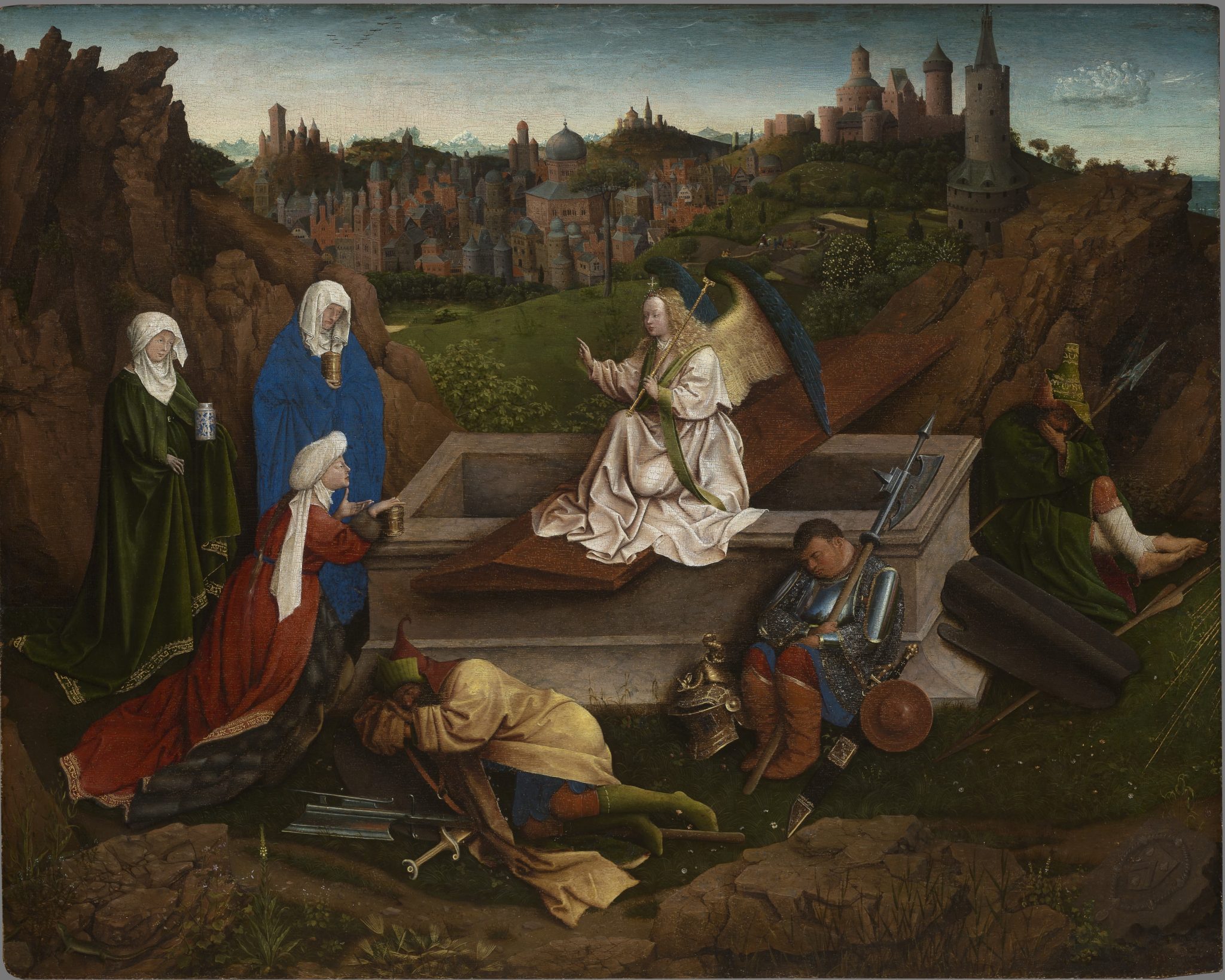
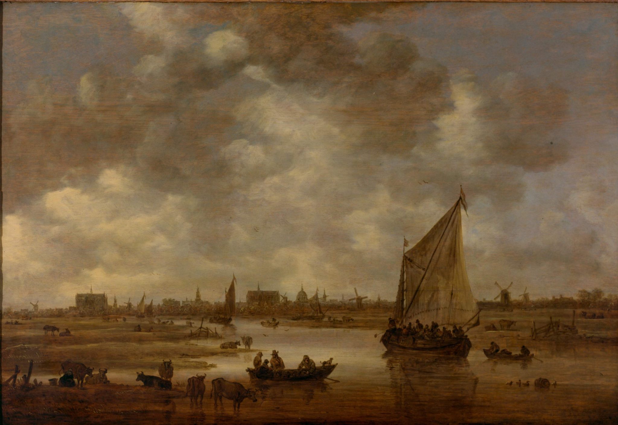
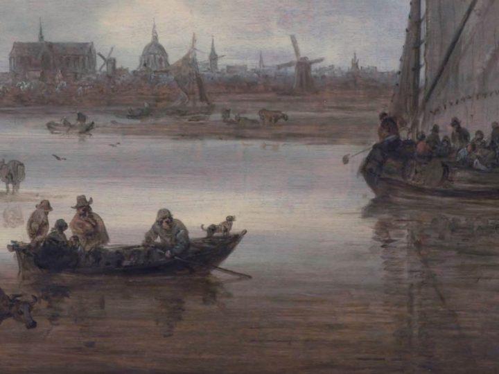
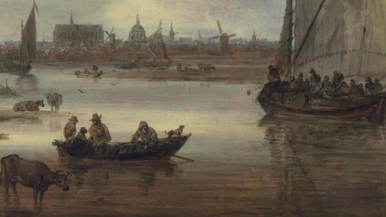
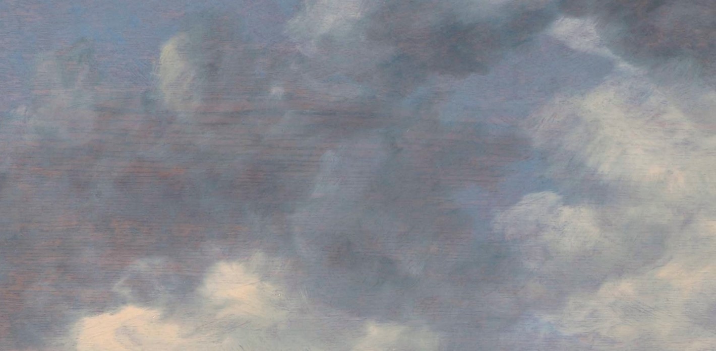
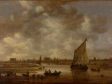
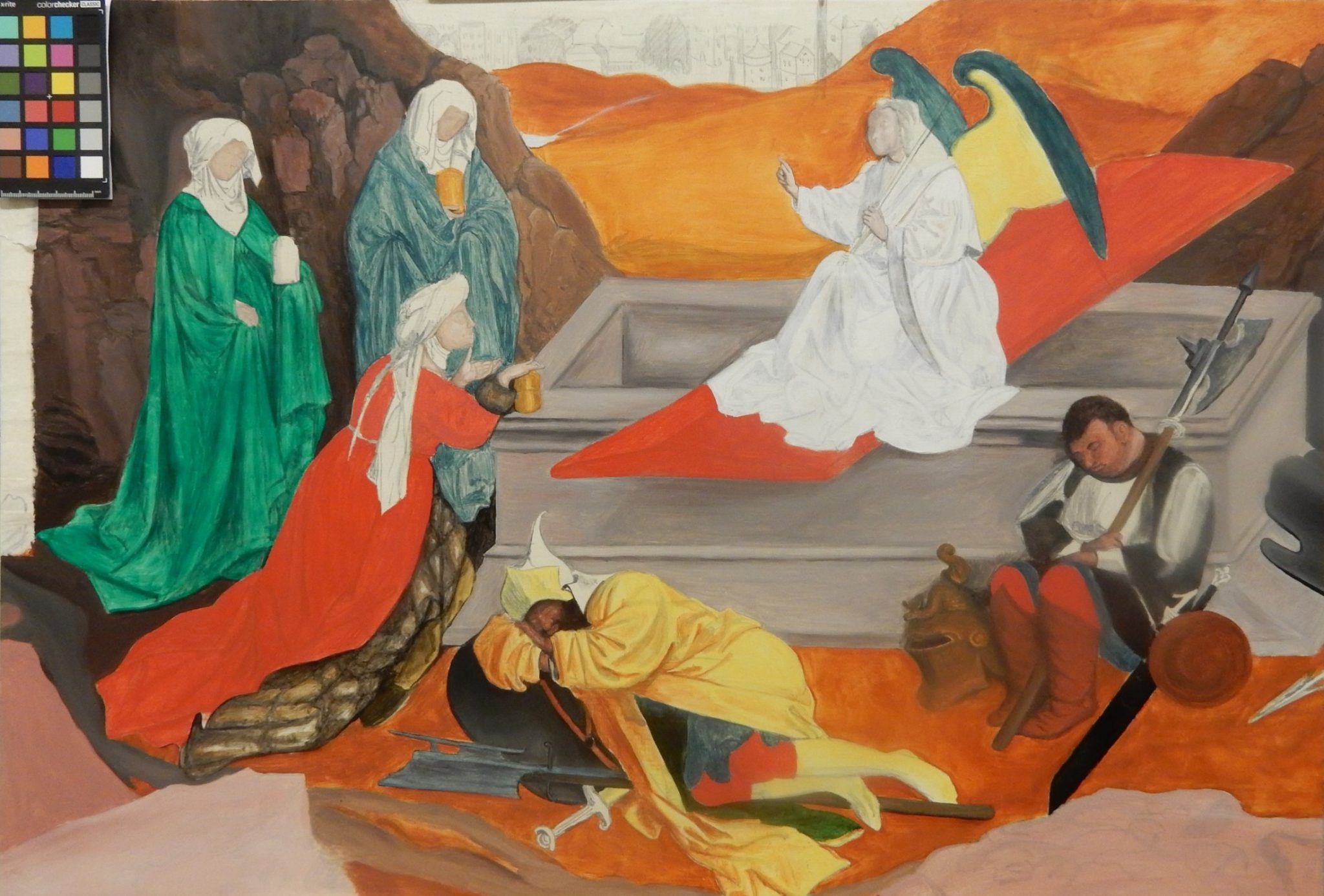
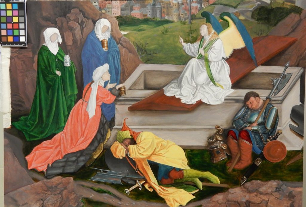
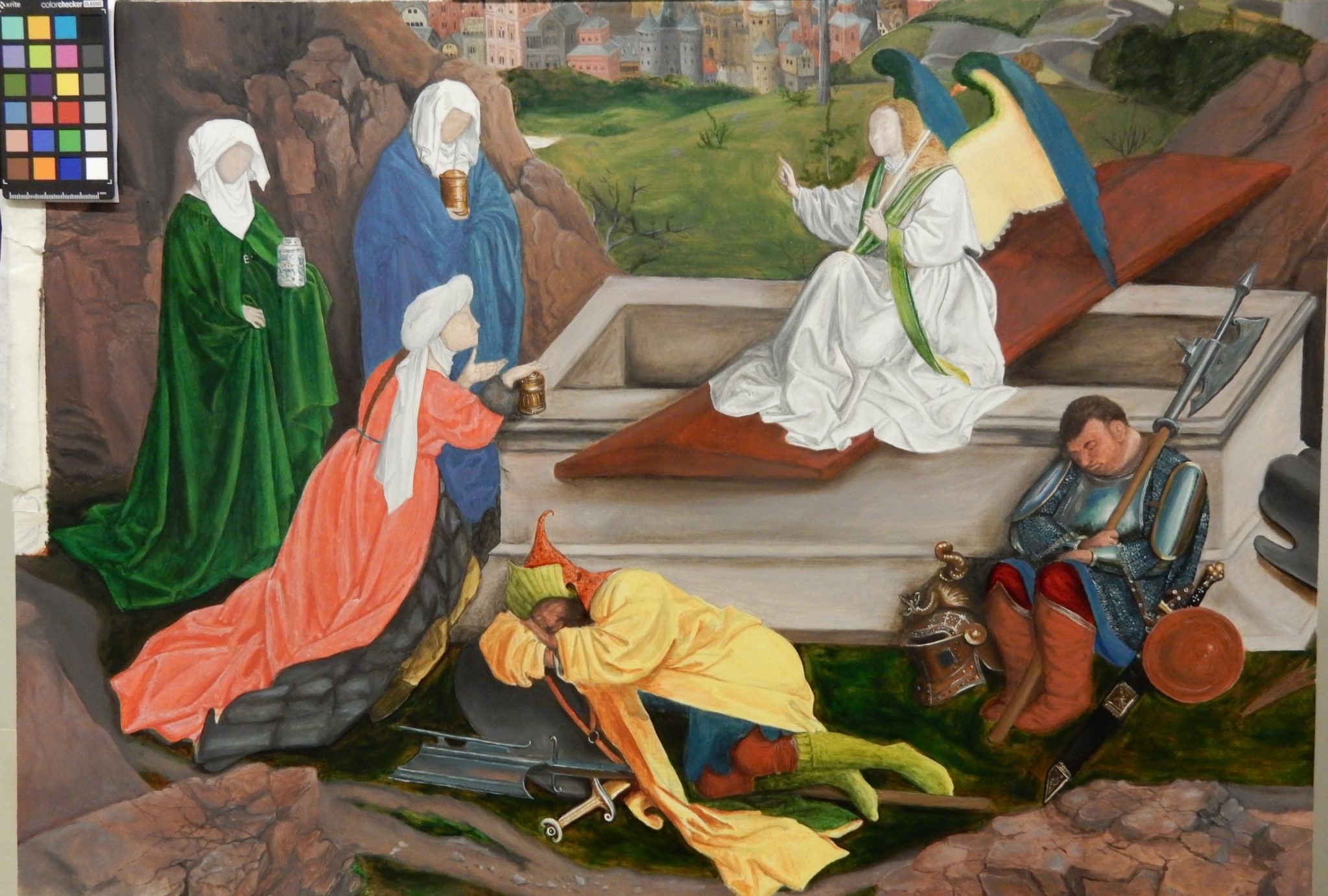
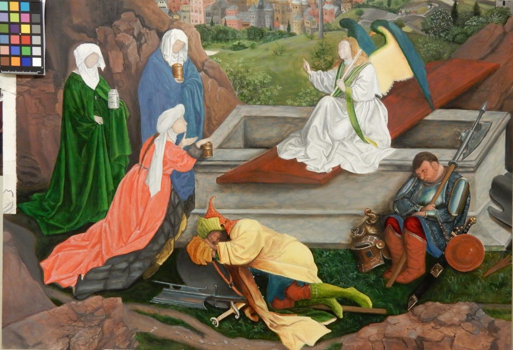
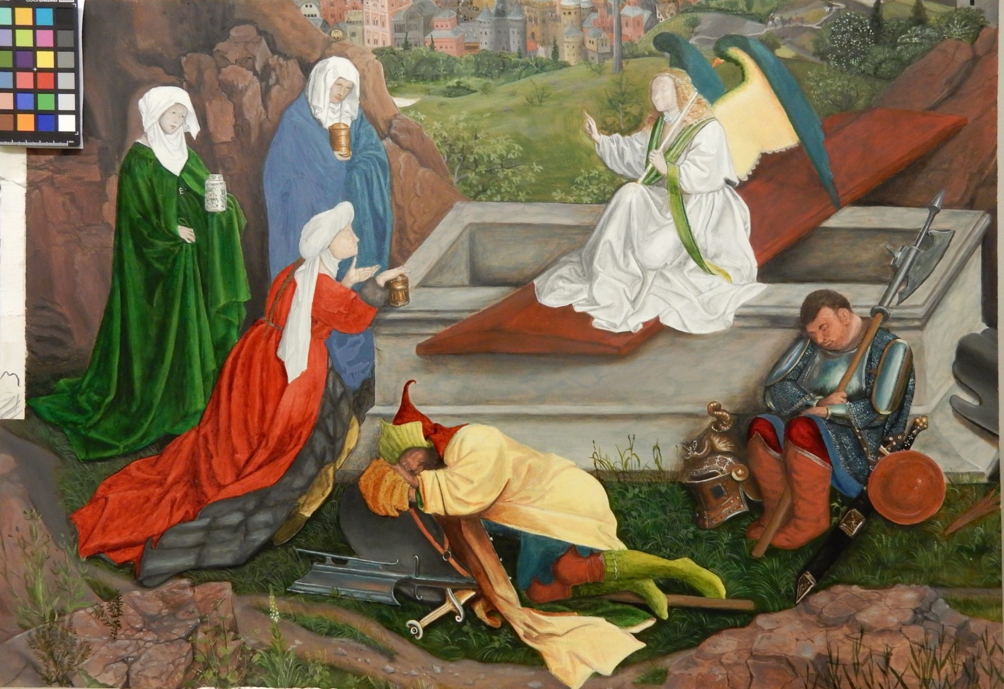
Just exactly what is a colored ground, and what can it do? A comparison between a painting with a landscape and figures attributed to Jan van Eyck (before 1390 –1441) and his workshop painted on a white ground, and one by Jan van Goyen (1596–1656) on a toned surface, serves to demonstrate the differences in buildup and pictorial effect.10 The Three Marys at the Tomb is characterized by enamel-like, luminous tones with clearly defined color areas (fig. 1). In Jan van Goyen’s View of Leiden from the North-East, overall color harmony and tonality are prioritized (fig. 2). The difference literally emerges from the different grounds the artists worked on. Painting on a white surface, the Van Eycks completely covered the panel with multiple translucent paint layers, as seen in a reconstruction of this painting by Indra Kneepkens (see figs. 14–18). This way of building up each area with different layers resulted in the deep green and vibrant red of the saints’ robes but also in distinct boundaries between the different areas of color. In contrast, Jan van Goyen worked on a brown base tone, the combined effect of a thin, light brown ground and the brown color and grain of the panel that shines through.11 This was a conscious decision; he carefully exploited the light brown surface as a midtone throughout the painting, a technique he used not only in this work but also in many others.12 The light brown color and the grain of the wood give translucent qualities to the water in the foreground, connect the city in the middle plane visually to it (fig. 3), and give a lively quality to the clouds in the sky (fig. 4). Van Goyen’s deft exploitation of the brown tone makes abundantly clear that the ground does not function in isolation. Together with the paint layers, a colored ground defines the suggested three-dimensionality of objects in a painting. At the same time, it serves to connect the many different parts in a painting, thus contributing to a sense of unity. Because of these multiple functions, it is also highly efficient.
Between 1580 and 1625, more and more Dutch painters learned how to exploit the advantages of colored grounds, which remained popular throughout the century. Colors ranged from softer, subdued tones to stronger ones. Sometimes the ground can be seen because a painting has been left unfinished. However, Rembrandt van Rijn (1606–1669), Frans Hals (1582–1666), Jacob van Ruisdael (1628–1682), sometimes Johannes Vermeer (1632–1675), and many other artists made inventive, intentional use of their grounds in finished paintings, leaving small areas visible or allowing the ground to shine through translucent paint layers.
Seventeenth-Century Ground Layers and Their Names
“Ground” is the broad term used in modern art historical research for the layers applied to a painting support. Grounds typically consist of powdered pigments and filling materials in a binder—the liquid that binds the powders and gives consistency to the layer. A seventeenth-century ground consists of several layers and serves to create a surface suitable for painting. As Wilhelmus Beurs (1656–1700), Dutch artist and author, wrote in his 1692 painting manual, De Groote Waereld in ‘t Kleen Geschildert (The big world painted small), the ground makes “the open plane smooth and ready to bear the instruments and paints such that, if the piece is not good, it can [only] be blamed on the artist himself.”13
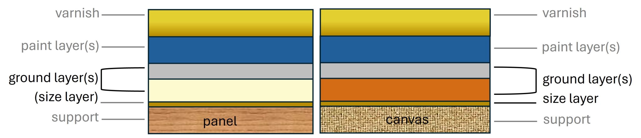
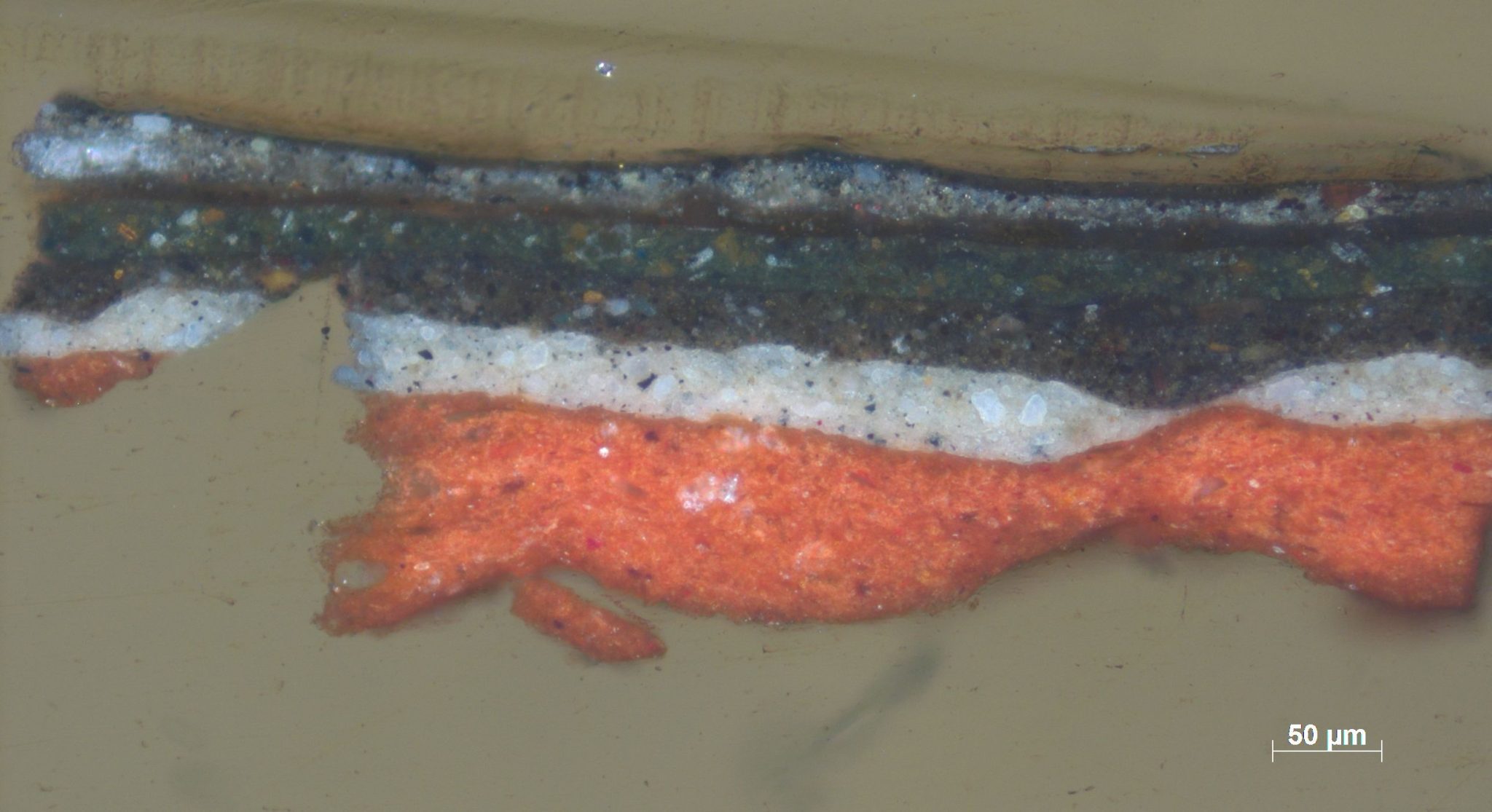
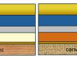
Seventeenth-century ground layers tend to differ depending on the nature of the support, whether panel or canvas. This phenomenon can be observed when examining the paintings themselves and has also been described by seventeenth-century authors.14 Beurs, for example, recommends preparing a panel with a first ground layer consisting of chalk and glue, followed by a layer of brown umber mixed with lead white and bound in oil. For canvas, the same author advises a size (glue) layer covered only with an oil-based pigmented ground, excluding the chalk and glue layer advised for panel.15 Figure 5 gives a schematic representation of the typical ground layers for a seventeenth-century panel or canvas.16
Each of the ground layers had its own function. A size layer sealed off the canvas fibers from the oils used in subsequent layers, as this oil could lead to the degradation of the canvas. The size layer typically consisted of a glue layer or a starch paste and was so thin that it is almost impossible to discern in painting examinations. It is mainly through historical recipe research that we know of this layer.17 The proper ground layer(s)—consisting of pigments, bulking materials, and a binder—evened out the texture of the support and provided painters with an uniformly colored surface that was “smooth and ready to bear” the brushwork and oil paints, in Beurs’s words. In the seventeenth century, oil was the binder of choice for most layers, with the exception of chalk-based layers on panel, for which animal glues were used. The pigments gave the layer(s) color, and bulking materials—often colorless powders such as chalk or sand—could be added to increase its volume or change its consistency. Historical recipes mention the use of spatulas, blunt knives, or brushes for the application of ground layers. While Beurs advises only a single ground layer, and some paintings indeed were executed on single ground layers, other contemporaneous authors and painting analyses demonstrate that many seventeenth-century artists used grounds of two layers, and sometimes even more.
Seventeenth-century recipes for panel preparation often omit a size layer. No reason is provided, but it seems logical that a first layer of chalk bound in glue, which was typical for panels, would make a size layer unnecessary. Another feasible explanation could be that a wooden panel did not need to be sealed off from the oil-bound ground layers in the same way as canvas, which is much more absorbent and can degrade due to the chemical interaction between oil and the linen fibers.
The difference between the layers applied to panel and canvas relates to their different properties, and thus the way they were used. One of the advantages of canvas is that it can be rolled or bent, which is especially convenient for the large-format works for which it was often used. A ground bound in glue would easily crack when the support was rolled up, whereas oil is more flexible. Thus, an oil-bound layer is a more logical choice for a canvas ground. This motivation is mentioned in historical sources.18
In seventeenth-century Dutch sources and the secondary literature on these sources, two terms are regularly encountered when grounds are discussed: primuersel and imprimatura. The Dutch primuersel is how Karel Van Mander, in his 1604 Schilder-Boeck, described a semitranslucent, pigmented, oil-based layer. Through this layer, Van Mander wrote, the underdrawing remains visible, which made the painting look “half painted.” This was the technique ascribed by Van Mander to his “modern ancestors” to set up a composition on panels.19 The term is very similar to the word imprimatura, which appears in the second edition of Giorgio Vasari’s Lives of the Artists (1568). Vasari uses the term imprimatura more broadly, to describe oil-bound second ground layers, without any indication that this layer was semitranslucent or thin.20 The term is also similar to imprimeure, employed in French seventeenth-century sources.21 In English seventeenth-century sources we encounter the term “priming,” both as a verb and as a noun. The verb describes the action of applying a ground; the noun is used to describe the layer itself. In seventeenth-century written sources, “priming” occurs only in descriptions of oil-bound ground layers, so it seems to have carried a narrower meaning than some other terms employed to describe grounds.22
The discussion above makes clear that authors made different use of terms such as imprimatura and primuersel. The uncertainty this leads to was continued into the twentieth century, as noted by Nico van Hout in 1998.23 Motivated by his study of sixteenth- and seventeenth-century sources, Van Hout chose to use the term imprimatura to describe the colored top layer of a ground, whether opaque or transparent. A lower ground layer he referred to as a “ground layer.”24 Stols-Witlox (2016), noting the same confusion, made a different choice, avoiding the terms imprimatura and primuersel altogether and instead writing about first, second, and third ground layers. This special issue follows Stols-Witlox’s terminology, describing all preparatory layers consisting of pigments and binder with the term “ground layer.” We consider this terminology to be the clearest, as it avoids any confusion about the interpretation of the term imprimatura. When pigments are added to modify the tone of a ground layer applied to the whole support, we use the term “colored ground.” The colored ground category thus includes cream or light pink tones only if the tone can be attributed to the addition of colored pigments. It is important to make this distinction, as tonality may change with time. For example, an originally white chalk and glue layer may become cream or yellow even if this layer was not intended to be a colored one. Chalk-based layers can also become orange-yellow as a result of absorbing oil from subsequent paint layers or due to the absorption of oil and varnish that yellow with age.
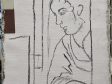
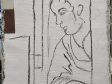
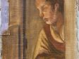
There is one particular type of ground layer for which we do use the term imprimatura. This is the streaky, brownish gray layer used by Flemish artist Peter Paul Rubens (1567–1640) and some of his contemporaries on chalk/ glue prepared panels, in particular on oil sketches (figs. 6 and 7). The reason that we make an exception for this very thin, semitransparent streaky layer is the particularly strong connection between this type of ground and the term imprimatura. Describing such a streaky imprimatura as a streaky ground would go against current convention.25
Dead Color, Working Up, and Retouching: The Layers of Seventeenth-Century Paintings
The color of the ground is what the artist saw while painting; therefore, historians must think about it in the context of the painting process. In the seventeenth century, the painting process typically consisted of three distinct phases or layers, each with a different name and function.26 Due to their broad application, these three phases can be used to describe the making of paintings in both the Northern and Southern Netherlands. In the first phase, the painter set up the composition. When done in ink or in a dry material such as black or white chalk, this phase is called the underdrawing. When the composition was set up with an oil paint instead, the layer is referred to in the Netherlands as the doodverwen (dead coloring). Some artists employed both, starting with a rough sketch that was further developed with paint. After executing the underdrawing and/or dead color, the artist could still see the ground between the lines of the dry drawing material or between the monochrome or colored dead-color areas. The second phase was called the “working up” of the painting: opwerken or opschilderen in historical Dutch sources. An artist could follow this with a third phase, reinforcing highlights and deep tones to give extra emphasis. This phase was called retockeren (retouching).27
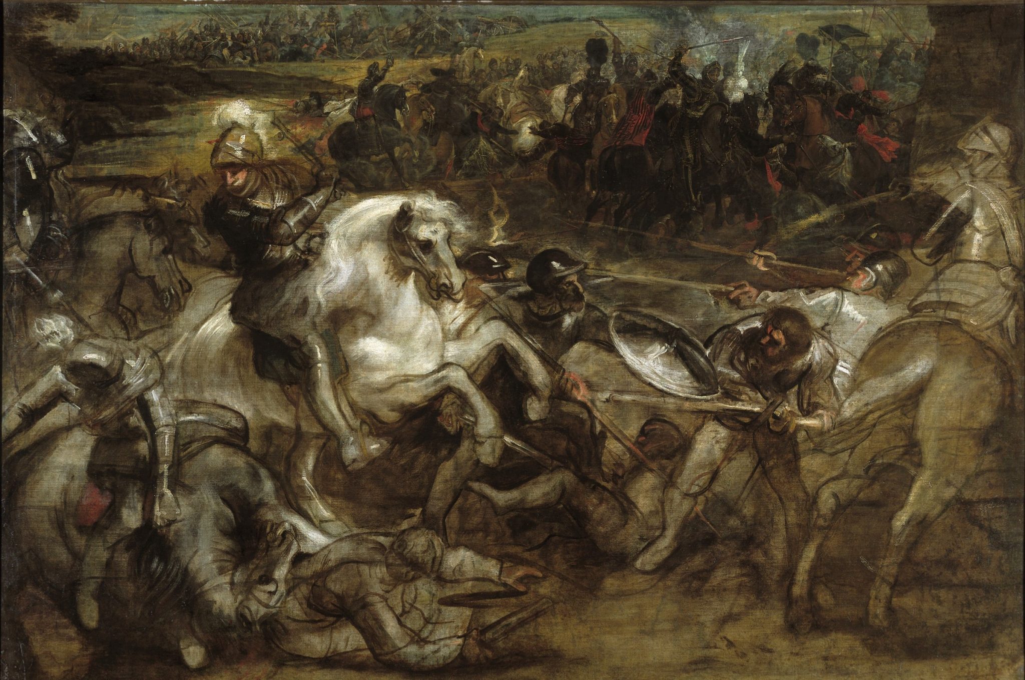
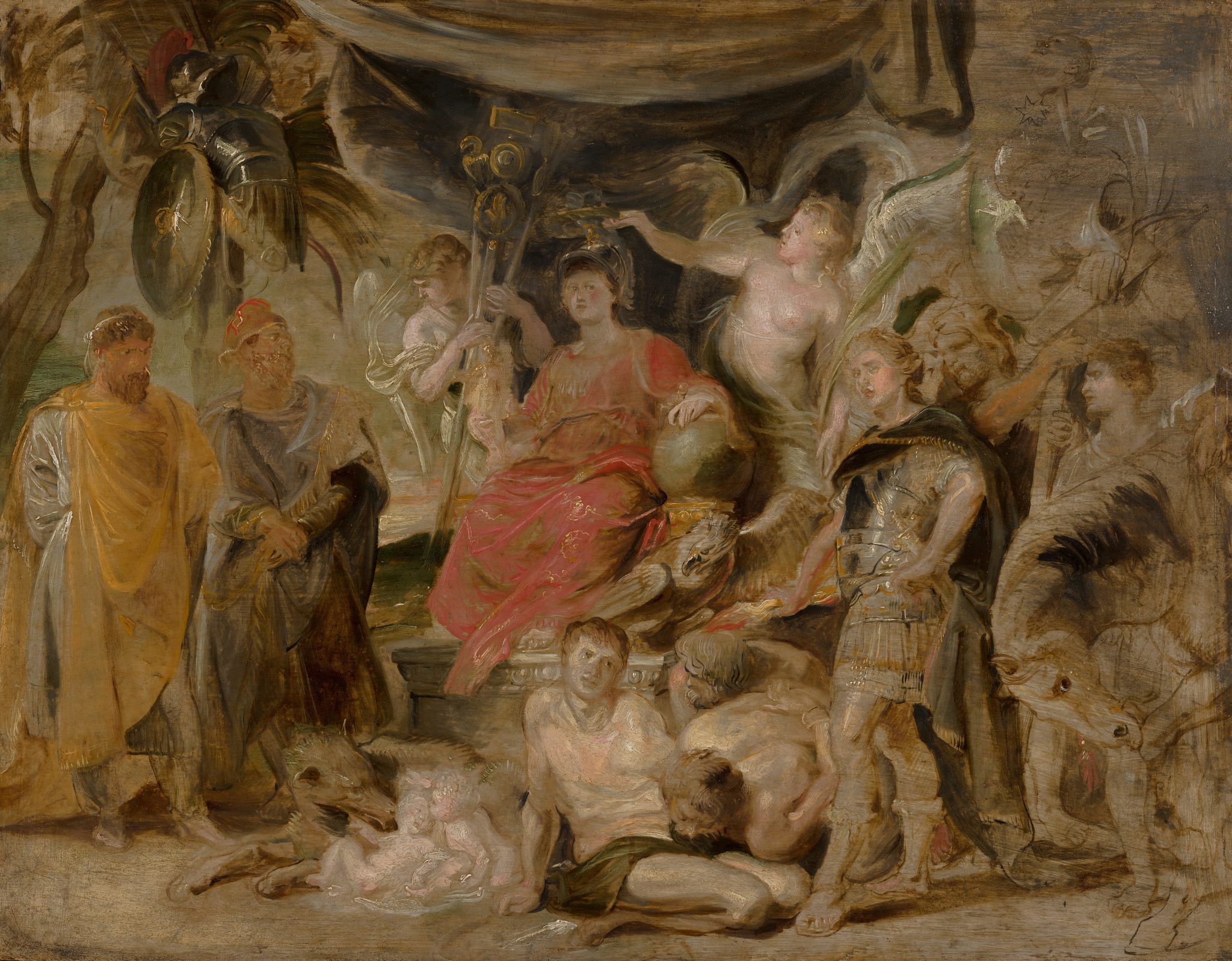
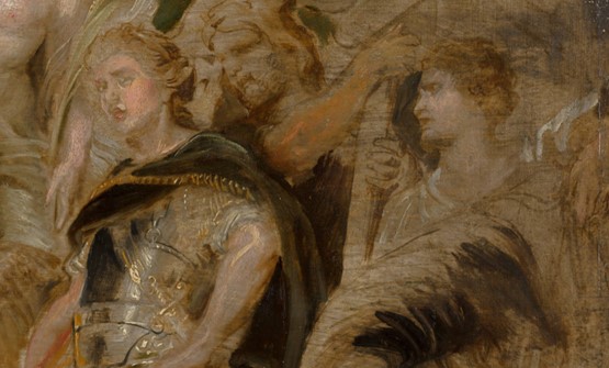
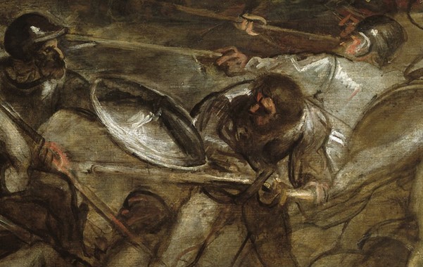
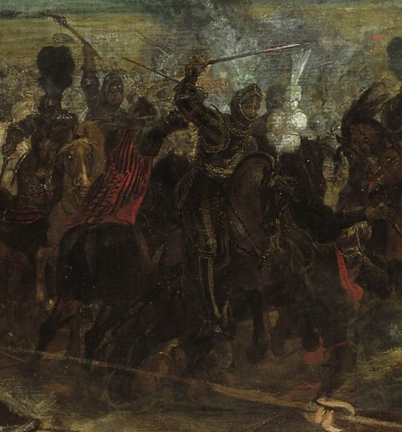
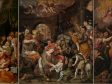
For the dead-color phase, artists used two strategies, both of which are recommended in contemporaneous sources. One was to set up the dead color on top of the colored ground in a rather liquid, monochrome paint, typically in a dark color, sometimes involving rough indications of the main color areas in the painting. This type of dead color is often referred to as an “oil sketch” in art historical literature. A gray or brownish colored ground could act as a midtone in this phase, as seen in an unfinished painting by Rubens, Henry IV at the Battle of Ivry (fig. 8), which offers an example of what a painting might look like at this stage. The painting shows how Rubens first indicated the main shapes with thin brown paint that he applied directly onto the gray ground—for instance, in the falling soldier on horseback in the foreground (fig. 9). The gray ground acts as a midtone and sits between the rough indications of highlights and shadows in the slightly more worked-up areas, where Rubens added some indication of color. The technique that is so clearly visible in this painting was also used by other artists in the Northern Netherlands, as discussed in the articles by Petria Noble, Anne Haack Christensen, and Marya Albrecht and Sabrina Meloni in this issue.28 The background, for which Rubens engaged his colleague Peter Snayers (1592–1667), is in a relatively advanced state of execution—in line with the advice voiced in contemporaneous sources to develop the composition from back to front—and here the gray ground is covered to a higher degree (fig. 10).29
The second strategy consisted of preparing areas locally for the color they would receive in the next phase: the opwerken or opschilderen. To this end, a painter would typically apply monochrome areas of color, effectively blocking out any influence of the colored ground. Such monochrome underpainting was only applied in areas where the ground tonality might disturb or weaken the effect a painter aimed for. Because the colored ground would remain on view in surrounding areas, the painter could still use it to harmonize the tonality of the painting. As a base tone, a colored ground has a subtle influence through its visibility in transitions between still life and background, for instance, or between the leaves of flowers.
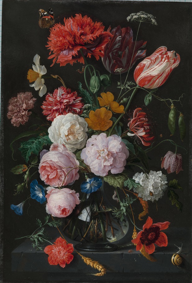
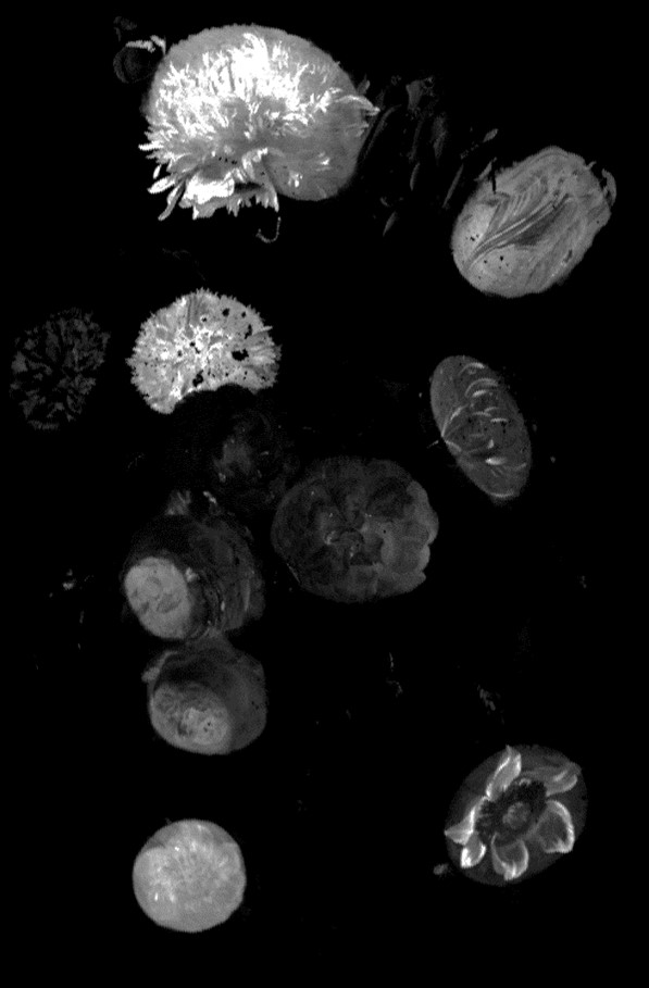
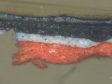
Arie Wallert draws attention to Gerard de Lairesse’s (1641–1711) advice for monochrome dead coloring for landscape painting (published 1712). De Lairesse recommends using cheap pigments in blue underneath the sky (indigo and white) and in gray or green for the area that was to become the landscape (umber and white or lamp black and light ocher).30 As Melanie Gifford points out, mannerist Flemish artists frequently used three zones in the underpainting stage: a brown foreground and a green middle zone, with light blue in the distance.31 Examples of this technique in flower still life painting are discussed by Nouchka de Keyser, who demonstrates how artists like Jan Davidsz. de Heem (1606–1684) applied oval-shaped local underpainting below their flowers. These local underpaintings were flower-specific: vermilion below red flowers, ocher below yellow flowers, and lead white ovals for white flowers. While largely covered in the finished painting, these oval underpaintings can be revealed through non-destructive investigative techniques like macro X-ray fluorescence scanning (MA-XRF), which can show where a chemical element is present. The location of vermilion, used for the underpainting of red flowers, is revealed by the presence of chemical element mercury (Hg) (figs. 11 and 12).32
The more finished background in Rubens’s Henri IV (see fig. 10) gives insight into what a painting might look like in the second stage of working up (opwerken). In this phase, the figures, buildings, and main details are executed in color. Rubens used warmly colored glazes to create the deeper tones, a step called verdiepen (deepening) in contemporaneous sources. He also added lighter, opaque scumbles, an action described as verhoogen (raising) in those same sources, to complete the illusion of three-dimensionality. With the working up finished, a painting appeared complete, or nearly so.33
Paints were typically allowed to dry between all three phases, as wet-in-wet application would result in the smearing of lower layers, destroying the depth and purity of the tones. The layered-ness of these paintings means that the stages can be distinguished in paint cross sections, where they are visible as distinct lines of color that sit on top of each other (fig. 13). However, all three stages are not always present throughout a painting. In more openly or sketchily executed works, an artist could choose to leave visible areas belonging to the dead color phase or even the ground itself.
The above description of how the color of the ground played a role throughout the painting process of a seventeenth-century artist shows how this color assisted and influenced a painter in establishing the division between light and dark. Furthermore, the ground color acted as a touchstone for the tonal values throughout all stages of the painting process.
Reconstructions to Investigate the Role of Ground Color Within the Layer System
Reconstructions are a tested way to investigate the workings of historical materials as well as the need and reasons for the particular processes artists used in painting, as discussed in depth in the essay by Maartje Stols-Witlox and Lieve d’Hont in this issue.34 They are of particular relevance in the investigation of colored grounds. As discussed earlier, the seventeenth-century system of layering differed significantly from fifteenth- and sixteenth-century methods (see figs. 1 and 2), and these differences influenced not only the visual appearance of the finished painting but also what painters saw while developing their compositions, and thus what they responded to in each consecutive stage of the painting process. The influence of the ground color differed in each stage of painting.


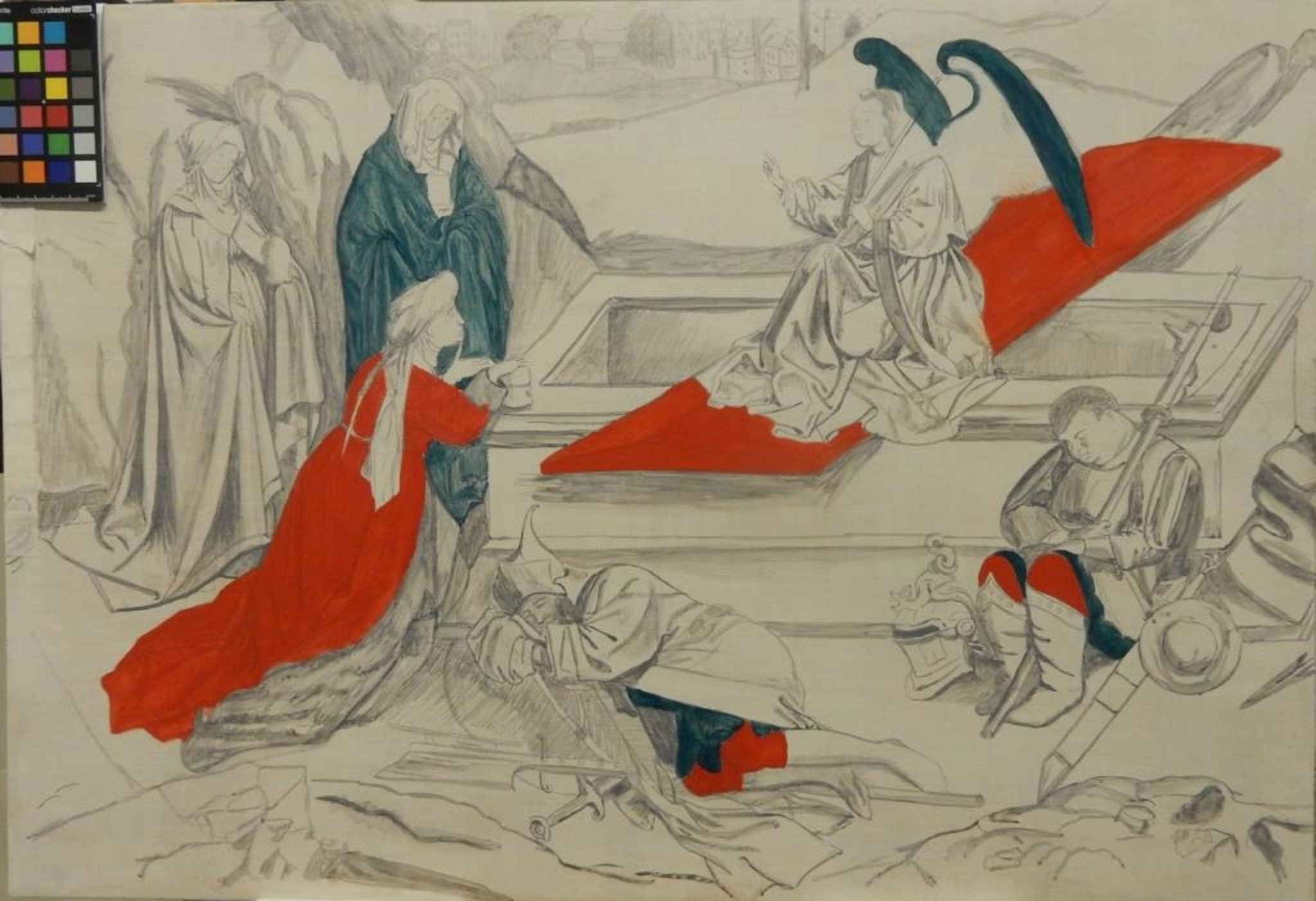
The way that reconstructions help investigate this phenomenon can be illustrated with a comparison between a painting executed on a white ground, using Eyckian methods, and the building up of a painting according to seventeenth-century practice. In her step-by-step reconstruction, Indra Kneepkens retraces the execution of Jan and/ or Hubert Van Eyck’s Three Marys at the Tomb. On the white ground (fig. 14), the underdrawing was applied (fig. 15), followed by an unpigmented isolation layer. The painting was then slowly built up in multiple layers, from opaque base tones to more transparent glazes in the final layers of the painting. To gain the required depth of tone, the glazes were applied in multiple layers, as a single thick layer would not dry without wrinkling, cracking, or even dripping down the paint surface. This reconstruction also shows that every section of the painting has its own distinct buildup: various shades of red below the red draperies, blues below the ultramarine glazes of Mary’s dress, and pale yellow and orange as base layers for the coat of the sleeping guard in front of the tomb (figs. 16, 17, 18, 19 ).
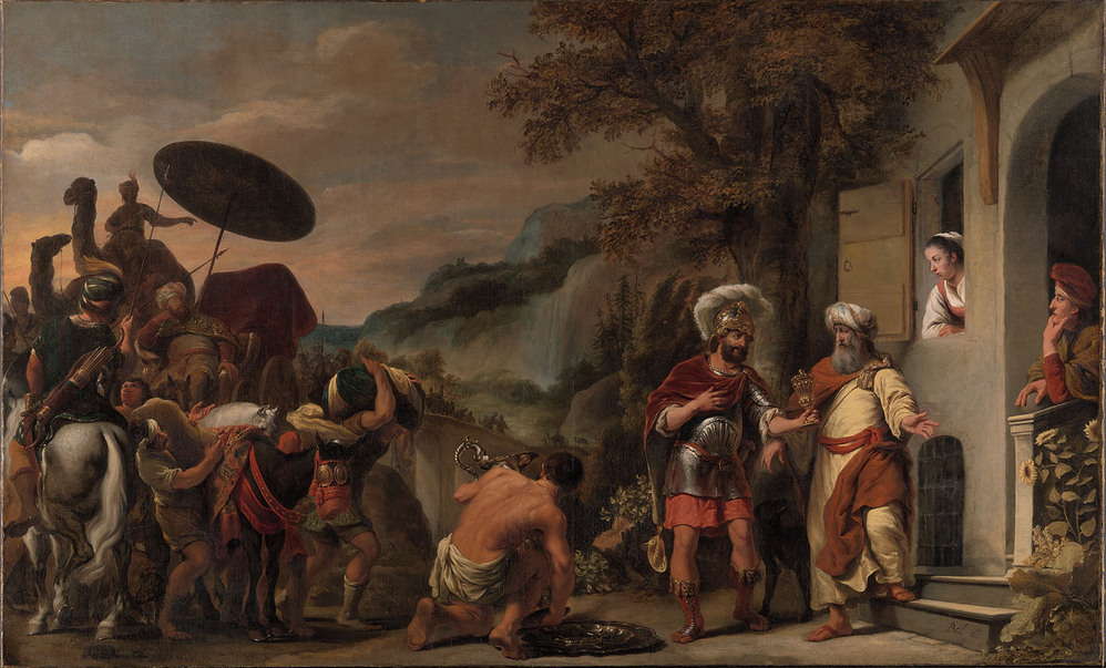
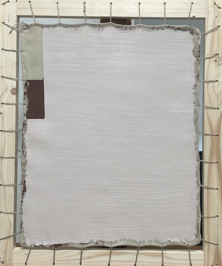
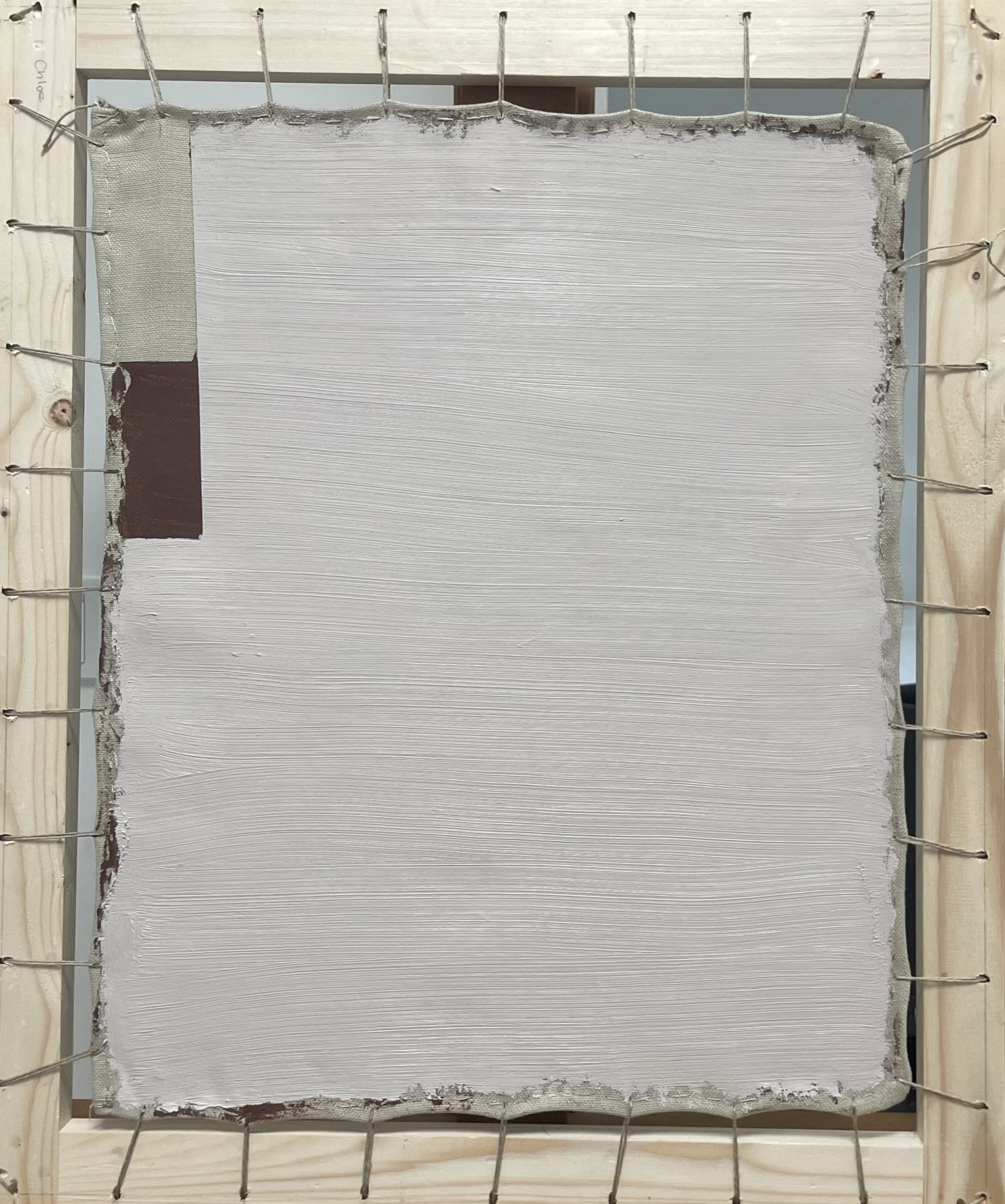
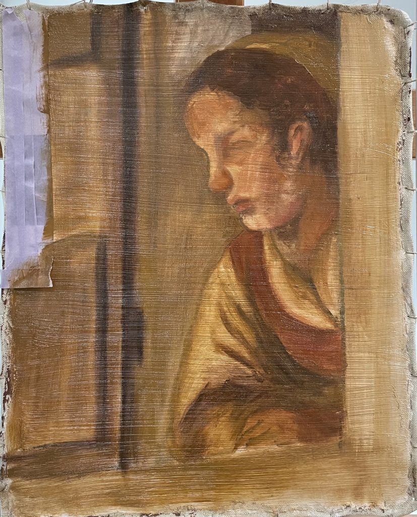
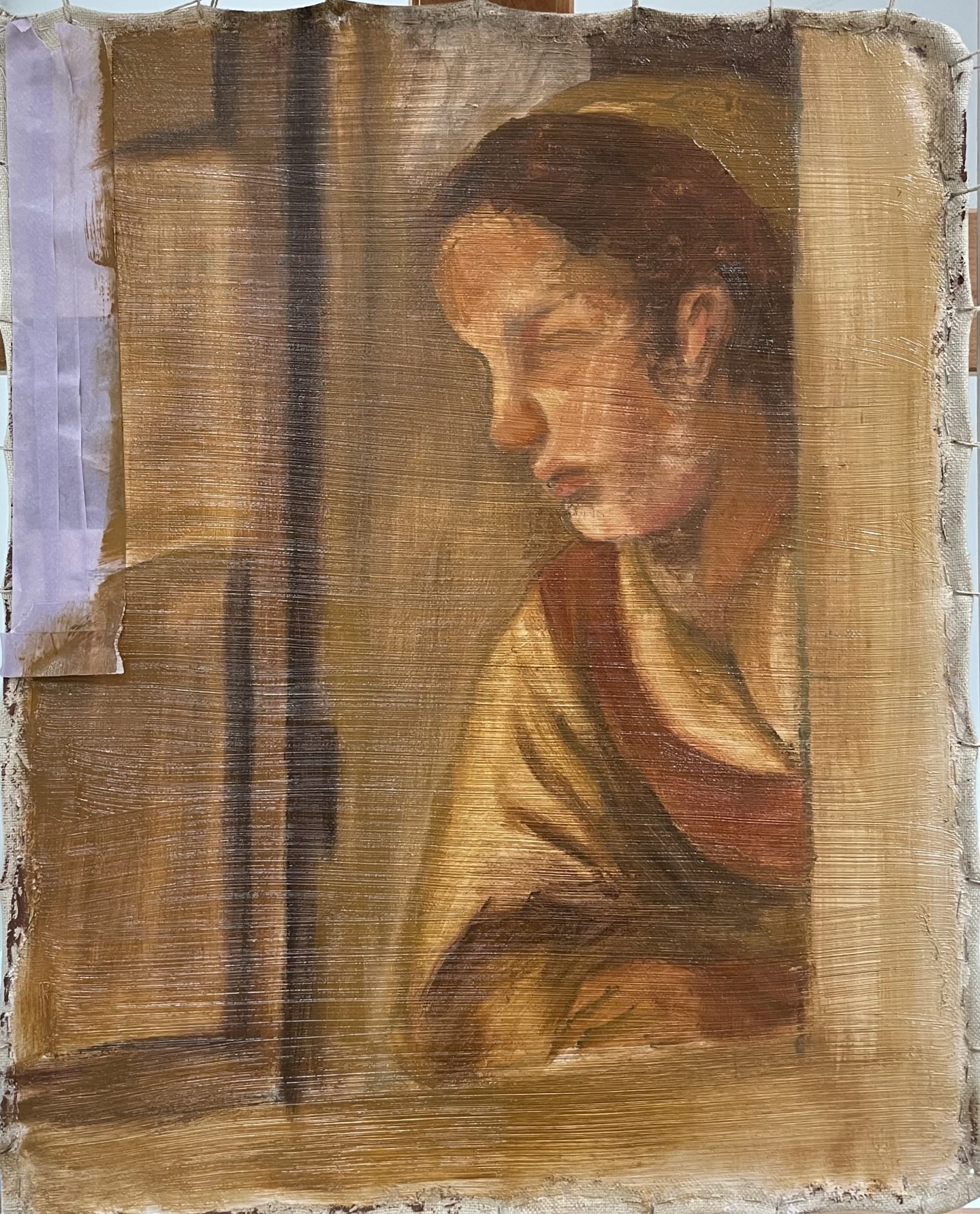
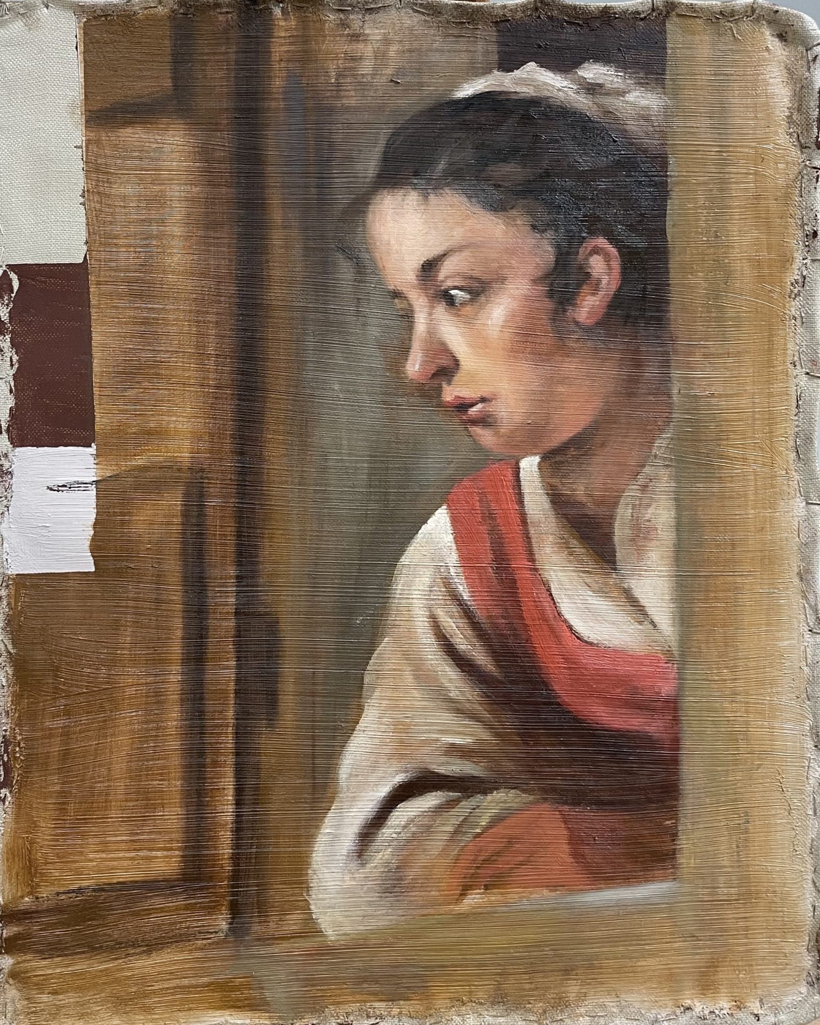
The Eyckian methods stand in strong contrast to the buildup of Ferdinand Bol’s large Elisha Refusing the Gifts of Naaman from 1661 (fig. 20). A reconstruction by University of Amsterdam Conservation and Restoration student Chloe Chang of a section from this painting (the girl leaning out of the window on the right-hand side of the large canvas) shows how a harmonious tonality can be created by making use of the gray ground and brownish dead color (figs. 21–24). Bol worked on a canvas covered with a ground consisting of two layers, a first red layer and a second gray one (fig. 21). After sketching out the most important elements in the composition with a painted underdrawing (fig. 22), Bol applied the dead coloring in a warm gray for the main contours and lights/ darks, reinforced with some roughly indicated color areas (white, some skin tones, and the midtone of the red bodice; (fig. 23). In the working up, he gave the painting its details, and most of the ground disappeared beneath opaque skin tones, dark hair, and the highlights and shadows in the girl’s dress. Not everything was covered, though; Bol allowed the ground to shine through in the architecture and in transitions between midtones and shadows (fig. 24). The difference between fifteenth-century and seventeenth-century methods is very clear when we compare how light areas are created. Bol made the white of the girl’s skin and clothing using thick applications of opaque lead white, while Van Eyck created the light skin tones with thin layers only partly covering the white ground. In the Bol reconstruction, the grayish brown of the ground and the dead color retain a visual function in the final painting, contributing to the harmony and balanced tonality that was considered so important in Dutch seventeenth-century art.


The Study of Colored Grounds in Netherlandish Art of the Sixteenth Century
Colored grounds became ubiquitous in seventeenth-century Netherlandish art for reasons that are explored in the essays in this issue. However, in the Low Countries they have a story that goes back to the first decades of the sixteenth century. That story is interesting and important in its own right, but it also contextualizes the developments in the seventeenth century—the focus of the present issue. Very little has been written on colored grounds in sixteenth-century Netherlandish art. For lack of data and detailed study, just how and when colored grounds reached the Netherlands is still not entirely clear. We now understand the journey to be more complex and circuitous than was initially thought.
Until now, the most influential publication on the origin and development of colored grounds in Netherlandish art was the article by art historians Hessel Miedema and Bert Meijer published in 1979.35 As noted above, the nature of this essay was largely exploratory due to the paucity of technical data. The article’s most important suggestion—that the practice of painting on colored grounds traveled from Italy to the Netherlands—has not been seriously questioned until recently. Miedema and Meijer argued that painting on colored grounds followed from an interest in new stylistic developments that Dutch artists had encountered in Venetian art around 1500. These developments constituted a move away from the use of more localized colors toward a preference for tonal harmonies, which was appreciated as a closer approximation of the visual experience of reality.36
Miedema and Meijer also observed that Netherlandish artists did not merely copy the existing technique of painting on colored grounds. Instead, they described how Dutch artists gradually found their own ways of achieving tonal color harmonies. Artists working between 1560 and 1590 still painted on traditional light-colored grounds. For tonal harmony, they relied on the selection of pigments, buildup of layers, and paint application (fig. 25).37 Painters operating between 1580 and 1610 were the first in the Low Countries to work regularly on more strongly colored grounds on canvas (fig. 26).38 They too were interested in tonal harmony and sought to achieve a natural spatial effect of figures and objects in the ordinantie (ordinance): the composition of a scene on the flat surface and in the suggested space at the same time.39 Like their predecessors, they did not significantly change their manner of painting, making use of the tinted ground mainly in the contours, instead of following the broad manner of the Italians. Only the fourth generation of Netherlandish painters, including Rubens and Rembrandt, fully exploited the Italian combination of open brushwork with impasto and glaze over a tinted underlayer.40
In the decades after the publication of Miedema and Meijer’s article, the nuances of its argument were lost, and the notion that colored grounds came from Italy and moved north gradually evolved into a widely accepted (if somewhat vague) article of faith. It was never seriously challenged, notwithstanding the fact that more recent research indicates alternative routes by which artists may have discovered the potential of colored underlayers. In her examination of the painting technique of Hieronymus Bosch (1440–1516), for example, Abbie Vandivere found that on his white grounds, Bosch sometimes locally applied gray layers.41 This allowed Bosch to work quickly and efficiently, especially in his landscapes, houses, and flesh tones.42 In other words, Bosch and presumably other Netherlandish painters working around 1500 were aware of the advantages of working on a tinted surface without ever having traveled to Italy. It is possible that they inspired subsequent generations. Studying paintings of anonymous Antwerp followers of Bosch and Pieter Breugel the Elder (1526–1569), Anne Haack Christensen and others suggest that Bosch, Bruegel, and their followers are the precursors to Rubens’s practice of working on a streaky imprimatura applied over the first ground, with this pigmented layer providing a specific overall tonality to the final image.43
The sixteenth-century Northern interest in and awareness of how colored grounds could enhance three-dimensional effects fit within a broader interest in toned supports. Iris Brahms has studied the use of colored paper across Europe, a practice that started as early as the fifteenth century. She points out that artists used colored paper as a midtone in drawings as an efficient way to suggest space and maintain tonal unity.44 Although the technique is largely different—the dead coloring stage of painting is absent in drawing—the function of the colored surface to modulate transitions between highlights and shadows in drawing is similar.45 The precise relationship between drawing and painting on a colored surface awaits further exploration.
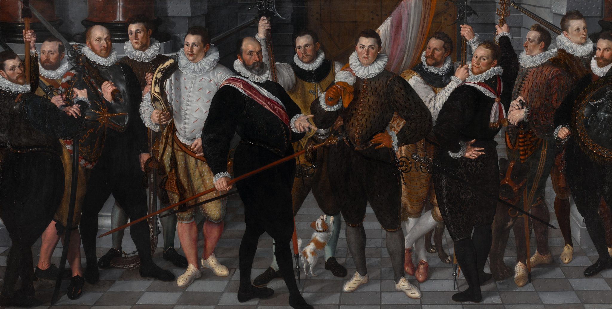
While the developments in the spread and use of colored ground in sixteenth-century Northern European art still need thorough examination, recently much work has been done on Netherlandish (mostly Dutch) painting between 1580 and 1650, notably by Moorea Hall-Aquitania in her dissertation “Common Grounds: The Introduction, Spread, and Popularity of Coloured Grounds in the Netherlands, 1500–1650.”46 Hall-Aquitania is the first to challenge the largely unquestioned primacy of the Italian narrative, as well as the assumption of a linear technical development with a single point of origin. The earliest painting on a strongly colored ground in the dataset that she compiled for her study is Cornelis Ketel’s The Company of Captain Dirck Jacobsz Rosecrans and Lieutenant Pauw (1588; fig. 27).47 Ketel never traveled to Italy, but he—like other early adopters, such as Cornelis Cornelisz van Haarlem (1562–1638) and Abraham Bloemaert (1566–1651)—did reach the French court at Fontainebleau, another sixteenth-century center known for the use colored grounds.48
Based on Hall-Aquitania’s recent work, there can be no doubt that knowledge of local practices, attentiveness to foreign traditions, a sense of experimentation, an interest in open brushwork and in tonal harmony, and an awareness of the efficiency of colored surfaces as a basis to paint on all played their part in the spread of colored grounds. What was needed for colored grounds to become ubiquitous was a stimulus to upscale the new and still-experimental practice. As Hall-Aquitania writes, the unparalleled development of a market for paintings between 1580 and 1625, in combination with a taste for a new kind of realism, provided the final push for the hidden revolution of colored grounds in seventeenth-century Netherlandish art.49 This is confirmed by the contributions to this special issue.
The Special Issue
The eight articles in this special issue can be read independently, but they also have a cumulative value because their topics interlock. Together they offer broader insights into the historiography of colored grounds, how artists and their suppliers exploited the optical effects that colored grounds made possible, and the methods that art history can employ to trace the impact of this revolutionary innovation.
Reviewing published literature on colored grounds in seventeenth-century Netherlandish painting, Elmer Kolfin argues that the introduction of colored grounds made possible a special kind of realism that eventually became canonical in the reception of Netherlandish painting of the seventeenth century. In her discussion of colored grounds in French art before 1610, Stéphanie Deprouw-Augustin explores the wide variety of colored grounds French artists employed in mural and easel painting long before their Italian and Netherlandish peers, a situation that complicates the hypothesis developed by Miedema and Meijer that colored grounds traveled from Italy to the Netherlands. Her research shows that an alternative suggestion by Miedema and Meijer merits our attention: to take Fontainebleau seriously as another possible origin for the development of colored grounds in Netherlandish art. Focusing on the impact of professional primers on local artistic practice and how the relationship between artist and supplier contributed to the rapid spread of colored grounds, Hall-Aquitania sheds light on the crucial role of professional primers in the development and spread of colored grounds in the Netherlandish seventeenth century.
The next three articles are case studies that represent the impact of colored grounds on the techniques and visual appearance of seventeenth-century painting. They demonstrate the variety of ways in which colored grounds were used by different artists across genres and also within the oeuvre of single artists. Petria Noble’s contribution on Rembrandt describes his use of different types of grounds throughout his oeuvre and traces the relationship between ground color, style, and pictorial effects within this master’s body of work. Sabrina Meloni and Marya Albrecht’s contribution focuses on the genre of still life painting, following from a comprehensive study of the still life paintings in the collection of the Mauritshuis (The Hague). Their article studies the use of locally available grounds, particularly a special category of dark, near-black ground layers. Anne Haack Christensen discusses the relationship between representation and reality in the oeuvre of Cornelis Gijsbrechts (1625–1675) by comparing Gijsbrecht’s actual practice with the primed canvases that he depicted in some of his trompe l’oeil still lifes.
Databases proved to be a crucial tool in Hall-Aquitania’s doctoral research on the development and spread of colored grounds, as they help to identify trends over time and geography. The innovative database she developed with Paul J. C. van Laar is one of two methodology-focused articles in this issue. Introducing the database and explaining its construction, the authors show how technical art history benefits from digital tools and how strategies to incorporate data of variable quality and age can be a model for future comparative research projects.50 The second methodological reflection, authored by Maartje Stols-Witlox and Lieve d’Hont, takes two case studies, one on the ubiquitous gray-over-red double ground and one on a highly exceptional black ground. This article argues for the effectiveness of reconstructions as a method of art historical inquiry that helps to answer questions about style, pictorial effect, and artistic motives.
Individually and combined, the articles demonstrate why colored grounds were so important in Netherlandish art and how their study enlightens us on broader art historical developments. There is still much to discover and learn about the topic of colored grounds. The editors of this special issue hope that the essays will help JHNA readers look more deeply into the layers of paintings and their effects on the surface, and that it will stimulate further research and deeper understanding of the hidden revolution of colored grounds in seventeenth-century Netherlandish art.


