This essay presents observations on the distinctiveness of Protestant and Catholic literary practices and identities in the seventeenth-century Dutch Republic. Inspired by Catholic emblematists from the Southern Netherlands, Dutch Catholics as well as Protestants employed the religious emblem as a means of bolstering their faith and shaping their identity – but never at the same time, and never in the same manner. The religious emblem was at first claimed by Protestants such as Jacob Cats. After 1635, it was appropriated by Catholic authors such as Jan Harmensz. Krul and Everard Meyster. As the genre was reappropriated by Protestants such as Jan Luyken in the 1680s, Dutch Catholics moved away from the emblem to express their identity in new and exclusively Catholic genres such as soberly illustrated prayer books. Production of Dutch emblem books occurred in the same social and cultural isolation as clandestine Catholic church art, indicating that no sharing of visual practices and media took place among denominations in the Republic.
In 1658, De kruysleer ter zaligheydt (The Doctrine/Ladder of the Cross Leading Towards Salvation) (fig. 1), a religious emblem book conceived by Everard Meyster, was published in Amsterdam by Cornelis de Bruyn. Meyster was an aristocrat from Amersfoort with an openly Catholic affiliation. This confessional orientation is manifest in every detail of De kruysleer ter zaligheydt. Here Meyster embraced the genre of the religious emblem as it had developed in the Catholic Southern Netherlands shortly after 1600, a genre in which devotional prints were utilized as instruments of Christian meditation and contemplation. The four picturae of Meyster’s emblems as well as the title engraving of De kruysleer ter zaligheydt are all based on the Regia Via Crucis (fig. 2) of the Benedictine monk and theologian Benedictus van Haeften, first published in the Southern Netherlands in 1635 with the purpose of providing the reader with a solid understanding of the significance of the Stations of the Cross, and thus inspiring imitation of Christ’s example by offering pictorial stimuli with which the readers could visualize the scenes.1
The readers of the De kruysleer ter zaligheydt were invited to see themselves as present in this scene: “God! Seal our ears, yea, bind us to the mast † of Your cross; so that no hellish monster can take our soul by surprise with the sweet sound of its endless kingdoms †, which he presents to be as lovely as they are false.”2 To van Haeften’s original composition, Meyster’s (unknown) engraver added the figure of Christ on the sail, to suggest that those in the boat are being watched by Christ. The emblematic images and their appeal to the readers’ abilities to imagine themselves as participants in the events depicted were used by Meyster to kluyst’ren (chain) the readers’ thoughts to the search for God; they were meant to summon their memory, imagination, and will, to make their souls turn toward God.3
All of the crosses in van Haeften’s images were replaced by ladders in De kruysleer ter zaligheydt. The ambiguity of the volume’s title, in which reference is made to both the doctrine and the ladder of the Cross, is visually enhanced by this pictorial adaptation. Besides being a central motif in every pictura, the ladder is also a structuring principle for all the texts: each of the fifty-two weeks of the year has its own leer (meaning rung, but also teaching), and climbing those rungs leads the soul toward God.4 In its ascent, the soul is exhorted: “Well, soul! Are you already tired after having climbed so little †, only halfway up the ladder [doctrine] of salvation? Ay, you must not fall asleep, not even for a little bit † keep climbing higher, and you will be freed from all burdens.”5 Furthermore, the schematic representation of the three steps, hope, love, and faith, that will lead the reader to heaven is also based on the image of a ladder.6
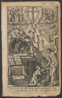
Even though Meyster replaced van Haeften’s crosses with ladders, he emphasized the importance of the original motif by adding little engraved crosses to almost every line of the printed text. In doing so, he enforced the pivotal role that the pictorial motif of the cross – almost never used in Dutch Protestant religious emblems at the time – played in the religious emblematics of Southern Netherlandish authors.7 The title engraving of the Jesuit Adriaan Poirters’s Het duyfken in de steen-rotse (Little Dove in the Cleft of the Rock) (fig. 3), for instance, published in Amsterdam a year prior to Meyster’s De kruysleer ter zaligheydt, was covered with various representations of the cross. A cross is offered to the kneeling girl, a representation of the human soul, and a stream of crosses rises up to heaven, where they form a large cross made of little crowns.
In the Southern Netherlandish context, Meyster’s De kruysleer ter zaligheydt was by no means an exceptional phenomenon. Comparable religious emblem books had been published in the Southern Netherlands since the start of the seventeenth century. Southern Netherlandish Catholics, and especially Jesuits, deployed the genre as a tool to enhance the communication between God and the believer. To this end, a special iconography was developed to supply readers with an aid for meditation and personal contemplation by stimulating their visual faculties; characteristics of this iconography have recently been analyzed by art historians such as Ralph Dekoninck and Walter Melion,8 who show that the images in these emblem books visualize what the accompanying meditative texts describe. In response to the texts, viewers were encouraged to identify directly with the depicted figures, to consider the figures as representing themselves. Images were understood to engage the cognitive and affective faculties of mind – will and desire – a process by which one could get to know his or her own soul, enabling the soul to refashion itself. The constant interaction between image and word in these prints was intended to guide viewers’ meditative exercises. This use of images proceeded from complex theories on visuality and the applicability of sight in religious matters that were widespread at the time. Among the many Southern Netherlandish emblem books, Jan David’s Veridicus Christianus (The True Christian) (1601), Otto Vaenius’s Amoris Divini Emblemata (Emblems of Divine Love) (1615), and Herman Hugo’s Pia Desideria (Pious Wishes) (1624) achieved the most popularity, influencing literary traditions in many European countries.9
But while religious emblematics flourished in countries such as England, France, and Germany, stimulated and inspired by these Southern Netherlandish models, the religious emblem based on this Catholic model was initially avoided by the Dutch as a result of Protestant opposition to the use of religious imagery. Although the genre of the emblem was one of the major types of visual expression in the Republic, Dutch religious emblematics based on the Southern Netherlandish example only began to thrive toward the end of the seventeenth century, when a new impetus was given to the genre in the work of Jan Luyken. (His Jesus en de ziel [Jesus and the Soul] of 1678 was thoroughly modeled on Herman Hugo’s example.10) Meyster’s early interest in the genre can perhaps be linked to, or explained by, his publisher’s orientation toward the international market. Cornelis de Bruyn had produced several Dutch translations of English and German adaptations of Catholic meditational texts before producing Meyster’s De kruysleer ter zaligheydt.
The aim of this article is to shed light on one specific feature of this ambivalent attitude toward the religious emblem in the Republic by focusing on Dutch Catholic appropriations of the genre. How did Dutch Catholic emblematists such as Meyster appropriate and adapt a genre that had such specific Catholic connotations while operating in a literary field dominated by Dutch Protestants, given all their objections to the religious emblem?
My observations are meant to supplement the conclusions drawn by Xander van Eck in his book on hidden churches, Clandestine Splendor. According to van Eck, the art for the clandestine churches in the Republic was based on “a relatively limited repertoire of images, with subjects generally being confined to scenes from the life of Christ, the Passion, and the life of the Virgin Mary.” This art was mostly created by prominent artists who supported the Catholic faith themselves: it was commissioned by Catholic patrons who valued the artists’ doctrinal affiliation over their skill and talent.11 My question is whether the production of Catholic emblems was also organized along denominational lines, in the sense that the subject matter and producers of these emblems were likewise restricted to Catholic traditions and agents.
Van Eck’s conclusion opposes the common notion that in the (relatively) tolerant Republic, iconographic traditions and visual practices were more or less freely shared among Protestants and Catholics. Rembrandt’s etching The Death of the Virgin, created in 1639, has often served as a prime example of the process of sharing that was presumably widespread in Dutch culture. The deathbed scene is not taken from the Bible, but from Jacobus de Voragine’s medieval Legenda aurea (Golden Legends). Rembrandt thus appropriated a pre-Reformation, Catholic tradition in a predominantly Protestant society and this appropriation clearly left its mark on the end result, as Shelley Perlove and Larry Silver have recently maintained. Rembrandt practiced self-censorship in creating the deathbed scene: he left out the cross and candles, elements of the Catholic iconographical tradition that were openly opposed by Dutch Protestants in the 1640s.12 The mixture of Protestant and Catholic features evident in this etching has recently led Mary Christine Barker to conclude that “Rembrandt transcends the religious categories of his own times and those that our time has attempted to impose on him.”13 Not only Rembrandt but other artists appropriated Catholic traditions and adapted them to suit the needs of a Protestant audience. But how then did Dutch Catholics respond to this invasion into their cultural domain?
Van Eck’s assessment of the cultural separation of Dutch Catholics supports Charles Parker’s recent argument that, although the freedom of conscience proviso in the Union of Utrecht (1579) gave Catholics in the Republic the liberty and protection that confessional minorities in other European countries lacked, the practice of the Catholic faith was more restricted than some scholars have thus far presumed. According to Parker a “structure of intoleration, harassment, and exclusion” seems to have characterized the life of Catholics in the “Holland Mission.”14 Because the Eighty Years’ War against Spain brought with it the bloody persecution of Protestant heretics by the Spanish, Dutch Catholics were looked upon as potential enemies in the first half of the seventeenth century. As a result, Dutch Catholics ended up in social and cultural isolation for the duration of the century, according to van Eck and Parker.
Several other scholars, however, have argued that the authorities embarked on a new course for dealing with religious differences after the Peace of Münster in 1648. According to Jo Spaans, Judith Pollmann, and others, after 1648 a concerted effort to maintain equilibrium developed between the main public church, several smaller Protestant movements, and the large minority of Catholics.15 Only during the last quarter of the seventeenth century did Catholic doctrine, and in particular its Jesuit variety, again become hotly disputed in the Republic. John Marshall, for example, in his study John Locke, Toleration and Early Enlightenment Culture, mentions the growth of anti-Catholicism in the Netherlands after 1680 as a reaction to the atrocities perpetrated by Catholics against the Huguenots in France (and, earlier, against the Waldensians in Italy) and to the coronation of the Catholic James II in England in 1685.16 Maarten Prak has shown that this growing antipathy led to the enforcement of anti-Catholic legislation in parts of the Republic during the last quarter of the seventeenth century, since the Catholics still posed a threat in the south, and new threats were arising in Münster.17
What can be said about Dutch Protestant treatment of Catholics during the seventeenth century if the literary culture of the Republic is taken as the point of departure? The scope of this article does not allow for a detailed answer to this question. I will focus on just a small segment of Catholic literary production by examining and comparing – in broad terms – the dominant Protestant religious emblem tradition to the developments in religious emblematics among Dutch Catholics between 1600 and 1700. In line with van Eck’s conclusions, I will argue that in this specific domain, the realm of religious literature, Dutch Catholics operated from just as isolated a position as the painters for the clandestine churches. In their clandestine churches, but also in their literature – which was more visible to Protestant eyes – the Catholics kept aloof from the Protestants for the duration of the century. The Protestant production of religious emblems never coincided with Catholic exponents of the emblematic genre in the seventeenth-century Republic.
Protestant Emblem Production Before 1658
As I have argued elsewhere, wide acceptance of Catholic emblematic iconography among Dutch Protestants was delayed until the 1680s owing to opposition by influential figures in the Dutch Reformed Church who were guided and limited by restrictive views regarding the use of religious imagery that were inspired by Calvinist theology.18 They not only obstructed the appropriation of Southern Netherlandish emblematics by Dutch Reformed authors, but they also affected the opinions of authors from other Protestant denominations.19 Despite these hindrances, even for Dutch Protestants the idea of providing religious edification through the emblem had its appeal. Attempts to make productive use of the genre on acceptable terms were made by Protestants from various denominations throughout the seventeenth century, resulting in a compromise: only elements from secular iconographic traditions could be used in Protestant religious emblems up to the 1680s.
The Dutch Reformed publisher Dirck Pietersz. Pers initiated the Dutch religious emblem tradition when he issued a reprint of a Dutch translation of Gerard de Jodes’s and Laurens van Haecht’s Mikrokósmos. Parvus Mundus, first printed in Antwerp in 1584. The picturae of this volume show scenes from classical mythology, which were given a religious interpretation in accompanying texts, consisting of biblical quotes and explanatory verses. Pers changed neither the title of de Jode’s and van Haecht’s Dutch translation – De cleyn werelt (The Small World) – nor its content. In the preface to his 1608 reprint, he explained that he had been thinking about leaving out the biblical quotations in the 1584 edition, since he himself thought it wise “not to mingle the heavenly with the earthly.”20 Out of respect for the authors, so he claimed, he ultimately decided against removing the biblical quotations. The collection of emblems was again reprinted by Pers in 1613. This time a new title was assigned to the emblem collection, Den gulden winckel (The Golden Treasury), perhaps to indicate the changes he had made. The adaptations were only marginal, however: the biblical quotes were still included – this time without any editorial comment – and the new texts by Joost van den Vondel closely resembled van Haecht’s originals.21
The most successful attempt to set a standard for the Dutch Protestant religious emblem was made by Jacob Cats, five years after the publication of Den gulden winckel. In the picturae of what was to become the most popular Dutch emblem book, Sinne- en minnebeelden (Emblems and Images of Love) (1618), Cats presented representations of Dutch realia, as seen in many secular emblem books published at the time. Cats codified a format consisting of pictorial realia accompanied by didactic (rather than meditative) subscriptions. While avoiding distinctly religious iconography, he nevertheless conveyed a religious message emblematically, although the aims of meditation, visual stimulation, and the evocation of emotions remained absent. Cats did not mean his picturae to heighten the soul’s awareness of its own image-making power by inviting the viewers to visualize themselves as present in the scene. His images served instead as an aid to religious instruction by evoking instructive guidelines conveyed in the accompanying texts.22
Cats’s model was extremely influential, and deviations from that model were not cordially welcomed in the Republic. One example of the failure by Dutch Protestants to introduce the religious emblem by appropriating elements of Catholic iconography can be seen when Zacharias Heyns published his Emblemes Chrestiennes et Morales (Christian and Moral Emblems) in 1625.23 Even though Heyns reworked and adapted devotional imagery from the Catholic tradition, avoiding a meditative use of the images and emphasizing the dominance of the word of God over the images, his efforts resulted in little widespread acceptance of this kind of religious emblem in the Republic.
At an earlier stage, Heyns had also encountered resistance when he – most likely because he was following the example of illustrated French editions – included biblical illustrations in his Dutch translation of Du Bartas’s La Sepmaine (1579). When Heyns first published his translation in 1616, the engravings depicted anthropomorphic representations of God (fig. 4). These engravings, presumably made by (the young) J. Sweelink, who would also engrave the picturae for Cats’s Sinne- en minnebeelden in 1618, strongly resemble a series of etchings after the frescoes by Raphael in the Vatican Loggia. This series was first published in 1607 in the volume Historia del testamento vecchio, produced by Giovanni Orlandi in Rome (fig. 5). The original Catholic illustrations were reprinted by the Amsterdam publisher Michiel Colijn in his edition of the Historia del testamento vecchio (1614) without any adaptations. These were replaced by nonfigural elements in the second edition of Heyns’s translation published in 1621 (fig. 6).24
This adaptation was brought about, it appears, by a decision made between 1616 and 1621, at the Synod of Dordt, to produce a new Dutch Reformed Bible in which no imagery was to be included that could give erghernisse (offense).25 Biblical illustrations could be tolerated, according to Dutch Reformed views, as long as they did not include allegorical elements or anthropomorphic representations of God; these restrictions apparently applied not only to the Dutch Reformed Bible but also to other literary genres and to Protestant authors – such as Heyns – who were not affiliated with the Dutch Reformed Church. Biblical illustrations were tolerated because they were perceived as relatively comprehensible, literal representations of biblical stories, but emblematic imagery provoked fierce opposition among Dutch Protestants. Since emblematic, allegorical images were designed to look beyond what was visible, the chance of their misinterpretation increased, as this required human capacities to interpret visual stimuli, and they were regarded with great suspicion.26
In 1631, the very first Dutch Protestant emblem book with a specifically religious connotation and a meditative purpose, Emblemata Sacra (Sacred Emblems) by the Dutch Reformed minister Bartholomeus Hulsius, was published and produced in Frankfurt by Lucas Jennis. Hulsius was unable to find a Dutch printer willing to publish his work but found a good alternative in Jennis who produced an intriguing series of religious emblem books between 1617 and 1631 in his Frankfurt workplace: the Emblemata Nova/Emblemes Nouveau by the Catholic Andreas Friedrich, the Emblemata Sacra by the Lutheran Daniel Cramer and the Emblemata Sacra by the Dutch Reformed Bartholomeus Hulsius.27 Friedrich worked within the tradition of the Counter-Reformation and Cramer based his picturae on the medieval symbolic tradition of the sacred heart, which was well known in Germany, while Hulsius’s picturae show scenes from daily life as well as landscapes, combined with some allegorical elements. This last was a pictorial tradition established by Cats. In contrast to Cats, however, Hulsius intended his images to function as aids to meditation: they did not serve as (arbitrary) starting points for edifying moralizations but instead were meant to be studied for their specific meditative potential.
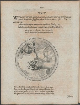
Hulsius explained that images were to be used in one’s “H. Meditatien” (holy meditations) throughout the day. To enhance their daily exercise he selected picturae depicting scenes from daily life.28 In emblem XXIX, for instance, the picture shows two hands being sprayed with water by a third hand reaching from the clouds (fig. 7). In the accompanying poem, Hulsius argues: “As seen in the hands depicted here: / If one [hand] washes the other, both are cleaned / Help your fellow human being and you will not regret it.”29
In the prose text following the poem, this advice is specifically applied to church members: by working together they can purify God’s church. Even though Hulsius’s picturae contained realistic elements rather than elements from religious iconographies, his images were meant to serve as stimuli for a meditative process, inviting the readers to see and feel their own hands washed by the water dripping from heaven.
Owing to the obstructive response of influential figures in the Dutch Reformed Church, further development of the religious emblem by Dutch Protestants was hampered. This resulted in the production of emblemata nuda (emblems without pictures) in the 1640s and 1650s.30 The brief glance here at the Protestants’ religious emblem production till 1658 paves the way for a discussion of its Catholic counterpart.
Catholic Emblem Production Before 1658
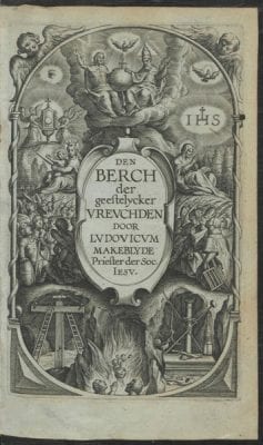
Cats’s initiatives in developing an idiosyncratic Protestant religious emblem were not counterbalanced by Dutch Catholic literary activities in the first quarter of the seventeenth century. Catholic religious literature, whether illustrated or unillustrated, was virtually absent from the publishing scene in the 1610s and 1620s. In a way, this reflected the state of the Catholic Church in the Republic: works by the Delft Jesuit Lodewijk Makeblijde, such as the richly, emblematically illustrated Den lust-hof der gheestelicke oeffeninghen (Pleasure Garden of Spiritual Exercises); Den hemelschen handel der devote zielen (The Heavenly Trade of Pious Souls); or Den berch der gheestelicker vreughden (Mountain of Spiritual Joys) (fig. 8), were printed in the Southern Netherlands rather than in the Republic perhaps because the Dutch Catholic Church had been declared a “mission field” by the pope. That is, the church trained missionaries (mostly priests) in the Southern Netherlands with the intention that they would enter the Republic with the goal of regaining Catholic control.
Given this situation, the Catholic iconography developed in the Southern Netherlands obviously encountered resistance in the Republic.31 The Amsterdam Catholic printer and publisher Paets was rather secretive about his own version of Hugo’s emblem book, Pia Desideria, with new woodcuts of the original engravings by Boetius à Bolswert, which he had commissioned from the famous Christopher van Sichem. The title page of Paets’s 1628 edition stated that the book was printed in Antwerp by Hendrick Aertssens. Paets could not openly publish his edition of Pia Desideria, so he forged a printer’s address in Antwerp, while secretly printing the volume in Amsterdam.32
In another compromise between the dominant Protestant tradition and his own agenda, Paets succeeded in exploiting the emotional potential of illustrated religious texts in a manner that was also acceptable to non-Catholics. In 1631 he issued a new edition of three tracts written by (Pseudo)-Augustine, titled Vierighe meditatien (Fervent Meditations), adding a selection of the woodcuts van Sichem had made for the 1628 edition of Pia Desideria.33 His purpose was not only to maximize the financial return of these woodcuts but also to introduce Catholic imagery in the Republic. To do this in an acceptable manner, Paets chose three tracts on the spiritual dimension of faith that had been previously printed in the Republic, in the 1620s, but in unillustrated Latin editions by the Amsterdam publishers Johannes Janssonius and Willem Jansz. Blaeu.34 To reach out to a wider audience, Paets published these tracts in Dutch, using a sixteenth-century translation. To illustrate the title page of the Vierighe meditatien, he commissioned a woodcut based on the title engraving of Janssonius’s edition of the tracts. The engraving visualizes the relationship between Augustine and God by rays of light connecting the two (fig. 9).
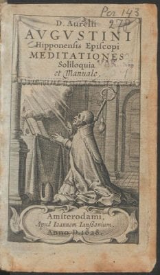
Paets’s production can be classified as low-risk, since no major investment was needed, and the title page showed an image that had already been presented to the Dutch audience on an earlier occasion. Also, Paets’s use of the Pia Desideria woodcuts was somewhat concealed: Hugo’s picturae were only visible when the Vierighe meditatien was opened. No mention of them was found on the title page. And the emblematic characteristics of the images were toned down because they were accompanied not by Hugo’s dense and obscure verse but by much more straightforward prose texts containing religious instructions rather than meditations.
In this instructional context, the similarities between Hugo’s iconography and the iconographical format presented in Cats’s Sinne- en minnebeelden are striking. Nevertheless, Paets minimized Hugo’s meditative reading of the realia even as he adopted Cats’s moralizing approach.35 Thus with the publication of the Vierighe meditatien, Paets tested the limits of freedom of expression. Apparently a Catholic volume of this kind – albeit not a religious emblem book like Pia Desideria – could be printed openly in the Republic in 1631.36
After the 1630s, the Protestants’ turn toward the emblemata nuda left the field open to Dutch Catholics. This cultural vacuum was filled by a Catholic publisher from Amsterdam, Cornelis Dircksz. Cool, who produced Jan Harmensz. Krul’s Christelycke offerande (Christian Sacrifice), a religious emblem book (partly) based on the iconography of Pia Desideria. The fact that Cool was also working in Amsterdam, a city known for its relative toleration with respect to Catholics, is significant here.37 In the 1630s, Krul had become popular through a number of song and emblem books that were basically moralizing in nature, although they did contain signs of Krul’s religious motivation – for example, in the preface to the Minne-spiegel der deughden (Mirror for Lovers of Virtue) dating from 1639.38 He took a more religious and Catholic approach in the Christelycke offerande, as is immediately apparent from the use of offerande (sacrifice) in its title, a word that up to that point had only been used in Catholic religious works published in the Southern Netherlands.39
In the preface to the Christelycke offerande, Krul addresses the Christelyken leser (Christian reader) in an irenic tone, articulating the wish that his readers will be moved to sacrifice a “fervent love of their heart in inner prayers” to Jesus.40 The images and their intended effect are nowhere mentioned in this preface. Krul only lists “Hymns, Christian Prayers and Rhymes . . . drawn from God’s Word,” as a means to stir up passionate love for God.41 Although it was not explicitly noted by Krul, he borrowed part of his texts as well as the ideas of some of his picturae from Pia Desideria. These elements were then integrated with typical Dutch features (Dutch landscapes, Dutch interiors) resulting in an even deeper fusion of Cats’s and Hugo’s iconographical programmes.
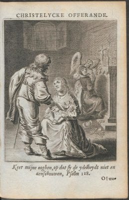
An example can be seen in image reproduced here (fig. 10). An elegantly dressed young woman kneels in front of an equally well-dressed young man who is offering her a deck of cards. Behind them kneels another woman, soberly dressed and supported by amor divinus, who turns to look at the couple, her attention drifting from the altar in front of her. On the altar appears an image of Jesus on the cross and another of a kneeling woman (Mary?). In the accompanying text, the speaker is identified with the soberly dressed, distracted woman. Since human eyes are so easily distracted by all that is going on in the world, they need God’s help: “Let my eyes be turned towards Heaven / Closed to earthly things, in order to overcome these desires.”42 This first emblem in the volume turns out to be programmatic: the false facade of the world and the wish to devote oneself to God form Krul’s themes. Elements from the images are frequently used to convey all the aspects of this message. In the poem “Geestelyke mine” (Spiritual Love), which follows the first emblem, the presence of the lily in the first woman’s hand is explained with a reference to Song of Songs 2:2, “As the lily among thorns, so is my love among the daughters.” By emphasizing the theme of worldly temptations, Krul has singled out one of the topics addressed in Hugo’s Pia Desideria. Yet Krul diminishes the central focus on the love between the soul and God so evident in Hugo’s emblems, perhaps in an attempt to adjust Pia Desideria to Dutch readers. Although Krul was clearly able to publish his Christelycke offerande freely, the book failed to appeal to as large and interconfessional an audience as he had hoped, even though he was working by then with another Amsterdam publisher, Jan Jacobsz. Schipper. He probably chose Schipper in a vain bid for the success Jacob Cats had achieved with this same publisher.43
To use such clearly Catholic images as illustrative components or as sources of inspiration was thus unproblematic from 1640 onward.44 Expressing support for the idea of valuing these images on their own merits – as Joost van den Vondel did in the 1640s – was quite another matter. After converting to Catholicism around 1641, Vondel engaged in fierce polemical confrontations with Protestant writers. His attitude toward the religious, allegorical image formed a small, but apparently significant part of the controversies: it was discussed with great acuity on more than one occasion. The much more concealed Catholic paintings in Dutch schuilkerken (hidden churches) caused much less controversy than Vondel’s openly published poems on the assets of Catholic imagery.45
It was Vondel’s view on the function and status of stained-glass windows with depictions of the crucified Jesus that encountered the most opposition. Vondel was criticized for treating these depictions as visible signs of God’s presence on earth. The pivotal issue of these discussions was the value that should be assigned to the religious image. As long as images were used for purposes of illustration, Catholic authors could operate freely and unrestrained. But matters were quite different when they aspired to a more profound and confessional use of the image. The criticism of Vondel did not come from the authorities but from a group of Protestant poets who published the pamphlet Poëten vegtschool (Poets’ School of Combat), which contained Vondel’s Catholic poems (written between 1641 and 1645) together with parodies of these poems, as well as parodies of the parodies.46 In his “Klaghte over het veronghelucken der Kerke van Sinte Katharine t’Amsterdam” (Lament on the Demise of the St. Catharine’s Church in Amsterdam), Vondel had written that “Jesus eer” (Jesus’s honor) had incurred injury from the fire that destroyed the church:
The apostle himself, yea not even Christ is safe:
He is scorched on the cross, and singed on his column47
In a Protestant reaction to this poem, Jacobus Conradus, a student of Calvinist conviction from Leiden, raised the question as to whether Vondel was attributing inappropriate qualities to the statues, turning them into idols:
What? Is he actually being singed on his column?
No, he who believes that scourges Christ’s heart;
It’s not a human being who kneels here in devotion
And offers living prayers to an image that cannot breathe.
Shun, then, prayers that destroy Jesus’ honor.48
In response, Vondel argued that the Reformation extinguished the “de zon der Godsdienst” (sun of religion) by devaluing Jesus’s “zichtbaer bloet” (visible blood) as a means of grace.49 This attitude was also criticized by another Protestant, the Remonstrant Jacob Westerbaen, who in his pamphlet Kracht des geloofs (The Power of Faith) opposed Vondel’s idea, as articulated in his Altaergeheimenissen (Mysteries of the Altar), that sensory responses and especially visual sensations could enhance a person’s faith.50
A passage in Vondel’s Inwydinghe van ’t stadhuyst’ Amsterdam (Inauguration of the Town Hall in Amsterdam), published in 1655, containing a description of the paintings on the Nieuwe Kerk’s organ, caused no such controversy, most likely because Vondel restricted his reference to the deeper meaning of these paintings to a single line: “Men ziet hier geene verf, maer louter ziel, en leven” (What one sees here, is not paint but the soul and liveliness of the depicted scenes).51 The commotion about Vondel’s expressions of his theories about such images must have been partially caused by specific features of Vondel’s position and personality. But it appears also to have been connected with the level of detail and depth of kinship with Catholic theology that his ideas displayed.
Polemical Features of the Catholic Identity: Everard Meyster’s De kruysleer ter zaligheydt (1658)
A next step toward an open display of a Catholic identity in religious emblems was the publication of Meyster’s Catholic emblem book, referred to in the introduction above. The book was published by Cornelis de Bruyn, who had not only published Dutch translations of English and German Protestant adaptations of Catholic models but also produced a reprint of Vondel’s Den gulden winckel three years prior to the publication of De kruysleer ter zaligheydt. There are no indications that de Bruyn himself inclined toward Catholicism. The engravings in De kruysleer ter zaligheydt are not signed but can perhaps be attributed, based on similarities in style (especially in the depiction of the human faces), to the engraver Jan Veenhuysen, who engraved and signed the title page of Het tweede deel van ’t wonder van Oosten (The Second Part of the Eastern Miracle), a book that de Bruyn also published in 1658 (fig. 11). Veenhuysen was not affiliated with the Catholic church either.52
As mentioned above, in using van Haeften’s imagery as a model, Meyster did not remove the Catholic features of the original. On the contrary, the emotional overtones of van Haeften’s imagery – intended to bring about the meditative process – are emphasized in Meyster’s picturae: the crossbow depicted in pictura 3 is shooting a heart toward amor divinus, while van Haeften’s picture shows an arrow rather than a heart. In his choice of images, however, Meyster could have been more outspokenly Catholic. He appears to have avoided overtly Catholic images such as the one in which van Haeften’s engraver visualized the soul’s unification with Christ (fig. 12).
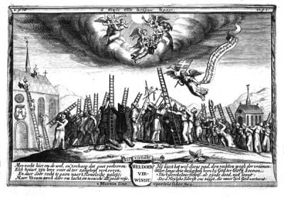
Provocative, however, was the outspokenly Catholic, indeed Jesuit, aphorism, “Ad majorem Dei gloriam,” included beneath Meyster’s opening verse53 and the polemical cast of the large fold-out print, engraved in the same style as the picturae and set in a similar ornamental framework, that appears following folio I4r. The print depicts a mountain, with groups from various denominations all trying to reach God’s heaven by climbing a ladder (fig. 13). A Catholic bishop, portrayed in the middle, is the most successful in his attempt. A Jesuit and Cistercian and Capuchin monks are situated next to him. The people on the far left are furthest away from heaven: they are demolishing a Catholic church. A group of naked people, Anabaptists, is moving away from heaven, and on the far right soldiers are busy demolishing people’s ladders. Underneath the print an engraved text explains to the viewer that all this fighting keeps people from entering heaven.54 In some copies of the De kruysleer ter zaligheydt, this print is absent. Since it was not originally part of a quire but was glued onto one of the pages, it was semidetachable and could easily be removed; was this manner of production chosen because of the polemical nature of the print?55
Meyster’s openness did indeed invite criticism, albeit not specifically aimed at his use of religious images. An anonymous pamphlet dating from 1676 maintained that Meyster “met Paus Jut soo vaeck boeleerde” (often flirted indecently with the ludicrous Pope).56 Meyster himself wrote about the resistance he encountered from Dutch Reformed ministers in De gekroonde berymde policy: Zijnde het eerste deel der Meysterlijke werken, bestaende in hemelsche, en aerdsche gedagten (Crowned and Rhymed Politics: Being the First Part of the Masterly Works, Consisting of Heavenly and Earthly Ideas).57
Meyster’s De kruysleer ter zaligheydt was never reprinted, nor was it referred to by other writers. Its importance should, however, not be evaluated solely in terms of the number of people who knew of its existence. Striking in comparison to earlier Catholic illustrated productions in the Republic is its outspoken, almost aggressive articulation of Catholic identity. Word and image were fully integrated by Meyster to lend support to the reader’s devotion as well to the position of Catholics in Dutch society. The volume was part of a series of illustrated devotional works by Catholic authors – from various European countries – published in the Republic around 1660. Adriaan Poirters’s Het duyfken in de steen-rotse was soon to be followed by another of his works, Het masker vande wereldt afgetrocken (The Mask of the World Pulled Off), published in Amsterdam in 1659 by Philips van Eijck. Also, a Dutch edition of Boetius à Bolswert’s Duyfkens en Willemijnkens pelgrimagie (Pilgrimage of Little Dove and Little Willemina) was produced by Michiel de Groot in Amsterdam around 1660. Other publications by Southern Netherlandish Jesuits were to follow: an illustrated edition of Aegidius Carlier’s Ad maiorem Dei gloriam . . . christelycke spreucke vanden H. Ignatius de Loyola (For the Greater Glory of God . . . Christian Proverbs by Ignatius de Loyola) was sold in Amsterdam by the widow of Joachim van Metelen in 1676.
In the absence of any Dutch Protestant emblem books in which Catholic iconography was deployed in these decades, it appears that Dutch Catholics were articulating their own identity more clearly in publications such as Meyster’s candidly Catholic emblem collection. This new assertiveness was firmly based on Southern Netherlandish emblematic traditions.
Dutch Protestants’ Distance from the Catholic Emblematic Tradition
The advance of the Dutch Catholic identity in religious emblematics might well have become conceivable through the publication of a second Dutch translation of Herman Hugo’s Pia Desideria, titled Goddelycke aandachten (Divine Meditations), in 1653, by the Dutch mystic and chiliast Petrus Serrarius. Consistent with Serrarius’s unorthodox ideas, the Goddelycke aandachten propounded a mystical and idiosyncratic version of Pia Desideria. Serrarius was convinced that imitating Jesus’s example would result in a state of mind in which the reader would be overformt (reshaped) to coincide with His image.58
The origins of Serrarius’s eccentric adaptation were as international and varied as Serrarius’s own background. Serrarius was born in London, the son of parents who had fled from the Southern Netherlands to escape Spanish rule. He was educated in the Republic to serve as a priest in the French-speaking Reformed Church (the Waalse kerk), but was forced to leave this church in 1628. Afterward he preferred to refer to himself as “priester van de algemene christelijke kerk” (priest of the universal Christian church).
In producing his Goddelycke aandachten, Serrarius cooperated with the Amsterdam publisher Salomon Savrij, who produced copies of copperplate engravings originally made for a 1628 Latin edition of Hugo’s Pia Desideria published by Henrick van Hastens in Antwerp. The new title engraving for Hastens’s edition, less erudite and more emotional than the original title engraving Boetius à Bolswert made for the 1624 edition of Pia Desideria, was also reused by Savrij. The soul is shown carrying a burning heart that is almost too large to be lifted, while amor divinus pours the fire of love into an opening at the top of the heart (fig. 14).
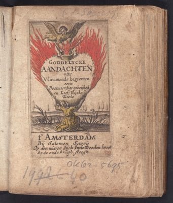
This title engraving, based on a Anton Wierix print from the series Cor Jesu Amanti Sacrum, anchored Serrarius’s adaptation even more firmly in the Southern Netherlandish tradition. Even though Serrarius perceived devotional, emblematic imagery to be an important aid in the rebirth of mankind, he himself did not envision a radical change in the use of emblematic religious imagery in the Republic.59 The rest of Serrarius’s religious works remained unillustrated – even his title pages often lacked pictorial material.60 And when his central theme was the invisibility of (the road to) God, as in Van den waere wegh tot God (The True Road to God), dating from 1661, the use of religious imagery was neither discussed nor demonstrated.61 Serrarius obviously did not intend to change Protestant opinions on the applicability and usefulness of sight in religious matters in general.62
Because of its reuse of the copperplates originally made for the 1628 edition of Pia Desideria, the publication of Serrarius’s Goddelycke aandachten appears, at first, to be tied to Catholic traditions. But based on a reconstruction of Serrarius’s personal network, such a link hardly seems likely. Serrarius was connected to an international, predominantly English network of spiritually interested Protestants who had produced a number of religious emblems books, including the adaptation of Pia Desideria in the 1630s and 1640s. Serrarius’s own adaptation and rewriting of Hugo’s work resulted not from any direct connection with Catholic circles but rather from his bond with these English Protestant intermediaries.63
Even though Serrarius had toned down the Catholic features of Pia Desideria – in that he adapted an English Protestant rewriting of this emblem book – his Goddelycke aandachten still bore traces of the Catholic alternative to the Protestant attitude toward religious imagery. As a result, in 1653, when Goddelycke aandachten was published in the Republic his innovative compromise found little response in Protestant circles. Dutch Protestants kept the Catholic visual tradition at arm’s length in the 1660s and 1670s. This is best seen in the case of the Voorhof der ziele, behangen met leerzame prenten en zinnebeelden (Temple of the Soul, Embellished with Edifying Prints and Emblems), written by the Anabaptist François van Hoogstraten in 1668.64 Van Hoogstraten was the first to translate the mystical works of the Spanish Franciscan Diego de Estella (e.g., his De Contemnendis Mundi Vanitatibus) into Dutch, and at first sight, the Catholic traditions seem to have had a profound influence on his Voorhof der ziele.65 The title engraving, made by the young Romeyn de Hooghe, includes several elements of Catholic iconography (fig. 15). It depicts Jesus inviting a man – who holds a burning heart in his hand, offering it to Jesus – to accompany Him on the road to heaven. Behind Jesus, God is represented as a radiant triangle with the inscription “Jahweh,” and the Holy Spirit as a dove. At the lower end of this road, another man as well as a devil stare at Jesus; they look very frightened and are obviously not about to join Him. Underneath this scene is a quotation from Boethius’s Consolatio Philosophiae: “Falsa tuens bona prius / Incipe colla jugore trahere: / Vera dehinc animum subierint” (So must you too, who now have eyes / Only for false goods, first begin / To draw your neck from the yoke, / That then the true may slip into your mind).66
The message contained in all of this is that the faithful should leave evil behind and concentrate on the good by preparing their hearts for Jesus. In this preparatory process, emblems could play a vital role. According to van Hoogstraten in the preface to the Voorhof der ziele: “One can, in my opinion, be edified . . . by images and words, by sight and sound.”67 One of the poets who wrote a preliminary verse to the Voorhof der ziele promises:
Through images learn to discern
The false appearance from the truth.68
Since the images themselves demonstrate the difference between truth and illusion, they become reliable means of attaining knowledge – a remarkable point of view in a Protestant context. The images in the Voorhof der ziele will, according to van Hoogstraten’s brother Samuel in his preliminary poem, touch upon the “mind, and heart” of the readers, showing them representations of “everything that nature brings forth on earth.”69 Van Hoogstraten’s purpose was to embellish the temple of the soul with beeltenissen (images), and to supply these images with interpretations based on the Bible and the books of wise men.70
Van Hoogstraten’s picturae showed scenes from daily life, and in spite of some Catholic influences, he created religious emblems that were typical for Dutch Protestants at the time, as he abstained from giving the images mystical and meditational purposes. His aim was to instruct the reader about the vanity of the world rather than establish communication between God and the reader through the medium of these emblems.71
In emblem LI, for instance, “Aensiet de vogelen des hemels” (Behold the fowls of the air), based on Matthew 6:26, the picture depicts a stork – a common representation of piety in those days – snatching a frog from the earth and flying toward heaven (fig. 16). The reader is asked to identify with the stork in the accompanying text. One should free one’s mind from all earthly concerns (represented by the captured frog):
As long as the mind is bound and hampered by these concerns.
It will find no pleasure in contemplation,
Nor in prayers, which allow us to approach God,
As an excess of concerns wearies the mind.
The brain remains in a fog and darkened.Come then to where God’s Presence shines,
And prepare yourself for the call of His voice,
Unchain your heart, which is held far too tight
By so much estrangement and worry,
Then you will rest like a lamb in the cool shade.72
The promise of communication is there, but van Hoogstraten’s emblems do not set out to facilitate the actual process of approaching God step by step.
Conclusions
After 1678, emblematic features derived from the Catholic tradition were widely employed in shaping the faith of Protestant readers, owing to the activities of Jan Luyken. These developments contradict what has previously been suggested by several scholars, namely the growth of anti-Catholicism among laypeople in the Netherlands around 1680. As I have shown elsewhere, the contrary seems to have been the case: after 1678, the nature of toleration changed from a situation of enduring prejudice to sharing traditions, as outspokenly Catholic features were incorporated into Protestant identities.73
This was only half of the story, however. At precisely the moment when Dutch Protestant emblematists accommodated aspects of the Catholic emblem tradition, their Catholic counterparts steered away from it. What seemed at first an instance of confessional rapprochement proves to be something altogether different. The Catholic cultural tradition was successfully appropriated by Dutch Protestants because in the religious emblem the Dutch Catholic identity itself had lost much of its edge. After Meyster’s De kruysleer ter zaligheydt of 1658, the genre was no longer employed by Dutch Catholic authors in the north. Krul and Meyster were not succeeded by a new generation of Catholic emblematists. The new emblematic works produced in the Southern Netherlands never became part of the production process in the Northern Netherlands.74 Dutch editions of Southern Netherlandish religious emblem books, such as the Dutch translation (De heyr-baene des cruys) of Benedictus van Haeften’s Regia Via Crucis, were produced in Bruges and Antwerp in 1667 and 1693, rather than in the Republic.
Instead, new and unillustrated or minimally illustrated Catholic publications emerged: after 1680, the production of such Catholic prayer books, books of hours, catechisms, and church books showed a sharp increase in the Republic.75 These works very often contained only an illustrated title page or a small number of prints that were based on Catholic emblematics, as in the 1718 edition of Wilhelm Nakatenus’s Hemels palm-hof, ofte groot getyde-boek (Heavenly Garden of Palms, or Large Book of Hours) (fig. 17).
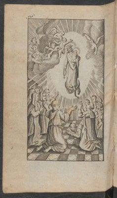
Therefore, when the production of Catholic emblem books is taken as the point of reference, emblematic sources reinforce the argument that little or no sharing of visual practices and iconographical traditions took pl
ace among denominations in the Republic. In contrast to van Eck’s conclusion, I have contended that the production process itself was not organized along denominational lines, even though the outcomes of these processes – the printed books – were more easily hidden from the public eye than the clandestine-church paintings. Meyster’s De kruysleer ter zaligheydt was published in a city that was tolerant toward Catholics, but neither the book’s publisher nor (most likely) its engraver was Catholic. What made the publication of the De kruysleer ter zaligheydt a strictly Catholic affair was Dutch Catholic proprietorship over the religious emblematic genre at the time. As soon as Protestants advanced in this domain, Catholics abandoned their newly established territory.
It remains to be seen how the specifics of literary media influenced other domains within the Dutch religious visual culture. Was the use of other visual media – such as stained-glass windows in churches or theatrical elements in the art of preaching – also organized along denominational lines? Were ideas that restricted the use of visual aids in the realm of literature transferred from one medium to another in those cultural spheres where religious literature and other visual media enjoyed mutual contact with each other – such as pamphlets or sermons on religious theatre, or treatises by painters on religious art? If so, did this result in more widespread forms of cultural isolation for Dutch Catholics?
And if the focus were to be placed on the circulation of Catholic emblem books rather than on their production, would the outcome be different? It is possible that copies of Pia Desideria and other emblem books published in the Southern Netherlands were already circulating in the Northern Netherlands by the first half of the seventeenth century. We know for a fact that Constantijn Huygens owned a copy of Pia Desideria, and further research into readers’ libraries and personal documents could provide additional insight into their demands and preferences, revealing yet another aspect of seventeenth-century Dutch religious culture. Personalized copies and readers’ marks could also prove valuable sources of information. The scientist Johannes van Swammerdam, for example, was obviously intrigued by the Wierix series Cor Jesu Amanti Sacrum, as he pasted them into one of his books.79 A manuscript, titled Verborge leven der ziele met Christus (The Hidden Life of the Soul with Christ), kept in the royal library in The Hague, into which Luyken’s picturae for Jesus en de ziel have been copied and supplied with new texts also suggests that some readers were profoundly intrigued by the idea that images could enhance their religious reading experiences.
More research is needed to explore how readers used (personalized) emblem books in order for scholars to build their knowledge of Catholic visual traditions. Did readers’ preferences eventually transform the production of religious literature in the Republic? Did their appreciation of meditational images contribute to the extensive production of Protestant religious emblems at the end of the seventeenth century?
Additional questions can be posed if the Dutch situation is placed in its international context. Dutch Protestants with an interest in Catholic visual traditions (Heyns, Hulsius, Serrarius) appear to have been inspired by Protestant models from England, Germany, and France, demonstrating that the mingling of Catholic visual traditions and Protestant literary genres could be instrumental to the development of devotional literature. Rather than consulting Dutch Catholics, these Dutch Protestants turned to such foreign sources of inspiration. Were Catholics in neighboring states just as isolated, or was this a typically Dutch phenomenon?80 And in the Republic itself, were Catholics isolated in all cultural spaces, or do the emblem books as well as clandestine church art form the exception to the rule? Ultimately, we need more research into the development of Dutch illustrated religious literature in order to establish why a state known for its religious toleration – the Dutch Republic – never produced a religious literature based on the mingling of Protestant and Catholic traditions.
